Margine office took over Casa Coo renovation in Rome. The renovation blends historical preservation with contemporary design, restoring original features like vaulted ceilings while introducing minimalist, modern elements. The project focuses on stripping away excess embellishments to create a sober, elegant atmosphere, with new materials and layouts that enhance both functionality and aesthetics. Key updates include a floating kitchen, reimagined bedrooms, and thoughtful details that honor the building’s heritage while offering modern comfort.
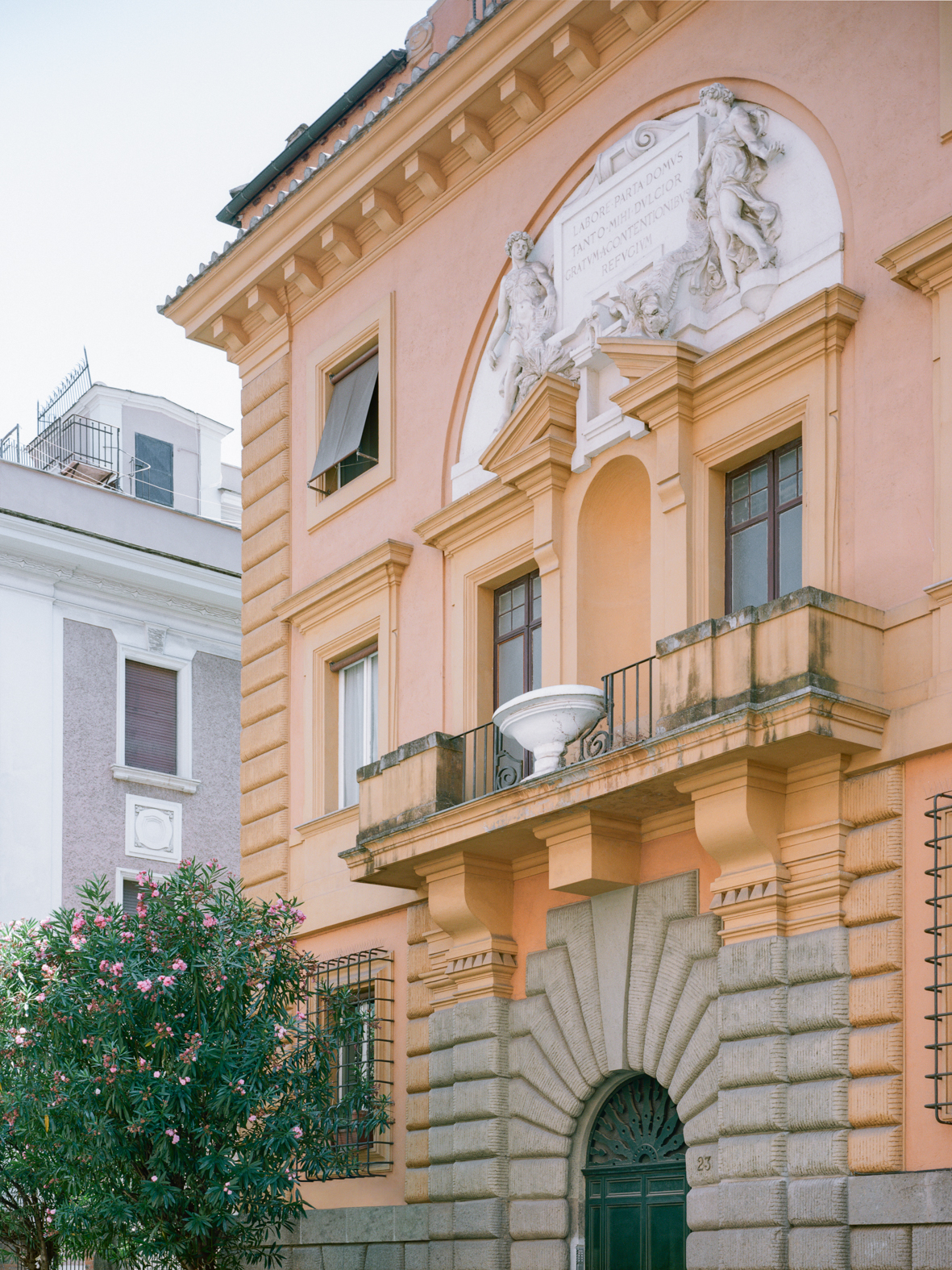
In the Monti district, nestled among buildings near the Colle Oppio Park and just a few hundred meters from the Domus Aurea, stands the Villino Brini-Meschini. This small but distinctive example of Roman “barocchetto” architecture was designed in 1923 by architect Pietro Aschieri, commissioned by the prominent Art Nouveau decorators who gave the villa its name.
A staircase, adorned with an intricately carved solid cherrywood handrail, leads to the attic once owned by Brini. Here, the painter left his artistic imprint, enhancing the final landing with a trompe l’œil that creates the illusion of continuity with the pentagonal window on the main façade. Additional traces of the past, this time attributed to his son Ercole, were discovered in the form of study sketches during the initial inspection of the apartment. Ercole Brini was a celebrated graphic artist and set designer, known for collaborating with Fellini and for creating iconic film posters, including those for Antonioni’s Blow-Up and Pasolini’s Mamma Roma.
The client, a Roman surgeon, wanted to renovate the home with a contemporary, clean, and minimalist aesthetic while tailoring it to his family’s needs. He favored dark, rich tones to contrast with the natural light flooding in from the attic’s triple exposure. Before the renovation, the house featured an entrance hall, a spacious living room with a dropped ceiling and an adjoining veranda used as a dining area, a kitchen, a master bedroom with parquet flooring designed in a framed modular pattern bordered by a decorative frieze, a small bedroom, a bathroom, and two attic spaces used as storage rooms.
The house was filled with numerous embellishments and coverings that weighed down and darkened the perception of the space. Dropped ceilings, moldings, wallpapered walls, stucco, and marble cladding all contributed to a o an overwhelming and disjointed feel.
The renovation project aimed to strip away and simplify this overwhelming aesthetic, embracing a sober, elegant, and rational style that could restore the home’s original essence. At the same time, it sought to create a contrast of colors and materials with contemporary additions.
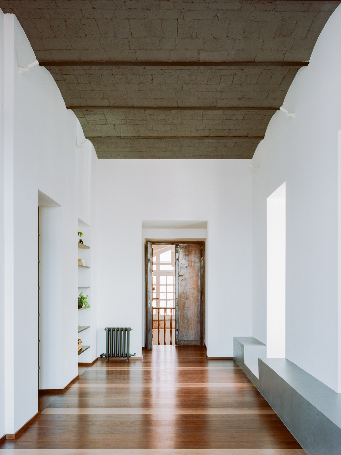
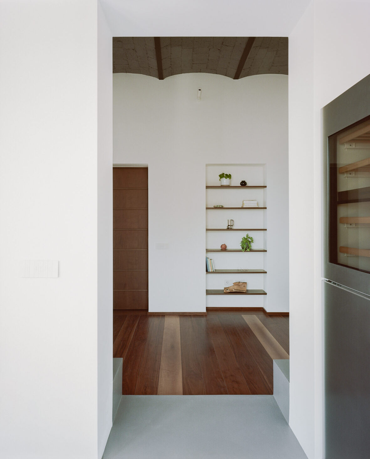
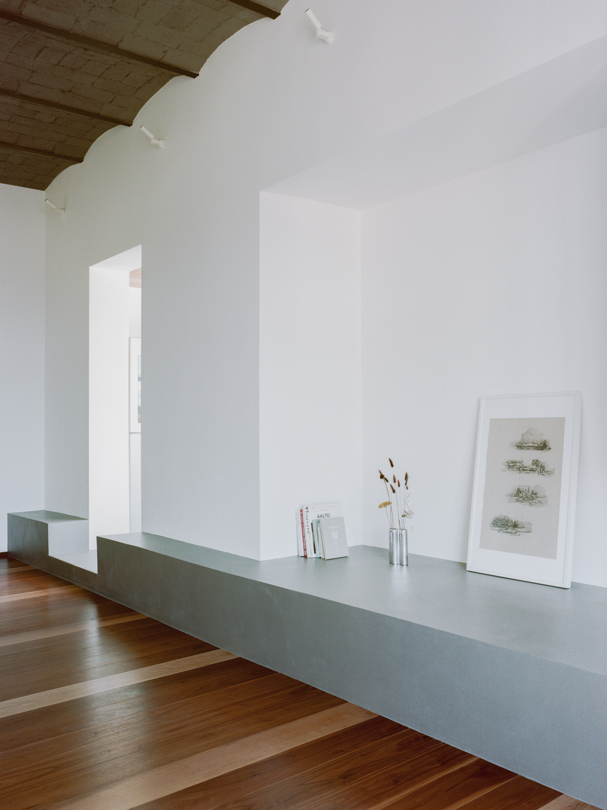
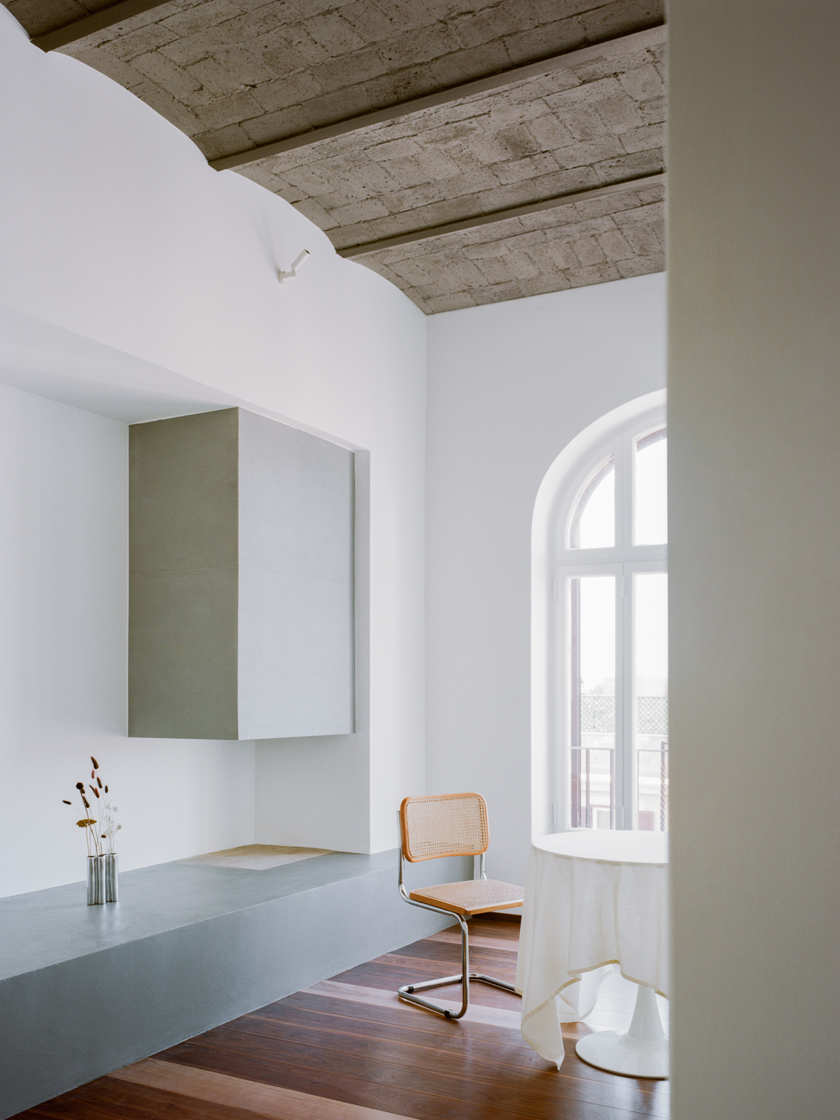
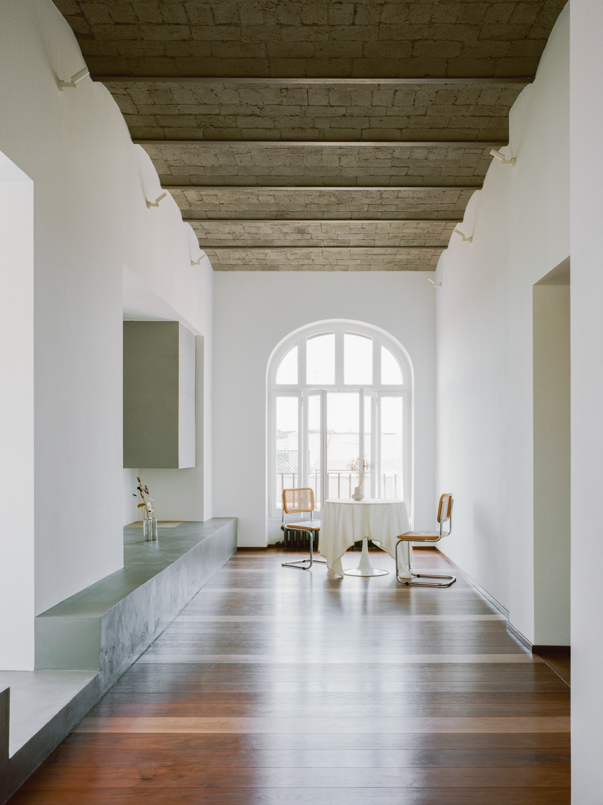
The preliminary surveys revealed that the dropped ceilings in the living room and bedrooms concealed a stunning vaulted ceiling in stone with steel beams. Restoring the ceiling not only elevated the living room but also enhanced its overall grandeur. The old, time-worn parquet was replaced with walnut planks interspersed with oak, laid in alignment with the ceiling beams. The existing fireplace was replaced with a sleek, minimalist design, clad in concrete slabs and suspended above a microcement base that doubles as a bench in the living room and extends into the veranda area, serving as flooring.
This approach created a seamless formal and functional continuity between the historic home and the newer addition.
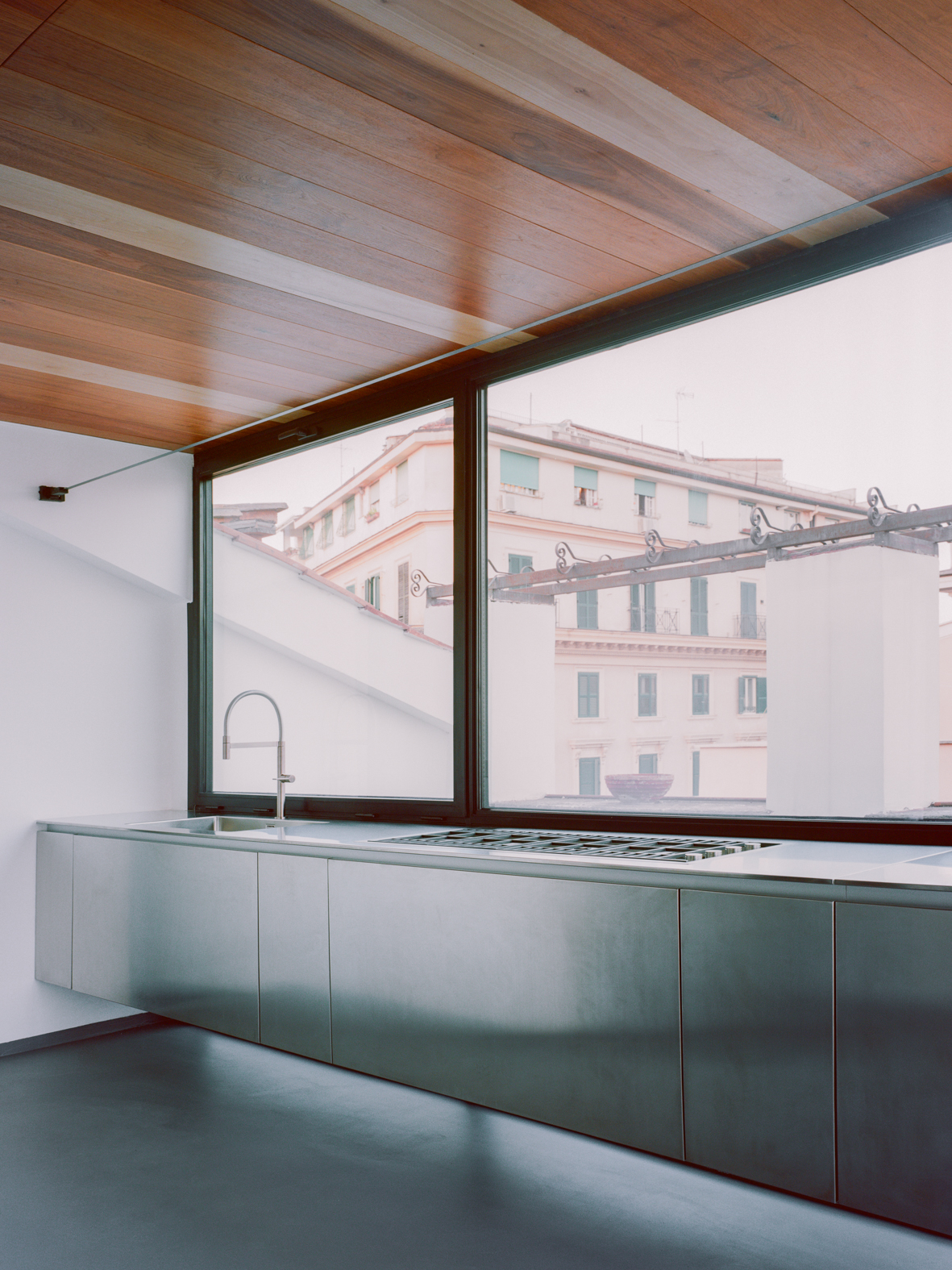
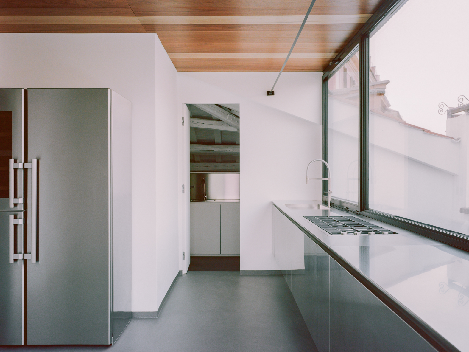
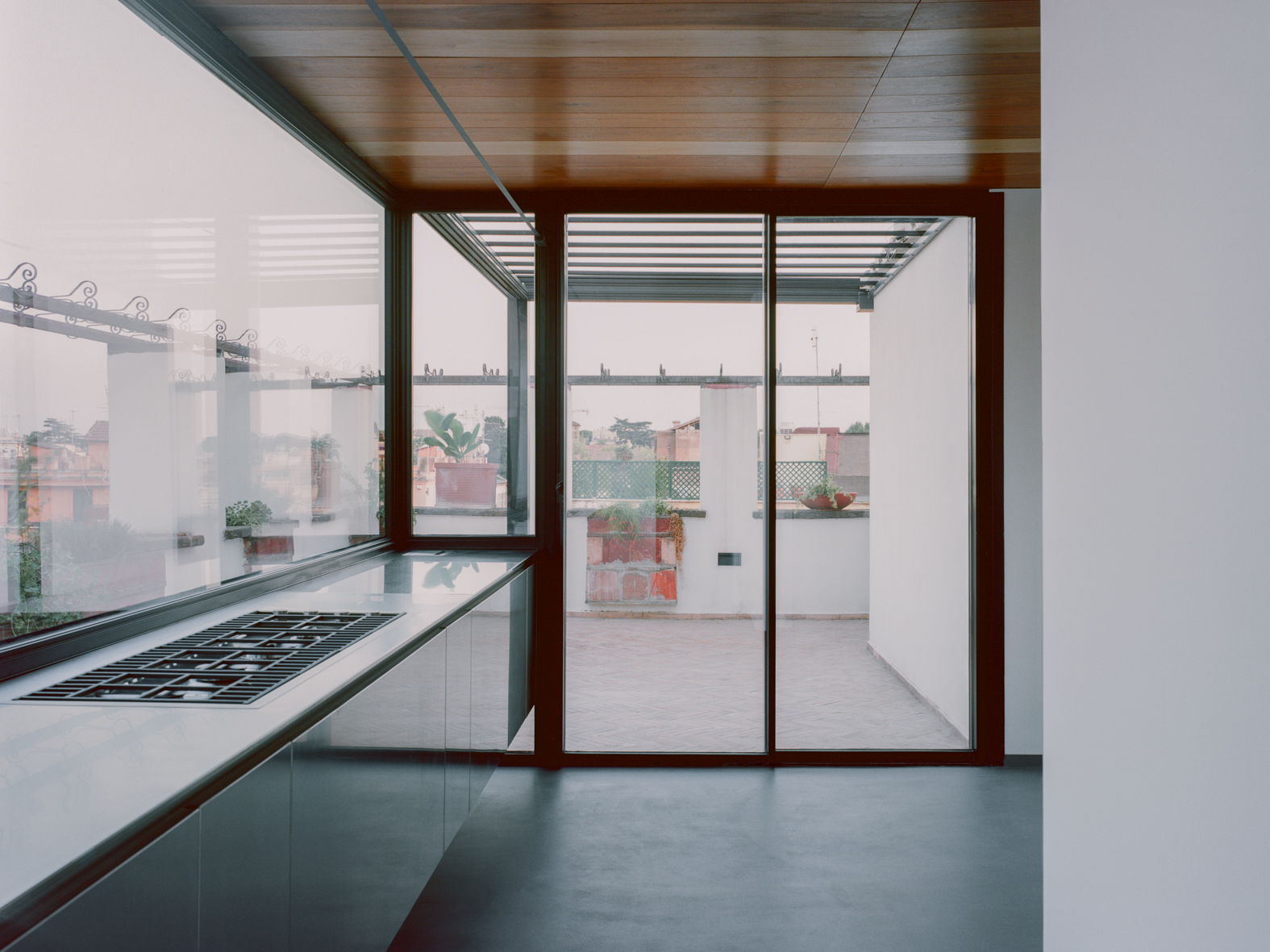
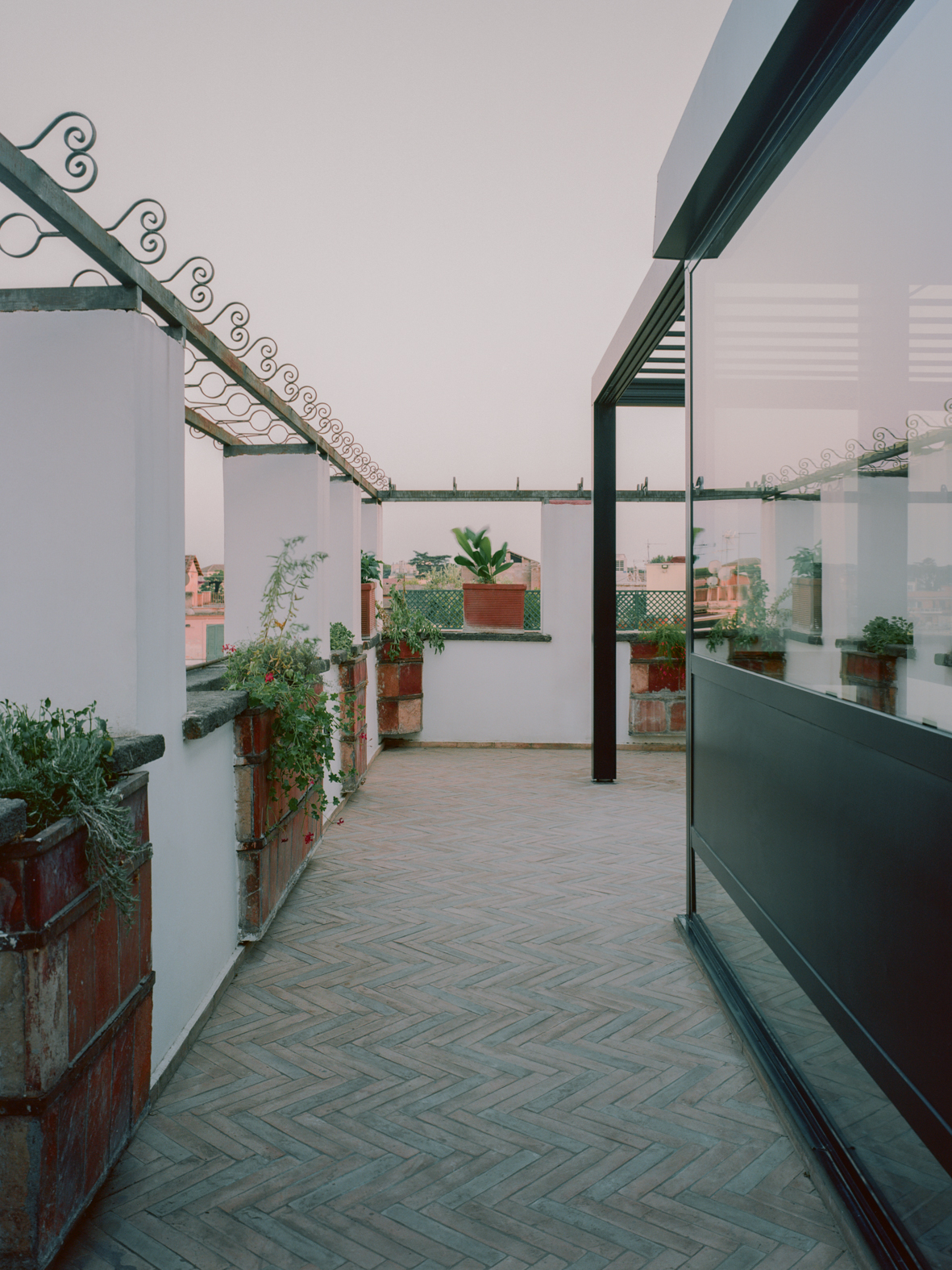
The veranda, once a simple panel-covered structure, has been completely reimagined in a contemporary style and transformed into a kitchen, offering the clients—who are particularly passionate about culinary arts—a space that seamlessly connects with the outdoors. To maintain brightness and this connection to the terrace, the kitchen was designed in steel and suspended from the veranda’s structure, effectively appearing to float in the space. The floor continues the materiality of the fireplace base, while the ceiling is clad in the same bi-chromatic planks as the living room. From the veranda’s glass doors, one can access the terrace with a view of Colle Oppio and the Colosseum, paved with colored terracotta bricks laid in a herringbone pattern, reminiscent of traditional Roman flooring. A pergola, aligned with the veranda’s volume, will allow for outdoor dining in the shade of the newly planted jasmine.
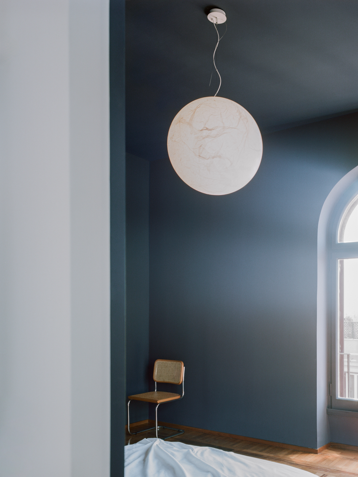
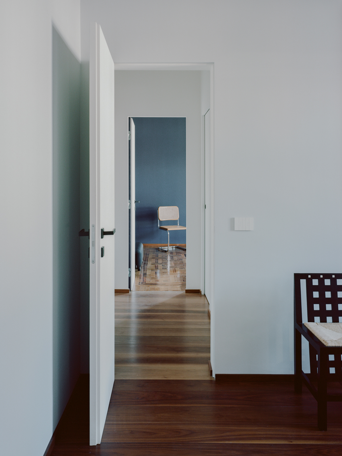
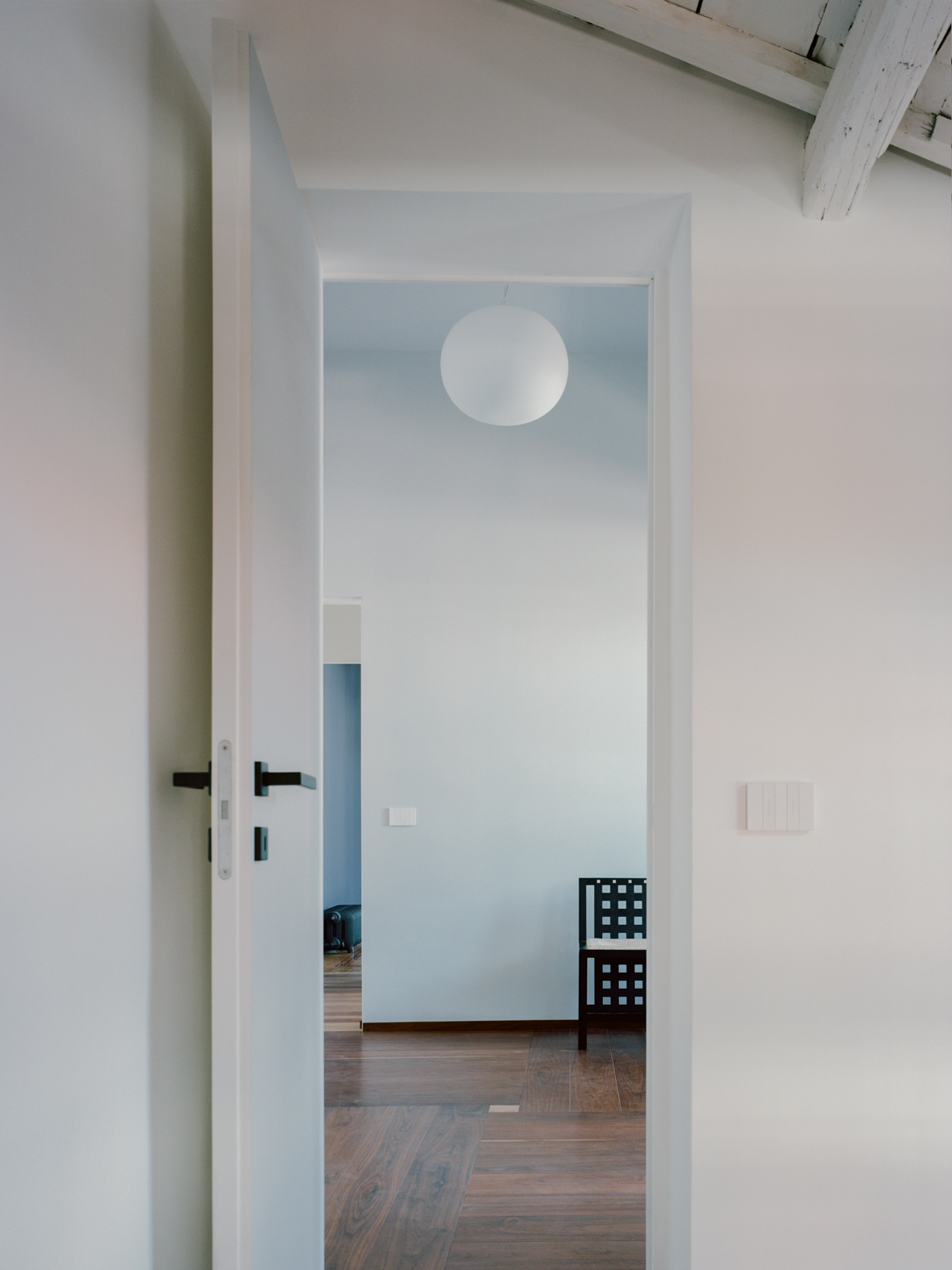
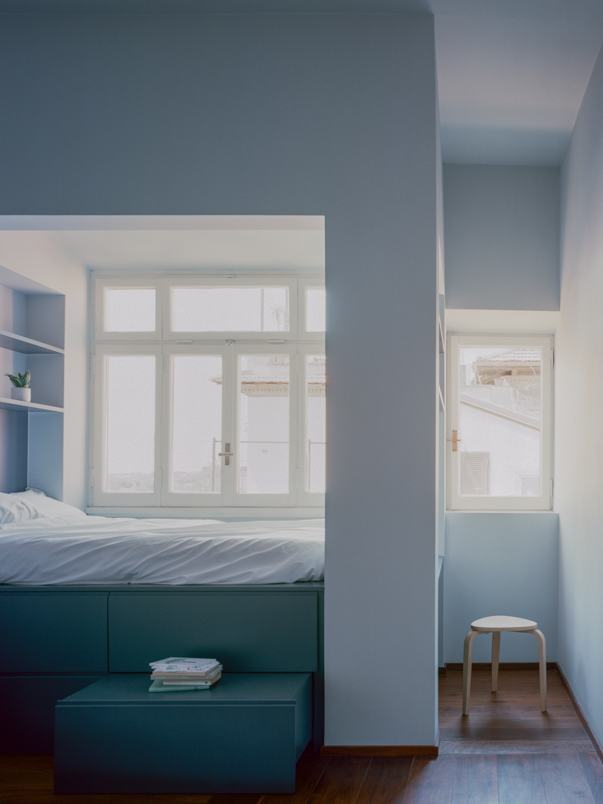
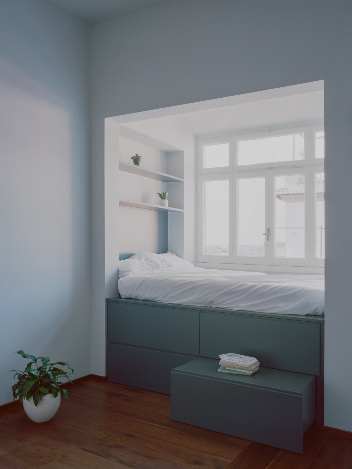
Upon re-entering, you access the private area of the bedrooms and bathrooms through a wooden door, whose design contrasts with the adjacent bookshelf. The master bedroom, with a view of the Colosseum from its window, has been enhanced with Prussian blue walls, the restoration of the original modular parquet, and the addition of a central lamp, Groppi’s Moon, which evokes the ambiance of a night sky. The existing kitchen and bathroom were combined and transformed into a small bedroom. In the old bay window, where the stove used to be, an alcove was created: a custom-built piece featuring a raised bed, with stairs made of storage drawers leading up to it, and a headboard that serves as a bookshelf on one side and a desk on the other.
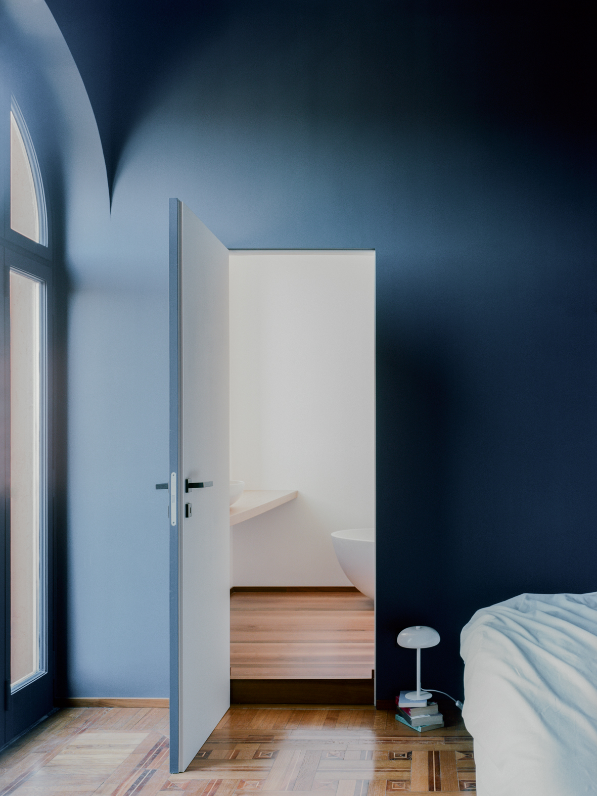
A distinctive feature is the flooring: a small light oak tile at the center of the room divides the space into four quadrants, with alternating horizontal and perpendicular walnut planks.
From the former single bedroom, two bathrooms were created: a smaller one for general household use and a larger, private one for the master bedroom. Both were enhanced with Agape fixtures, providing a rich sensory experience through a striking contrast of rough and smooth textures. The loft spaces, with their wooden trusses highlighted by a coat of white paint, have now been seamlessly integrated into the small bedroom and kitchen areas.
The original wooden window frames were carefully restored, honoring the aesthetic integrity of the historic building, while being upgraded with low-emissivity double glazing to improve efficiency. All systems were modernized to enhance comfort.
Key details, such as architectural lighting by Groppi, Flos, and Viabizzuno, the deep tones of Foglie d’Oro wood and the textured finishes by HD Surface, the artisanal terracotta by Fangorosa, and the selection of classic cast iron radiators by Artekalor, serve as the sole decorative elements. These features, with their understated yet refined elegance , pay homage to the historic essence of the original property.
Facts & Credits
Project title: Casa Coo
Project location: Rome, Italy
Architecture: Margine (Giulio Ciccarese, Valentina Pontieri)
Project team: Arch. Giulia Marzocchi
Date of completion: October 2024
Area: 130m2
Text: Provided by the authors
Photography: ©Lorenzo Zandri
READ ALSO: Apartment CK in Lisbon | by RAR.Studio