Void Studio breathes new life into Casa Müller, an early 20th century building in Chihuahua City in Mexico, with a revitalization that is all about reigniting the flame of community life.
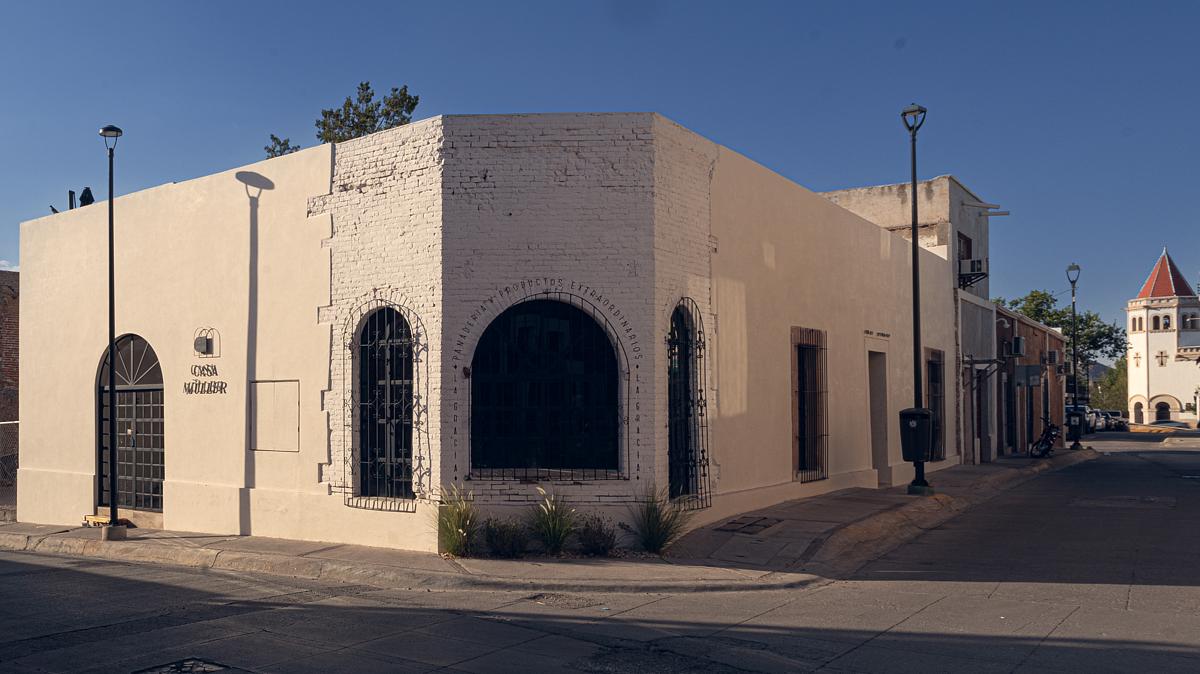
Built in the early 20th century by the Müller Stellmann couple, the walls of this house hold the sun of over a hundred years of sunsets; its windows, the progression of the history of the north of the country, and the interior, the grandeur of a family that had fallen into oblivion. Casa Müller is an ambitious project set to transform a once-troubled neighborhood in Chihuahua City into a vibrant hub of community and culture. The project aims to revitalize a property notorious for drug use and crime, breathing new life into the area and altering its perception.
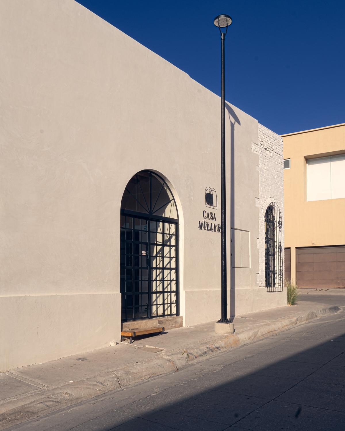
After the death of its last heirs, furniture, lamps, books, and personal objects remained as if waiting for the return of its former inhabitants. But no one ever knocked on the door again. As with many other buildings in the historic center of Chihuahua, time passed over this one and it became abandoned, obscuring the splendor of its ceilings with cloth skies, checkerboard floors specially designed for its main hall, and the crimson red facade. Ceilings fell, windows were vandalized, and with the collapse of one of its walls, the property was looted and turned into a hotbed of social problems. Its location, on the corner of 4th Street and José Esteban Coronado, a block from the Gameros Mansion and in a straight line with the Chihuahua Metropolitan Cathedral, gives it great architectural importance, but even more substantially, urban importance.
And it is from the understanding of this relevance that the architectural firm Void Studio proposes a project that breathes new life into the house.
With the clear mission of rehabilitating the property and generating a positive impact on the area, the owner contacted the architecture studio and gave them carte blanche to work. Chihuahua’s historic downtown, once a beating heart brimming with residents and lively commerce, now echoes with a sense of loss. The tight-knit community spirit that defined this district has faded, replaced by a focus on fleeting visitors.
This project isn’t just about revitalization; it’s about reigniting the flame of community life.
In response, Void proposed a project that preserves and adapts the original structure to a layout that allows for new dynamics, while respecting the beauty of the house and highlighting its different construction stages.
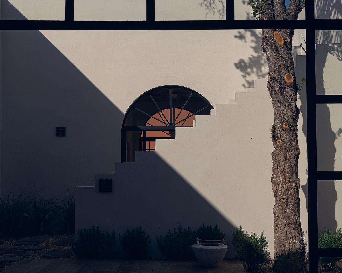

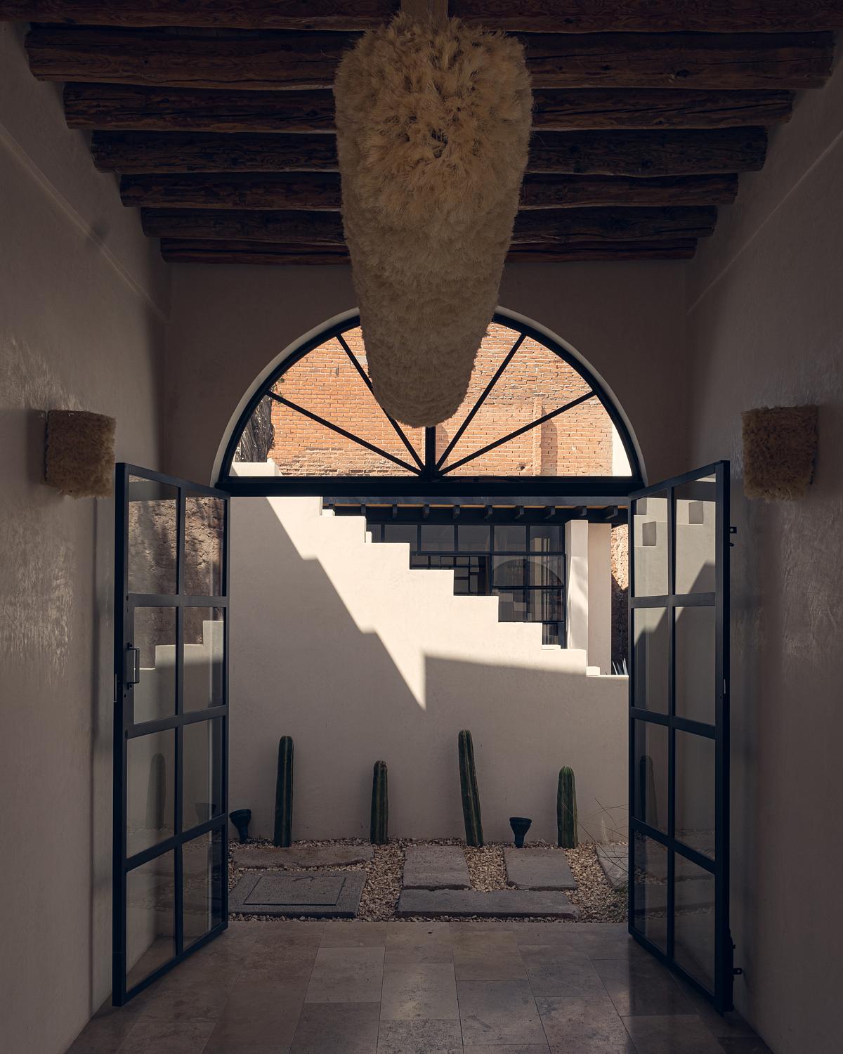
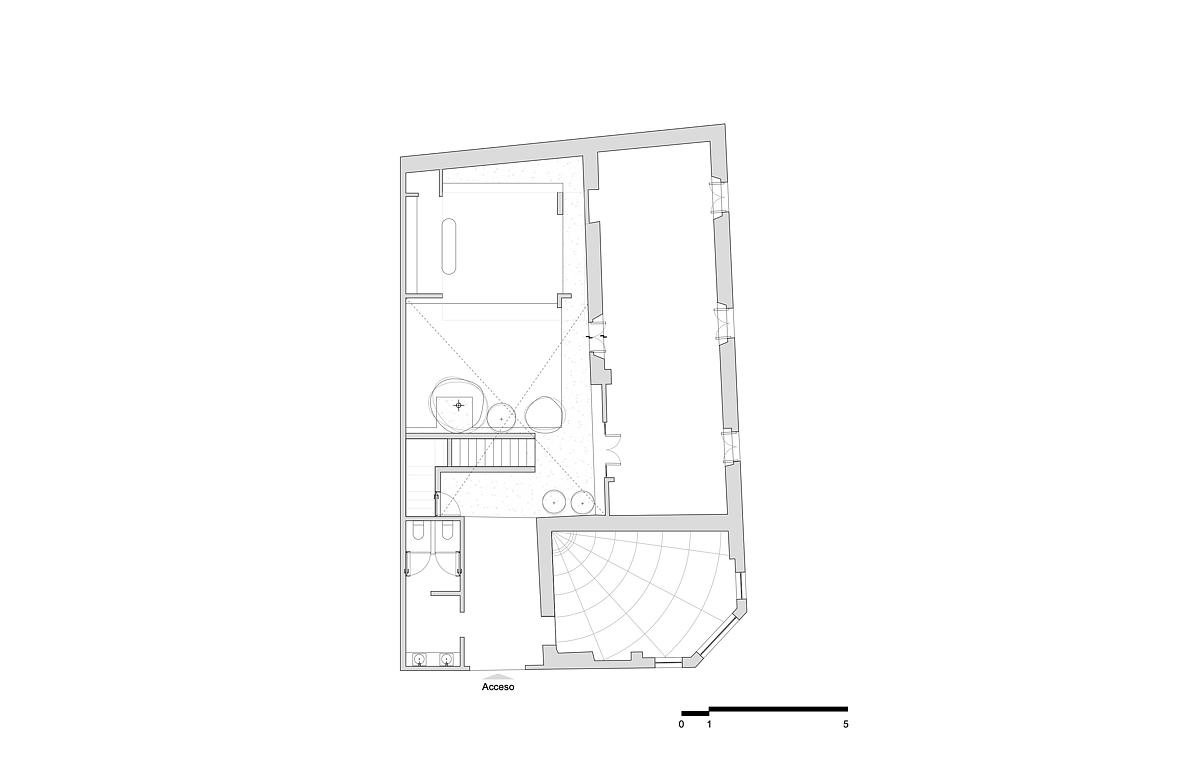
Of the two original courtyards, only one would be preserved, around which three independent spaces would be organized: offices, a bakery, and a space for events – specifically, Sotol tastings.
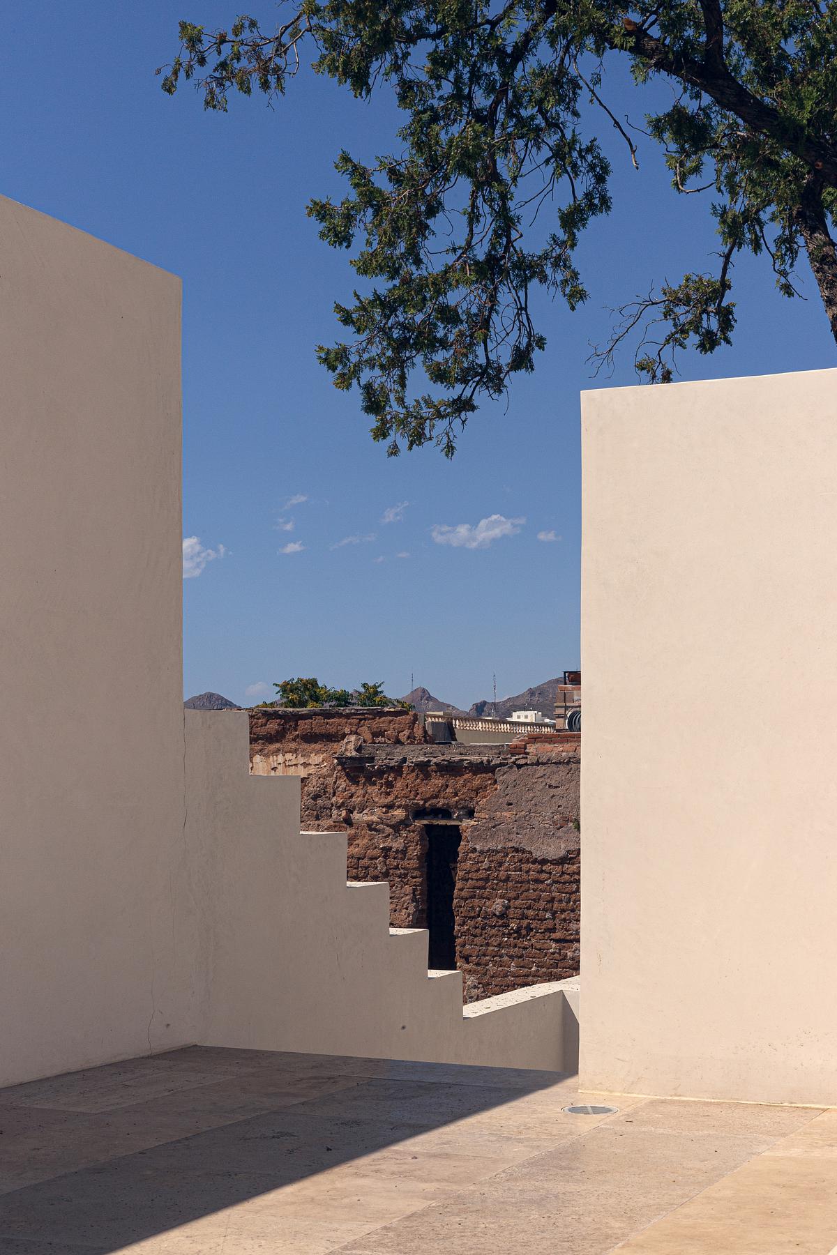
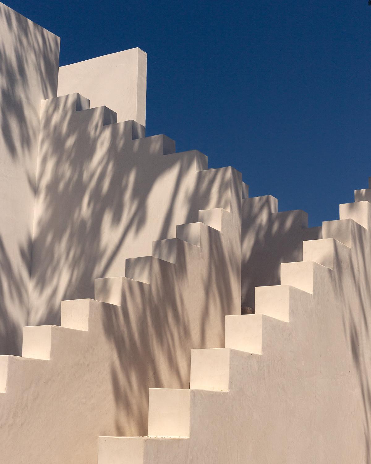
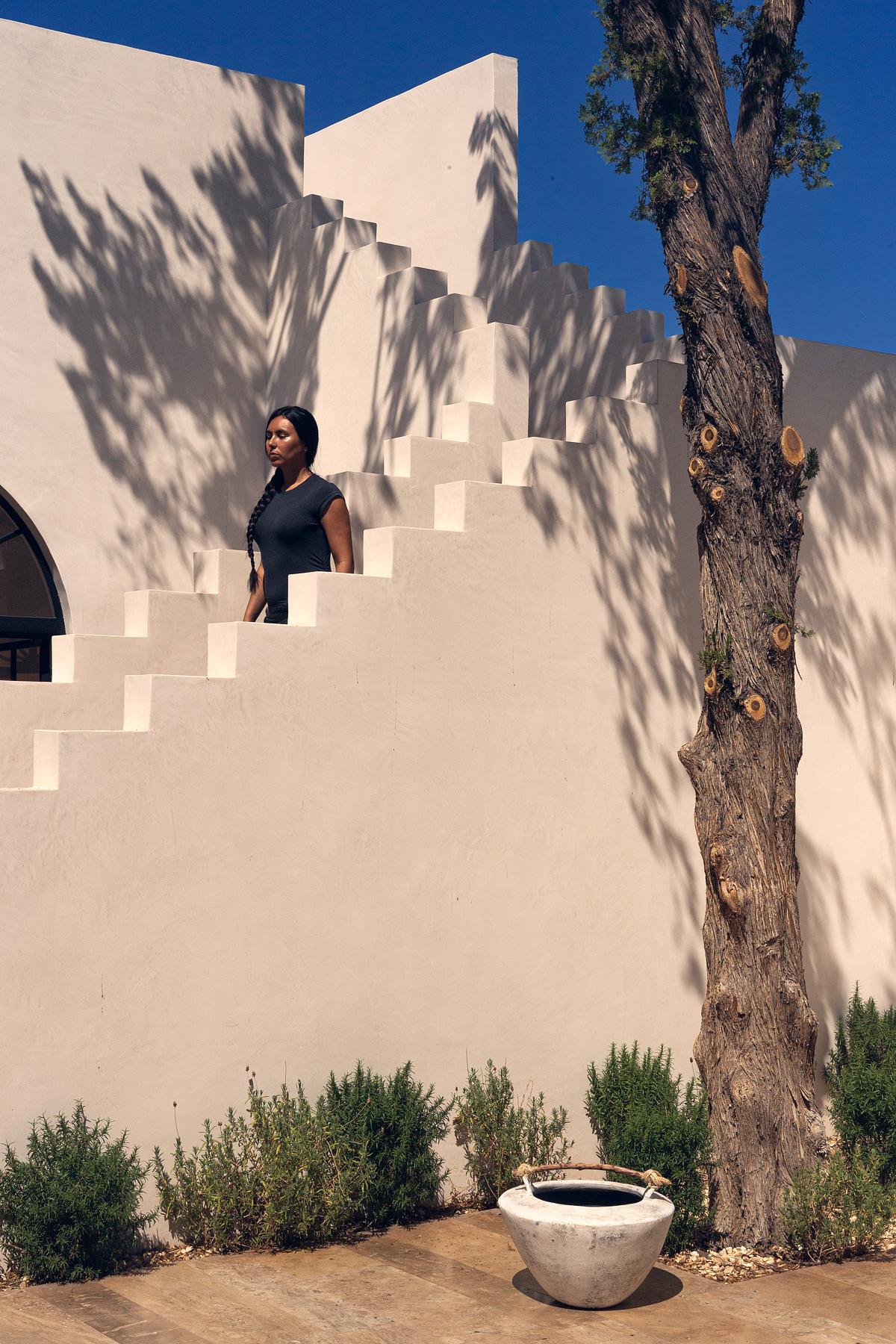
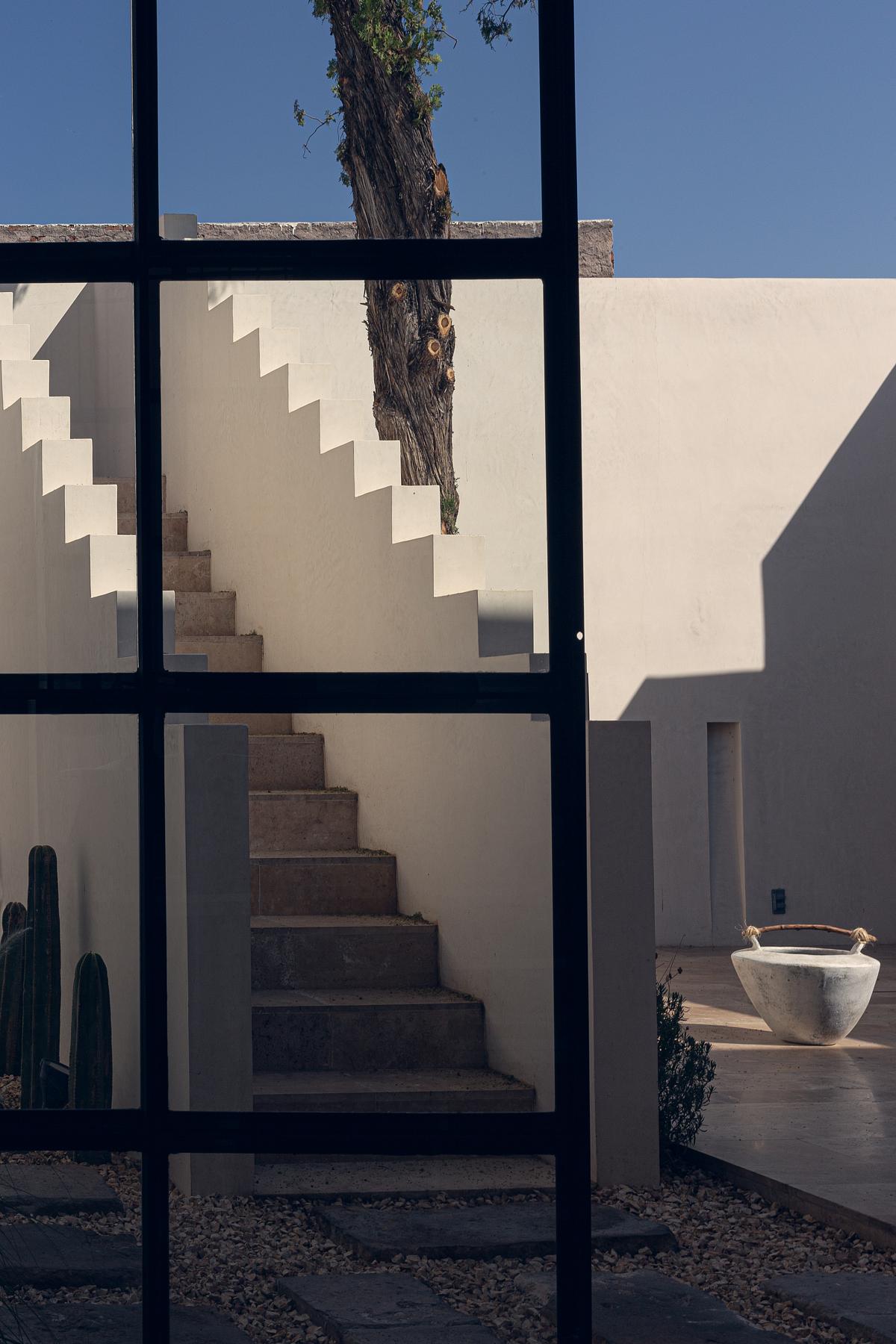
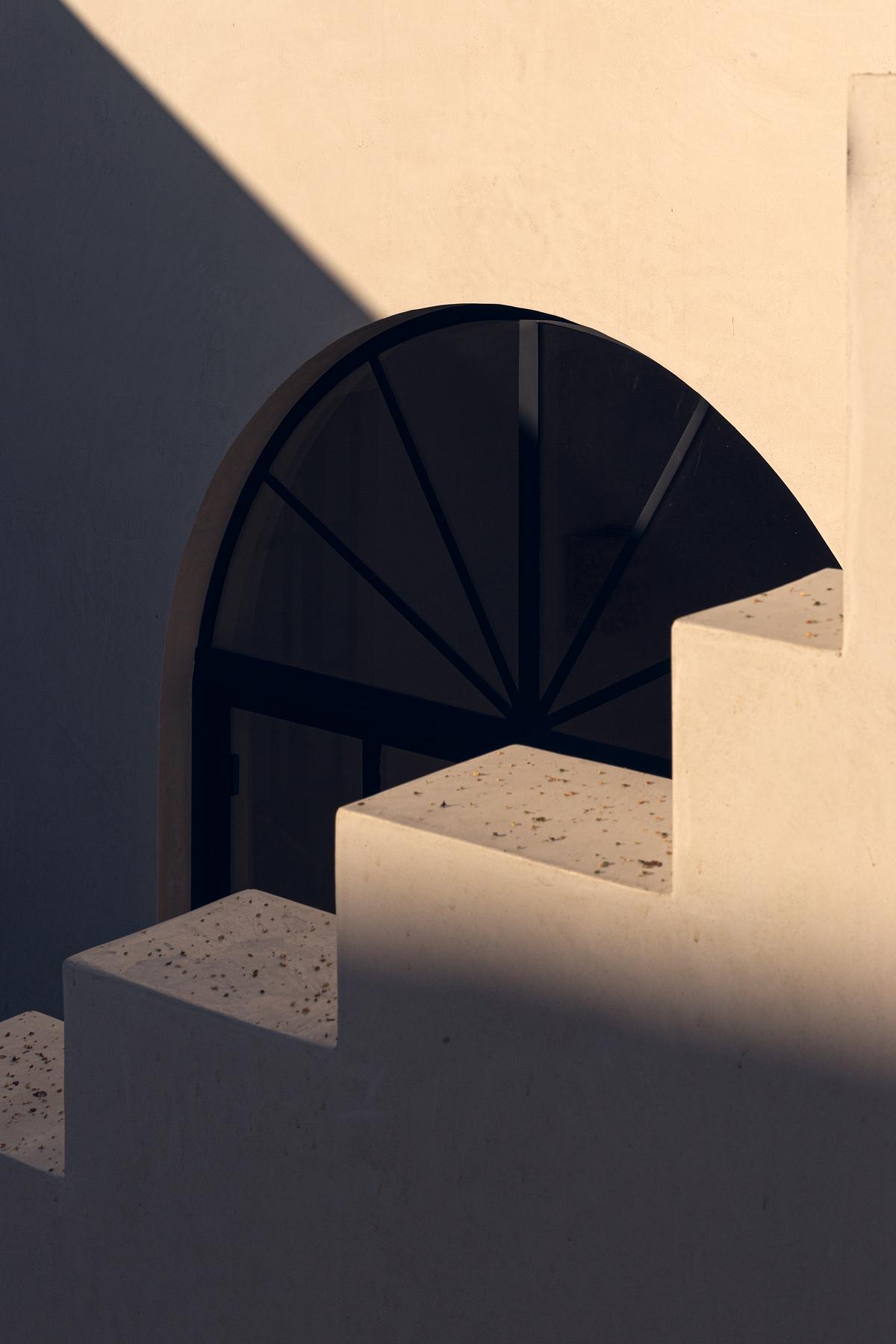
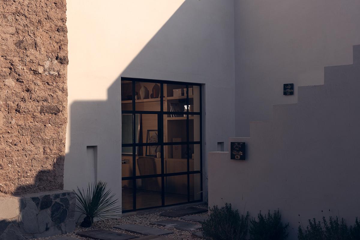
From the street, the view of the central courtyard is relatively closed by the white angles of a staircase, an almost sculptural element that has become the insignia of Void Studio. The staircase leads to a terrace that opens up the upper floor and takes advantage of the panorama of domes that flourish around. In order to accommodate these new functions, access and services were replanned.
During the execution of the project, the phases and styles of the house were revealed. The oldest structure in the adobe of the traditional mining style, an addition with a French flavor in the space of the octagonal corner, possibly from the Porfiriato era, and, around the 1940s, the incorporation of arched doors and windows with ornate ironwork.
Fulfilling the idea of honoring the passage of time, witnesses to its history are preserved at different points.
In the bakery area, remnants of the original wallpaper, the windows, and the checkerboard floor with a peculiar two-radius design – devised and produced in Mr. Enrique Müller’s terrazzo factory – were rescued; but it was also decided to leave some fragments of exposed brick and the marks of the supports of the cloth ceilings.
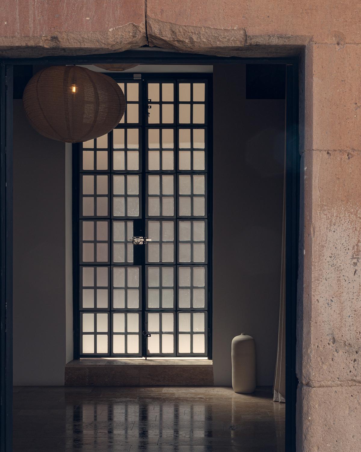
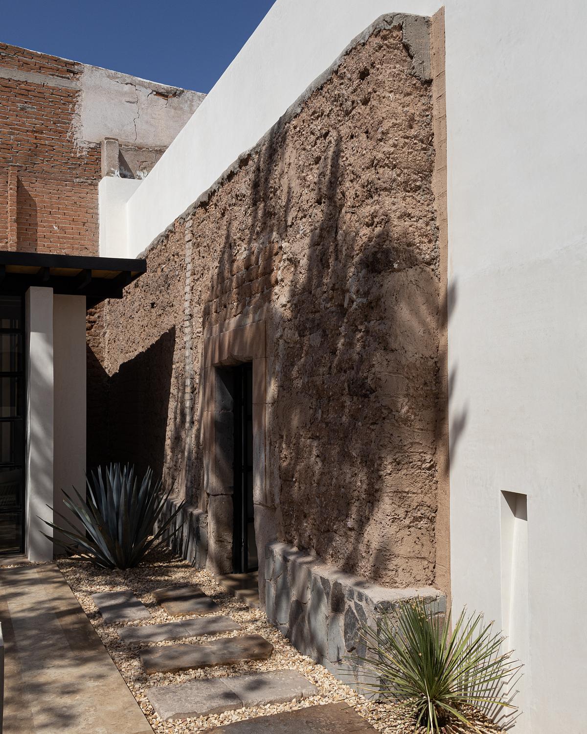
The use of the beam system was respected, and although none of the ceilings could be saved, the walls were maintained and cared for with the selection of coffered ceilings that reduce the weight. In cases where the adobe was left exposed, it was treated with a sealant that protects it and allows it to breathe; in cases where it was covered, the option was to superimpose Tablaroca walls.
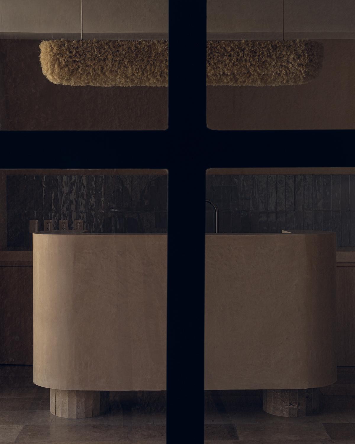
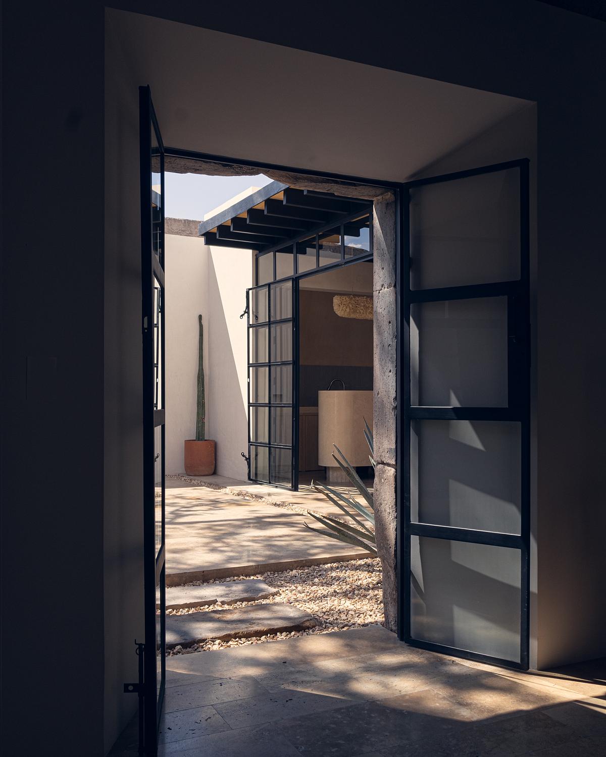
In the office, the second skin of the wall does not reach the ceiling and is made explicit with a line of light that shoots towards the old textures. As a new construction, the space for Sotol tastings has openly different architecture and a flexible layout to adapt to the nature of other types of events. A small room with a bar and kitchen facilities inside a structure that is perceived, by far, as much lighter than the rest of the areas, as it is formed with a roof of beams, plywood, and sheet metal, and three of its four sides in ironwork with glass. Two of these, like windows to time, overlook original adobe walls.
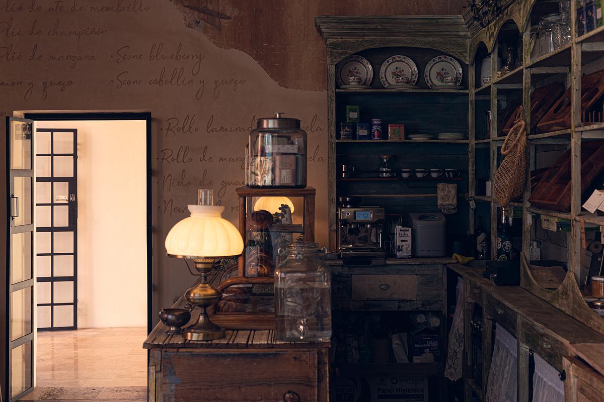
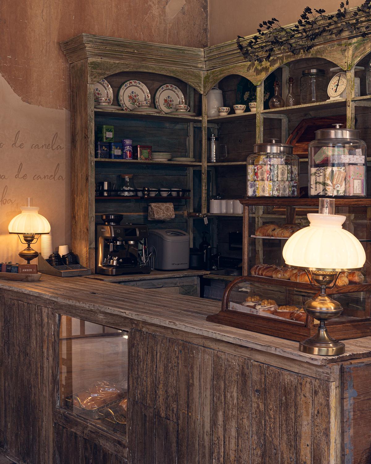
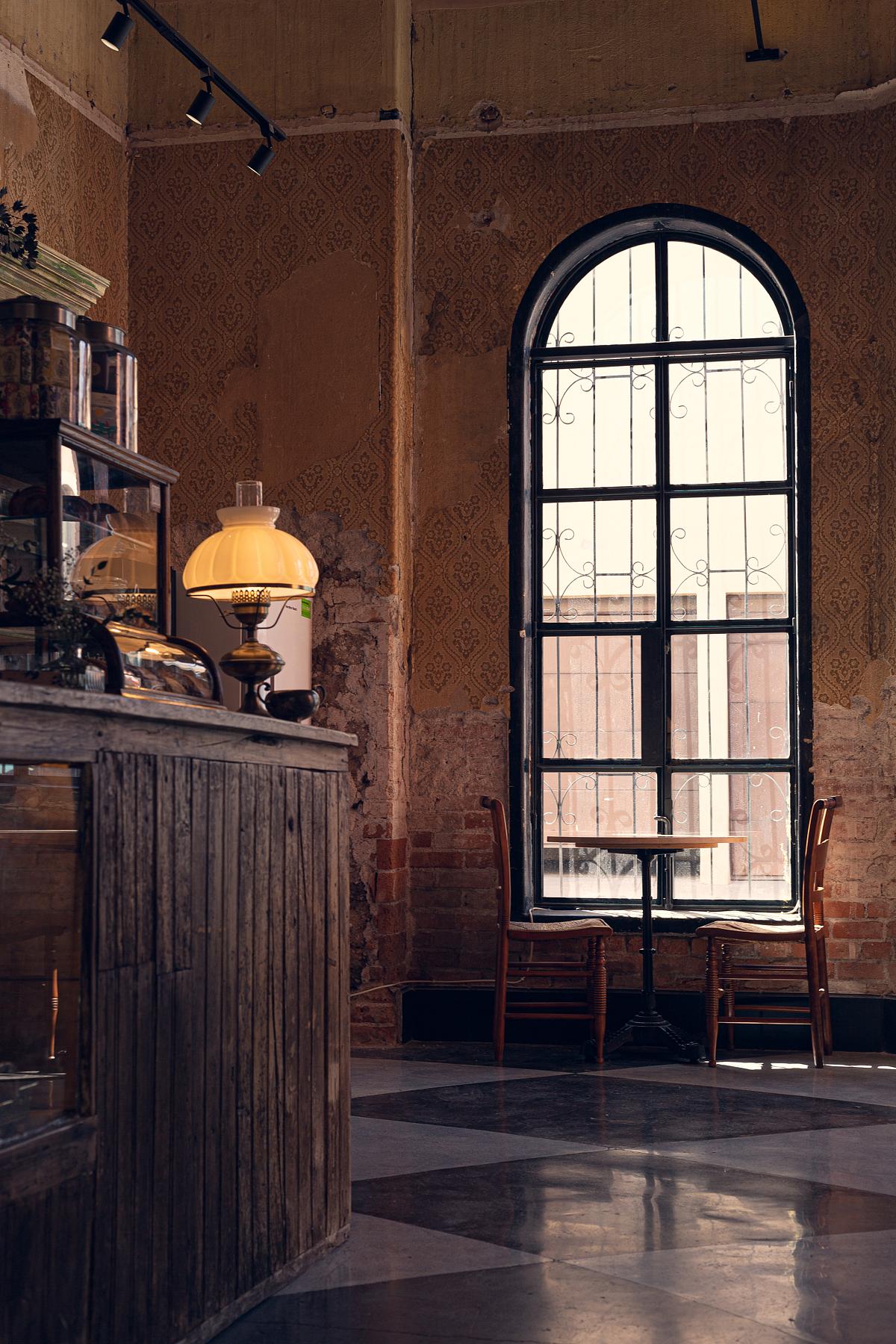
At the level of finishes, the architecture studio sought a consonance with what already existed. In addition to the original elements that were preserved and exposed, on some walls Kimiplaster by Kimikolor was used, a specialized stucco with neutral tones and textures. For the floors, the palette went to ki básico: travertine marble on the inside, natural stone in different sizes on the outside, gravel, and fragments of reclaimed quarry stone.
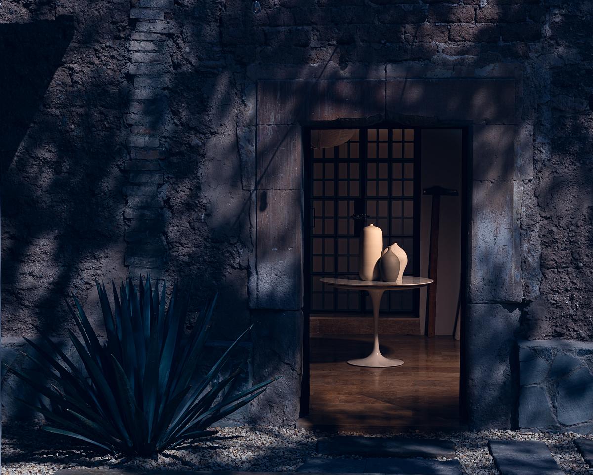
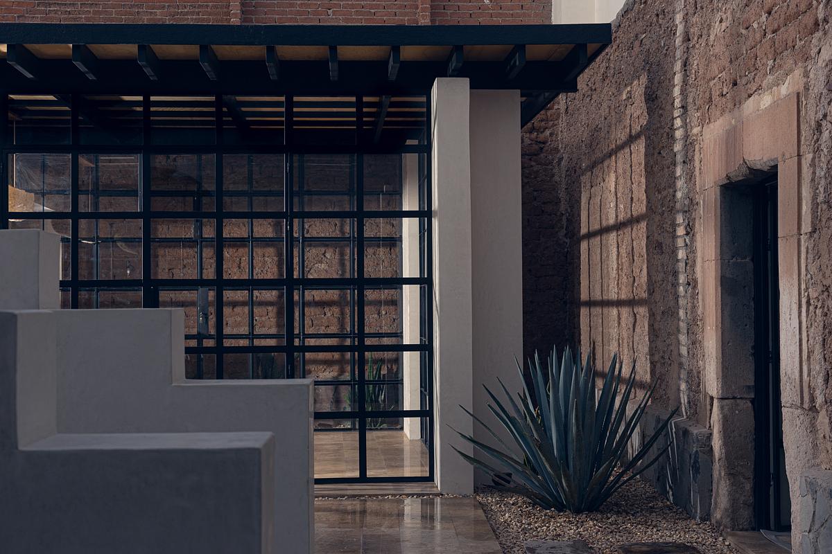
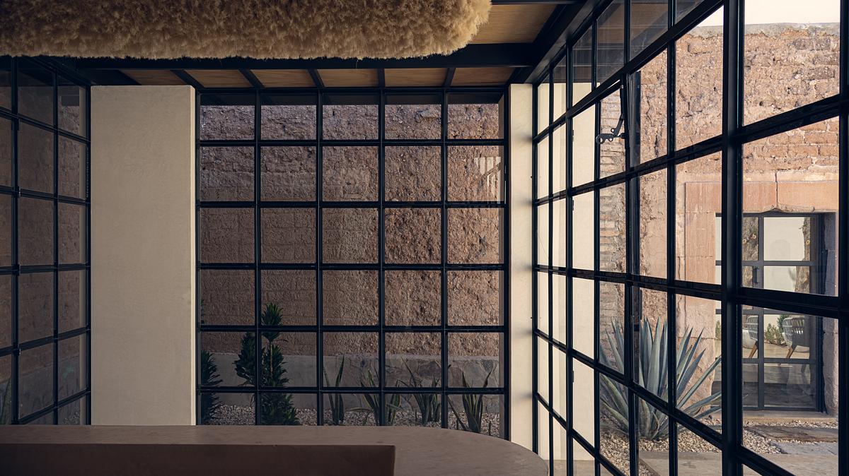
For the facade and the surfaces of the central courtyard, the white color draws on traditional knowledge and reduces the heat of the spaces by reflecting the intense sunlight of the place.
Hand in hand with its architectural merits, Casa Müller is also designed to have a positive social impact on the city.
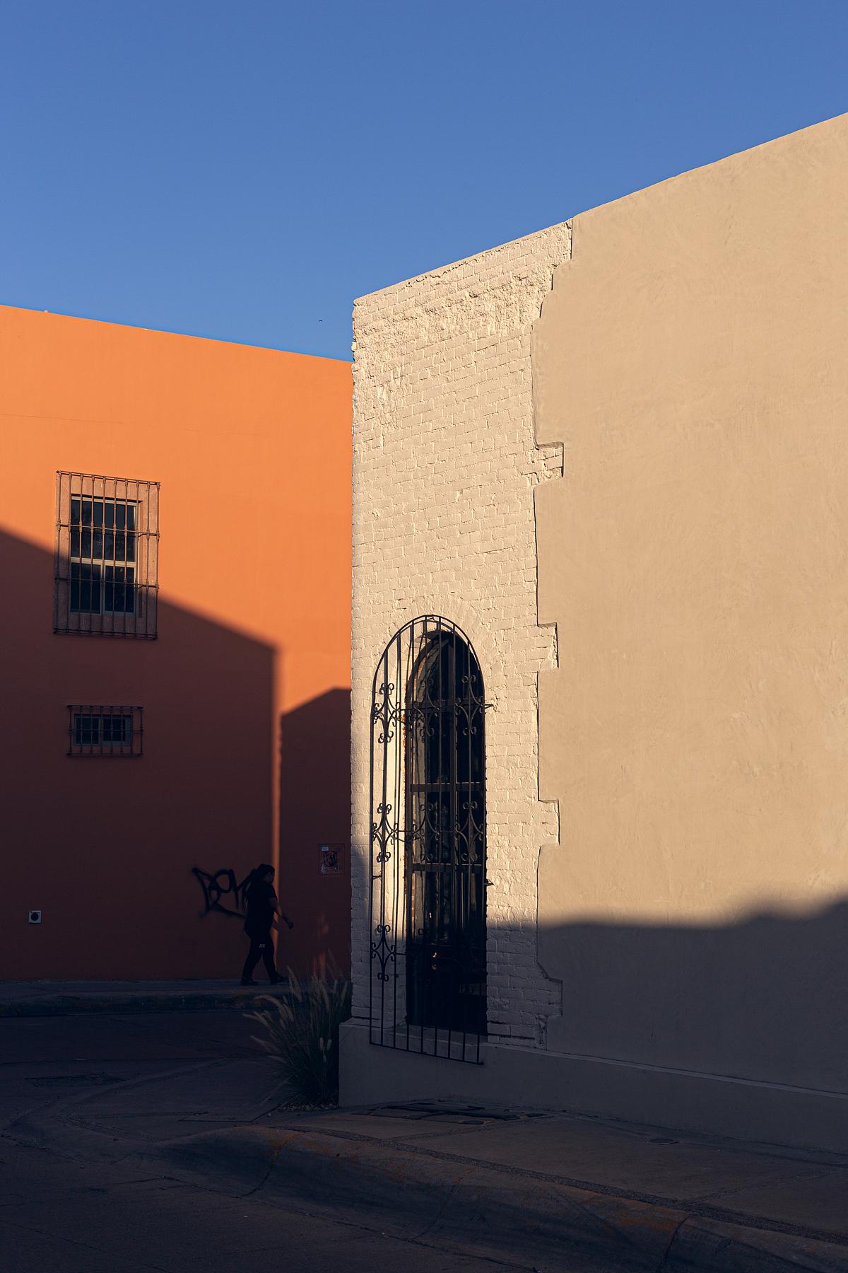
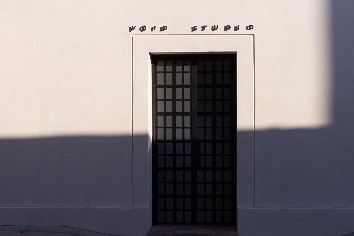
While the work was carried out within the confines of the house, the greatest effect is felt externally, as the proposal for diverse uses in the area attracts new populations and brings life back to a neighborhood that – like the house itself – had been forgotten. With spaces like the bakery and the event area, people can take ownership of the property and fall in love again with a historic center that is not only important but also beautiful. On another level, the area is gaining importance so that neighboring property owners can see the value – architectural, commercial, and social – of their properties and join in the change by restoring them.
The project envisions a space that fosters connection and belonging, encouraging residents to reclaim their neighborhood and embrace its potential. Through a combination of mixed-use spaces, including offices, a bakery, and an event area, Casa Müller will create a dynamic destination that attracts people from all walks of life. By providing a safe, inviting, and engaging space for residents, the project aims to instill a sense of pride and ownership in the neighborhood, fostering a more cohesive and vibrant community.
Facts & Credits
Project title Casa Müller
Typology Interior, Renovation
Location Chihuahua City, Mexico
Architecture Void Studio
Project size 240 m2
Completion date 2024
Photography Alfredo Diaz Anzures
Text provided by the architects
READ ALSO: Flitch Cottage in London | by Whittaker Parsons Architecture Studio