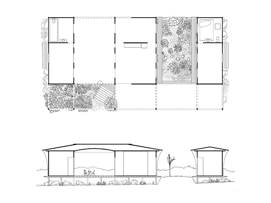
The house is made of three parts; a living room, a bedroom and a guest bedroom. The bedroom and the guest bedroom are equal in size, and balanced at opposite ends of the house. The living room is larger and sits between the two bedrooms. The guest and host share this room together. In the evening they eat and drink together. Afterwards they part in opposite directions. To reach their bedrooms, the guest walks through a courtyard while the host walks through an empty hall.
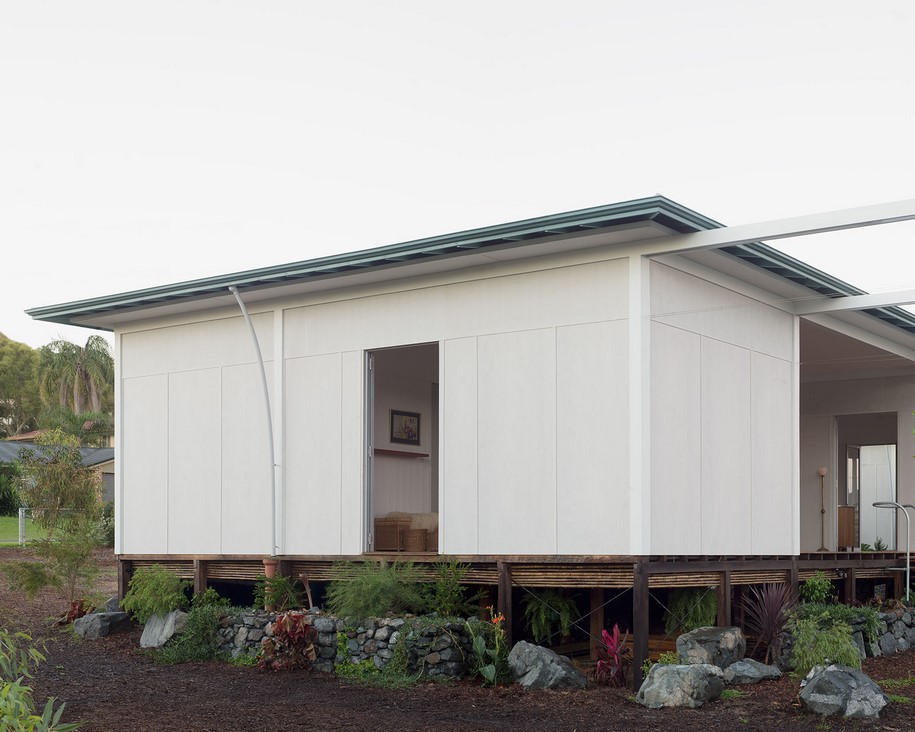
The living areas and sleeping areas are physically separated, and so their accompanying routines are separated too. Cooking then eating, then showering, then sleeping – routines like these organise ordinary life. Only in the the gaps between these routines is there chance for an overview.
In the house, these gaps are expressed as empty rooms, a hall and a courtyard. Their emptiness creates a pause that calls attention to the present.
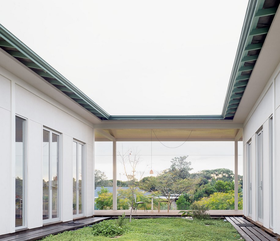
The sudden awareness of being between two moments can interrupt action. We might remember something we need to do, or be reminded of something important. This is the purpose of these empty rooms.
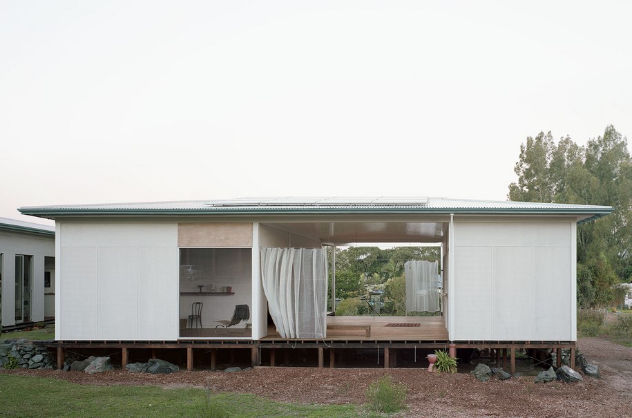
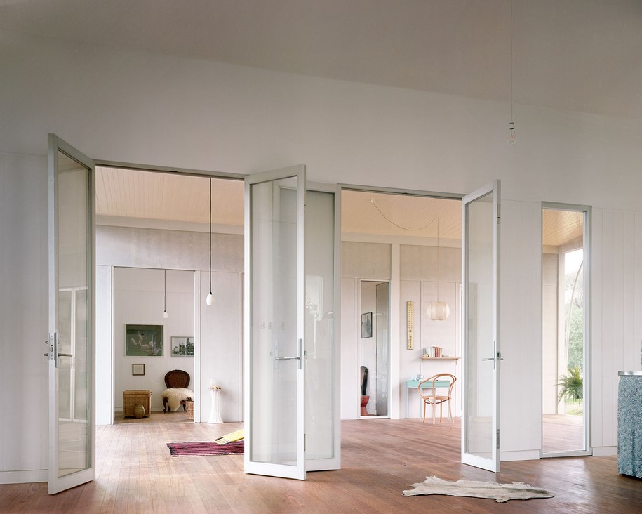
Identical doors connect the empty rooms to the functional rooms so from room to room all the doors align. They frame long views through the house. From one bedroom you can see across the garden, over the kitchen, and catch a glimpse of someone getting ready for bed. Their sense of privacy comes from nothing other than distance. On a warm evening with all the doors open, the rooms disappear, and it’s like being in an orchard.
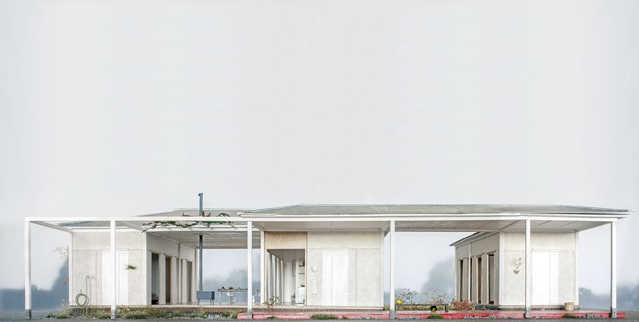
There are also views to the garden, framed by columns running along the edge of the house. The row of columns is the facade of the house. It’s not a facade that is looked at but one that is looked through. The columns and doors are repeated throughout the house so that each area, however separate, relates to the whole.
The bathroom is a separate project to the rest of the house, it lives inside the house like bacteria inside the gut. The idea is to let each part remain distinct. The basin expresses its bowl shape and the toilet pan expresses its u-bend. By allowing an object enough breathing space, its innate qualities are revealed, and we see that the products we use to service our body have their own anatomy.
It’s no surprise that plumbing looks organic. Basins distribute waste and liquids like our own stomach and intestine. To repress organic associations in a bathroom seems like repression of the body itself. We don’t want to be reminded of our own plumbing. Architects who obsess over bathroom tile alignments might be suffering from a disorder that is colloquially referred to as anal retention.
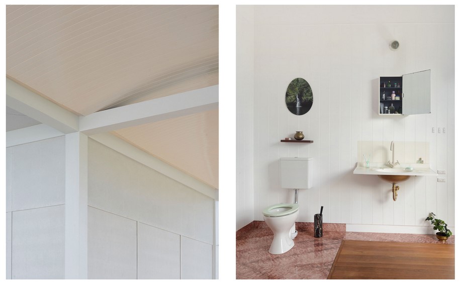
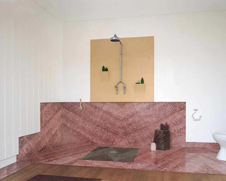
 In this bathroom it’s the opposite, organic associations are accented wherever reasonable. The basin tap is the colour of a skin tone. The shower pipes meet like a wishbone. The P-trap and flush pipe are highlighted in shiny brass and chrome. When parts of the bathroom are allowed to express themselves, not only do they seem organic, but associations can be made between them.
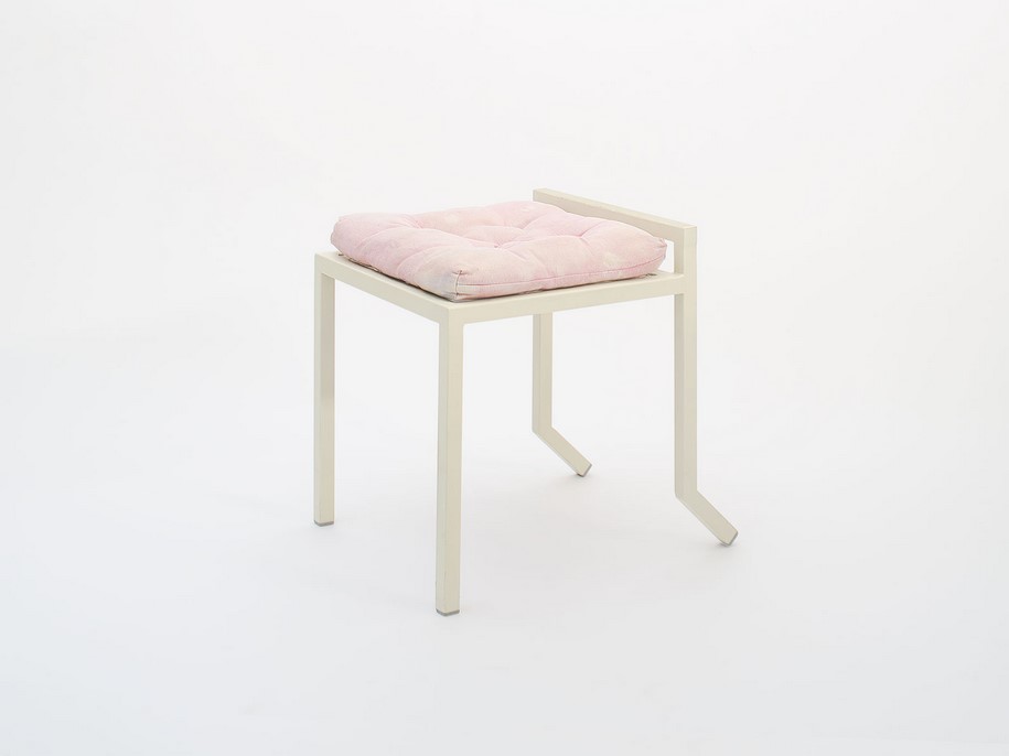
This chair’s simple shape allows the cushion a specific dignity, like a plinth that displays an archaeological artefact.
Above the basin is a medicine cabinet. The basin seems more basin-like when next to its inverse, a pot on a shelf. The medicine cabinet seems more organised when compared to the foliage of a forest. The forest surrounds a waterfall, hung in an oval frame. The oval is repeated in the gilded underbelly of the basin and the mint green seat of the toilet pan. This oval motif gives the objects an affinity for each other, so when you wash your hands you think of waterfalls, and the toilet seat reminds you of a picture frame.
All these different objects cluster along lines of bilateral symmetry, as bodies do. And while the shower area is mostly geometric, the marble looks like flesh and is displayed in a way that unfolds like mirrored body parts. Above the marble is a yellow square. It frames the shower hardware like the background to a portrait, a portrait of a figure, something embryonic.
These comparisons and associations are not the point of the project. They are the byproduct of simply letting things be. As with flower arrangement, there is no set outcome to begin with. The objects find their place, and together they form a whole.
Plans
Facts
project title House with a Guest Room
architecture Andrew Power
location New South Wales, Australia
year 2018
photography Andrew Power
READ ALSO: LESS IS ENOUGH: ON ARCHITECTURE AND ASCETICISM | Pier Vittorio Aureli