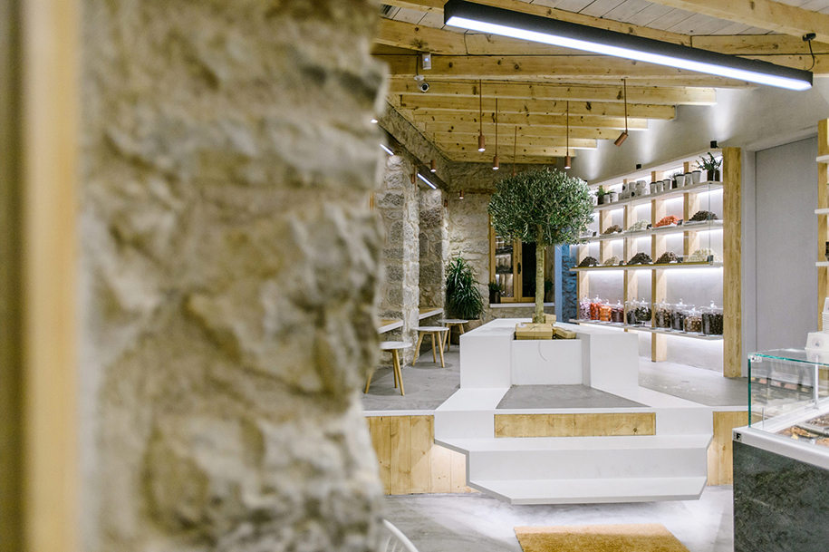
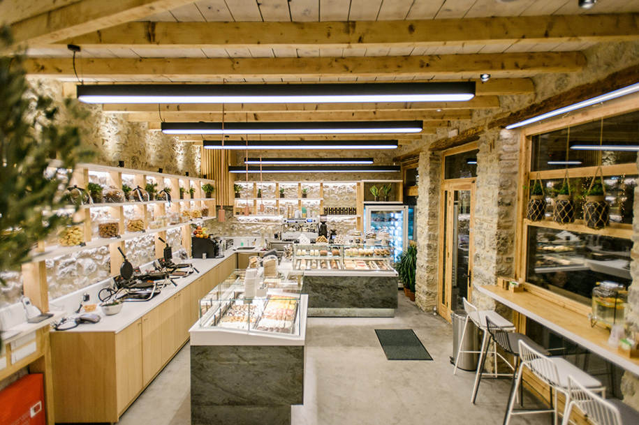
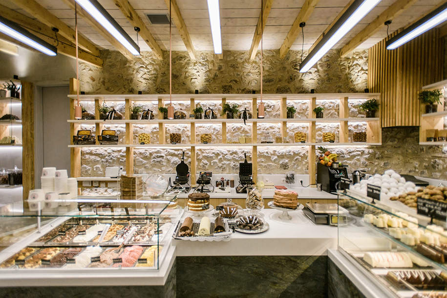
Sweet Garden is the third concept store designed by the Athens-based ADD Architectural Studio in Arachova, Greece. Having to cope with the programmatic use of pastry, sweet bakery, coffee and ice cream, the design aspired to create a homely atmosphere matching with Arachova’s cold winter and hot summer.
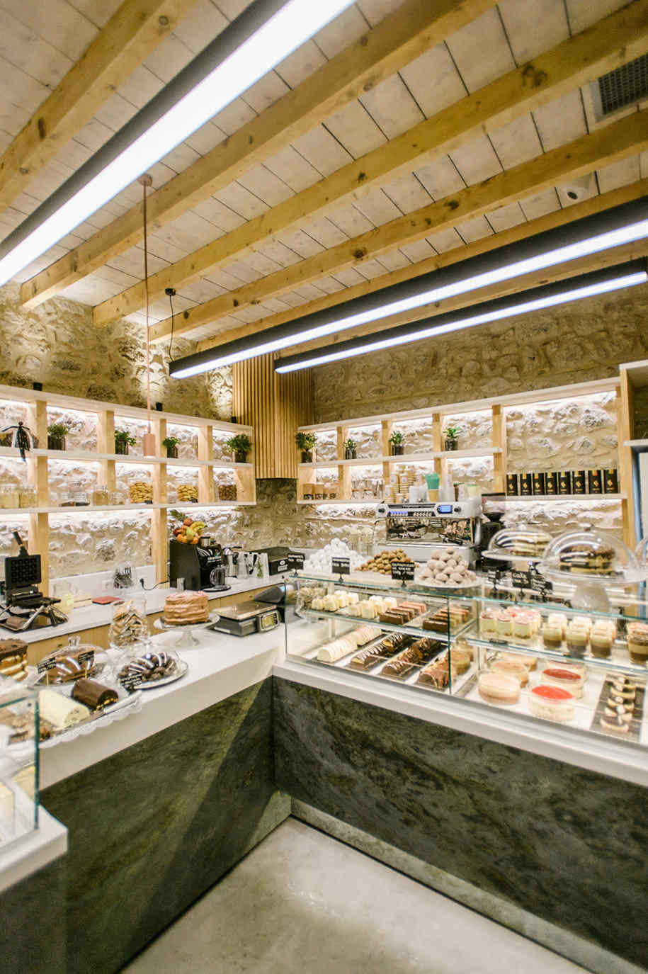
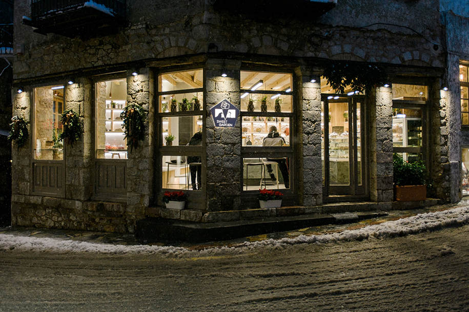
text provided by the architects – All of the façade’s existing frames were replaced, offering tempting views of the freshly made sweets, hot coffee and cold ice creams, luring the passers-by to a tasteful experience. Inside the shop, the rock masonry was preserved and carefully lighted so as to act as a soft but characteristic background. The roof’s wooden beams were restored to their original color palette, whereas the rest of the roof’s wooden planks were de-saturated in order to accentuate the division between the static bearer and the rest of the roof.
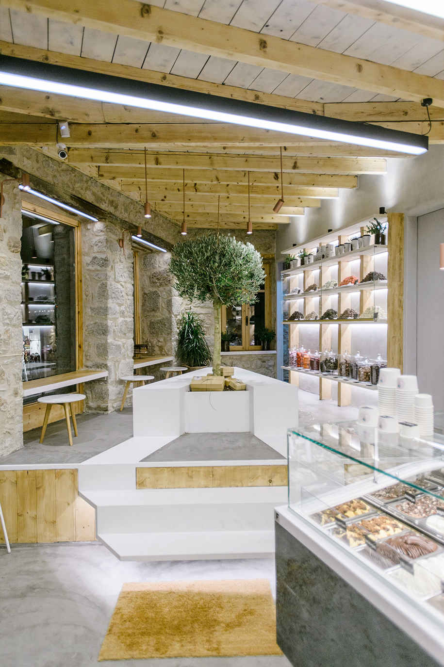
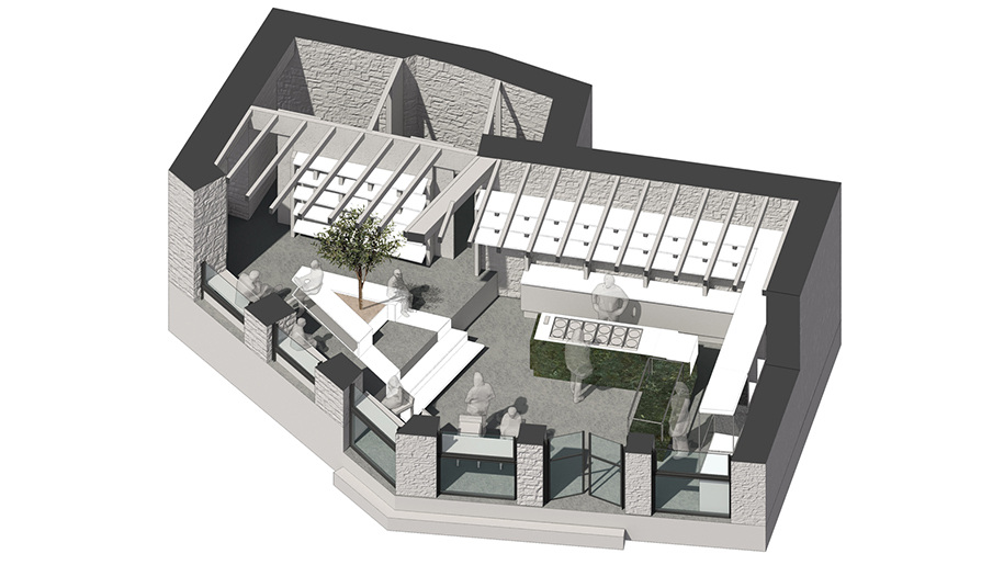
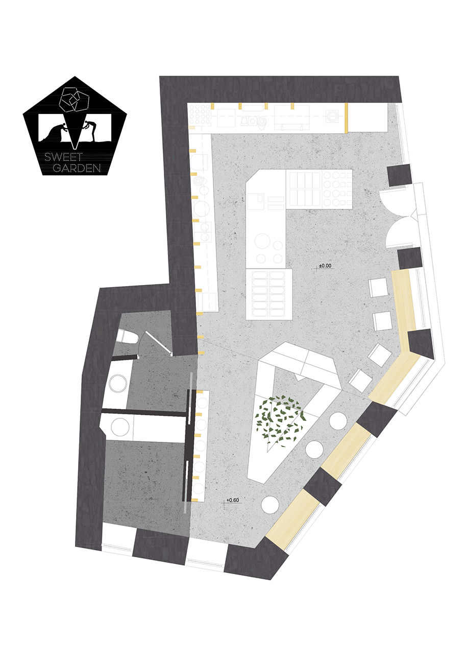
The cross-sectional direction of the wooden beams works in favor of a phenomenological aspect of the shop’s length, eventually making the shop seem larger. The space is divided longitudinally by an existing height difference of 0.5m which was integrated into the design, thus signaling the programmatic division between circulation/preparation and sitting area.
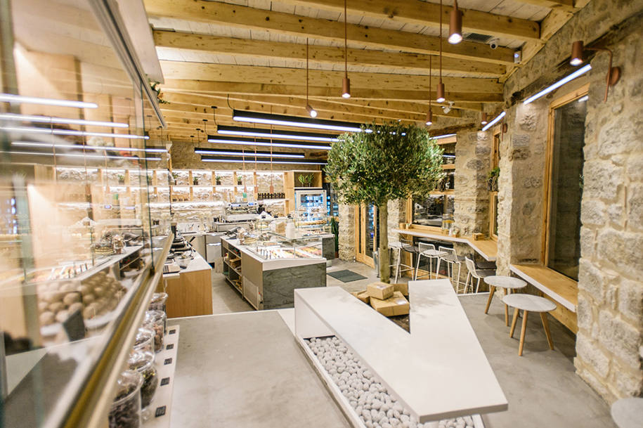
The necessary stair bridging the two spaces was formed from white-painted steel and left hovering gently above the ground. The stair is part of a larger piece of furniture, featuring a hollow triangular receptor where a small olive tree is placed. In this way, the white metal sheet unravels becoming stairs, flooring, plant pot and eventually sitting bench. The sitting area deals with the primordial Greek notion of “estia”, which symbolizes the center of the ancient house, the place where every member of the dwelling would gather around this. In that case “estia” is signaled by a small olive tree, establishing a direct reference to the ancient topos of Delphi and its famous landscape. The triangular outline of the bench -along with its hollow footprint filled with white rocks – combined with the narrow perspective of the space which it inhabits creates a visual dynamic as it refuses to touch the ground on both ends.
The horizontal exhibition shelves were painted white and partitioned by vertical wooden pseudo-columns placed so as to match the optical extension of the roof beams. Thus the shelves act as a foreground-construction creating a sense of unity between the shop’s preparation and sitting area. The gentle design process reaches its final touch through the adding of green hue in the overall visual impression of the shop. This was achieved by cladding the base of each main showcase with green marble spotted with mild watermarks. As the client enters the shop, the eye instantaneously conceives a silent “agreement” between the marble and the olive tree.
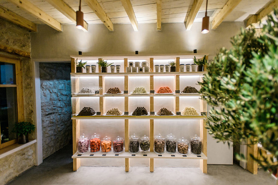
The surgical use of led tapes on the windows’ upper frameworks, the main showcases, the sitting bench and the white horizontal shelves, highlights different aspects and materiality choices of the design. In the same way, the lighting spots placed over each new pseudo-column create a strong vertical rhythm bringing together the shop’s whole area.
The horizontal perspective is only “disturbed” by black hovering thin light beams placed perpendiculaly to the shop’s long axis thus providing the exhibition space with necessary extra light accentuation in a discreet way. Finally, the estia is lit through hanging bronze spots again in a triangular array, enclosing it and signifying its presence through light.
Facts & Credits:
Architects ADD Architectural Studio, Chronopoulos Argyris, Koutsioumaris Dionysis
Year 2017
Photography Dimitris Papageorgiou, mirror studio | mirror photography
More architectural interiors by ADD Architectural Studio, here!
Ένα ακόμη έργο των ADD Architectural Studio, εδώ!
READ ALSO: The Lodger Architecture Studio redesigned Be Seen eyewear boutique in Halandri
