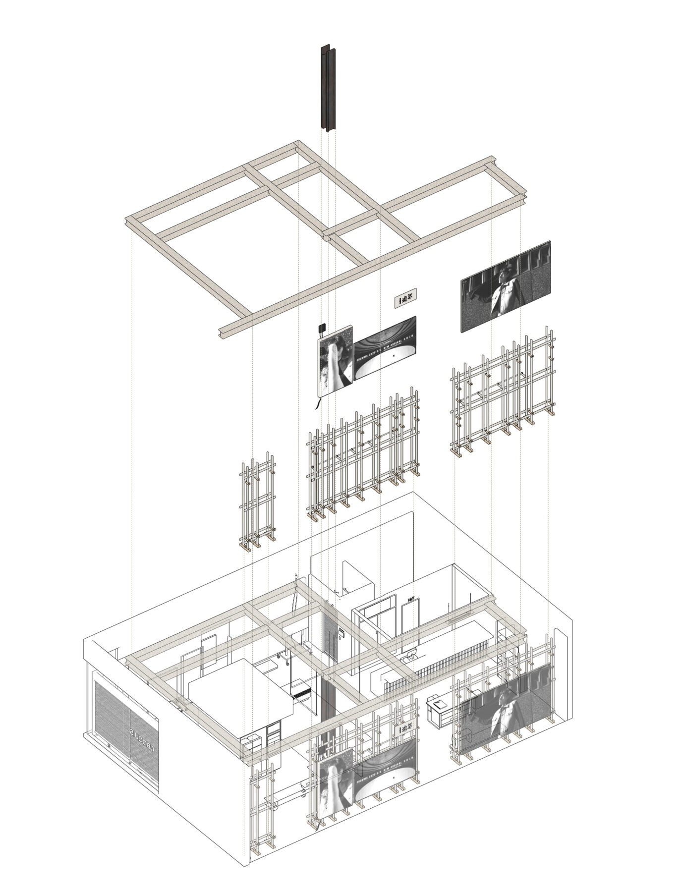
Using as a reference “ReReason” by Polish-German artist Alicja Kwade, as well as the concept of readymades of Marcel Duchamp, Sò Studio created the new store SI of CROQUIS. Inspired by their previous work SAMO project, studio’s team, created a structure on the facade of the building which operates from the exterior as a display canvas of the products and advertisements and for the interior as hanging racks. In the core area, fitting room is located while the rest is an open plan space with unlimited possibilities. Found artworks are placed randomly, in unexpected ways, despite their originally use.
-text by the editor
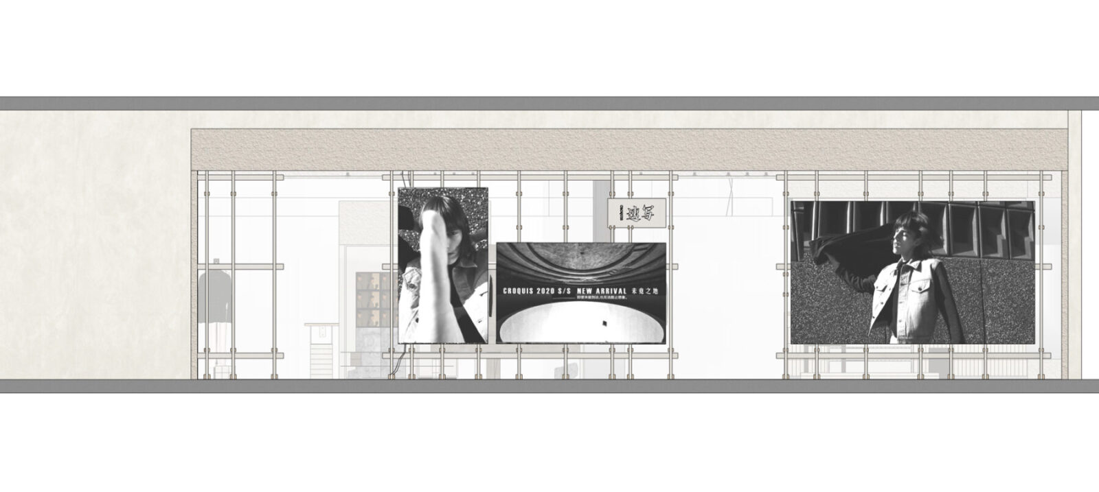
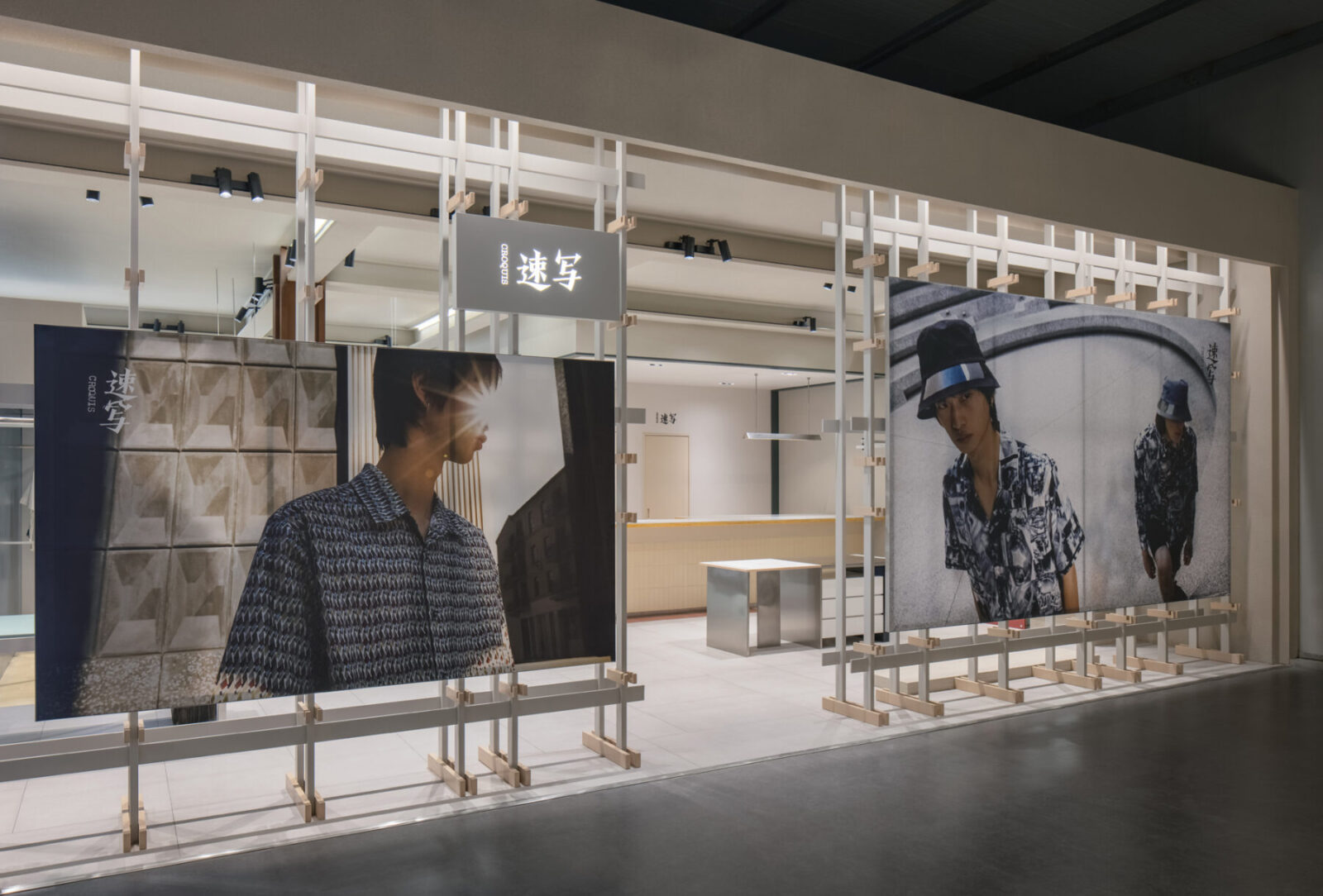
Sò Studio launched the SAMO Image Store in Chongqing, 2019. The biggest highlight of the SAMO project is the application of systematically exterior façade design, which gives the façade an unfinished building structure appear. It allows the interior details to be displayed to the passing-by customers through the gaps on the façade. CROQUIS was impressed by SAMO’s Image Store. When Sò Studio is tasked to design the SI store for CROQUIS, Sò Studio decided to adopt and take a further step in the design of the systematically exterior façade.
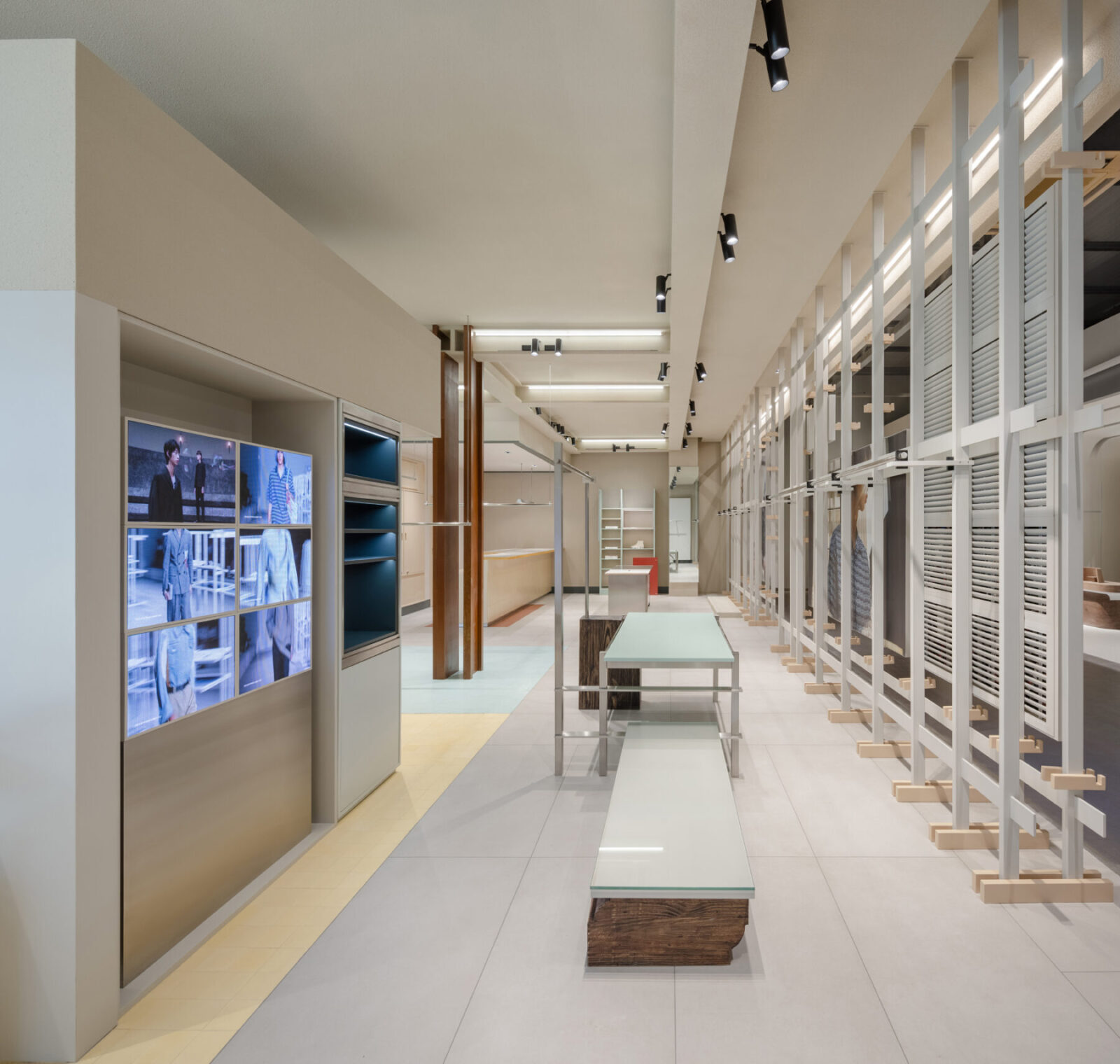
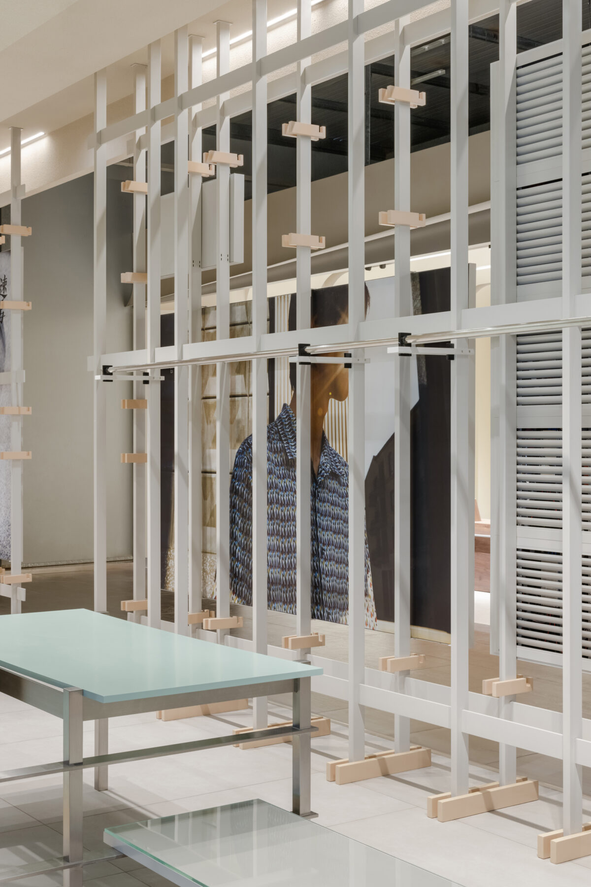
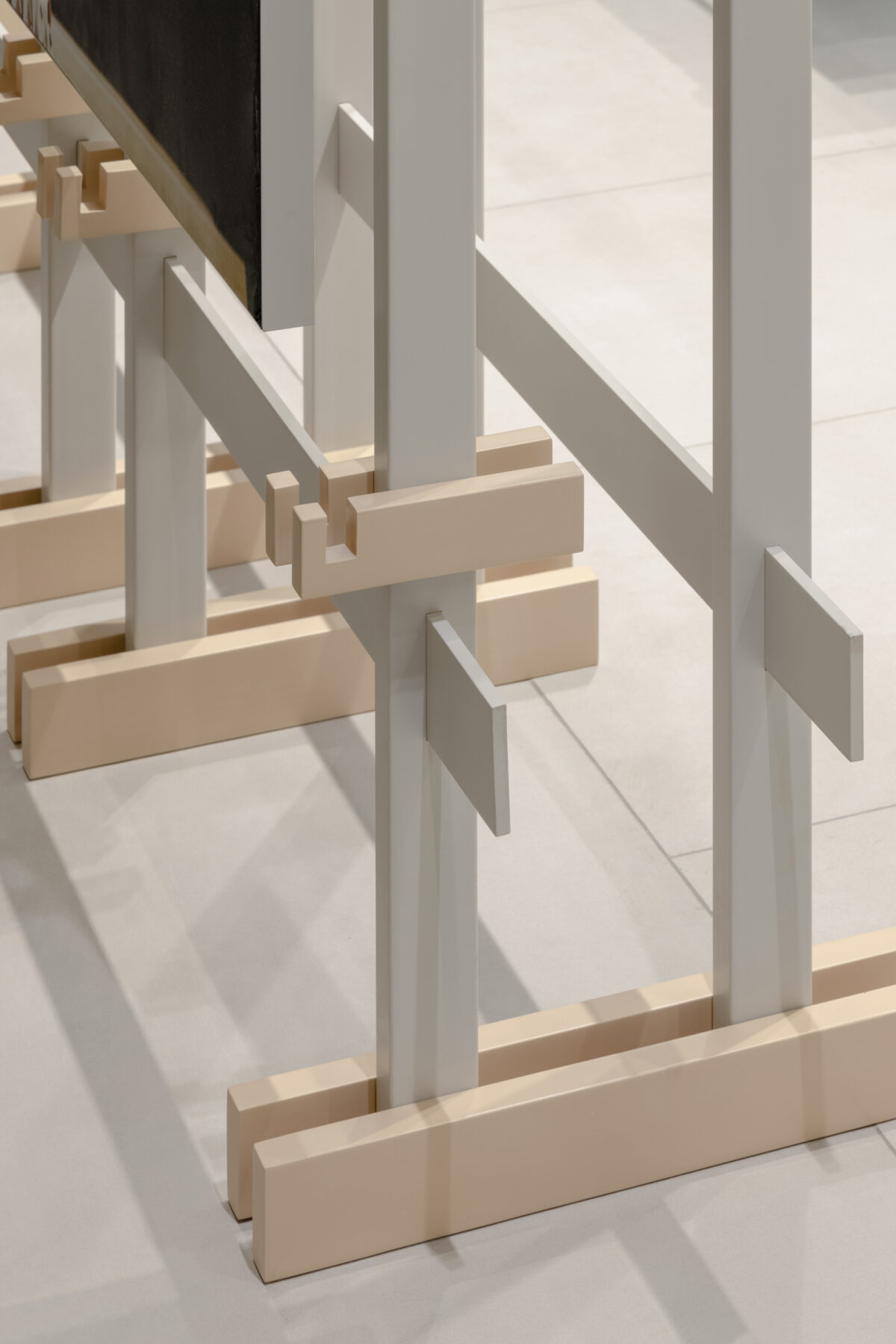
The frame and structure of the exterior façade remain. Meanwhile, the structure functions as the interior hanging racks and exterior exhibiting elements. The facade looks like a huge painting frame from the outside allows freely change of the brand posters and advertisements. The cream-coloured clothes-racks inside the store reflect the beauty of daily life. The location and height of racks are able to change as required.
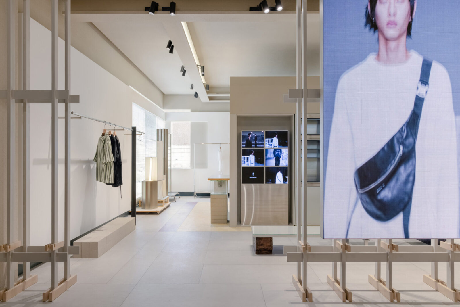
Different from the traditional glass façade, two entrances formed by structure and the gaps on the exterior façade attract people to look inside and explore the store.
The design concept is inspired by “ReReason” proposed by Polish-German artist Alicja Kwade, as well as the concept of readymades of Marcel Duchamp.
By collaging the objects found in daily life and rereasoning the phenomenon of modern life to express the design concept, which is in line with CROQUIS’s concept that “Life is about making choices, so is fashion”. With the help of this distinguished design idea, Sò Studio has infused a sense of vitality and relaxation to CROQUIS’s rigorous and mature brand identity.
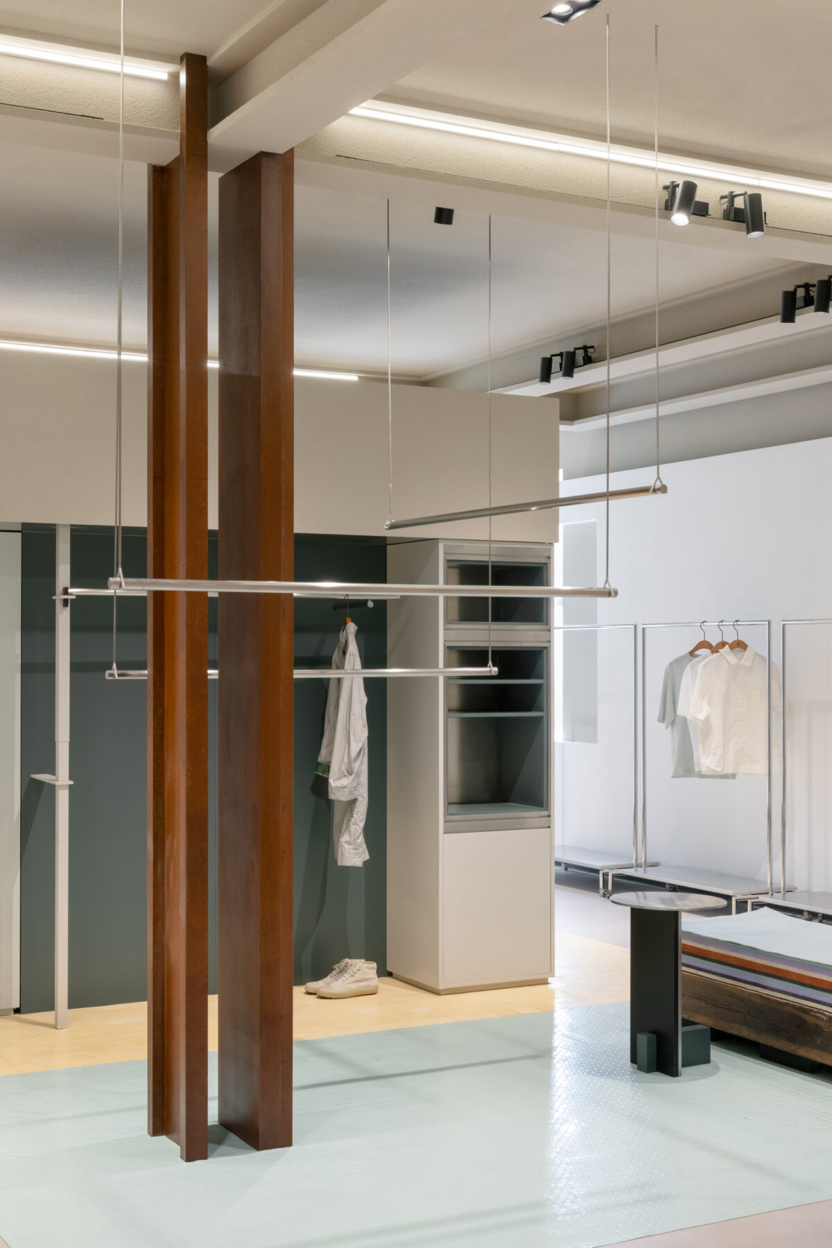
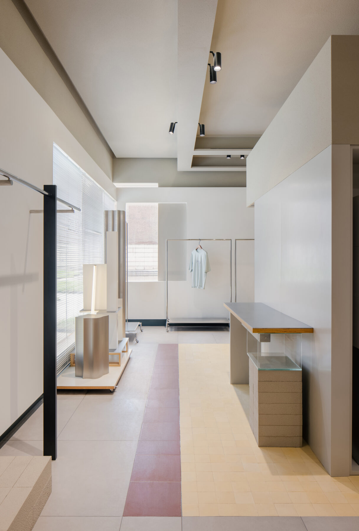
The original building structures and materials have been kept in places, such as exposed bricks, rough stones, shutters, concrete columns, and benches. The roughness of these objects forms the beauty of daily life. They tell the story of history and mark the flows of time in their pure and original form. White-wall paint, smooth stone brick, and a piece of dark green glass have been used to transform the space by partially covering the original elements.
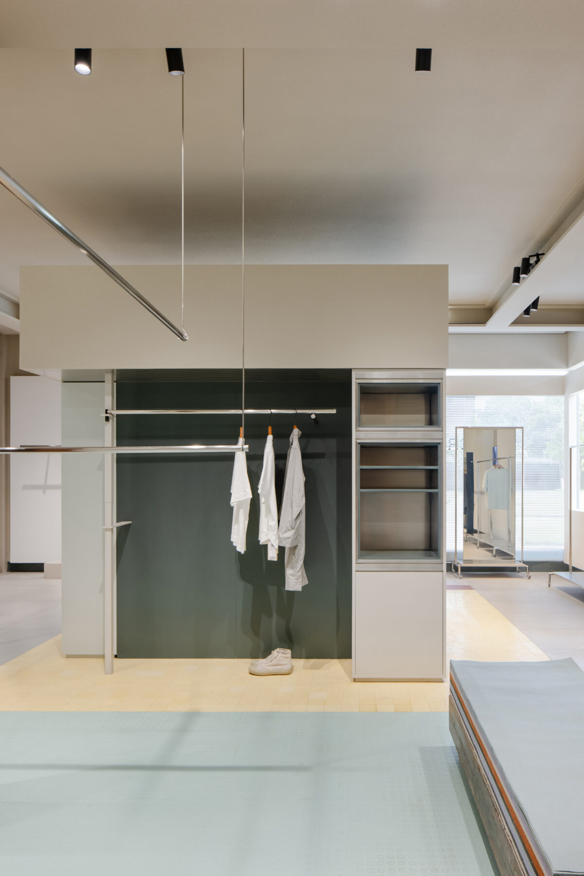
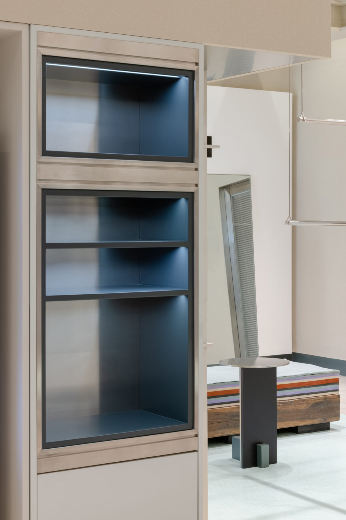
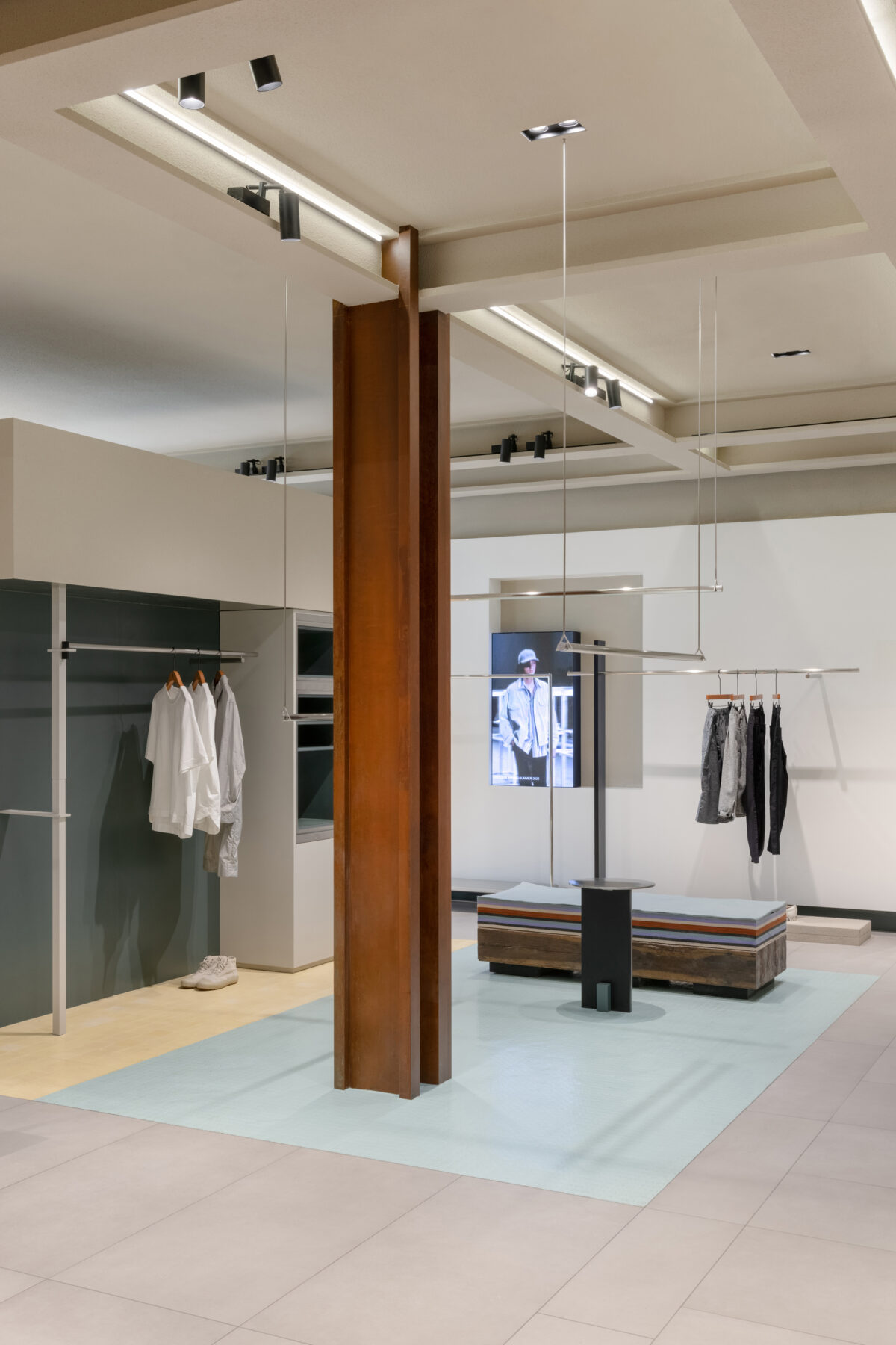
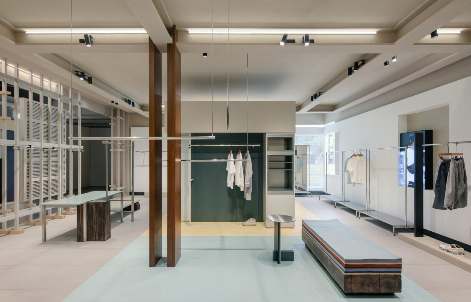
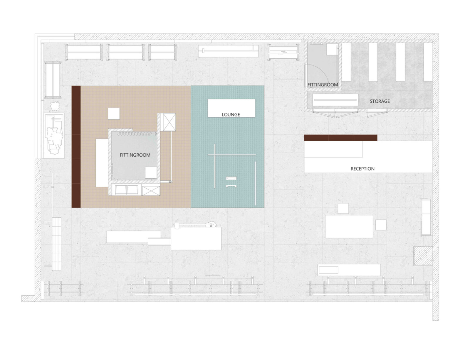
The fitting room is located in the core area of the store provides full accessibility for customers from all directions. The vintage dark green color and refrigerator-like accessories display cabinet creates a Bauhaus touch to the place.
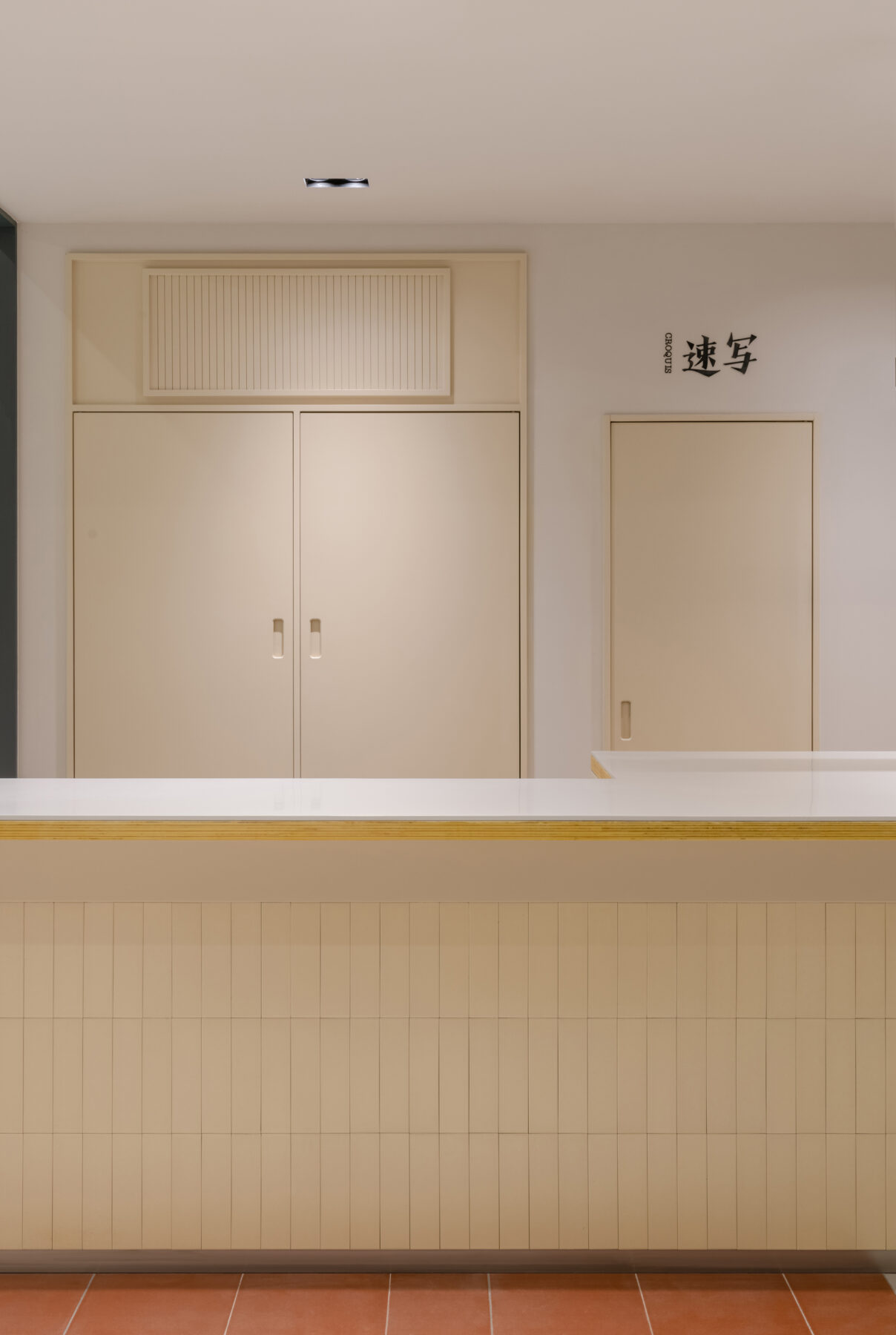
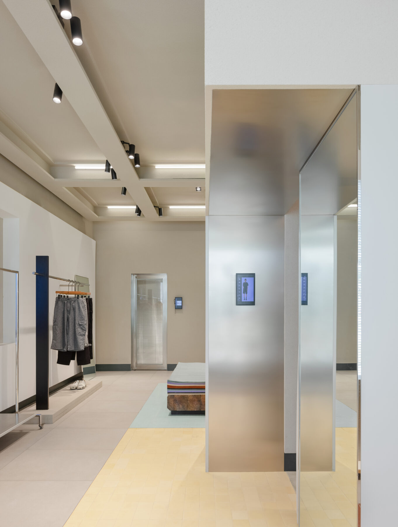
The reception is next to the fitting room. The background wall of the reception is transformed from the original door and louver of the service entrance and electrical box. By rereasoning the existing objects and empowering them with new meanings provides a sense of integration of the history and present. Objects from the past blend into the new environment redefining the sense of space and bringing the beauty of nature.
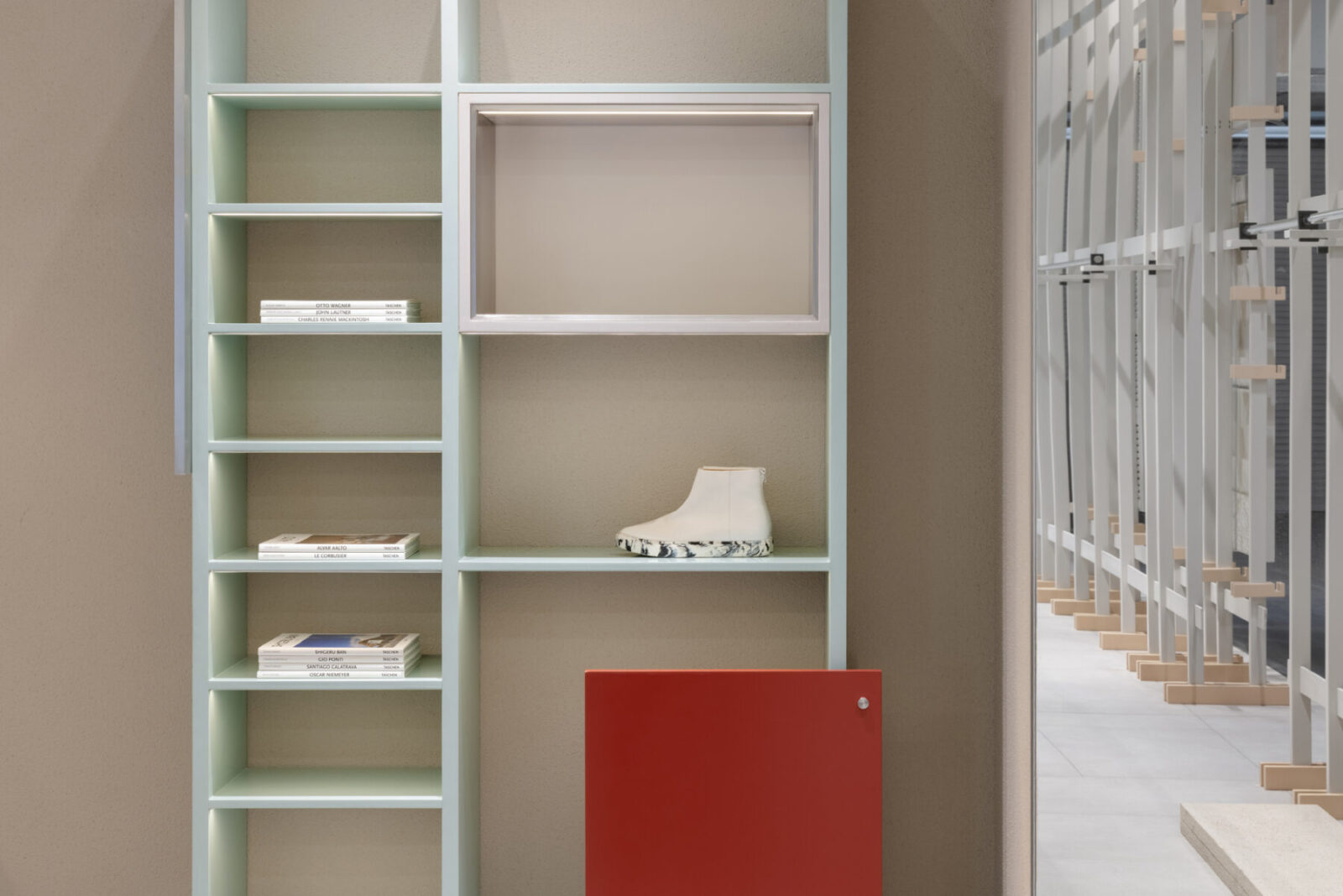
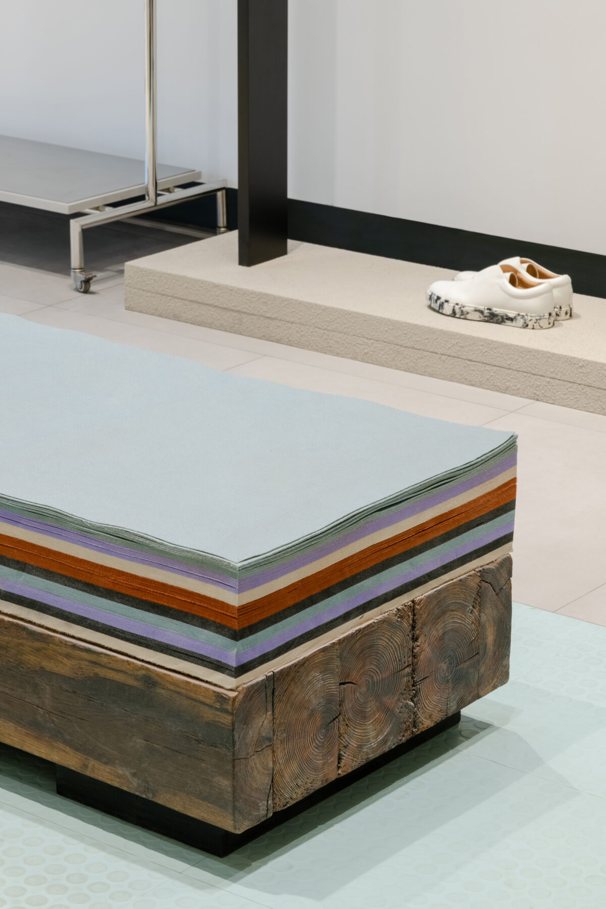
The display of found art pieces enriches the storytelling of the space. Installations crafted by old woods, stone piers, clocks, second-hand television, abandoned materials, and tubes, as well as random piled-up wool felts are placed randomly in the space. These randomly and illogically placed objects shake off their original identities, blurring the boundary of imagination.
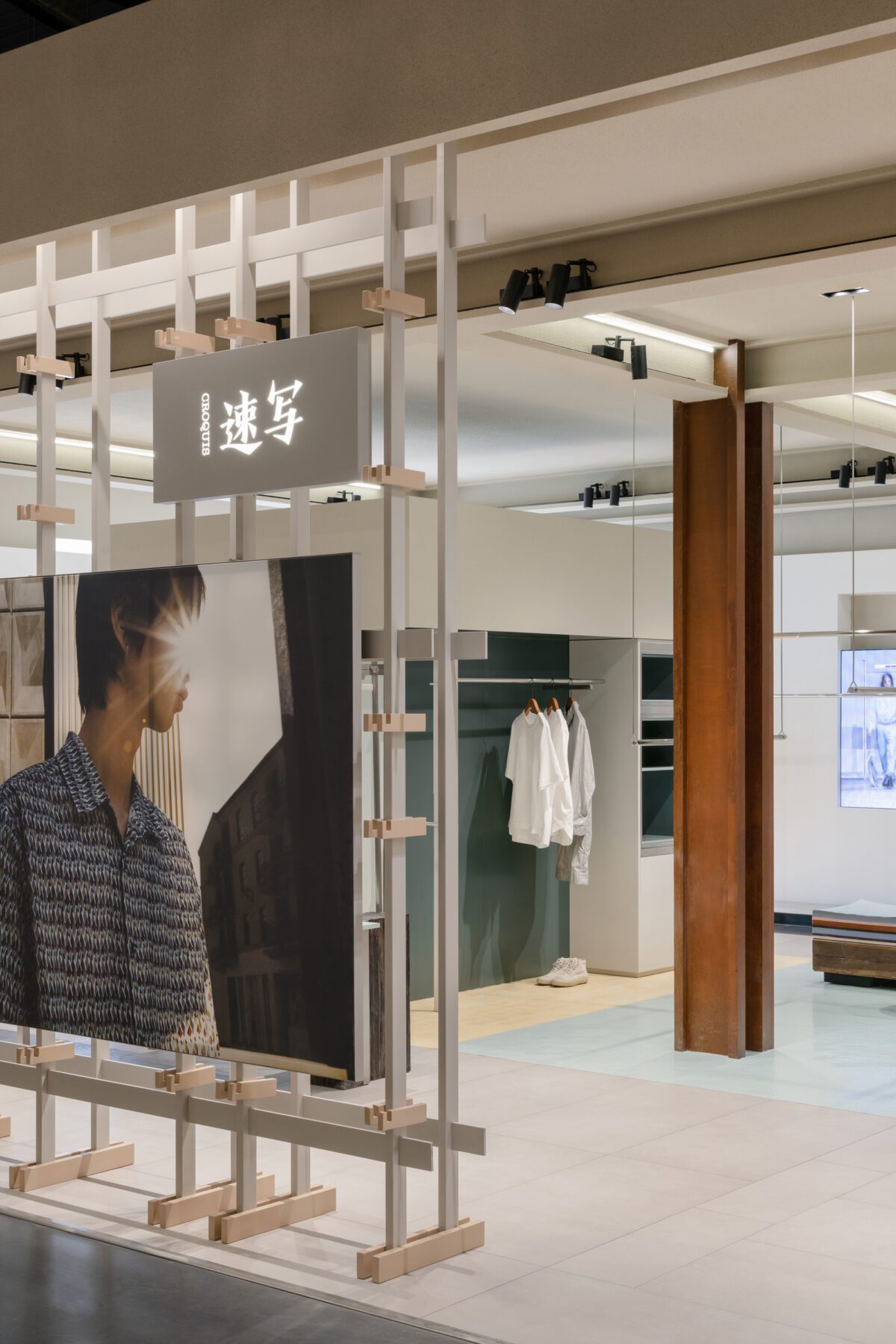
The floor and ceiling are using the same treatment method as the installations. The ceiling is finished with the huge I-beam. Its raw texture and structure provide a great foundation for the installation of lamp chamfers and cords.
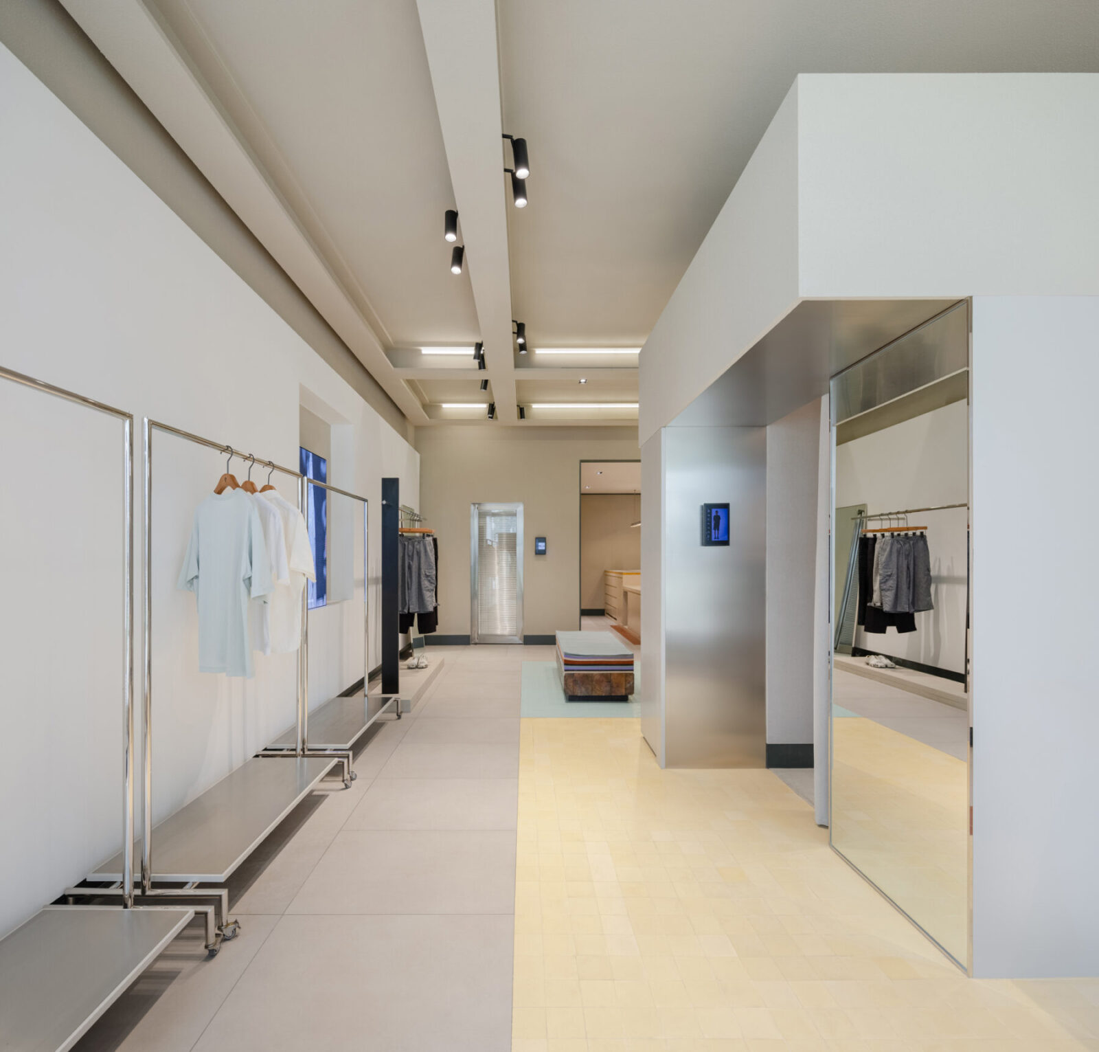
The floor finish is made by the combination of the dark green base molding, a mixed pattern of brown stainless steel and stone, vintage domestic floor tiles, and even the rubber material found on tactile paving. The unexpected materials and components applied in the space are objects people see in daily life. Sò Studio transforms and deconstructs these materials to redefine their purposes in the space.
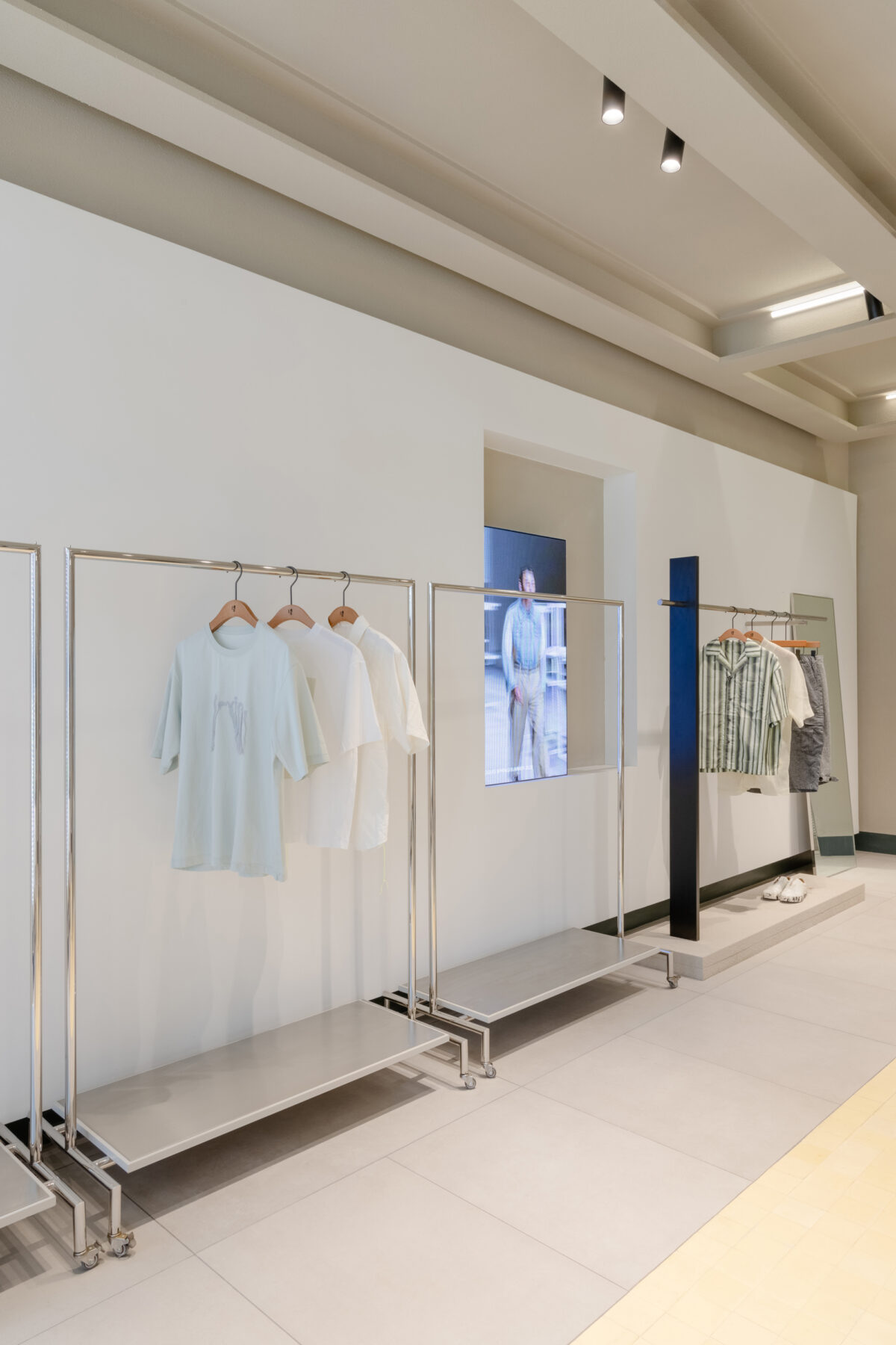
The design of this space is not limited to one specific form. Instead, it is an open answer that offers the chance to encourage people to create their art pieces. It empowers unlimited inspirations to the limited space.
Credits & Details
Name: SI of CROQUIS
Concept: ReReason Gross
Built Area: 140㎡
Address: Hangzhou Xiaoshan Store
Design team: Sò Studio
Design director: Yifan Wu, Mengjie Liu
Client: JNBY
Completion Year:2020
Photographer: Wen Studio
Sò Studio is an innovative architecture, interior, and industrial design practice based in Shanghai. Its scope of work includes retail spaces, commercial complexes, restaurants, cultural institutions, workspaces, medical spaces, galleries, and private residential.
Sò Studio works closely with designers and clients from diverse backgrounds to employ a bespoke approach for every project. Apply imagination in the creative industry to create inspiring places with a powerful visual impact. Sò Studio delivers a better vision of life and creates more public value while creating great spatial design and use experience.
Sò Studio was founded in 2016 by Yifan Wu and Mengjie Liu, in response to the increasing demands for their distinctive design aesthetic and clever use of material details in architectural, interior, and industrial design contexts.
READ ALSO: Εγκαίνια για την πλατεία Ελευθερίας στη Λευκωσία της Κύπρου σε σχεδιασμό Zaha Hadid Architects | Συνέντευξη με τον Δημήτρη Κολώνη