KLAR architecture office designed Villa Stela, a house for the architect’s family. The house was initially designed as a two-by-four timber frame structure but eventually transformed into a brick building. The two-storey building is based on a monolithic, two-level reinforced concrete slab made of ceramic blocks.
-text by the authors
Client’s brief
A baby on the way, a studio in its infancy, deep pockets and the question of a family housing on the table. My parents gave us a part of their sunny garden, which used to be an orchard.
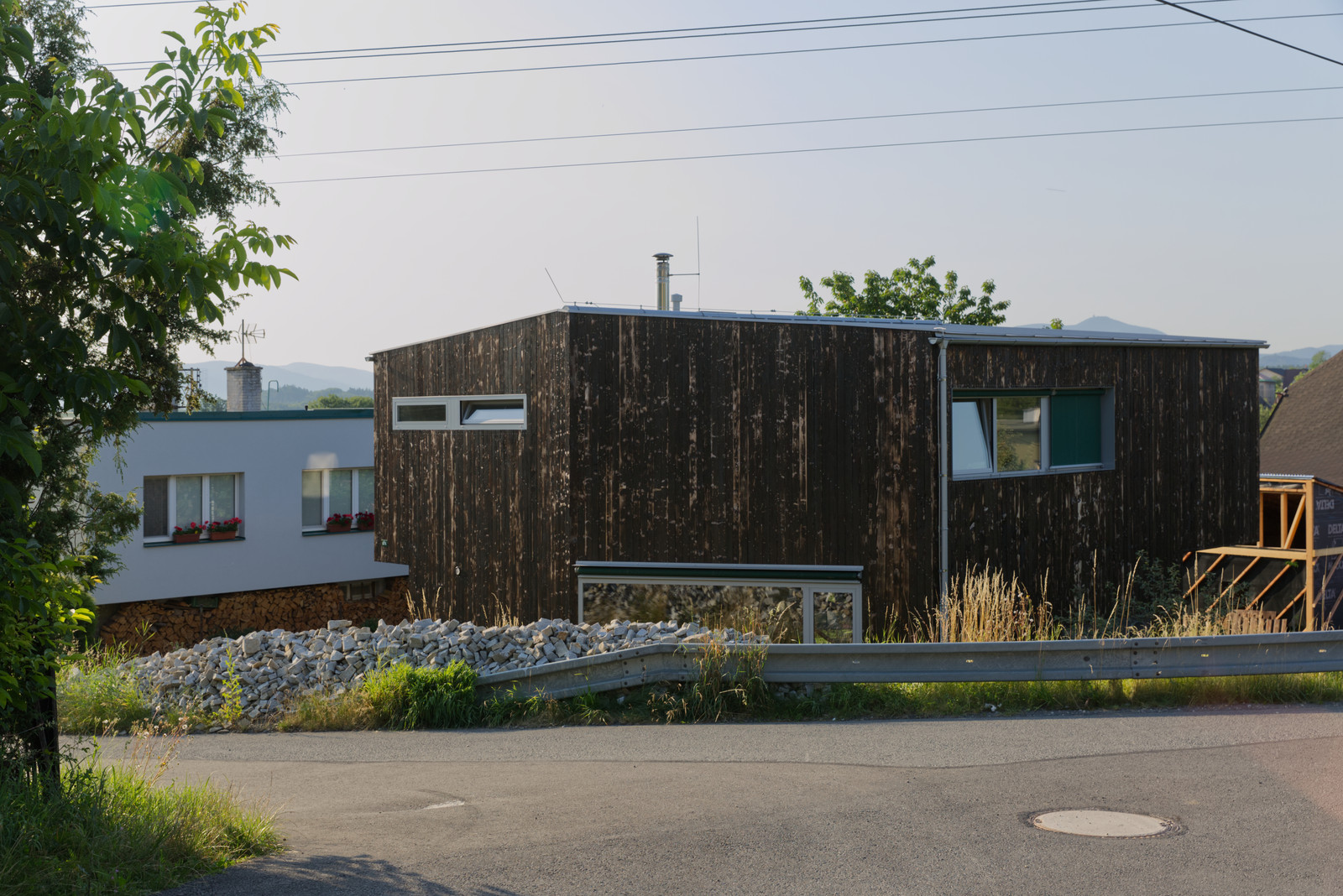
The house was initially designed as a two-by-four timber frame structure but eventually transformed into a brick building. The reason behind this significant shift was Jura, our neighbour, who worked as a bricklayer and offered us his hand. He was the reason we redesigned the house as a brick building. After all, the prevailing house material in Staříč is brick.
Location
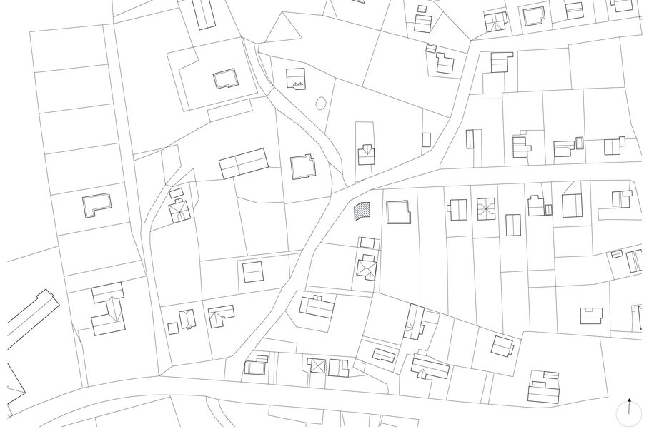
The corner plot is located near the town centre, in an organised development of houses built here mainly in the second half of the 20th century. A common feature, especially on the opposite hill, is the condensed development with gables set perpendicular to the sloping terrain and adherence to the building line.
With just a few exemptions, these principles repeat on the street where the plot of the house is located.
Sloping gently to the south with exposed views of the Beskydy Mountains and its highest peak Lysá hora, the plot is accessible from the street on the north side.
Concept
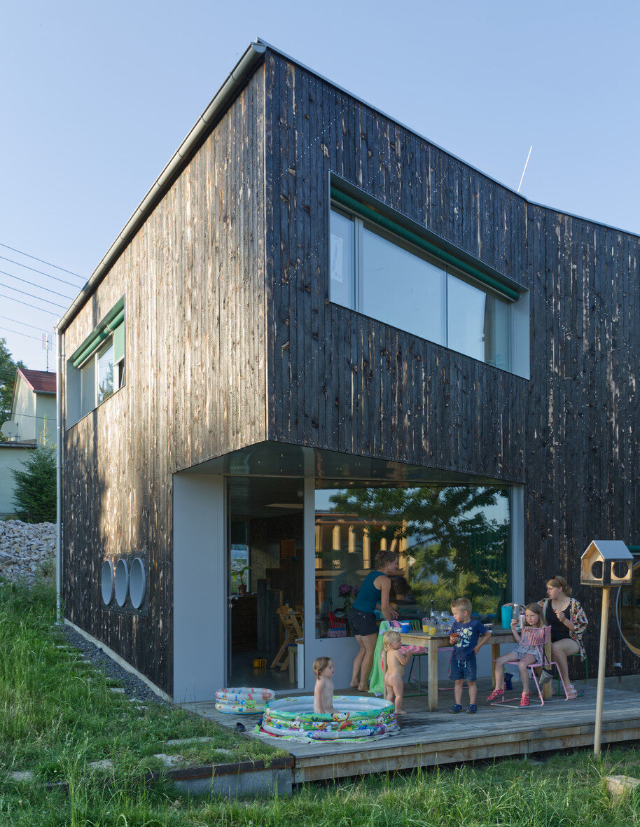
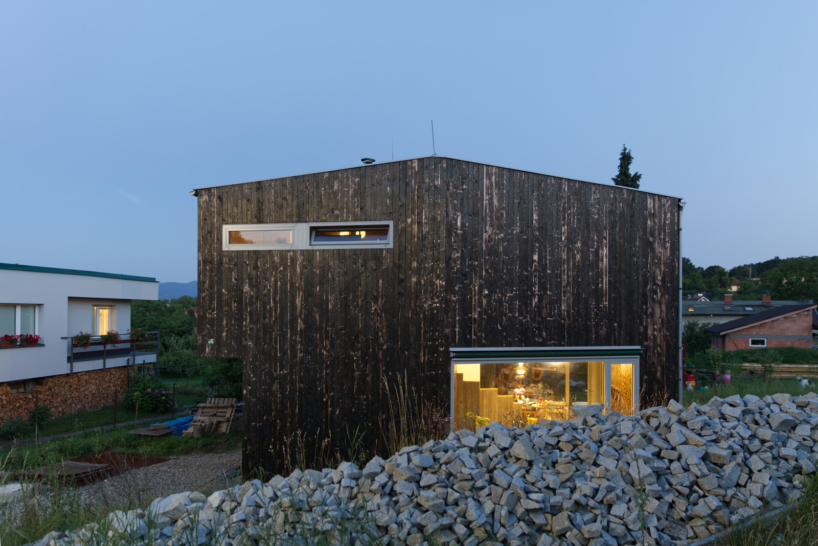
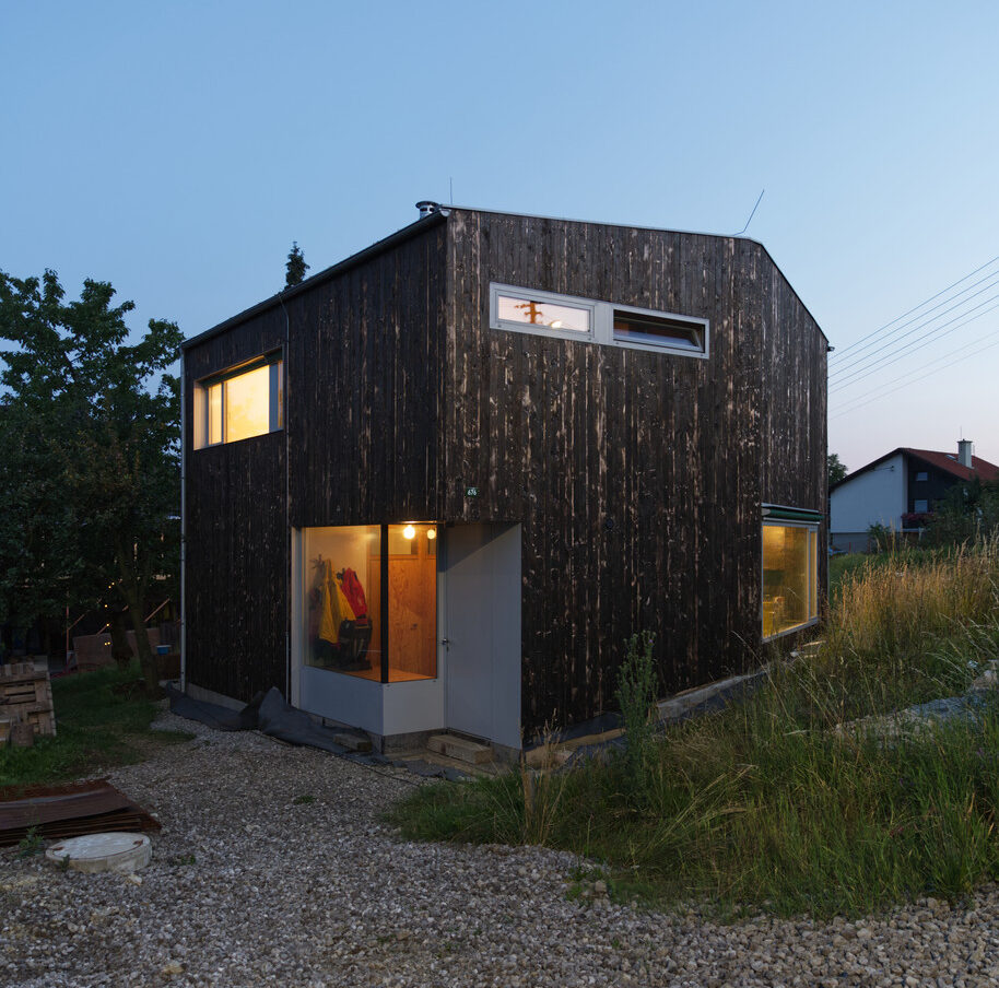
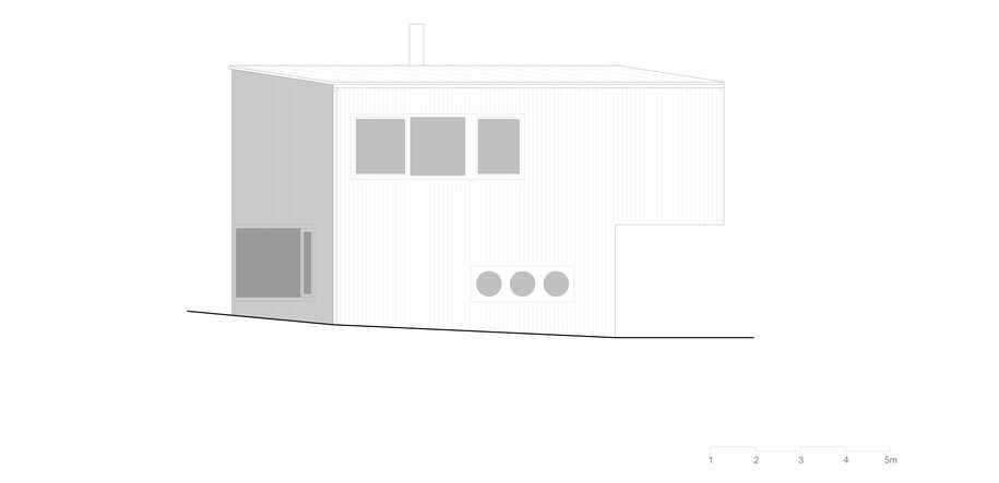
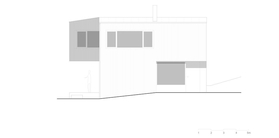
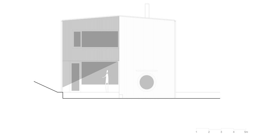
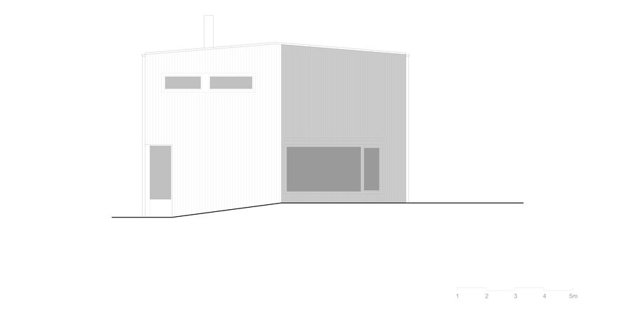
A black cube has sprung up out of the undermined coal area. The form and original concept stem from a simple cube. Maintaining the building line and a healthy setback from the neighbouring house was an important aspect. An aspect that has brought a specific massing to the design. Following the property line, the northern façade creates a distinct divide evoking a defensive shield.
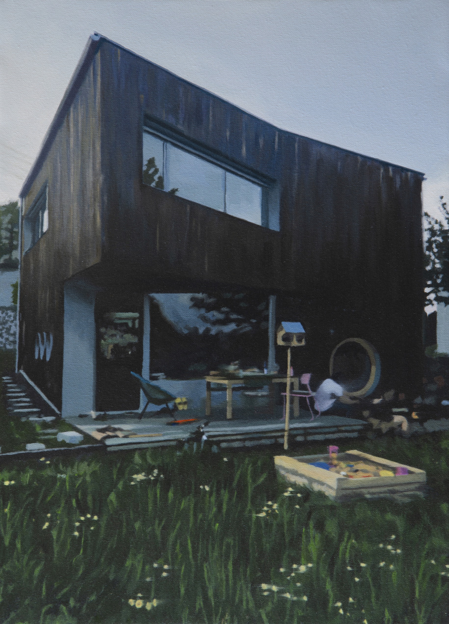
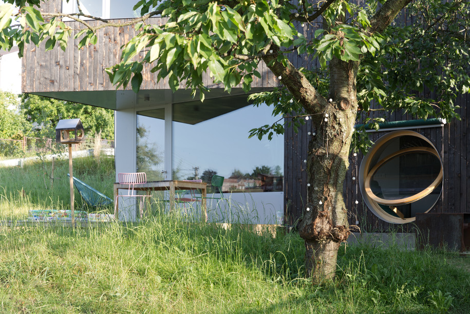
This divide is drawn parallel to the south façade of the house. The cantilevered part of the façade faces Lysá hora and the private garden. The resulting impression contributes to the different perceptions of the building’s scale depending on the viewing angle.
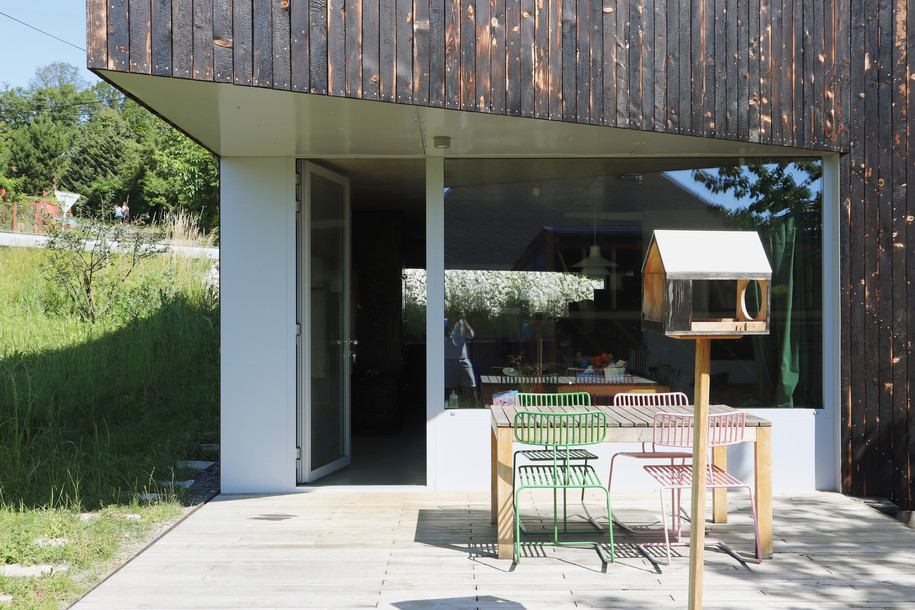
That is why many passers-by compare the house to a shed or a cabin. Most of them think they are looking at a small house which can hardly accommodate a family of four. But as soon as they enter the house, they realise the mass has visually deceived them on the outside.
Layout solution
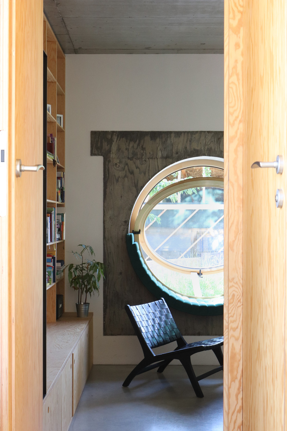
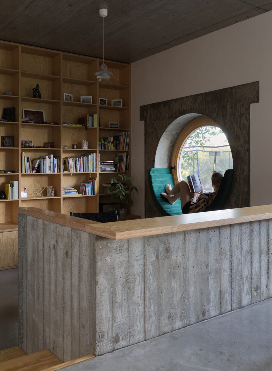
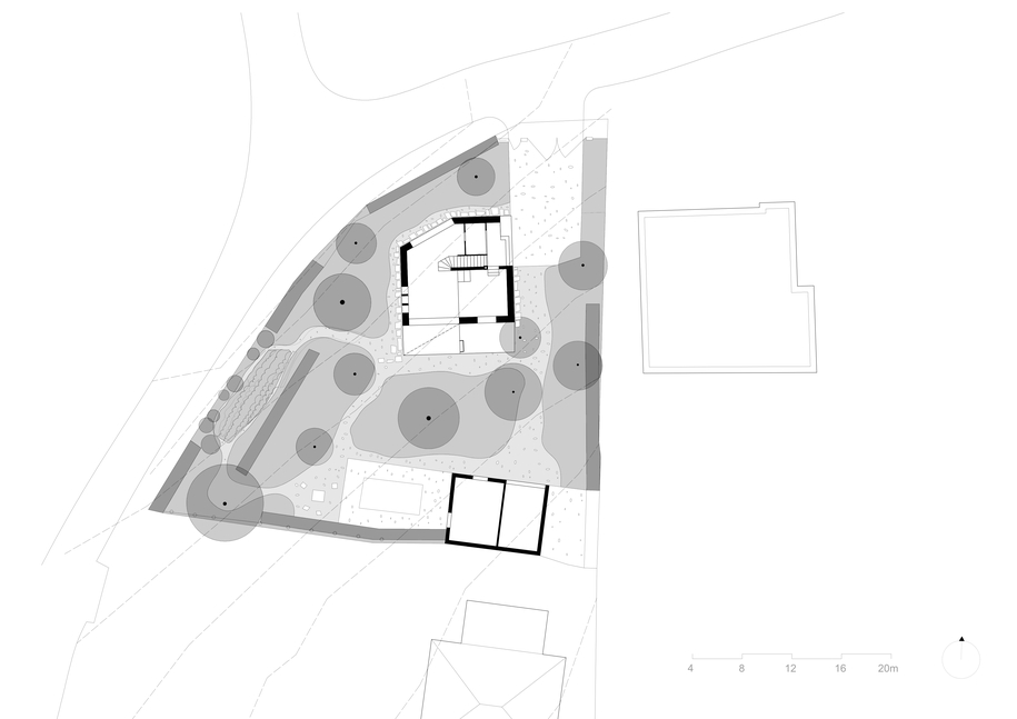
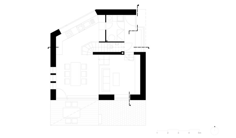
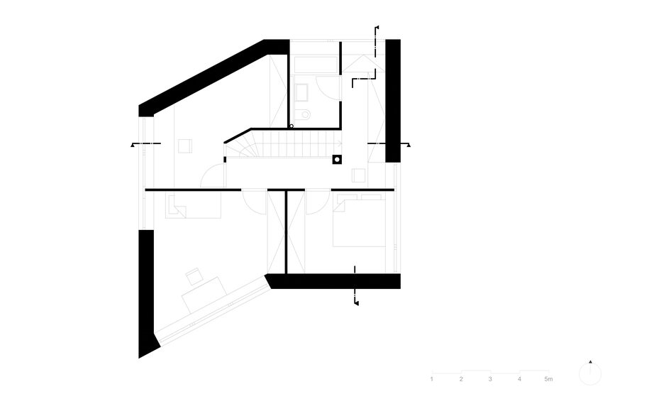
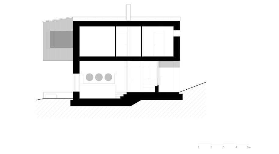
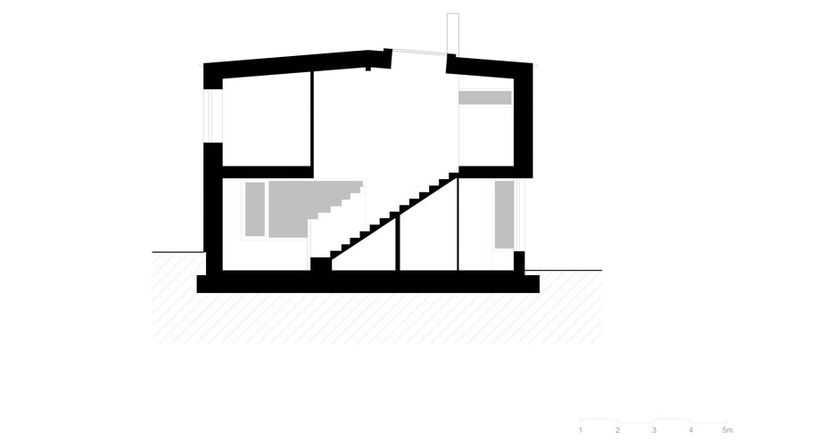
The layout is divided by a cross-axis into imaginary quarters. In the middle is a staircase with a chimney and an installation core. Our goal was to create a house adjusted to the topography of its plot to a maximum level. This idea shaped the multi-level character of the living space inside. While the epicentre of our house revolves around the large dining table, the area with a sofa situated just a little below this level serves as a calm reading spot the cosy character of which is emphasised by a circular window sill with a cushion.
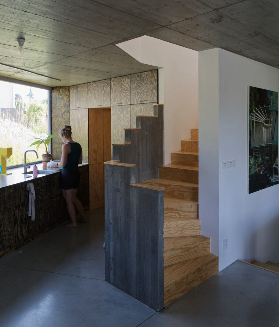
The first floor is conceived as a day zone with technical facilities and continuously connected spaces – a living room, dining room and kitchen. The design puts much emphasis on the effective use of all available space. That is why, for example, the staircase contains a toilet and other storage spaces accessible from the kitchen.
The second floor represents the rest area of the house; there are two children’s rooms, a bedroom, a hallway with storage and a bathroom.
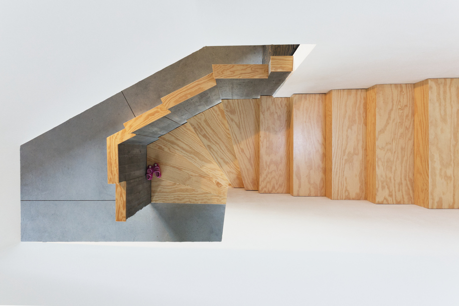
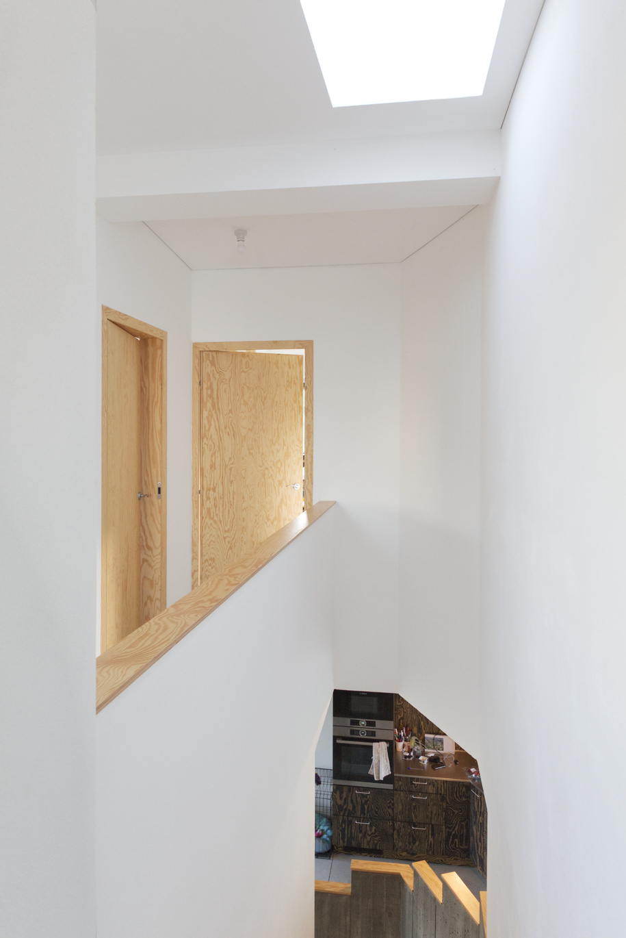
Connecting the two levels is a single staircase featuring a subtle concrete railing. At its bottom, the staircase curves into a built-in concrete monolith with three round openings. The monumentality of the monolith is further intensified as it protrudes from the wall. A repeating motif can be observed in part of the living space too. The dining area is defined in two ways – by the living space located slightly below the level of the dining area and by the concrete wall topped with a plywood slab, which continues as a window sill by the dining table. The window sill can function as a bench accommodating larger visits. The staircase railing is decorated with a similar detail at its end.
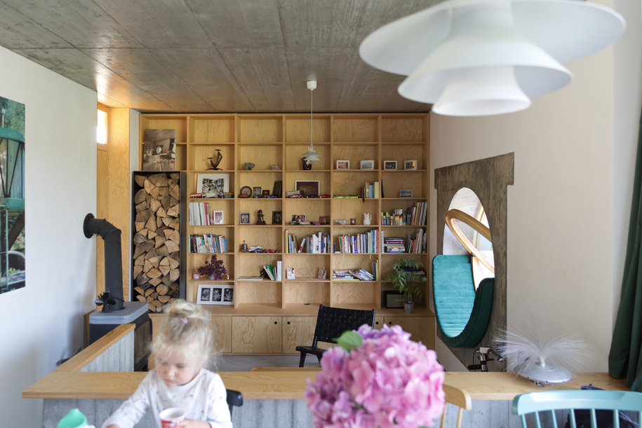
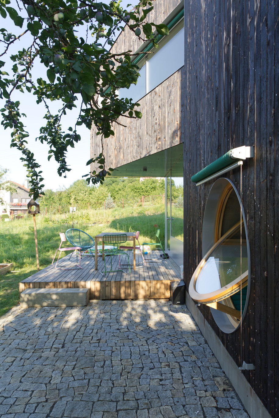
The kitchen has a large window enabling views of the street. The large stainless-steel worktop contrasts with the black paint on the pine plywood cabinet doors. The dining area opens to the two-level terrace referencing the multi-level interior layout. The upper part is made of oak wood, and the lower part is paved with granite cubes.
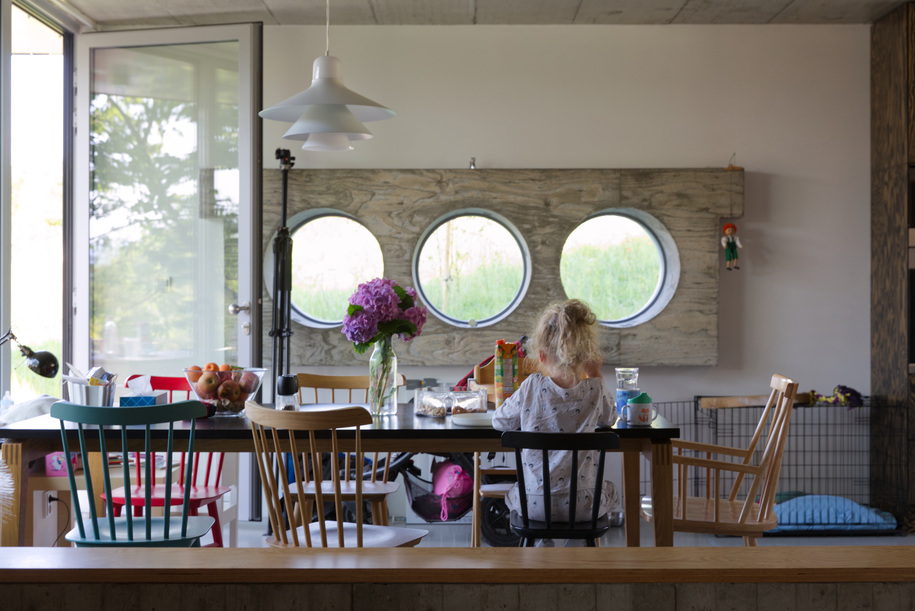
Opening the kitchen window to the street brought one surprising by-product: an interaction between the people inside the house and those who walk alongside the street. The passers-by usually wave to the homeowners and smile at each other. Considering the local tradition of strong privacy protection, it is quite an unusual phenomenon.
Structure and materials
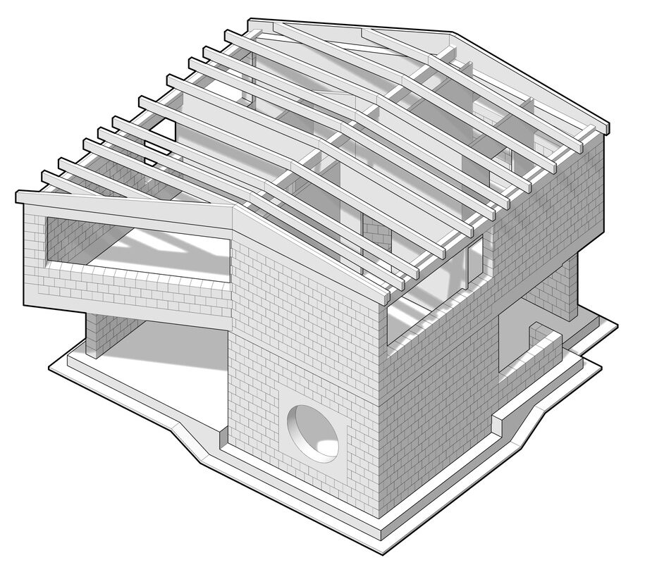
The two-storey building is based on a monolithic, two-level reinforced concrete slab made of ceramic blocks. We made the monoliths with circular openings on the 1st floor right on the spot. The ceiling consists of a reinforced concrete finish. The interior truss is covered in plasterboard, following the interior roof slope. On the soffit and wall junction, a fine joint is visible.
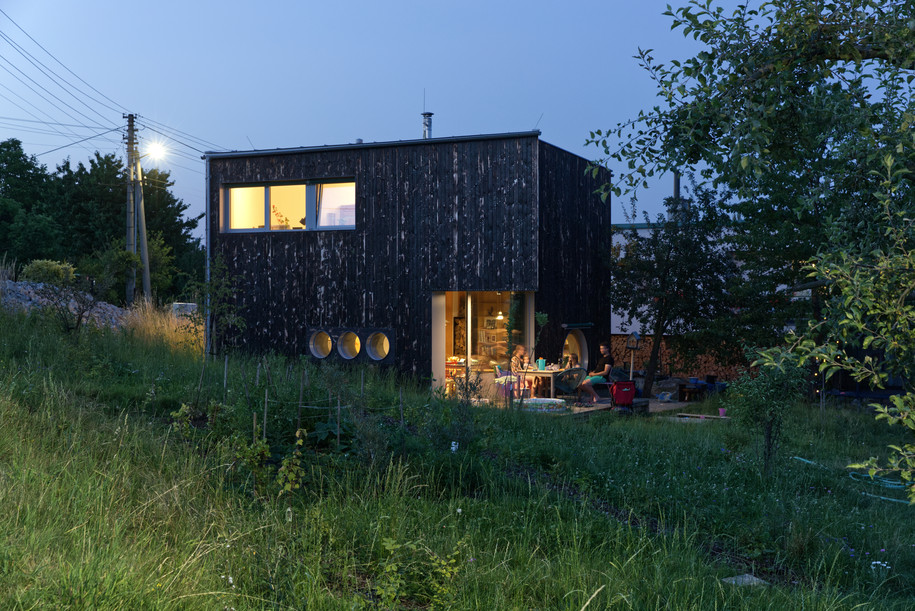
The principal insulation material is mineral wool, which forms part of the ventilated façade. The façade is finished with burnt spruce boards screwed onto a sloping grid. Contrasting against the dark colour of the façade is a light grey tone repeated on the aluminium frames of the window and door panels’ aluminium portals and the skin in the soffits of the cantilevered parts of the house. The same colour was used on the seamless roof sheeting, including the guttering and plumbing.
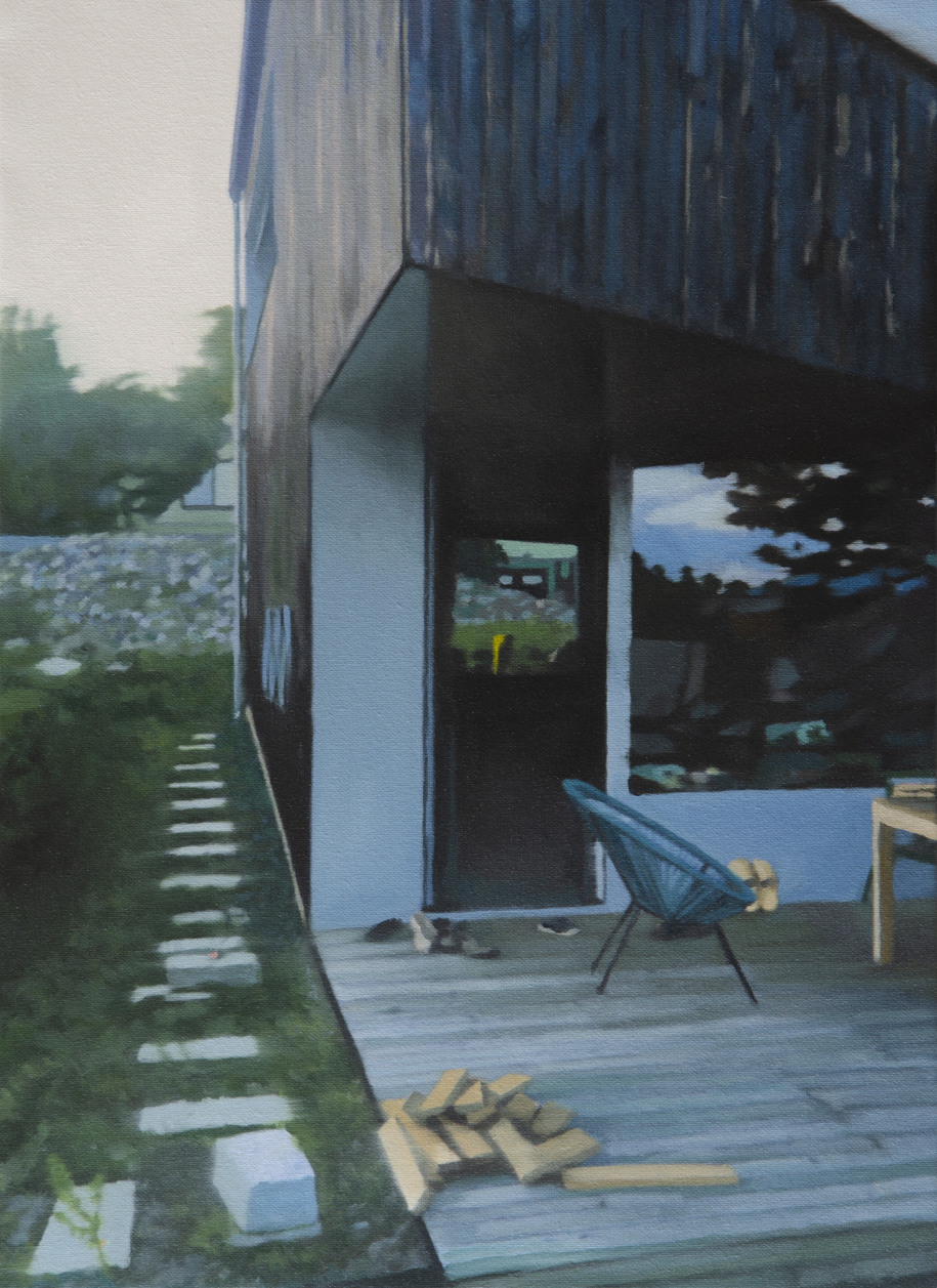
The entrance is dominated by a flangeless door and a corner stained-glass window without a structural frame. The plinth of the stained-glass window consists of sheet metal aligned with the glazing frame. This detail is used on the terrace entrance too.
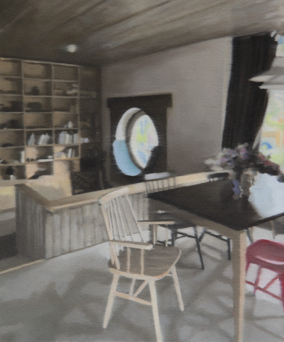
There are three materials the combination of which prevails in the interior – concrete, pine plywood and white plaster. All rooms have polished concrete floors. The ceiling on the 1st floor playfully employs spruce bio-based panels with annual ring patterns. At the same time, brushed pine plywood texture appears on the concrete monoliths with circular openings. The patterns of the trees are also reflected in the walls lining the staircase.
Pine plywood is the principal material used on the built-in furniture, including the kitchen, the interior flangeless doors and window sills.
Plans
Credits & Details
Studio: KLAR, Kocián & Liška architekti
Author: MARch. Zdeněk Liška
Team: Lubomír Mik, Václav Kocián, Tomáš Šenovský, Pavla Tvrdá
Year of completion: 2021
Built area: 77 m2
Photography: Václav Kocián
Paintings: Pavel Samlík
READ ALSO: Sustainability is at the heart of Mace’s culture, says Associate Director of International BIM Consultancy Marzia Bolpagni