After winning an international competition in 2003 commissioned by the Flemish Government, Dutch architecture office KAAN Architecten has worked intensively on the complex masterplan, renovation and extension of the Royal Museum of Fine Arts in Antwerp, Belgium also known as KMSKA (Koninklijk Museum voor Schone Kunsten Antwerpen) bringing contemporary allure to a glorious, overlooked beauty of the 19th century.
-text by the authors
In addition to being one of the last examples of bold neoclassical architecture in the city of Antwerp, the museum houses a rich art collection that embraces seven centuries of art: from Flemish Primitives to expressionists, from paintings to drawings and sculptures. The Department of Culture, Youth and Media of the Flemish Government has invested approximately 100 million euro in the overall renovation of the building.
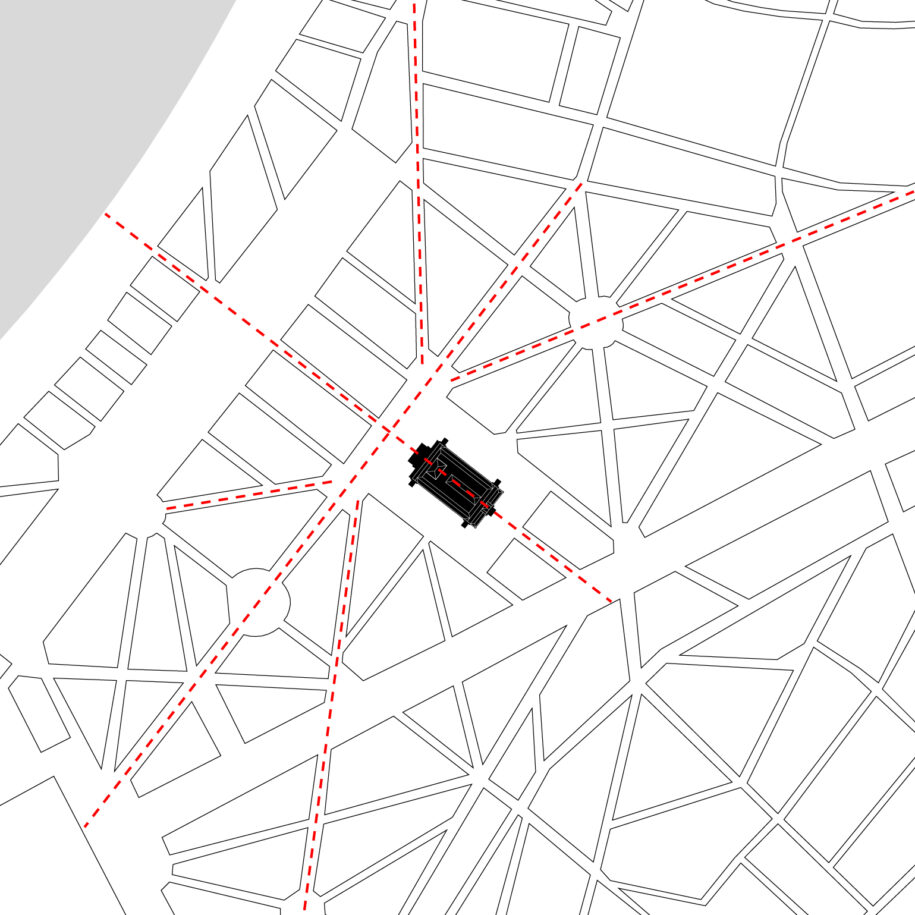
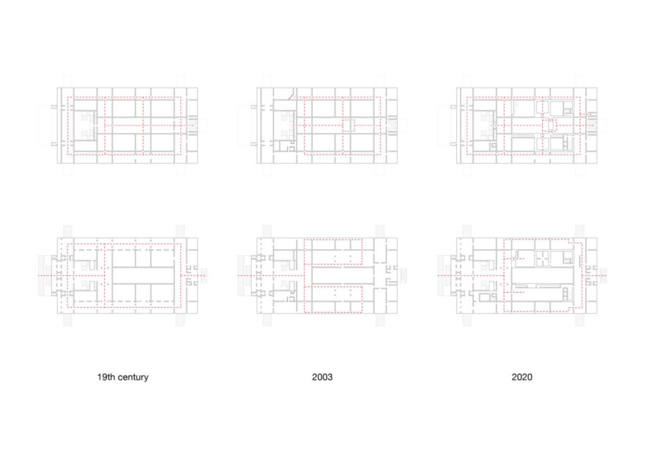
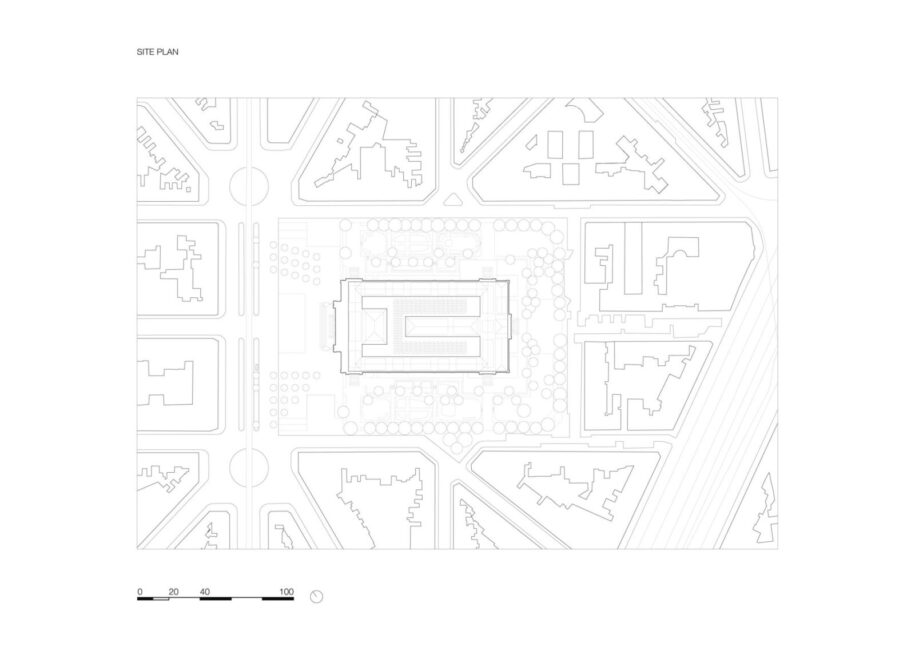
Rising above the remains of the 16th century citadel and intertwined within the remarkable star-shaped urban fabric, the museum was originally designed in the 19th century by architects Jacob Winders and Frans van Dyck. It opened to the public in 1890. KMSKA was conceived as a daylight museum, where visitors would enjoy a promenade surrounded by stunning artworks as well as the external landscape, witnessed through its multiple lookouts over the city and the inner patios. During the 20th century, new developments in exhibition design and museum distribution brought fundamental changes to the building’s layout, modifying the original circulation route and the connection with the city.
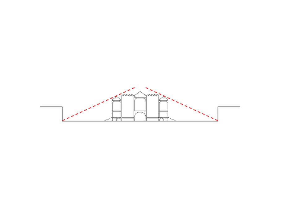
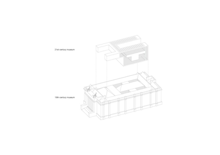
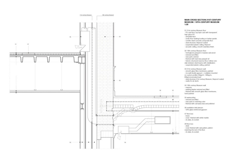
In the early 2000’s, while KAAN Architecten started working on the museum’s masterplan, renovation and extension, the southern neighbourhood of Antwerp began to progressively gain greater value through public investments and urban transformation. One of the architects’ most intrepid initiatives was to completely conceal the extension of the museum within its existing inner structure — the new addition is not visible from the outside — in order to highlight the heritage value and the resilience of the outstanding 19th century building, nestled in this fast-changing district.
The extension co-exists with the powerful historical structure without diluting its monumental character.
“Both the 21st and the 19th century museum couldn’t be more different and more intense. They embody an emblematic contrast in dimensions, light and atmosphere, while being designed as flexible spaces to welcome future exhibitions”, affirms Prof. Dikkie Scipio, architect and co-founder of KAAN Architecten.
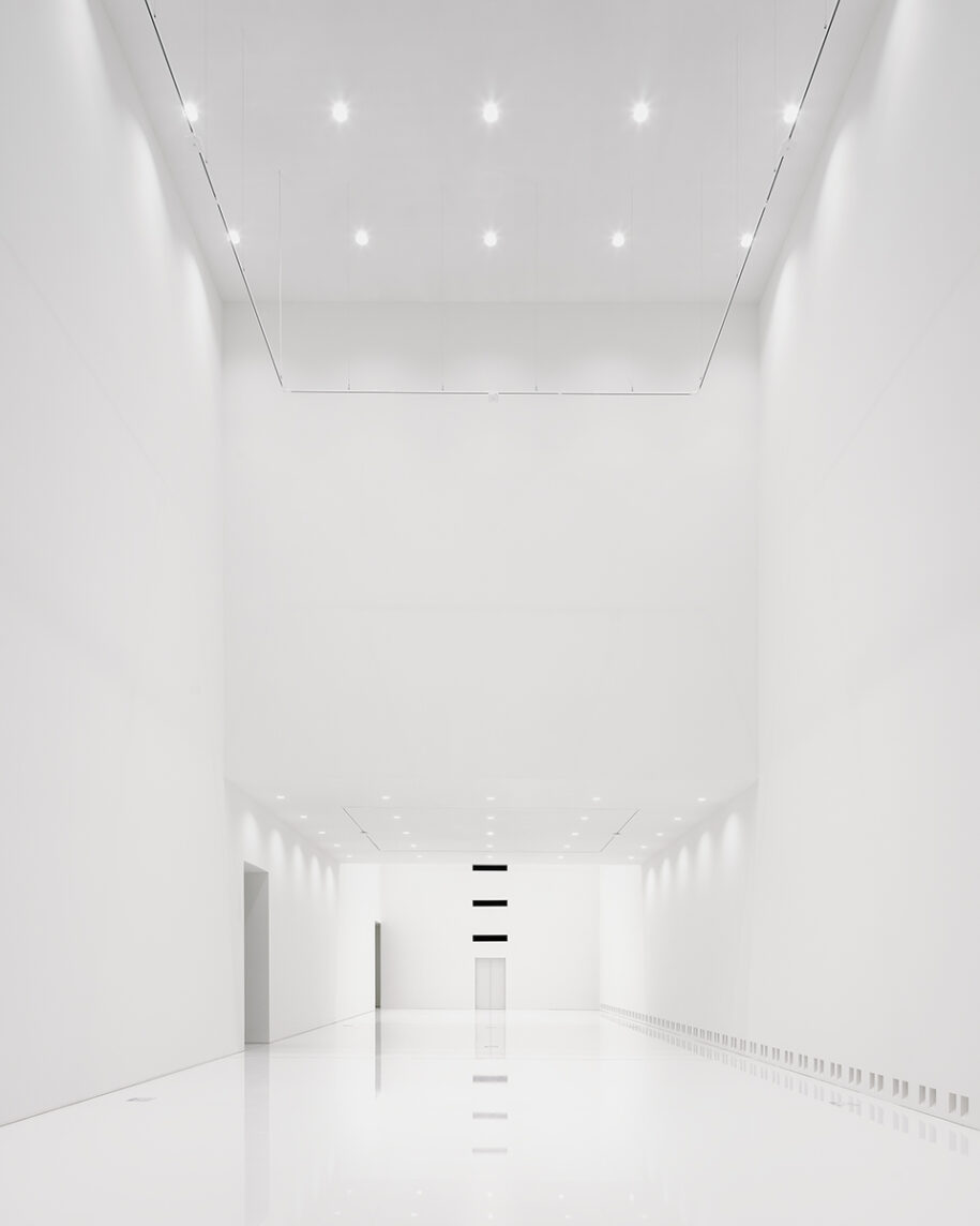
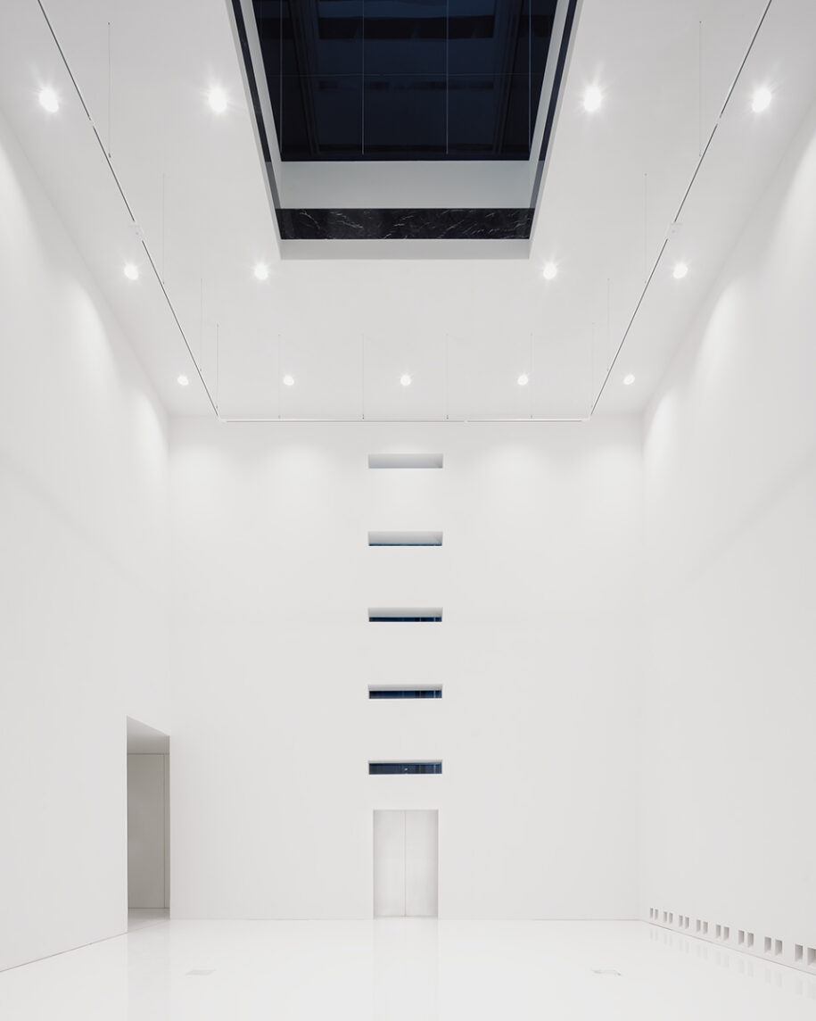
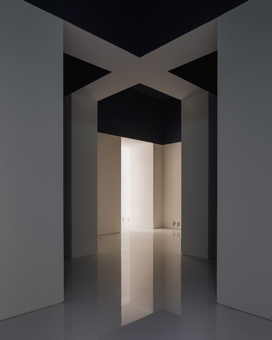
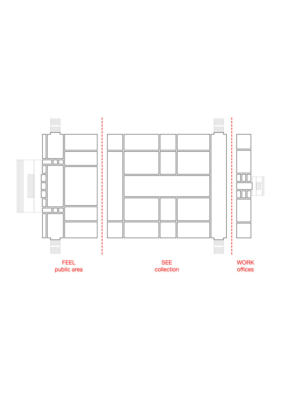
KMSKA is now divided into three realms: a public entrance area (feel), central exhibition spaces (see) and offices (work) at the rear side of the building.
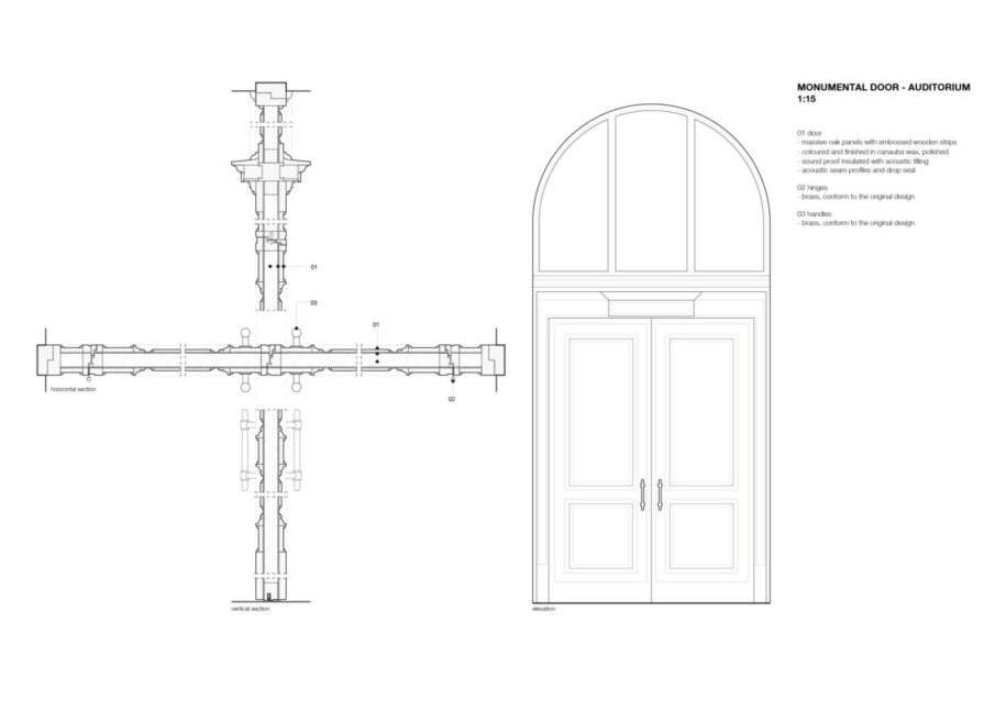
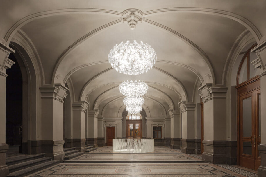
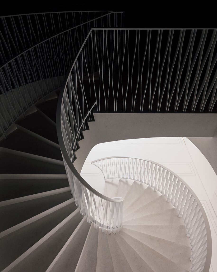
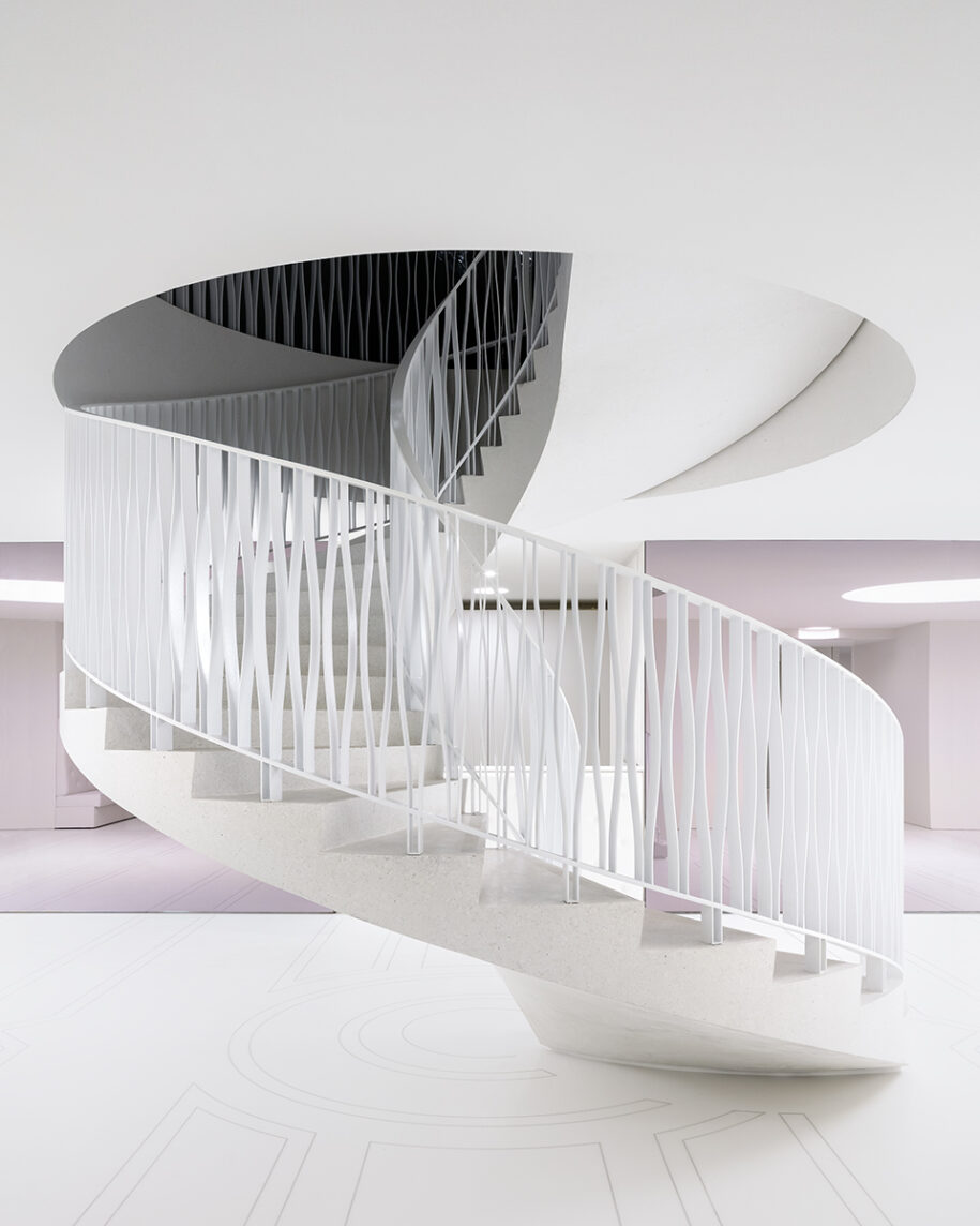
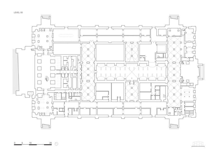
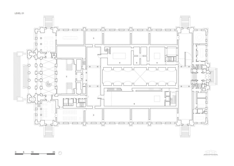
From Leopold de Wael square, a grand staircase grants access to the museum: large restored oak doors open onto the entrance hall, which features several museum facilities such as an interactive information zone, a café, an auditorium, a bookshop with a coffee corner and a circular staircase to the street floor level where a library, a cloakroom and a second entrance for large groups are located.
The entrance hall leads to the majestic de Keyserzaal (named after artist Nicaise de Keyser), which serves the pivotal role of introducing the visitors to two different routes and experiences: one, going up the grand staircase, leads to the main floor of the renovated 19th century museum; the other, continuing straight ahead, leads visitors to the new 21st century museum.
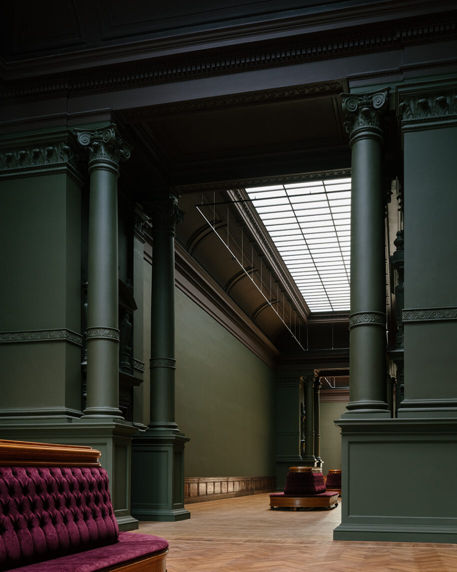
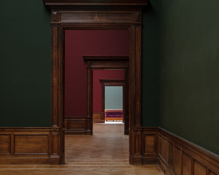
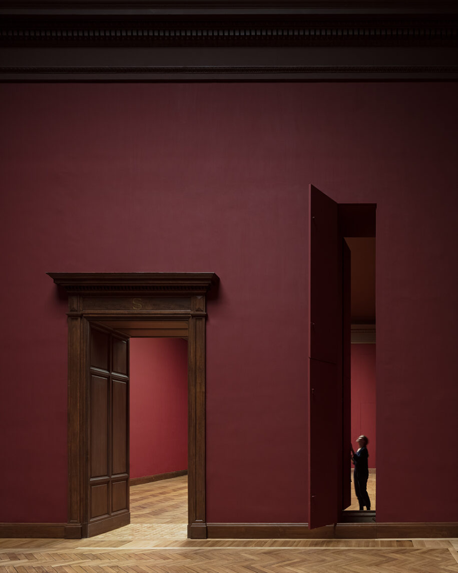
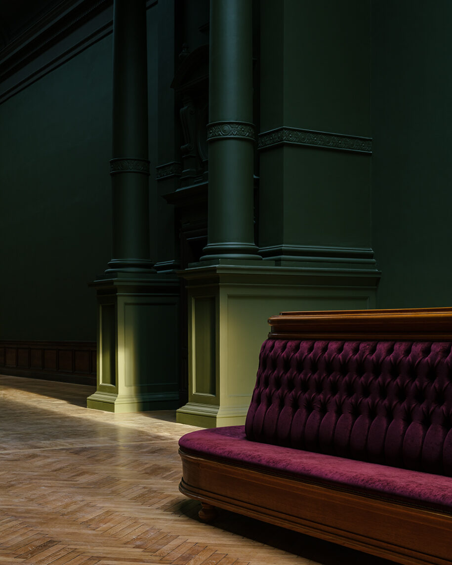
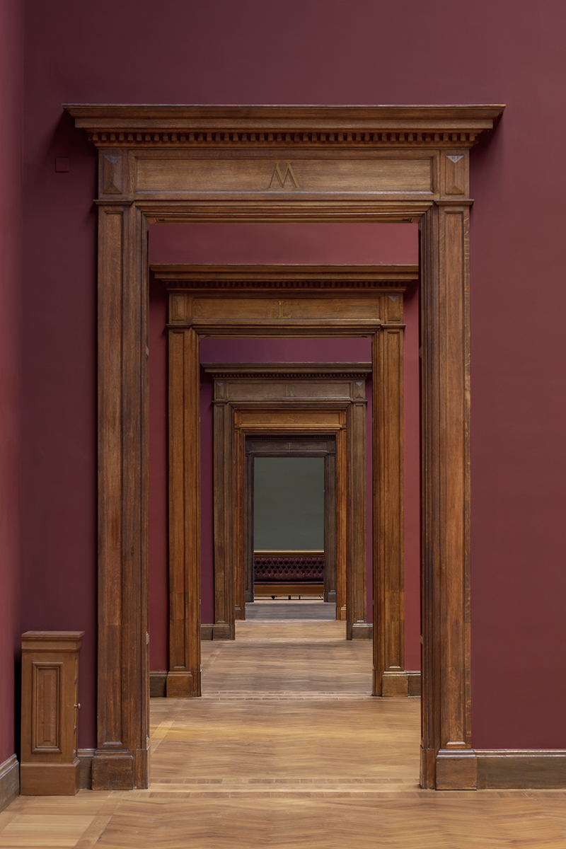
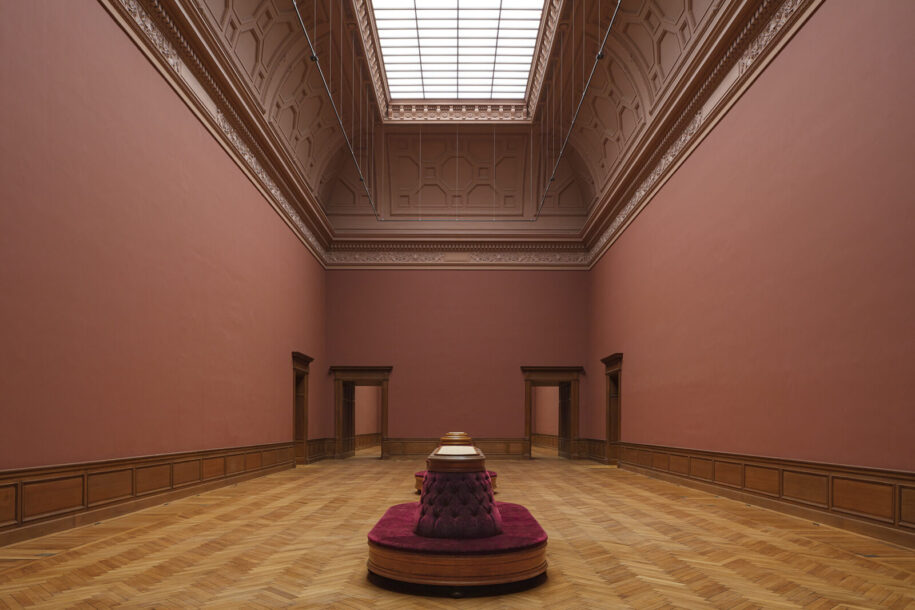
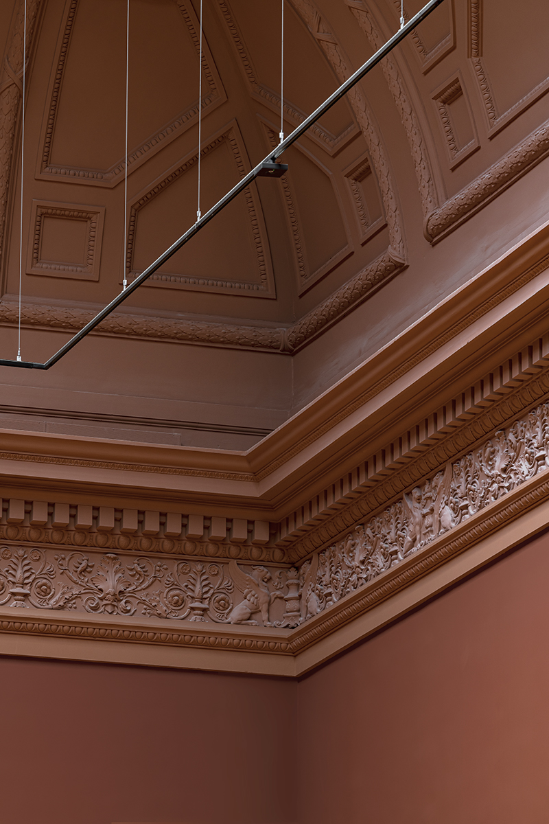
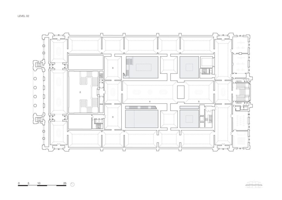
While visiting the historical museum, guests walk through an enfilade of exhibition rooms tinted in dark pink, green and red; oak doors, tall columns and ceiling ornaments in plasterwork collectively convey a feeling of ancient grandeur. The colour palette chosen during the renovation process directly relates to the museum’s original colours. On the first floor, large windows visually connect the bright yet modest interiors with the surroundings, while on the second floor, the main halls are lit by wide glass canopies and equipped with elegant sofas for those enjoying the art masters. The impressive Rubens and Van Dyck halls will host some of the highlights of the collection and are therefore positioned at the very core of the building.
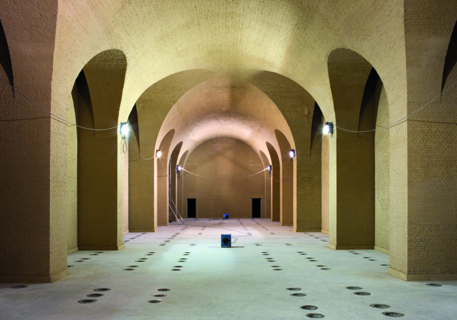
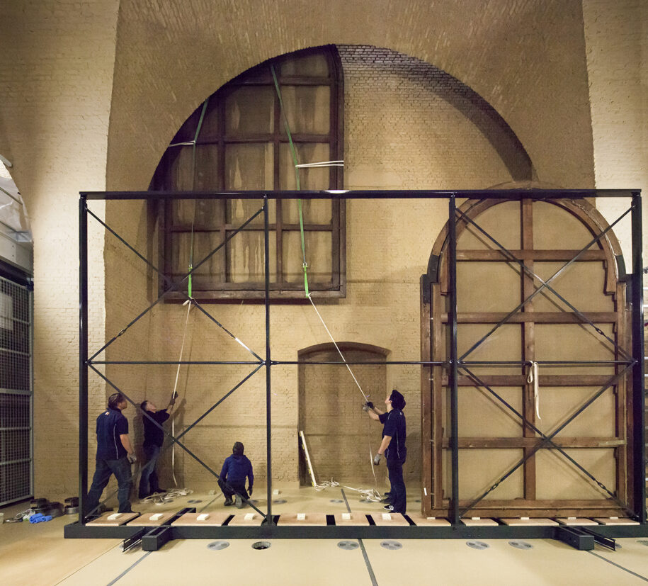
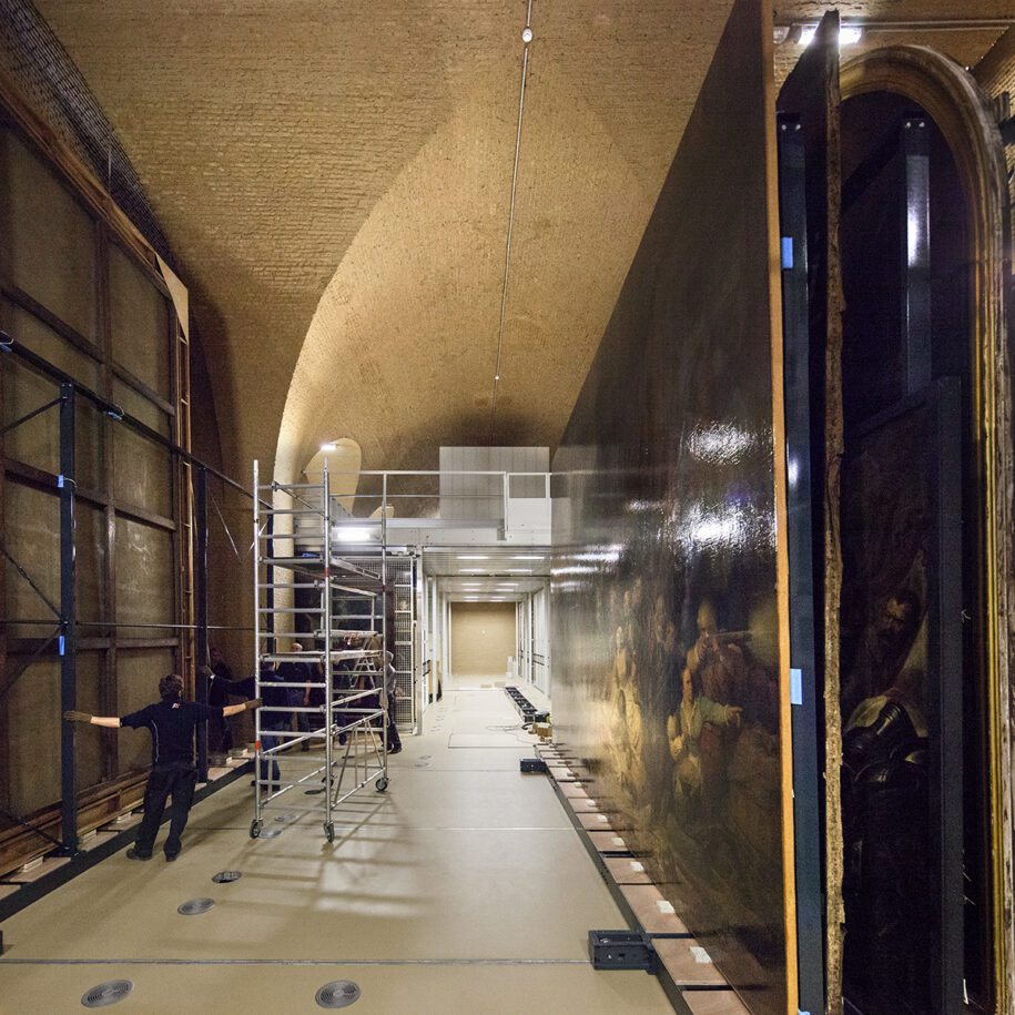
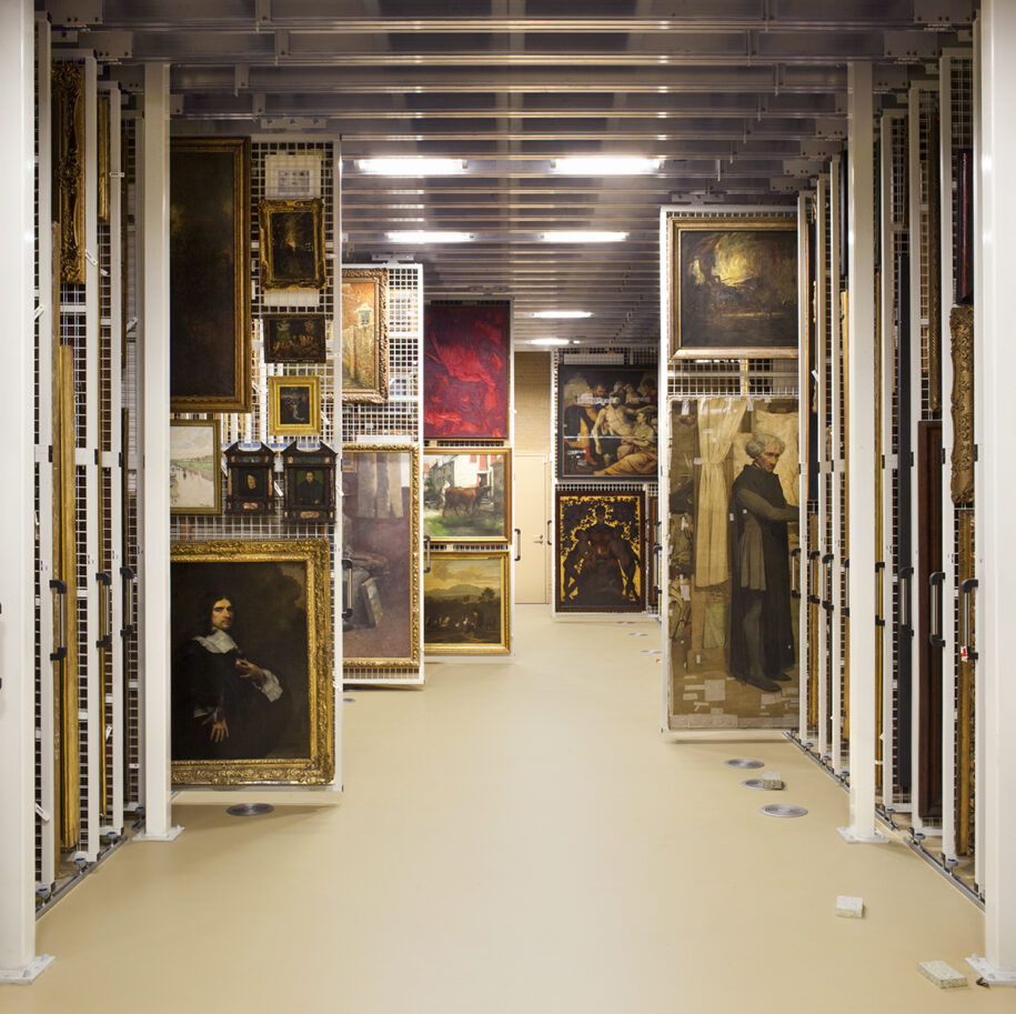
The collection depot has been relocated inside the original location of the air-raid shelter bunker underneath the two main exhibition halls, at the street level. Extra-large paintings, taller than the high doors, can travel from the depot through one of the original 19th century hatches to the upper floors. From this position and following a specific route, a track of slender vertical hatches can deliver the paintings to the contiguous halls.
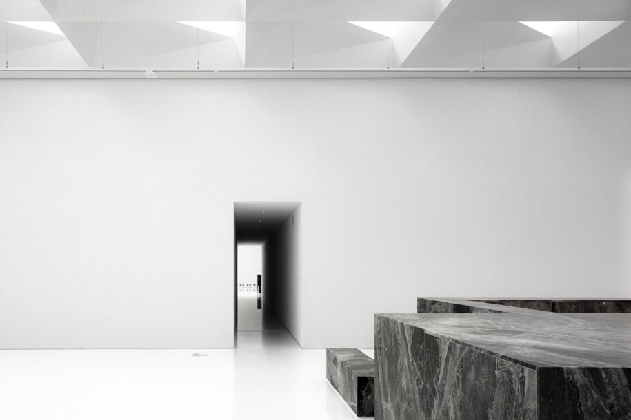
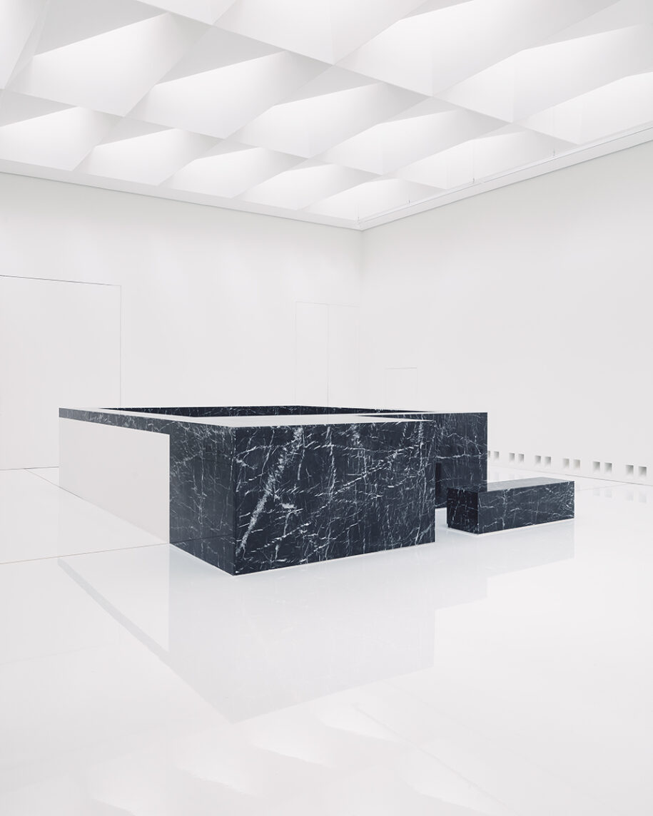
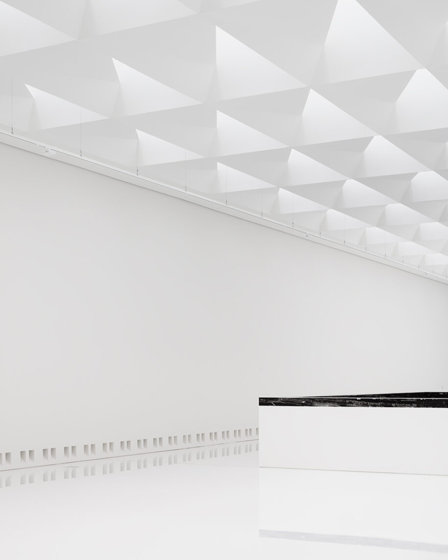
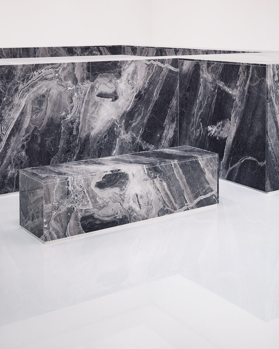
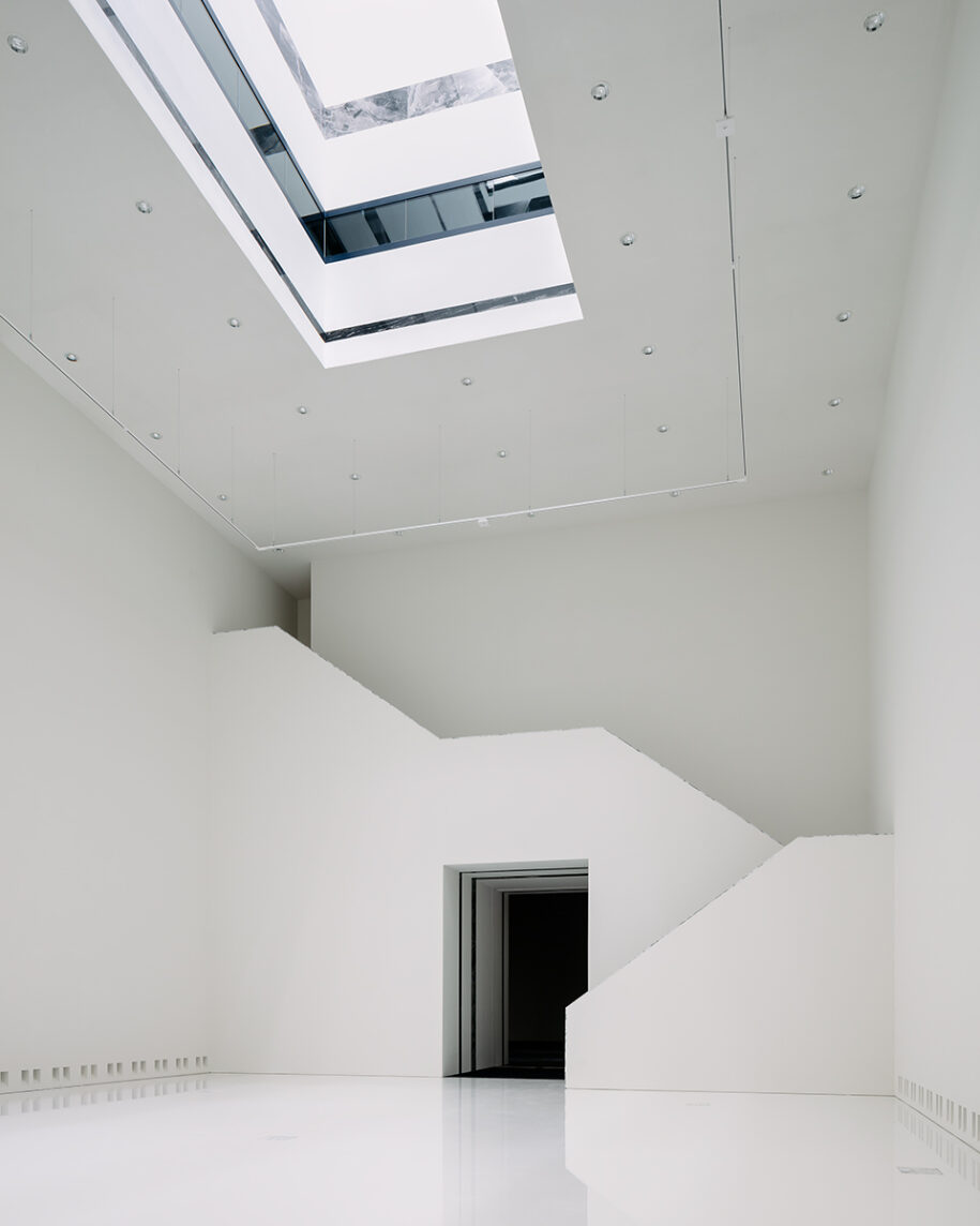
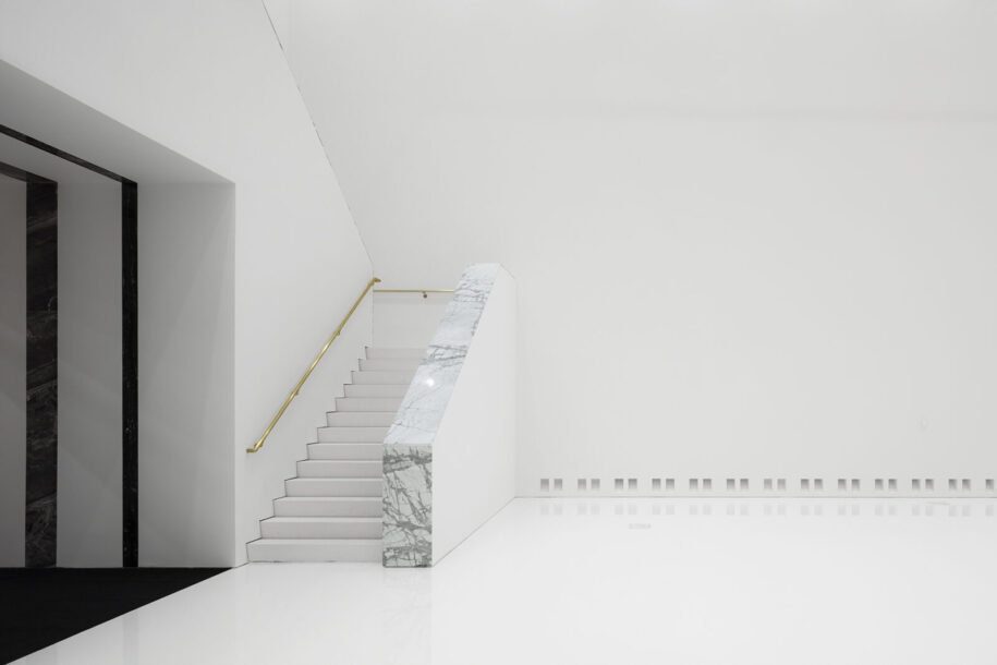
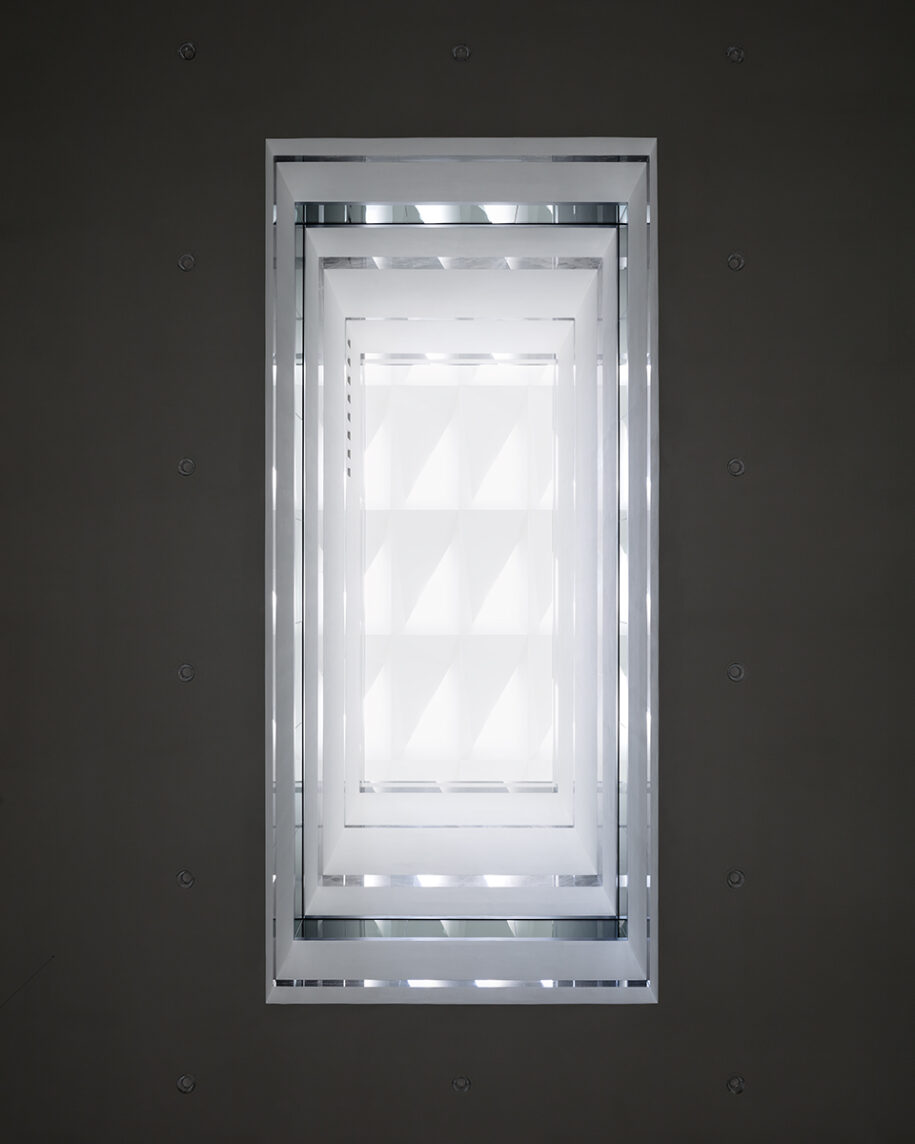
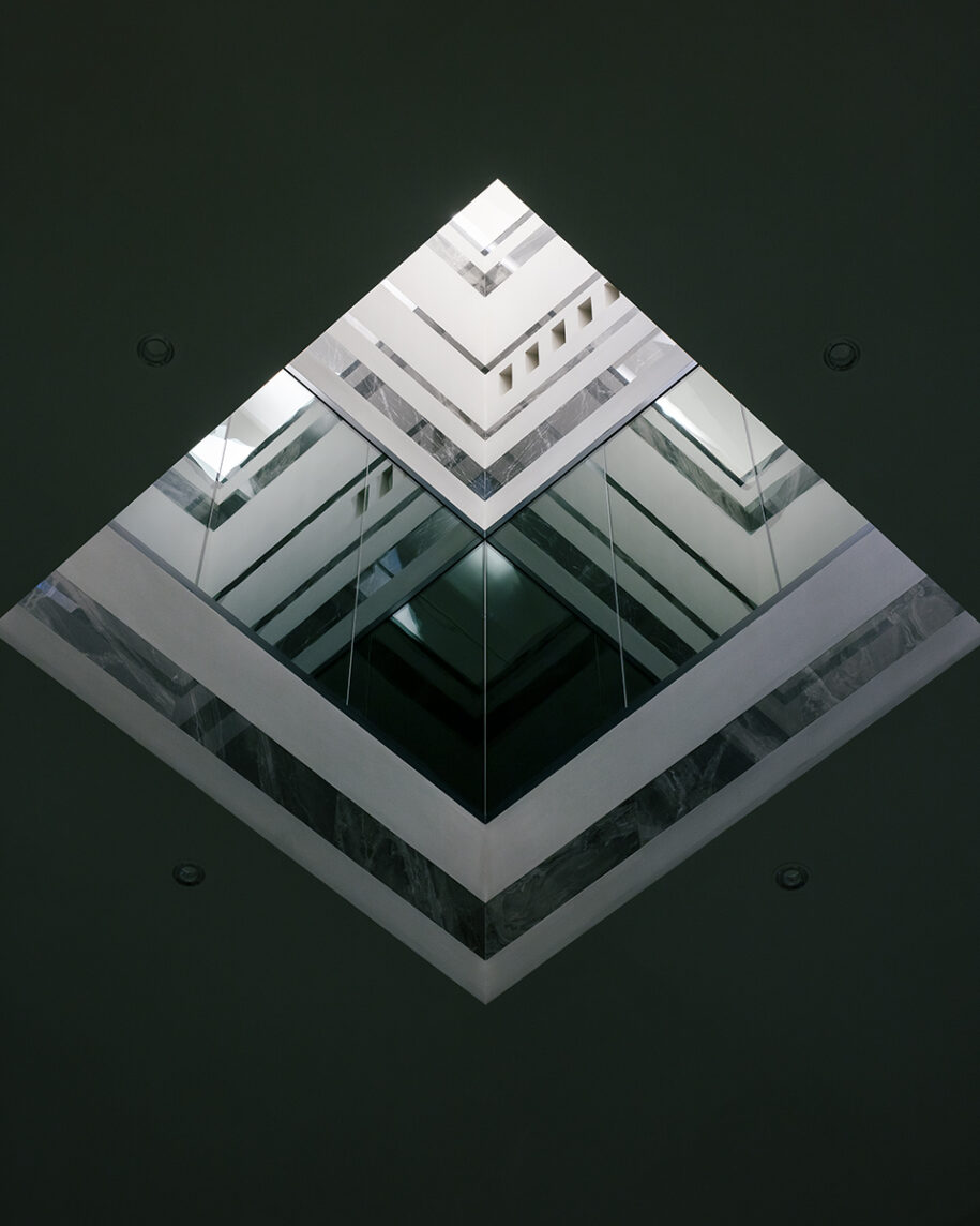
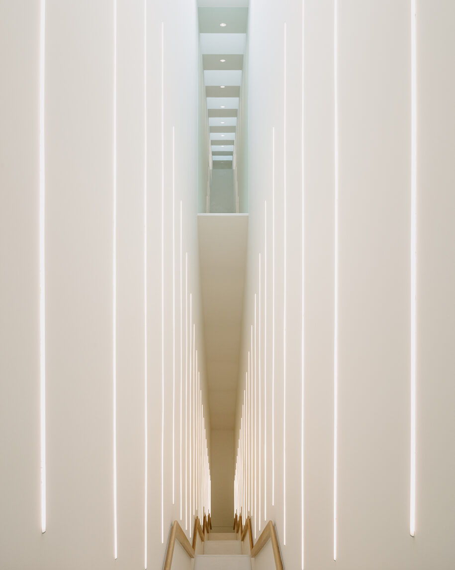
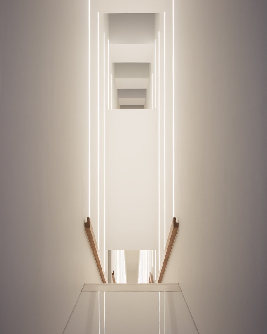
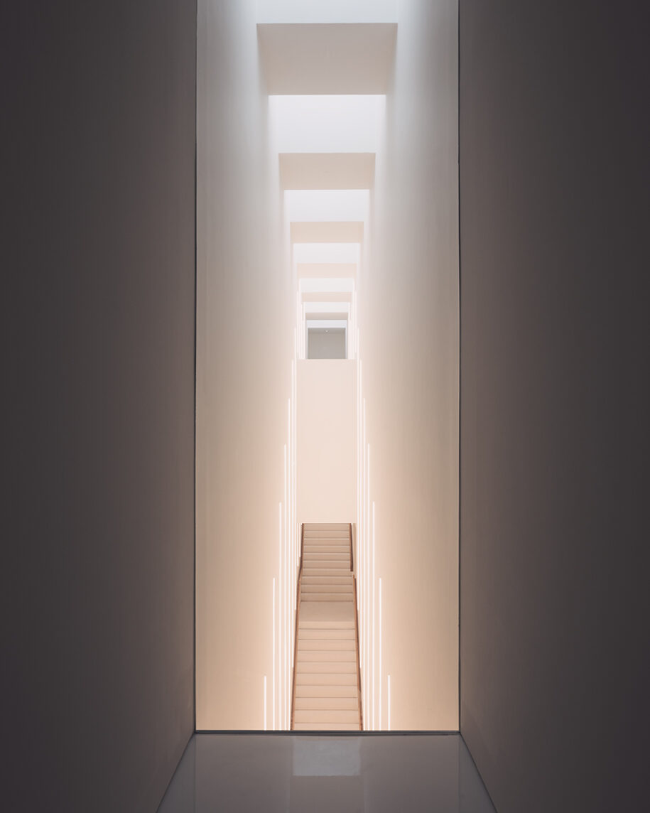
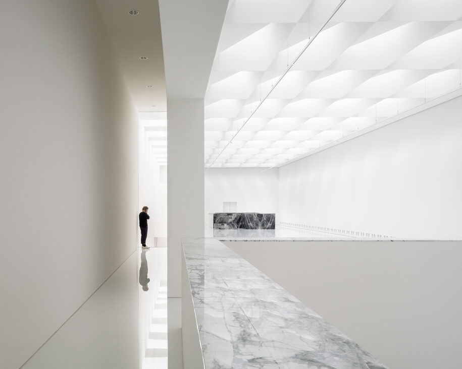
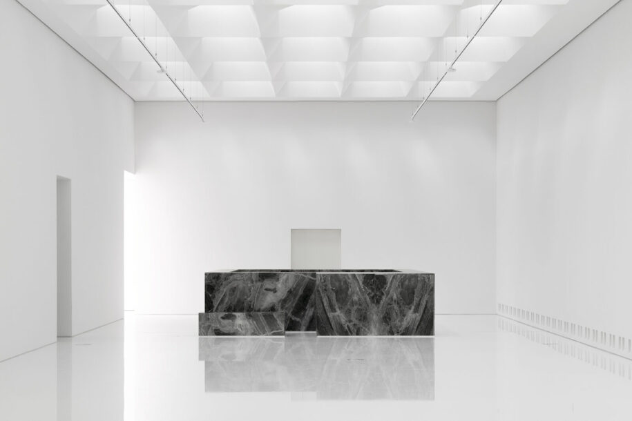
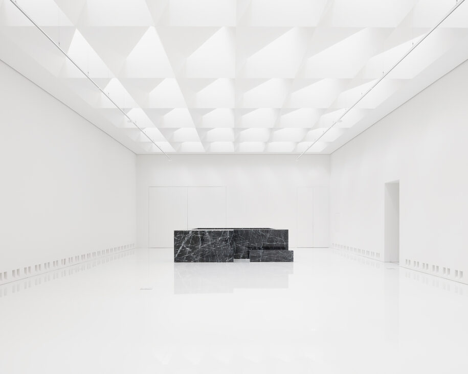
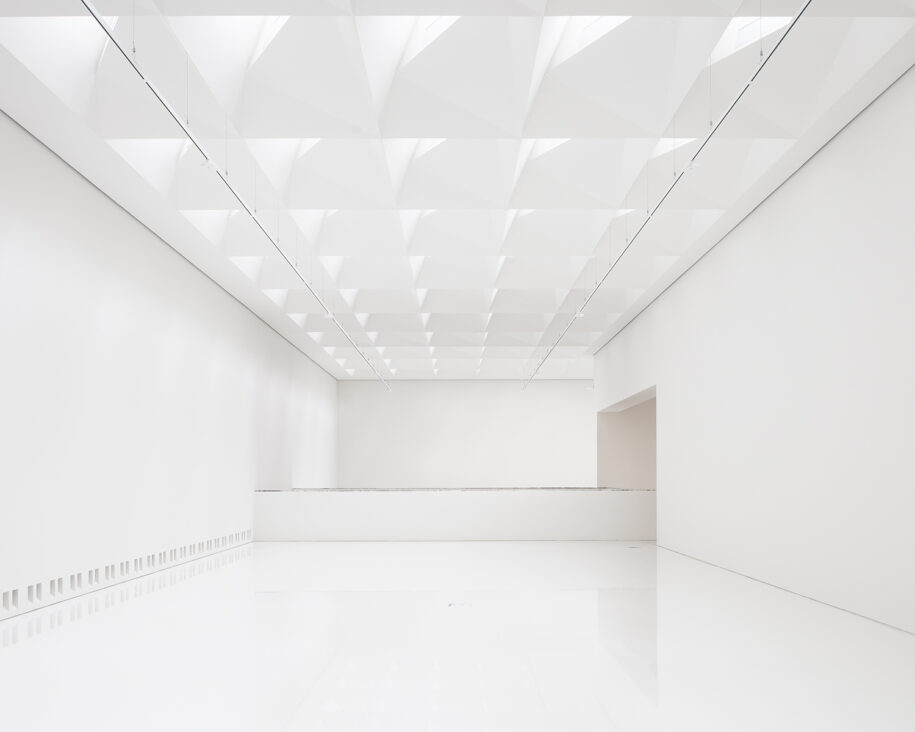
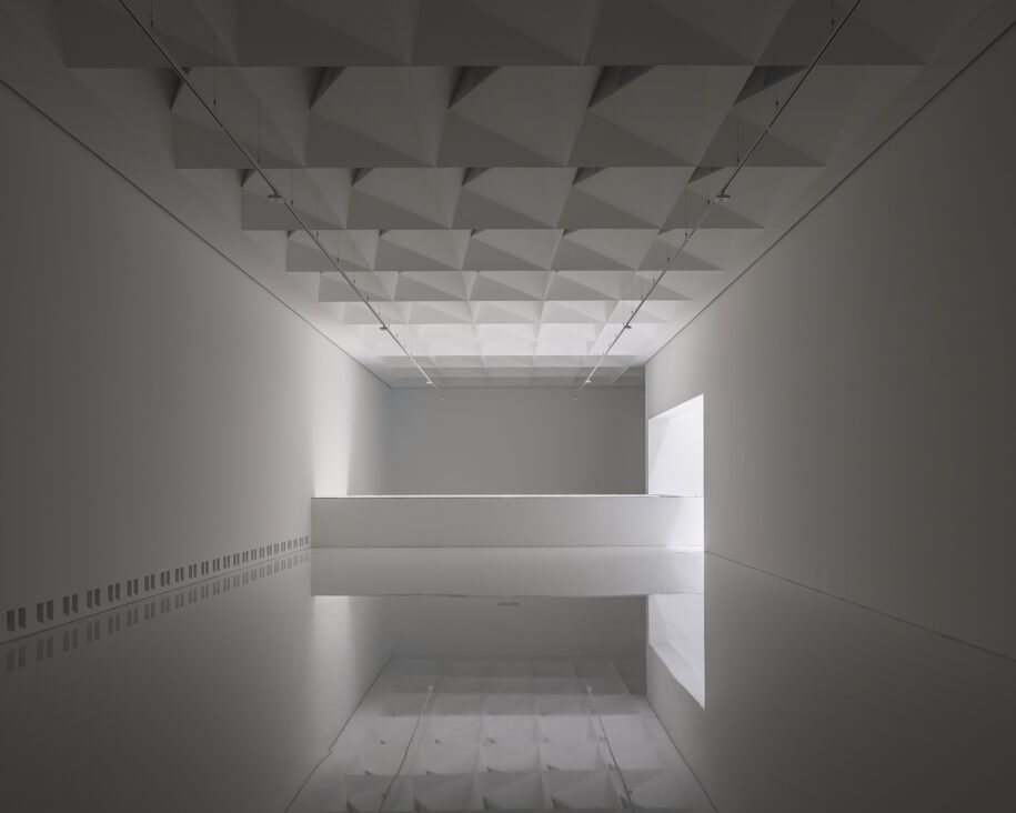
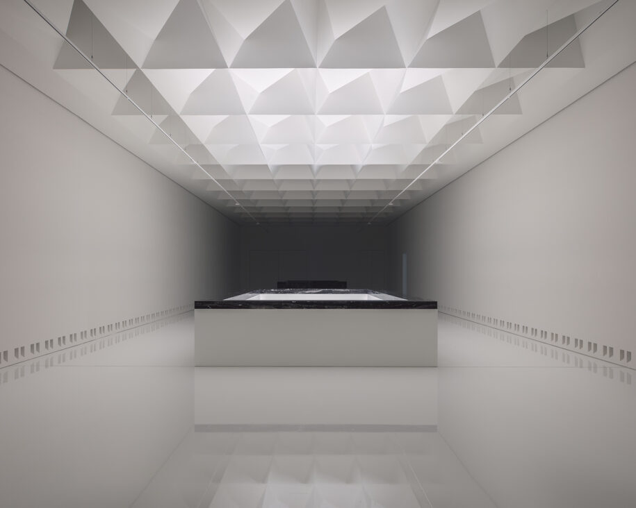
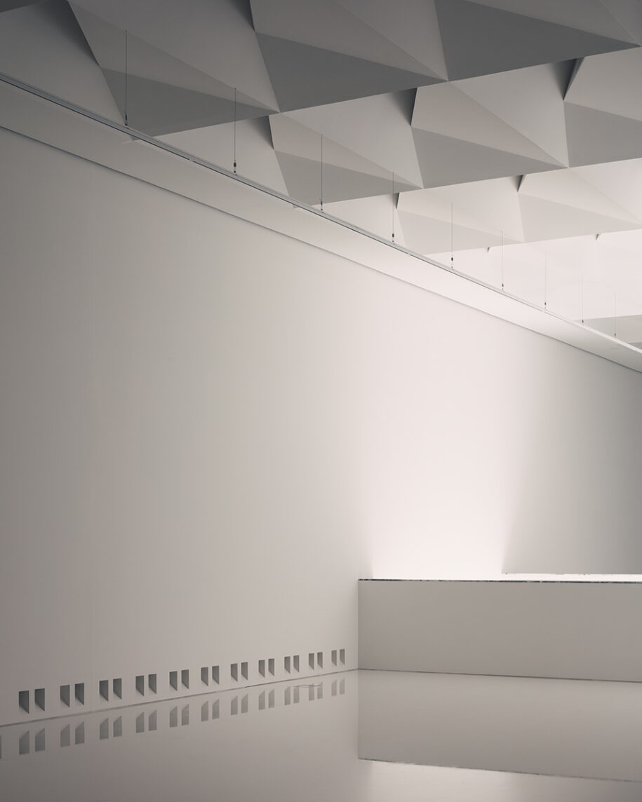
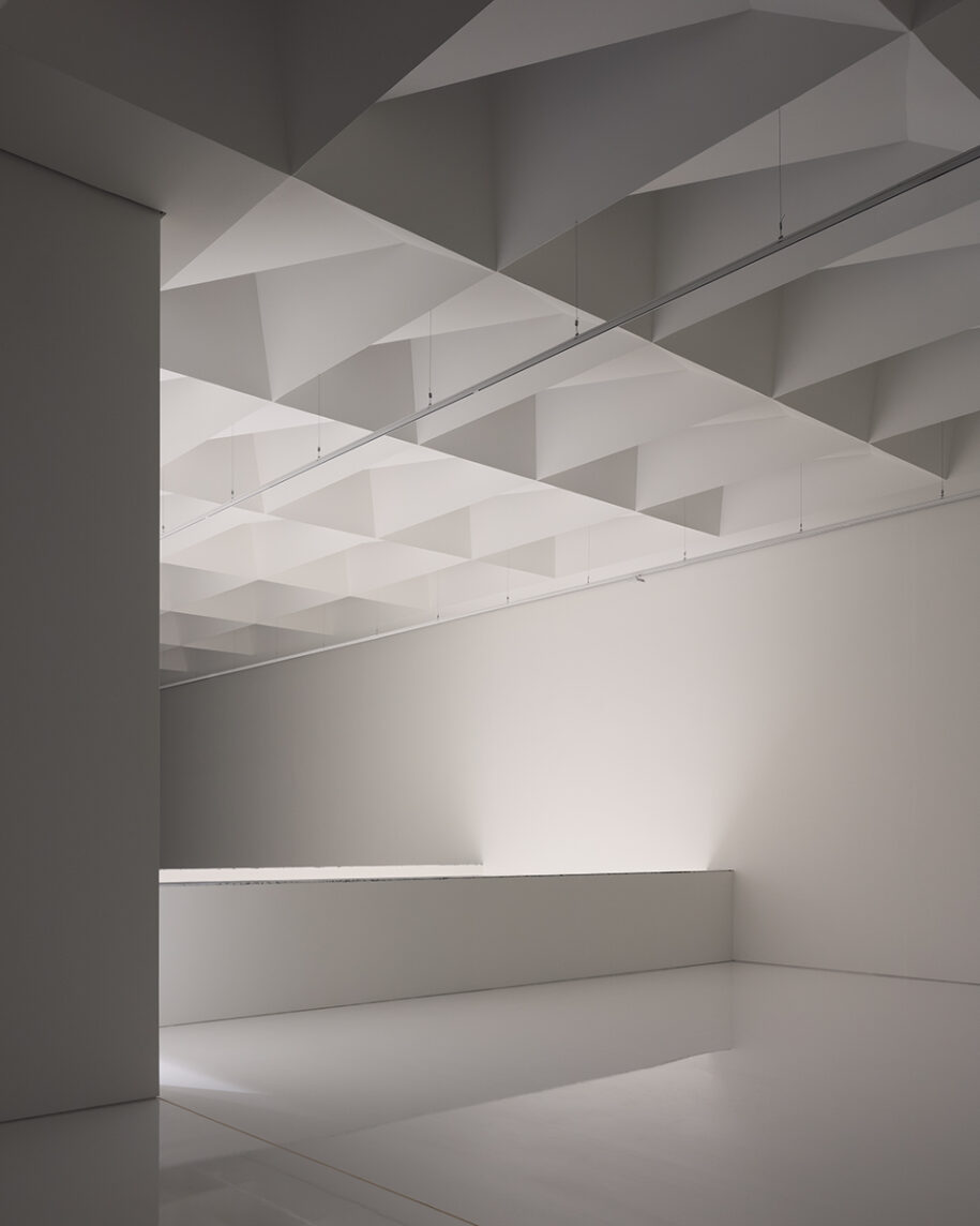
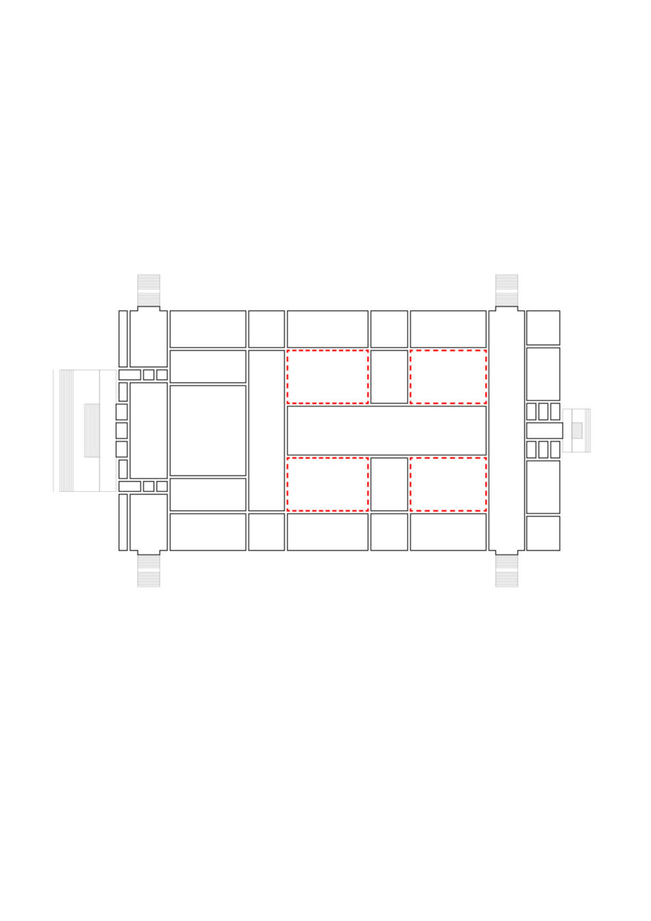
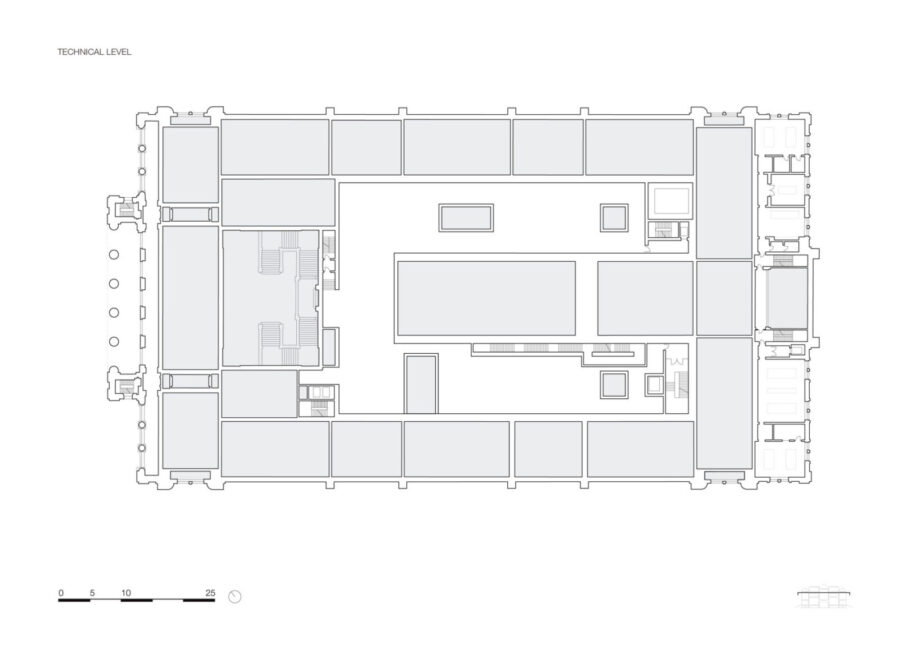
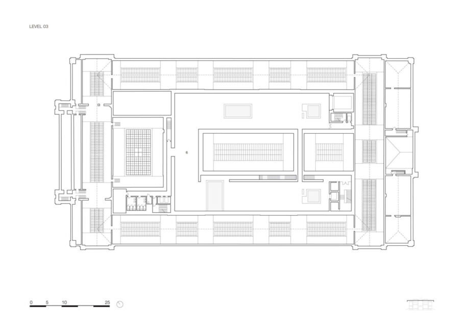
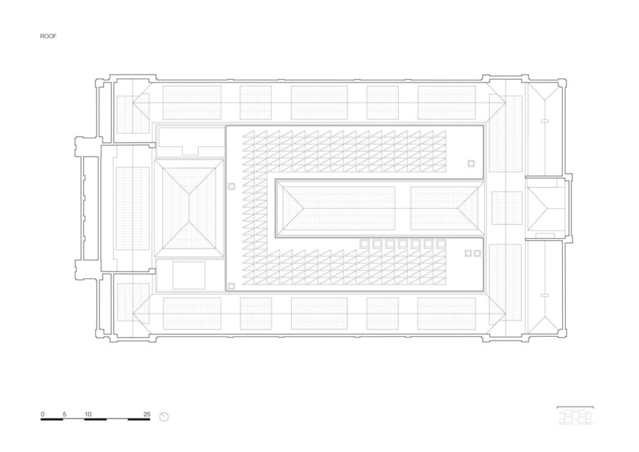
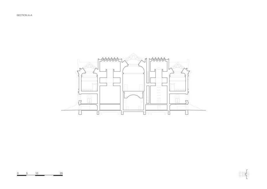
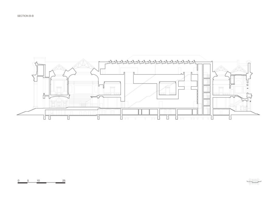
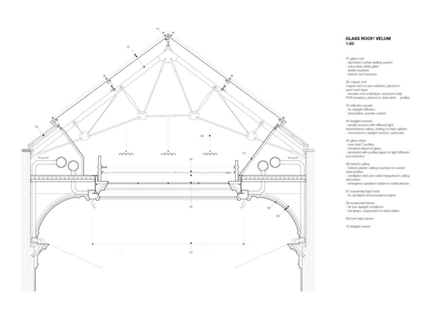
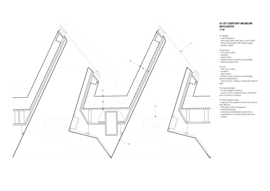
Continuing their visit through the museum, visitors approach the new 21st century exhibition space, a completely autonomous venue, built within the four original patios and wisely unfolding at the heart of the museum’s structure. These spaces consist of bright white exhibition halls, where daylight beams in form 198 triple triangulated north-facing roof elements located on the top hall and flooding through four large light wells, measuring up to 23 metres floor-to-ceiling. These skylights are designed to guide and diffuse the light, and their structure also features additional lighting to compensate for the seasonal loss of daylight. The three-dimensional urethane high-gloss floors of the new museum enhance the dazzling effect of these spaces. A sequence of strong vertical spatial experiences dematerialize the visitor’s experience and juxtapose it with the historical identity of the building.
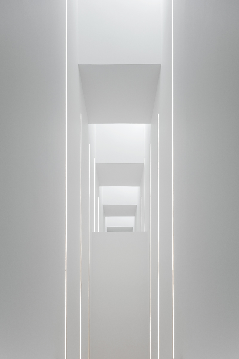
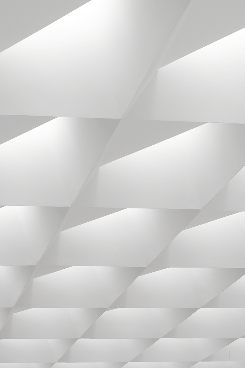
Where the new extension ‘cuts’ the museum’s solid mass, subtle marble inlays have been added, echoing the elegant 19th century museum’s materiality.
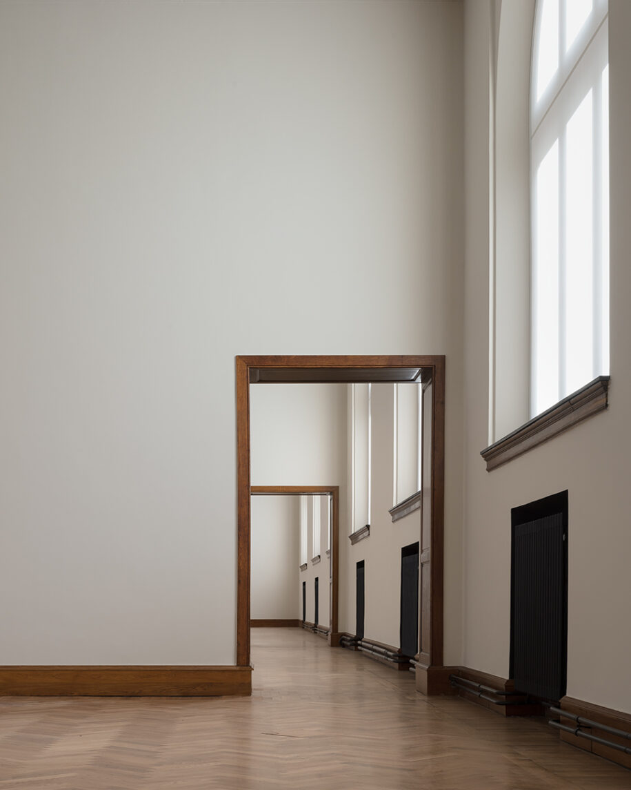
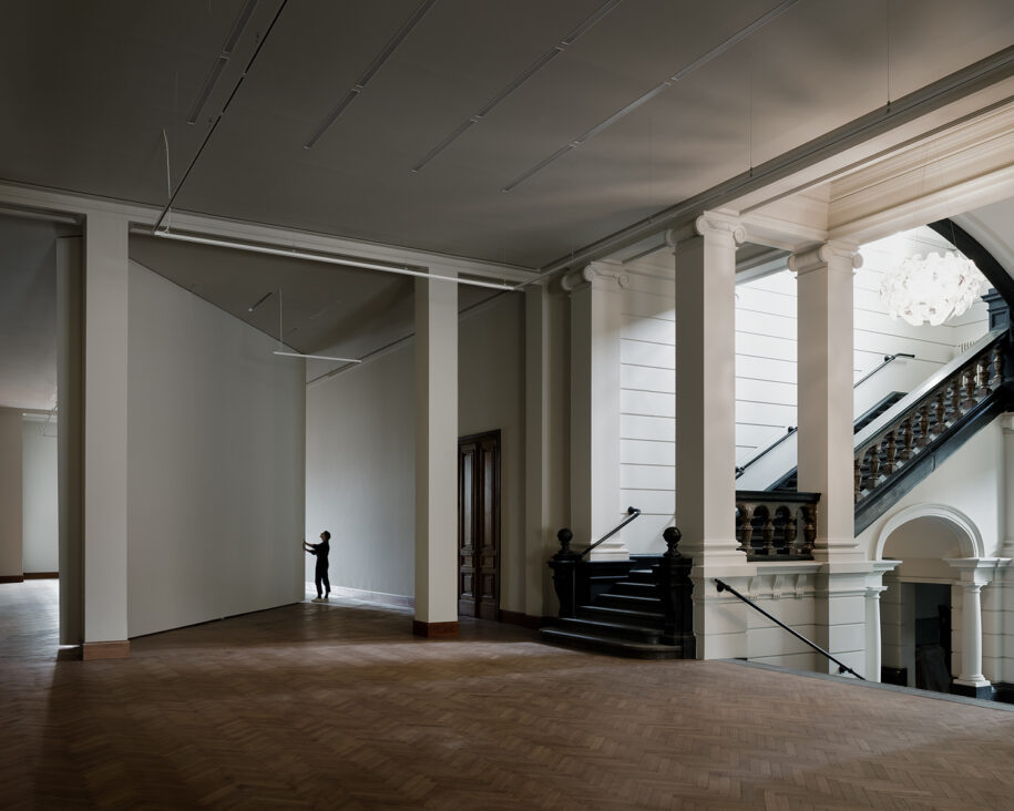
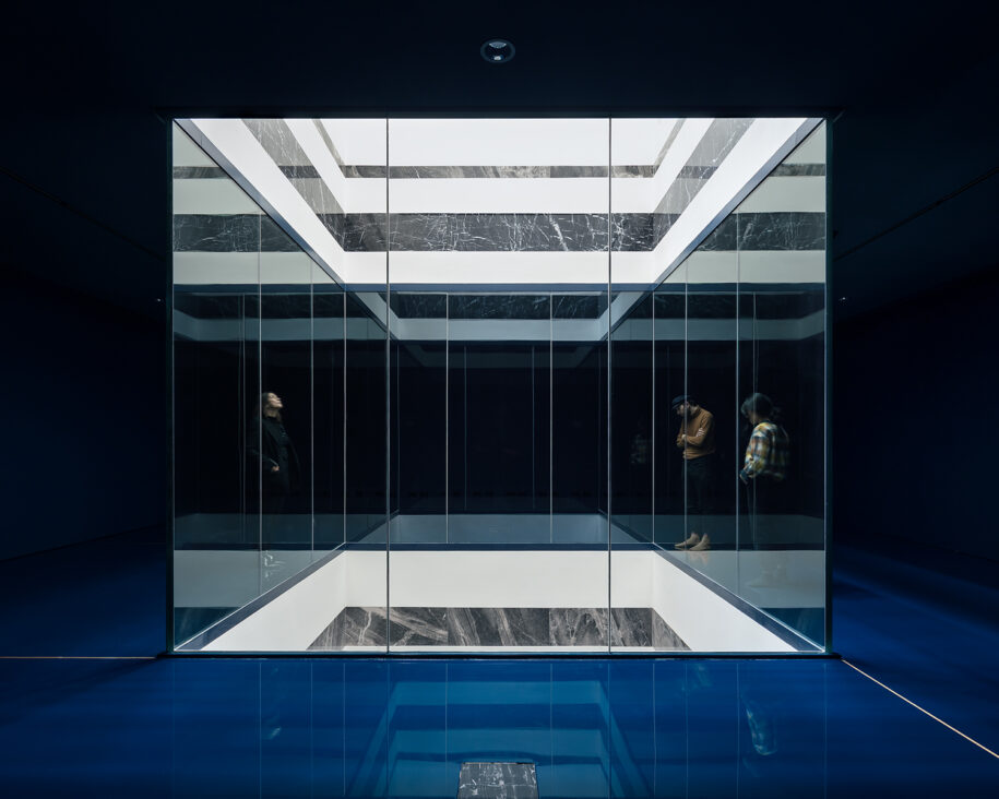
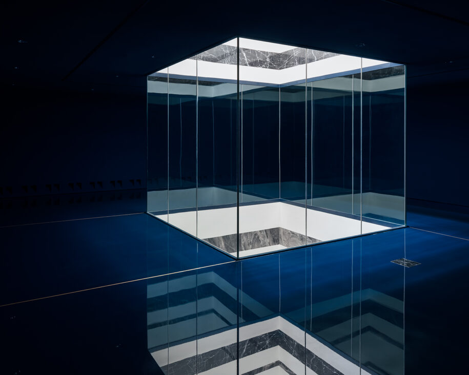
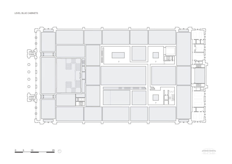
A long impressive linear staircase connects the new exhibition halls on the first floor to those located on the top floor, also granting access to an intermediate floor, which is dedicated to displaying delicate artworks such as etchings and drawings. These dark cabinets are also visible through the four lightwells and are characterized by intense dark blue. The chosen colour scheme is related to the original colour palette but uses brighter variations.
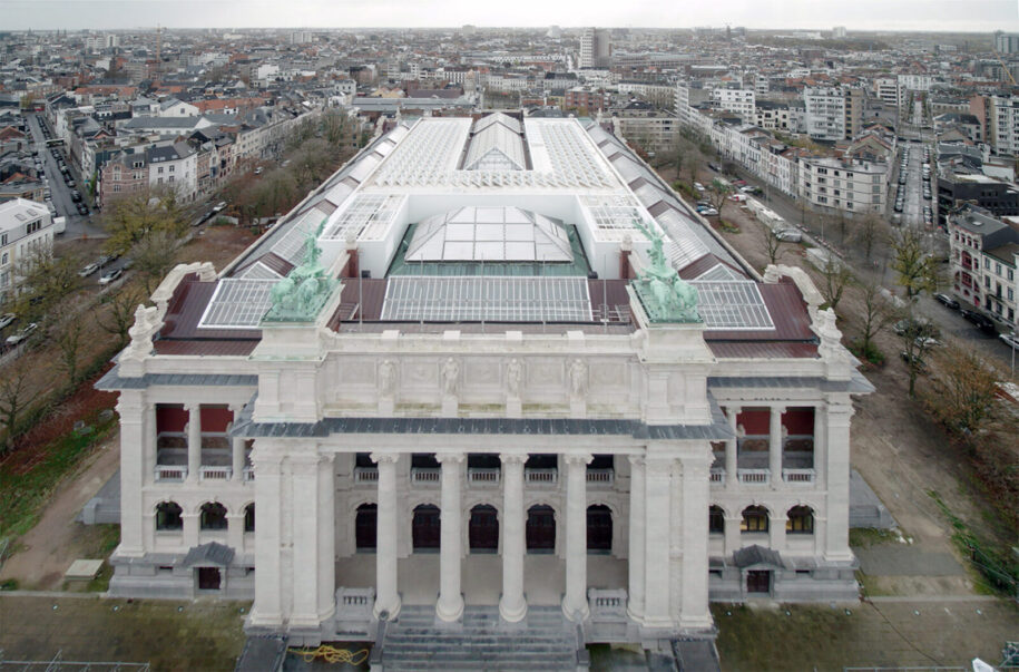
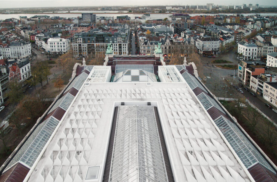
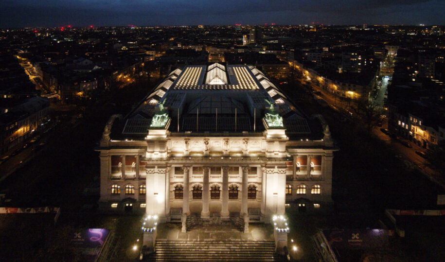
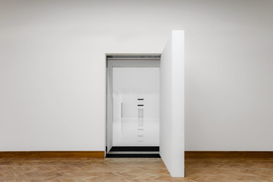
In order to allocate the necessary space for the new museum premises and its advanced technical installation, careful decisions have been taken, such as shifting the position of the original wall between the Rubens and Van Dyck halls in order to bridge the blue cabinets and the new exhibition halls above. Another remarkable feature of the renovation is the 5,5 x 9 metre pivoting wall on the first floor that can rotate to facilitate logistic flows and to allow artworks or large objects to access the wide art-elevator.
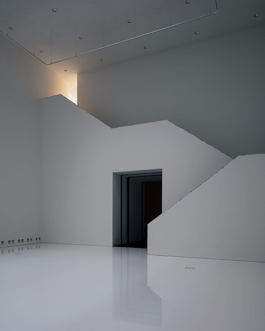
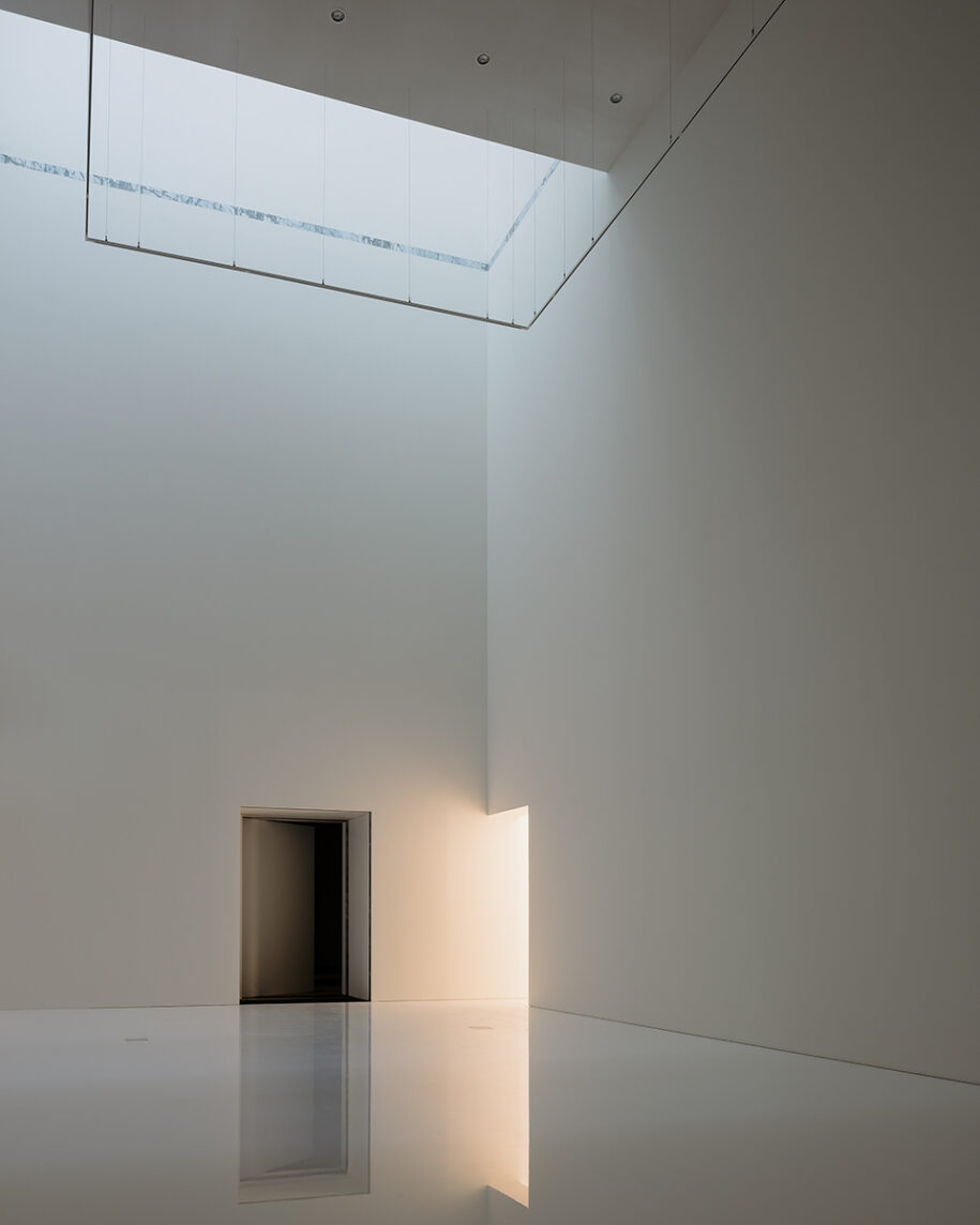
KAAN Architecten has created an architectural concept for KMSKA that takes the form of an enchanting journey where visitors explore the two contrasting and dialoguing museums, which unveil themselves little by little.
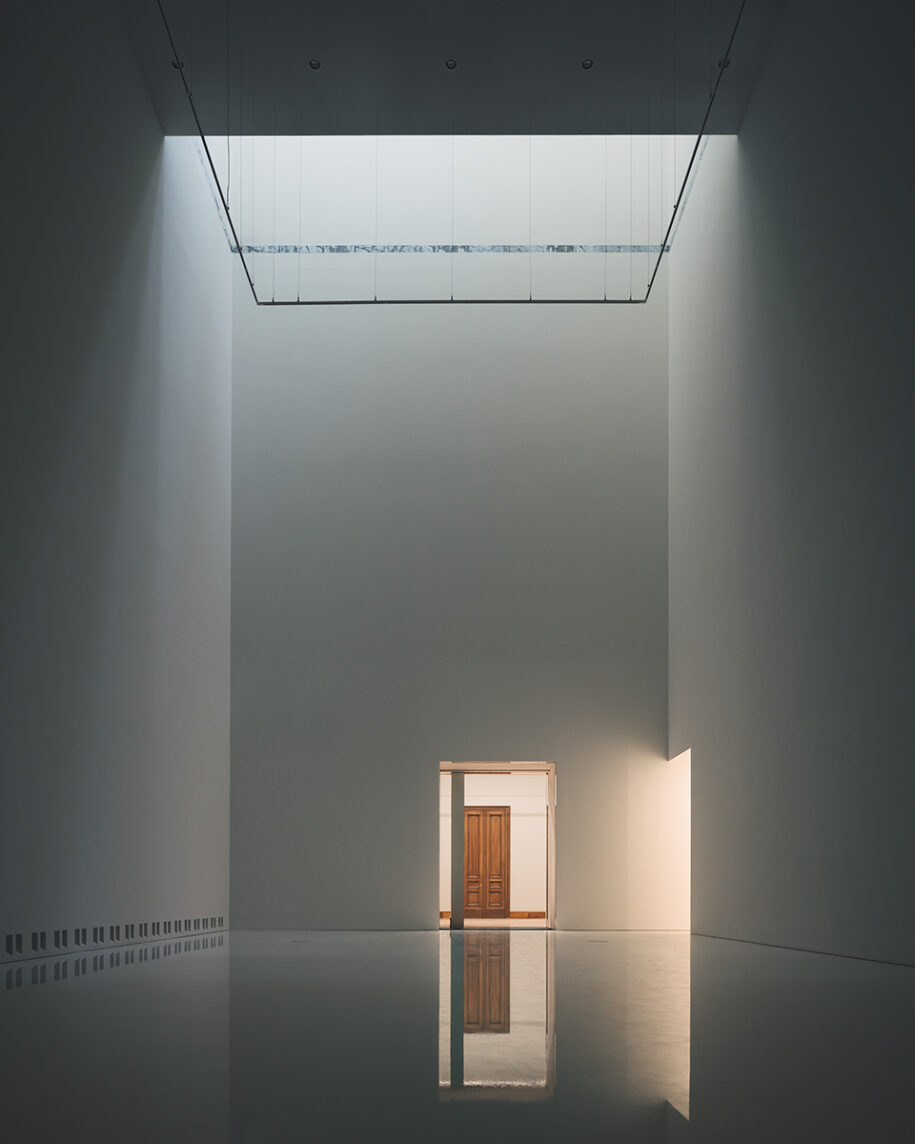
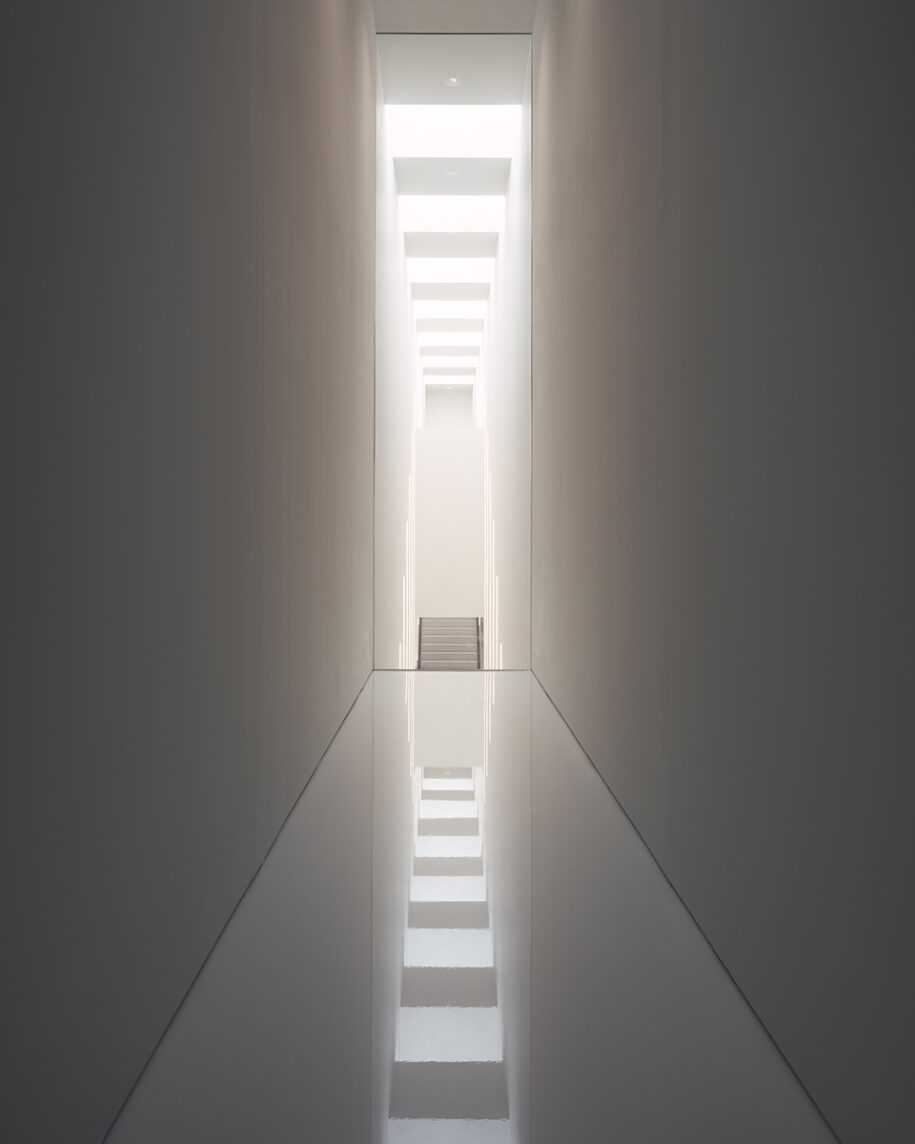
The experience is never predictable yet always in balance: both routes are challenging and designed to serve the art.
KAAN Architecten is currently working on the office spaces integrating the KMSKA structure, and Dikkie Scipio is additionally supervising the Masterplan at the museum. The renovation of the museum takes time. The completion of the construction phases 1 and 2 is certainly an important milestone. However, there are other important goals to reach before the museum will be able to open its doors to the public. These include: the renovation of the offices, operational testing of the climate system, scenography, the museum garden, moving in the artworks and the creation of a new art mosaic in the entrance. As such, the museum is not able to communicate an opening date at this time.
Diagrams & drawings
Facts & Credits
Project title Royal Museum of Fine Arts Antwerp (KMSKA)
Typology Renovation, Extension, Museum space
Location Leopold de Waelplaats 2, Antwerp, Belgium
Masterplan development period 2003—2010
Design phase January 2010 — ongoing
Construction December 2011 — ongoing
GFA 30.000 sqm
Architecture KAAN Architecten (Kees Kaan, Vincent Panhuysen, Dikkie Scipio)
Senior project leader Walter Hoogerwerf
Project team Valentina Bencic, Maicol Cardelli, Alice Colombo, Aksel Çoruh, Davis de Cos Roman, Sebastian van Damme, Paolo Faleschini, Raluca Firicel, Eva French i Gilabert, Michael Geensen, Narine Gyulkhasyan, Marco Jongmans, Martina Margini, Giuseppe Mazzaglia, Laura Ospina, Maurizio Papa, Ismael Planelles Naya, Giacomo Rizzi, Ralph van Schipper, Kim Sneyders, Koen van Tienen, Niels Vernooij, Martin Zwinggi
Fixed furniture KAAN Architecten, Rotterdam
Photography Stijn Bollaert, Karin Borghouts, Sebastian van Damme, Mediamixer
Check out, also, Utopia, a Library and Academy for Performing Arts in Aalst, Belgium by KAAN Architecten, here!
READ ALSO: Cork Oak House in Celorico de Basto, Portugal | Hugo Pereira Arquitetos
