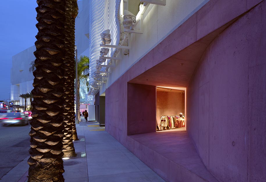
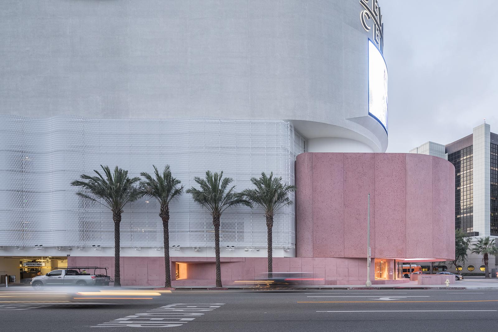
The Webster’s latest flagship store in Los Angeles, designed by Adjaye Associates , is a new 11,000 square feet ground-up retail development adjacent to the historic Los Angeles Beverly Center.
Juxtaposed beneath the monolithic eight story structure, The Webster elegantly asserts itself as a sculptural and experiential counterpoint to the Beverly Center’s retail experience. The cantilevered concrete facade references and reimagines the brutalist shell of the original existing building and is injected with a pink dye—an ode to the luminosity of California, where the Pacific light naturally amplifies saturated colors.
“ In the past five years I’ve started to work with a lot of saturated red and pink hues, which extends back to the early color experiments I did at the beginning of my career.” – Sir David Adjaye OBE
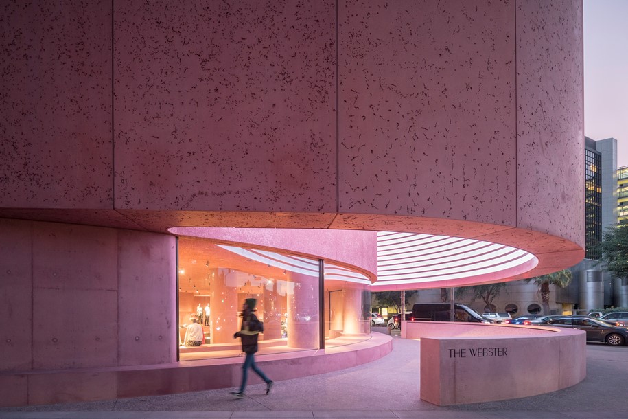
“Pink felt like fashion, but I wanted to make something that was tough and gentle at the same time.”
– Sir David Adjaye OBE
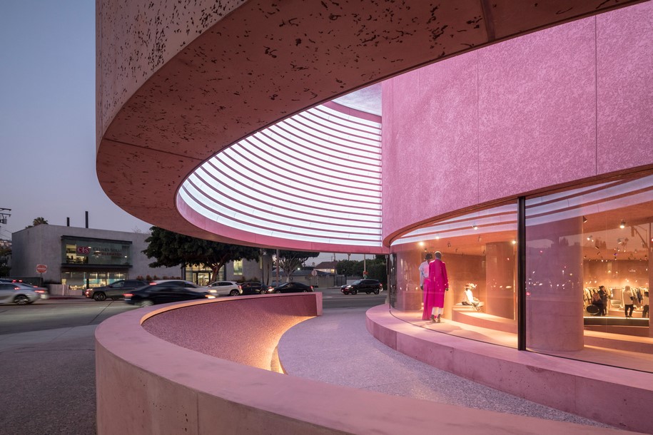
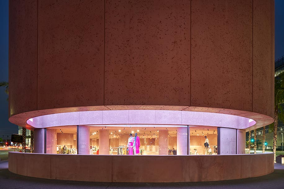
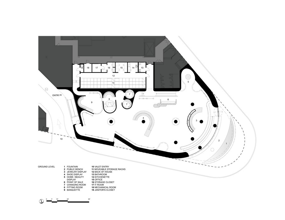
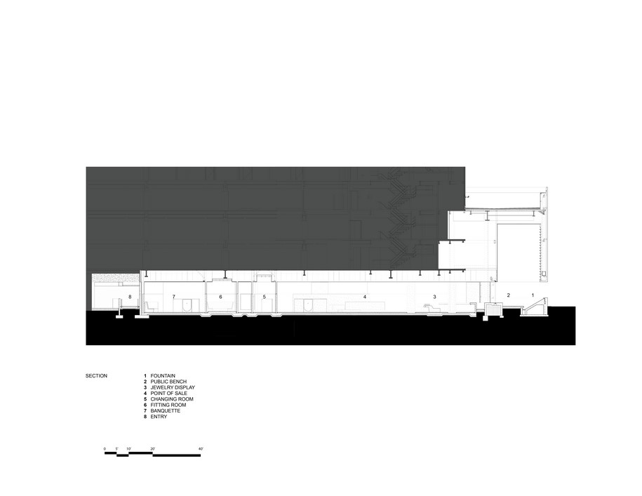
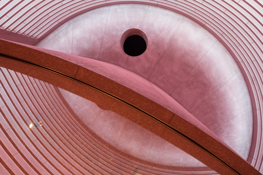 Encompassing square footage that was originally allocated for interior retail, The Webster establishes a new public space at the intersection of San Vincente and Beverly Boulevards. Featuring a digital art wall and a sculptural water fountain, the new public space cultivates an unexpected urban oasis. Visible only from the underside of the cantilever, the digital art wall spans its surface area to form an columnless portico with banquette seating. Both out of deference to and in defiance of Hollywood’s amplified digital culture, the art wall is intentionally low resolution at 1472 pixels wide and 20 pixels tall; it is a sculptural canvas that will debut bespoke art pieces commissioned by The Webster.
At the main entry, a panoramic window—comprised of three sheets of curved glass—creates an angular visual portal, dissolving the boundary between the public space and the retail inside.
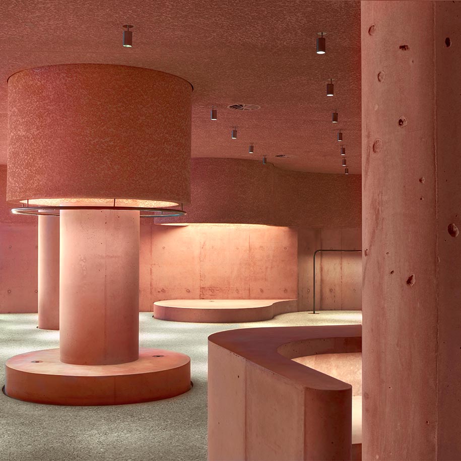
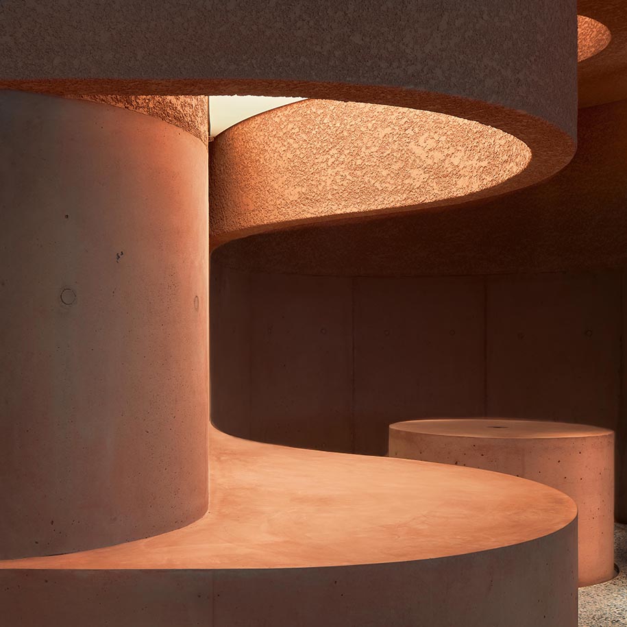
Conceived as a landscape of forms for display and inhabitation, the color and material palette of The Webster’s exterior identity continue into the interior.
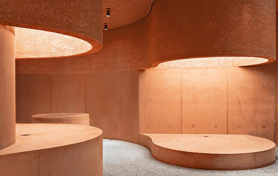
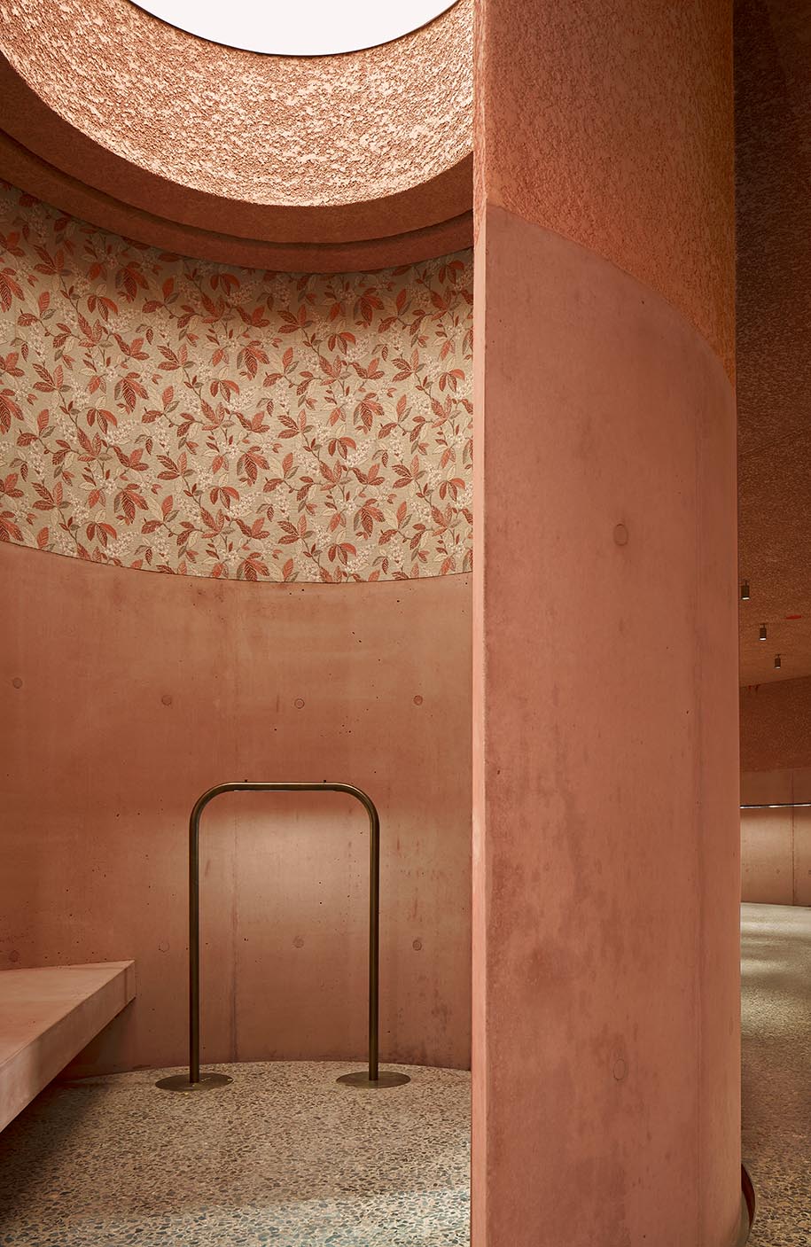
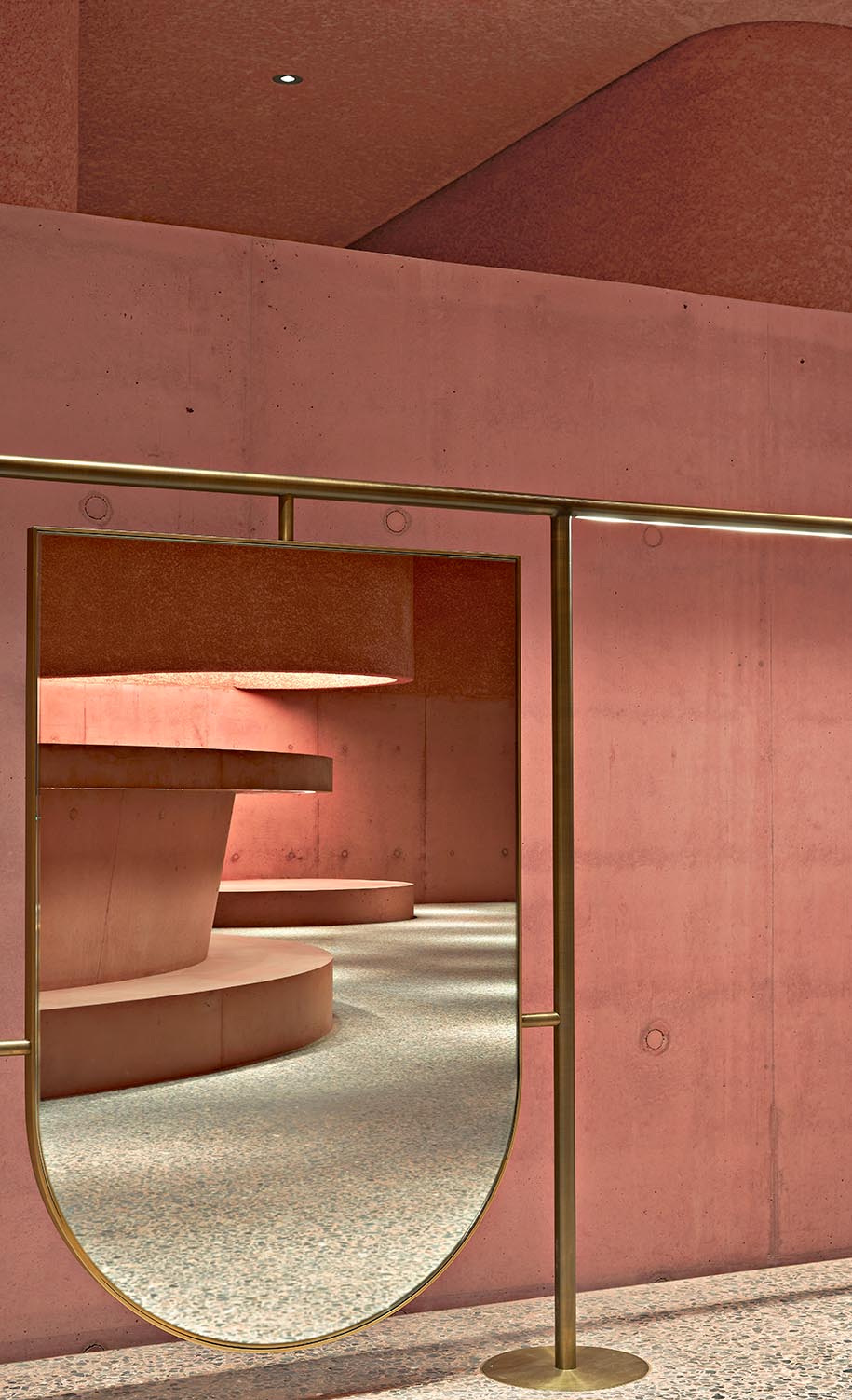
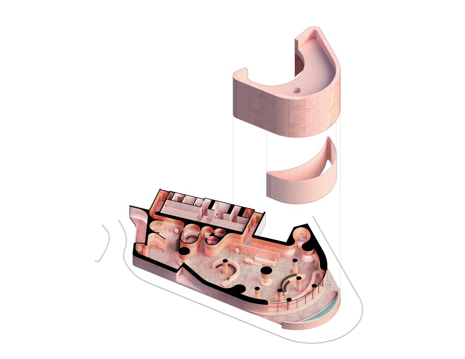
Oscillating between varying textures and types of concrete, the interior is akin to a sculptural field punctuated by cast-in place concrete columns and teardrop shaped display plinths, creating a series of vignettes for the curated merchandise on display.
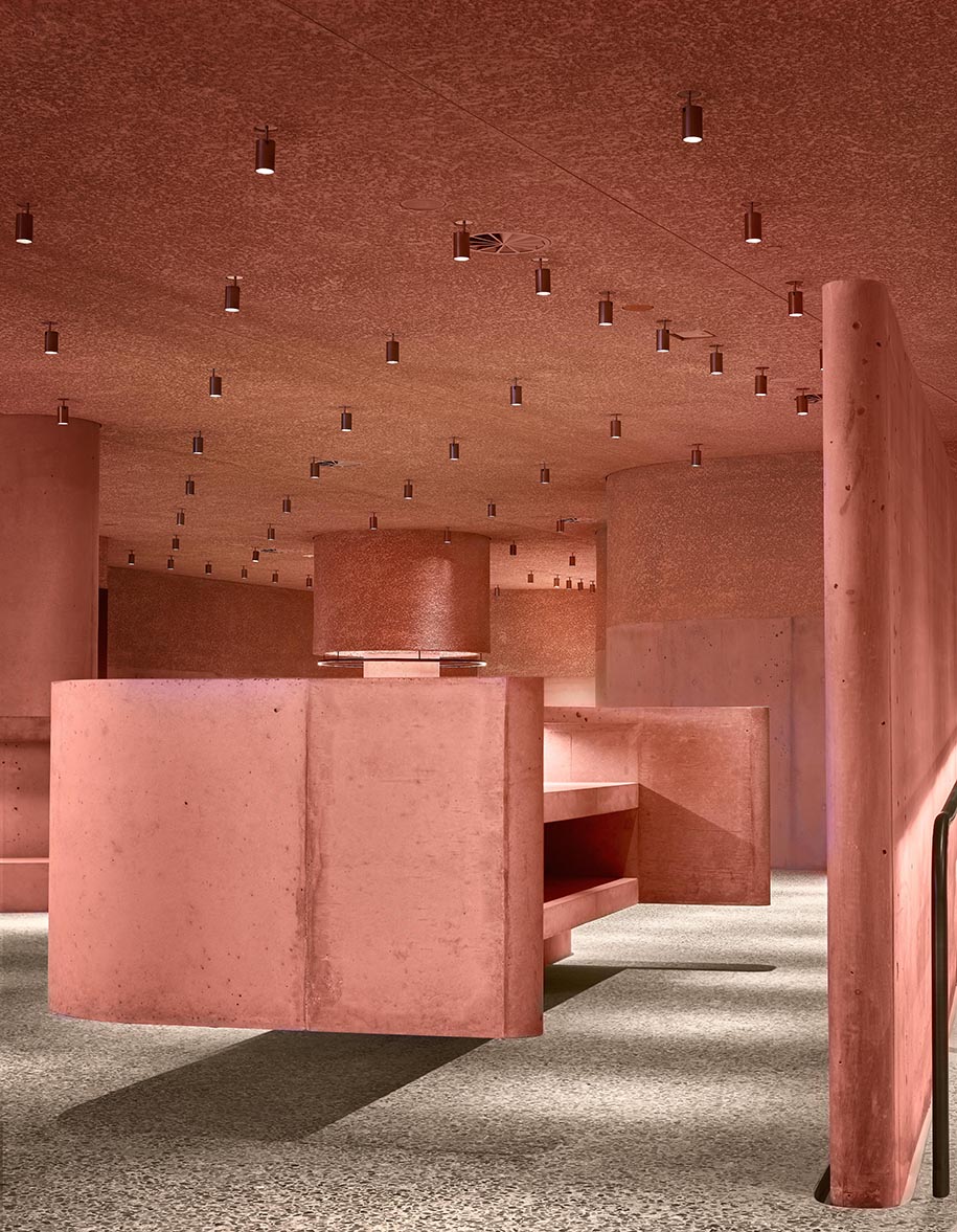
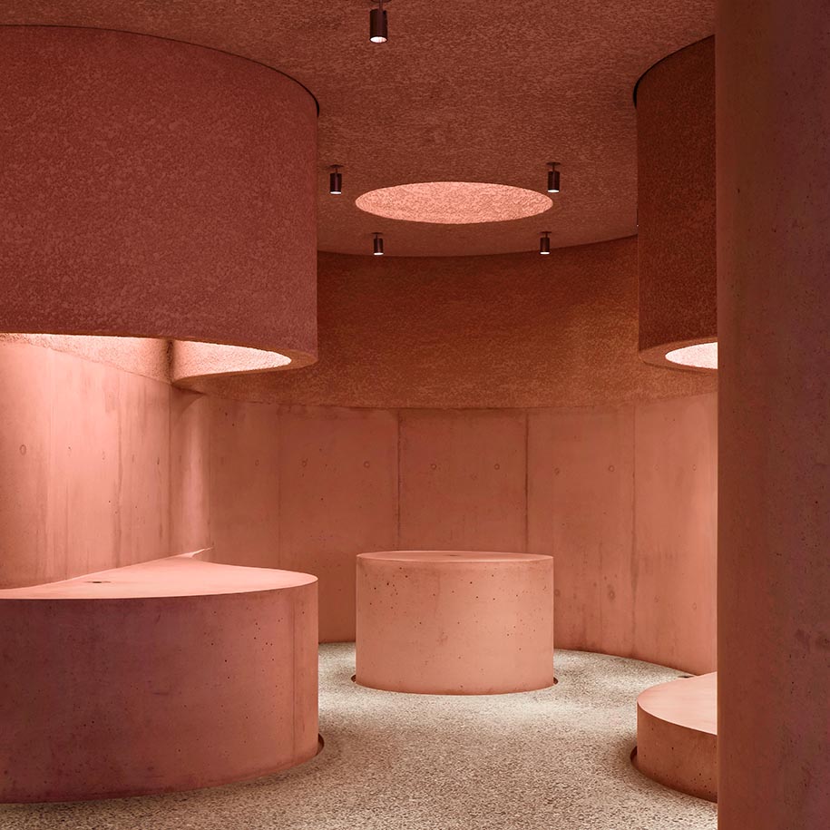 The ground concrete floor features black cherry marble fragments. Bronze framed mirrors and display racks line the perimeter. These interior finishes balance an appreciation for the sculptural beauty of the store’s sinuous form without detracting from the curated products on display.
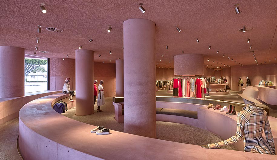
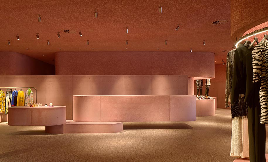 The upper walls of the fitting rooms are softened with vintage 1950’s wallpaper, sourced from the client’s personal collection.
Transcending the now dated transactional and commercial experience of most brick and mortar retail, The Webster offers a destination and experience not only for its clients but for the city of Los Angeles.
Plans
Facts & Credits
Project title The Webster
Architecture Adjaye Associates
Location Los Angeles, USA
Date 2020
Client Taubman Company / The Webster
Area 11K SF
Materials Cast-in-place concrete, precast, GFRC, Glass, Pyrok, bronze
Architect of Record Neumann Smith
General Contractor Jacobsen Swinerton Joint Venture
Civil Engineer Mollenhauer Group
Landscape Architect Grissim Metz Andriese Associates
Structural Engineers Ludwig Structural (Engineer of Record) Guy Nordenson Associates (Design Engineer)
Mechanical/Plumbing Engineers E & S Construction Engineers
Lighting Consultant Brian Orter Lighting Design
Electrical Engineer Swanson Rink
Concrete Consultant Reg Hough Associates
Facade Consultant Thornton Tomasetti
Water Feature Consultant Waterline Studios Inc.
Technology Consultant Standard Vision
READ ALSO: Architects Magdalini Gavriiloglou, Georgia Kotsari & Chrysanthi Skotara win 3rd prize in the Open Architectural Competition for the Cremation Center of Patras