Founded in 1941, Coach began as a leather goods retailer, displaying their products in a single row of library-like, wooden shelving that categorized their handbags and wallets. The brand`s repertoire has since expanded to include a full range of lifestyle merchandise including outerwear, footwear, jewelry, watches and sunwear, which are now sold in a variety of retail environments from specialty boutique to department store.
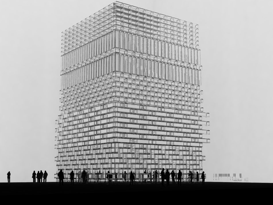
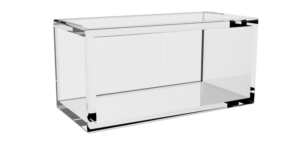
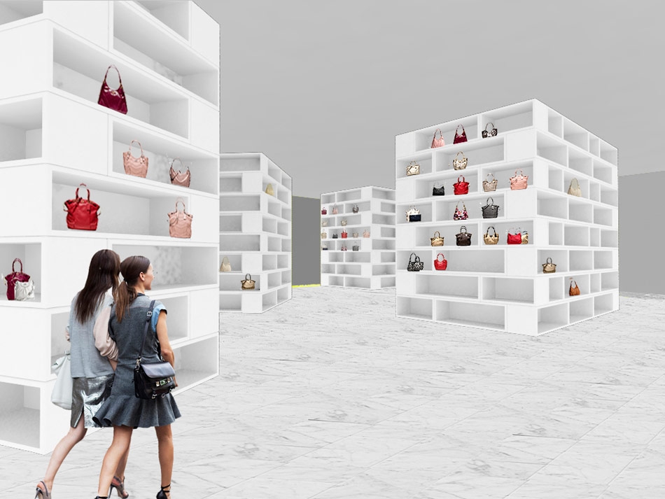
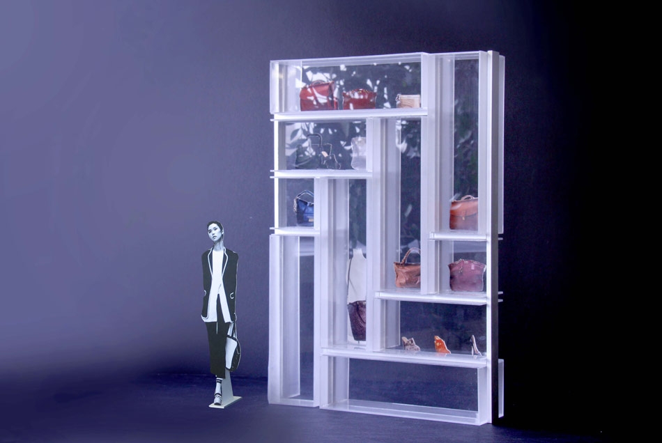
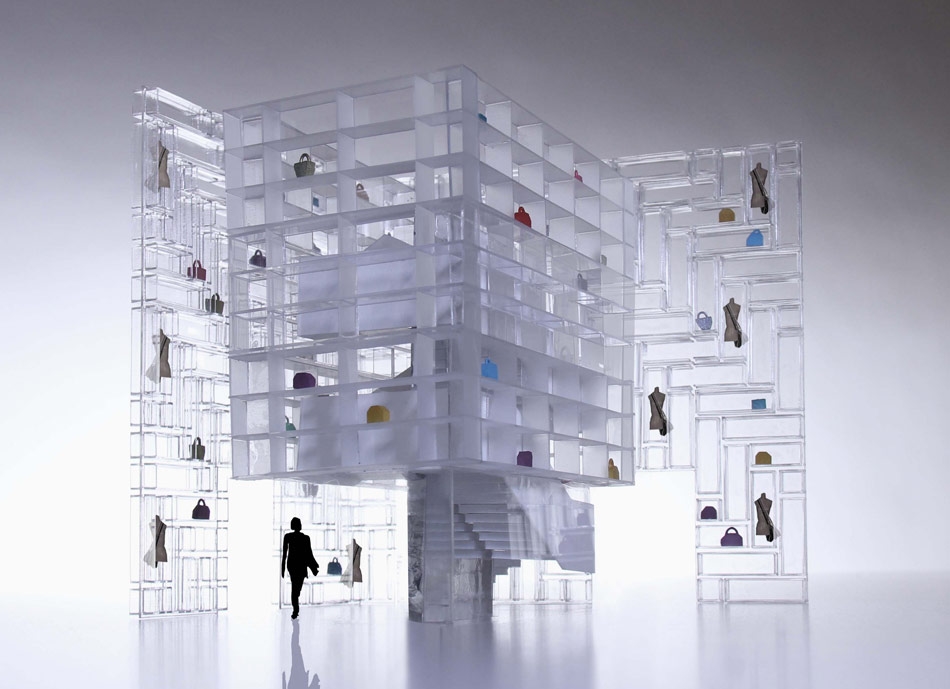
Inspired by the clarity of Coach`s original, systematic filing retail strategy, OMA designed a modular display unit that is flexible enough to accommodate the specific needs of each product and retail environment. The spatial possibilities of this highly functional system reinforce Coach`s mission to represent `logic and magic.` For a kiosk within Macy`s department store at Herald Square, display units were assembled into a floor- to-ceiling high, “V” shaped wall. Products appear to float in the acrylic units, while maintaining views to the accessories floor beyond.
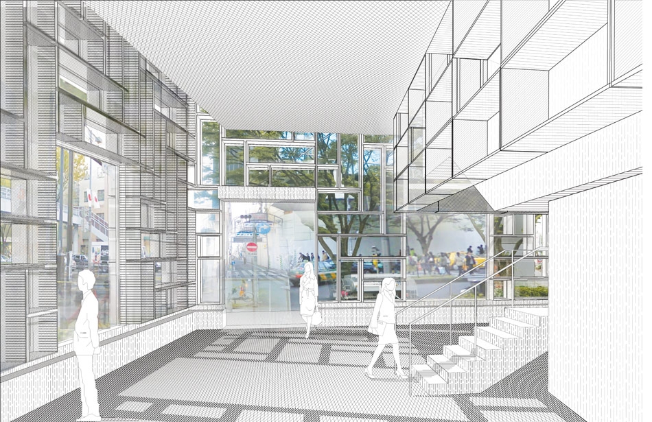
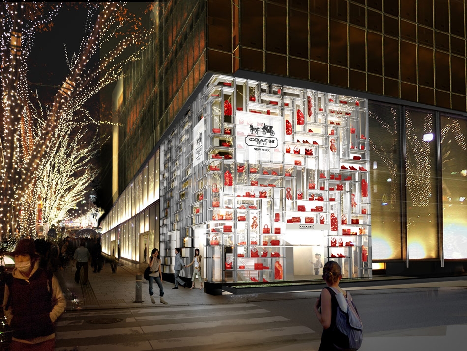
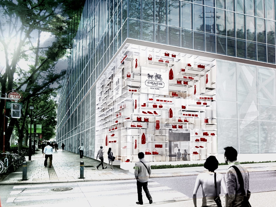
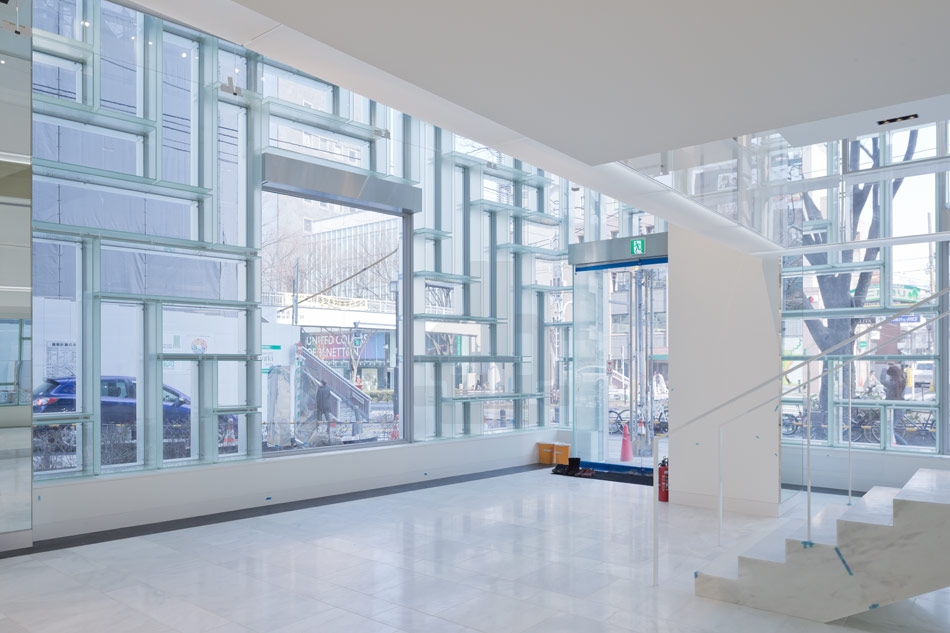
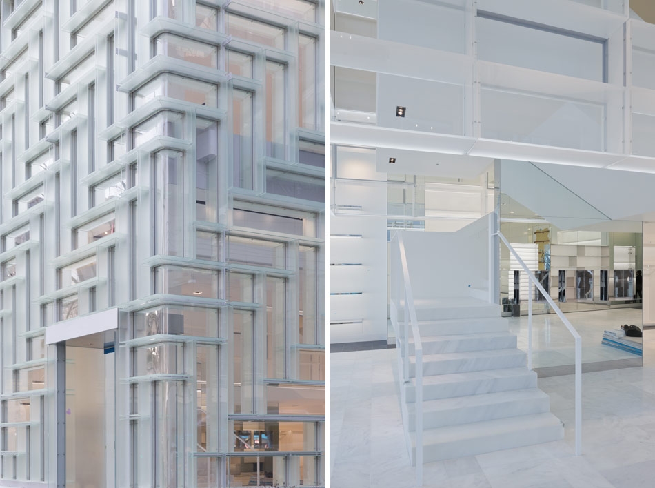
Coach`s ninth Japan flagship is a two-story, corner site on Omotesando, a prominent retail corridor in Tokyo. In comparison to the increasingly decorative elevations that characterize Omotesando, OMA`s design integrates display into the façade, seamlessly extending the brand`s presence from the inside out.
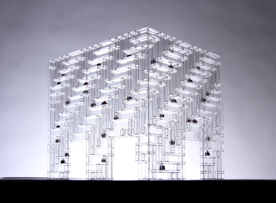
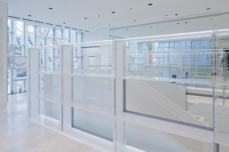
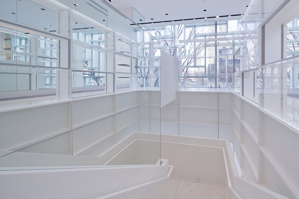
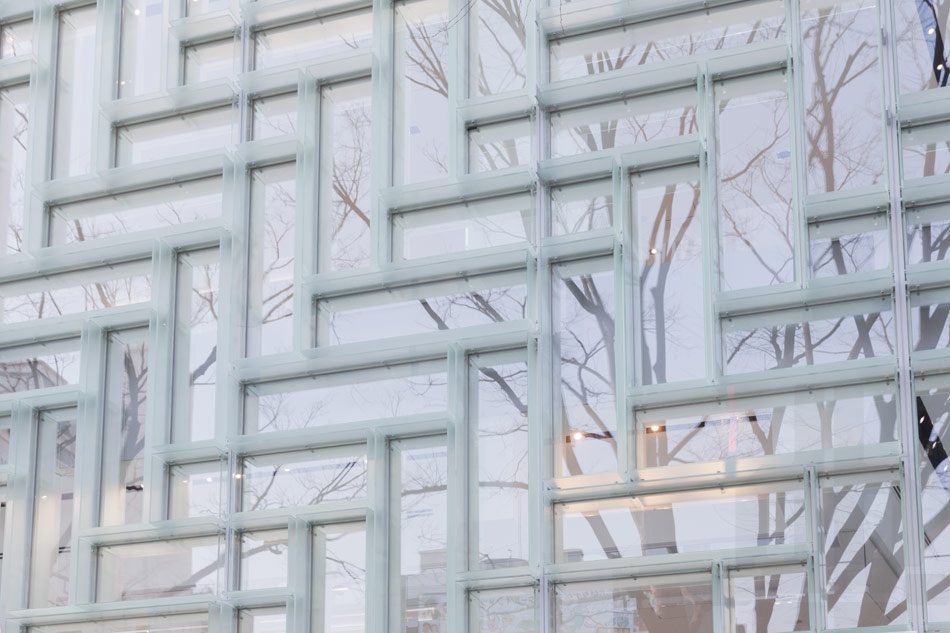
Dimensioned to accommodate Coach`s standard merchandising elements (ex. mannequins, busts, bags), the flagship`s basic display unit measures1800 mm x 520 mm. Frosted glass that provides interior shelving is further articulated to the exterior as louvers. The display units are configured in a herringbone pattern, assembled in vertical and horizontal orientation to facilitate a range of curation scenarios.
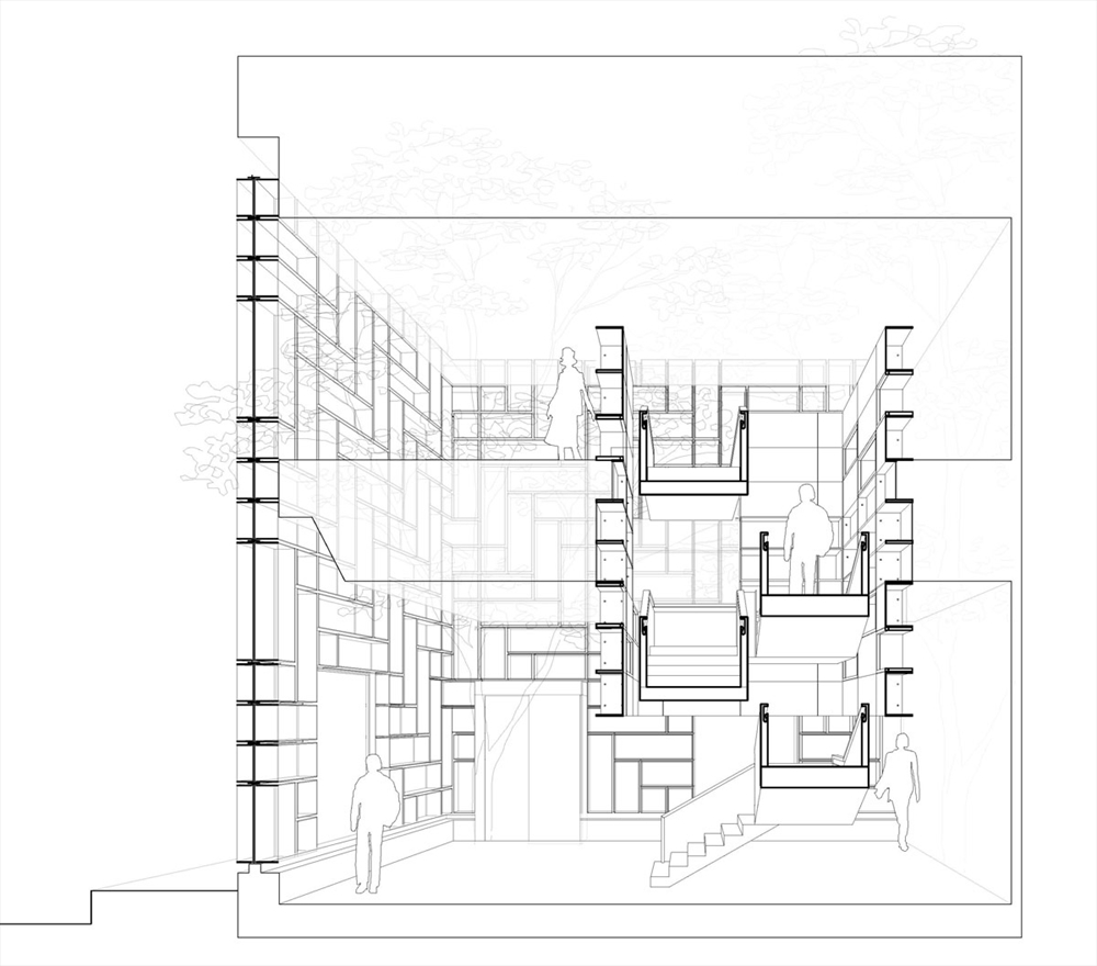
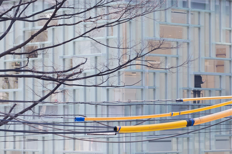
Viewed from the exterior, the double-height storefront presents an uninterrupted survey of Coach`s full collection in a single view, with a dedicated frame for each product. Viewed from the interior, the display unit`s translucency creates an active backdrop for merchandise, filtering Omotesando`s streetscape into the shopping experience.
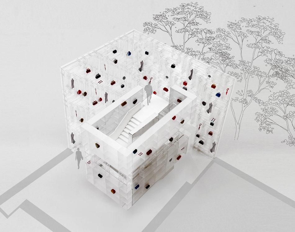
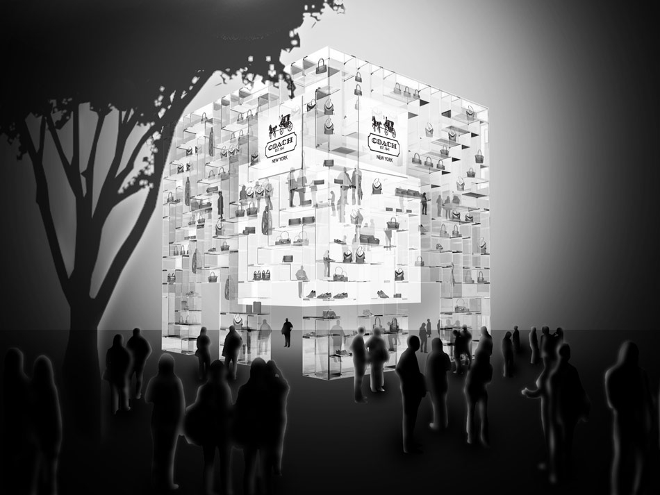
In addition to the façade, OMA designed a central core of acrylic blocks that provides second layer of fixed display. The floating tower of illuminated units encases the store`s circulation, drawing circulation up to the second level of the store, while maintaining urban views. Beyond increasing display density, the tower creates a spatial condition in which the shopper is continuously surrounded by product. In the evenings, the circulation tower acts as a lantern, illuminating the façade as a dynamic, 24-hour window display from within.
 BY OMA (C) ALL RIGHTS RESERVED
  BY OMA (C) ALL RIGHTS RESERVED
 BY OMA (C) ALL RIGHTS RESERVED
 BY OMA (C) ALL RIGHTS RESERVED
 BY OMA (C) ALL RIGHTS RESERVED
 BY OMA (C) ALL RIGHTS RESERVED
 BY OMA (C) ALL RIGHTS RESERVED
 BY OMA (C) ALL RIGHTS RESERVED
 BY OMA (C) ALL RIGHTS RESERVED
  BY OMA (C) ALL RIGHTS RESERVED
 BY OMA (C) ALL RIGHTS RESERVED
  BY OMA (C) ALL RIGHTS RESERVED
 BY OMA (C) ALL RIGHTS RESERVED
 BY OMA (C) ALL RIGHTS RESERVED
 BY OMA (C) ALL RIGHTS RESERVED
 BY OMA (C) ALL RIGHTS RESERVED
  BY OMA (C) ALL RIGHTS RESERVED
 BY OMA (C) ALL RIGHTS RESERVED
READ ALSO: OUTPOST / OLSON KUNDIG ARCHITECTS