Pelletier de Fontenay renovated Marconi Residence in Montréal, Canada taking advantage of the unusual urban surrounding, composed of garages, train tracks, and an adjacent laneway, while creating a patio as the heart of the new intervention, a focal point around which the domestic life evolves, a central node articulating every spatial transition.
-text by the authors
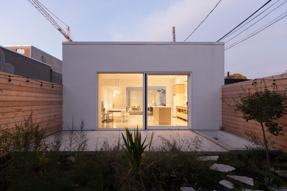
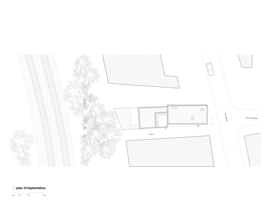
Situated in the eclectic Marconi-Alexandra neighbourhood, the project takes advantage of unusual urban conditions such as surrounding garages, train tracks, an adjacent laneway. Rather than being seen as negative, these elements are incorporated to the project beneficially.
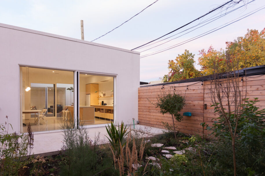
A unique urban context
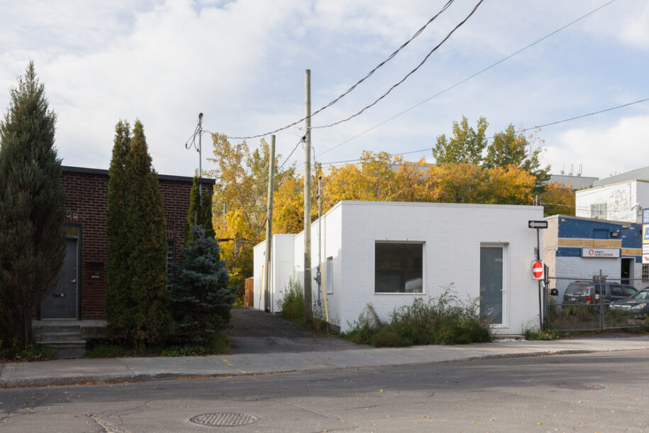
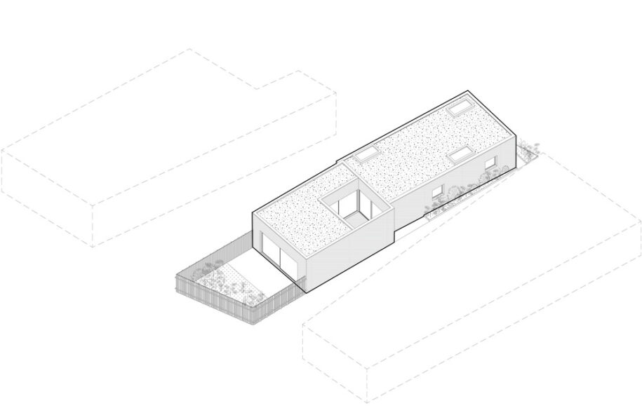
On Marconi street, scattered residences punctuate an urban fabric essentially composed of car repair shops, small industrial buildings and workshops. Built in 1910, the original building was a typical Montreal one-storey bungalow with a flat roof, commonly referred to as “shoeboxes”. Despite being located in an area where housing is prohibited according to the zoning plan, the house had a vested right to be modified or extended. The client’s request was to renovate the house and expand it to accommodate a small family. A number of factors led to the decision of preserving the existing one-storey volume of the building. First, it was important to maintain the sequence of aligned shoeboxes present on the street. Secondly, “shoeboxes” as a typology are slowly disappearing from the city’s landscape and being replaced with denser two to three storey buildings. The project was an opportunity to develop an alternative approach for these types of one storey buildings. Therefore, despite the proximity of the train tracks in the back, the addition takes advantage of the depth of the lot rather than its height.
In fact, the close relation to the train tracks is used as a positive element. The rare trains that pass by bring a cinematic effect to the house. The animation, both visual and acoustic, is welcomed. Each passage of a train becomes a marker, an event punctuating daily life. This moving landscape is embraced and theatrically framed by the big aperture in the back facade.
Home is where the patio is
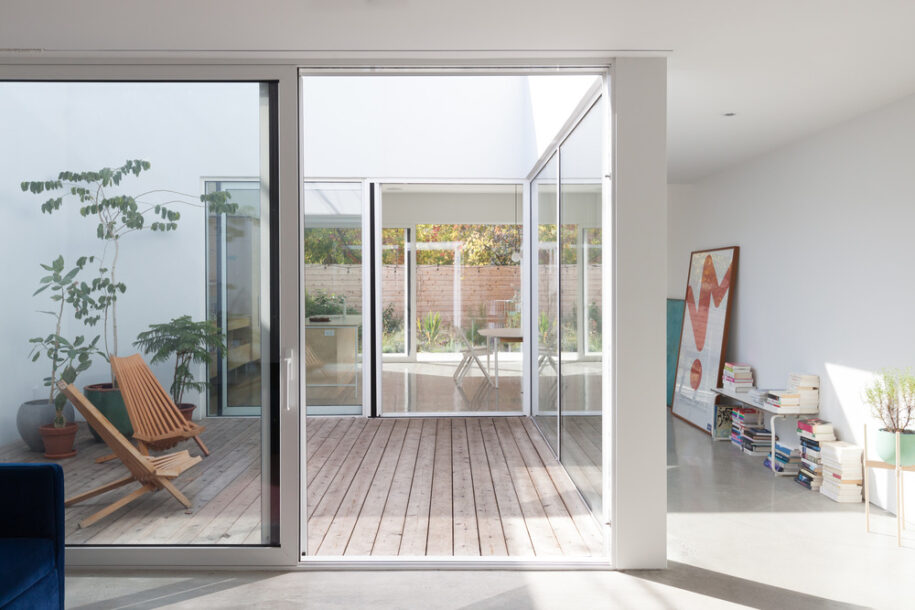
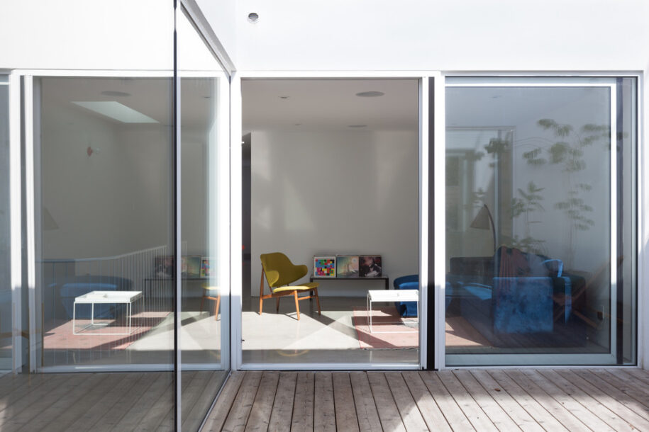
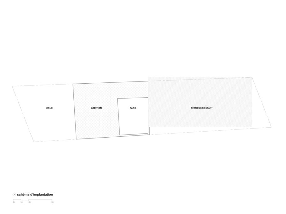
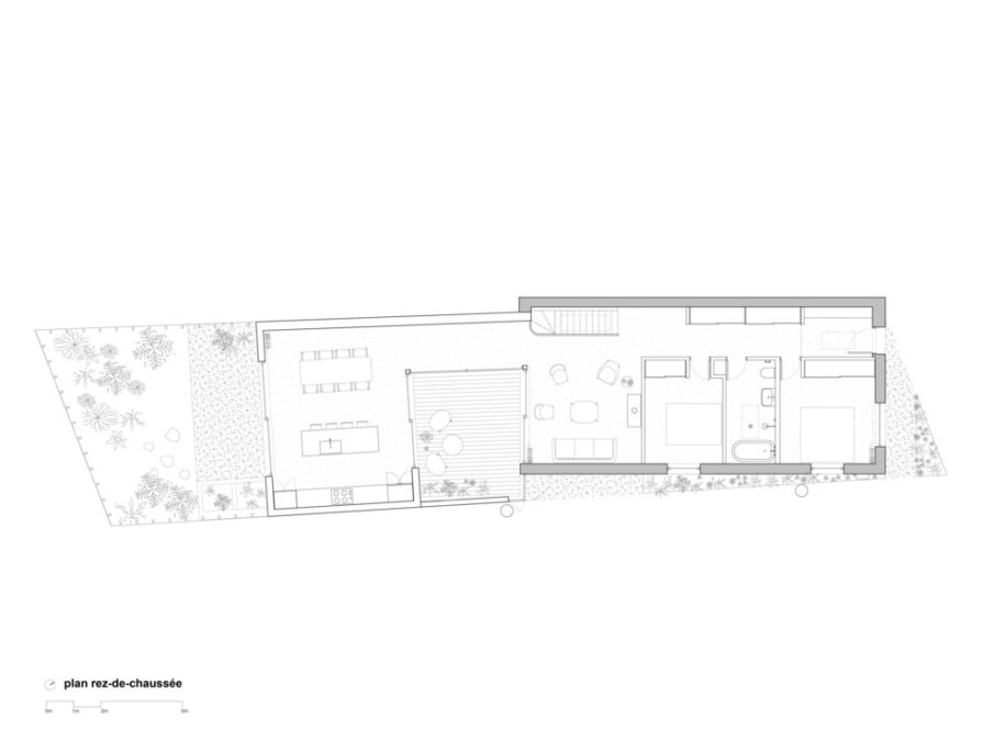
While the clients were immediately seduced by the buzzing energy of the site with garages on one side, trains on the other and the laneway along the southern edge of the lot, it seemed important to create a place to escape the constant stimulation emanating from the surrounding context. By distancing the addition from the existing structure, a void was created at the center of the house. This void creates a physical and visual gap, a pause between old and new, a new heart of the house. It is both a place to isolate from the street and a place for concentration and introversion. The extension filters exterior stimuli and acts as a sort of acoustic and visual buffer between the tracks and the patio.
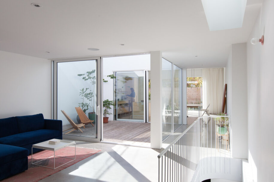
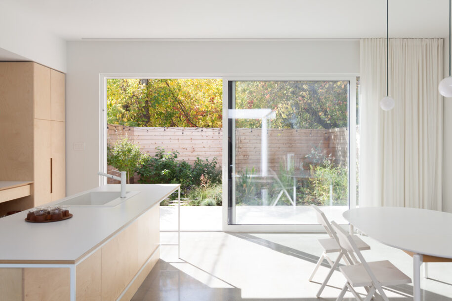
The house thus becomes a spatial gradient where one can choose their position according to their mood and needs. The two courtyards have entirely different identities: the backyard opens itself up to a lush garden and the wild vegetation along the railroad tracks, while the interior patio is introverted, abstract and devoid of planted vegetation.
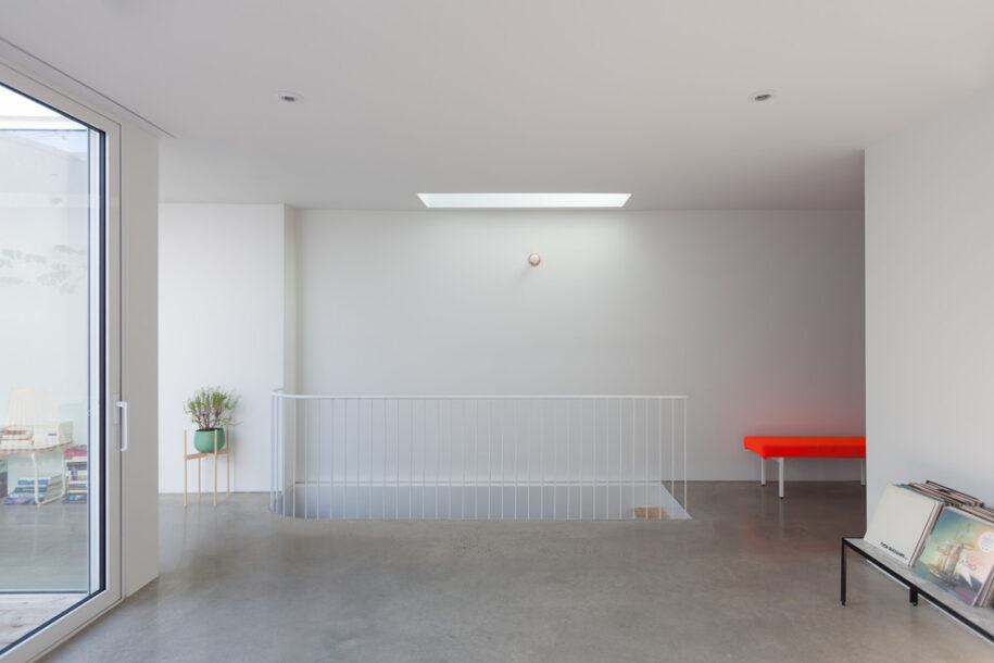
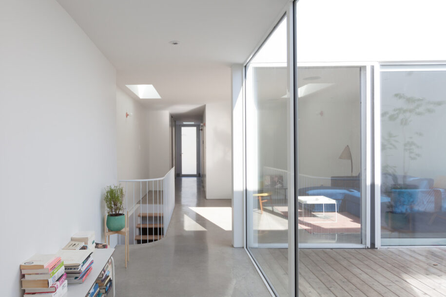
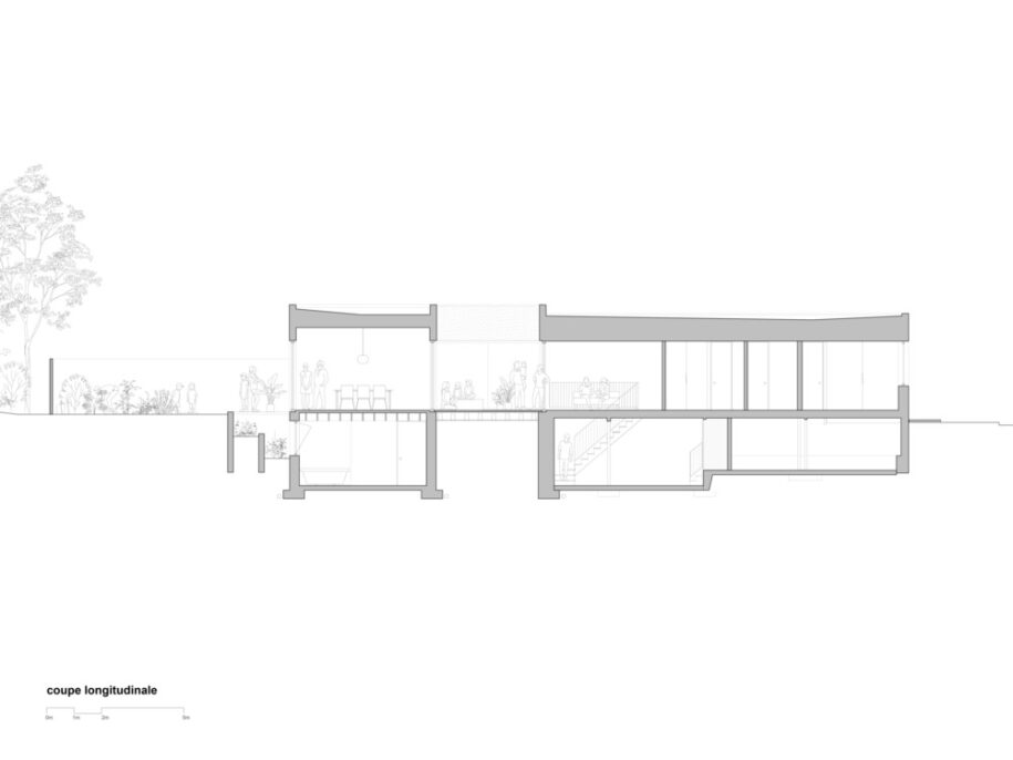
The interior living spaces are placed on either side of the patio, making it a focal point around which one revolves throughout the day, a central node articulating every spatial transition. The extensive glazing around the void allows light to penetrate deep into the house. Large sliding panes of glass on each side of the inner courtyard create a fluid passage from the living room, through to patio, through the kitchen and to the rear garden. When all operable panels are in open position, the inner courtyard becomes an extension of the inner space and can fully participate in the intimate life of the house.
Using the jagged lot limits as an opportunity to articulate the house
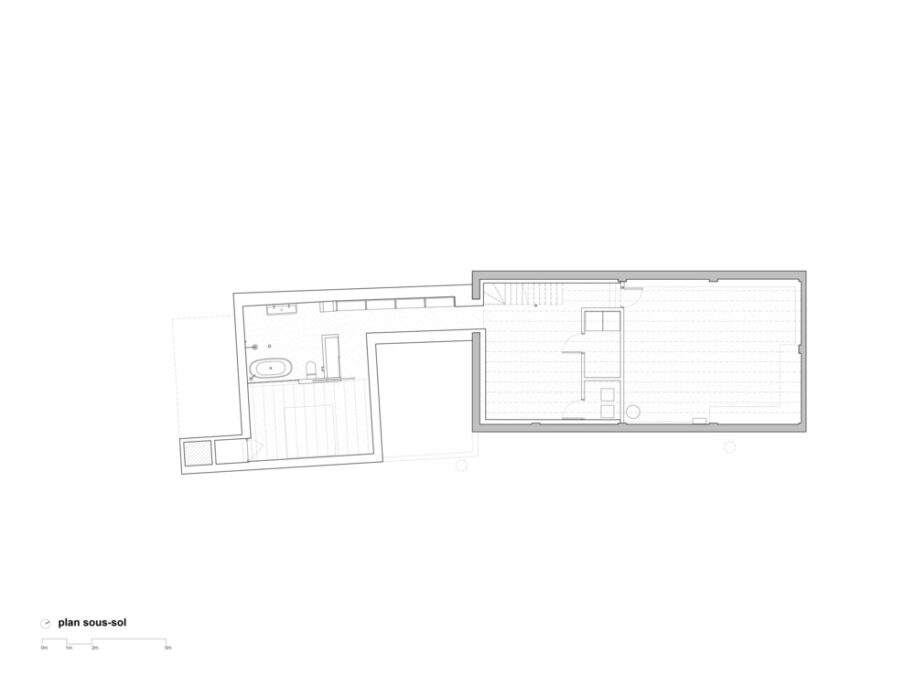
At first glance, the disalignment between the original house and the addition could be seen as a formal decision. In reality, this break was generated by the desynchronization between the official cadastral limits and the actual position of the original house. On the north side of the lot, the wall gradually deviates from the property line to encroach 400mm onto the neighbouring property. The addition, however, had to be built directly on the actual property line thus creating a break in the north party wall. The plan takes advantage of this articulation to mark the programmatic transition from the living room and the passageway to the kitchen. The staircase leading to the basement is also carefully inserted in this central corridor.
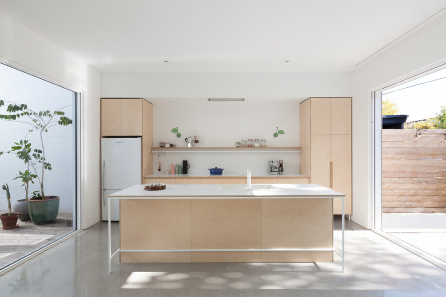
At the southern edge, along the laneway, a past reallotment had added a small triangular parcel to the buildable site. This small piece of land was just wide enough to create an opening onto the patio from the laneway, an opportunity seized in order to activate the inner courtyard. An additional door at the corner of the patio creates a second entry and establishes a direct connection between the house and the alley. In hindsight we can say that site constraints, both urban and regulatory, became the conceptual catalyst of the project.
Internal organization
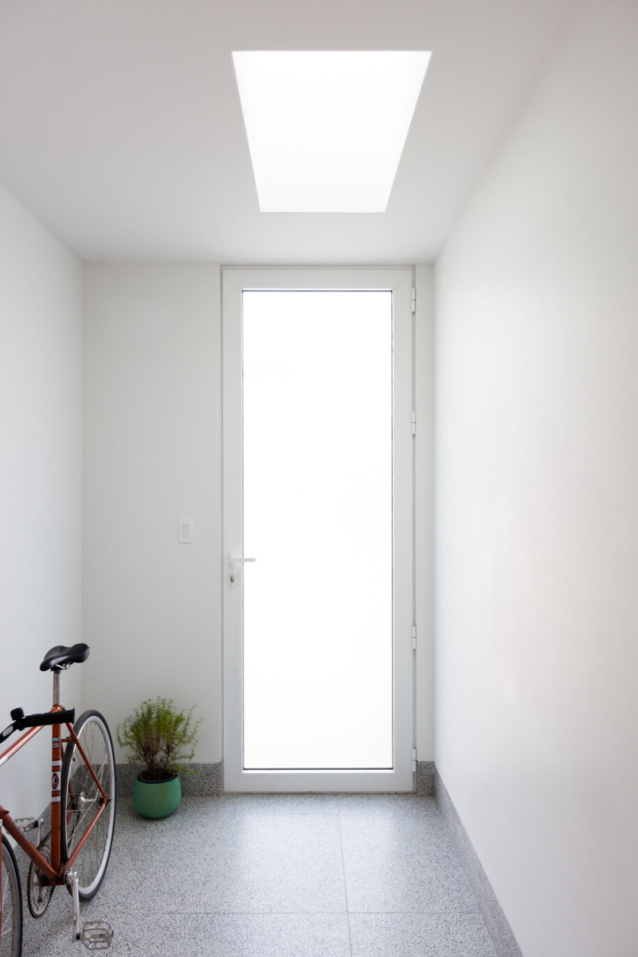
The main entrance is situated at the northeast corner. A tall frosted glass door opens onto a small mud room where the existing floor was sunk, an adaptation of the Japanese Genkan which controls the dissemination into the domestic space of dirt and small gravel that plagues Quebec streets in the winter. A skylight punctuates the space, creating a more formal threshold and lighting up the perspective of the entrance when seen from the living area. The ground floor is otherwise occupied by a bedroom, a bathroom, and an office. The office, a writing room, features a big square window with a frontal view of Alexandra street. A second skylight placed above the staircase brings natural light all the way down to the basement.
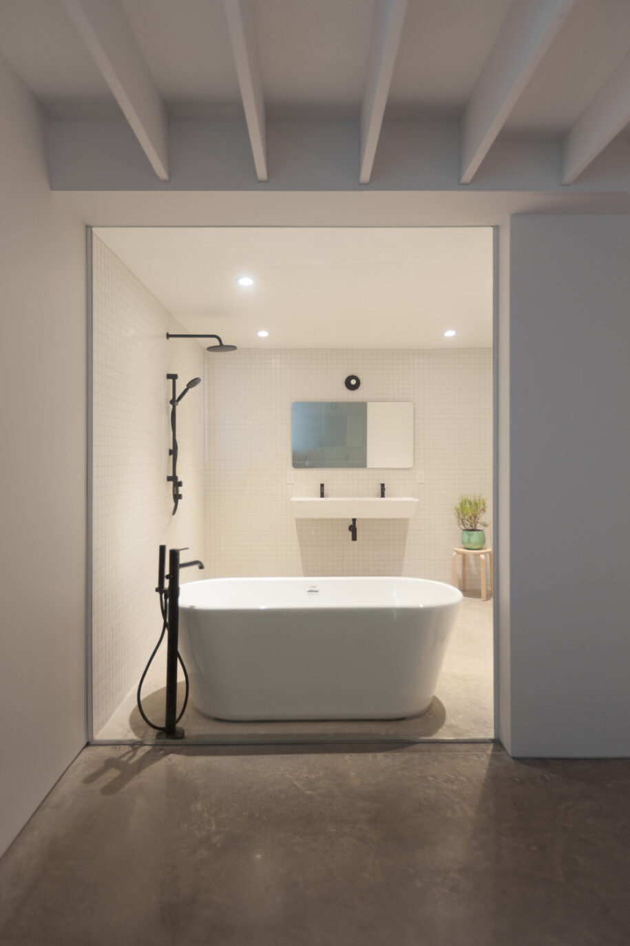
The basement under the original house includes a family room and a large storage area. The master suite is placed below the newly built addition, slightly removed from living areas. Despite being underground, generous natural light comes into the room from a large light well in the backyard. The master bathroom is separated from the bedroom by a large glass pane that allows indirect natural light to come in, while also framing scenes of intimate daily life.
Materiality
The restrained palette of materials used for the exterior and the interior supports the conceptual clarity of the project while also acknowledging economic imperatives. The white stucco used for the addition reinforces the simple geometry and abstract nature of the project. The red brick of the original house was painted white in order to create a homogeneous feel throughout the house. The interiors are simply painted white, keeping the emphasis on the client’s numerous objects, books and art. The concrete floor, present on both levels of the house continue into the backyard, creating an exterior extension of the living spaces between the garden and the back facade.
Another typology
The patio is a year-old typology dating back to the roman era and present in many different cultures. It is however more often associated with warn climates, than nordic ones and is remarkably largely absent from Quebec’s and more specifically Montréal’s architecture. The patio constitutes the main conceptual driver of the project. It is introduced at the heart of the house to add spatial and perceptual complexity in an otherwise simple and frugal space.
Drawings
Facts & Credits
Project title Residence Marconi
Location Mile-Ex, Montréal, Canada
Date 2017-2019
Area (gross) 263m2
Architecture firm Pelletier de Fontenay
Partner in charge Hubert Pelletier
Team Hubert Pelletier, Yves de Fontenay, Yann Gay-Crosier
Structural engineer Lateral
Construction Construction FRX
Photography Pelletier de Fontenay
READ ALSO: "LYCABETTUS PAN.ORAMA" open concept design architectural competition | Entry by Plaini and Karahalios Architects & MSB Landschaftsarchitekten