Kanpo arquitectos took over the design of Midegasa offices. Midegasa is a family company with a long history in the supply of special raw materials. Founded in 1900, it has been in business for five generations and currently has several plants in the north of Spain and its headquarters in Asteasu, Gipuzkoa. This is where its offices are located, occupying a space on the first floor inside a large industrial building where materials are stored and bagged. The space takes the form of a closed box within the larger volume of the pavilion and is developed in a U-shaped floor plan, the result of the extension of the central area with two side wings towards the interior.
The original offices had several problems that led to the need for a comprehensive refurbishment. On the one hand, the lack of natural light, due to the shape of the floor plan, in which only the central part next to the façade was illuminated, leaving the two side wings underused. On the other hand, insufficient thermal insulation meant that they were very cold in winter and hot in summer, making it a totally uncomfortable space for the people who worked there.
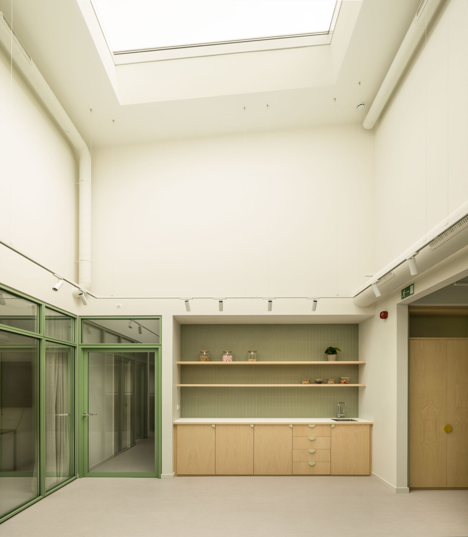
Their request was very clear: on the one hand, they wanted a space with more light and more cheerful, reflecting the positive character that is breathed in the team, and on the other hand, we had to solve the problem of thermal comfort that they were suffering. We decided to approach the project with the proposal of introducing natural light through two large skylights where the natural lighting of the façade did not reach. In this way, we were able to illuminate the two wings of the “U” and increase the area of use.
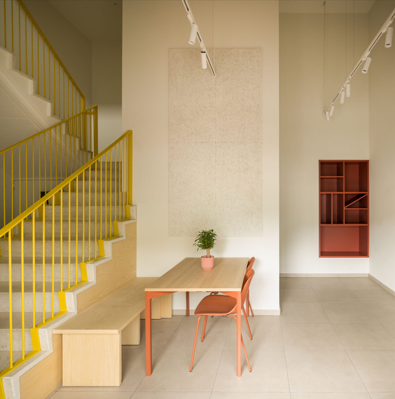
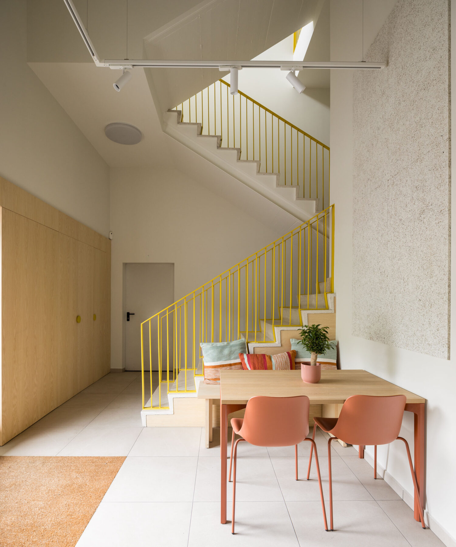
The two skylights were placed at the ends, breaking the roof of the office “box” and reaching vertically to the roof of the pavilion at these two points and at a third, which will configure the entrance hall. These three key points within the space are linked by a linear route that tells visitors about the work being done and the centenary history of the company. Access from the outside is from the ground floor, where a small meeting area has been installed to receive quick visits next to the cupboard designed for parcels, and from here the main floor is accessed via the stairs or the lift, which have also been renovated.
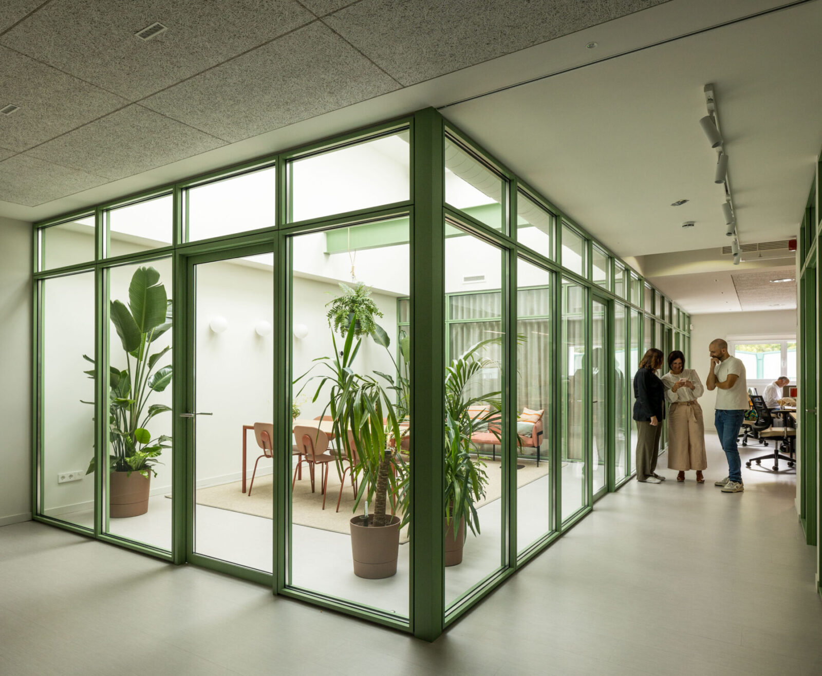
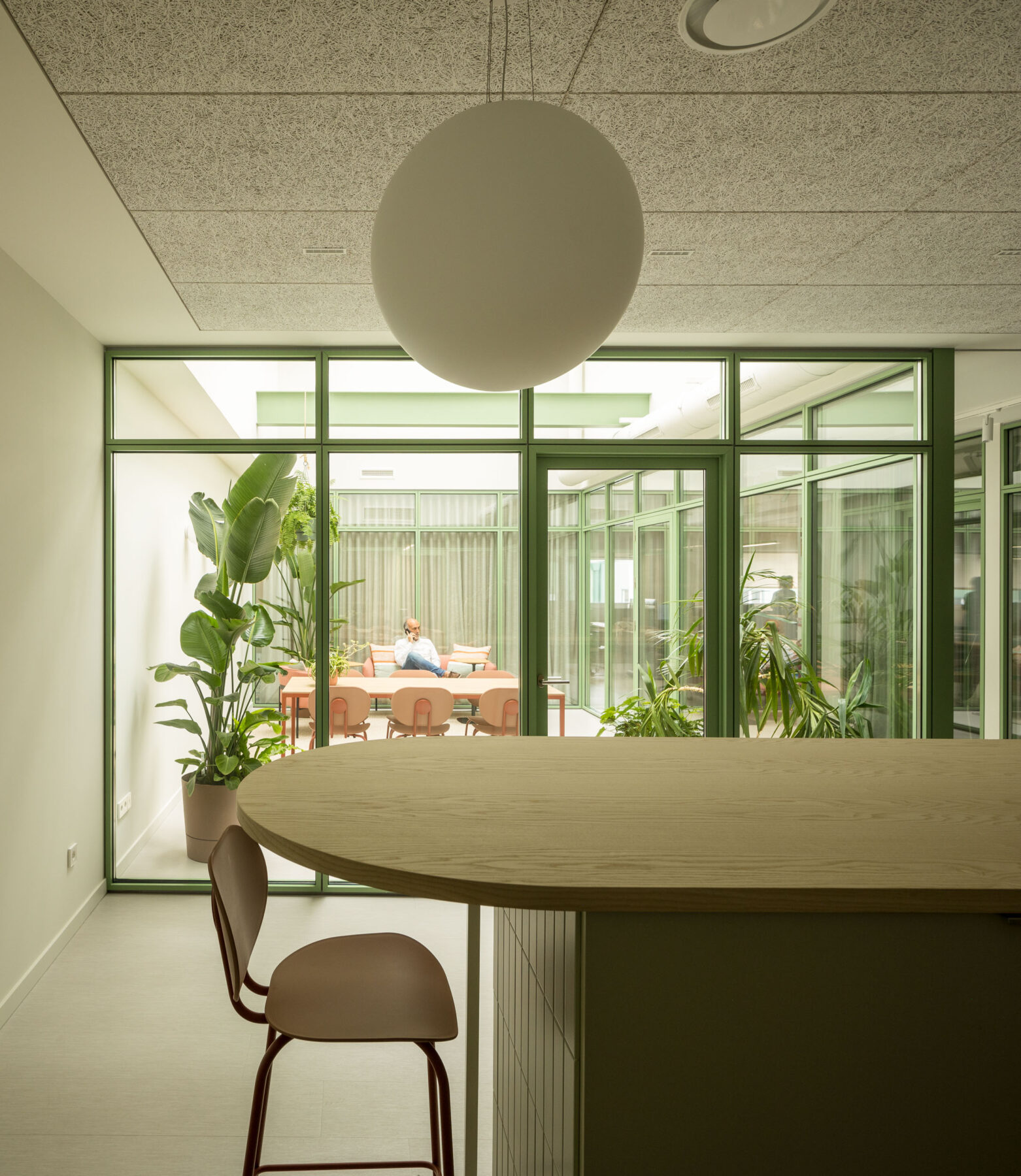
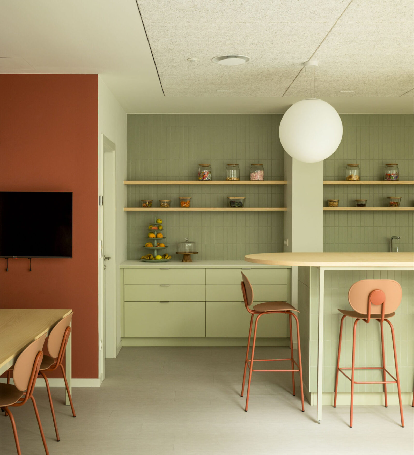
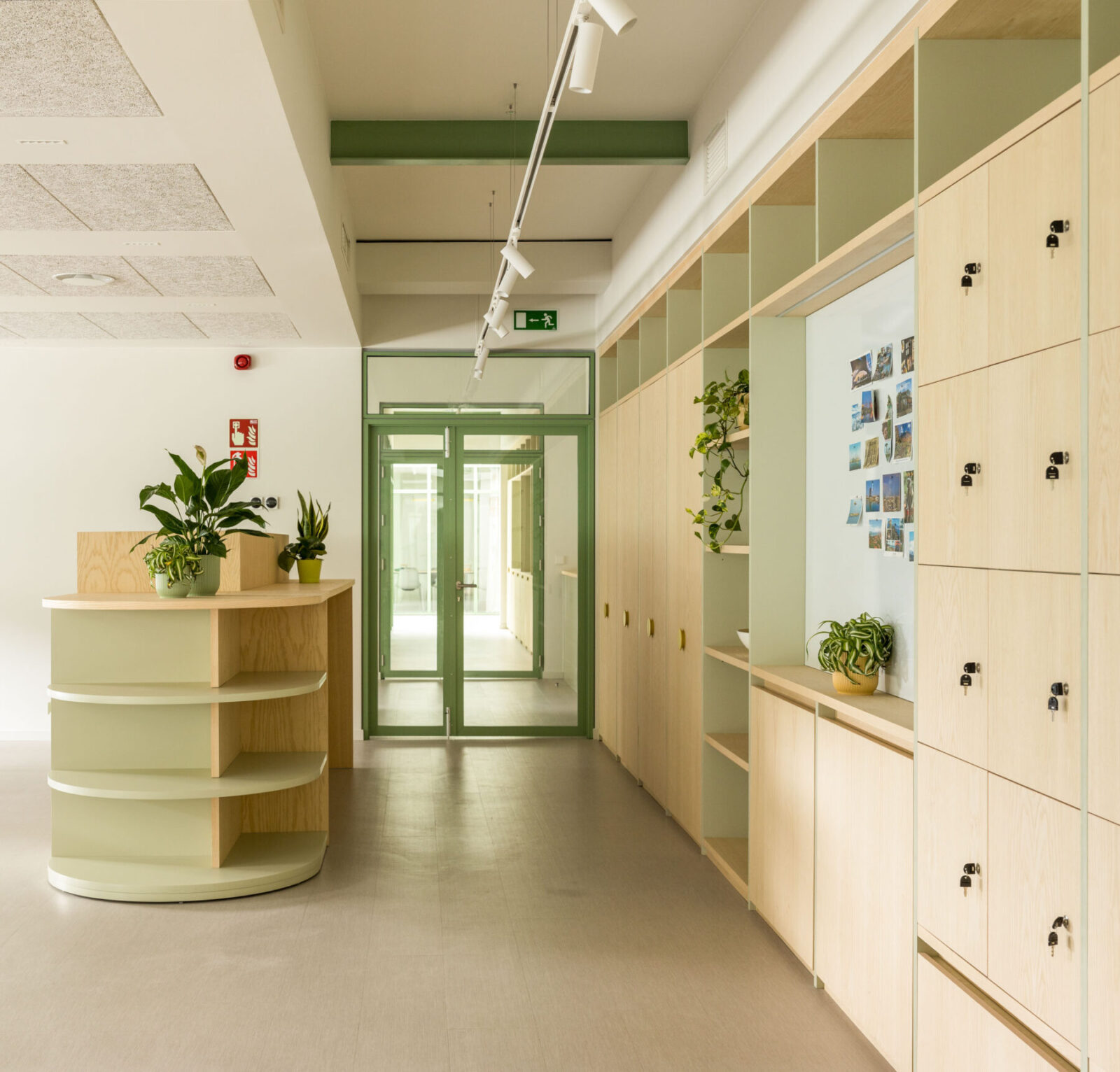
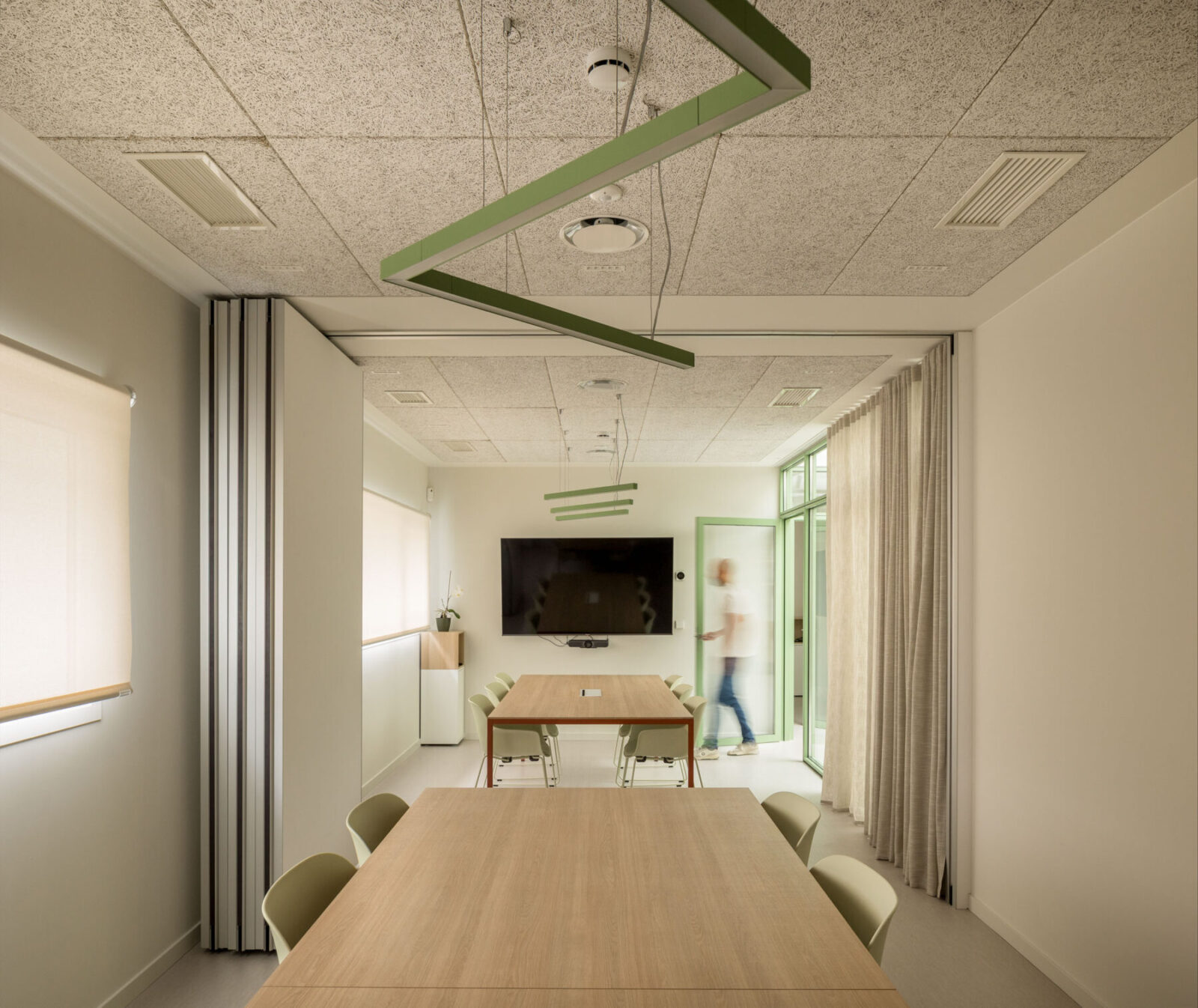
On the main floor, on the first floor, there is a distributor that welcomes all visitors and where a display wall has been installed with the different materials they sell. This distributor divides the floor into two areas: to the left, the meeting area and to the right, the work area. The meeting area is configured around a vertical and luminous space under the skylight, which distributes the rooms and contains a coffee area for visitors. Five meeting rooms with different capacities and characteristics have been designed to meet the different needs and types of meetings held in the company. This area also contains the toilets and the archive.
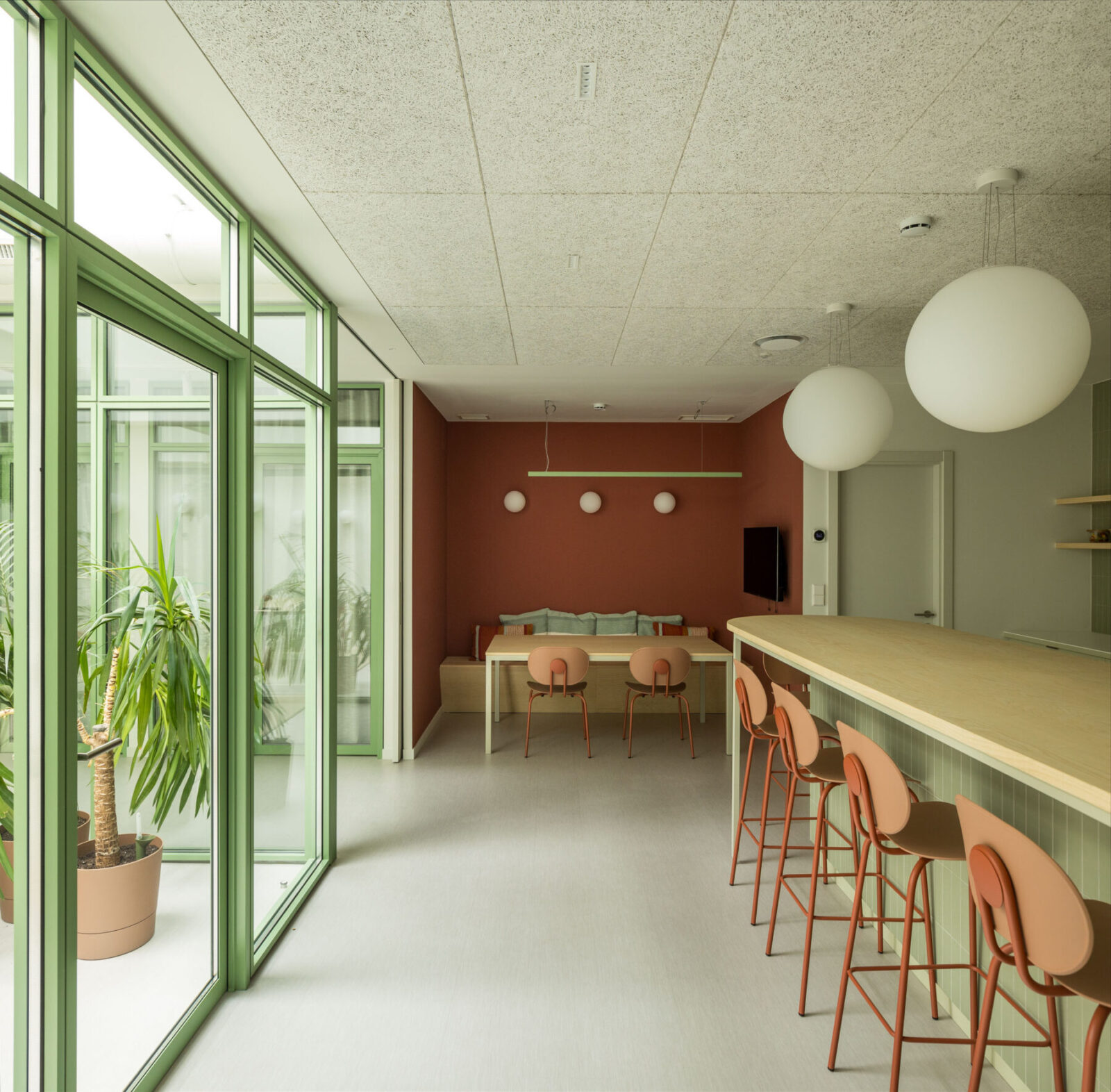
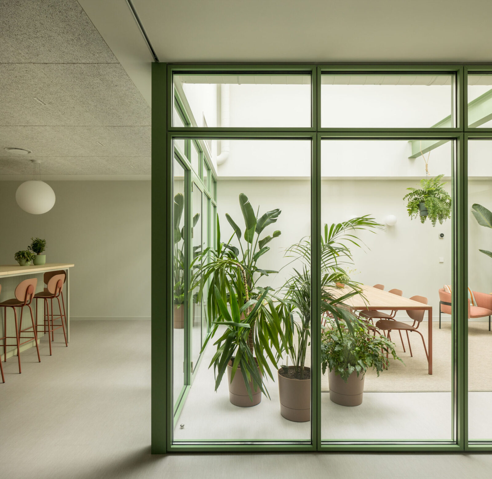
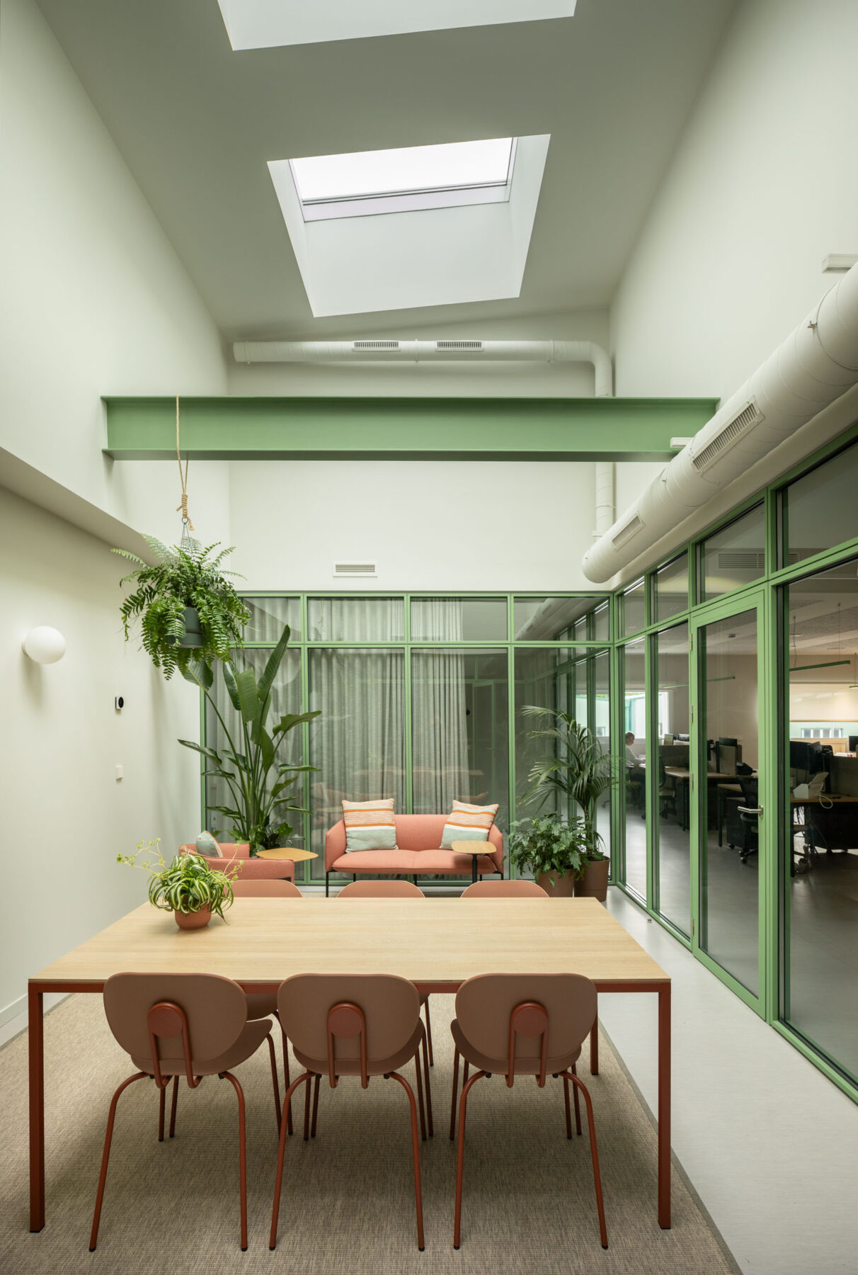
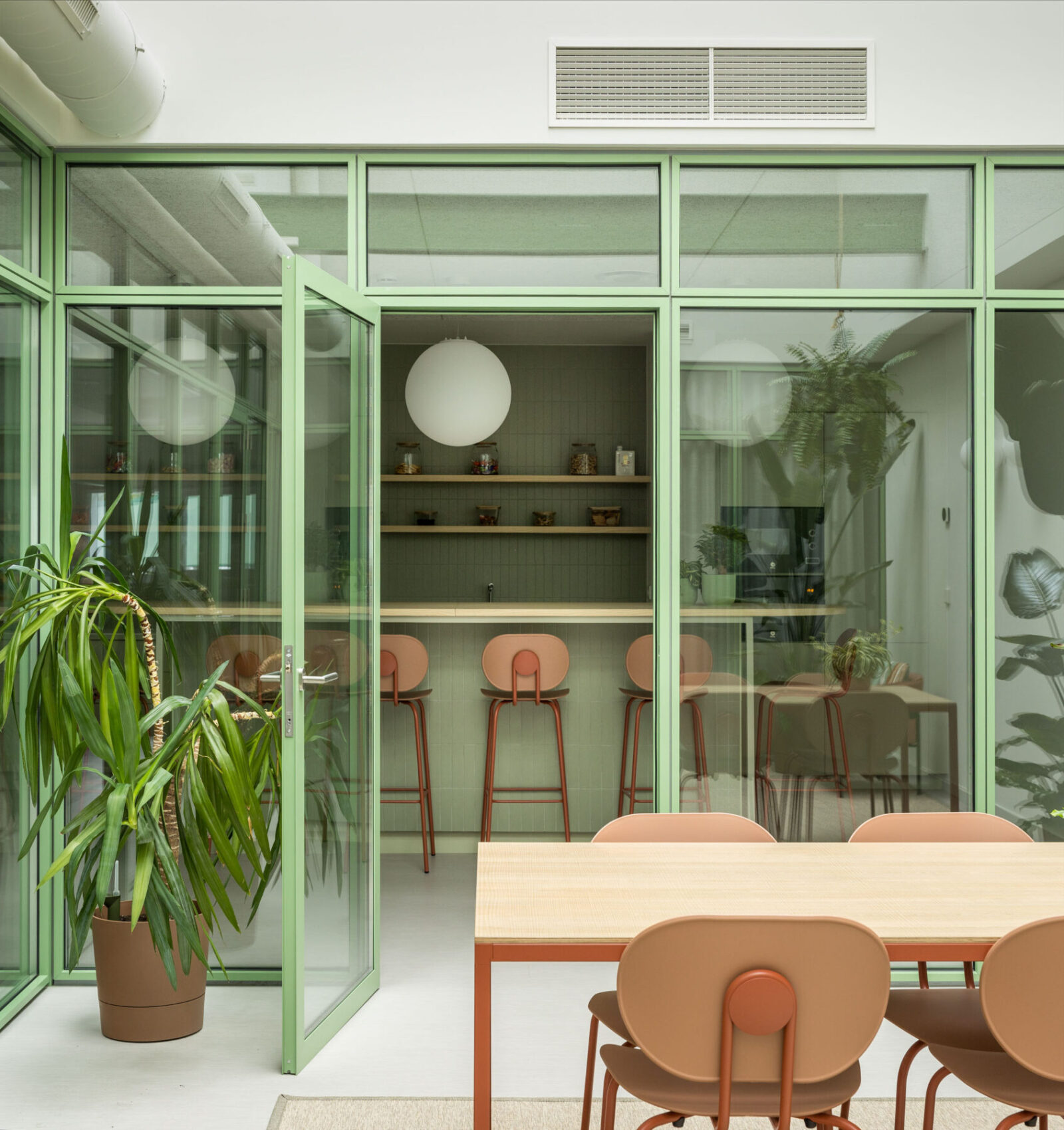
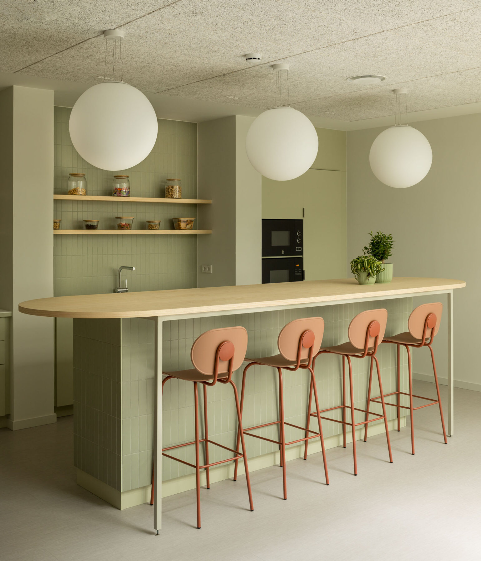
On the right wing is the open space, where the workstations have been placed next to the windows to receive natural light. At the back, two offices and next to them, the conservatory. This space under the second skylight was conceived as an indoor garden where you can relax, meet informally, eat together or rest surrounded by plants and light. This conservatory also helps to bring light into the office, which has been designed to also serve as a meeting area. The office is an important space in the company, as it is the place where they meet every day and where any event is held. For this reason, it has been designed with different areas where you can eat, meet or have a coffee.
Two booths for videoconferencing and telephone calls complete the programme next to the workspace. The use of colour was one of the initial requests, so the architects opted for the colour green, which the company had already been using in its branding and because it is also the colour of the landscape of industrial pavilions that surround the building and constitute the predominant view from the interior. The architecture team decided to apply the colour to the structure of the partition and turn it into a protagonist element that also provides a certain industrial character that enriches the space.
The prominence of the green colour of the screen led us to choose a light-coloured ash wood for the rest of the furniture, which was custom-designed. In addition, other colours such as yellow or terracotta have been introduced in details of the furniture and lighting, in a moderate way to complement the predominant green without detracting from its prominence.
Facts & Credits
Project title: Midegasa Offices
Project type: Office architecture
Architecture: Kanpo arquitectos
Project and site management: María Yáñez and Gorka Ugarte, Kanpo arquitectos
Developer: Midegasa
Year: 2023
Surface area: 587m²
Location: Gipuzkoa, Spain
Text: Provided by the authors
Photography: Erlantz Biderbost
READ ALSO: Hellenic Aesthetic Store in New York City | by SOUTH architecture
