We’re born into this concrete world, where sanctuary is to be alone or to pretend to like it. Your wildness is a convenience store in the desert, pale pink, dusty, arid. A new church, a fresh sin.
— Taylor Rhodes, Calloused: A Field Journal
The convenience store has a ubiquitous presence in Asian metropolises, and Shanghai is no exception; they have become urban markers dotted throughout the city, brightly lit, they shine through the day and night, serving the city’s inhabitants tirelessly.
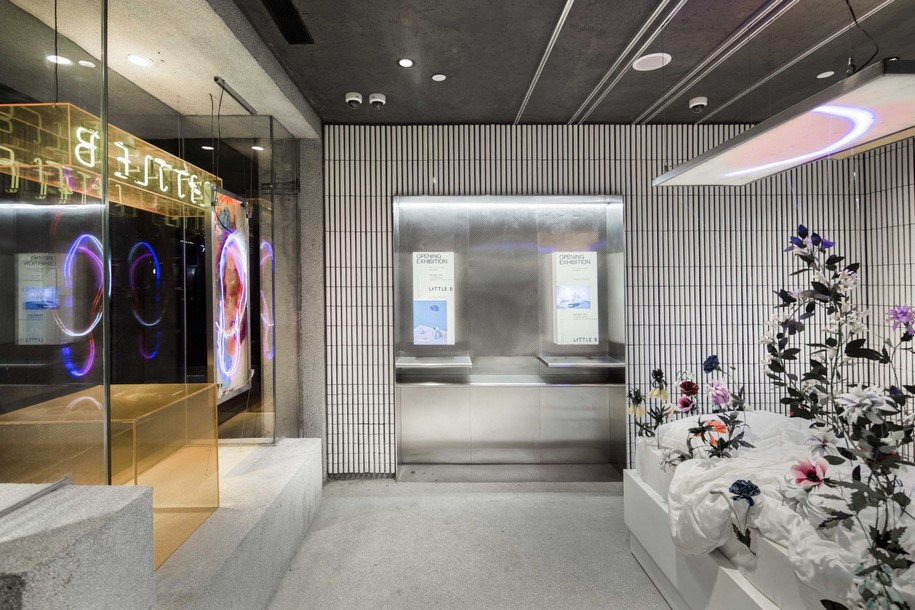
In a new concept store for popular lifestyle brand The Beast, Little B takes the idea of a convenience store to another level.
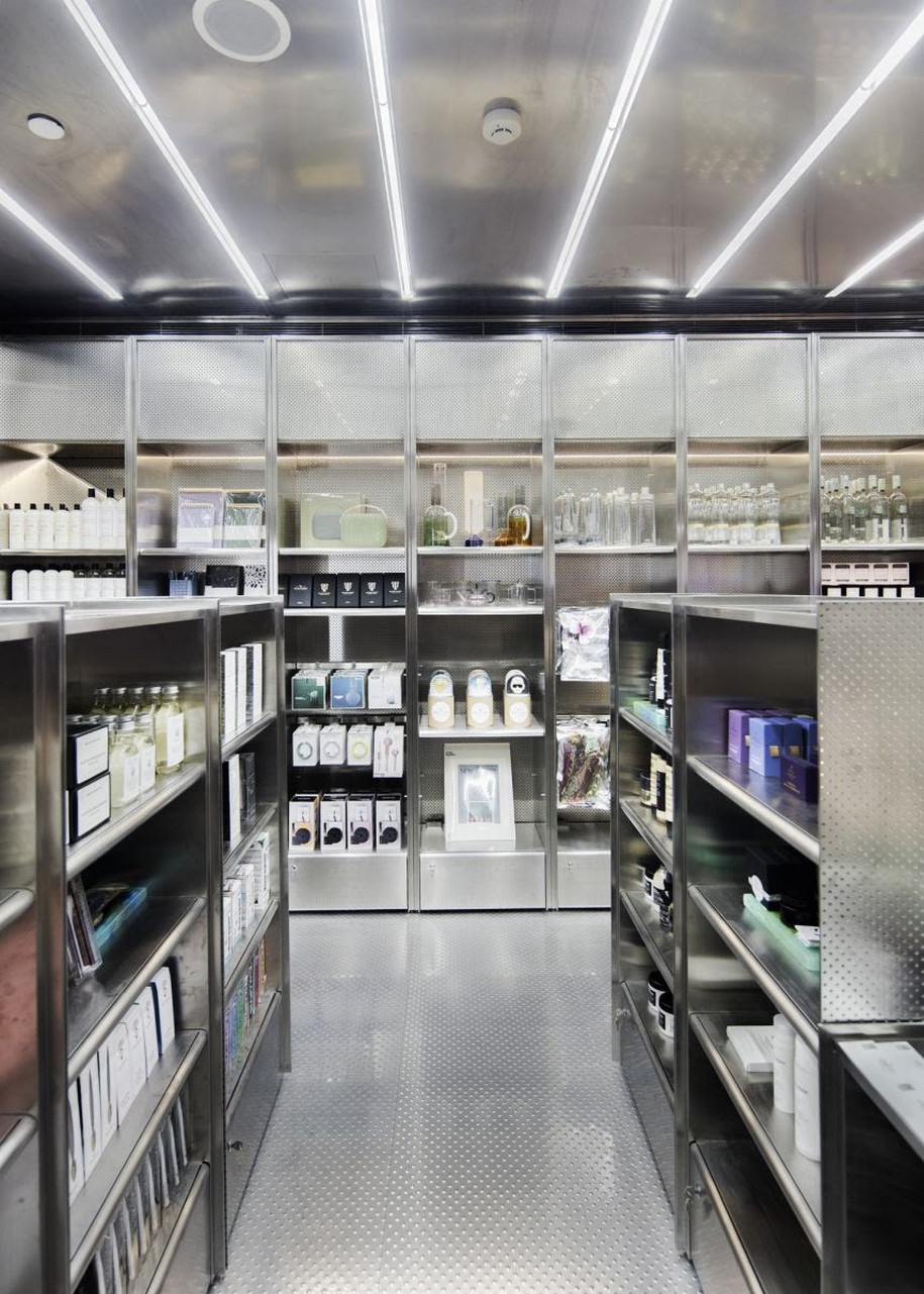
As with any typical convenience store, it offers light food and drink, personal care items, and basic home accessories—except each item here is sourced from various high-end local and international brands, carefully curated for the culturally astute and increasingly discerning taste of Chinese consumers.
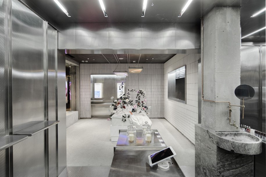
In thinking about how to embody this new retail concept, NERI&HU’s design plays off of the perfunctory nature of the modern convenient store, the spontaneity of street culture and “pop-ups”, while still staying true to a timeless aesthetic that doesn’t rely on instant gratification.
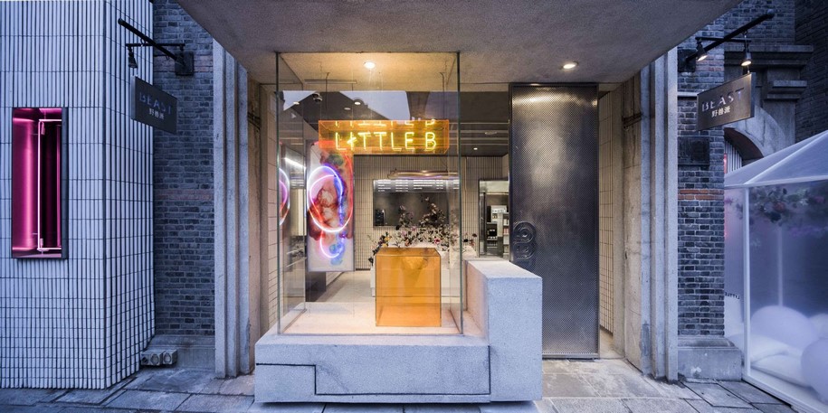
Stepping into the store, the first encounter is not immediately with the retail environment, rather an art installation.
Throughout the design process, NERI&HU encouraged the client to make further breakthroughs with the typology and dedicate a portion of the already small floor area to be used as an undefined multi-purpose exhibition space to showcase art work, to install feature brands, to host pop-up events, and to accommodate large scale visual merchandising.
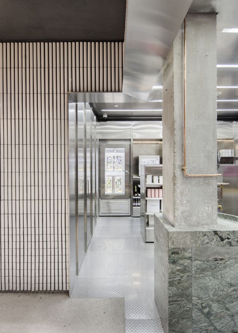
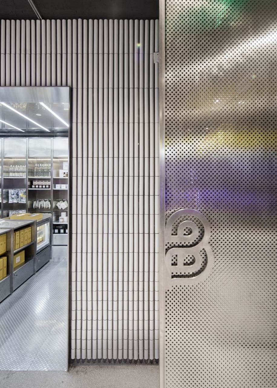
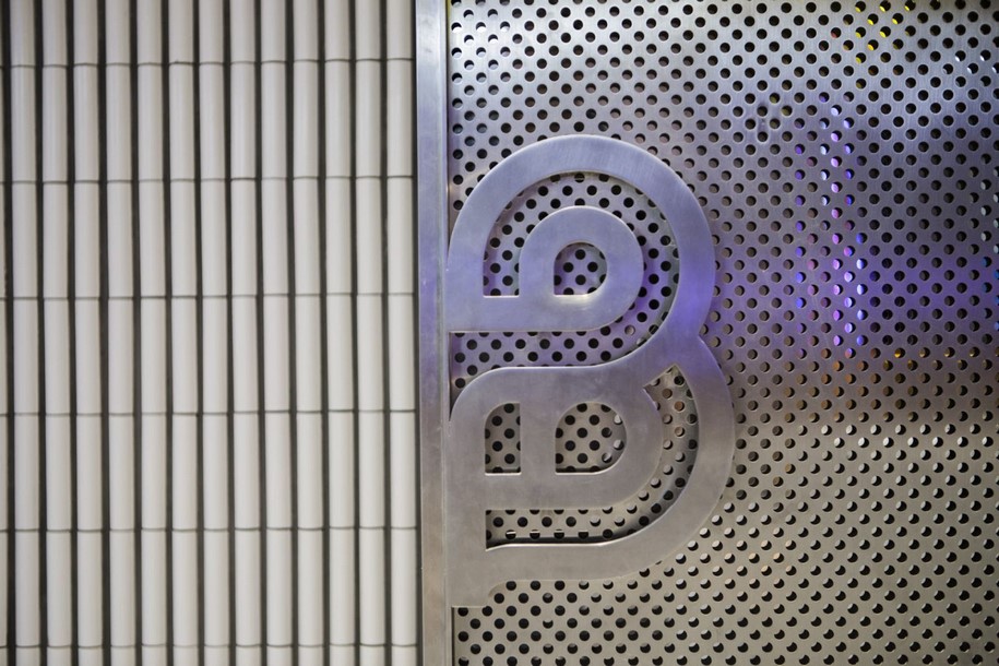
To the left of the existing façade, a new addition is clad in curved white-glazed tiles in a vertical pattern, which extends to the interior of the store and winds its way to the right side of the shop to pass behind the existing window. The material continuity of the tile serves not only to tie together the three distinct parts of the façade, but becomes a subtly textured backdrop for the shop’s colorful contents.
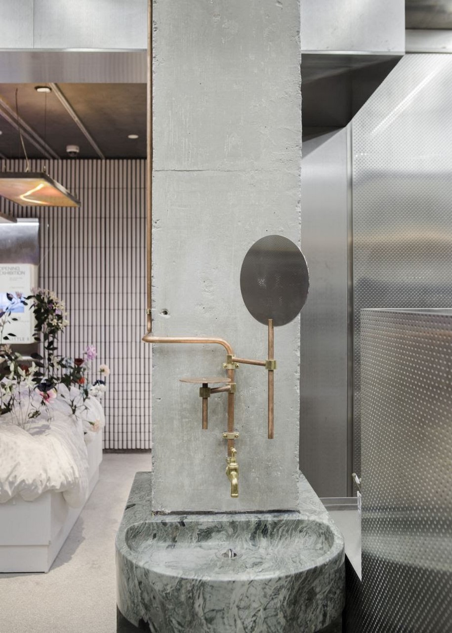
Stepping into the store, the first encounter is not immediately with the retail environment, rather an art installation. Throughout the design process, Neri&Hu encouraged the client to make further breakthroughs with the typology and dedicate a portion of the already small floor area to be used as an undefined multi-purpose exhibition space to showcase art work, to install feature brands, to host pop-up events, and to accommodate large scale visual merchandising.
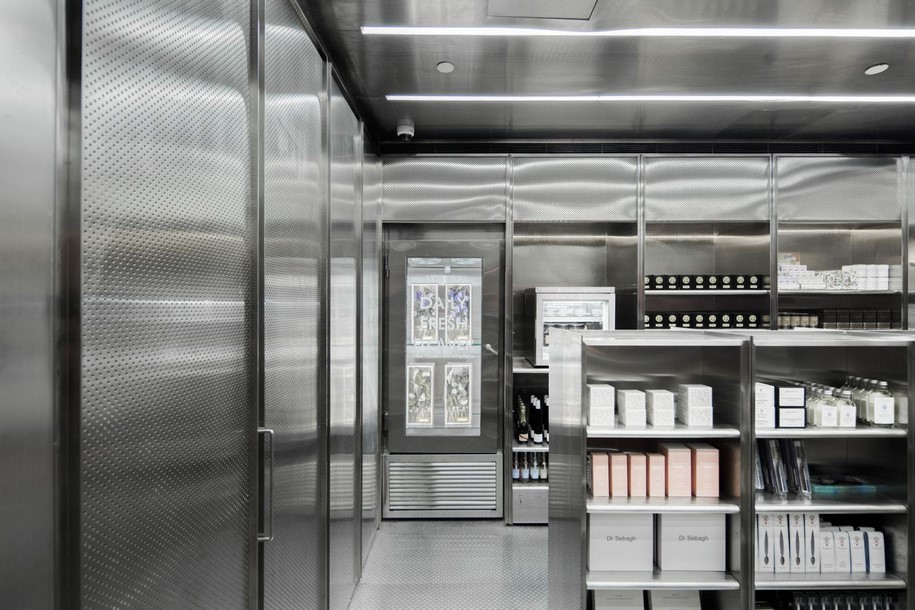
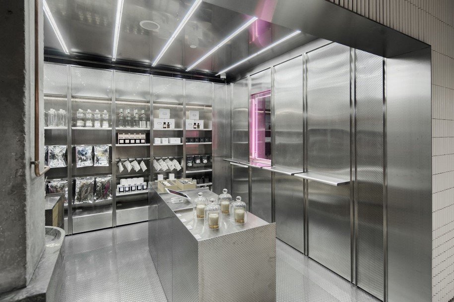
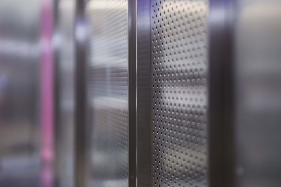
In the retail area, custom stainless steel display and shelving fixtures envelope the perimeter completely. Stainless steel, a rather sterile material, is brought to life by the layering various finishes: including brushed and polished, perforated and bump textured. The vibrant packaging of the products, the colors and shapes from the feature artwork, as well as the signage lighting begin to reflect off of each other, blur boundaries, and activate the space.
With this project, NERI&HU attempts to refine and evolve the convenience store typology.
While fulfilling its inherent demand for efficiency and functionality, every designed element, detail and material choice embodies the desire for more, perhaps, for a bit of humanity to grasp onto.
Facts & Credits
Project title Little B Concept Store
Architecture NERI&HU
Type retail
Location Shanghai, China
Year 2018
Photography Shen Zhonghai
Project title Little B Concept Store
Architecture NERI&HU
Type retail
Location Shanghai, China
Year 2018
Photography Shen Zhonghai
READ ALSO: 40 χρόνια ISV ARCHITECTS

