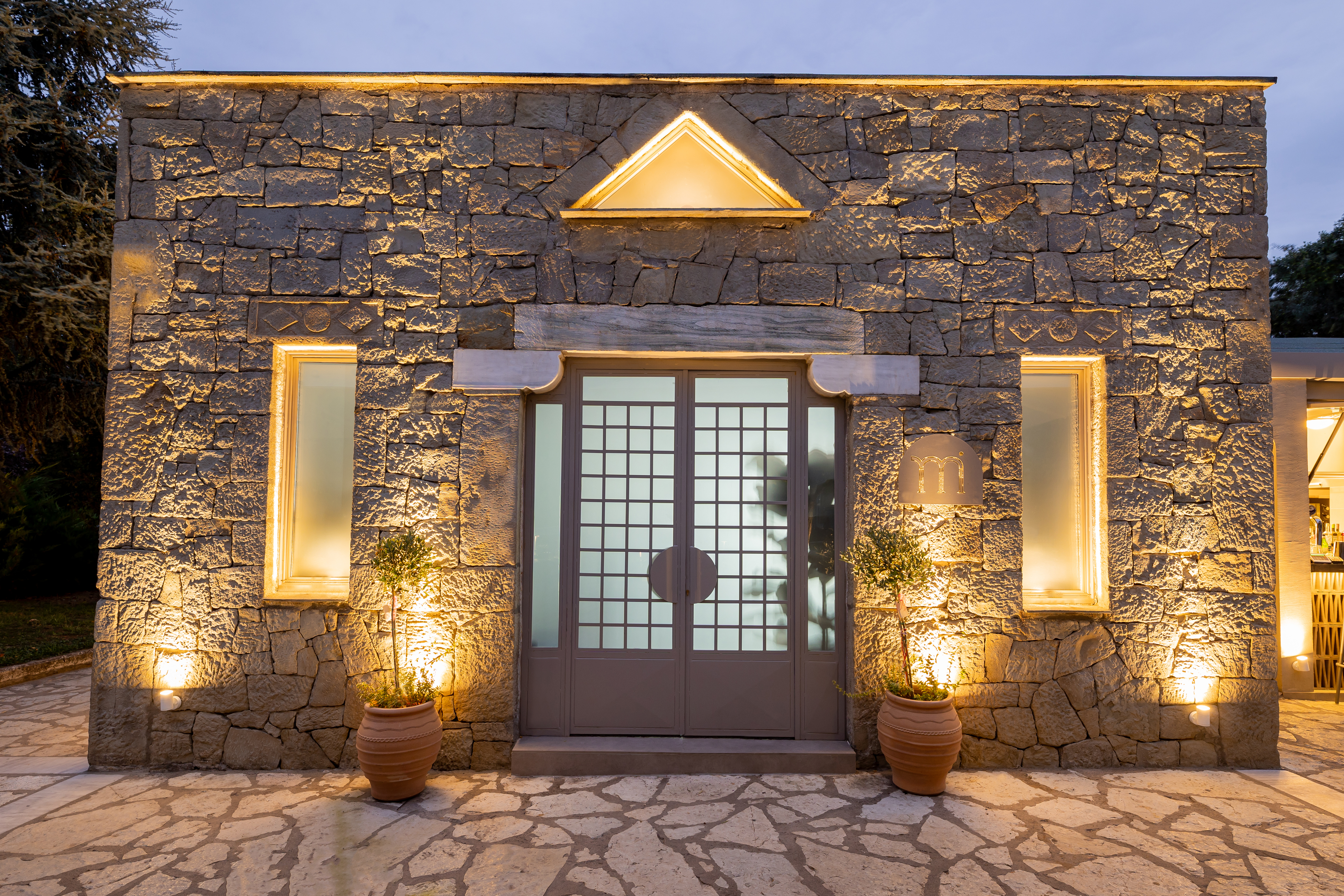
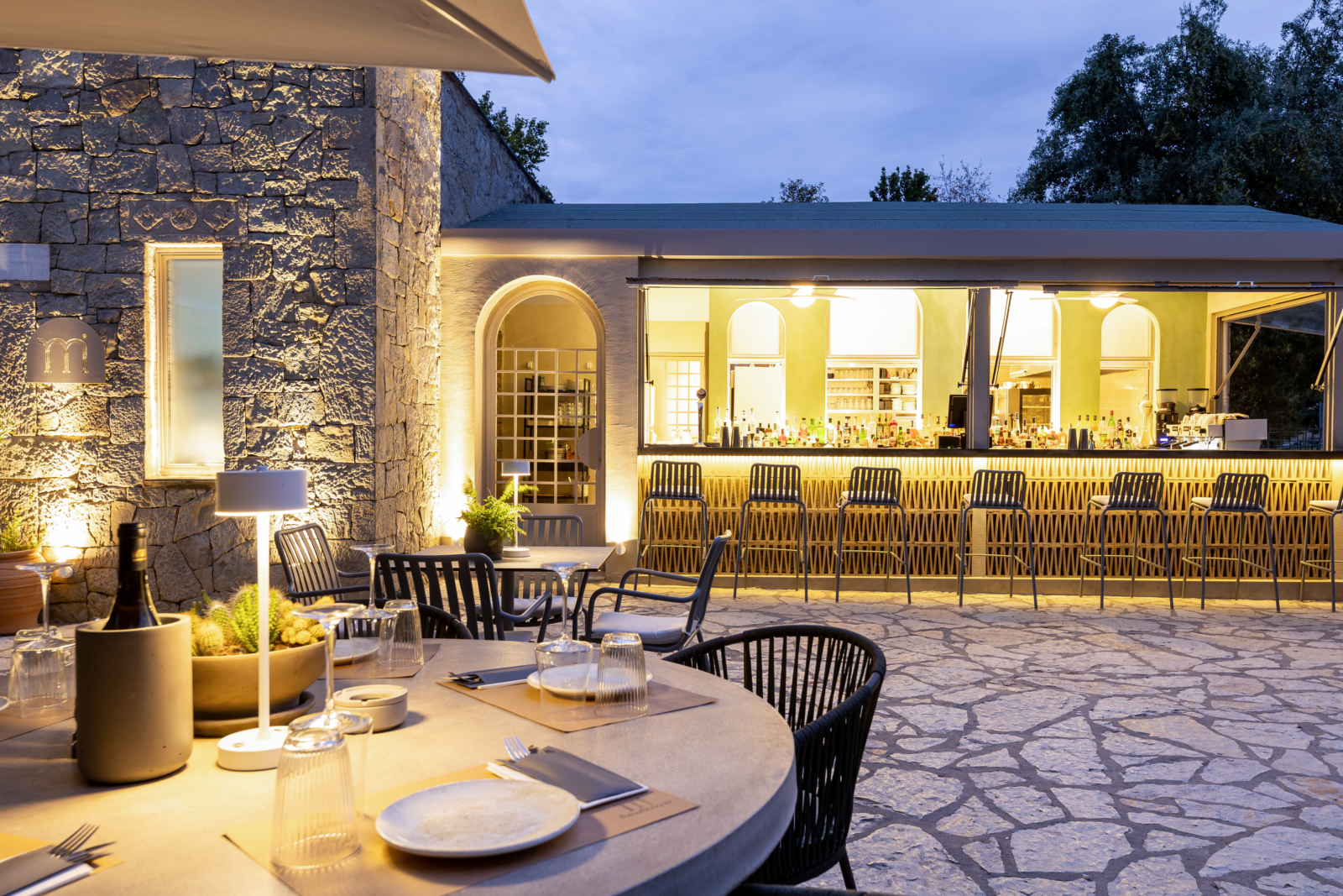
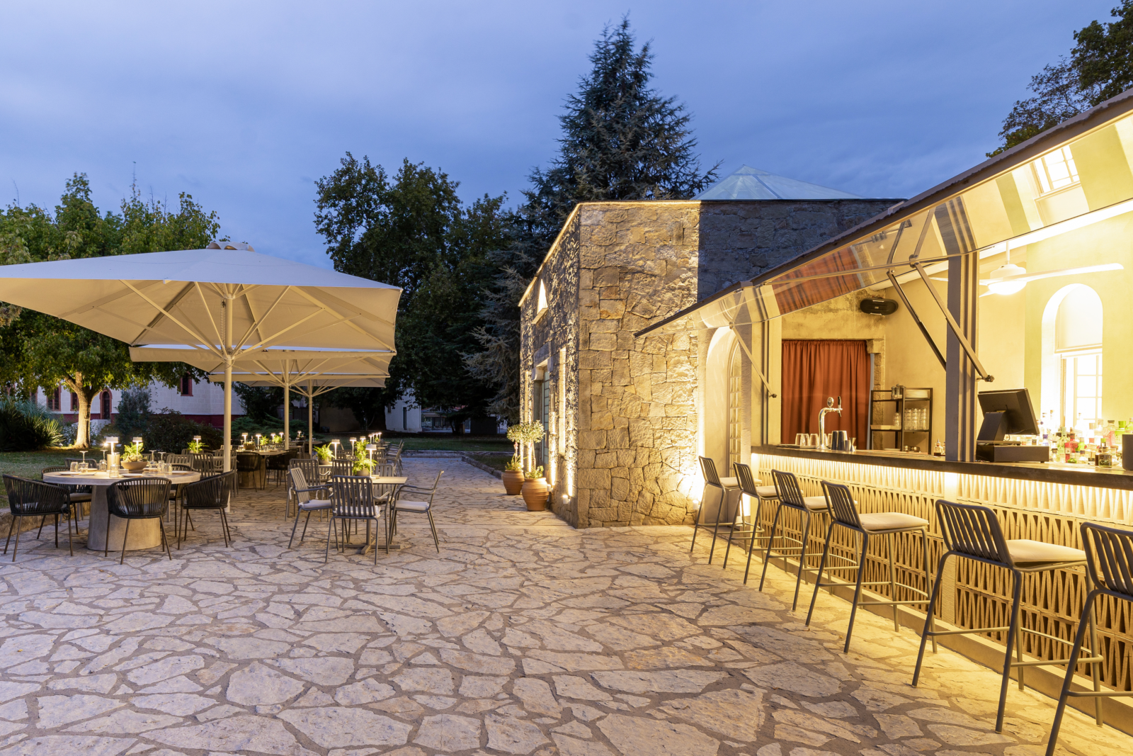
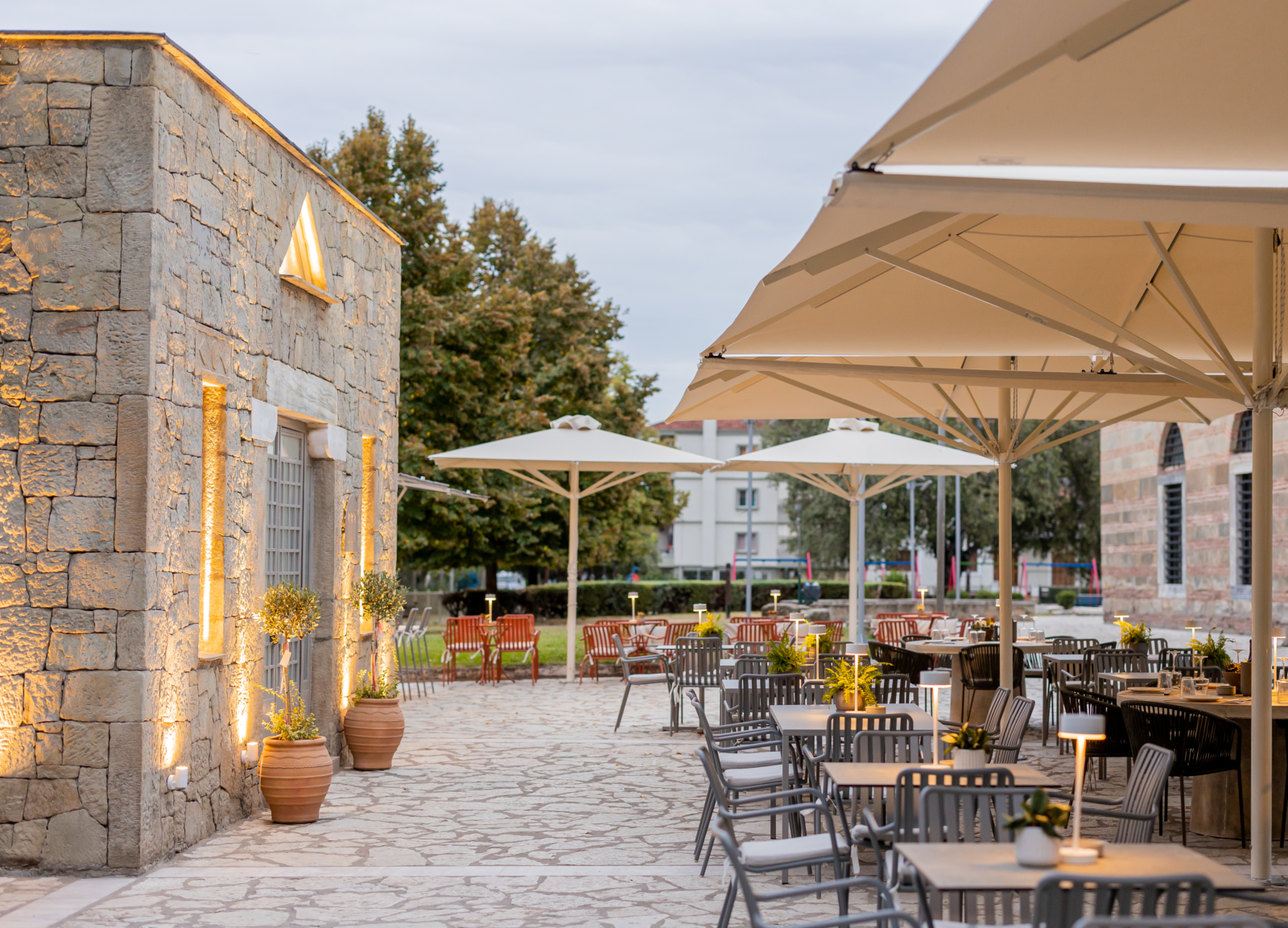
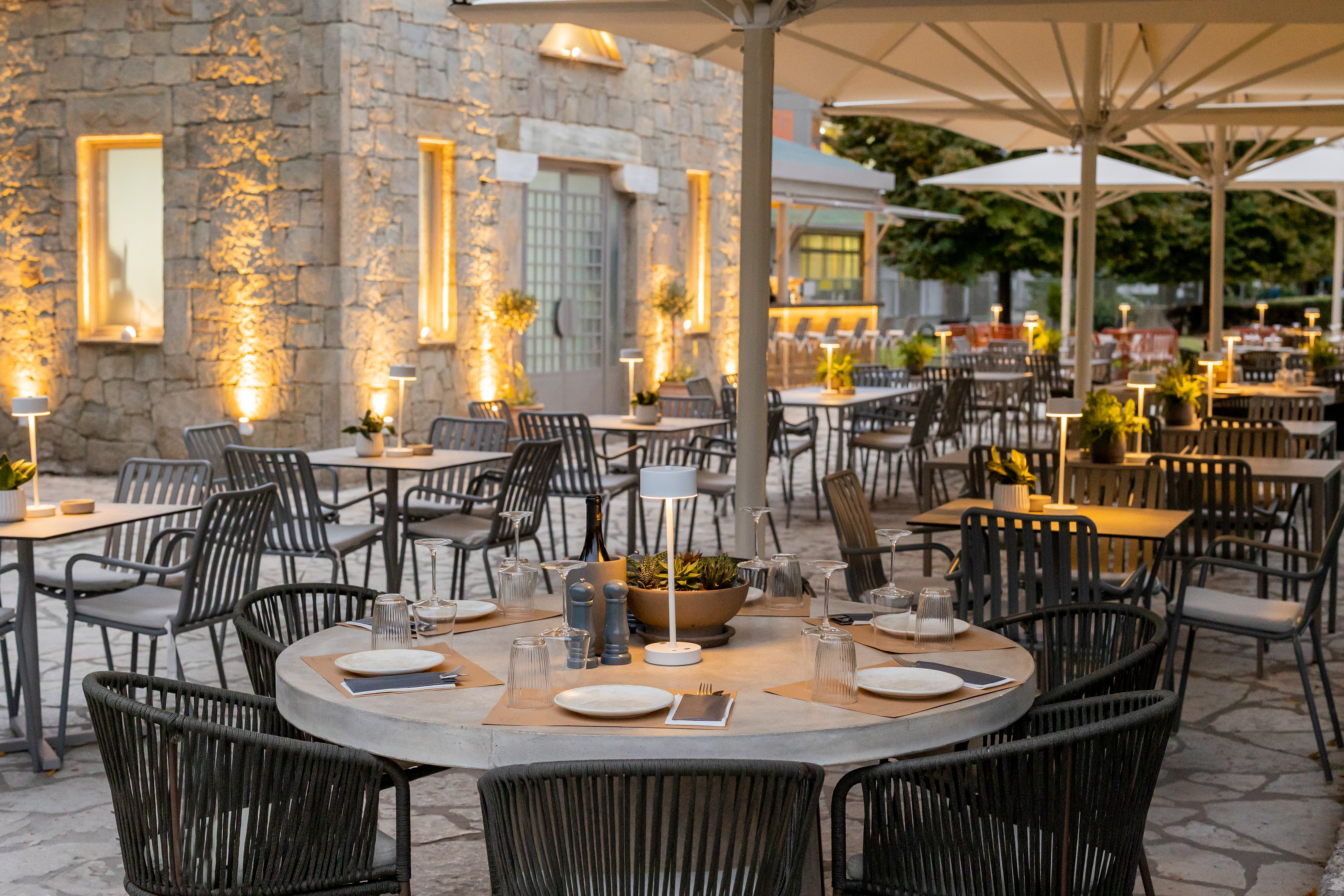
Studio pluslines were asked to design and build “The little mosque”, an all day bar and restaurant located at a town hotspot, friendly to all ages, with minimal aesthetic and with references to the past that blends in with the surrounding landscape both by construction materials, but also by color, aiming to upgrade the entire area in general.
-text by the architects
The building used for the store is located in one of the most central town squares, in the surrounding area of the Ottoman Osman Shah mosque or Kursum Mosque which also runs as a museum, a historical tourist attraction to the town visitors.
The main idea was to create a modern and minimal place inspired by the 1970s, in order to blend in with the surrounding area.
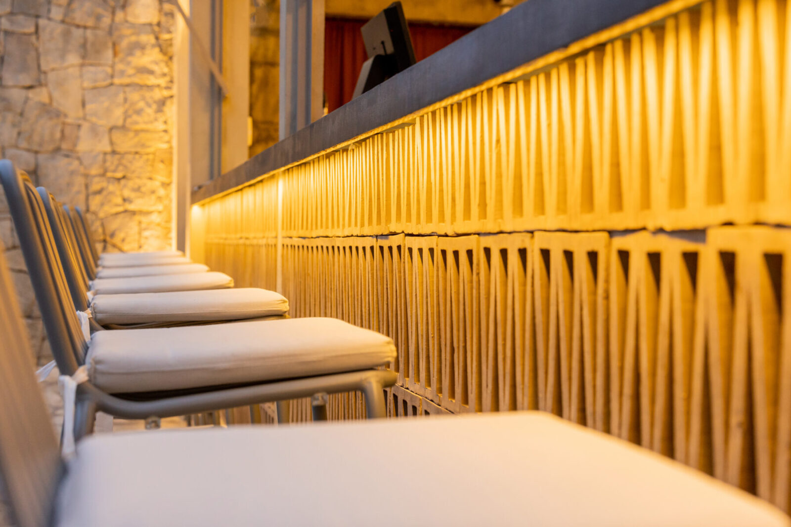
To achieve that both the materials and colour choices were carefully picked out . For the construction of the store, natural materials such as stone tiles, iron, wood, decorative stones, decorative bricks and cement were mainly used.
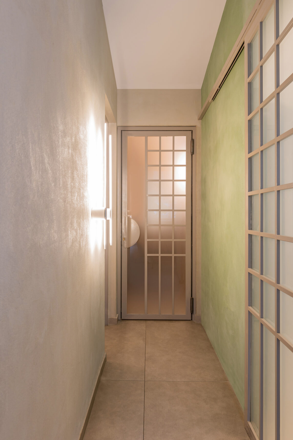
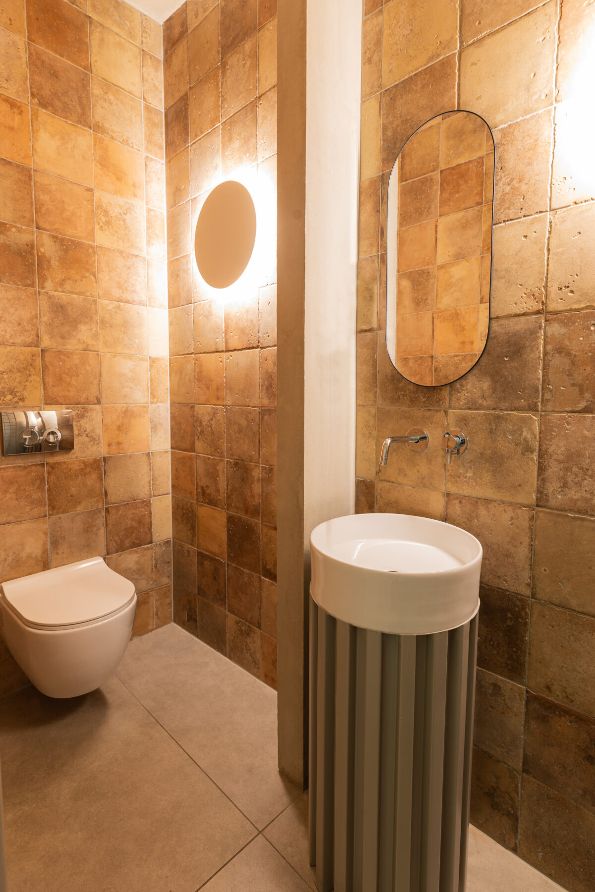
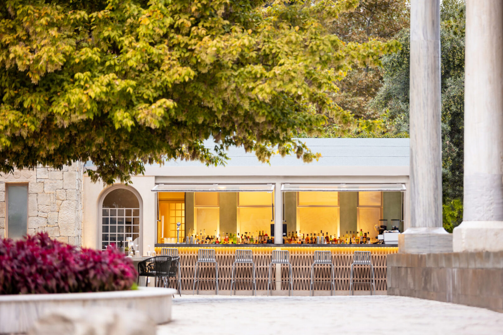
The building consists of a 50 square meters area with stone masonry, the internal construction of which will have been completed by the upcoming winter and will serve as the internal customer service room (hall). It is located at the left side of the building. Moreover it consists of another 50 square meters with brick recently-made masonry serving as A) the outdoor service bar B) The auxiliary area – kitchen, preparation room and C) the WC, designed also for people with disabilities. The WC also has an external door, serving square’s by passengers 24/7, even when the store is out of business.
When we took on the project, the building was in a very bad condition, there were many problems and almost no essential maintenance had been done. However it remained a building the decorative stone of which had a lot of potential in transforming into something beautiful. After proper maintenance and treatment and without major additions or changes this could be achieved, however still only on the left side of the building’s floor plan.
On the right side, it was necessary to radically reshape both the internal and the external part so that the building could not only acquire a more similar image, but also serve the needs of the store.
The idea for the design and layout was based on a visual continuity.
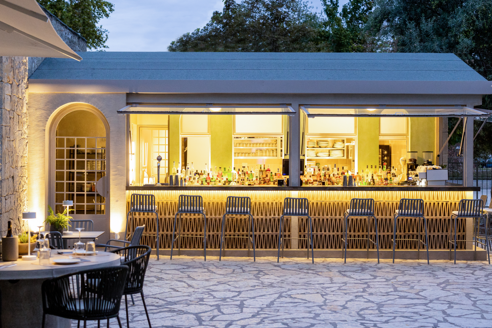
Everything was made so that the customer could have full sight of the store, starting from the bar with large opening glass facades (kiosk), to the food preparation area, with an open kitchen visible to the customer following by the place where the drinks are prepared. Therefore, the bar of the store was created in front row, taking up most of the view, and then behind it, the kitchen was built with large glass openings in order to achieve the visual continuity of the spaces.
Moreover, the design of the outdoor space included tables and seats (placed only wherever allowed in the surrounding area) and shading systems made of materials such as iron and cement so as to match with the store materials and in neutral colors to blend with the overall image of the square area. We wanted the outdoor space to not stand out of the surrounding area and appeal to by-passengers and visitors of all ages.
As far as the colour is considered, we used shades of the surrounding area, shades of stone-gray, green that is vividly present around the store, as well as some tiles and gray colours. The lighting plays a huge role in the aesthetics of building, as it creates a warm and cozy feeling during the evening hours, highlighting the view and and the open parts of the building.
Facts & Credits
Project title The little mosque
Project type Interior & Exterior Design
Location Trikala, Athens
Architects Studio pluslines
Photography Eythimis Leventis
READ ALSO: On the cliff_Anasa luxury resort | by Taka+Partners
