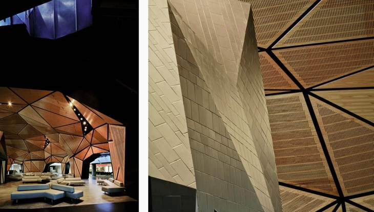
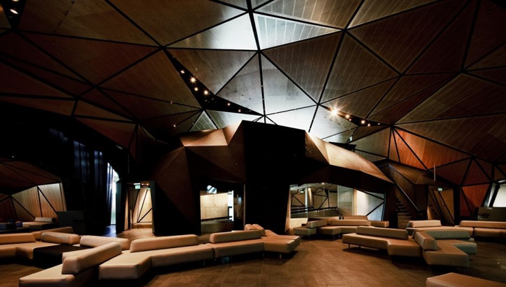
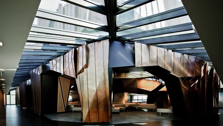
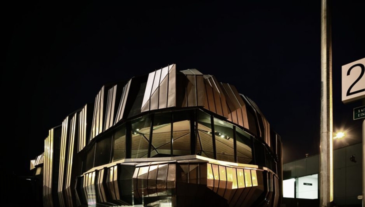
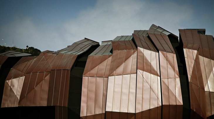
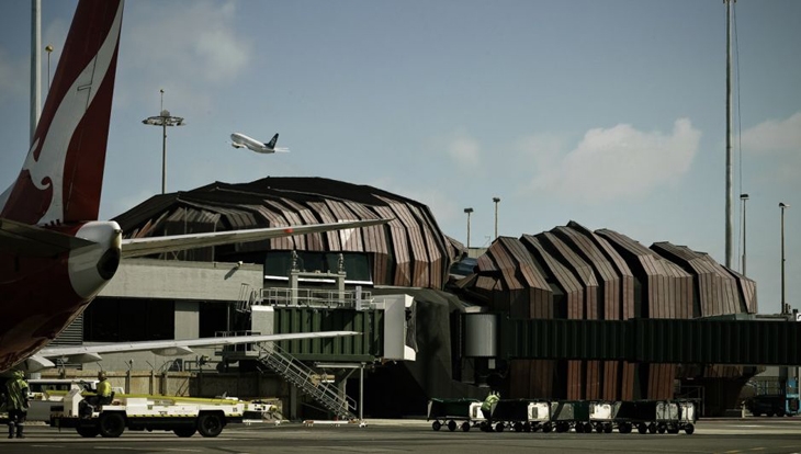
The design has been described as a pyramid of steel beams that meet at nodal points in mid-air, forming angles and planes that say ‘sculpture rather than building.The Rock interior is a calming haven inside that exudes warmth, with a passionate exterior design expressing Wellington’s vivid culture, environment and history.
Inspired by the environment around Wellington Airport, the angular forms of the terminal make a visual link with the rocks around the coast. The reference to local landform and the introduction of fissures and strata become features that have articulated the form, scale and massing of the design. Earth provides a counterpoint to air and flight, from which many airport terminals’ inspiration is drawn.
 (C) WARREN AND MAHONEY
  (C) WARREN AND MAHONEY
 (C) WARREN AND MAHONEY
 (C) WARREN AND MAHONEY
 (C) WARREN AND MAHONEY
 (C) WARREN AND MAHONEY
Video courtesy of Wellington International Airport Ltd.
READ ALSO: RUDY RICCIOTTI ARCHITECT FROM THE MuCEM MEDITERRANEAN MUSEUM IN MARSEILLE