Vallus is Latin for the defensive wall or bulwark; precisely a repelling rampart capped by palisades. Thus metaphorically, vallus stands for the `unreceptive` boundary, a closed borderline. Serving such a brute onset, tectonic expression in Vallusteca remains restrained and `circumspect`. Defining thus a spatial scheme characterized by introversion and remoteness, Vallusteca alludes first to a solitary bunker. And yet, Vallusteca reflects profound notions of reserved dynamism and canniness coupled with a latent feel of buoyancy. The rationale of such a tectonic personification is simple indeed: here is a museum that hates being one! Its massing remains absolute, austere and heavy. The volumetric parti intends to undo conventions in museum planning, to evade spatial stereotypes of pseudo-cosmopolitanism or commonplace stratagems, such as recalling a pop-culture mood.
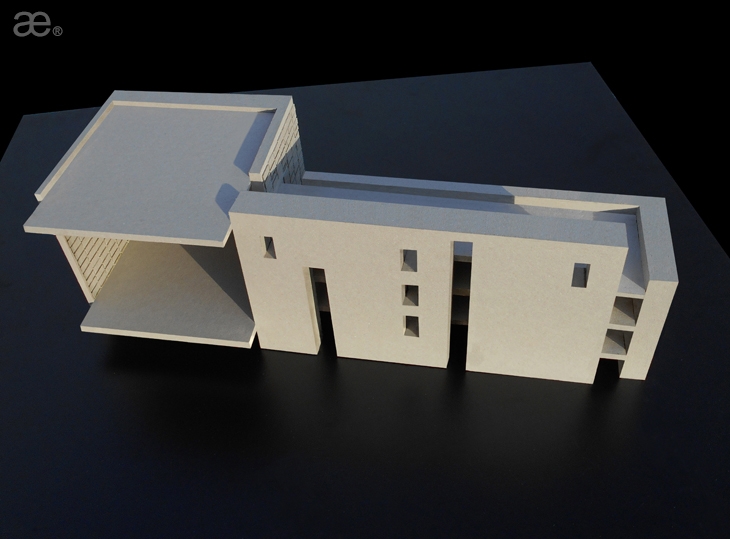
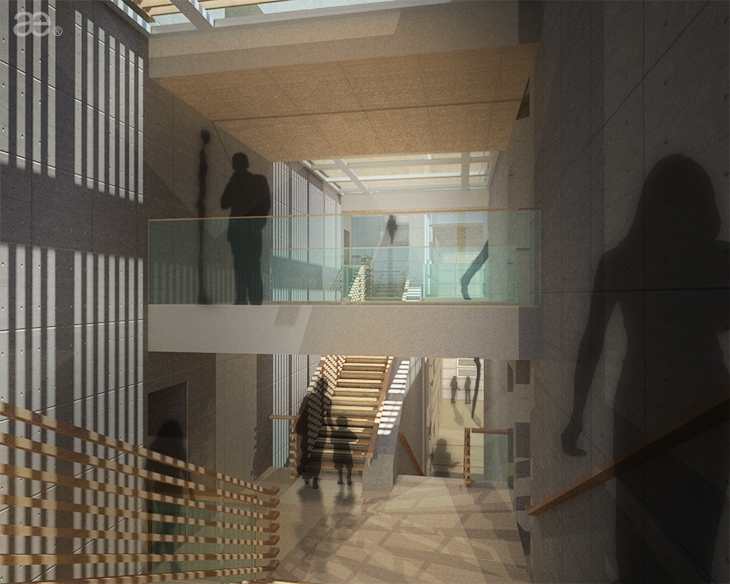
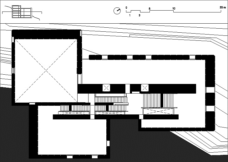
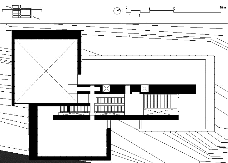
In plan, three segmented vallī – read walls – fold onto themselves, aligning with each other through their longer tails. The threefold formation is then emphasized by a central “spine,” materialized here as a set of parallel walls of imposing thickness. This linear in-between zone is energized as an internal boulevard easing orientation and circulation. Articulated as a sunlit canyon, this intricate iteration of a protected winter-garden hosts primarily the means of vertical movement, i.e. open stairs and elevators, as much as mechanical services – contained largely within the masonry mass.
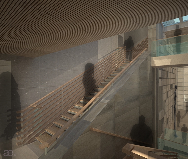
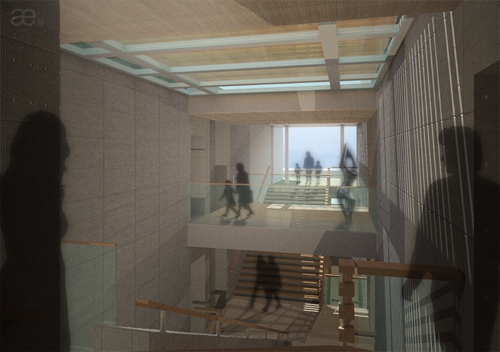
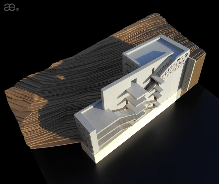
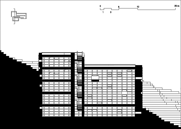
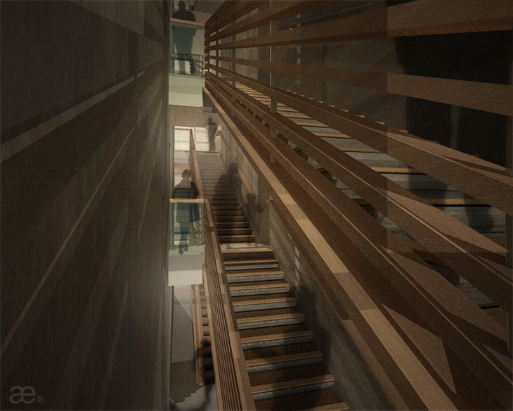
In section, stacks of stairs are organized within this protected core, surprisingly branching outwards at opposite directions at every level, seemingly undoing one another. This is a nodal design intention here, announcing inexhaustible movement vectors in an array of almost labyrinthine access patterns. Enabling individual “part loops” of the total circulation scheme, such an unexpected parti of contrasting stairs, an otherwise puzzling or even confusing trait, serves programmatic agendas for building sectors that can be isolated and individual wings that prove dividable. Independent shows may be curated at each volume separately, while multiple sub-units may be formed, such as partial stacks of floors and even smaller display pods, with access controlled in-between. Curators are thus exposed to a multiplicity of circuiting scenarios, ensuring that, with every event, an entirely differentiated exhibition experience may be attainable, advocated by differing diagrams of circulation. A helicoid movement vector is indirectly advocated, an 8-shaped trajectory that can be traced by `reading` the drawings.
Ultimately the wide public stairs lead out, at the topmost level, directing crowds to a series of terraces that become another intended escape destination. The roof-planes arise thus as a realm reconstituting contextuality: not distorting the natural topography beyond the building footprint, the figure-ground shape is re-produced as a public space atop. Here is a public domain protected and freed; that invites visitors, allowing public access atop even the highest vallī via exterior stairs.
The museum is entered guardedly from the back side, from the mountain side, where topography rises. One is allowed into a neutral lobby of conventional height, with commercial functions, a museum shop and the café, hosted within a typical unit of the square exhibition floors. Then visitors are transferred to the vertically open viaduct of the circulation zone offering diverse movement routes. The actual entry, furtively positioned in-between the two upper volumes and formed as a vertical glazing band, is accessed from a narrow pathway that, as one approaches, is visually disconnected from the seafront. One is really focused on the narrowing strip that leads only to an interior corner of the building and not compensated with views beyond. From this end we may witness a relatively low and elongated tectonic contour with even a balcony hovering over the entry area, offering thus a more ‘domesticated’ outlook or a reserved low-scale. In contrast, the front appears more monumental, taller, imposing.
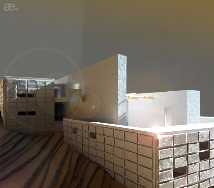
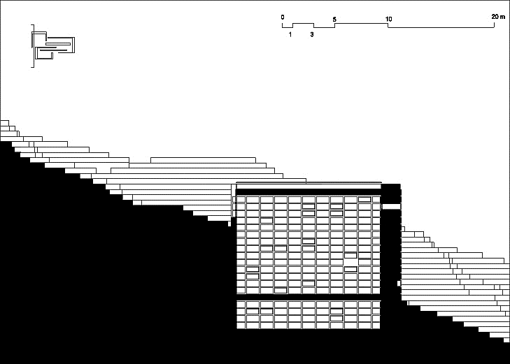
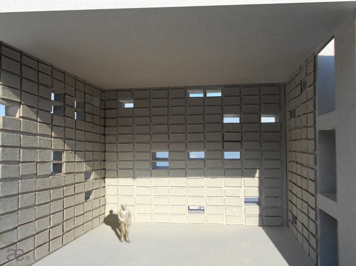
The multi-storied edifice is largely hidden within the steep slope; carved into the mountain side. Specifically, the cuboid at the forefront remains entirely void, a hollowed box announcing a central exhibition area suited for larger artifacts. This single volume becomes the hearth of the building, its point of reference, a unifying atrium in a sense. The cube alludes to a large cavern, a man-made hole dug into the soil. The second volume offers a stack of square-shaped display trays with conventional interior heights, while the third parallelepiped forms elongated galleries evolving almost as widened corridors. The tripartite scheme covers thus three basic types of exhibition space.
Interiors are only connected to the outside through seemingly random openings puncturing the monumental walls sideways. The sun is allowed into display areas as dense beams of indirect light, i.e. due to the wall thickness, differences in intensity still generate distinct beams of deflected glare. Yet the pattern of clerestories does not offer chances to gaze outwards much; it rather forbids from gazing downwards at the horizon of the sea, or upwards to the sky or the hill. Within gallery spaces, the only generous visual connection to the outside is found at end-points, in-between the three vallī, occurring where these actually fold: interim vertical slits are sealed with vertical curtain wall strips. Glazing undoes the intended masonry gaps and links individual walls, thus enclosing interior volumes.
In contrast, the internal spine of vertical circulation links to the outside vertically. This concourse zone remains open to the sky through its glazed flat-roof, and is animated with vertical shafts of light shooting downwards alongside the linear stairs. The thin yet expansive beams of light wash down the concrete walls, reaching deeper into the imposing and dark building. This dramatic effect offers glimpses to the sky even from the lowest levels, reconnecting between a chthonic condition and the apollonian strata; the bright openness of the sky.
Most walls feature protruding panels in a reversed waffle pattern. As almost all vertical surfaces are `occupied` by this anaglyphic motif, interior spaces are primarily suited for plastic arts and free-standing sculpture exhibitions – rather than wall-mounted artwork. There, these modules are foremost acoustic panels and screens for lighting, electronic systems and speakers, appearing as cushions, being thus more inviting. In the exterior, the gridded vertical pattern appears more rigid and offers visual articulation, projecting a certain air of hostility. This `scaled` surface, the modular texture evokes a roman tortoise combat formation; a marching scheme, with the characteristic orthogonal shields modulated. This retrieves the primary agenda of a hesitant yet confident tectonic ensemble. Practically, the building comes alive when the orthogonal panels operate `broadcasting` light and music schemes – an effect not reflected in the graphic presentation.
If our previous exhibitions venue Primiteca is a tetra-partite symmetrical planar scheme involving four identical vallī revolving around a central point, Vallusteca is re-working the principles in a three-fold iteration whilst converting the axial center, a vector, into a linear spatial zone. Then, if Tyrsethecal XL, our second museum scheme is the effect of three identical cuboids superimposed and fused into a single entity, Vallusteca keeps three parallelepipeds in close adjacency yet separate, mediated by a spinal chord, the set of linear walls. Thus Vallusteca bridges and fuses concepts re-occurring and re-studied in our work for the Cycladic island of Tinos.
Credits: Aristotheke Eutectonics – Office of Architectural and Urban Design. Design, texts, renderings: Aristotelis Dimitrakopoulos (A.Ph.D). Maquette: Angeliki Drakonaki. Drawings: Marina Antolović, Katerina Lazaridi. Axonometrics: Giacomo Bernardi. Collaging: Anna Montanari, George Zacharopoulos.
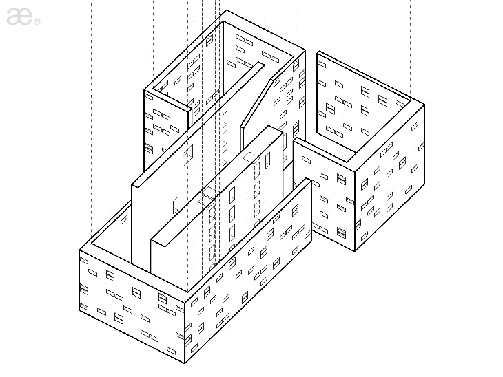 AXON DIAGRAM VALLUSTECA BY ARISTOTHEKE EUTECTONICS
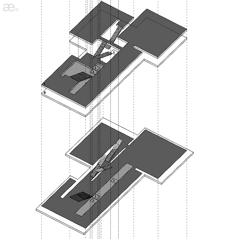 AXON DIAGRAM VALLUSTECA BY ARISTOTHEKE EUTECTONICS
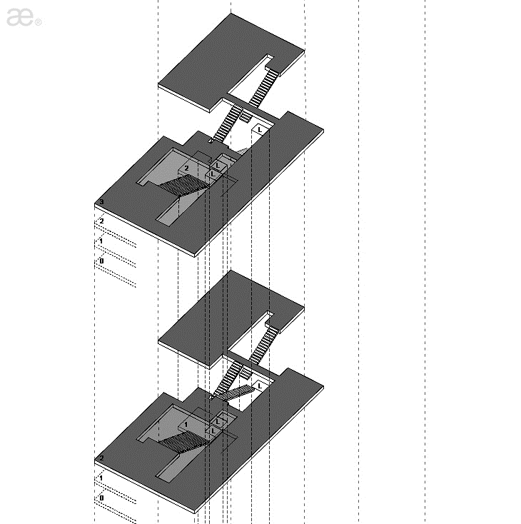 AXON DIAGRAM VALLUSTECA BY ARISTOTHEKE EUTECTONICS
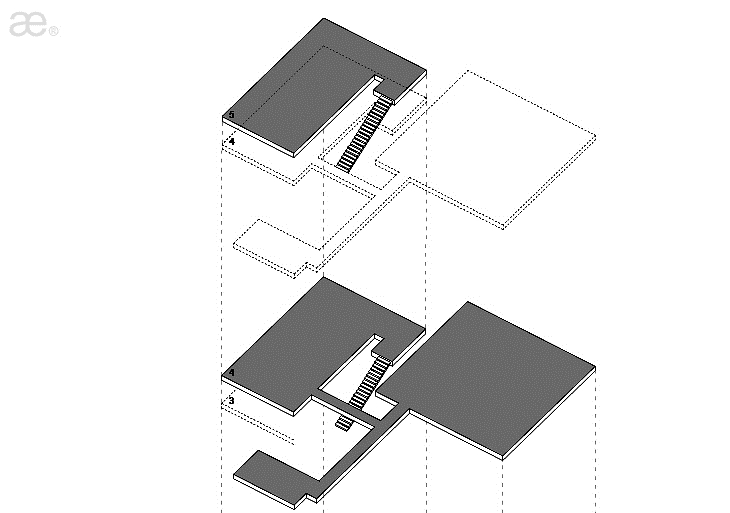 AXON DIAGRAM VALLUSTECA BY ARISTOTHEKE EUTECTONICS
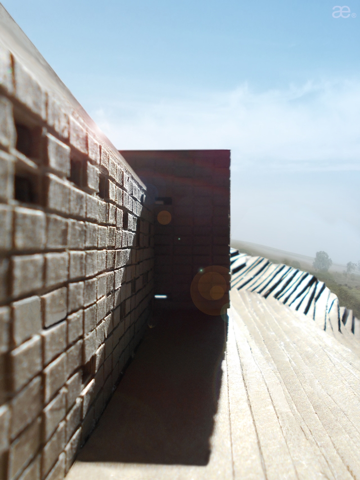 MAQUETTE, VALLUSTECA BY ARISTOTHEKE EUTECTONICS
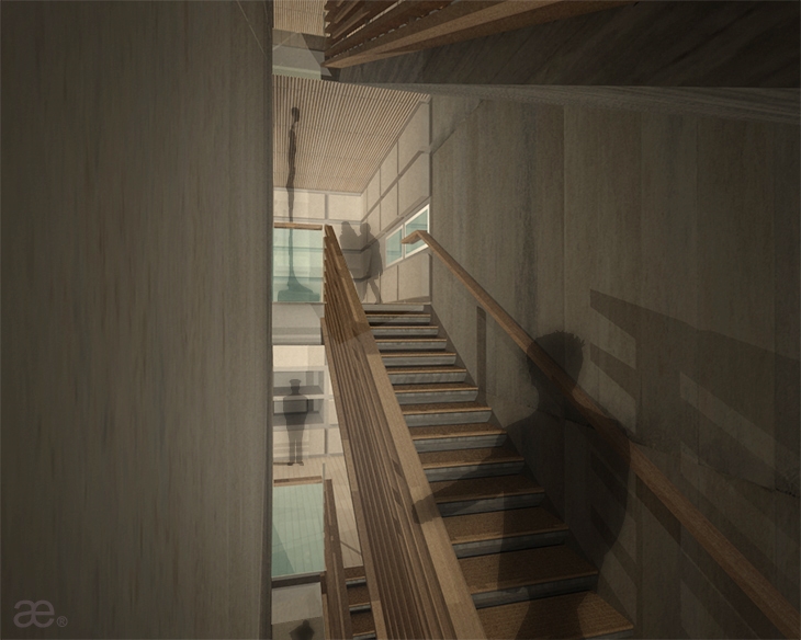 INTERIOR RENDERING, VALLUSTECA BY ARISTOTHEKE EUTECTONICS
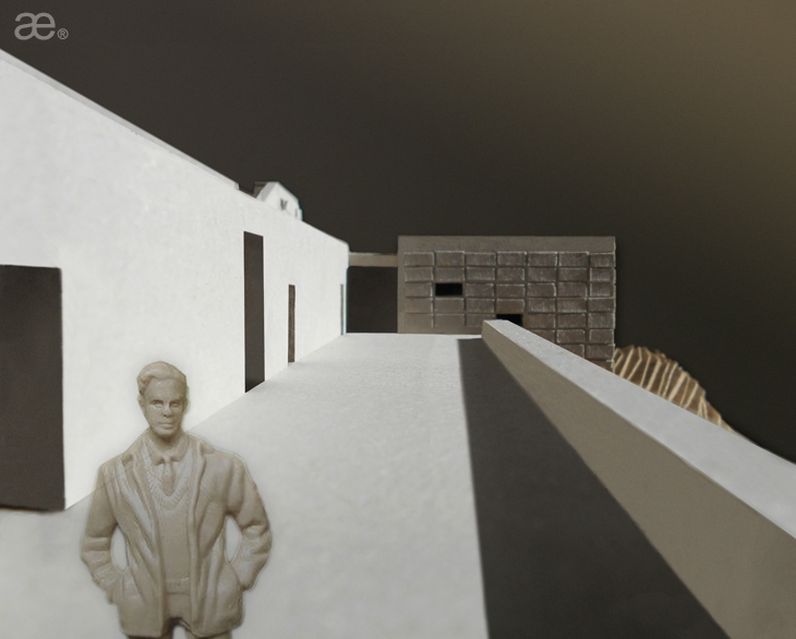 MAQUETTE, VALLUSTECA BY ARISTOTHEKE EUTECTONICS
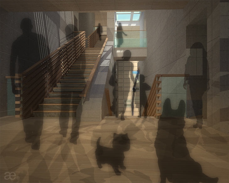 INTERIOR RENDERING, VALLUSTECA BY ARISTOTHEKE EUTECTONICS
 INTERIOR RENDERING, VALLUSTECA BY ARISTOTHEKE EUTECTONICS
 INTERIOR RENDERING, VALLUSTECA BY ARISTOTHEKE EUTECTONICS
 MAQUETTE PART, VALLUSTECA BY ARISTOTHEKE EUTECTONICS
 MAQUETTE PART, VALLUSTECA BY ARISTOTHEKE EUTECTONICS
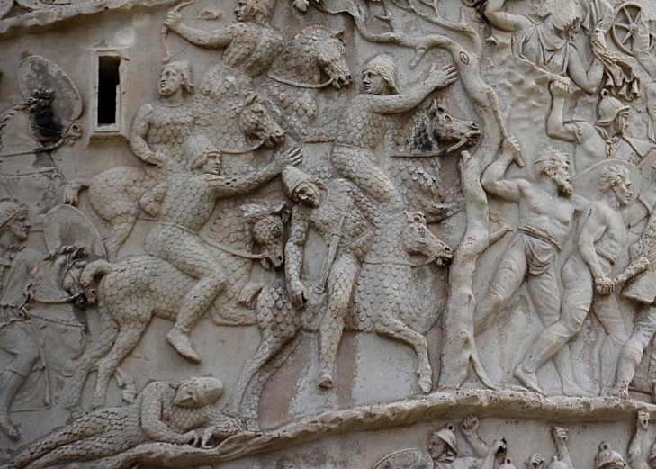 REFERENCE OF SCALED EXTERIOR SHELL, VALLUSTECA BY ARISTOTHEKE EUTECTONICS
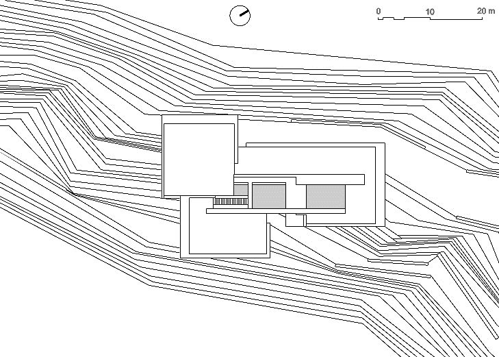 AERIAL SITE PLAN, VALLUSTECA BY ARISTOTHEKE EUTECTONICS
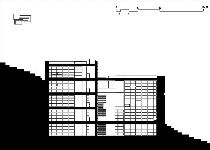 CROSS-SECTION, VALLUSTECA BY ARISTOTHEKE EUTECTONICS
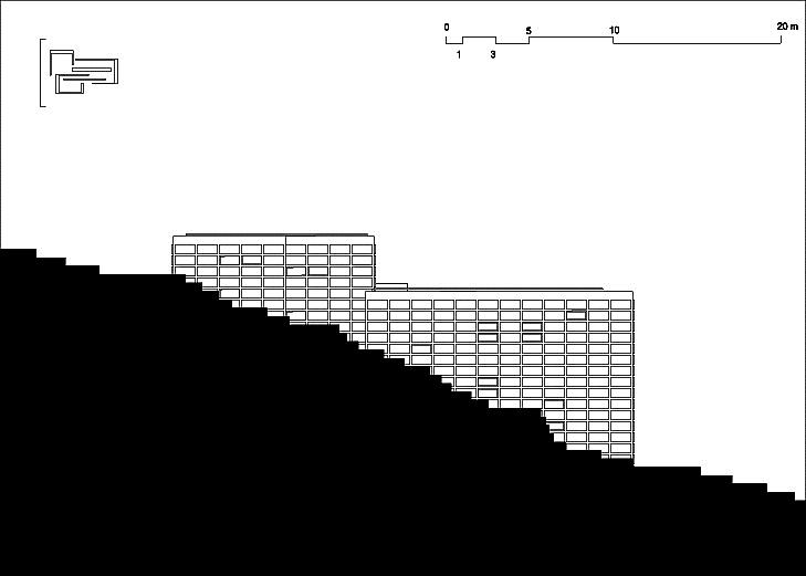 SIDE ELEVATION, VALLUSTECA BY ARISTOTHEKE EUTECTONICS
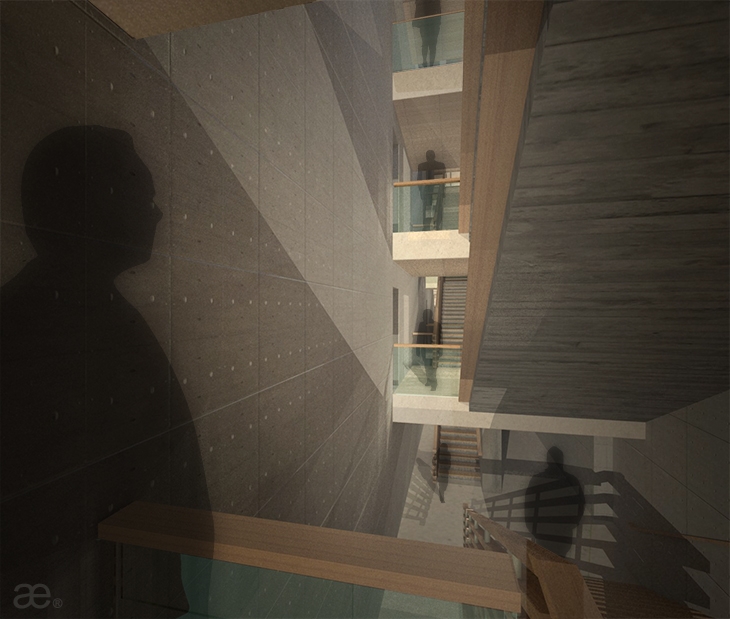 INTERIOR RENDERING, VALLUSTECA BY ARISTOTHEKE EUTECTONICS
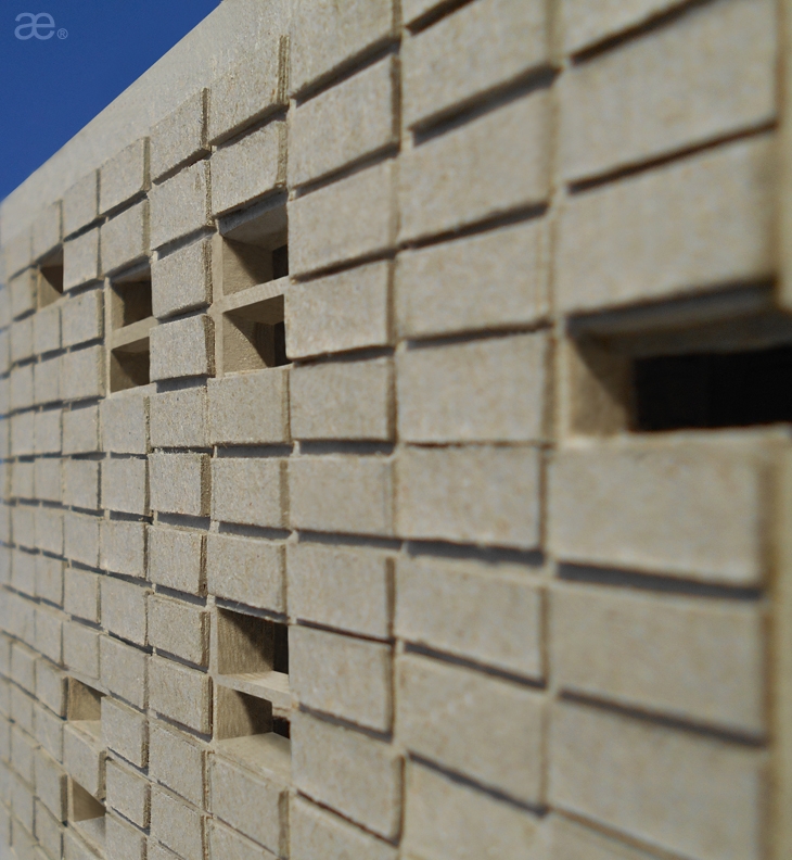 MAQUETTE DETAIL, VALLUSTECA BY ARISTOTHEKE EUTECTONICS
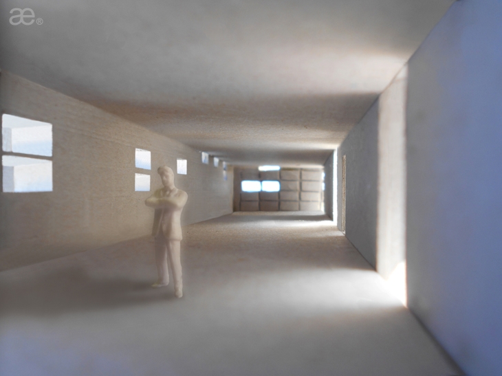 MAQUETTE DETAIL, VALLUSTECA BY ARISTOTHEKE EUTECTONICS
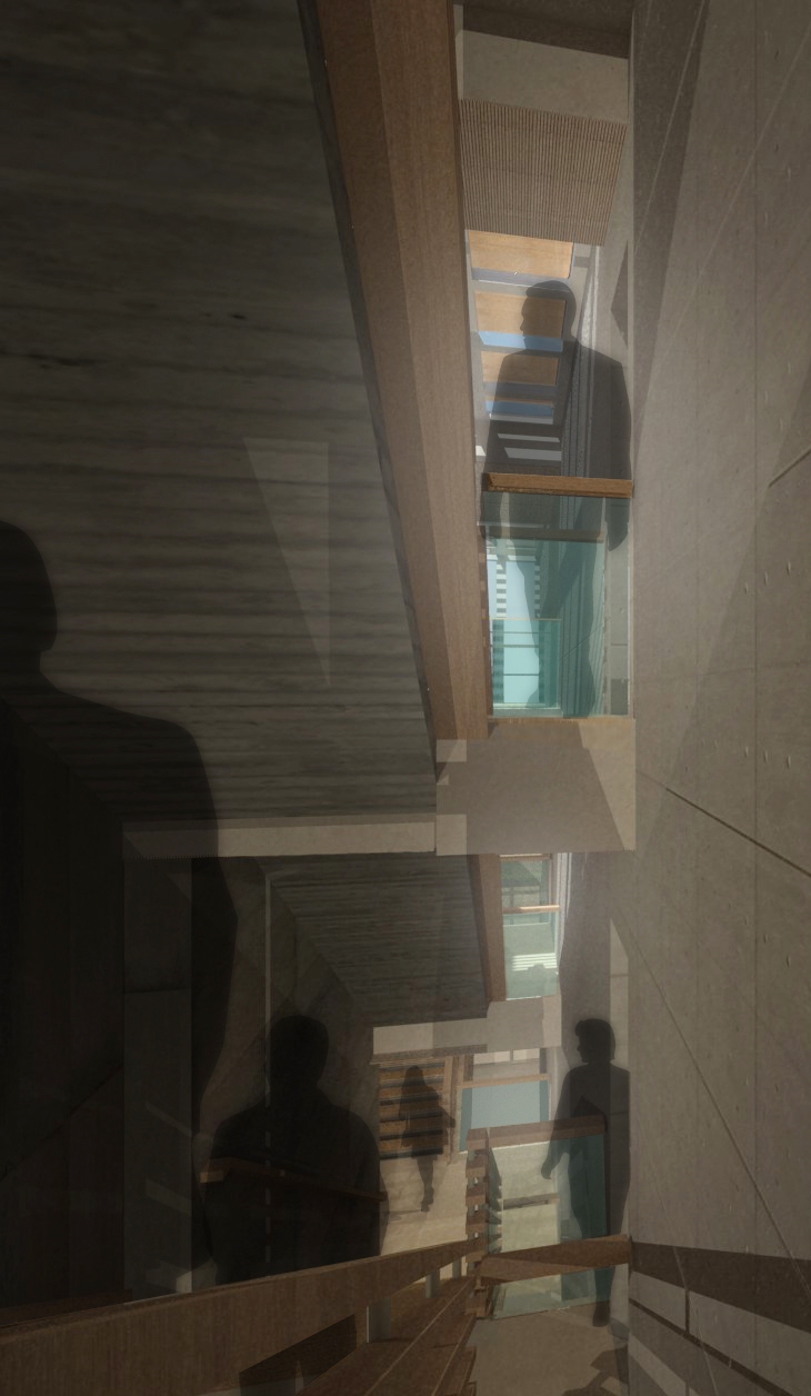 SPINE, INTERIOR RENDERING, VALLUSTECA BY ARISTOTHEKE EUTECTONICS
 SPINE, INTERIOR RENDERING, VALLUSTECA BY ARISTOTHEKE EUTECTONICS
 MAQUETTE, VALLUSTECA BY ARISTOTHEKE EUTECTONICS
 CROSS-SECTION, VALLUSTECA BY ARISTOTHEKE EUTECTONICS
 CROSS-SECTION, VALLUSTECA BY ARISTOTHEKE EUTECTONICS
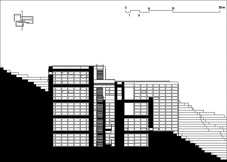 CROSS-SECTION, VALLUSTECA BY ARISTOTHEKE EUTECTONICS
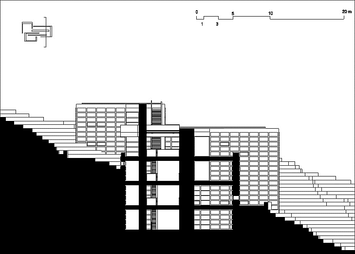 CROSS-SECTION, VALLUSTECA BY ARISTOTHEKE EUTECTONICS
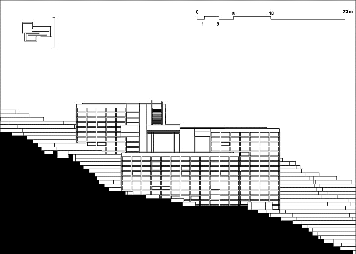 SIDE ELEVATION, VALLUSTECA BY ARISTOTHEKE EUTECTONICS
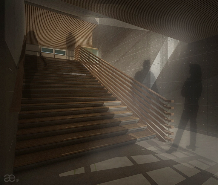 INTERIOR RENDERING, VALLUSTECA BY ARISTOTHEKE EUTECTONICS
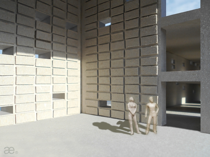 MAQUETTE DETAIL, VALLUSTECA BY ARISTOTHEKE EUTECTONICS
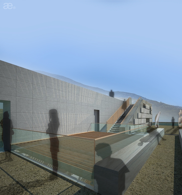 EXTERIOR RENDERING, VALLUSTECA BY ARISTOTHEKE EUTECTONICS
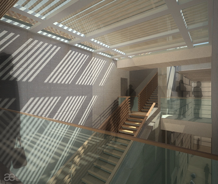 INTERIOR RENDERING, VALLUSTECA BY ARISTOTHEKE EUTECTONICS
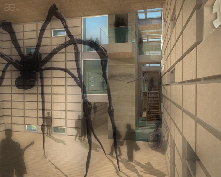 EXHIBITION CUBE, INTERIOR RENDERING, VALLUSTECA BY ARISTOTHEKE EUTECTONICS
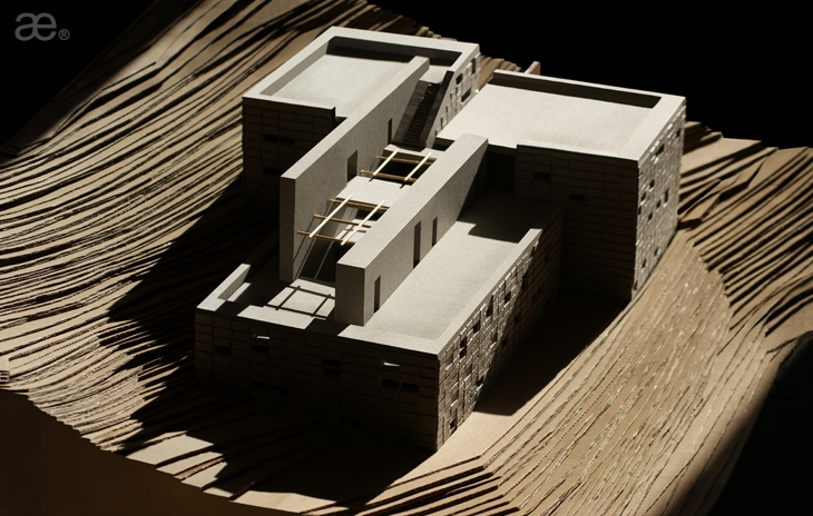 MAQUETTE, VALLUSTECA BY ARISTOTHEKE EUTECTONICS
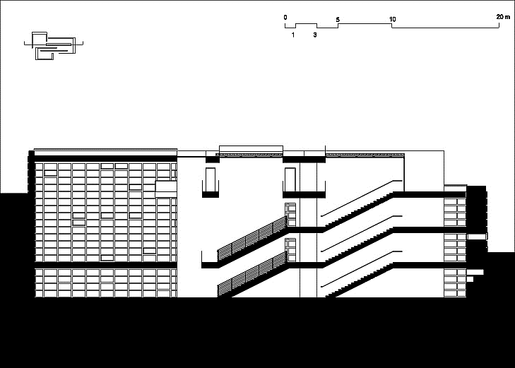 LONG-SECTION, VALLUSTECA BY ARISTOTHEKE EUTECTONICS
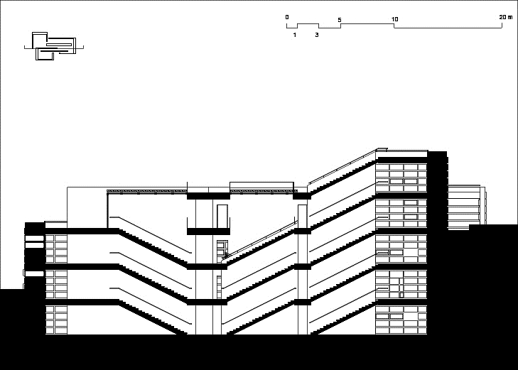 LONG-SECTION, VALLUSTECA BY ARISTOTHEKE EUTECTONICS
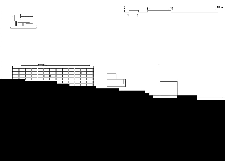 LONG ELEVATION, VALLUSTECA BY ARISTOTHEKE EUTECTONICS
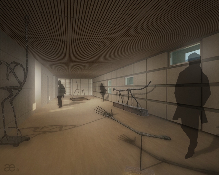 LINEAR GALLERIES INTERIOR RENDERING, VALLUSTECA BY ARISTOTHEKE EUTECTONICS
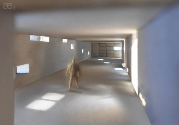 GALLERIES, MAQUETTE DETAIL, VALLUSTECA BY ARISTOTHEKE EUTECTONICS
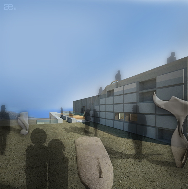 EXTERIOR RENDERING, VALLUSTECA BY ARISTOTHEKE EUTECTONICS
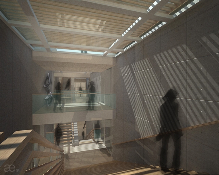 INTERIOR RENDERING, VALLUSTECA BY ARISTOTHEKE EUTECTONICS
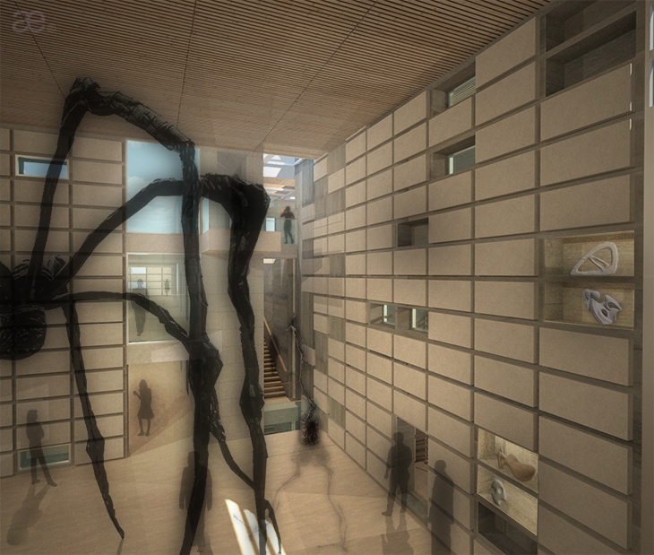 EXHIBITION CUBE, INTERIOR RENDERING, VALLUSTECA BY ARISTOTHEKE EUTECTONICS
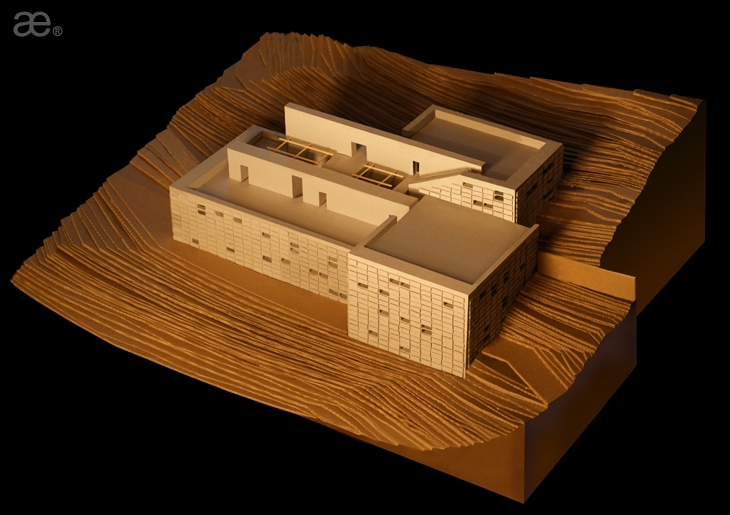 MAQUETTE, VALLUSTECA BY ARISTOTHEKE EUTECTONICS
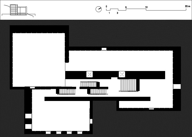 PLAN VIEW, VALLUSTECA BY ARISTOTHEKE EUTECTONICS
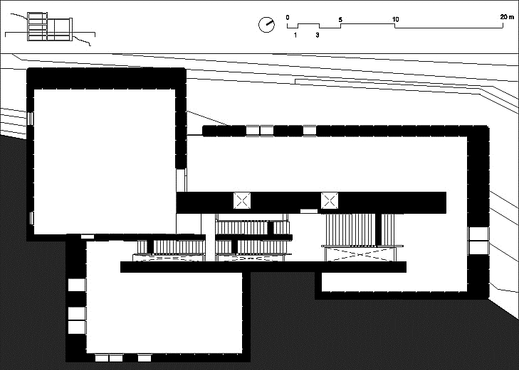 PLAN VIEW, VALLUSTECA BY ARISTOTHEKE EUTECTONICS
 PLAN VIEW, VALLUSTECA BY ARISTOTHEKE EUTECTONICS
 PLAN VIEW, VALLUSTECA BY ARISTOTHEKE EUTECTONICS
 INTERIOR RENDERING, VALLUSTECA BY ARISTOTHEKE EUTECTONICS
 MAQUETTE DETAIL, VALLUSTECA BY ARISTOTHEKE EUTECTONICS
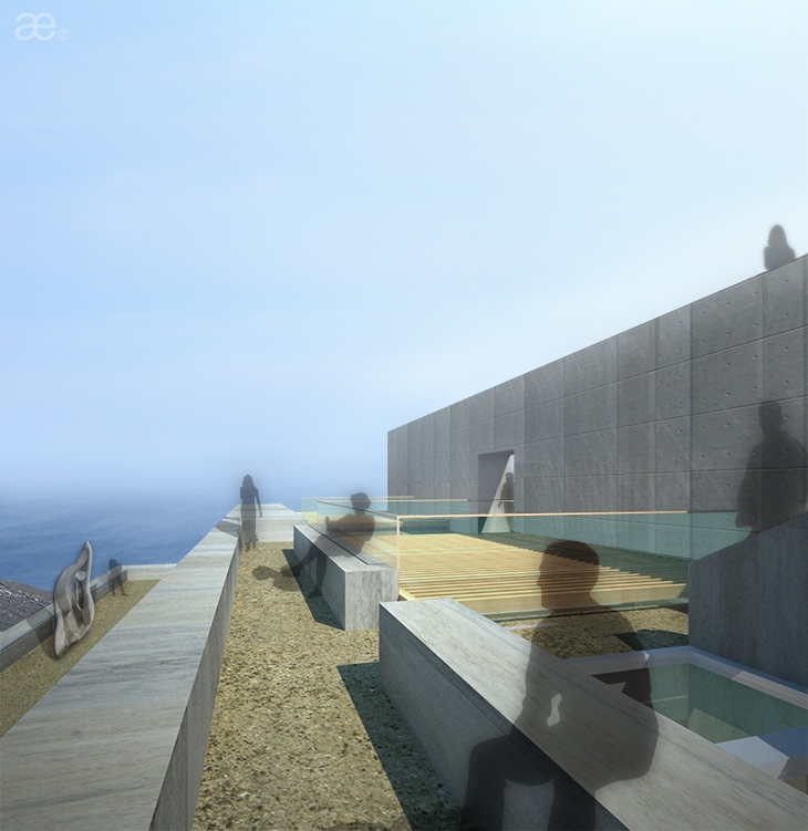 EXTERIOR RENDERING, VALLUSTECA BY ARISTOTHEKE EUTECTONICS
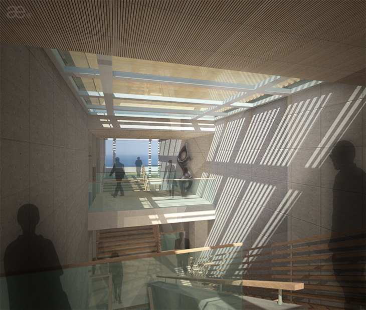 SPINE, INTERIOR RENDERING, VALLUSTECA BY ARISTOTHEKE EUTECTONICS
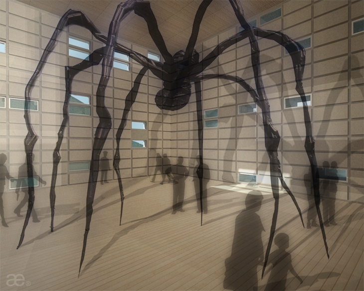 EXHIBITION CUBE, INTERIOR RENDERING, VALLUSTECA BY ARISTOTHEKE EUTECTONICS
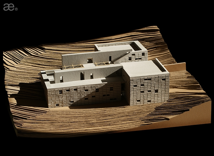 MAQUETTE, VALLUSTECA BY ARISTOTHEKE EUTECTONICS
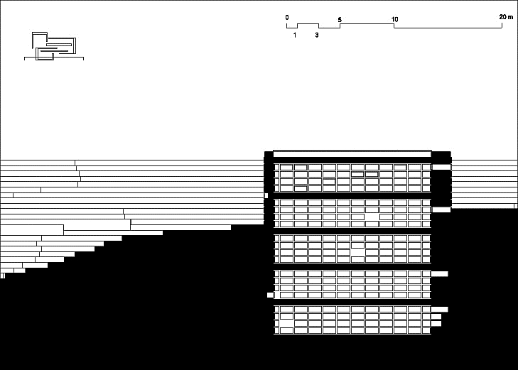 LONG-SECTION, VALLUSTECA BY ARISTOTHEKE EUTECTONICS
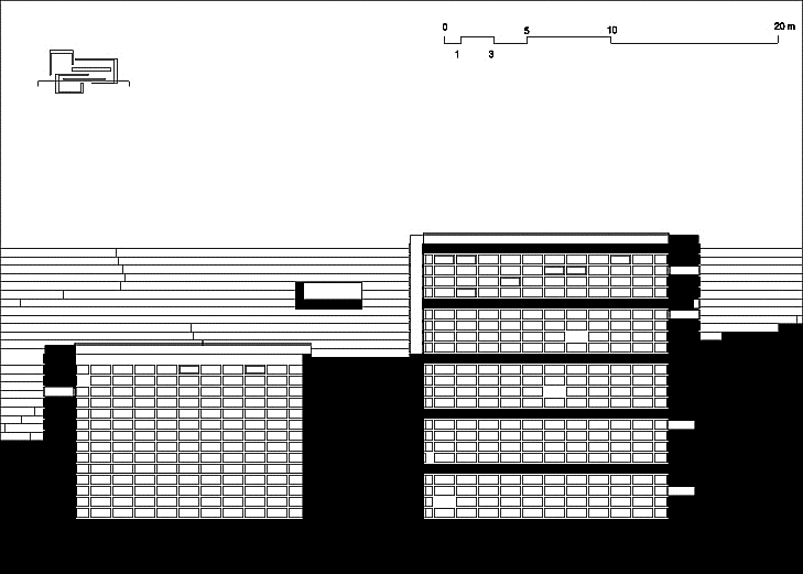 LONG-SECTION, VALLUSTECA BY ARISTOTHEKE EUTECTONICS
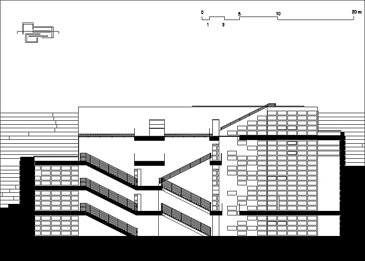 LONG-SECTION, VALLUSTECA BY ARISTOTHEKE EUTECTONICS
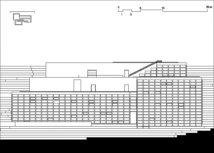 LONG ELEVATION, VALLUSTECA BY ARISTOTHEKE EUTECTONICS
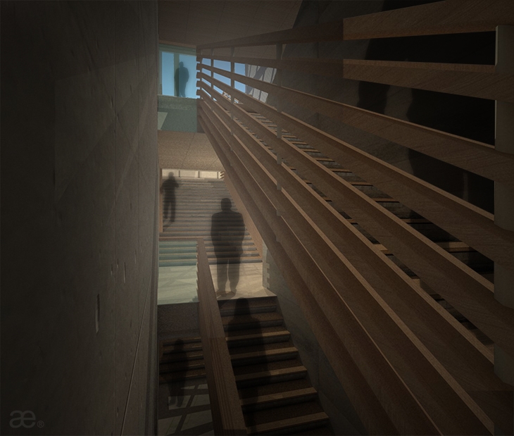 INTERIOR RENDERING, VALLUSTECA BY ARISTOTHEKE EUTECTONICS
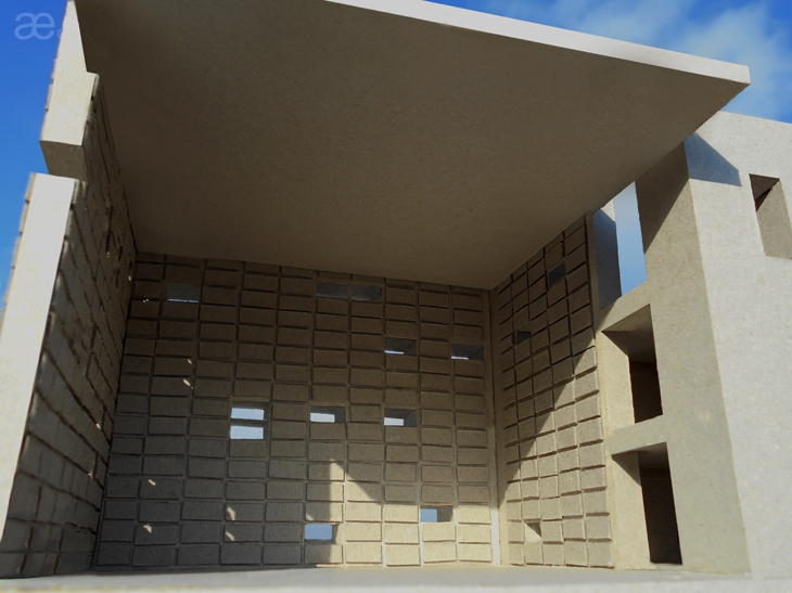 MAQUETTE DETAIL, VALLUSTECA BY ARISTOTHEKE EUTECTONICS
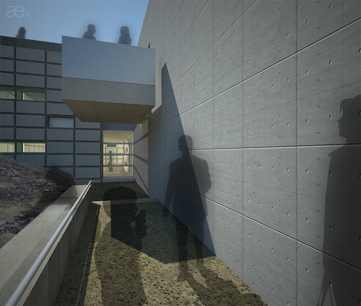 EXTERIOR RENDERING, VALLUSTECA BY ARISTOTHEKE EUTECTONICS
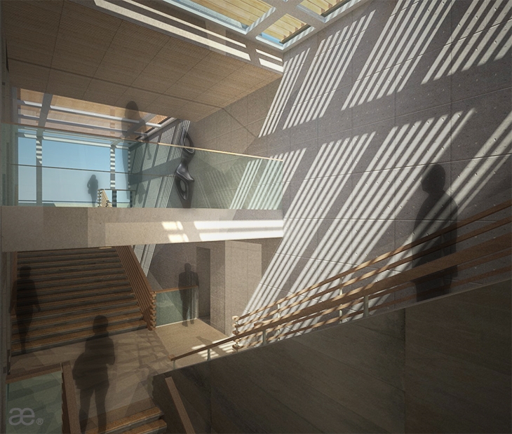 INTERIOR RENDERING, VALLUSTECA BY ARISTOTHEKE EUTECTONICS
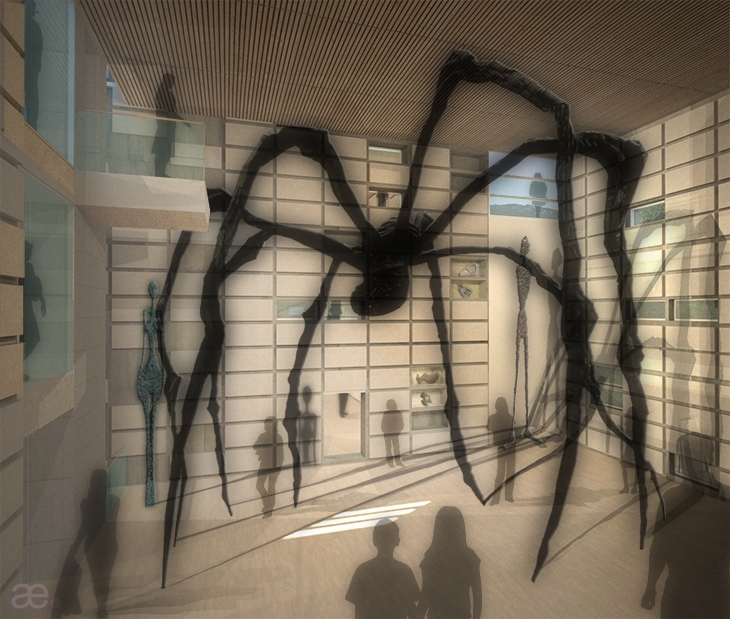 EXHIBITION CUBE, INTERIOR RENDERING, VALLUSTECA BY ARISTOTHEKE EUTECTONICS
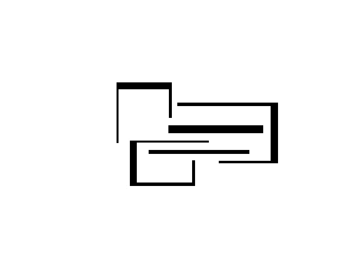 CONCEPT PLANAR DIAGRAM, VALLUSTECA BY ARISTOTHEKE EUTECTONICS
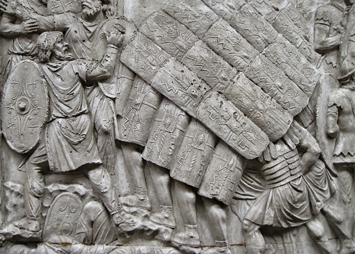 REFERENCE OF MODULATED EXTERIOR SHELL, VALLUSTECA BY ARISTOTHEKE EUTECTONICS
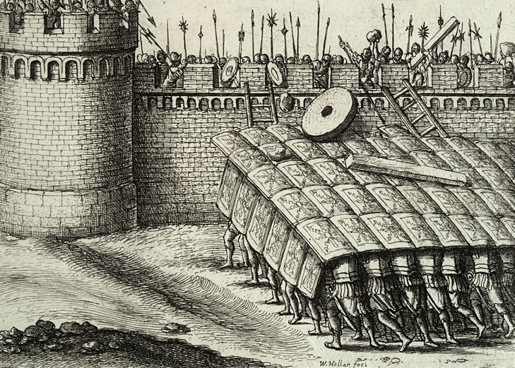 REFERENCE OF MODULATED EXTERIOR SHELL, VALLUSTECA BY ARISTOTHEKE EUTECTONICS
READ ALSO: Bllend Design & Research Office at ΕΣΩ Conference: A Sneak Peek