Dassyras is a family-owned coffee roaster founded in 1987 to produce artisan Greek and filter coffee. As the second generation entered the business, they began crafting a unique espresso blend of several different specialty coffee beans. Its distinctively rich taste and impressive aroma paved the way for the product to gradually become a bestseller in the wholesale market. But it was literally a no name brand.
So they commissioned us to create its name, logo and packaging.
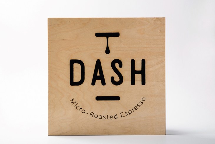
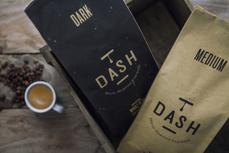
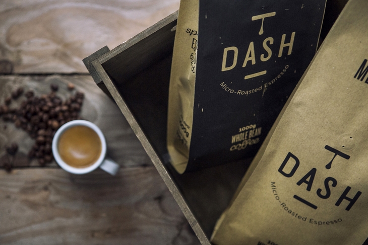
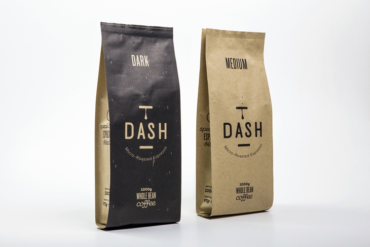
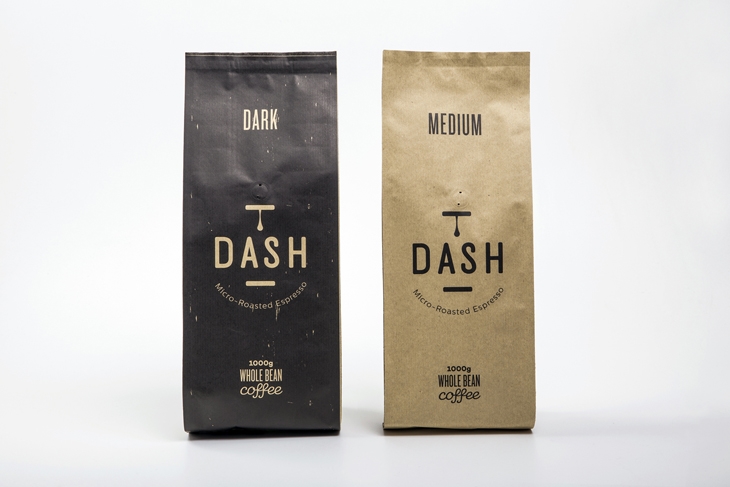
The name needed to be short, good-sounding, easy to remember and somehow connected to the family business name. So “DASH” fulfilled all three criteria and sounded a lot like Dassyras. DASH was placed in between two dashes to indicate a pause/break. Just like em dashes, which are used to indicate a break in a sentence. Meanwhile a coffee drop stands still, creating the impression that it will fall any minute.
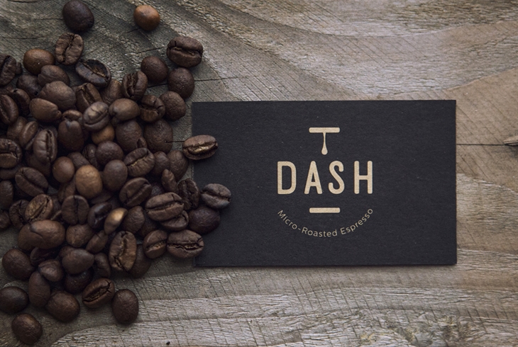
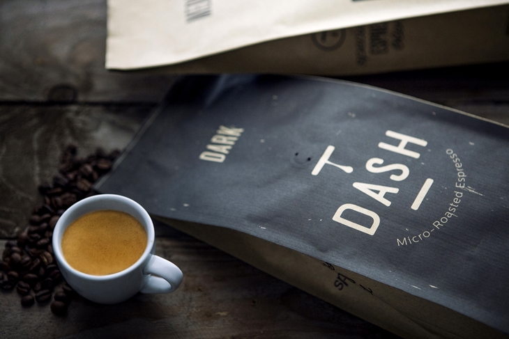
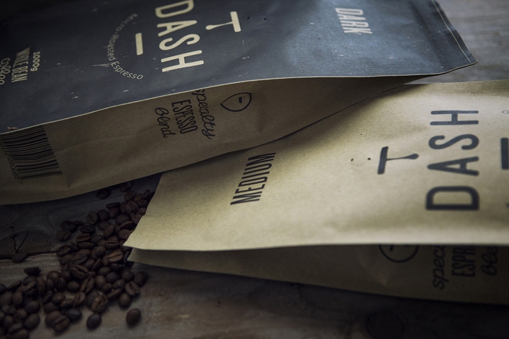
When it came to designing the packaging, we wanted something as crafted as the product itself. Different colors on packaging (kraft and slightly faded black) indicate the type of coffee roasting; kraft for medium-roasted and black for dark roasted respectively. To convey the brand’s authentic and micro-roasting personality, we also designed and printed their business cards on kraft paper and made by hand, one by one, Dash’s wood labels with the logo woodburned into them.
About S & Team
S & Team is an Athens-based brand agency delivering results-driven branding and communication solutions. Since its founding in 1998 it has served a wide range of clients extending from multinational companies to local producers. Our team is comprised of a project manager, a team of art directors and a copywriter collaborating with an extended network of architects, photographers, and web developers. And this is how we have been “raising” brands over the past 18 years.
 DASH / S & TEAM
 DASH / S & TEAM
 DASH / S & TEAM
 DASH / S & TEAM
 DASH / S & TEAM
 DASH / S & TEAM
 DASH / S & TEAM
 DASH / S & TEAM
READ ALSO: GREEK ARCHITECTURE STUDENT, DIMITRIOS SERGENTAKIS, RECEIVES 1st PRIZE AT THE ANNUAL INTERNATIONAL DESIGN AWARDS