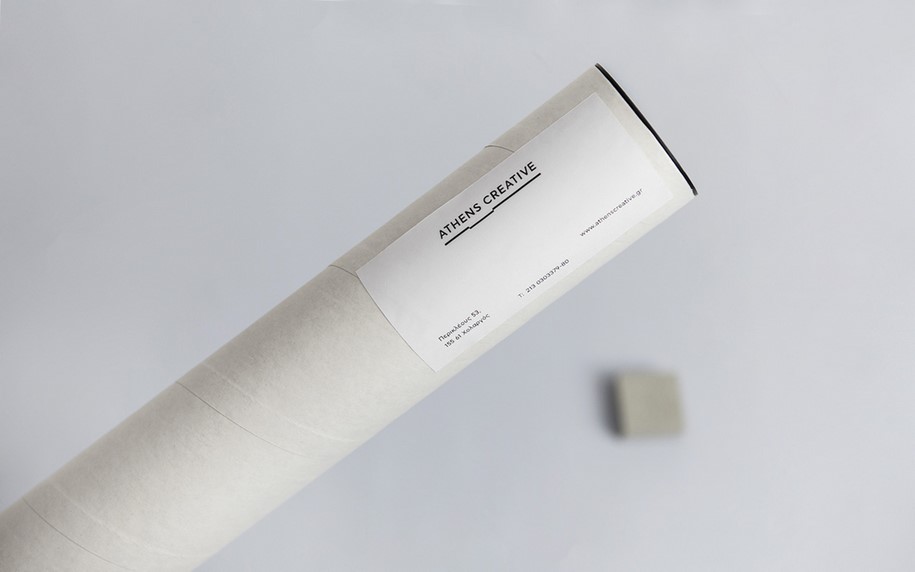
ATHENS CREATIVE is a design & management firm applying foremost in architecture and engineering consultation through experienced professionals. When ATHENS CREATIVE came to our office, they had already registered their name and wanted help with their branding. After thorough discussion with them, we concluded that they wanted a complete visual identity that would convey their design mentality and high-quality of their services regardless of scale.

During our brainstorming session, we mapped out what their work meant to us and came up with one key word /concept; ‘architectural scale’, which was then translated into visual – logo. The scale-inspired logo we presented to them has several extensions. First of all, the concept of ‘architectural scale’ implies the ability to take on projects, no matter their scale. Moreover, the scale detail acts as an underline for ATHENS CREATIVE. Nevertheless, the line is not strictly straight, which further demonstrates flexibility in the way they approach each project.

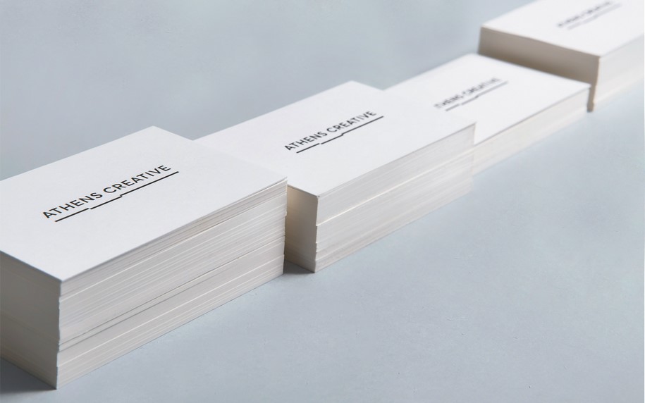
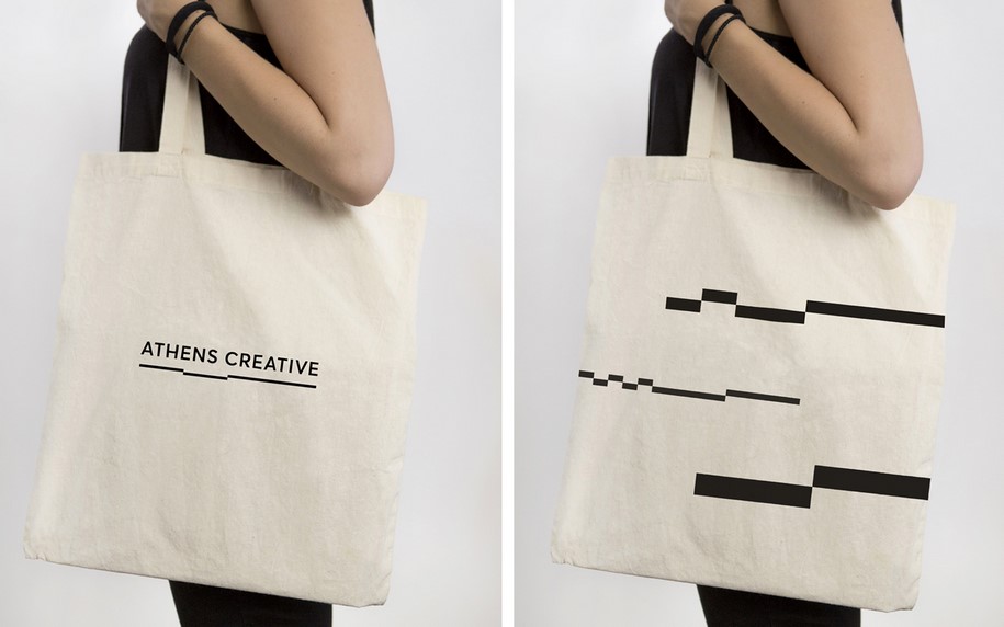
The idea of architectural scale-inspired line was further developed in ATHENS CREATIVE visual identity. More specifically, in their business cards, it underlines the name and job position of each partner, while ‘connecting’ them (when putting two or more cards next to each other). In addition to business cards design, their visual identity included customized stickers and tote bags.

Facts & Credits:
Design: S & Team
Printing Office: Ektipotiki Axion
Photography: Alexis Kamitsos
Client: ATHENS CREATIVE (http://athenscreative.gr/)

READ ALSO: Red house is a former winery transformed into a two-storey home and constructed of preserved and upcycled materials /EXTRASTUDIO