ATOMAA redesigned an apartment for a young couple in Milan employing bold colours, arches and curves so as to create an open, luminous, flexible and dynamic living space.
-text by the authors
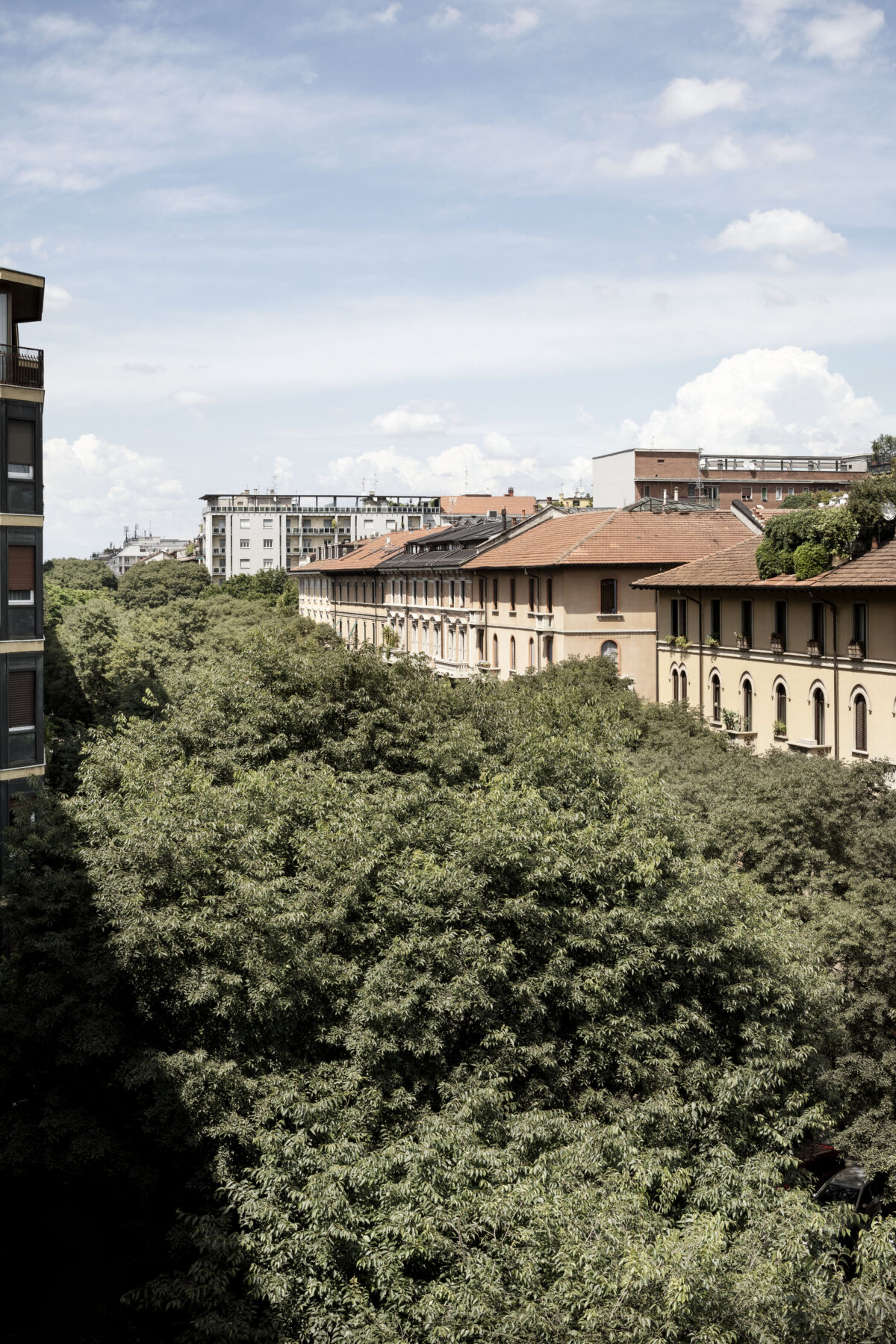
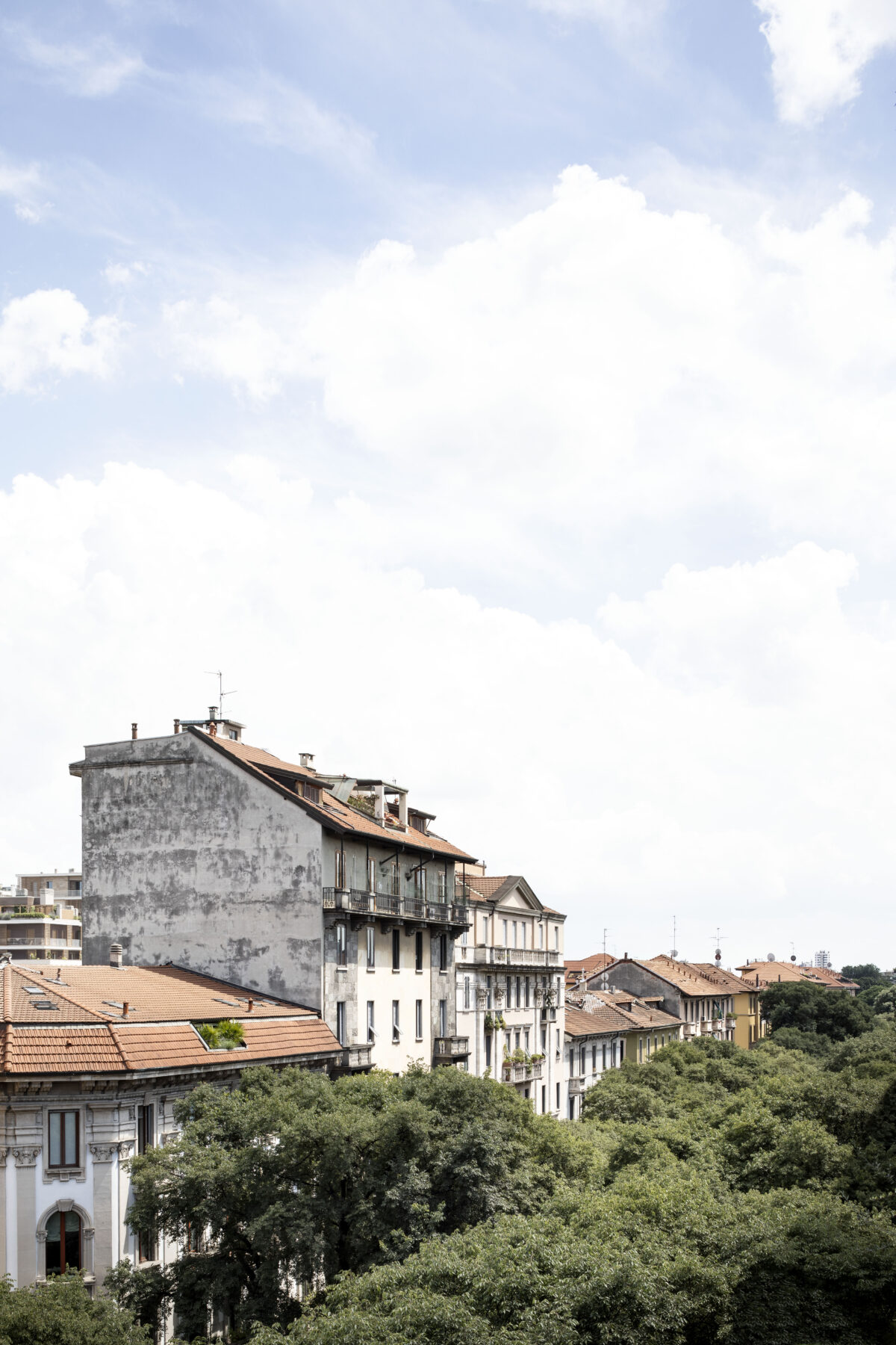
High above the treetops of one of the most beautiful streets in Milan, the sun fills an apartment with light, where functionality and aesthetics compete for the throne. The house, designed and built in the fall of 2019, narrates the story of those who live within: a young couple with a passion for reading, cinema, design and music.
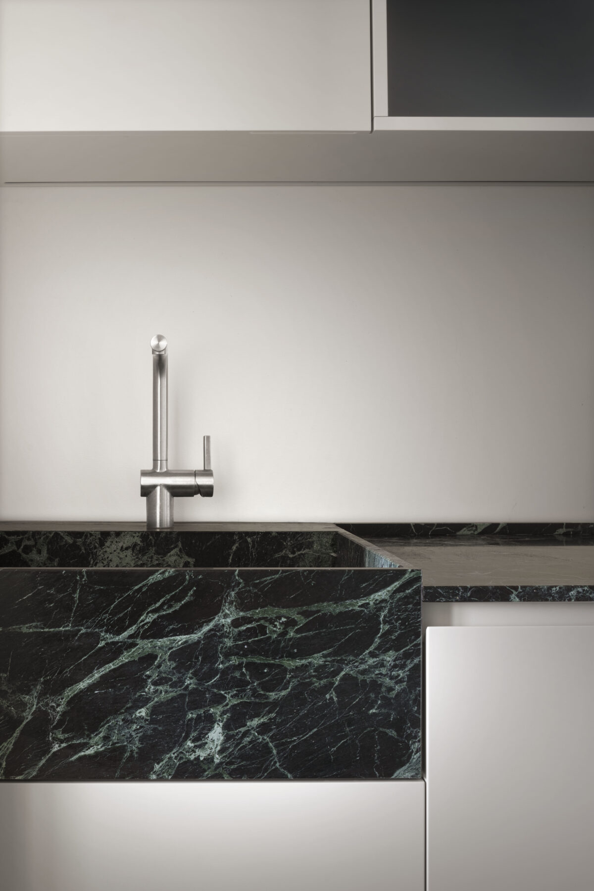
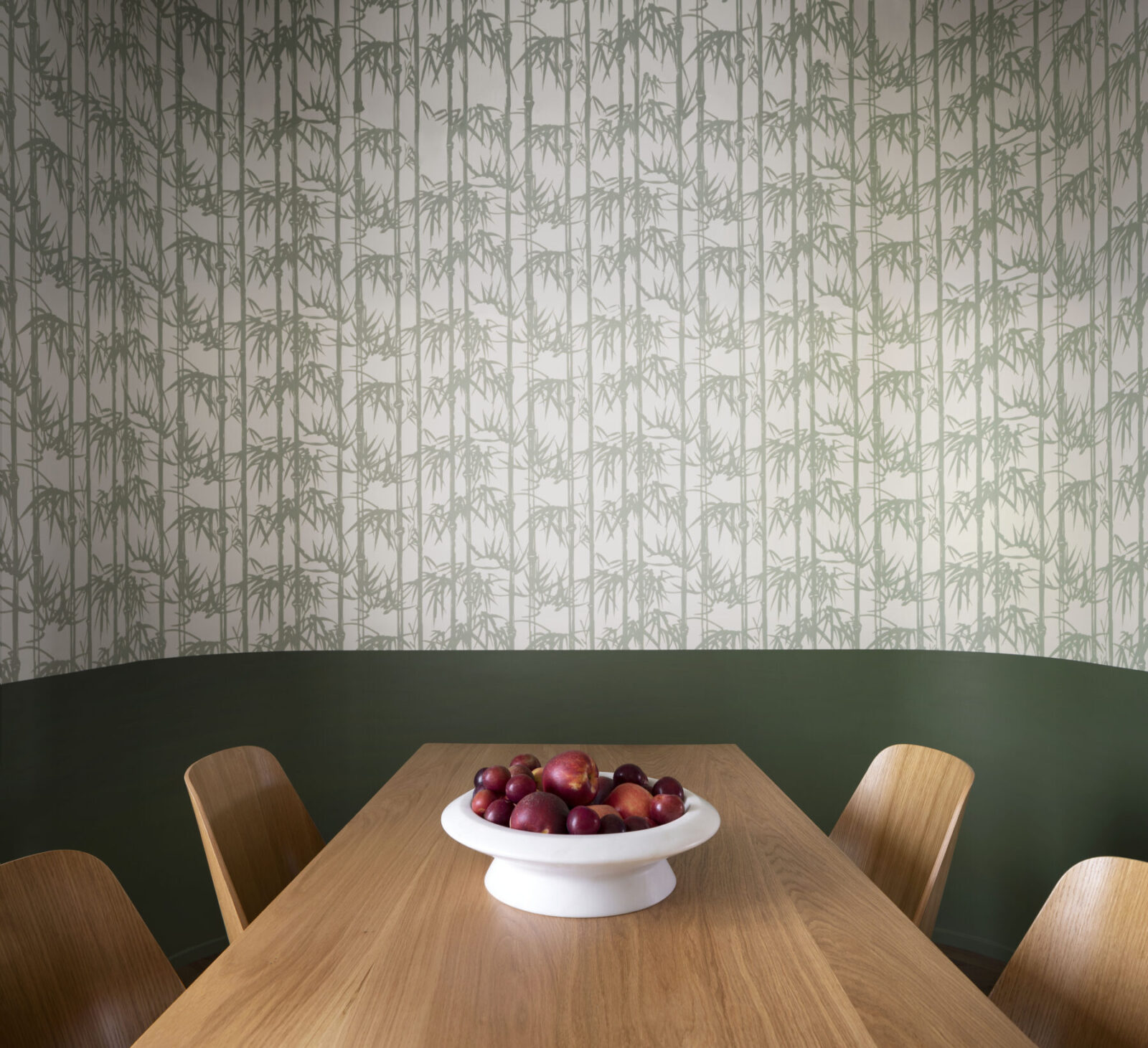
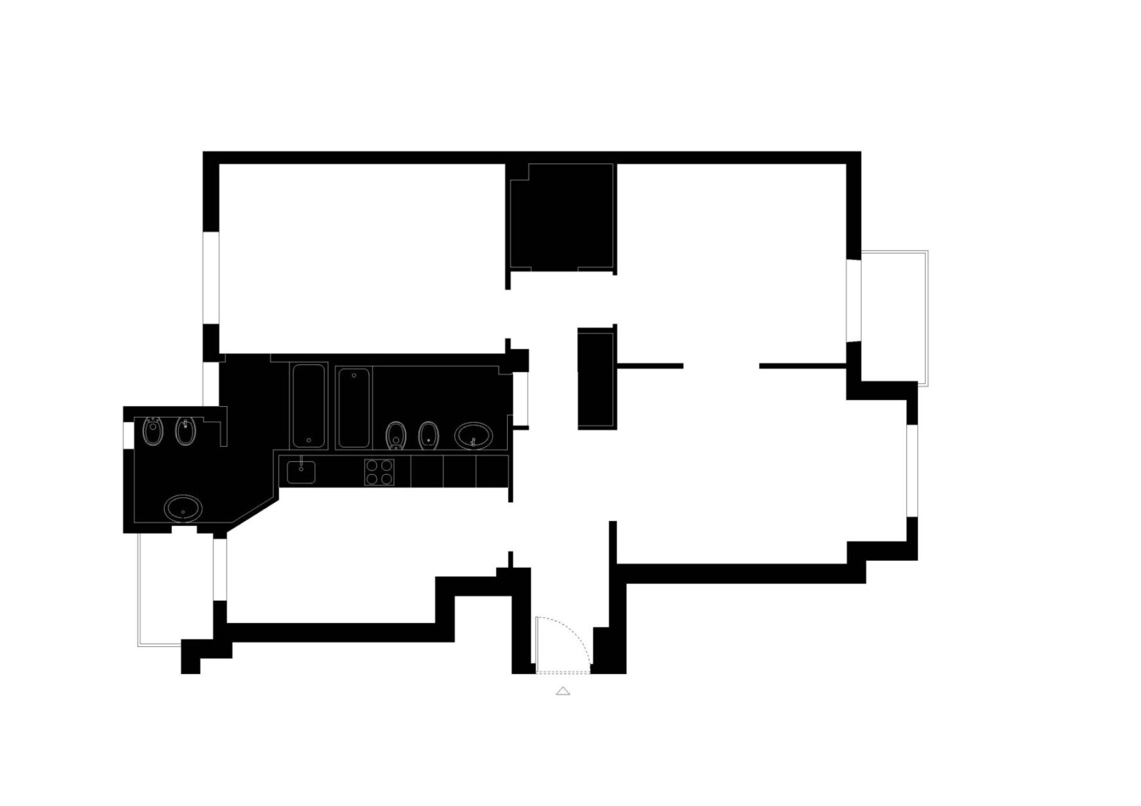
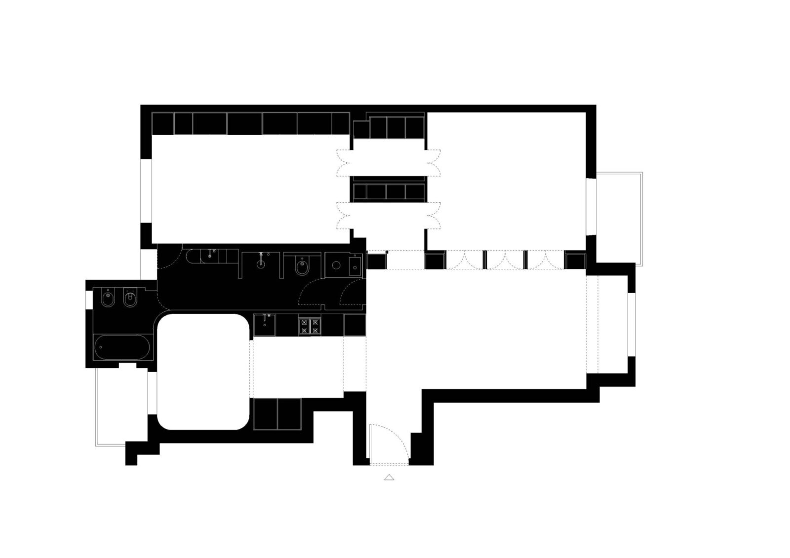
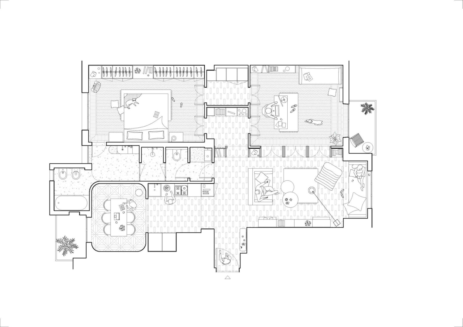
The architectural project is tailored to the clients’ desires with precision and dedication: the environments retain their original nature but are distorted in aesthetics and colours. A partition divides the original room used for the kitchen, obtaining – on the one hand – a compact dining room characterized by decorative wallpaper, a legacy of British domestic spaces, and – on the other – a minimal, elegant and functional kitchen.
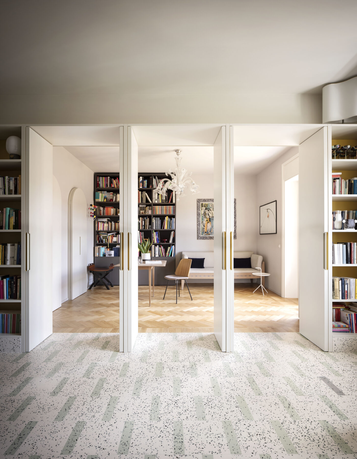
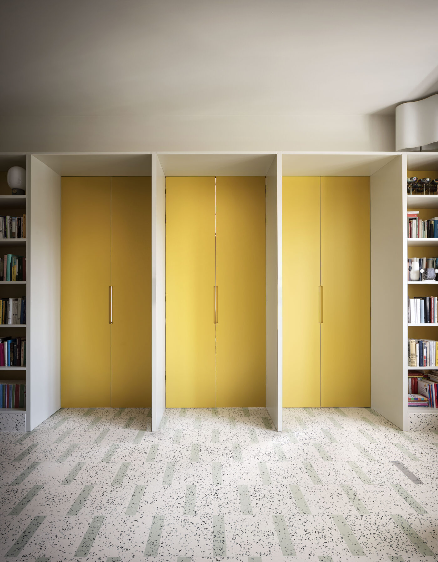
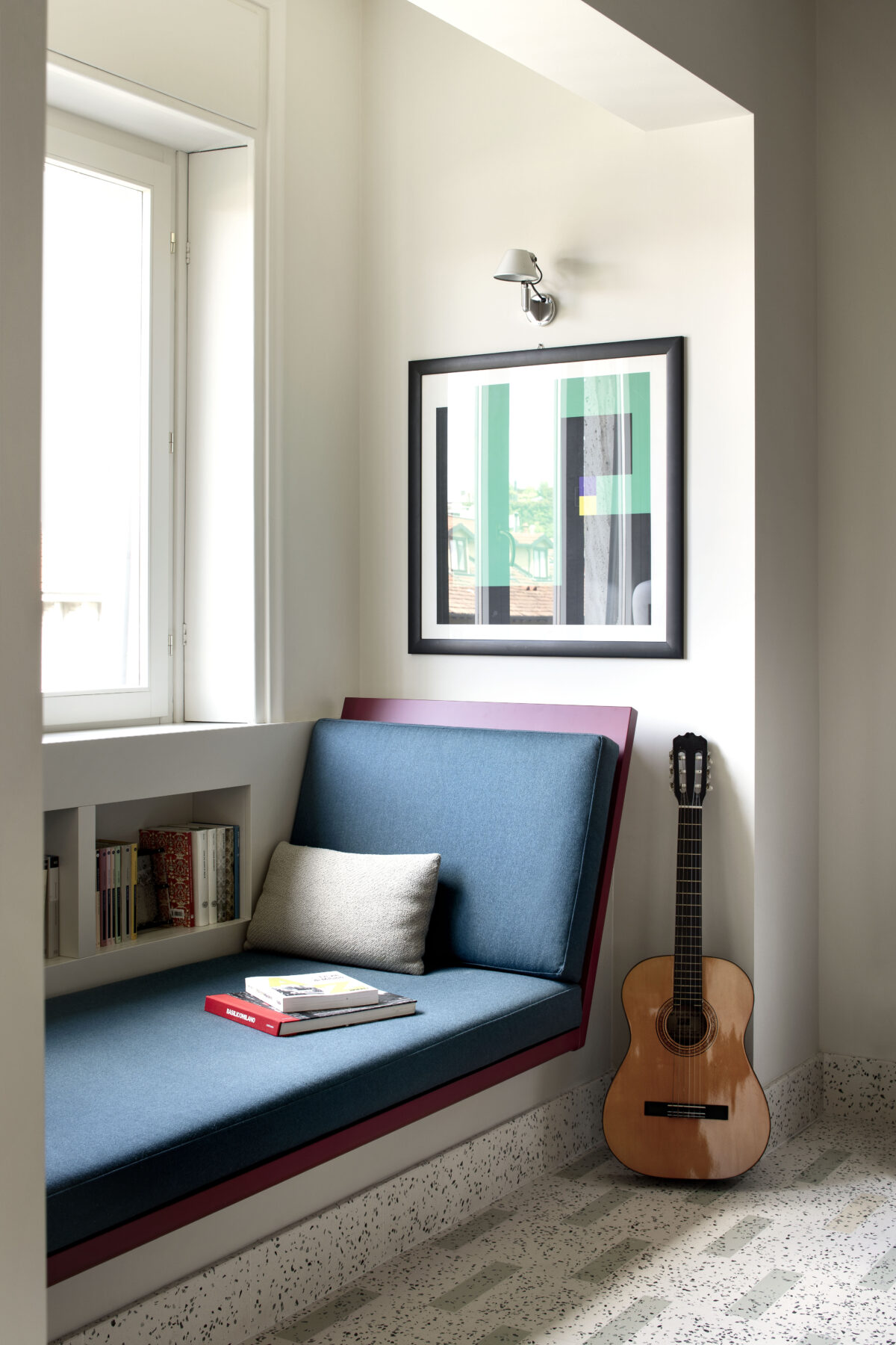
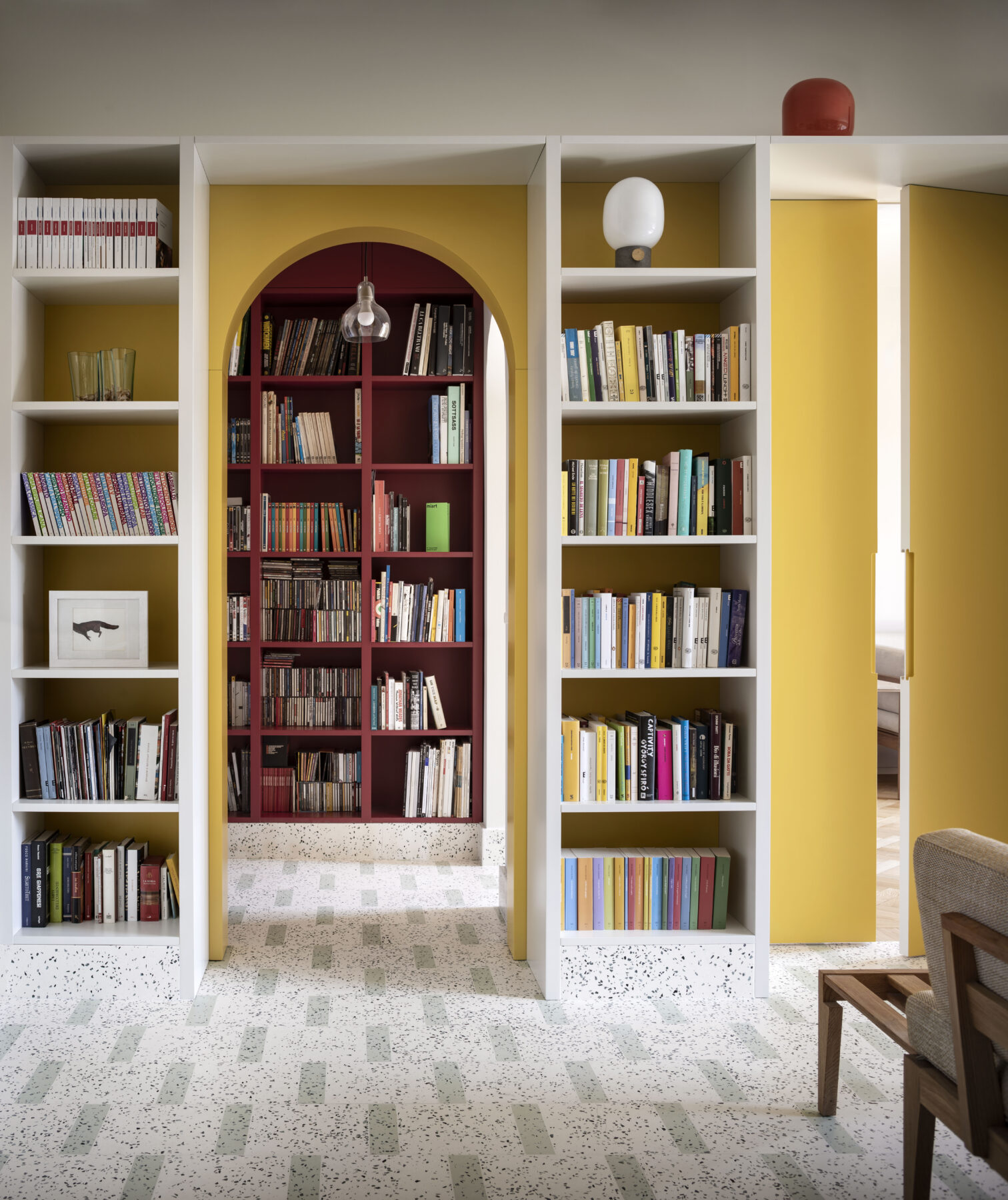
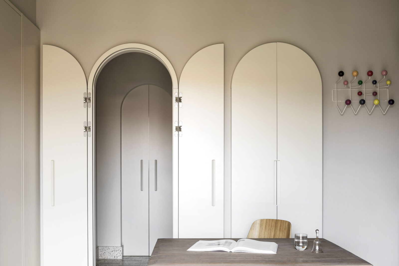
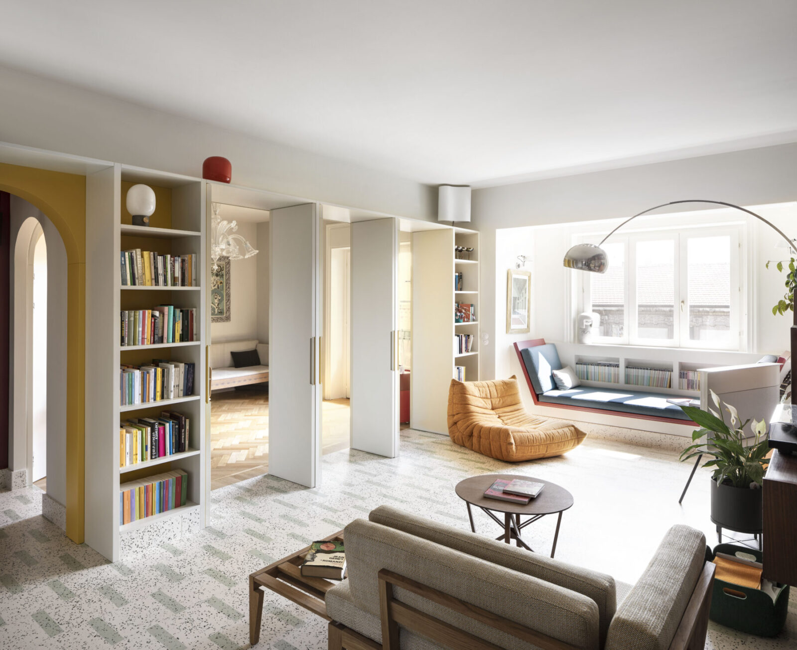
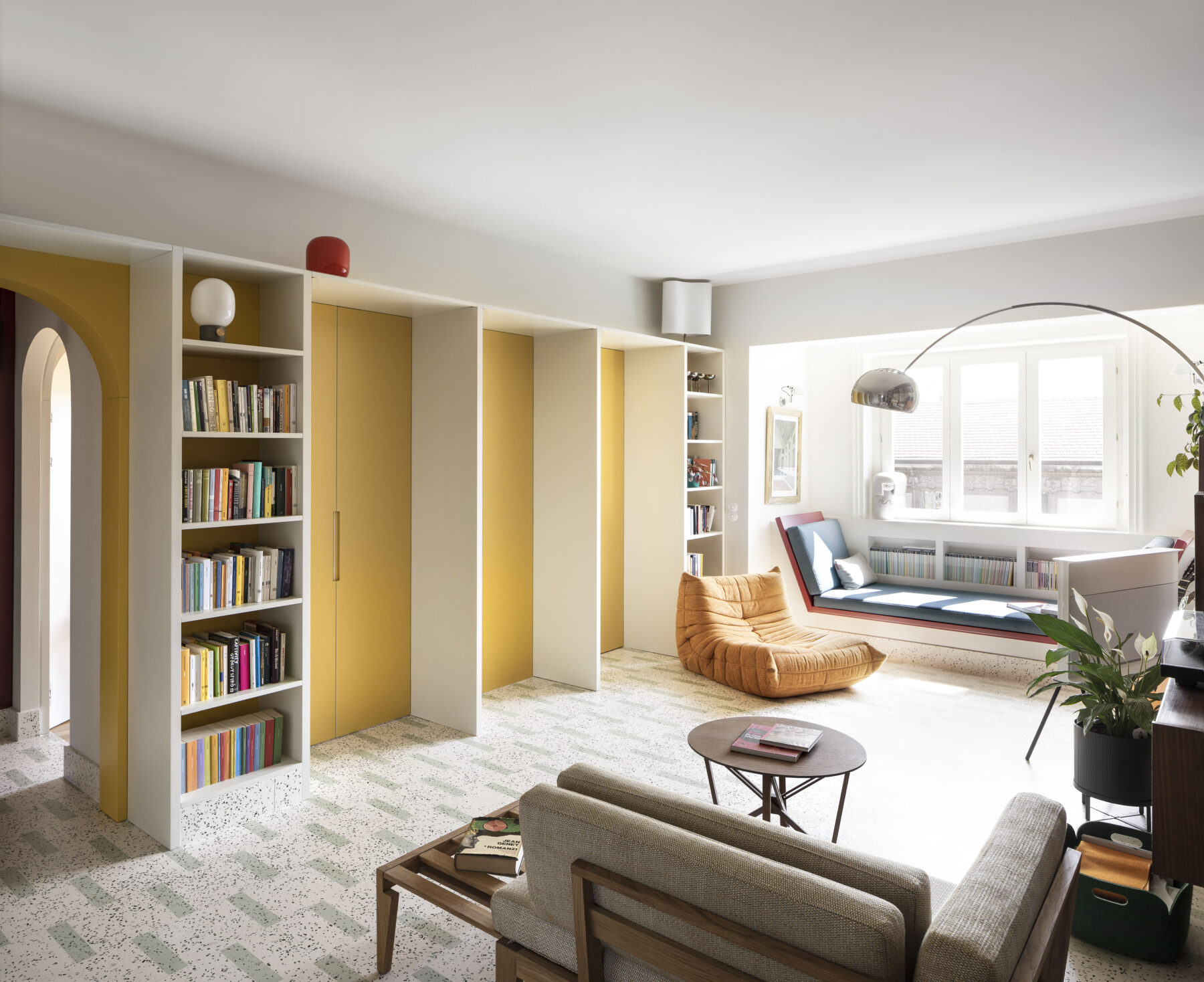
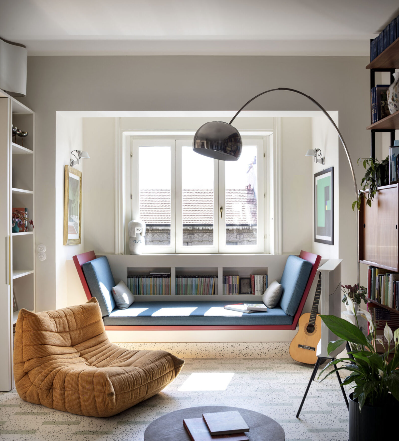
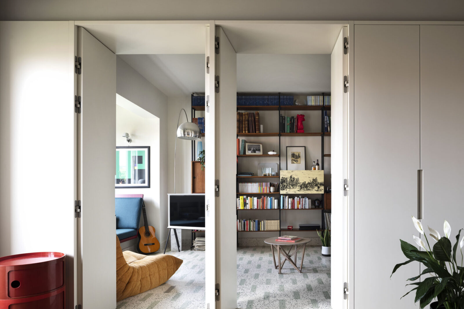
The existing living room, well defined by walls, corridors and a washroom, changes its face and becomes a large open space, characterised by a colourful floor in concrete grit, which creeps into every room. The space opens, through a sequence of large portals, towards the kitchen and the dining room on one side, and towards a reading-nook and bow-window, towards the east. The act of opening continues to the study/guest room through a series of large portal doors. The latter, however, completely integrated into a long bookcase, hides panels of an intense yellow, which provide a defined division between the entertainment and private spaces.
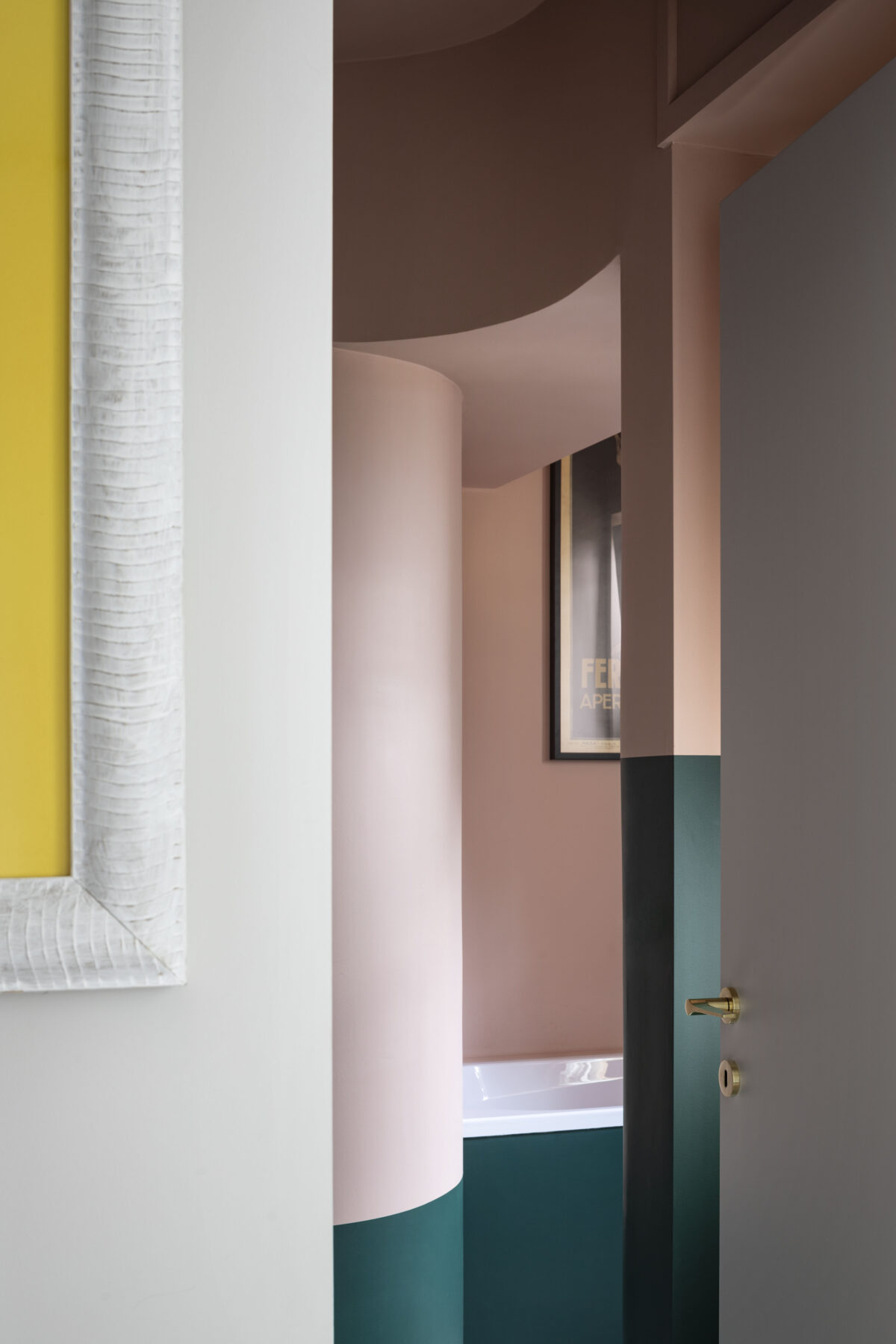
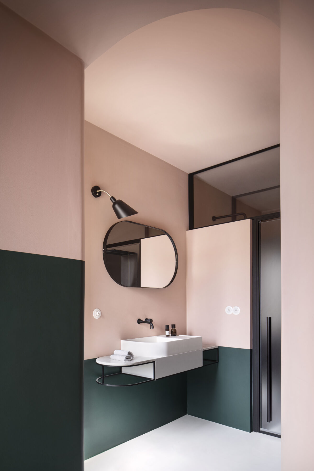
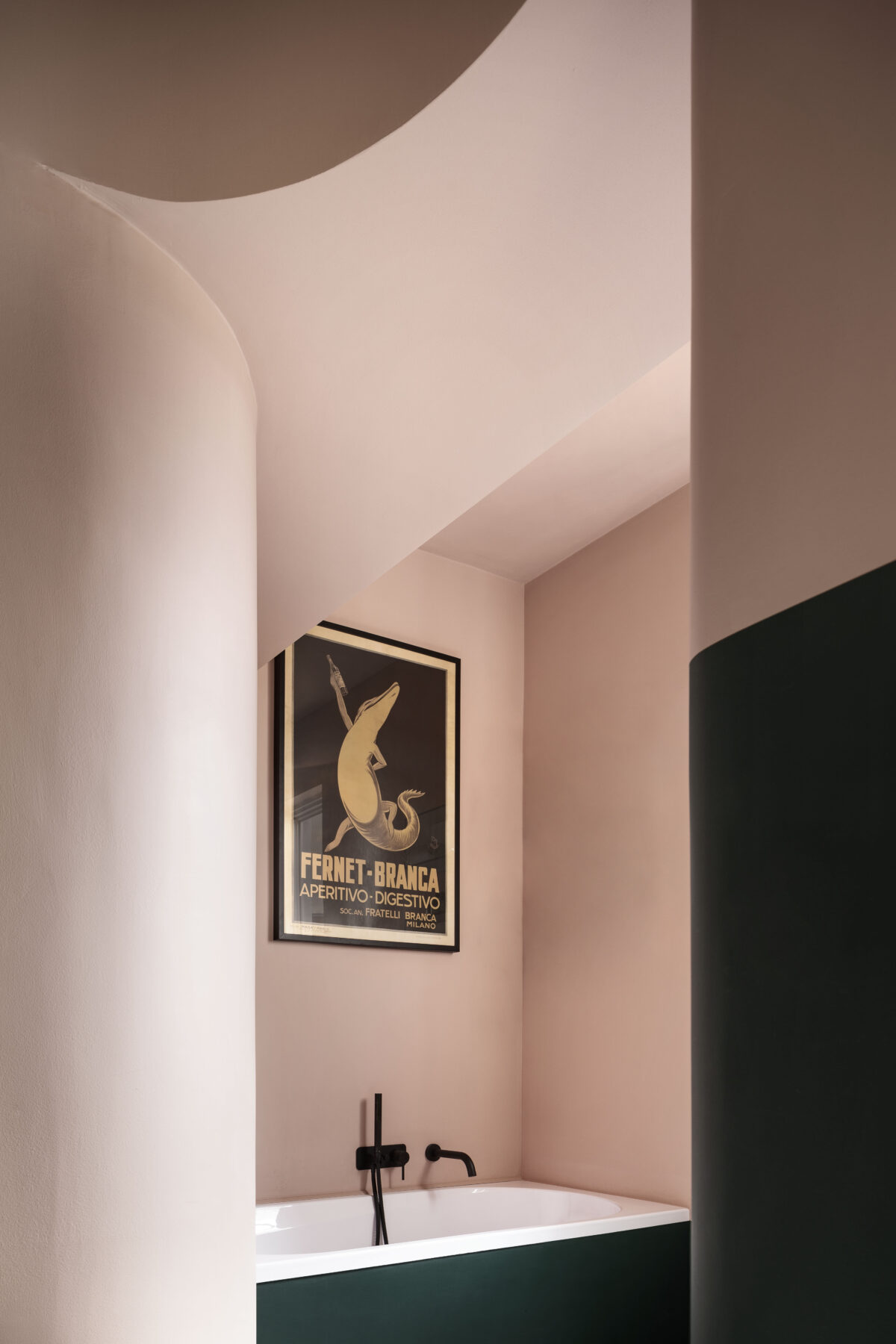
The bathroom is not a secondary environment: a real salle de bains has been designed with the aim of obtaining refined and tailor-made environments, coherently integrating the room intended for comfort services in the domestic space. The bathroom is divided into soft and fluid spaces that welcome a series of design objects carefully selected in partnership with the clients. The shower is a “passage” element that connects the master bathroom, accessible from the bedroom, to the secondary guest bathroom. This functional transition both eliminates additional distribution spaces to the services and filters the light coming from the master bathroom to the secondary bathroom, through the large integrated high level window.
The search for colour is fundamental in the design process: in this environment, pastel pink and dark green alternate elegantly, creating a bright contrast with the matte black finishes chosen for the taps, the profiles of the shower box, mirror and washbasin. Every detail has been evaluated and considered through a happy collaboration with the clients, another fundamental feature of the projects signed by ATOMAA.

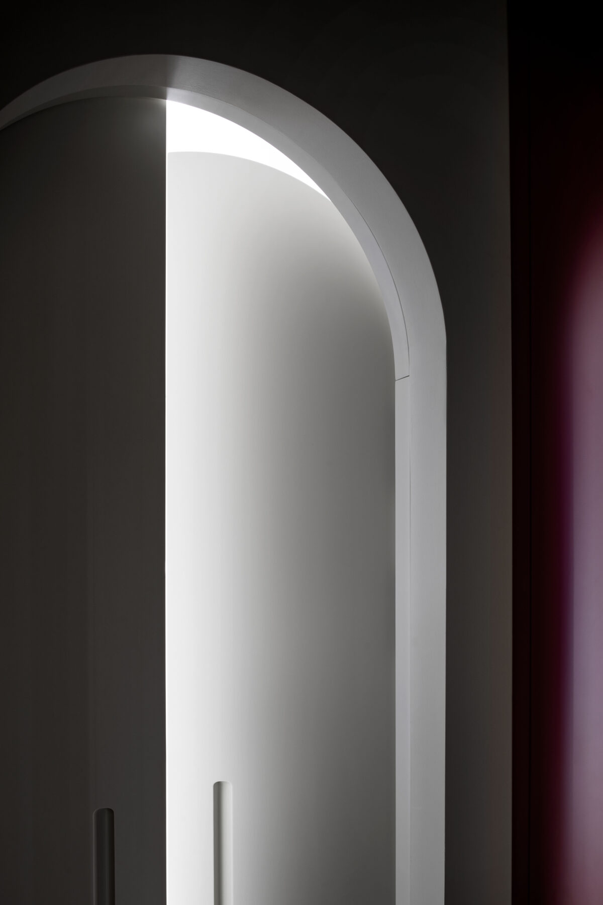
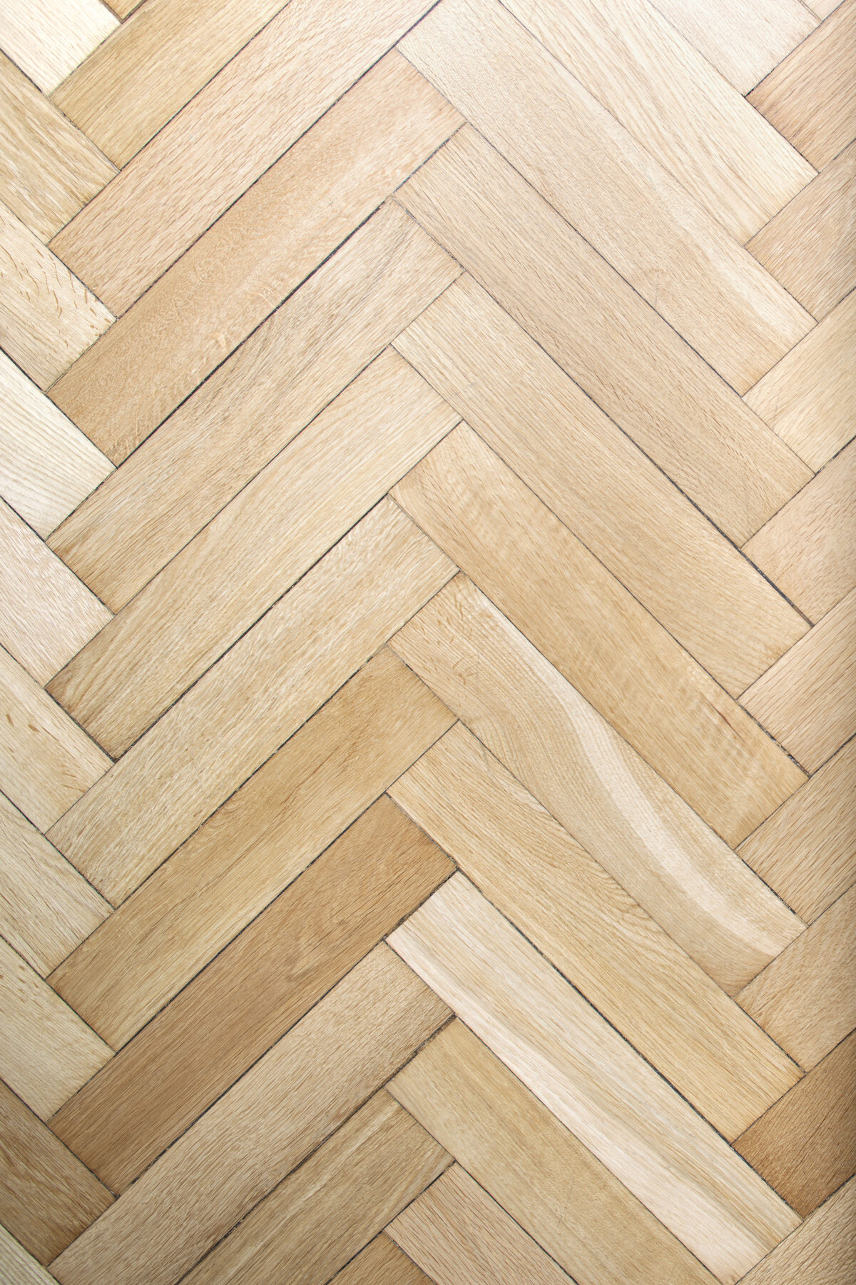
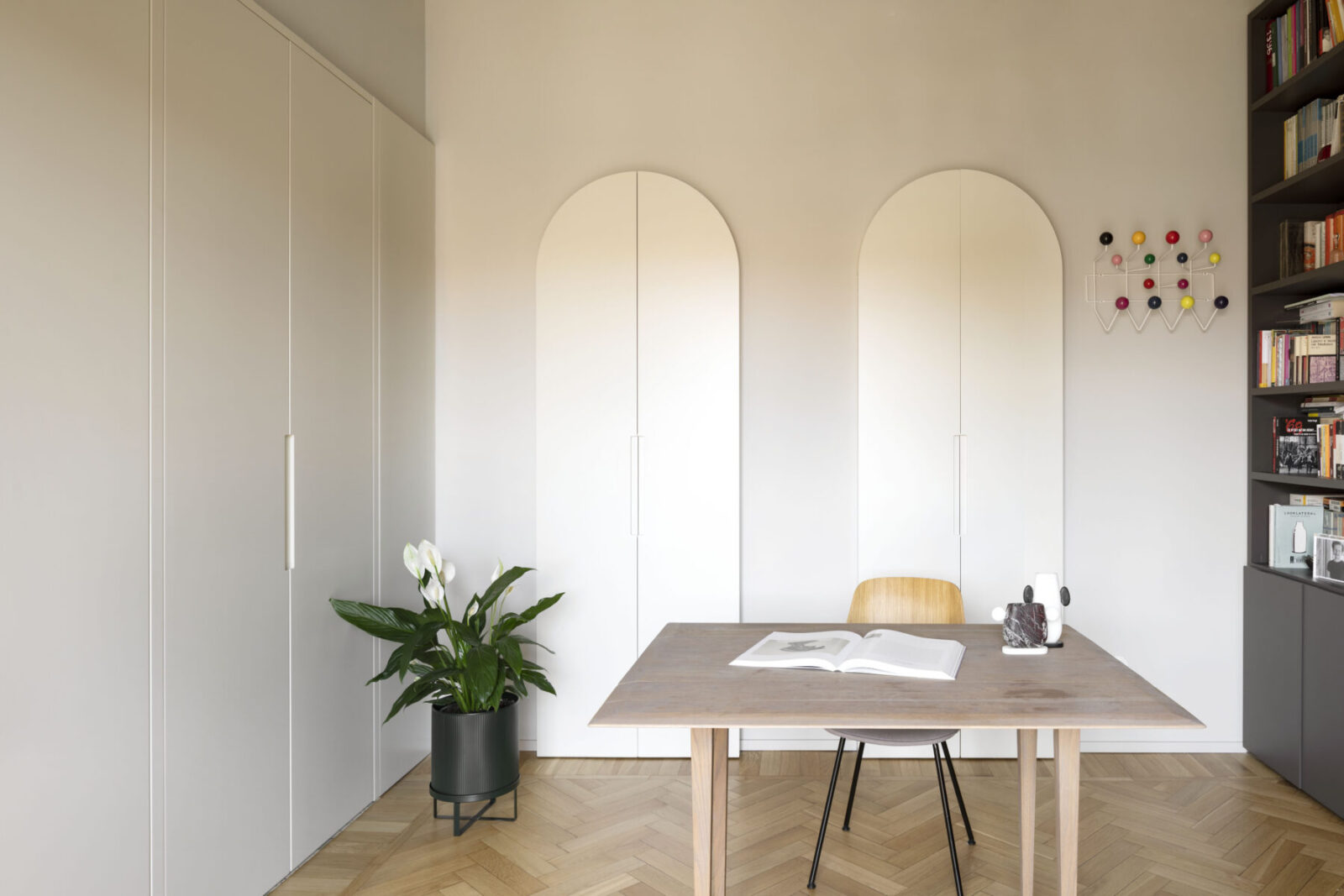
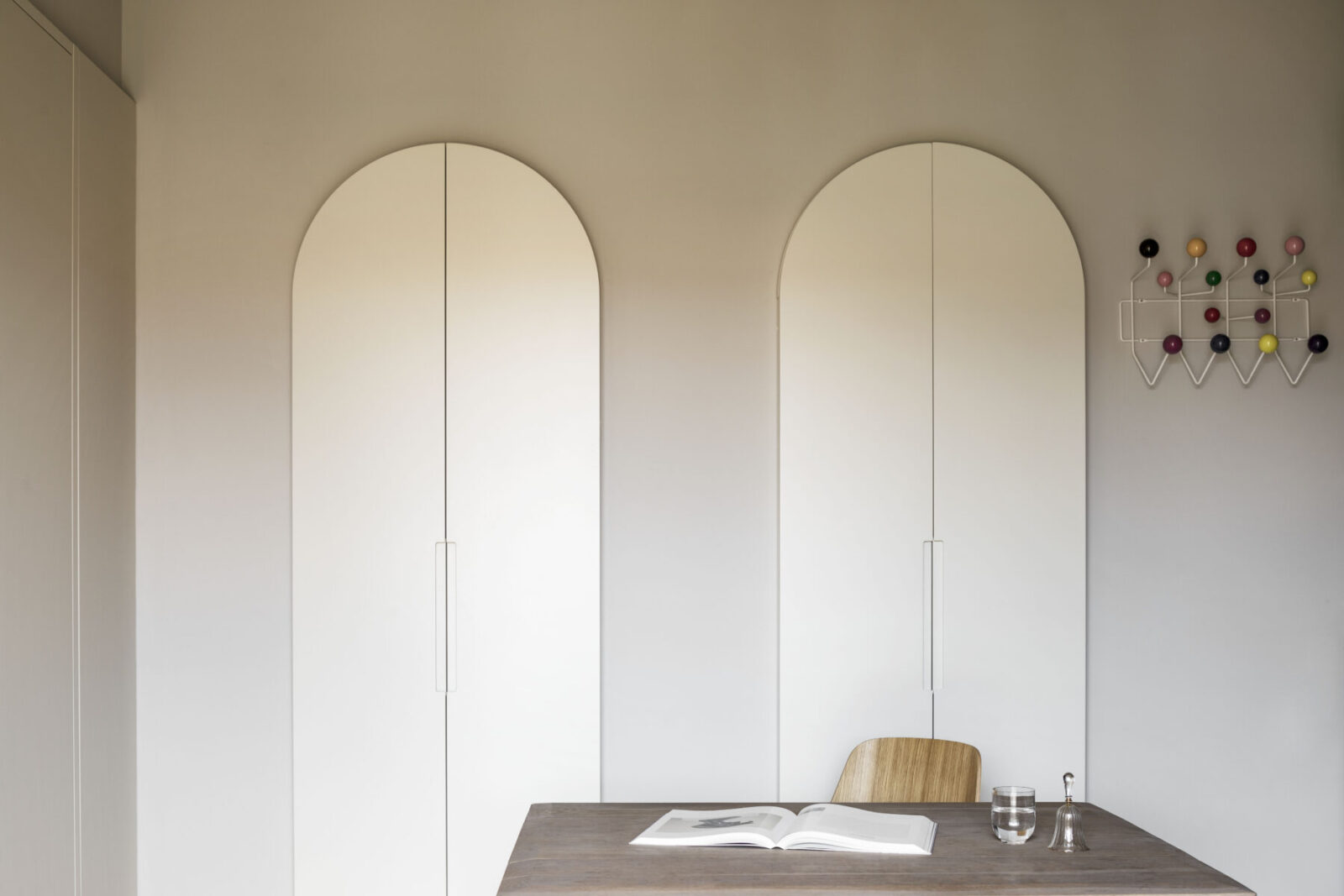
The bedroom and the study, on the other hand, maintain their antique style, with the original recovered parquet floors. These two rooms are bound to the rest of the home through a number of arched portals which allow one to expand ones field of view and fill the home with natural light. The arch and the curve are certainly two key elements of the project: they can be found in the bathroom, in the furniture and in the internal doors in a playful interpretation of the clients’ dreams.
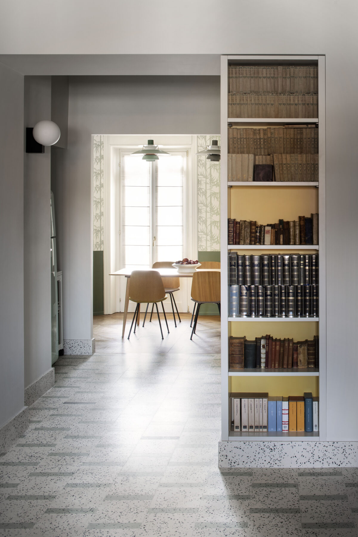
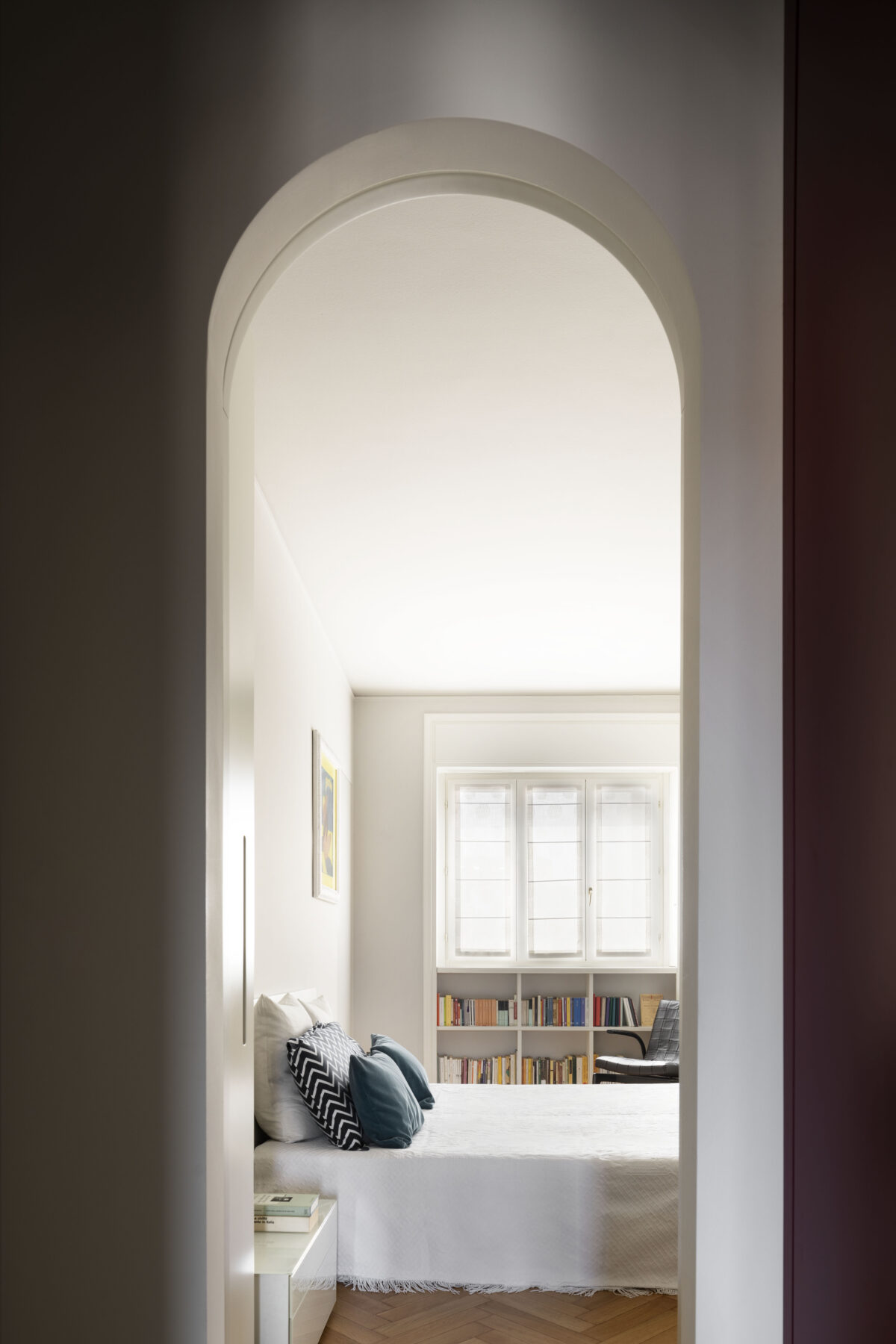
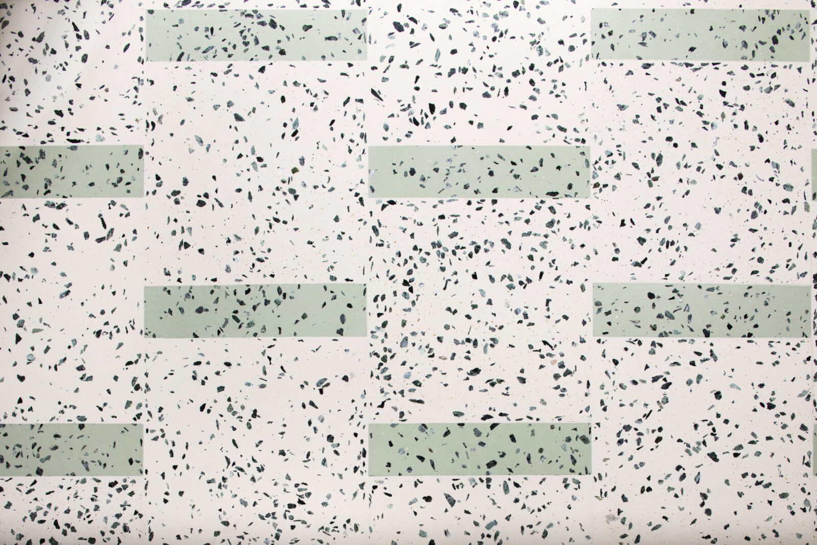
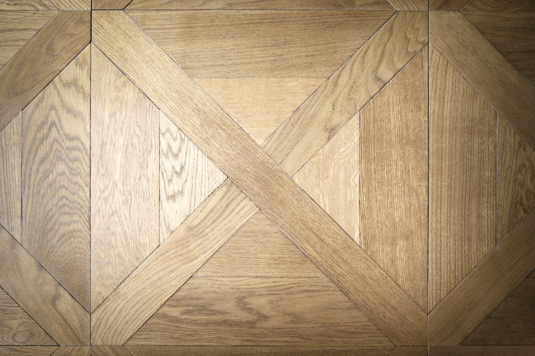
The project, while not upsetting the original layout of the house, gives the new owners flexible spaces, brightness, wide fields of view and a succession of varied environments that are always in communication with each other.
Drawings
Facts & Credits
Project title A home for readers
Typology Apartment renovation, interiors, residential
Location Milan, Italy
Client Private
Date 2020
Area 95 sq.m.
Architectural design ATOMAA
General contractor EDILBM Group SRL
Carpenter Giacomo Moor
Photography Alberto Strada
See, also, the renovation of NOLITA apartment, a house for flâneurs in Milan, Italy by ATOMAA & Studio Asabesi, here!
READ ALSO: Carner Perfumery in Barcelona, Spain | Jofre Roca arquitectes
