In an interval of one year, Athens-based studio ADD was commissioned to design two retail spaces. The former concerned the turning of an abandoned storage space into a boutique-concept store. The latter revolved around offering a new and strong identity to an existing clothing store.
The effort was driven by the desire to form a common architectural dictionary shared between the two spaces, thus creating a kind of an open dialogue while satisfying the unique programmatic needs of each space. The proximity of the two stores along Arachova’s central promenade axis favors the aforementioned strategy. Visitors and by-passers conceive the two spaces as consecutive stops along a single walk through the stores of Arachova. The similarity of the design imprint creates the desire to visit both.
The design concept of each store is complementary to each other. The use of steel as the key material of the design concept marks the identity shared by the two stores. The similar light patterns create a distinctive atmosphere through the surgical use of LED tapes.
Finally, the carefully designed movement routes reveal a dipolic case study: the former store favoring the customers’ linear stroll whilst the latter enclosing the visitor into a nautilus-like wandering.
L’Escalier concept store by ADD
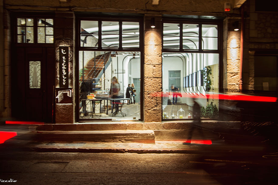
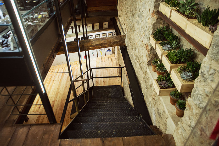
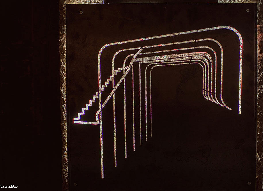
The “trans-formation” of an abandoned commercial space, situated along the main road of the village, into an exhibition space for small products of any kind. The staircase that led to the upper floor- and was formerly hidden- was chosen to be revealed due to its theatrical presence.
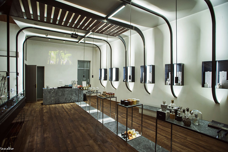
The same happened with the bearing rock wall-background that was covered with mortar. The choice to highlight the long axis of the plan came through the use of a “skeleton-like” structure of frames constructed from Η steel beams. These are bent in order to emphasize their role in inclosing the exhibitional space.
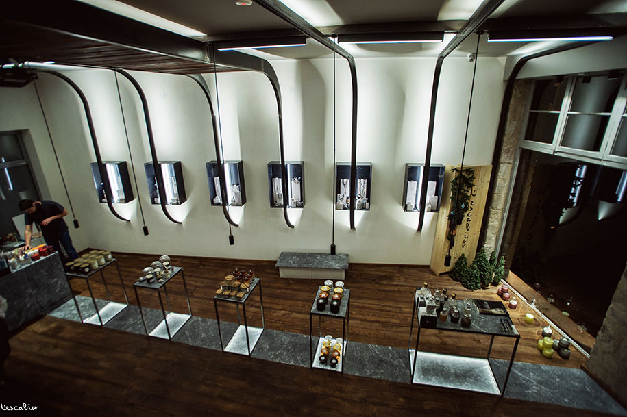
The way of exhibiting dictates the way one moves. A catwalk around the slim marble and steel tables, a stroll in front of the steel and glass drawer-showcase and the rhythm of walking given by the repetition of steel and glass jewelry boxes set on the second white background wall. At the end of the axis a marble desk leads out of the structure and towards the basement. There, the concrete shelves create the spectacle, while the floor will accommodate the “home” products.
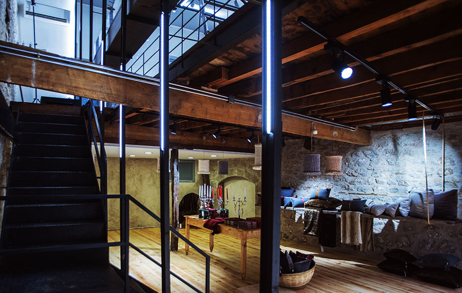
The concept of artificial lighting, through LED tape, constitutes the backbone of the project. Firstly, led tape is placed on the frames, stressing the spatial structure while, at the same time, it has been included in the design of the tables and boxes giving emphasis on the exhibited products as well as on the materials and design details of the furniture. LED and fluorine lamps are being hung from the frame structure, thus completing the concept of the linear exhibitional axis.
Lousso M&W by ADD
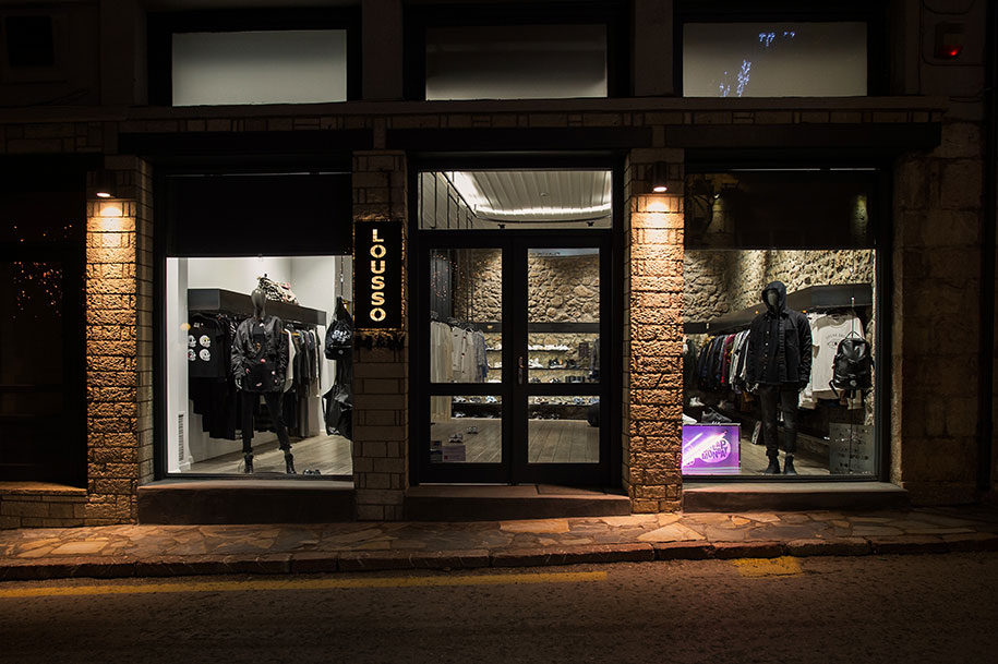
The conversion of a neutral clothing boutique into a space that has its own recognizable identity. In order for a dominant concept to emerge, all clothing items were re-positioned so as to cover the perimeter walls. The center of the space was conceived as a catwalk generated through the use of a central hanging structure from which the hangers are suspended.
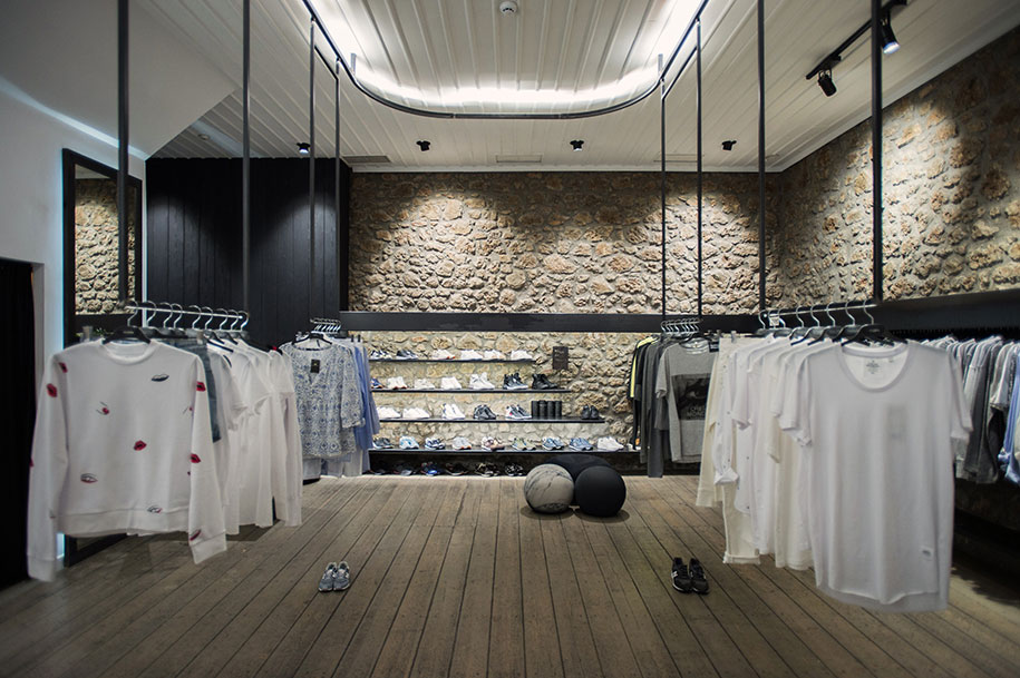
All of the suspended hangers bear hidden LED tapes which illuminate the clothes and remain lit up during nighttime, adding a surrealistic touch to the spectacle of the almost uncanny hovering. During working hours, the customers walk through this kind of “passarella”, entering and exiting it, through the hanging clothes’ intervals. As the persons circulate between the hanging clothes, their movement is translated into a gentle swing of the hangers.
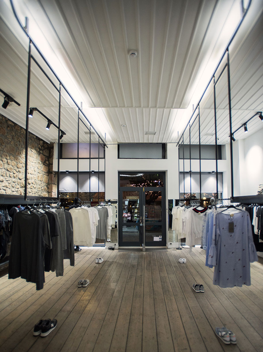
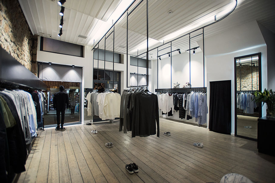
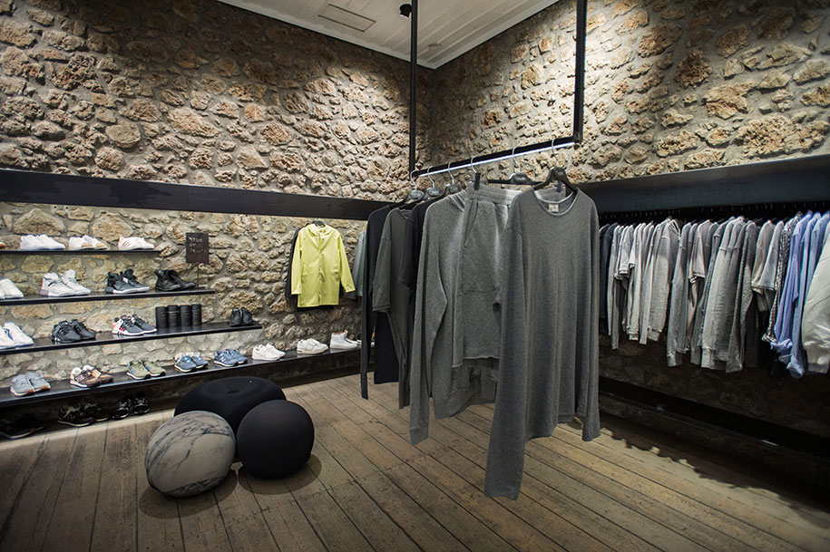
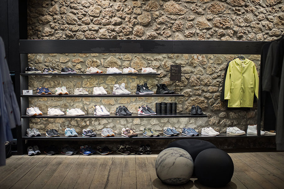
The main interval, opposite the boutique’s entrance, frames the existing masonry wall, facilitating the customers’ move towards the far end. This wall, as well as all the rest of the perimeter walls, bear newly placed steel selves, enhancing a sense of continuity and enclosure. The latter is accentuated by the shape of the roof structure. The roof is an arc emitting diffused light which guides the costumers’ footsteps as they stroll around the virtual geometry generated by the hangers.
Facts & Credits:
Architects: ADD, Chronopoulos Argyris, Koutsioumaris Dionysis
Project Title: L’Escalier concept store
Year: 2015
Project Title: Lousso M&W
Year: 2016
Photography: Dimitris Papageorgiou, mirror studio | mirror photography
READ ALSO: Artist Joonhong Min Expresses the Urban Anxiety through 3d Installations Made from Waste Objects