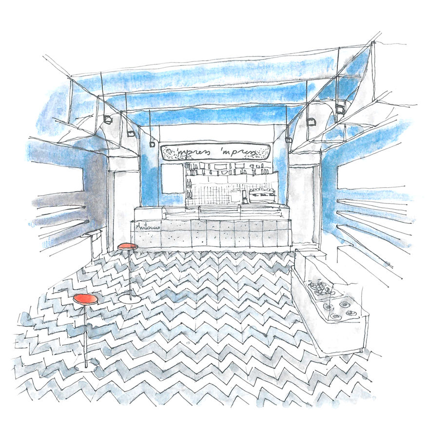
Quality raw materials, recipes inspired by the Neapolitan tradition, and an informal, yet refined environment: at the gates of Novara, within the Vicolungo outlet, Antonino – Il banco di Cannavacciuolo opens, designed by the Turin-based lamatilde studio.
–text by the authors
The new gastronomic format conceived by the Michelin starred chef from Campania, reinterprets street food in a gourmet way, offering signature cuisine suitable for everyone. The restaurant, which combines the sale of food and non-food products (cookbooks, aprons and accoutrements) selected by the chef, offers a selection of gastronomy for immediate consumption, onsite and on the go. On the menu, the authenticity of sweet and savory specialties triumphs, with sfogliatelle, babà, fried pizza, eggplant parmigiana and the legendary cuoppo.
From North to South, Italy is the home of street food, which constitutes an opportunity to re-discover the territory and its most authentic flavors. In this sense, lamatilde studio translates the conviviality of local cuisine into architecture, starting from its most popular roots.
“Il banco di Cannavacciuolo tips a hat to the simplicity of the markets: it is quintessentially Antonino, the ideal place to discover the street food of the star chef”, assert the designers.
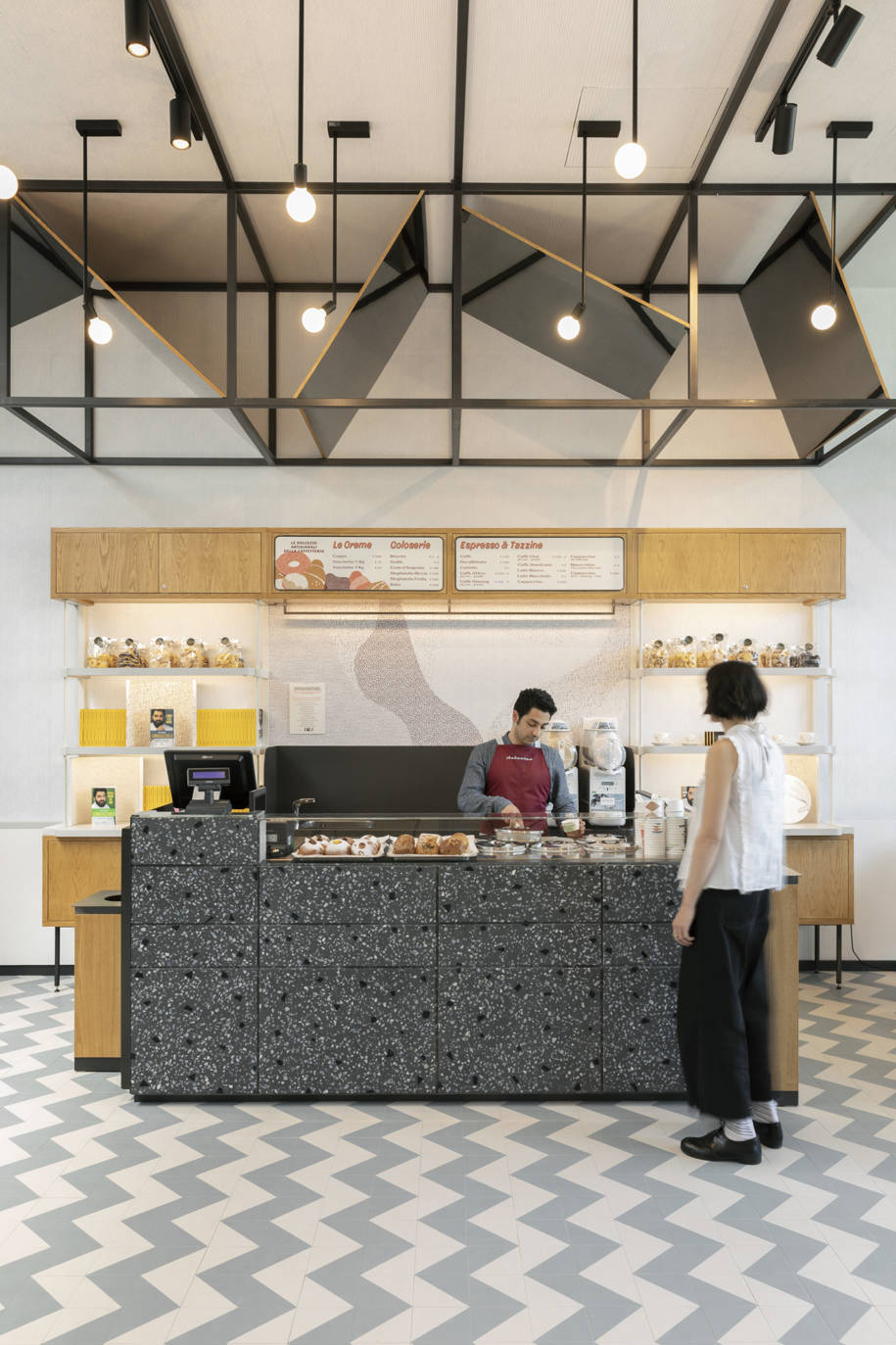
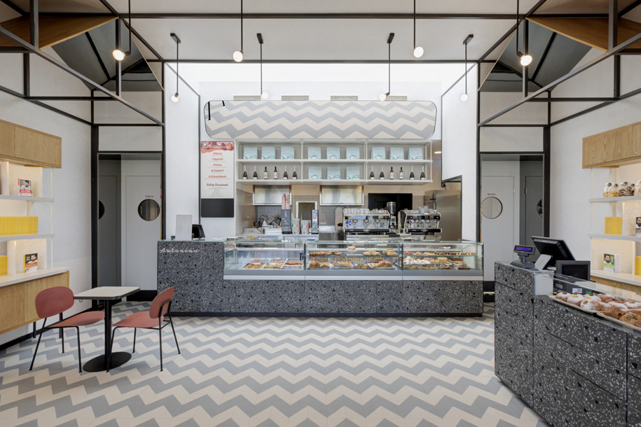
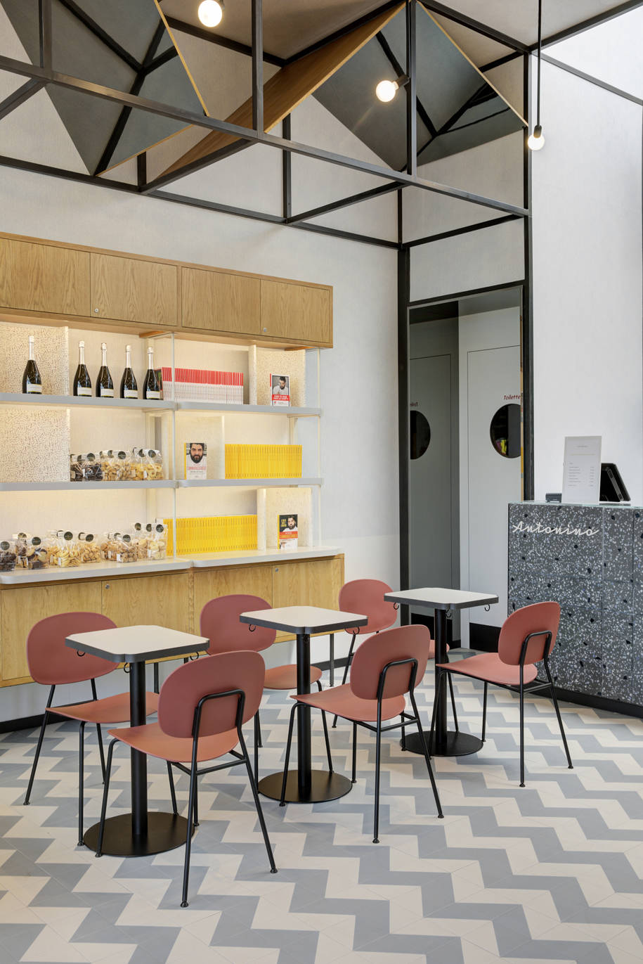
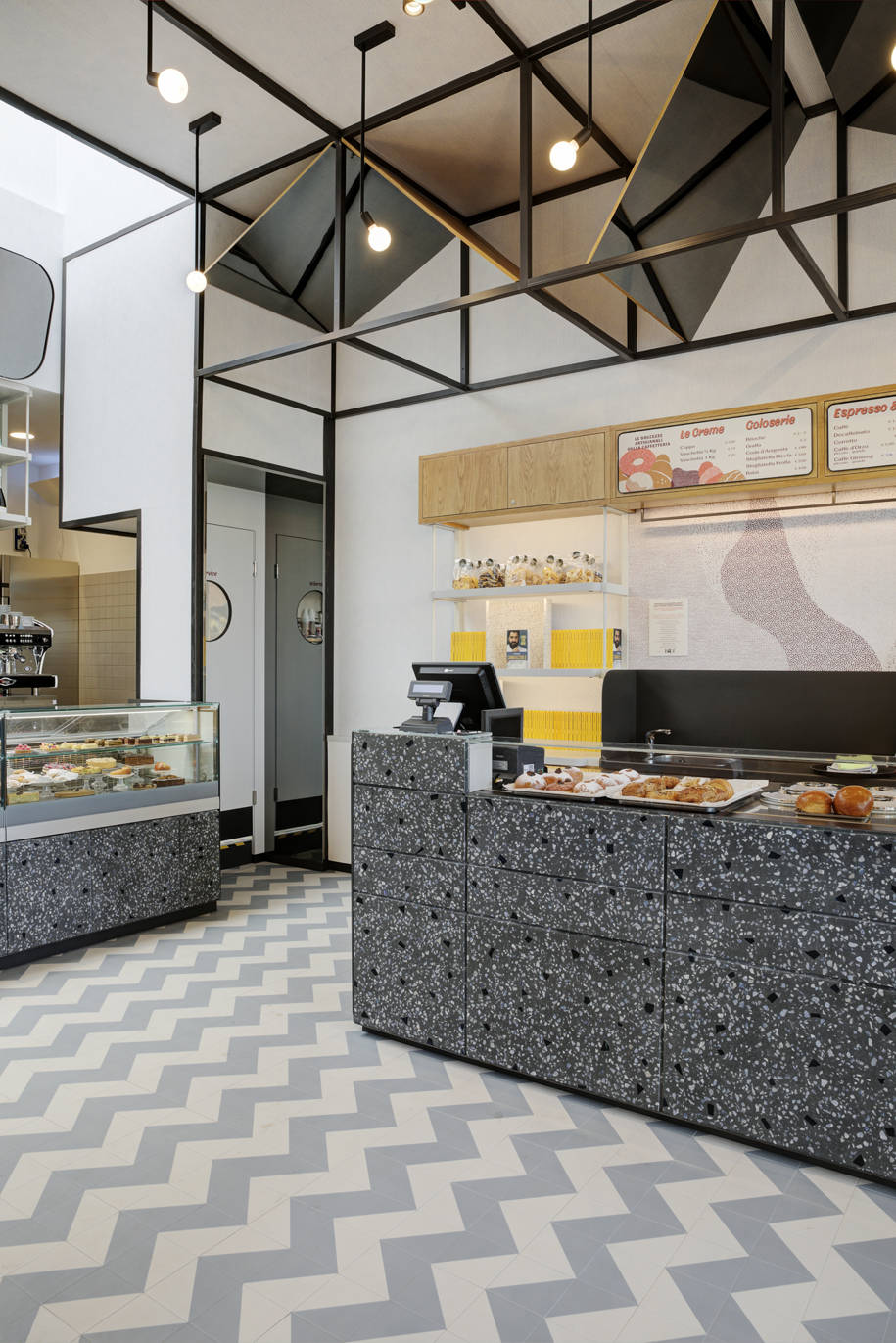
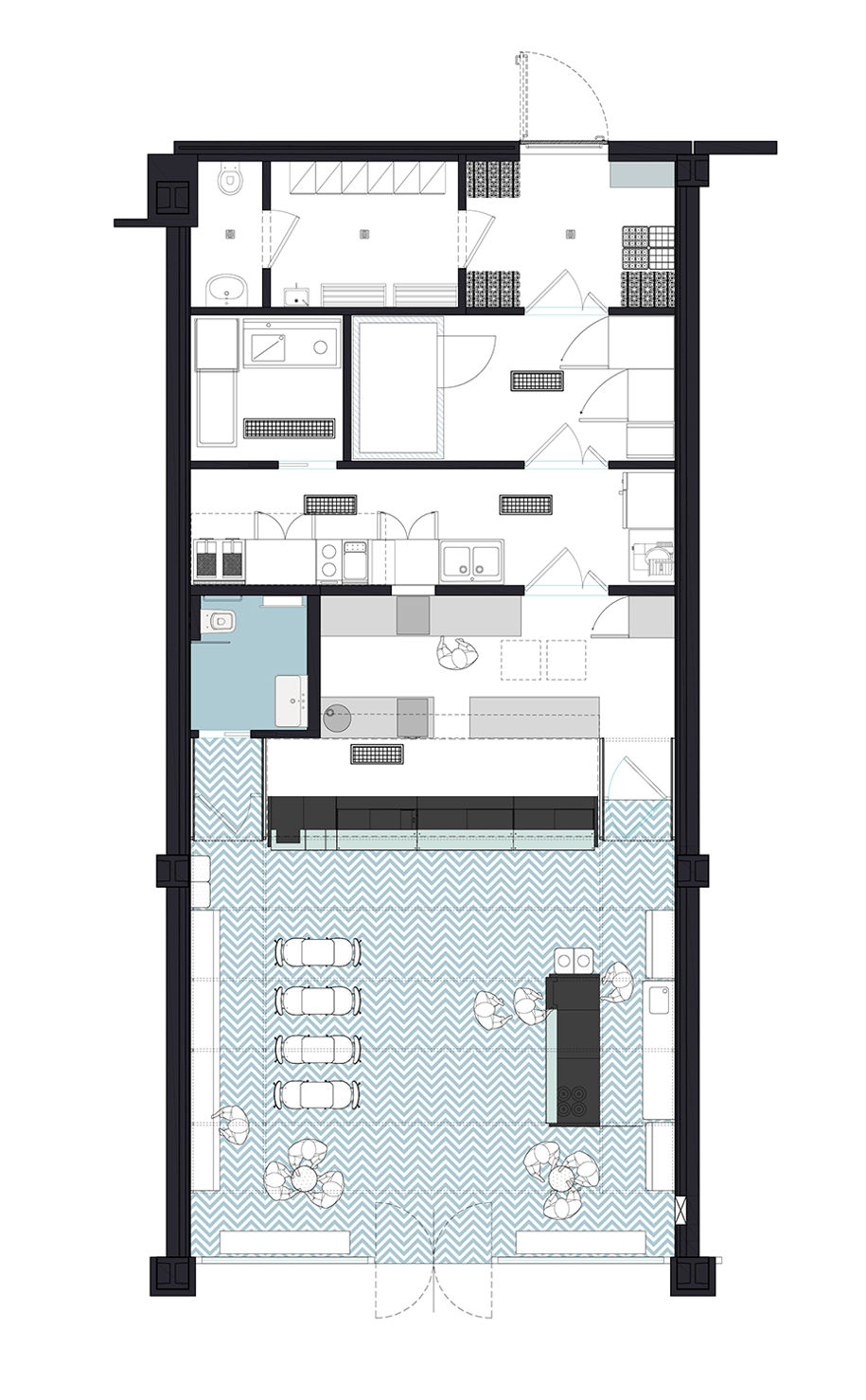
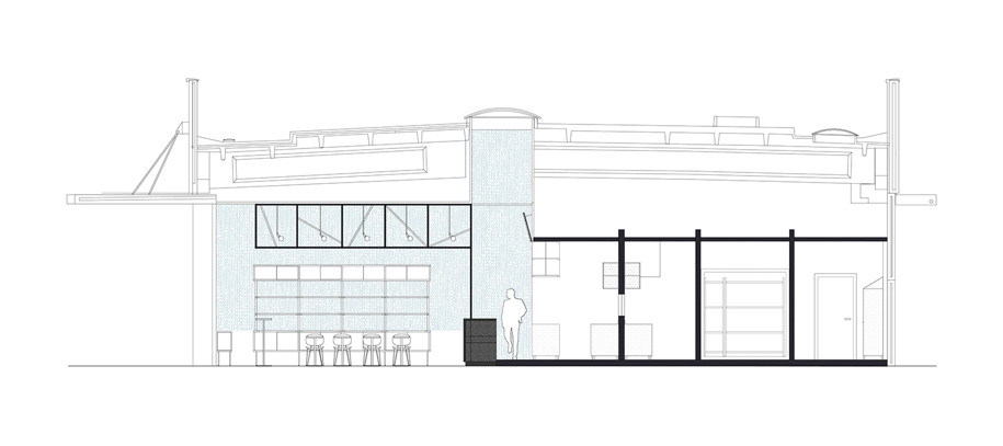
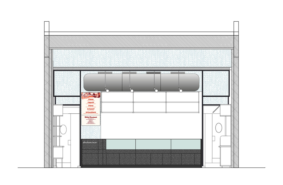
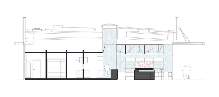
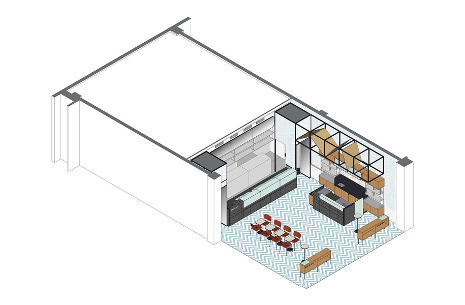
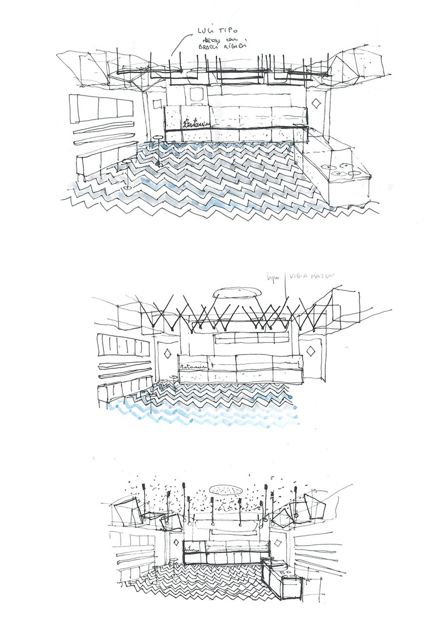
The plan is functionally divided into two, with one area for food preparation and another for its sale and consumption. The architectural elements have a traditional layout, with the central counter at its core. To reinforce the frontal perspective, which strategically enhances the products arranged along the escape lines, there are the two side accesses to the service areas. A second counter transversal to the first, along with the tables and the seats soften the regularity of the floor.
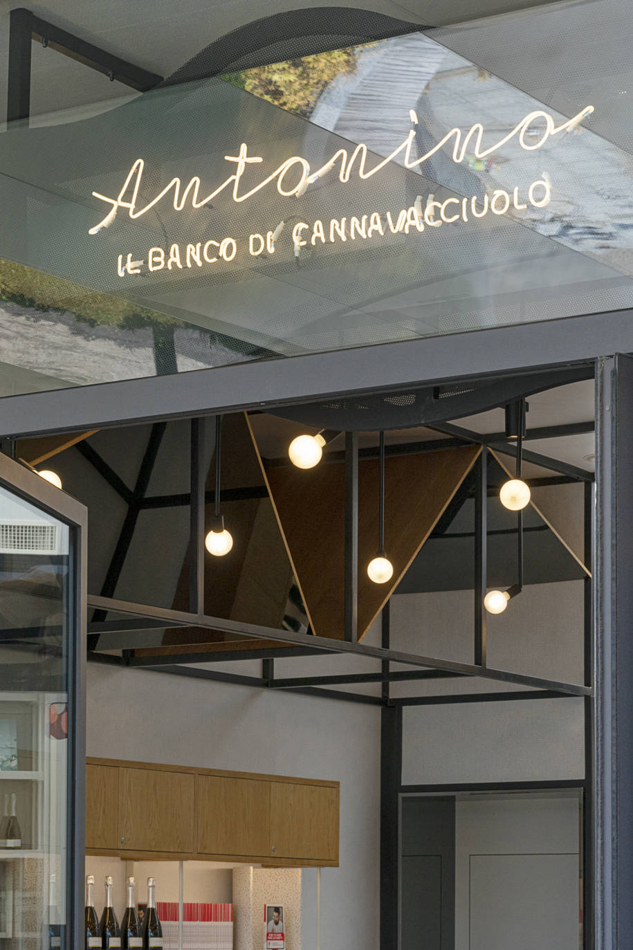
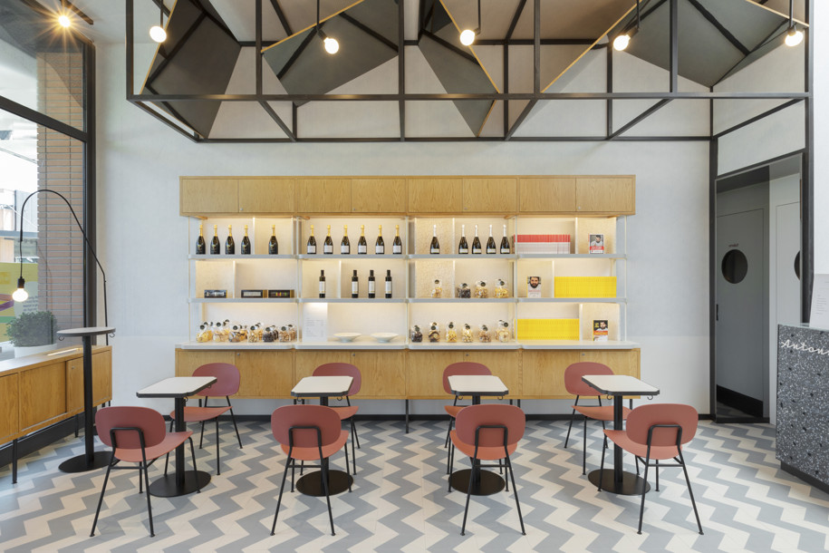
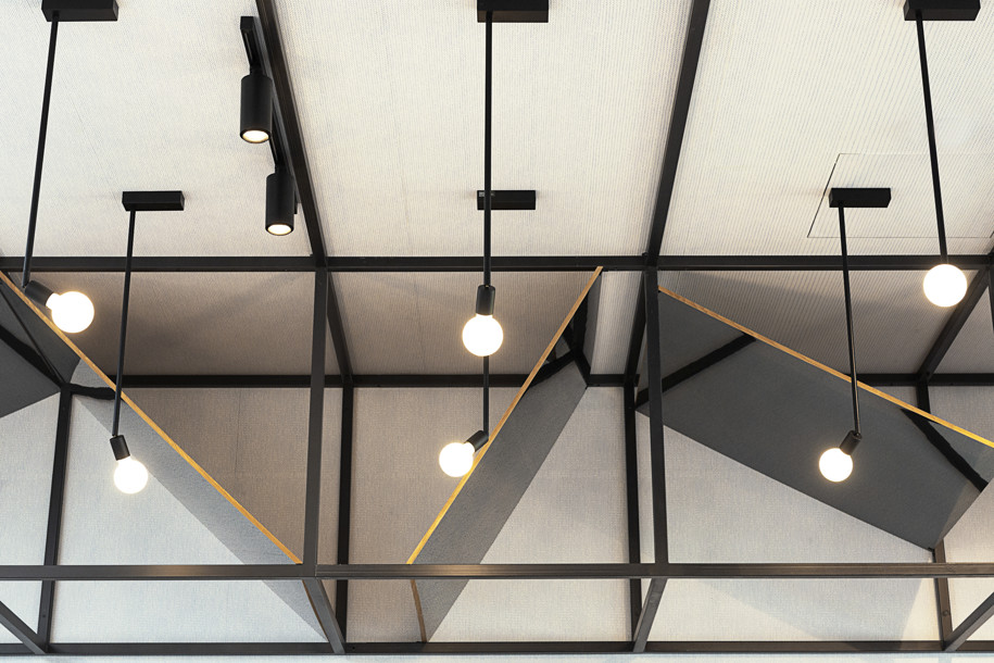
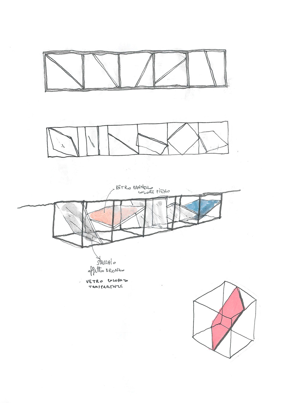
Along the side walls, a structure with awnings made from mirrored panels, constitutes the ultimate element of Antonino’s ideal square: an aggregation space that invokes the image of the portico and the succession of marquees of the stalls of an imaginary market.
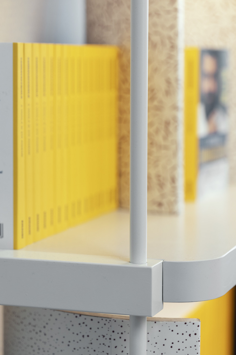
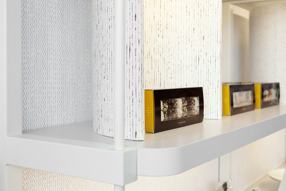
The project has been carefully tailored in all its aspects, starting with the furnishings: the wall displays, which characterize the lateral elevations, develop on three levels and are composed of two storage compartments at the top and at the bottom, and a central display section. In certain places, this presents semicircular niches that highlight specific products. The wooden shelving introduces a warm material note, in contrast with the agile white-painted structure.
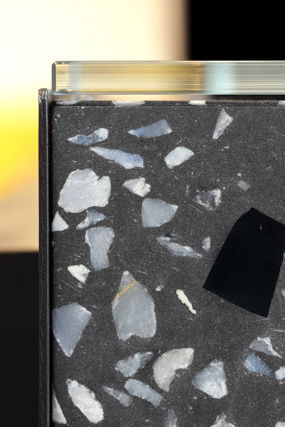
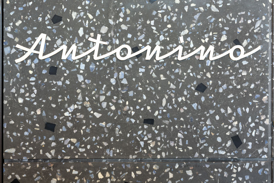
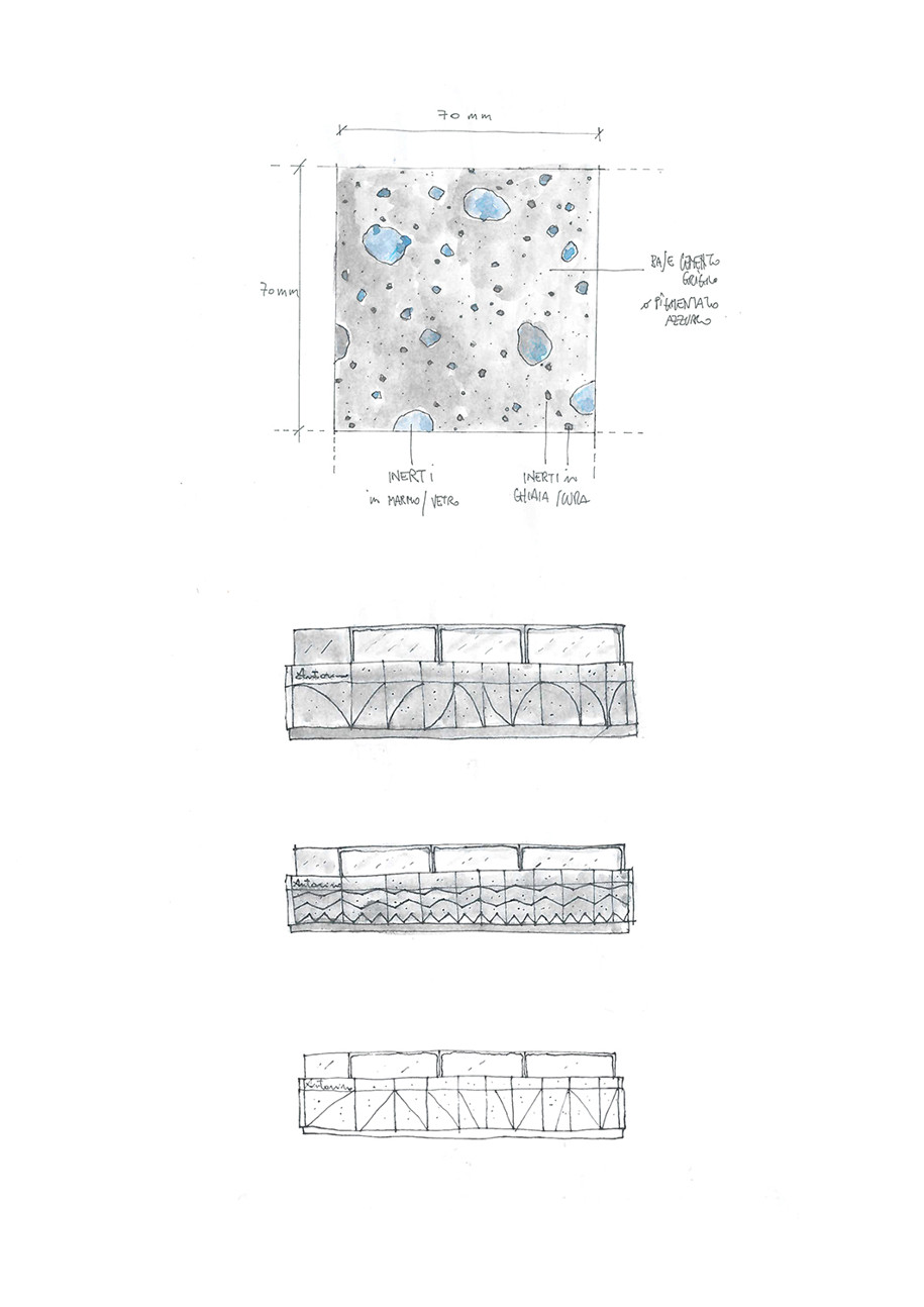
The well-balanced array of colors and textures also includes the counters, covered with a cement-based paste created ad-hoc, with aggregates chosen according to Antonino’s brand palette, all of which give the space an artisanal touch and retro charm.
Street food as a factor of cultural identity is the star of the set-up, of the brand identity and of all the phases of production, sale and consumption of Antonino’s creations.
From the vernacular italics with a vintage twist of the logo,
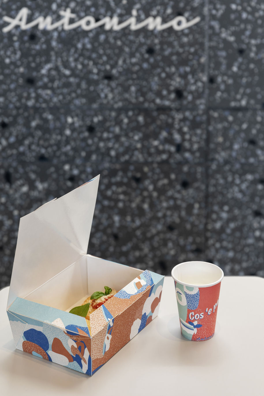
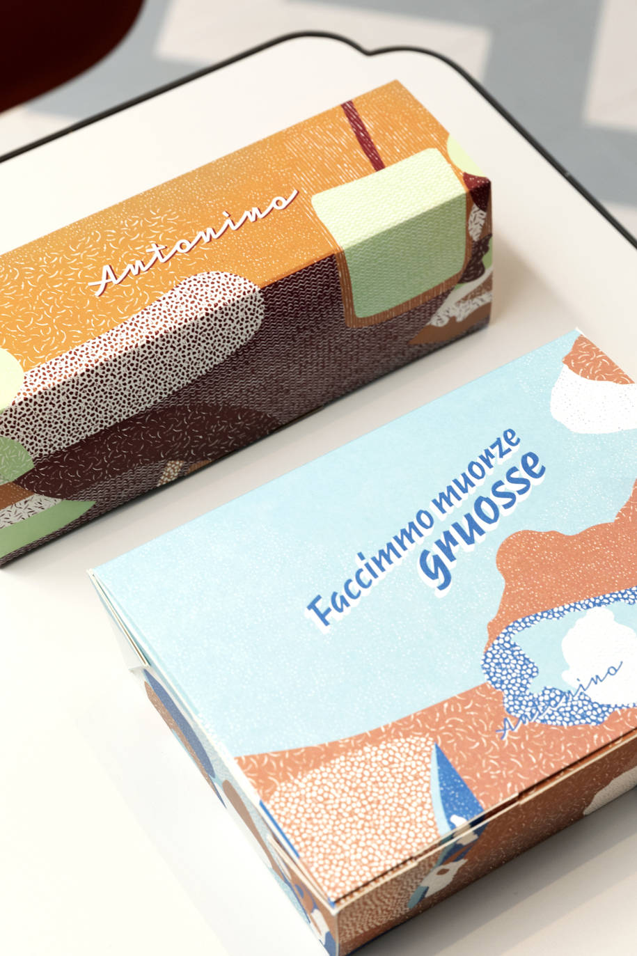
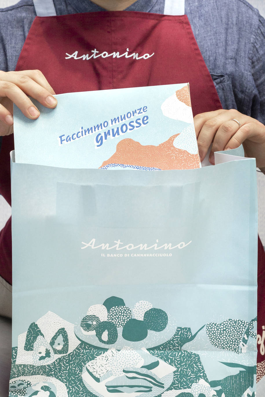
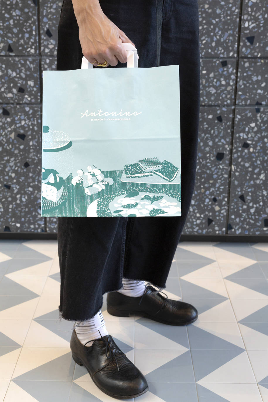
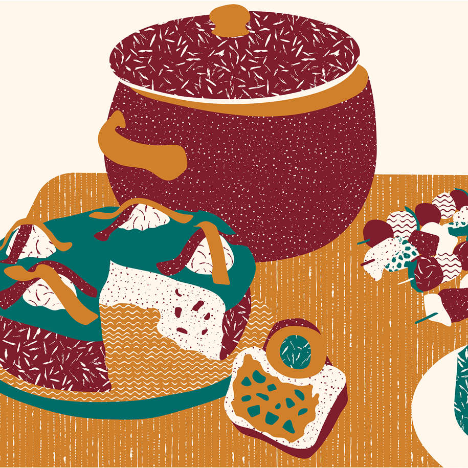
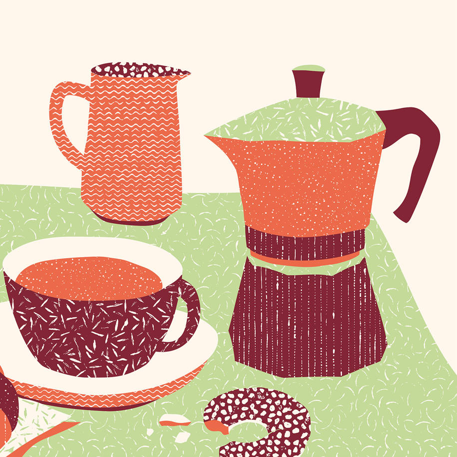
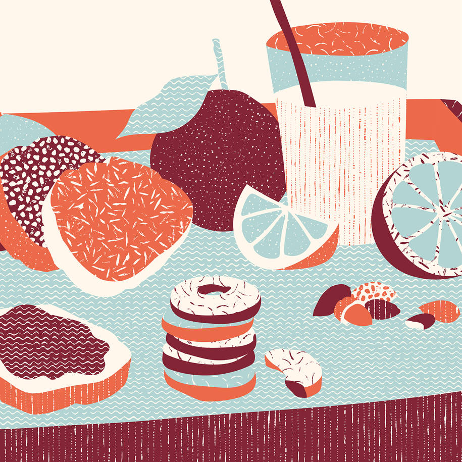
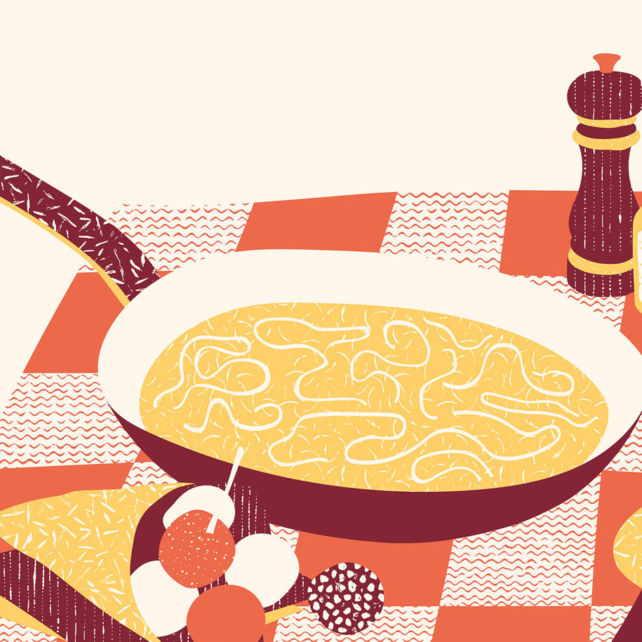
to the illustrations that immortalize the moments of the day related to meals; from the irreverent packaging that animates the products, making fun of the most colorful Neapolitan sayings and imitating the bustle of the market, to the naïf wallpaper patterns, made using, forks, whisks and knives as brushes.
With its highly expressive and artisanal character, the integrated project by lamatilde delights the eyes and the palate. Street food of unrivalled quality.
Drawings & Sketches
Facts & Credits
Project title Antonino – Il banco di Cannavacciuolo
Location Vicolungo-The Style Outlets, Vicolungo, Novara
Date June 2019
Area 144 sqm
Architecture & Brand identity lamatilde studio
Lettering Il letterista
Construction management Studio Morandi
Contractor Edilveruno
Electrical system New Light
Hydraulic system Emmeerre
Staff clothing Batna
Photography Pepe fotografia
Video Andrea Silvestro
Suppliers
Custom furniture CGF, Battivelli Manufatti (counter cladding)
Ceramic cladding Futura by 41042, Wide Vapour by Caesar
Seats Tondina Pop by Infiniti
Lamps Tiperdue by Vesoi, Muffin by Exenia
Finishings R.E.D. Pubblicità (graphic supports)
READ ALSO: CLAP studio creates HER, a shopping experience inspired by Mars in Hong Kong
