This particular renovation was challenging for two main reasons: the oblong space of preexisting barber-shop, needed to be correctly formed and secondly the need to set clear boundaries between the zones that would be created after the redesign process.
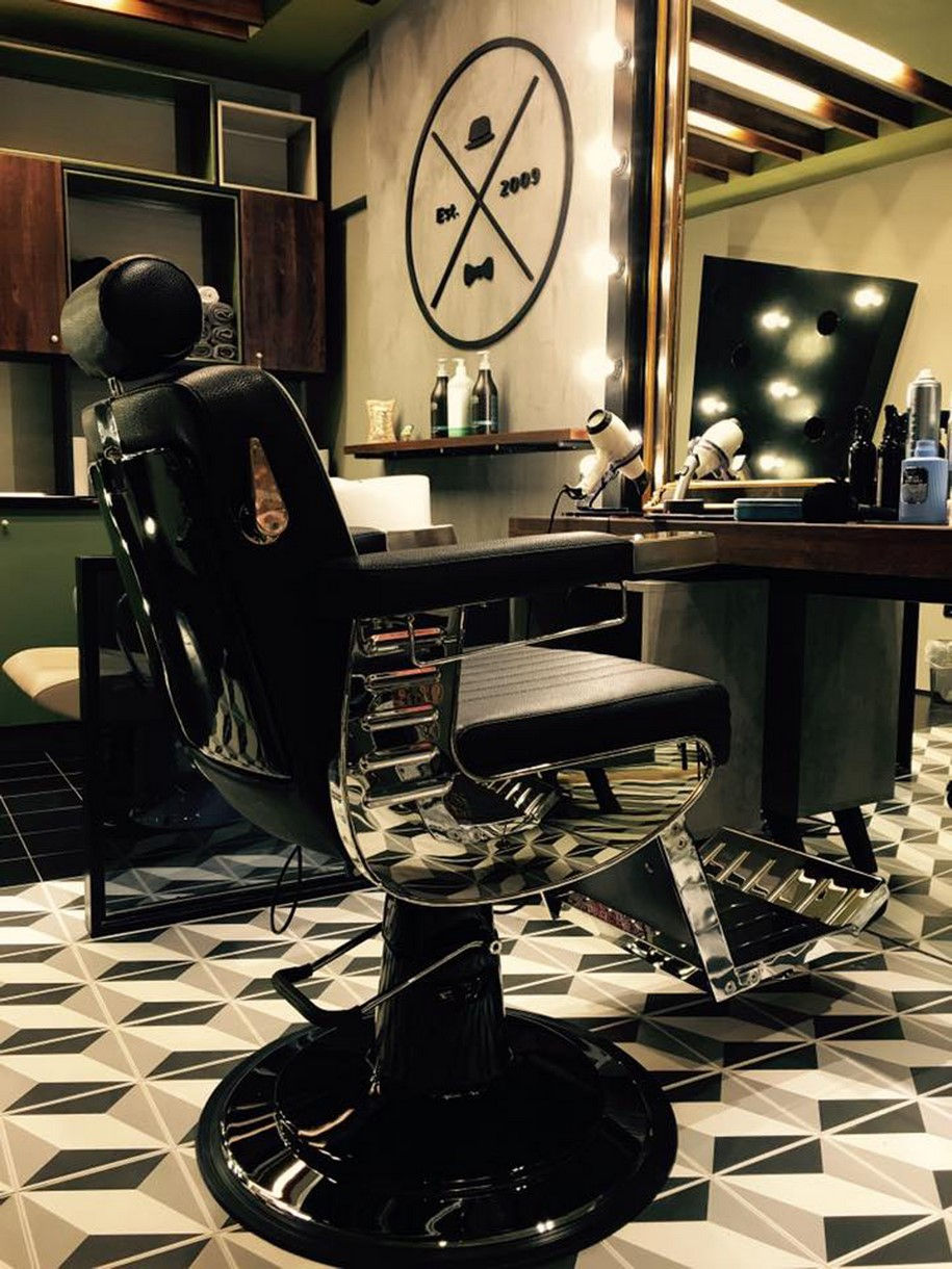
The customer’s desire for the renovation of his salon was to provide more comfort in the waiting room, which would be separated from the workplace, the main area of the barber shop. Before the renovation process, those two areas overlapped, causing malfunctions in the barber shop.
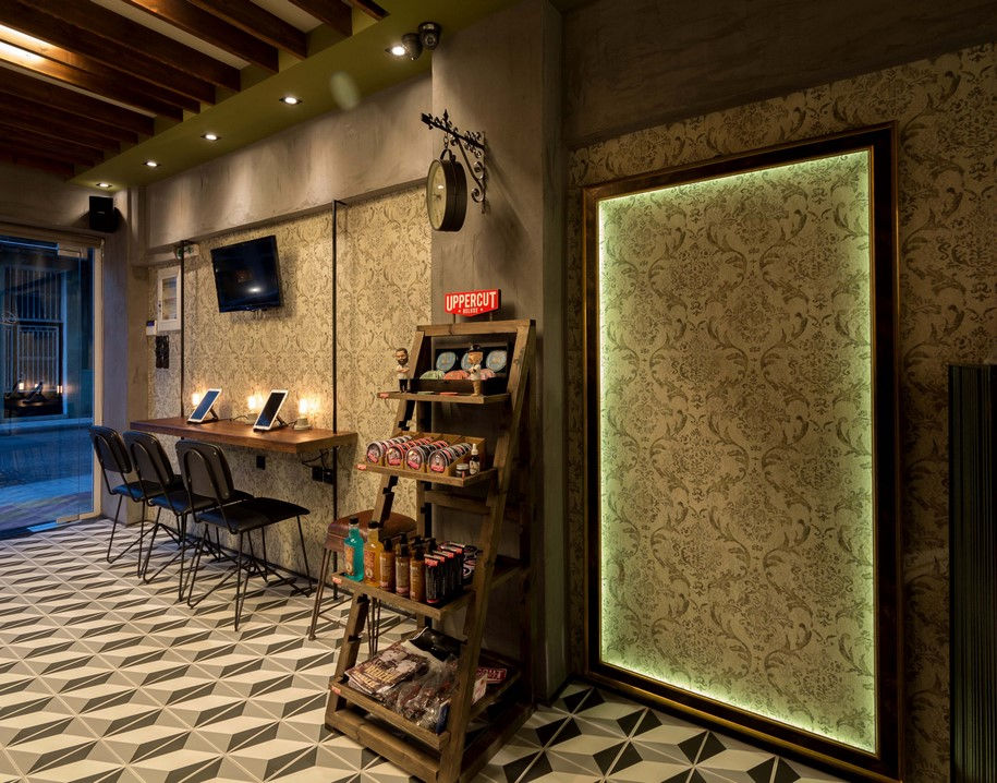
Four spatial zones were created that visually communicate with each other, but at the same time have clear boundaries: 1) the waiting room 2) the basic workplace and the cashier desk 3) the place where the customers are prepared and finally 4) the WC area.
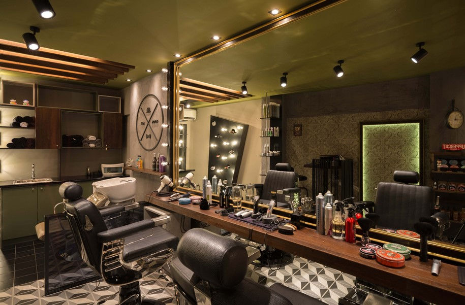
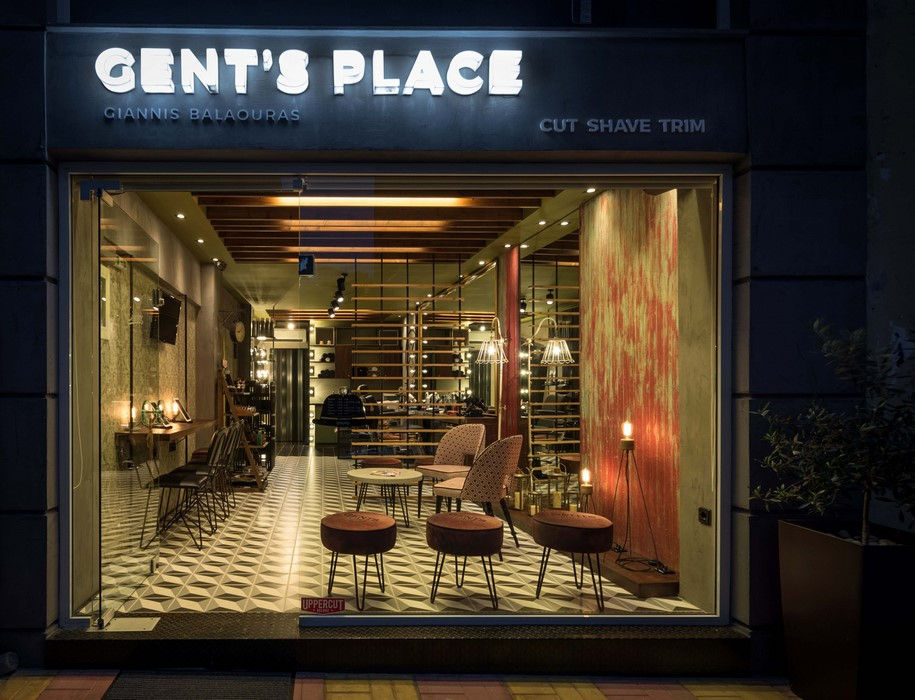
The separation of the space is feasible either through a non-solid partition or through glass, so that the shop function can be explicit even from the entrance. This visual communication is emphasized by the workbench, which extends to the waiting room and the facade of the barber-shop. It works as a functional bench where the hair products are placed, 80 cm from the ground, while in the waiting room it is just decorative a breath away from the floor.
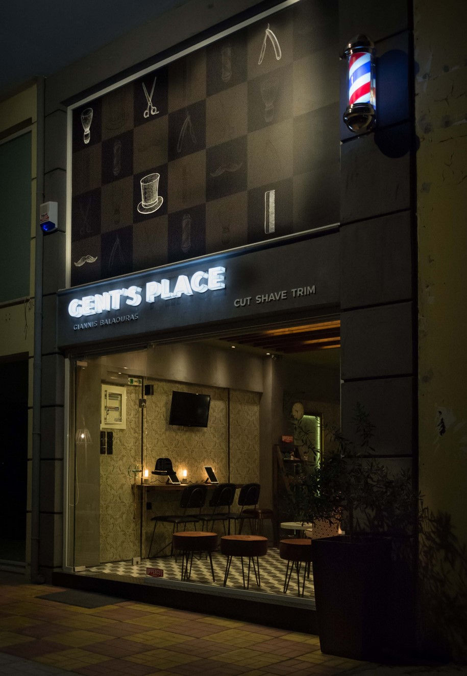
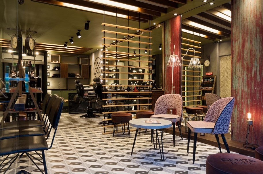
The ceiling was conceived as a continuation of the ground plan, following the zones of the main space, but also as one entity concerning the materials chosen to cover the existing recesses of the plasterboard of the old salon, finally forming in this way a visually united ceiling.
The waiting room also works as the façade of the barber-shop, which is the reason why it was chosen to remain unobstructed, totally transparent without any advertising panels or product exhibition, as widely used in other salons.
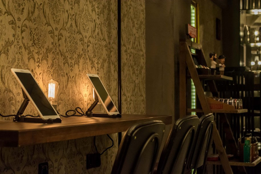
The result was a new, extrovert place that manages to adopt more zones than the previous one, having distinct boundaries between them, while at the same time it becomes noticed by the passers-by, who can easily process the space even from the façade. The customers are extra cared by the ability to use tablets while they are waiting, which definitely shows the owner’s desire to make them feel at home in a foreign environment, making the experience before their appointment even more pleasant.
READ ALSO: Daily Dose: a Street Coffee Shop in the Center of Kalamata by Andreas Petropoulos