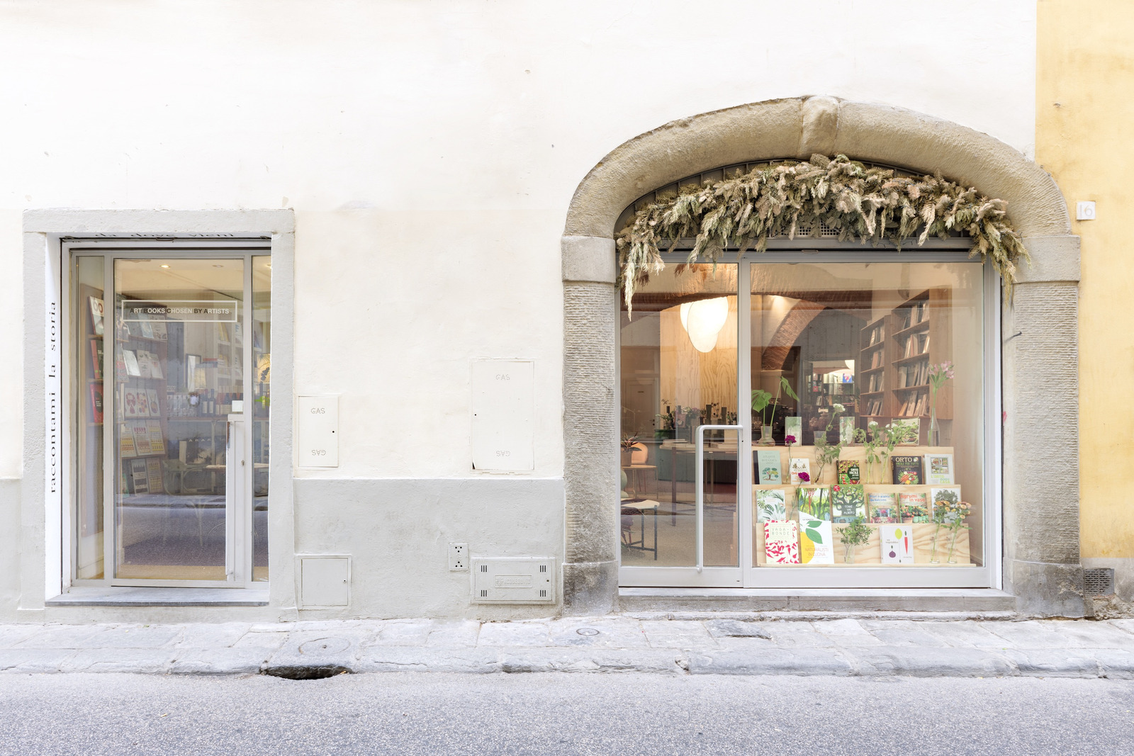
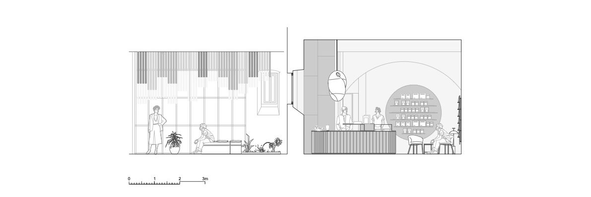
The architecture studio Deferrari+Modesti designed the extension project of Brac bookstore, necessary to accommodate a constantly growing public and the rich calendar of events and presentations. The expansion project confirms the atmosphere of the bookstore and its identity through a layout that is open to a variety of possible uses. The clients’ need was to extend the area for the display and sale of books, as well as the desire to define a fluid and versatile space in which to host all activities related to book presentations, readings, events, and workshops.
-text by the authors
The project is a place for meetings and sharing ideas, dedicated to enjoying art and food. Its two owners, Melisa and Sacha – she a bibliophile with interests in art and contemporaneity, he a chef specializing in vegetarian cuisine – launched the “bookstore with kitchen” formula. Already in this first arrangement, Brac’s space was defined by an inventive intervention by the architects, which was able to create an articulated and diverse environment, albeit on a small scale.
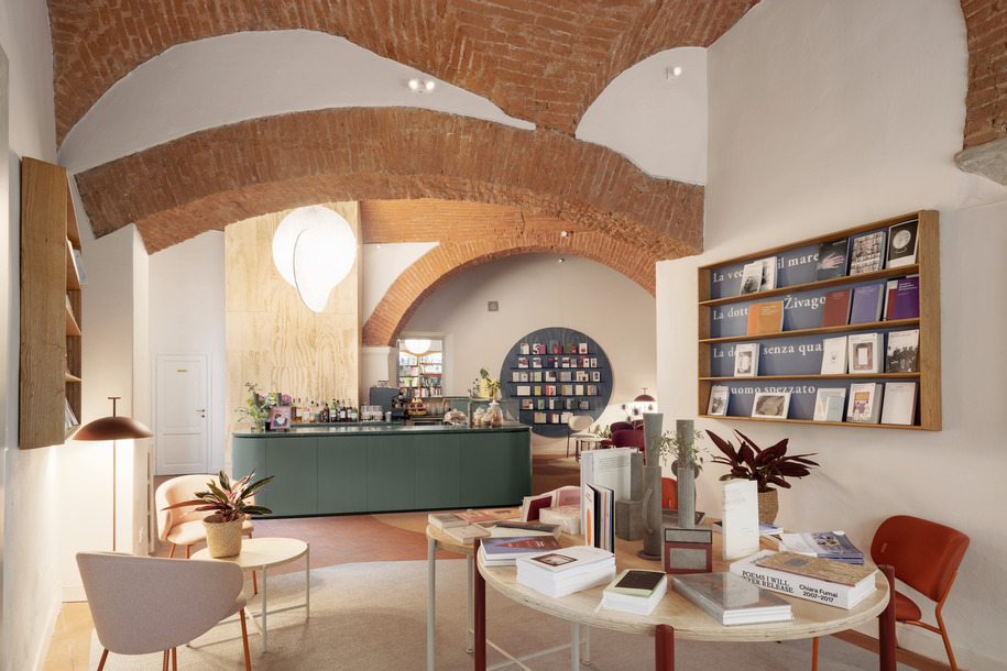
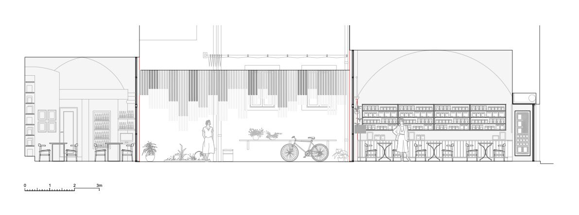
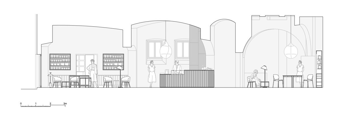
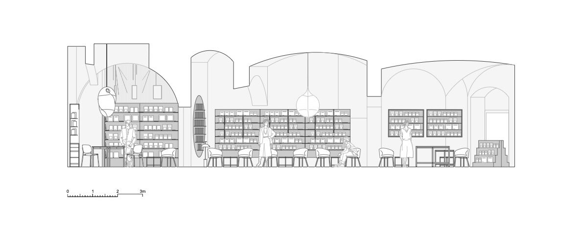
This latest recent intervention reuses and renovates the premises adjacent to the existing bookstore, defined by large rooms with arches and barrel-vaulted ceilings and traditional Tuscan finishes, such as brick vaults and terracotta floors. It is an interior space belonging to the historical fabric of the city of Florence, organized into three major rooms. Each of these possesses different sizes, shapes, and heights, which become references for the new system of furniture and scenography. The project builds precisely on the constraints of the space and then turns them into assets, working on specific set-ups and using a variety of devices and configurations.
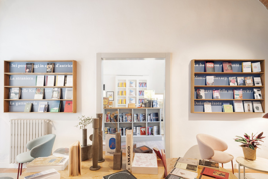
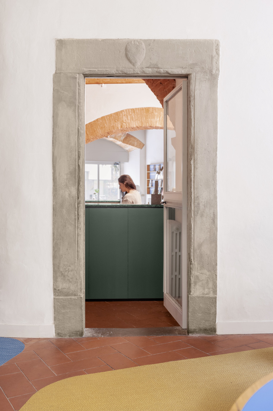
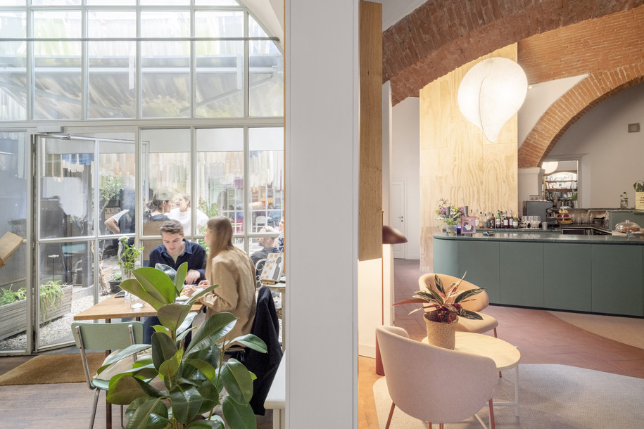
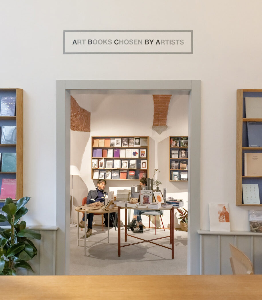
The sequence of the three main rooms is thus reorganized and rethought as part of one large interior, punctuated by rooms each characterized by a specific atmosphere. The new entrance hall is accessed directly from the street-facing storefront and from a passageway that internally connects to the original core of the store, whose colors and furnishings are echoed to clarify a unifying theme with the first intervention. The visitor is thus welcomed by the display of books, organized on a series of tables at different heights and wall bookcases. The second room one encounters as one travels through the new library spaces is the central room, organized around a large bar counter, which is configured as a single volume in green lacquered wood with green marble tops. On the walls are several bookcases. Presentations and public readings of books are held in the central room.
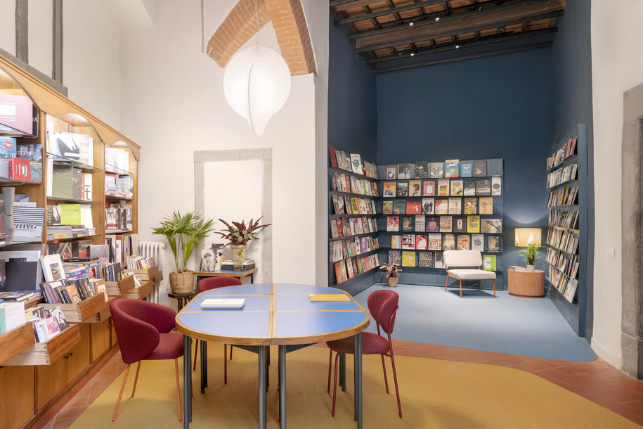
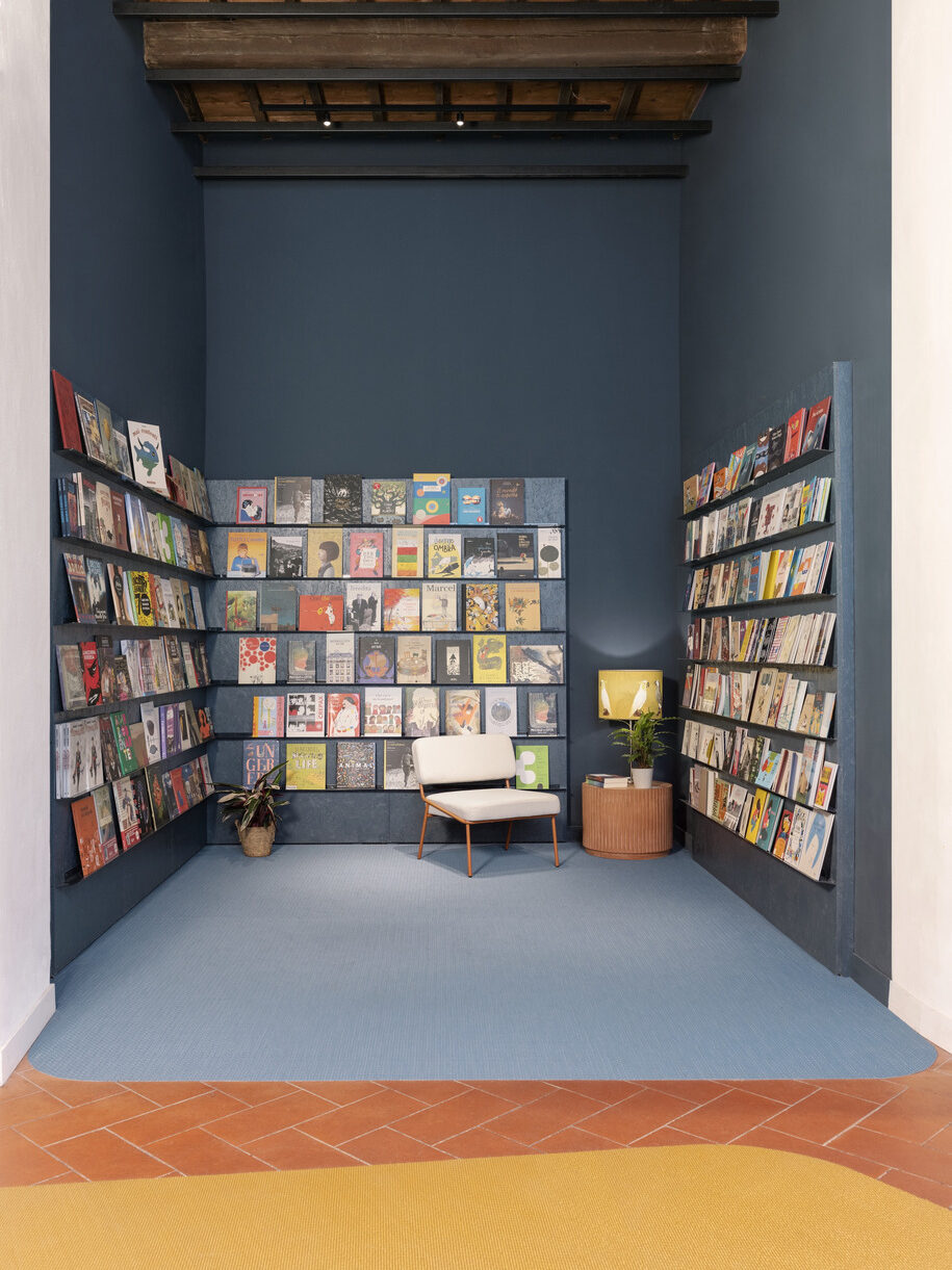
The third room is dedicated to group work and readings for children and young people. The entire third room, which in turn is divided into flexible and diverse spaces, thus features a lively combination of primary colors, such as the yellow of the carpet, the blue of the “ communal table” and the environment for younger children, and the red background of the wooden bookcase. The blue space, which defines a special portion of the third room, is intimate and enveloping. It is a space of respite, where one can sit, play, flip through a book, and imagine other worlds. The blue color breaks with the sequence of the preceding spaces and gives this room a more intimate, still dimension. Also in the third room, next to the blue space, a combination of tables offers the possibility of a single “communal table,” dedicated to studying, reading, and shared work.
The system is modular, designed to divide and aggregate in various forms, depending on its uses. It is in this part of the space that workshops for children, presentations for a wider audience, read-aloud, and moments of discussion can be hosted. Each room is occupied by a variety of furniture elements, custom designed by the architects, with different finishes, volumes, and geometries. In fact, the project exploits the capacity for furniture to act as a spatial device, a tool for orienting the actions of the public and the rhythms of their activities. The architects’ intervention is based on the desire to recompose the interior space and then break it down into a variety of functions and relationships.
Thus, the furniture performs different tasks: work surface, book display, seat, container, scenography, and filter. The color palette, already present in the first project for Brac, is revived and enhanced with bright color accents. New materials are added with the new intervention; from natural multilayer wood to painted panels, from lanolin-painted boards to painted OSB surfaces. The project also uses wood as cladding for the volumes that conceal service spaces.
These become elements to emphasize the proportions and heights of the rooms, as in the case of the light wood volume behind the bar counter, which takes the greatest height of the space. The sequence of rooms is delineated and punctuated by carpets, which in their shapes seek both to connect the various spaces and to highlight differences between areas. The carpets all have the same texture, but come in different shades; they are made of PVC, easily washable, yet their texture conveys a cozy feeling.
Various lounges are distributed in the rooms, with different types of seating, for reading a book, conversing or simply hanging out. The new intervention also had to deal with the scarcity of natural light, which filters into the space through the only street-facing window and the two apertures to the inner courtyard. As a result, the new rooms are illuminated through unobtrusive technical fixtures and more decorative lighting, warm and punctual, inserted into the various reading and seating areas. The two pendant lamps are iconic objects, which characterize the counter area and the communal study area. The entire lighting system gives the rooms a cozy and informal atmosphere with a contemporary feel. The project places the public at its center through the warm and open dimension of the new interiors, where time seems to dilate and reading, fine dining and contemporary arts find space.
Plans
Facts & Credits
Project title Brac bookstore in Florence
Location Florence, Italy
Architects Deferrari+Modesti
Project team Javier Deferrari and Lavinia Modesti in collaboration with Oliviero Martini
Floor area 270 m2
Photographers Anna Positano, Gaia Cambiaggi, Studio Campo
Press office Cultivar
READ ALSO: Fala atelier designed "dim cloud" in Porto, Portugal | Archisearch
