It was urgent an intervention in this commercial space. The place, with about 50m2, was discouraging to employees and owners: it was dark and inadequate in the lower floor, and impersonal and cold in the upper floor. The great challenge was to find a different identity for both spaces and still conjugate them coherently and harmoniously.
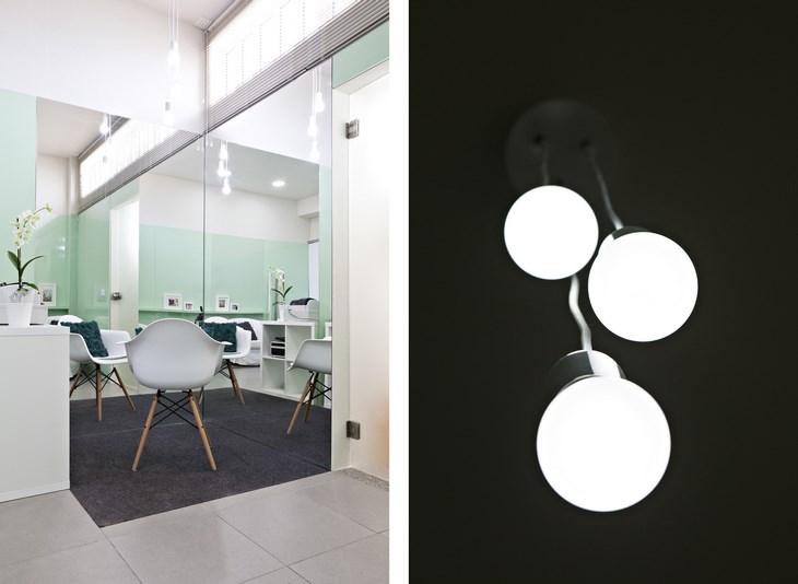
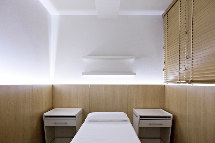
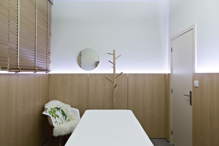
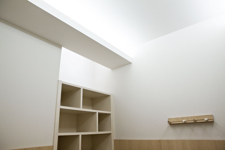
On the lower floor there is a common area dominated by a staircase and skylight. The various rooms were kept with the original settings. In the walls were introduced wood paneling. The lighting of the spaces has been completely changed and designed from scratch. Indirect illuminations in moldings or inverted lamps were conceived in order to create a peaceful ambiance, as desired. The walls and ceilings were painted in hot white. In the upper floor the option was also the creation of a paneling that surrounds the space, reinforcing the horizontal and integrating two doors on opposite sides of the room.
This paneling reportedly has a contrasting green color and also includes a shelf that takes advantage of a shoulder of a pillar.
A place where there was an enclosure with a shower tray, but serving primarily for storage, now is a space for make-up marked by a change of pavement, by placing mirrors up to the paneling and by an independent suspended lighting. The intervention of interior design worked from the beginning with the decoration in order to be found consistent, harmonious and within budget solutions.
Facts & Credits:
Year: 2015
Location: Vila do Conde, Porto, Portugal
A2OFFICE® team:
Architect and Coordinator: Alberto Dias Ribeiro
Decorator: Alexandra Marques
Interior Designer: Patrícia Valentim
General Contractor: In-proov
Photography: © AL.MA Fotografia | Alexandra Marques
 CARLI BEAUTY CENTER / A2OFFICE
 CARLI BEAUTY CENTER / A2OFFICE
 CARLI BEAUTY CENTER / A2OFFICE
 CARLI BEAUTY CENTER / A2OFFICE
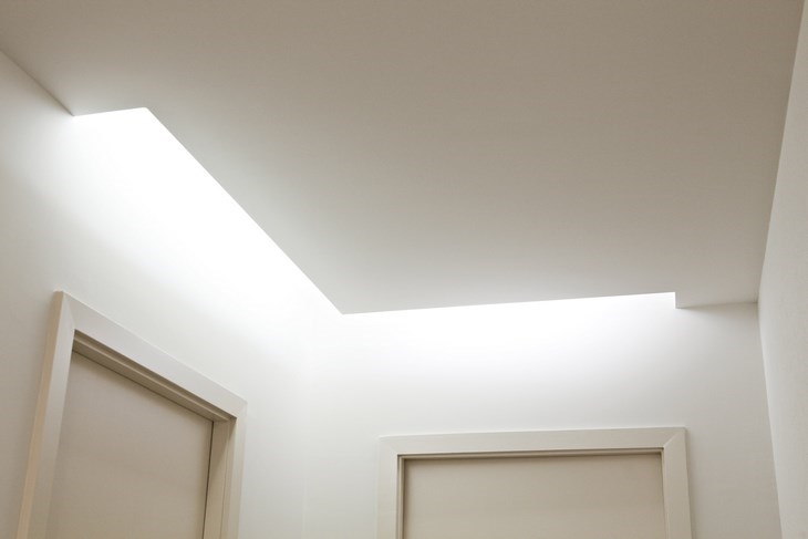 CARLI BEAUTY CENTER / A2OFFICE
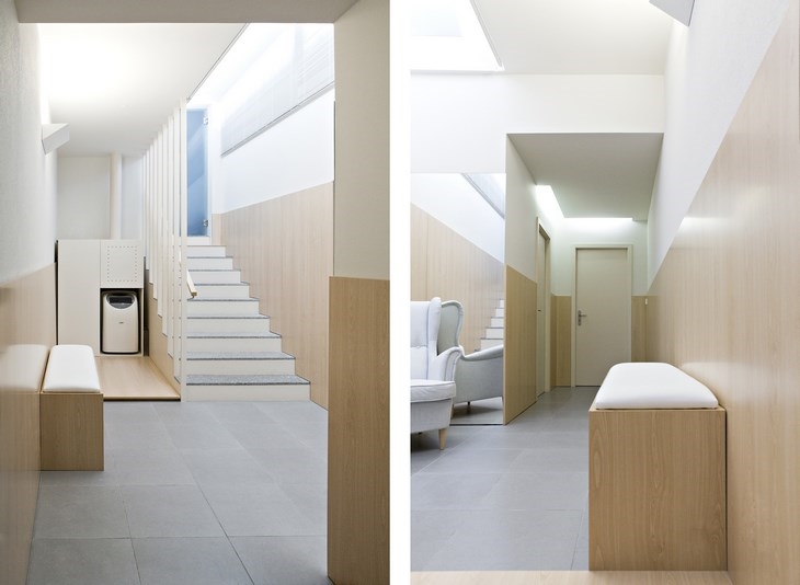 CARLI BEAUTY CENTER / A2OFFICE
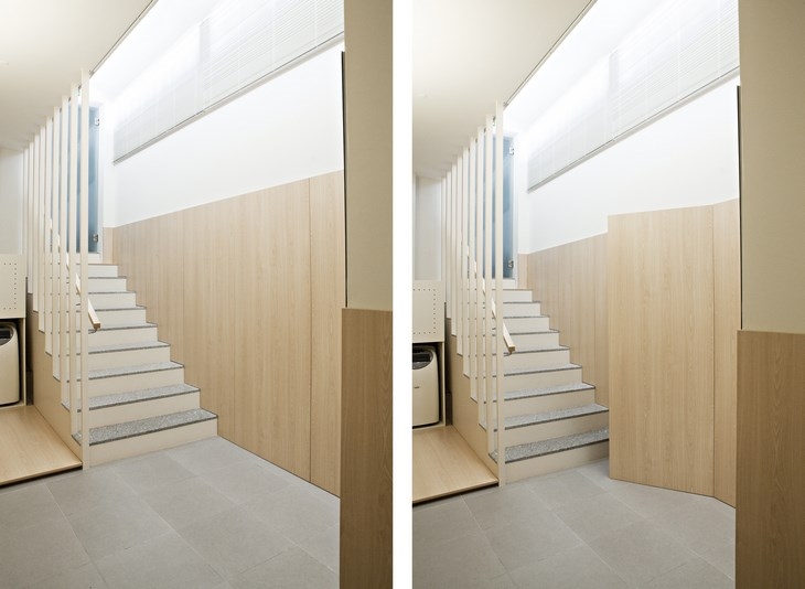 CARLI BEAUTY CENTER / A2OFFICE
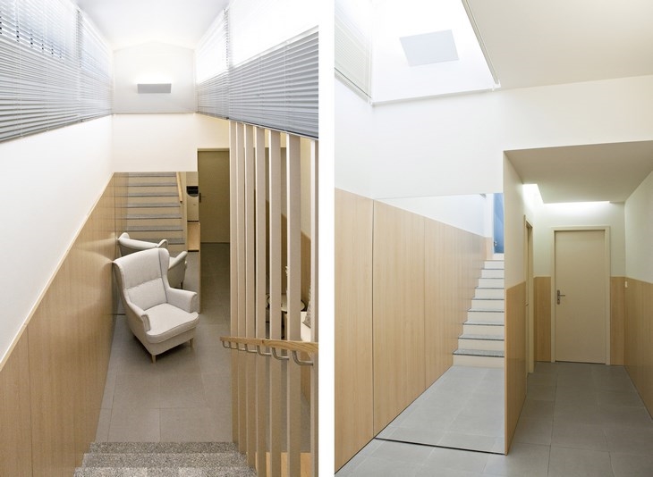 CARLI BEAUTY CENTER / A2OFFICE
READ ALSO: ANNIS ROAD / SCENARIO ARCHITECTURE / PHOTOGRAPHY BY MATT CLAYTON