LAMA studio took over the reconversion of a store and adjoining warehouse into a multi-purpose office space for Codea Studio in Barcelona. The aim of this project was the conversion of a commercial property and warehouse into a multi-purpose working space for Codea Studio, a Barcelona-based creative agency. Covering 355m2, the project area occupied one highly elongated floor.
-text by the authors
Due to its 6-metre-wide front façade, little natural light enters the building. The front area is a commercial space with a ceiling height of 4.5 metres, varying widths, with flat slabs and metal beams.
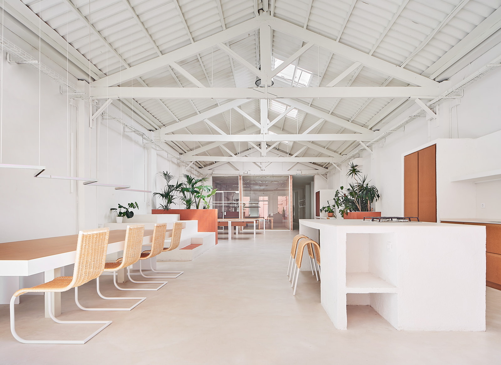
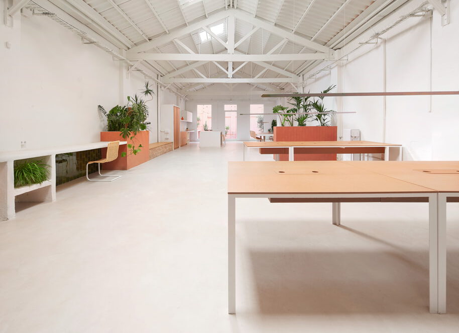
At the back is a charming open-plan warehouse with a 5.5-metre-high gable roof constructed using wooden trusses. It stands out as the space in the project with the most architectural personality. In order to meet all requirements of the agency’s brief, we defined two foundational concepts for the project.
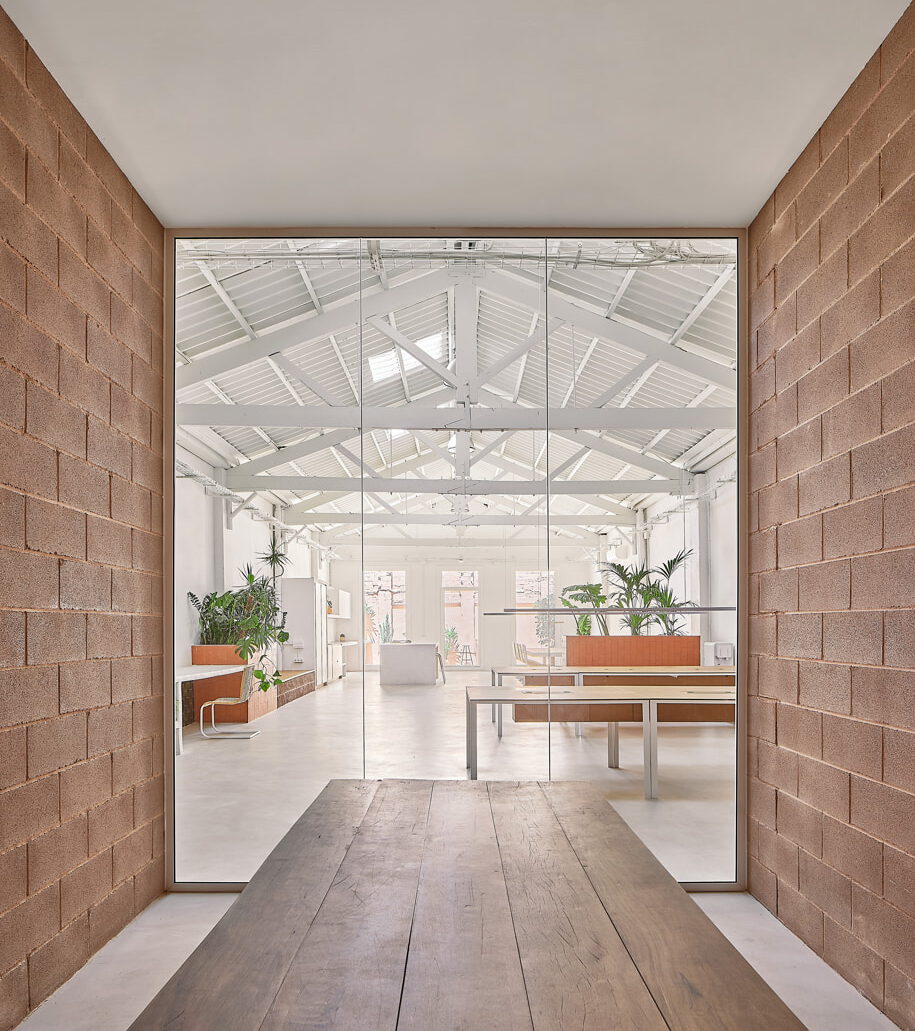
The first was the creation of a central core for service areas that would house storage, technical rooms, meeting rooms and lavatories, allowing us to retain both the entry space and the rear warehouse as large open spaces. The central core also functions as a transition area between the two spaces.
The second basic concept was our proposed construction of a continuous linear element running the full length of the dividing wall from the entrance to the back of the space, taking on different functionalities according to the needs of each area, and employing various materials and idioms.
Specifically, the plan sees the property distributed into four distinct zones.
First, the open-plan space adjacent to the street acts as the point of entry to the premises. Next, we come to the central service area which runs down a long hallway.
Then, at the back, we come to the unique warehouse area. This will become the main space where the day-to-day running of the agency happens. Finally, in order to open a new back façade and bring light into the building, the old courtyard at the back of the property was restored and three large openings were made to connect it to the interior. In terms of materials and finishes, the basic premise was not to disturb the original presentation of the spaces but only to clean and paint them white. This creates a neutral frame which focuses the attention on the renovation, creating for it an entirely independent language.
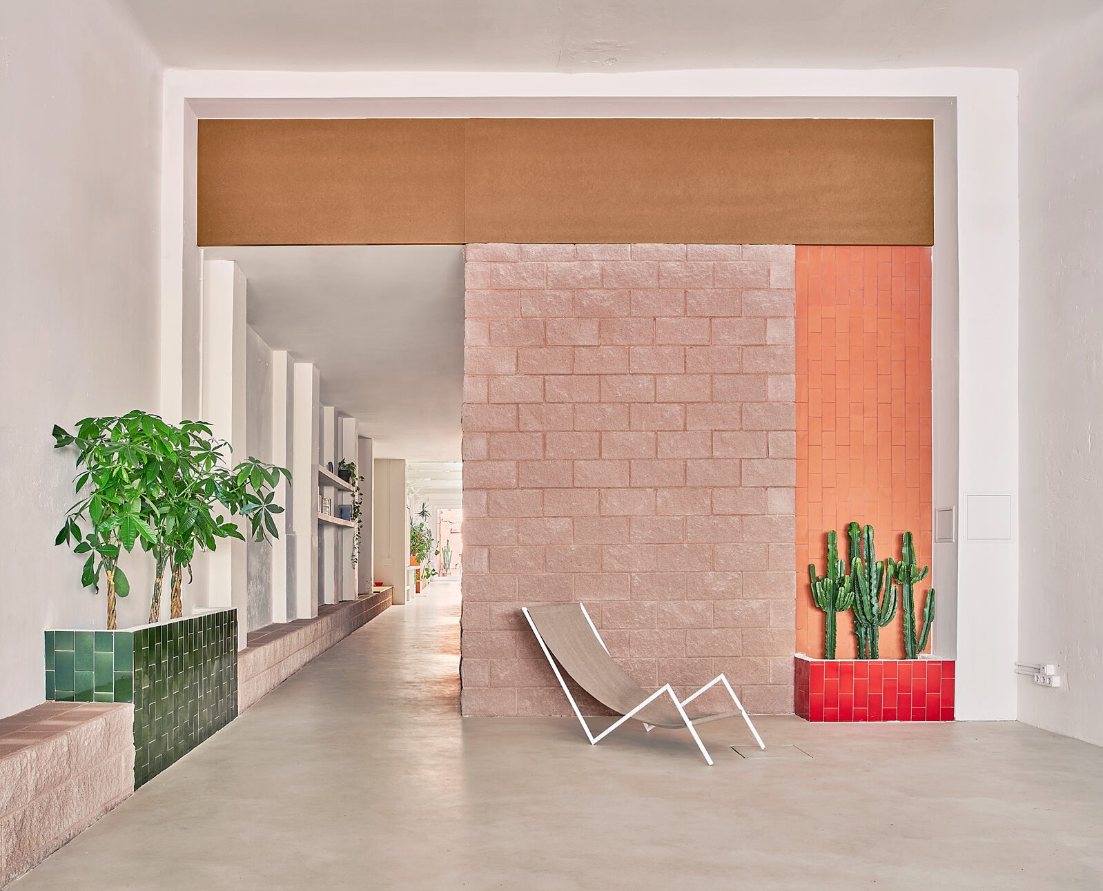
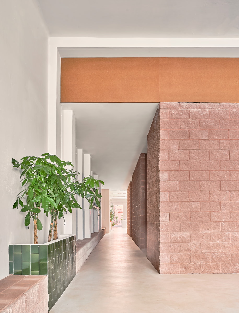
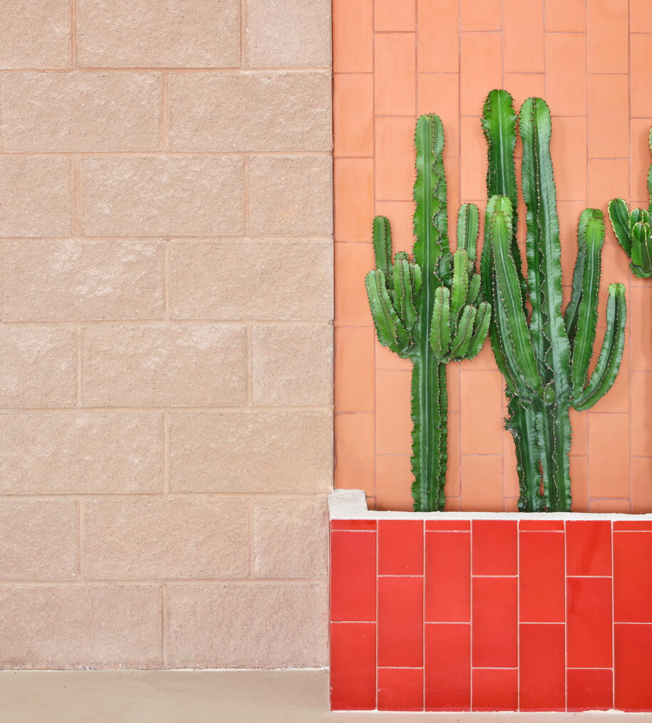
The client opted for the use of raw materials, volume and contrasting textures and colours. This is why the project materials mainly reflect a Mediterranean vernacular of architectural references plus the use of textures and colours of a more Mexican inspiration. Rough-finished concrete block with pink tones was chosen to create both the main core area and the continuous linear element. This brings personality and robustness to the project while acting as a self-supporting element for the construction of the entire perimeter and dividing walls of the core area.
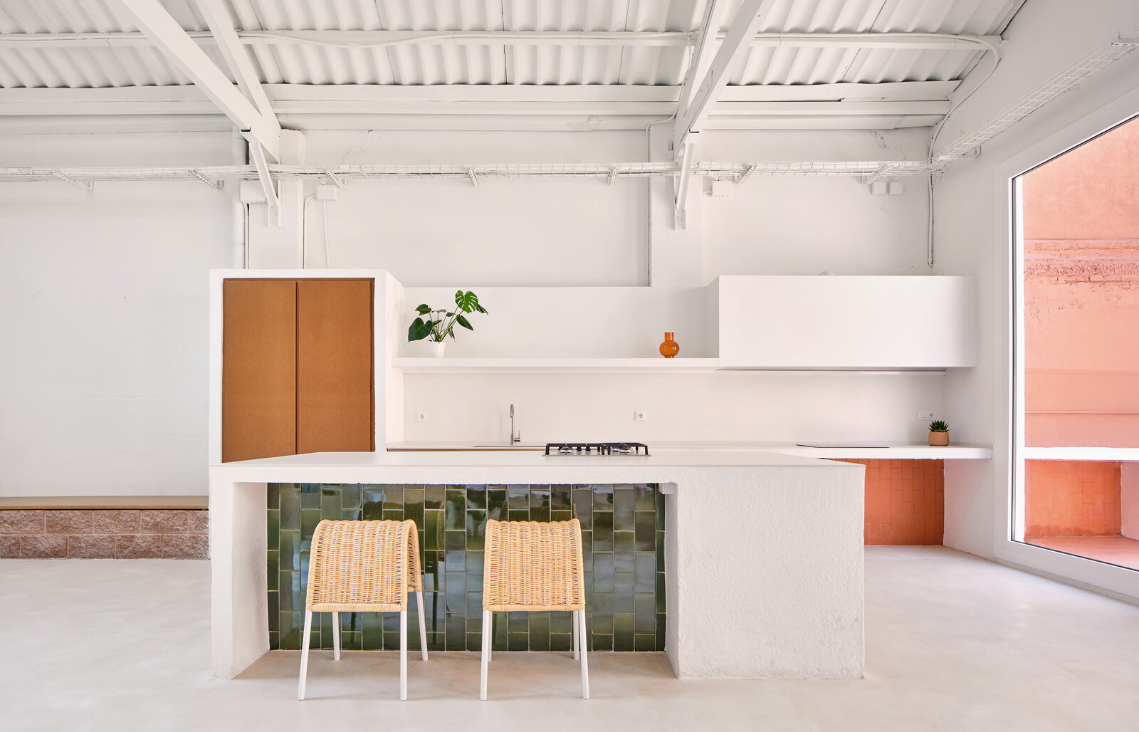
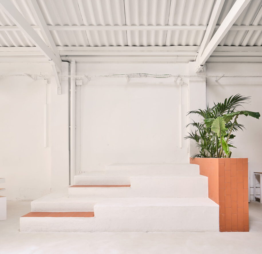
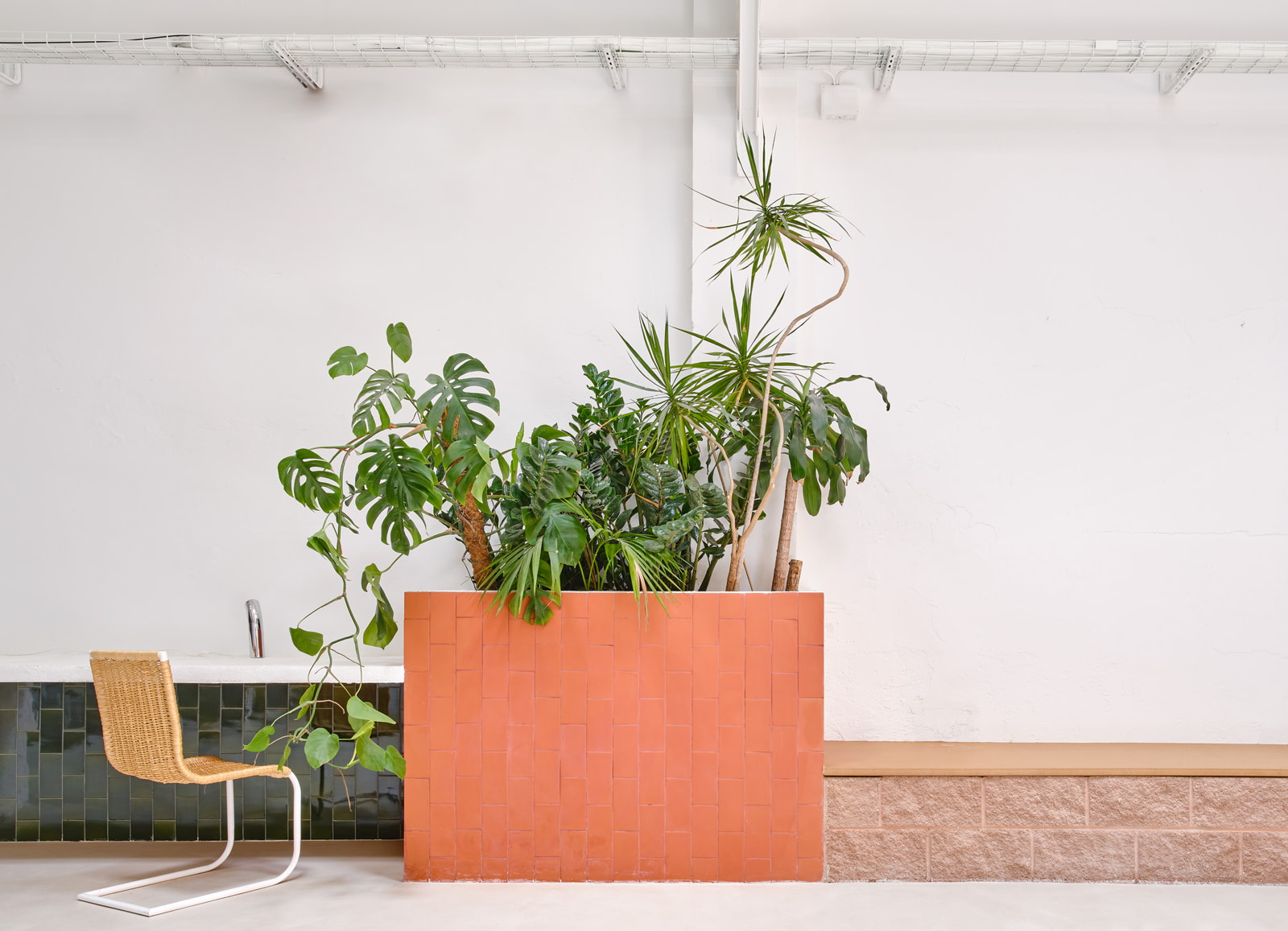
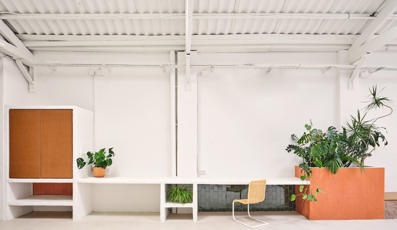
The different extensions that appear in the linear element and the warehouse were built on-site and were given a rather rough plaster finish, painted in white, highlighting their handcrafted character. For the lavatories, planters, work areas, and other areas needing special attention, complementary materials for cladding were used, such as traditional Catalan rasilla bricks and red and green glazed ceramic from La Bisbal.
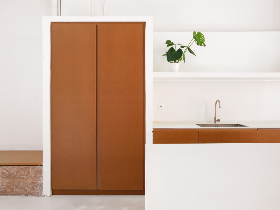
Finally, raw MDF board was incorporated into the project, which is a more contemporary material that contrasts visually with the others. It offers smooth surfaces to work with, bringing practicality, as well as elegance, to the project. The entry area is a foyer and multi-purpose room characterised by its spare nature, as it has to be adaptable for a wide range of uses. At the back of this space, we see the start of the service core, built using concrete blocks and clad in tile or detailed using MDF. On the left is the bench, the continuous element that runs right through to the courtyard, changing according to the function of each area. The central core, delimited by the high concrete block walls that establish a strong, solid voluminousness, offers two large passageways that function as a sort of antechamber.
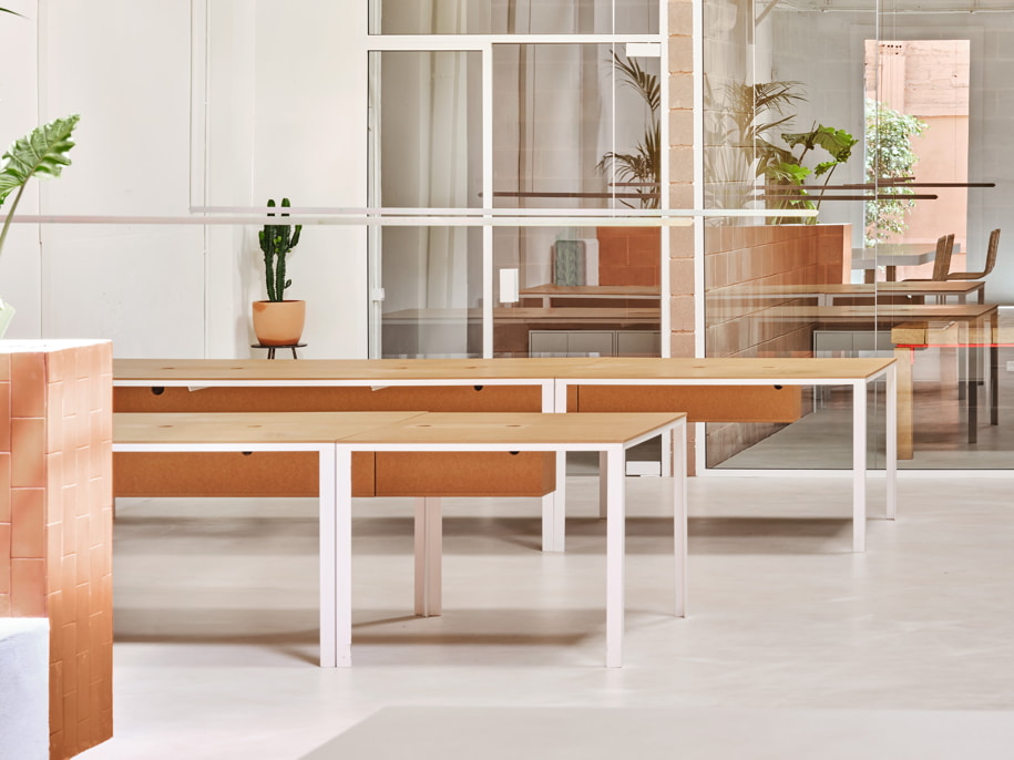
The first passage leads to the lavatories and the second to the storage areas and meeting rooms. In these semi-open foyers, the doors are panelled from floor to ceiling in raw MDF in order to create maximum contrast with the roughness and colour of the blocks. The meeting rooms open onto the main hall through large glass doors which extend the reach of the natural light while fostering a visual relationship between the spaces.
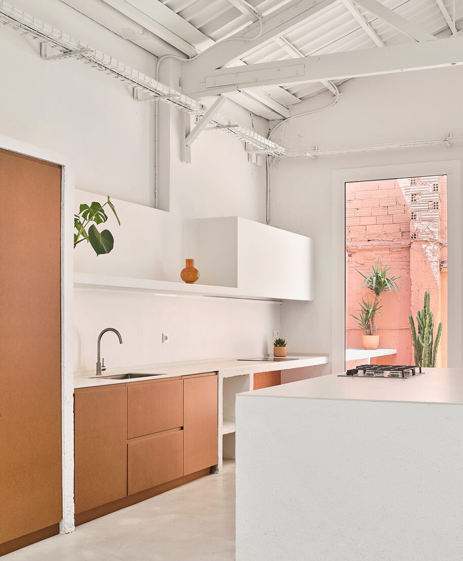
In the main hall, the varying uses required for the workspace are expressed in the continuous element as it runs along the entire side wall with cupboards, work surfaces, a planter, a bench and finally to the kitchen and the patio worktop. Here, too, cement block, elements of masonry and other various materials alternate according to the function of each section. The kitchen, located at the back of the former warehouse, is made up of different modules, either open or closed, with MDF. The extended cooking area, clad in ceramic tile, extends towards the outdoor courtyard. In the centre is a large island with a porcelain worktop that holds a work and storage area on one side and a bar with stools on the other.
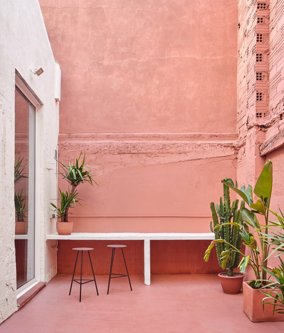
Only minimal treatment was given to the outdoor courtyard. It was cleaned and painted in the same way as the rest of the original architectural elements of the project, but here a terracotta-coloured paint was used, contrasting with the white of the interior. Opposite the kitchen is the dining area where an imposing metal table with an MDF top is set into the floor. The table was designed for the project by Cristian Herrera Dalmau, who also designed the suspended metal zig-zag lamp with a special iridescent bichromate finish.
The work area is located in front of the large windows of the meeting rooms and is organized in two lines of white lacquered metal tables with MDF tops. The suspended lamps, with the same zinc finish as the one in the dining room, were also designed by Cristian Herrera Dalmau.
Facts & Credits
Project title Codea studio
Project type Store and warehouse reconversion
Location Barcelona
Architects Lama studio
Collaborators Cristian Herrera Dalmau
Year 2022
Photography José Hevia
READ ALSO: Earthrise Studio, in London UK | by Studio McW
