House AD is a house conceived by Deferrari + Modesti as a micro-architecture that highlights natural light, the fulcrum of the house. In the district of Le Cure in Florence, at the foot of the Fiesole Hills, they designed the interiors of this flat for a young couple with a passion for architecture and fashion.
A fluid and open space involves different environments through furnishings, materials and colours that relate the rooms intimately.
The project involves the interior spaces of a residential flat at the foot of the Fiesole hills, in the Le Cure district of Florence, inhabited by families and young people who choose to move here because of the ample presence of services and greenery, which blends in with the surrounding hilly landscape. Here, the DEFERRARI+MODESTI studio of Javier Deferrari and Lavinia Modesti has created a bright and cosy domestic environment set in a late 1970s complex, which develops around a large inner courtyard.
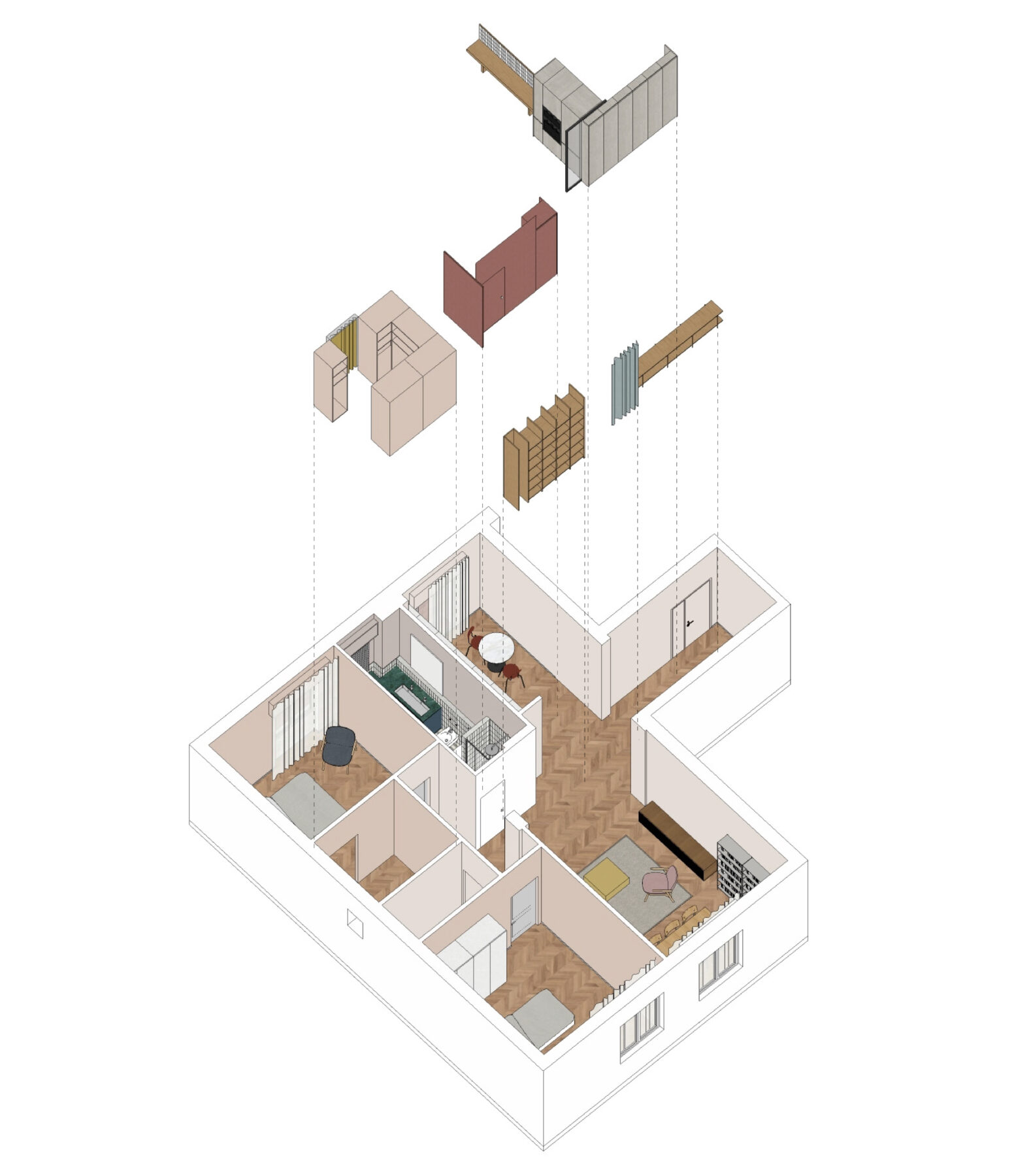
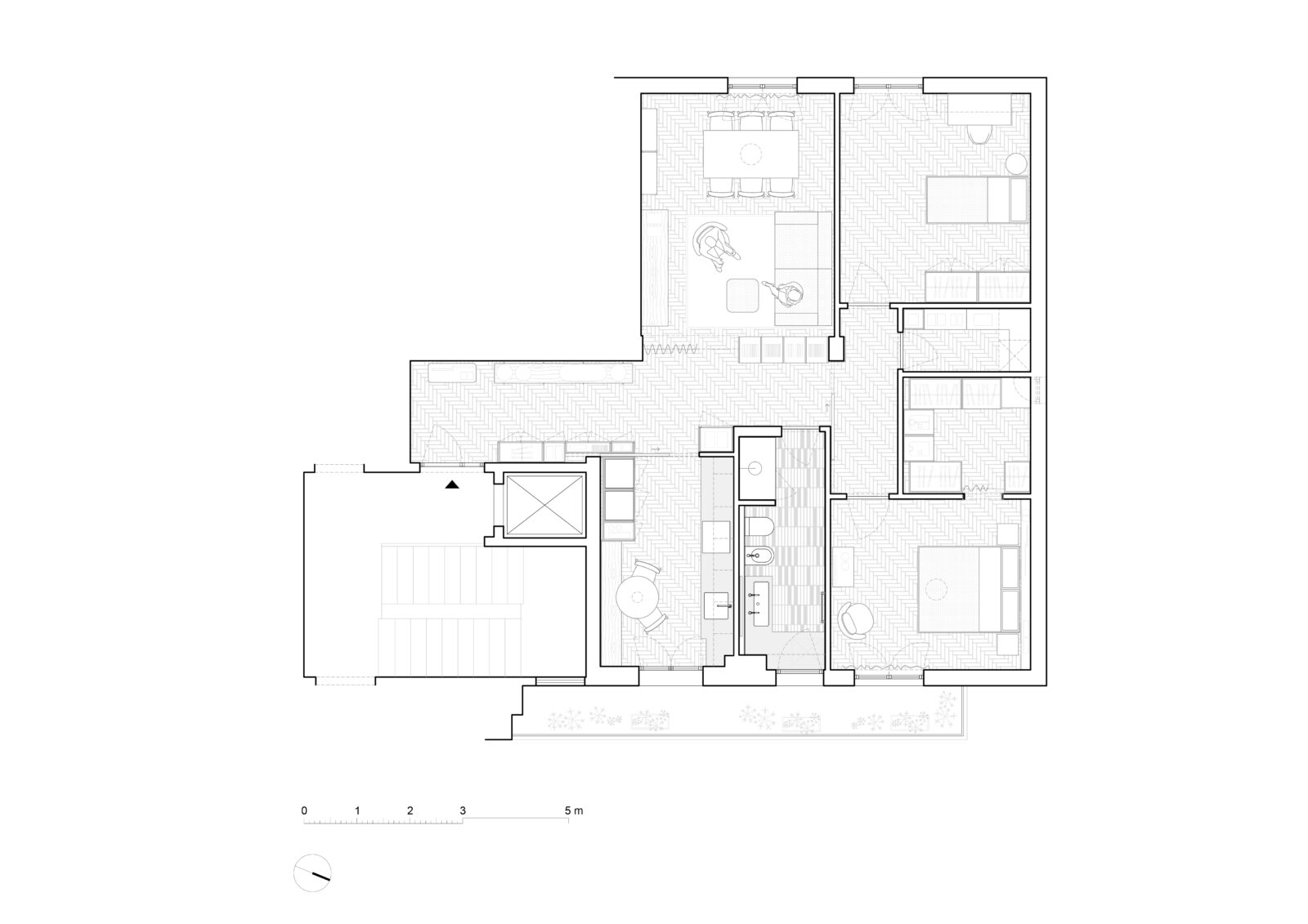
The owners are a young couple: Alice is apassionate about fashion and clothes and devotes herself to numerous pastimes that have manual skills as their common denominator and that lead her to need storage furniture where she can store all the materials she needs. Diego, on the other hand, is involved in urban regeneration and needed a place where he could work and study. The studio was involved with the request to design an informal and hospitable space where he could welcome friends and cherish his lifelong passions. The project was immediately confronted with the organisation of the existing spaces, arranged around a central pathway, with a clear division between living and sleeping areas. Internal circulation was interrupted by the presence of the corridor, made dark by the poor passage of natural light. The design path opens up to the possibilities of space and the needs of the two young owners. The intervention completely transforms and revises the existing building, trying to make the rooms as connected and bright as possible, taking advantage of the flat’s double exposure. The walls in the centre of the flat are eliminated to connect the rooms and make circulation fluid.
The different functions maintain their location, being interconnected by continuous furnishings, which develop on the new design of the spaces.
The design creates volumes and punctual furnishing devices to create new relationships and mark out the various uses.
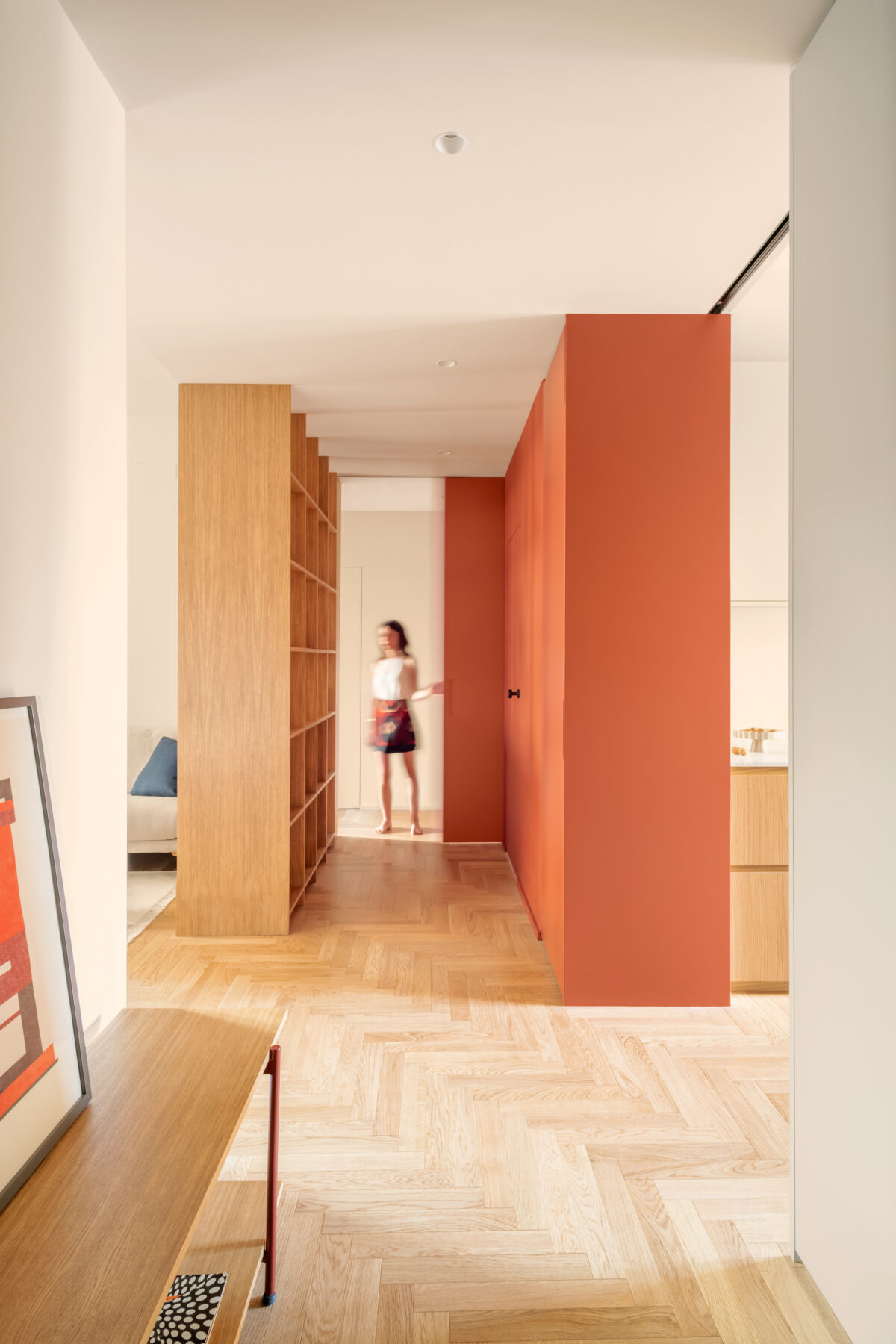
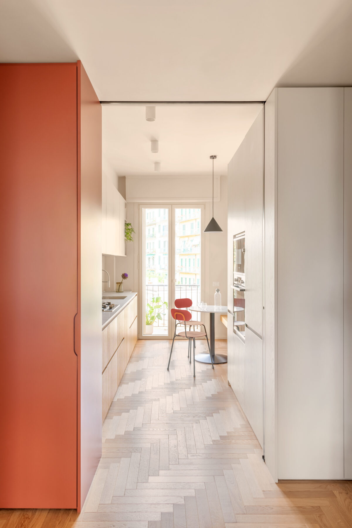
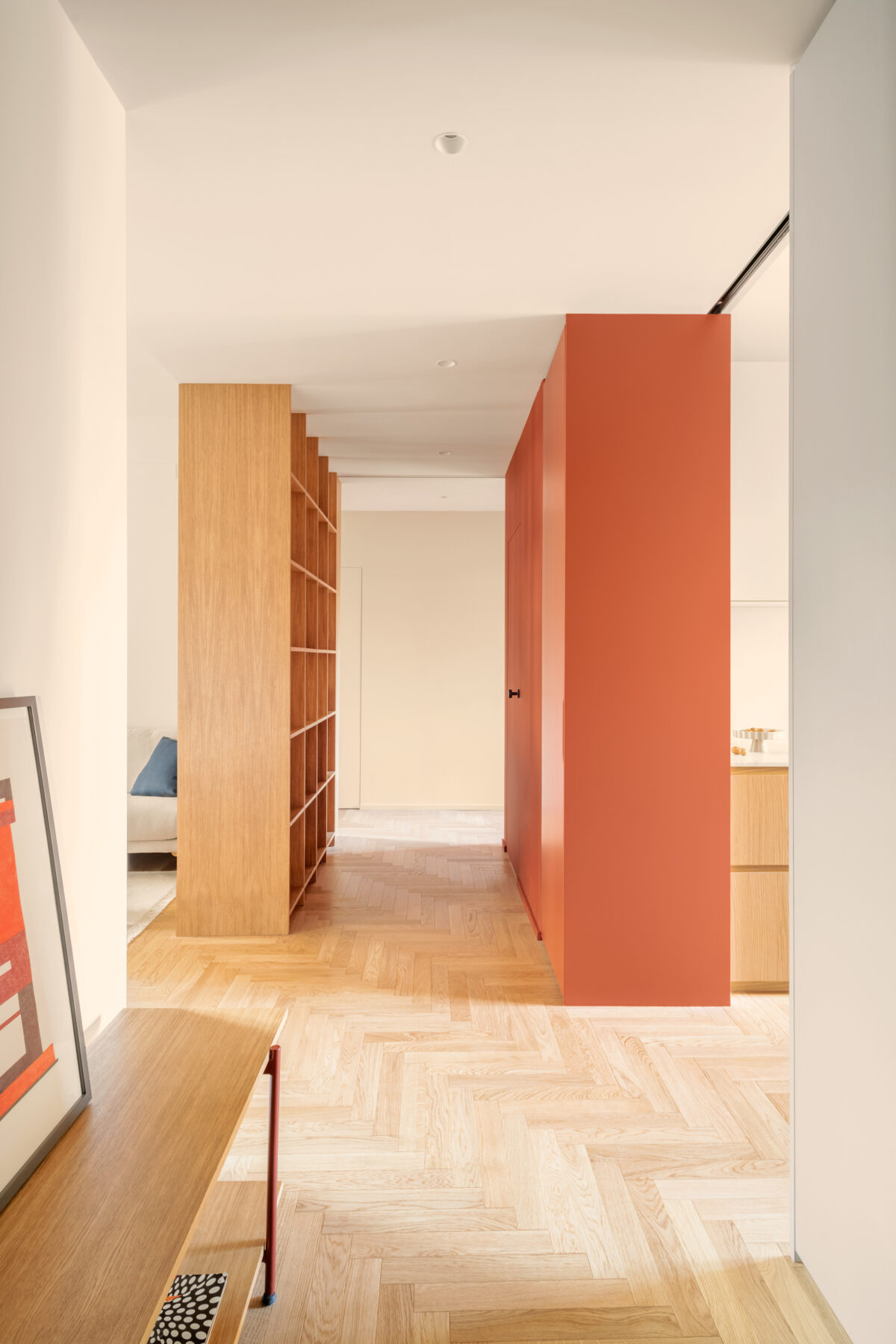
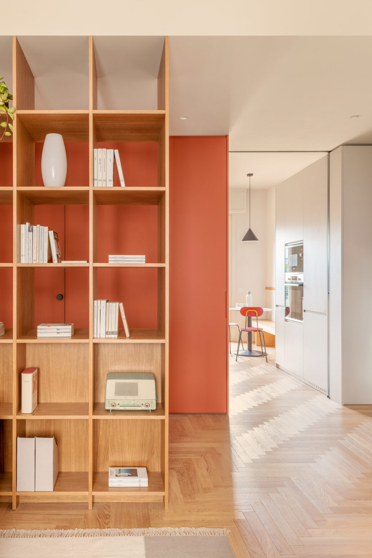
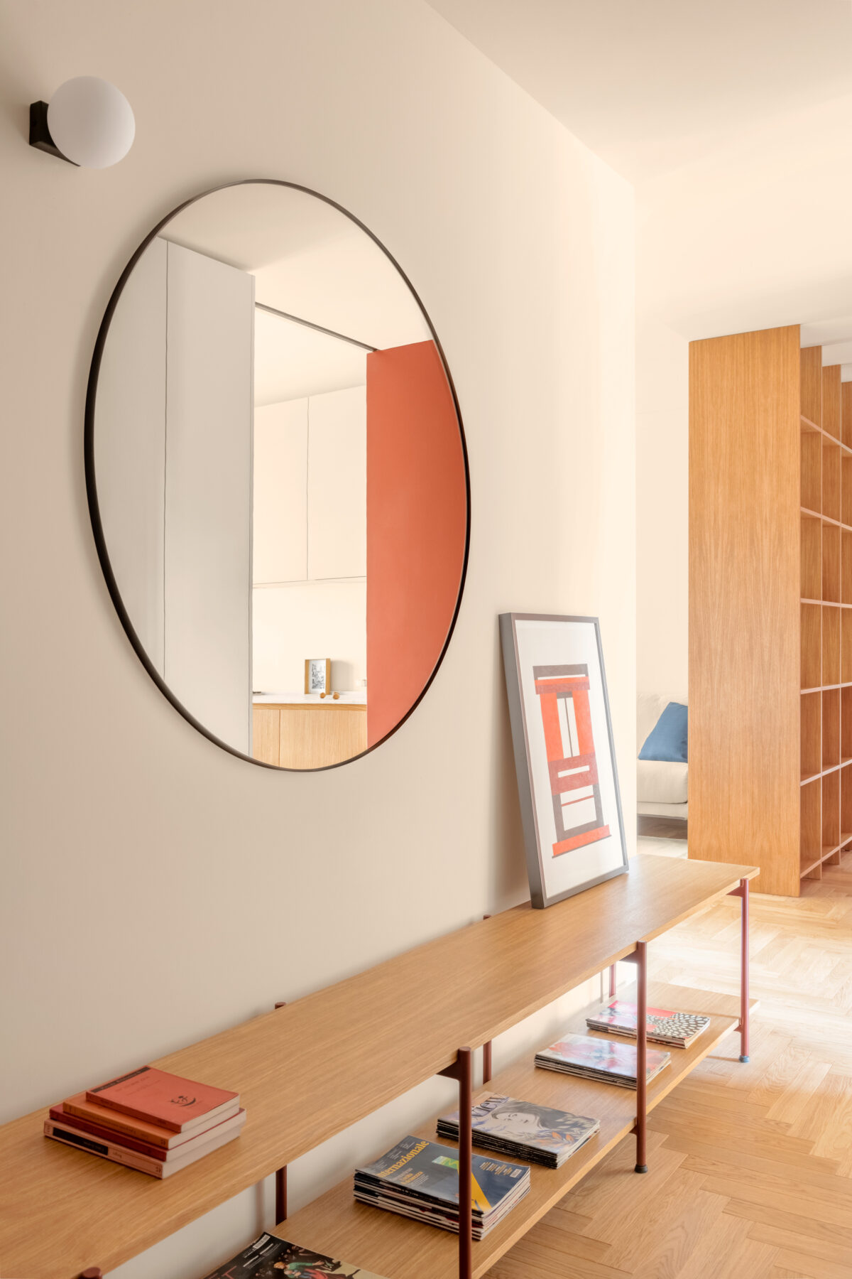
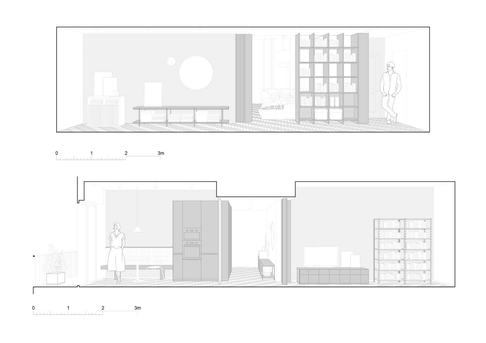
The customised furnishings not only characterise the various rooms, but also make the most of the available space by articulating into storage units, partitions, sliding panels with different colours and textures. The house is entered through a large entrance hall, where various volumes and furnishing devices are placed. Among these, a long cabinet with double oak shelves and an enamelled metal frame is used both as a bench and as a place to store objects and clothing. Above the bench is a large circular mirror, while a full-height lacquered oak wall unit occupies the opposite wall. It is a piece of furniture that runs along the corner between the entrance and the kitchen, placed at the transition between the two spaces. This wall unit has a dual function, at the entrance, that of wardrobe and storage for most of the utensils associated with the young couple’s passions, and in the kitchen, that of incorporating the tall units and pantry. The cabinet also contains a sliding glass door, which closes off the kitchen but still allows light to pass through..
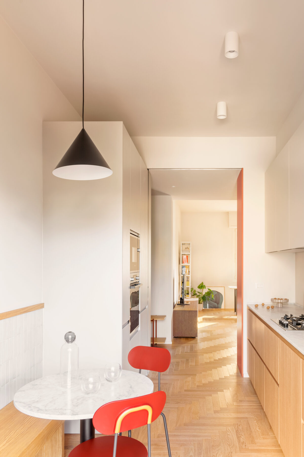
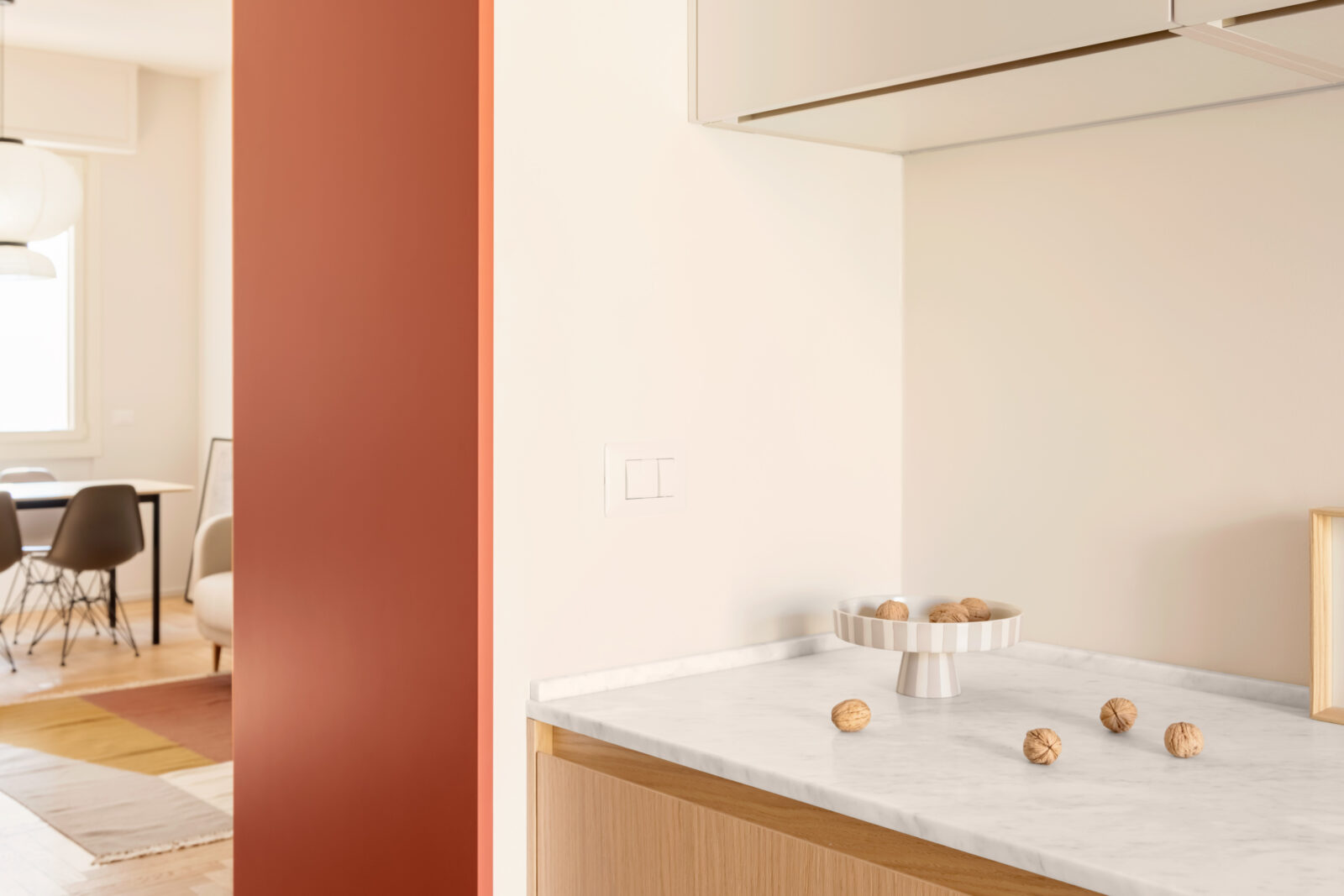
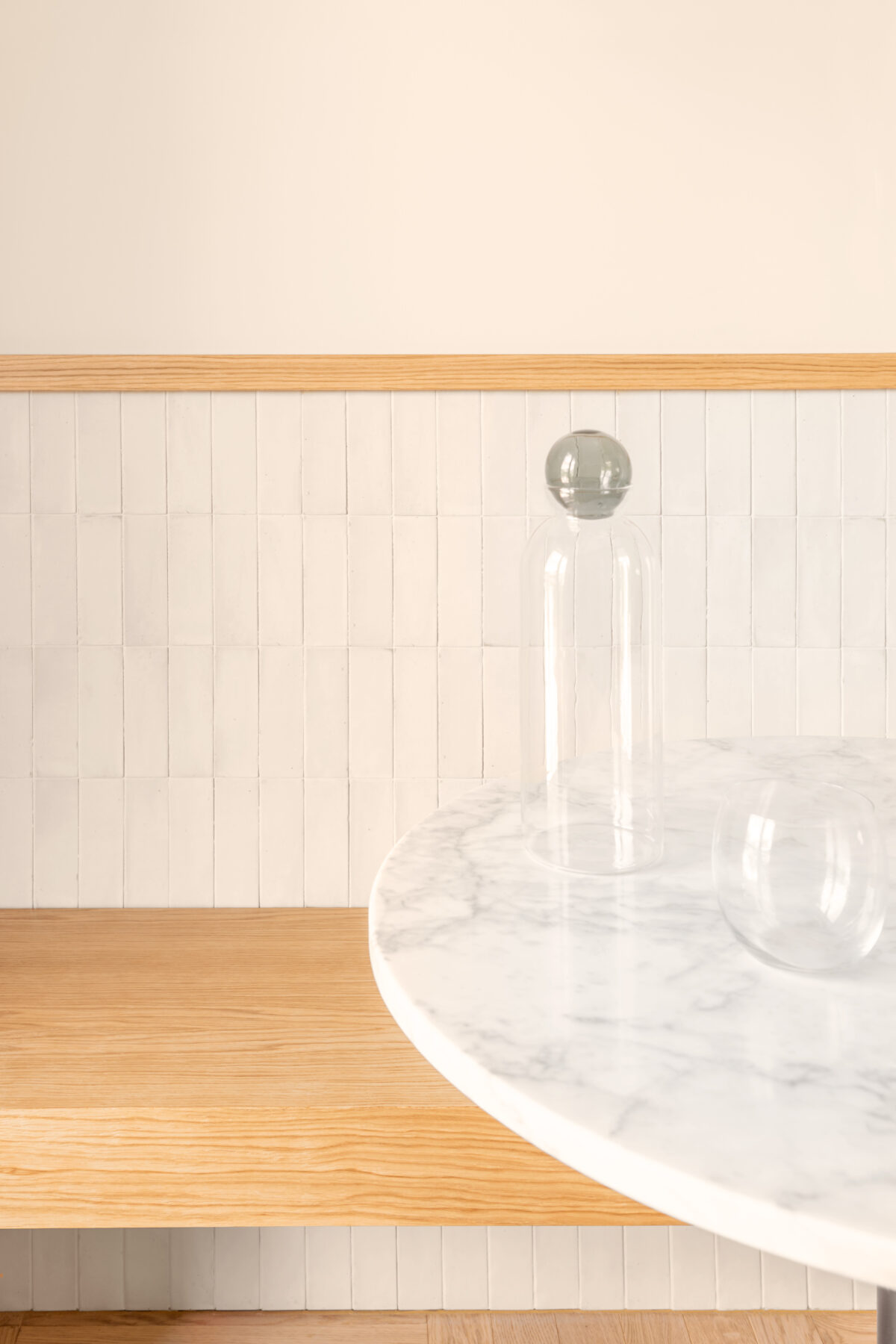
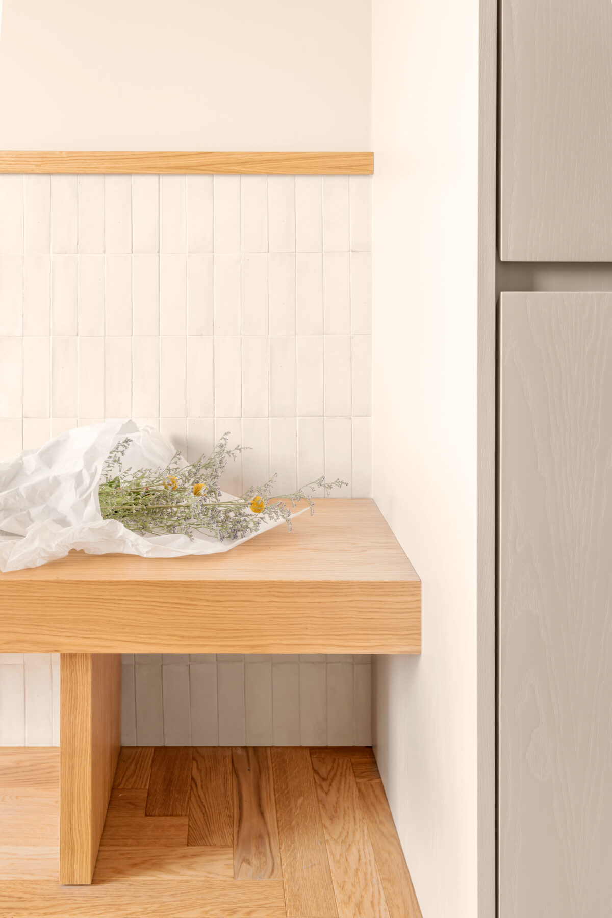
“The project is the synthesis of a wide-ranging and articulated process developed with the clients, in a continuous dialogue that could bring out their needs, daily habits, special requirements and could therefore create a space tailored to their needs and to their expectations”. Lavinia Modesti. The kitchen is completely renovated, distributing the furniture and organising the activities on the two main sides of the space. The kitchen furniture designed by the studio is modelled on the characteristics of the space. The choice of materials makes it cosy and informal, the natural oak cabinetry and the Carrara marble top are balanced with the lacquered wall units. Along the opposite wall, there is the volume containing the columns and the pantry, which continues towards the door to the balcony with an oak bench with a rectangular white tile backrest. The bench is used as a seat for a small circular table, also made of Carrara marble, where one can eat in company or share food preparation.
The central distribution space is now an open space, divided only by a full- height sliding panel, which allows the division of the living and sleeping area. This space is overlooked by the various furnishing volumes, which dialogue with each other and relate the spaces. The volumes are designed by clear geometries, according to different tones and materials, and alternate with the two concealed sliding doors that open and close as required. In the central space there is a false ceiling with a lowered height compared to the other rooms in the house.
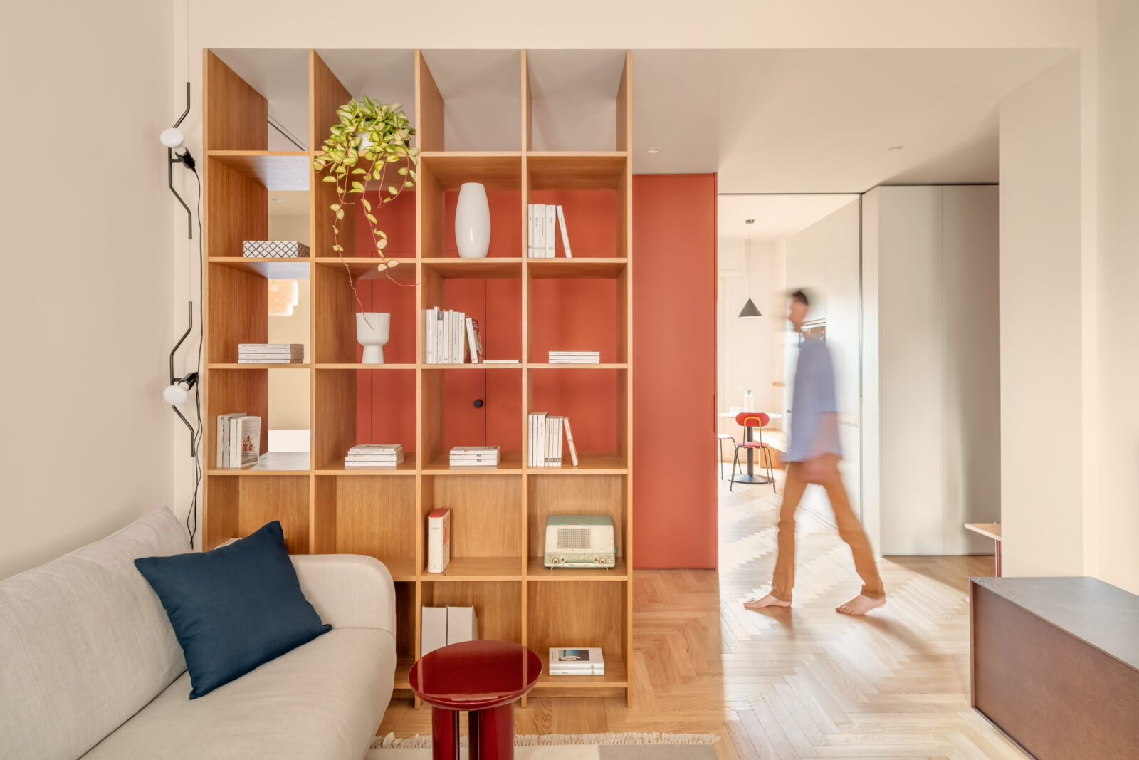
On the threshold of the living room is an oak cabinet with a through-structure, used as a bookcase and object container. The cabinet works like a filter in the space, dividing the rooms but allowing light to leak through. The living room is divided into two distinct areas: one dedicated to conversation, with a sofa, the other occupied by a large table with an oak top for dinners with friends. On the wall is a low walnut console table and a metal shelving unit. “We have designed every element that makes up the interior of the house, from the design of all the spaces, to the choice of all the materials and finishes, through the selection of all the furnishings, to the design of the custom-made furniture with the sole objective of making the flat bright, welcoming and functional” Javier Deferrari
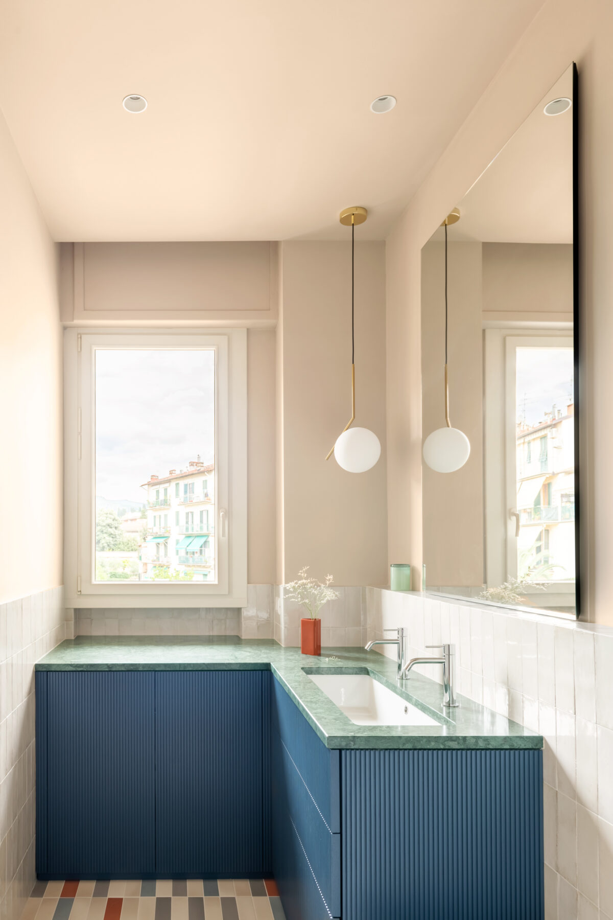
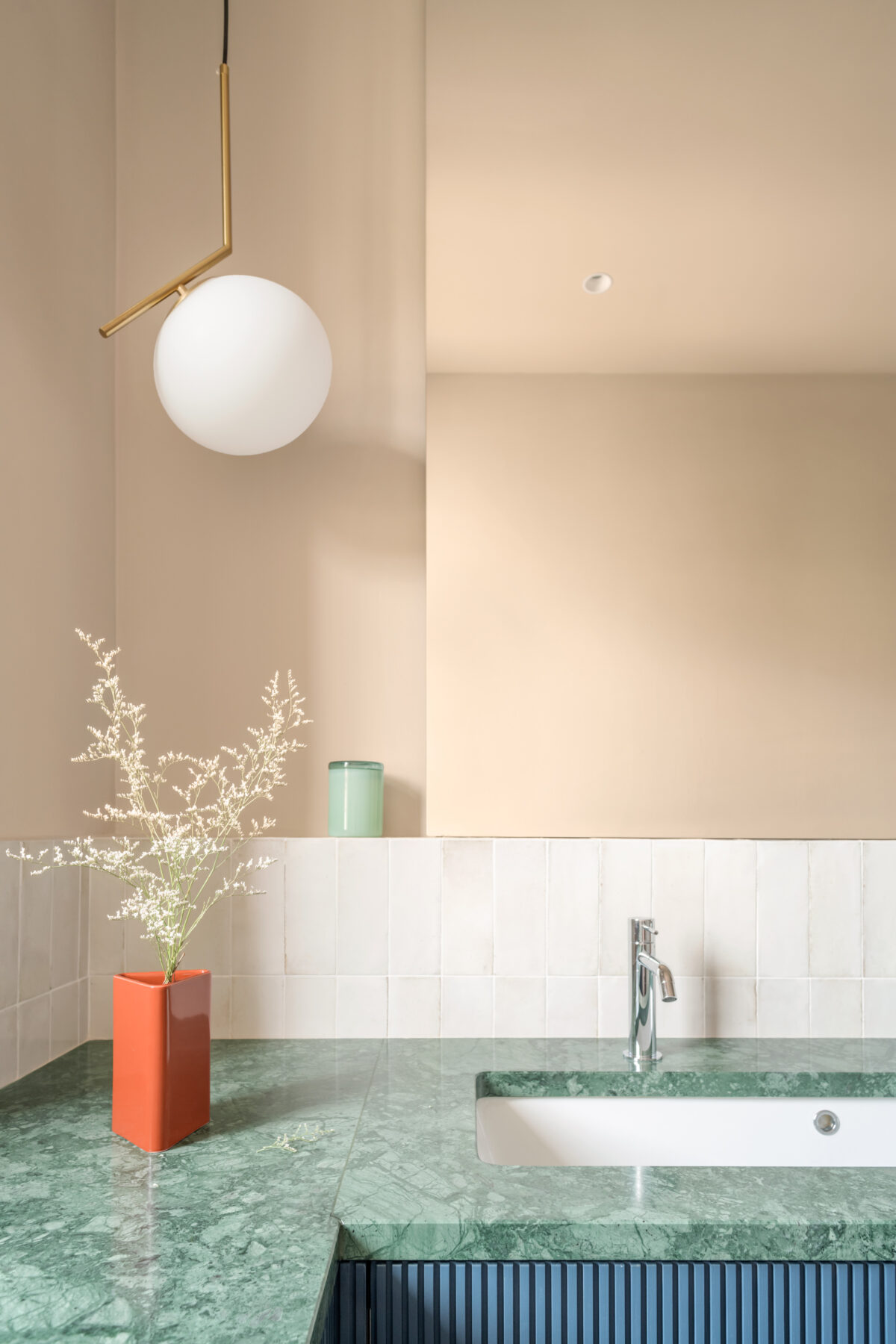
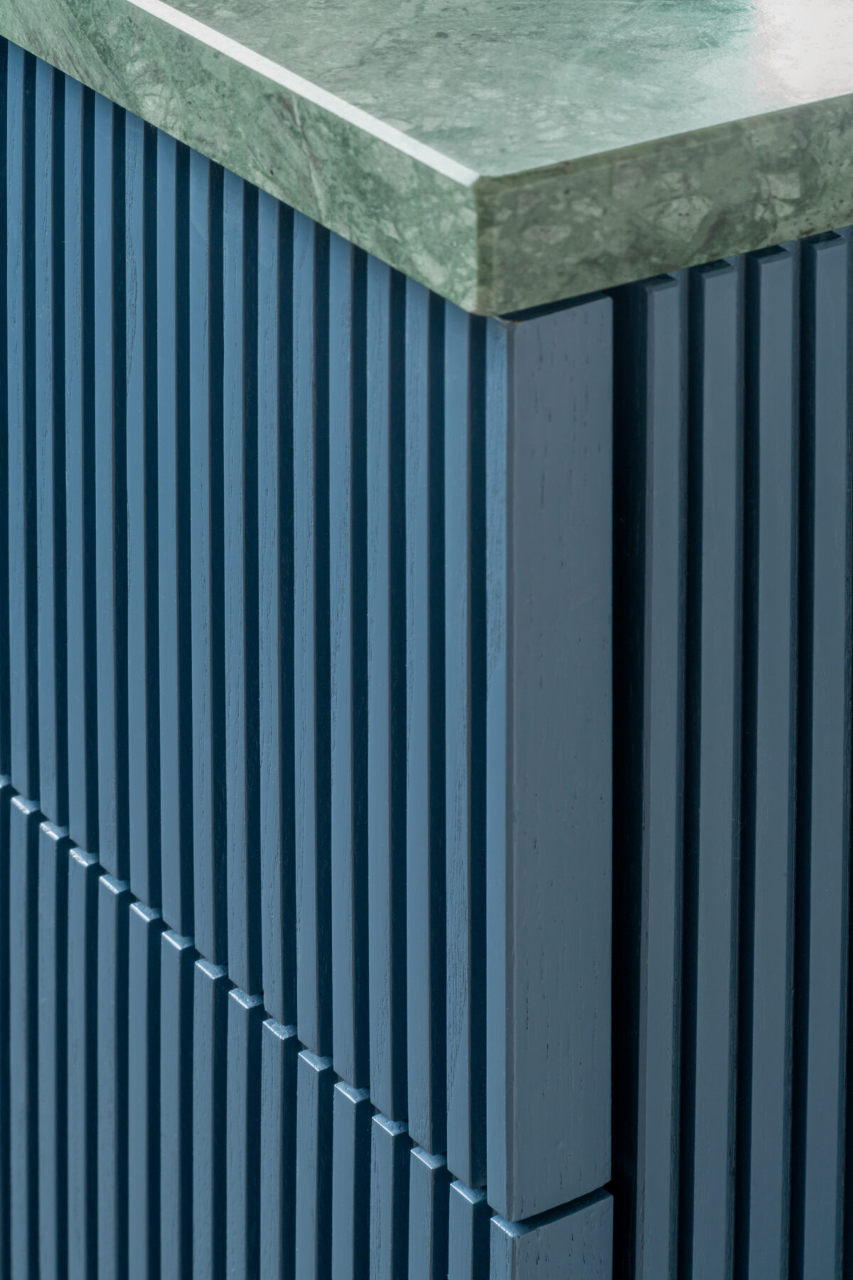
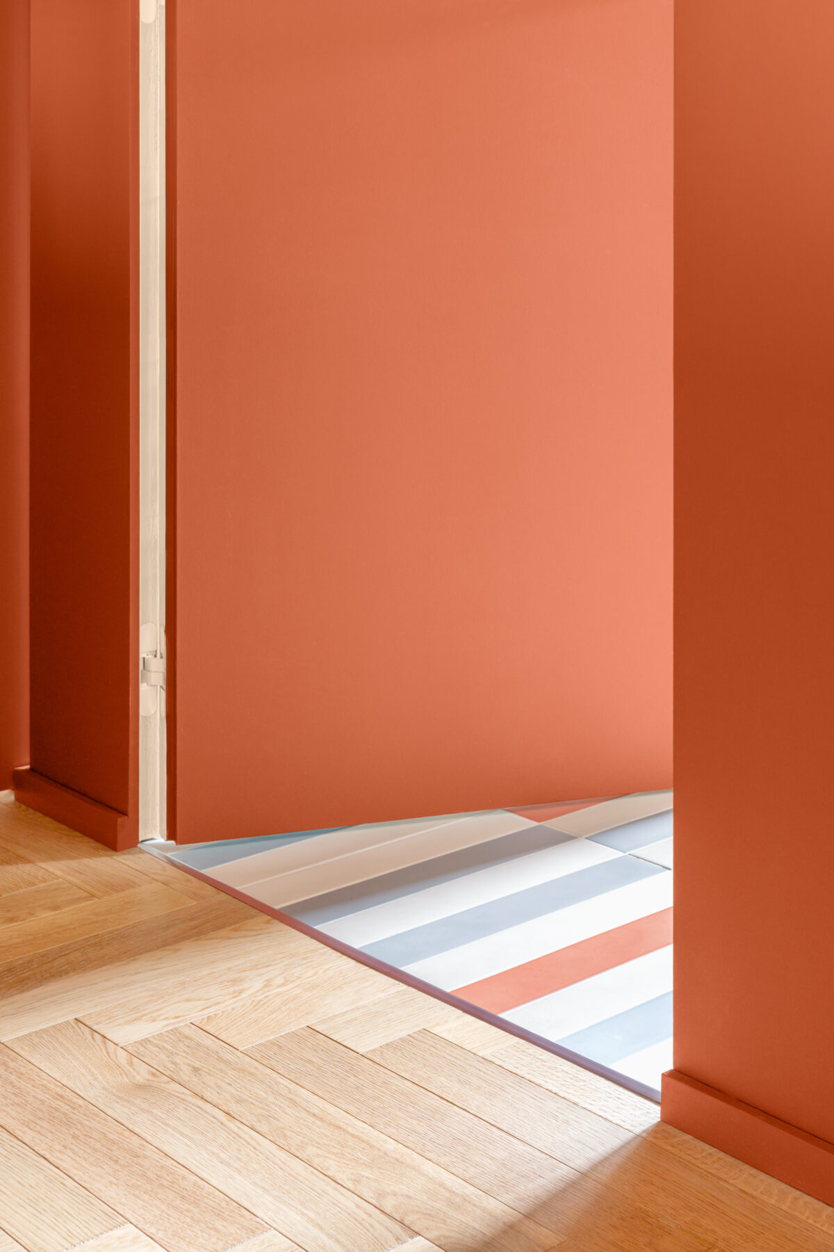
The entrance wall to the bathroom houses a storage unit that borders the kitchen and a full-height sliding panel that delimits the living area, all painted brick red to even out the surface and conceal the access door to the bathroom. These elements are configured as a unique volume, which faces directly onto the central space, alternating the colour of the surfaces with neutral or natural essences of the other volumes. The bathroom is organised with a masonry shower compartment next to the entrance, thus freeing up the only window on the wall opposite the entrance where a cabinet is set up that not only contains the washbasin but also houses the washing machine. Designed by the studio, the cabinet characterises the bathroom with its lacquered canned finish and large Guatemala Green marble top.
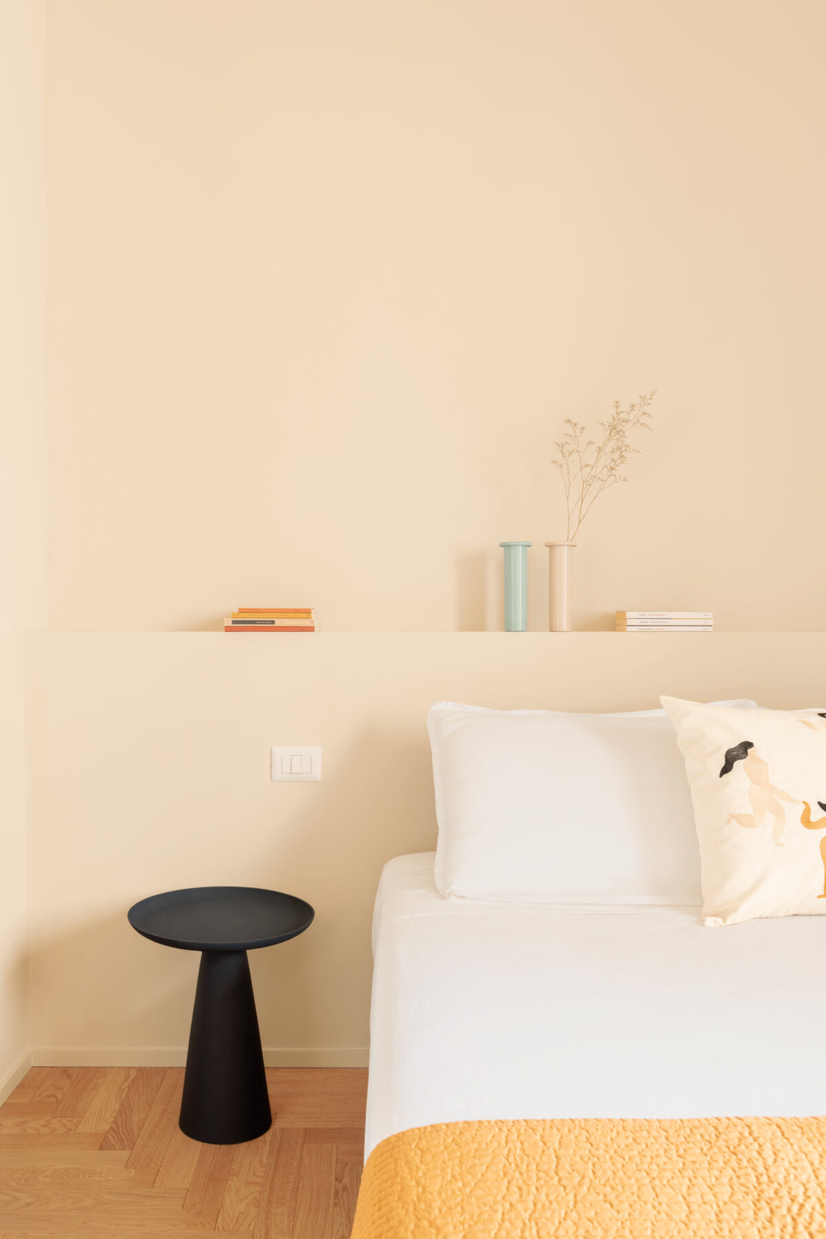
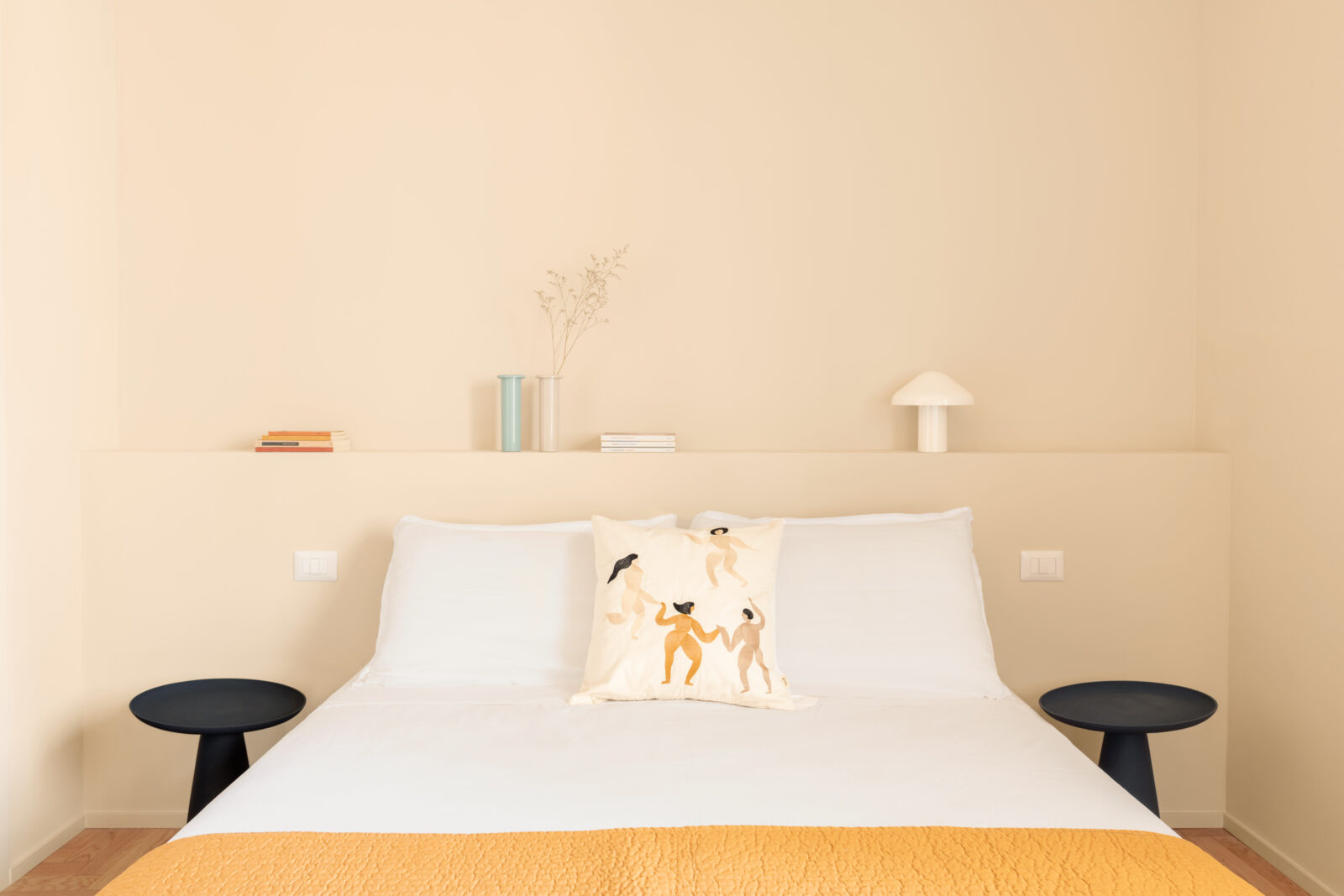
We continue to the sleeping area, whose rooms are completely redistributed to include a walk-in wardrobe and a storage room between the bedrooms. In the main room, in addition to the bed with masonry headboard, there is a reading corner and access to the walk-in wardrobe. The passage is lined with a lacquered wooden boarding, fitted with an ochre-coloured fabric curtain. Here the project has made maximum use of the available space to create a spacious and well-equipped walk-in wardrobe. The design opens up to the use of colour and different materials, in neutral colours varying in intensity between the living area and the sleeping area, creating a cosy, enveloping ambience.
Throughout the house, an Italian herringbone parquet floor is installed, uniting the spaces and expanding their proportions. In the bathroom, the parquet is replaced by a floor with porcelain tiles in alternating colours, with a three- dimensional, sculptural effect. Ceramic wall tiles are also used as boiserie in the bathroom and shower compartment panelling, both in neutral tones.
DEFERRARI+MODESTI
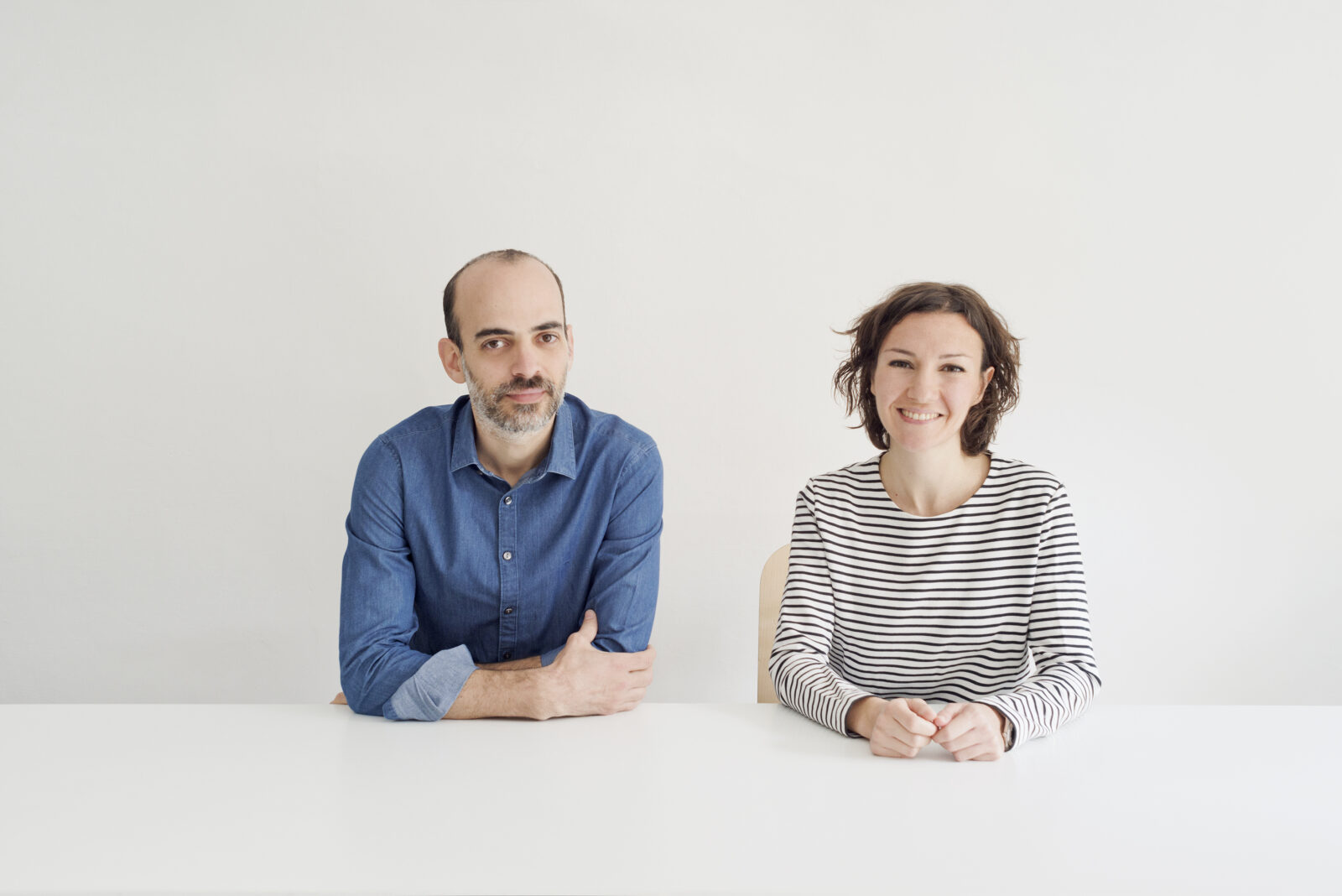
Created in 2010 in Florence, founded by Javier Deferrari and Lavinia Modesti. Over the years we have focused our research in Interior Design developing projects of different scales and types, each time creating a unique concept with its own distinct poetics.
The studio develops projects for private residences, corporate spaces for companies, showrooms, stores, offices and hospitality, and collaborate with major institutions in design in permanent and temporary museum installations. They collaborate with both private clients and major institutions and companies including La Galleria degli Uffizi, Targetti Sankey, Toscana Resort Castelfalfi, Castello di Banfi, Marca Corona, Mirage, Museo Piaggio, Cruna.
Alongside the professional design activity, we flank the academic commitment. Since 2017 we have been collaborating with IED as Teachers and Coordinators of the Bachelor’s degree course in “Interior Design”.
Recent awards to the office: In 2020 the studio is a finalist at the Dezeen Awards in the “Emerging Interior Designer of the Year” category. In 2021 the TH01 Targetti Hub is among the winners of the prestigious Iconic Awards promoted by the German Design Council. In 2021 the studio’s works have been exhibited inside the Italian Pavillion of “Resilient Communities” of the 17th Architecture Biennale, inside the section edited by Rebelarchitette and Alessandro Melis “Detoxing architecture from inequalities: a plural act”
Lavinia Modesti
(Pisa, 1979) graduated in architecture from the Faculty of Architecture in Florence. Her final project on foldable chairs included Enzo Mari as external mentor. Lavinia started her professional career as assistant to Enzo Mari, collaborating on furniture elements, office components and artistic reproductions. Her professional experience continued in Barcelona at Actar-Arquitectura and then in Milan at Caru- so-Mainardi’s office and Boeri Studio. Since 2010 she has been a founding partner of the multidisciplinary study Deferrari+Modesti.
Javier Deferrari
(Buenos Aires, 1978) studied architecture at the University of Buenos Aires. In 2002, after moving to Milan, he graduated from the Polytechnic. After several years of experience in Italy and abroad, in 2008 he began collaborating with Stefano Boeri’s studio, which led to his involvement in the redevelopment project for La Maddalena’s Ex Arsenale Militare. Since 2010 he has been a founding partner of the multidisciplinary study Deferrari+Modesti.
You can also check another work of them on the of Brac bookstore in Florence here
Facts & Credits
Project title: House AD | Apartment for a young couple
Typology: Residential, Interior Design
Location: Florence, Italy
Architecture: Deferrari + Modesti , Javier Deferrari, Lavinia Modesti
Photography: Anna Positano e Gaia Cambiaggi | Studio Campo
Text: provided by the architects
Collaborators: Oliviero Martini, Sara Panchetti
Client: private
Project size: 90 square meters
Schedule: Schematic design, design development and construction documents: febrary 2022 – september 2022
Construction start: september 2022
Completed: may 2023
READ ALSO: Inside out residence in Mallorca, Spain | by NØRA studio
