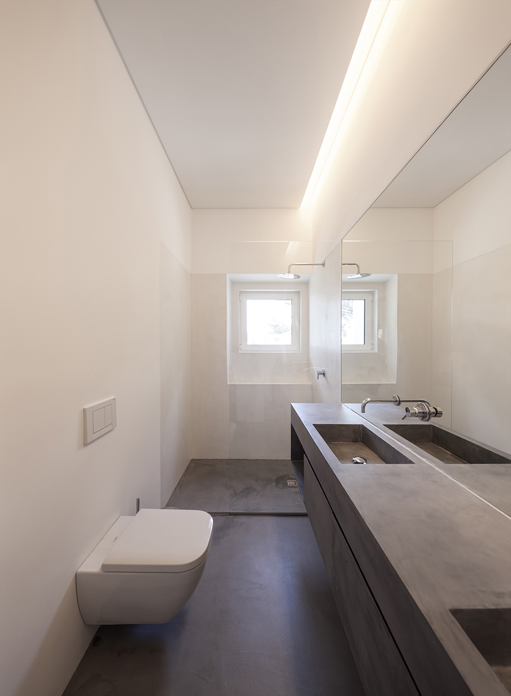
The House in Estoril refurbishment project has taken as starting point the pre-existing layout with some relevant spatial qualities deserving to be preserved and explored. Conversely, it was necessary to adapt the house to contemporary life, to become functional and in line with the expectable comfort requirements.
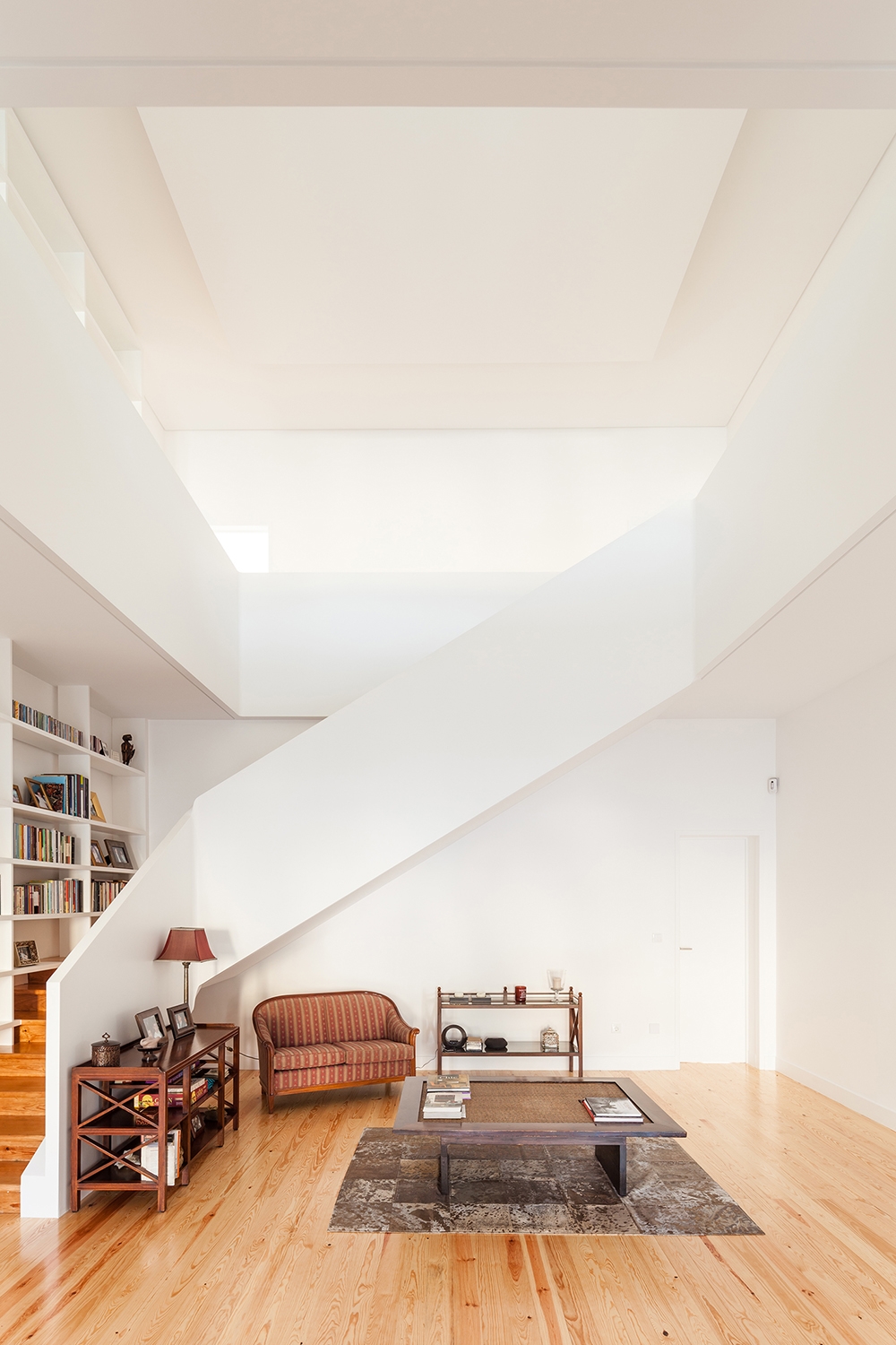
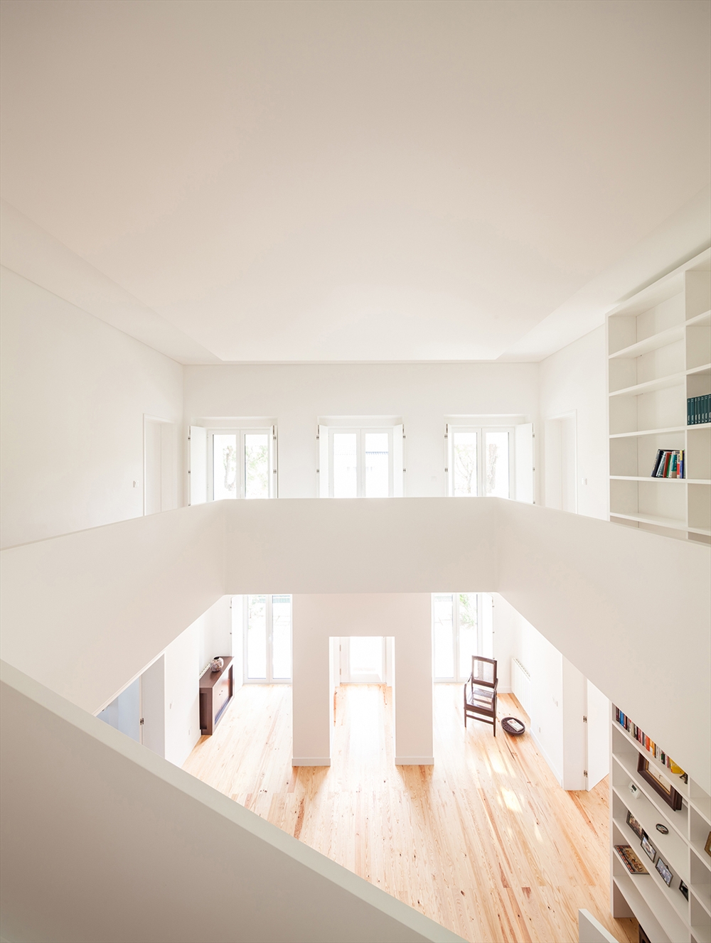
The central area is assumed as the aggregator element, minimalist and debugged, using the stairs as a continuous and fluid gesture, to link the two clearly distinct floors: the ground floor gathering the social areas of the house, is quite fluid and all the adjacent defining spaces establish a complementary relationship with the square central hall.
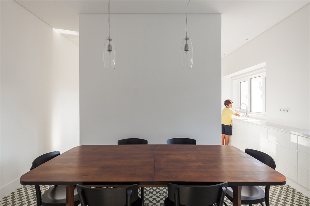
The bookcase intersects the volumetry and provides a more human scale opposing to the organic line of the guard. The main entrance releases the discovery of a large space with double height and surrounding areas (living room and dining room at opposite ends) and leads to the kitchen which gained new proportions and closes the last side of the square. The “1st” floor functions as a walking gallery to provide access to the rooms, peeking over the lobby. The colors and materials were selected with the primary aim of emphasizing the simplicity of the new geometry design and promoting pre-existing qualities.
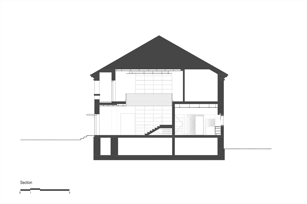 HOUSE IN ESTORIL / TARGA ATELIER / SECTION
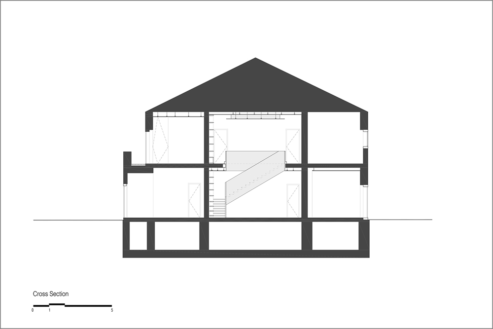 HOUSE IN ESTORIL / TARGA ATELIER / SECTION
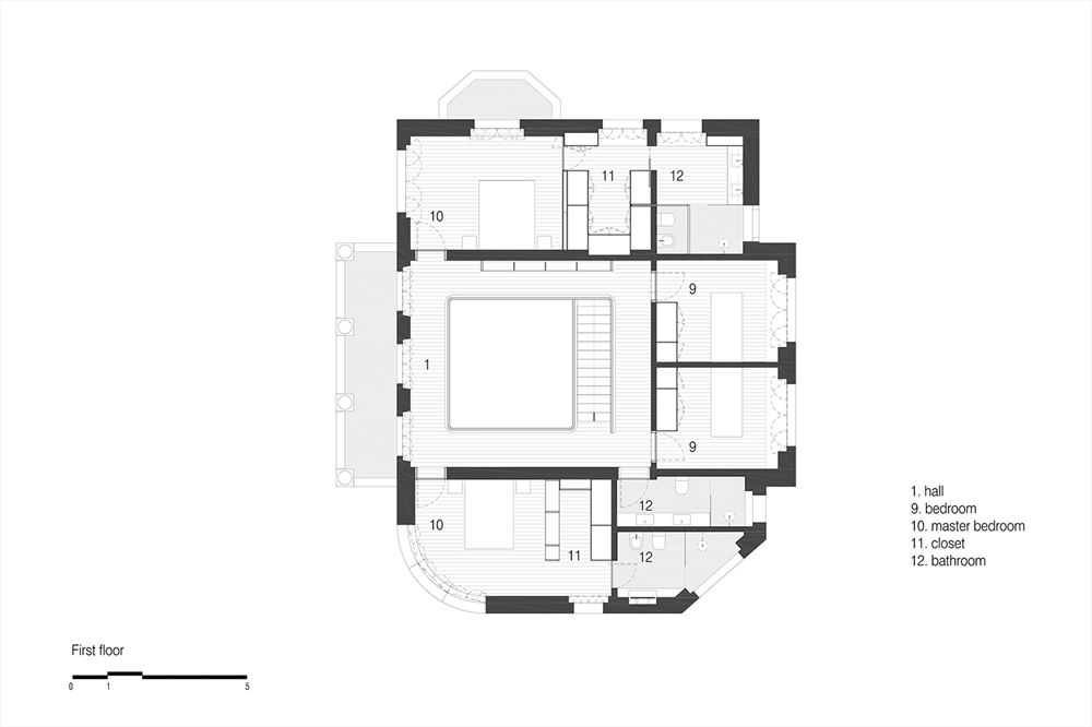 HOUSE IN ESTORIL / TARGA ATELIER / FIRST FLOOR
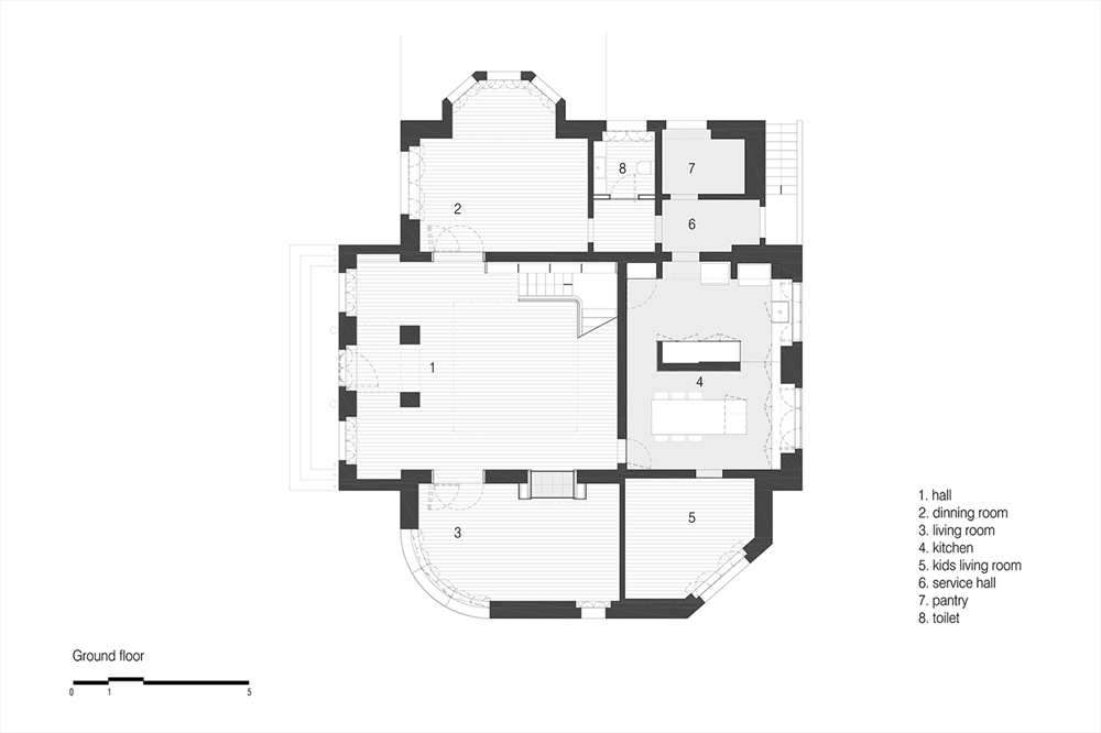 HOUSE IN ESTORIL / TARGA ATELIER / GROUND FLOOR
 HOUSE IN ESTORIL / TARGA ATELIER
  HOUSE IN ESTORIL / TARGA ATELIER
 HOUSE IN ESTORIL / TARGA ATELIER
 HOUSE IN ESTORIL / TARGA ATELIER
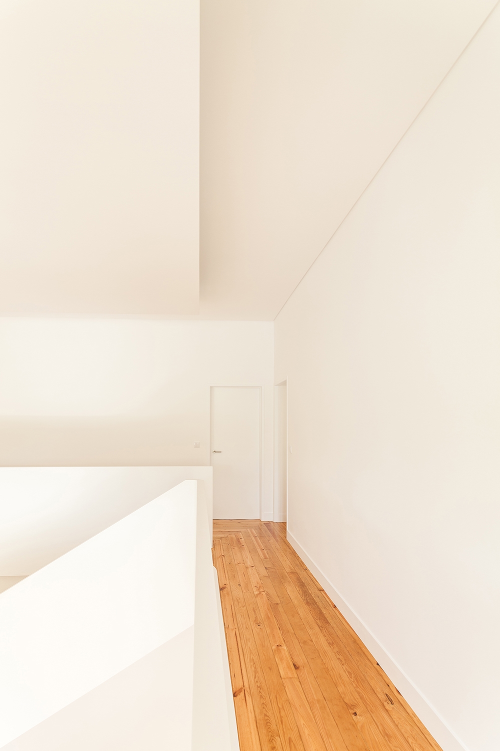 HOUSE IN ESTORIL / TARGA ATELIER
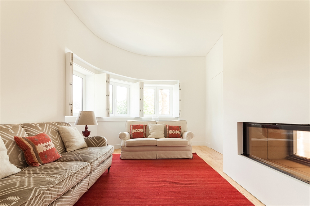 HOUSE IN ESTORIL / TARGA ATELIER
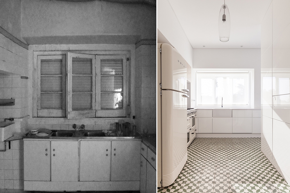 HOUSE IN ESTORIL / TARGA ATELIER / BEFORE AND AFTER
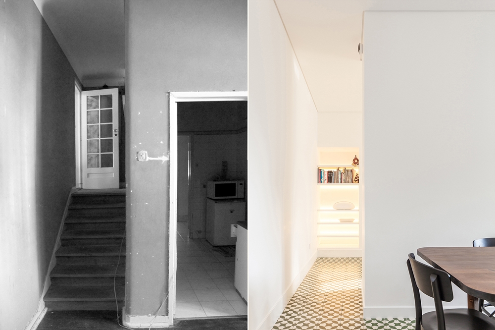 HOUSE IN ESTORIL / TARGA ATELIER / BEFORE AND AFTER
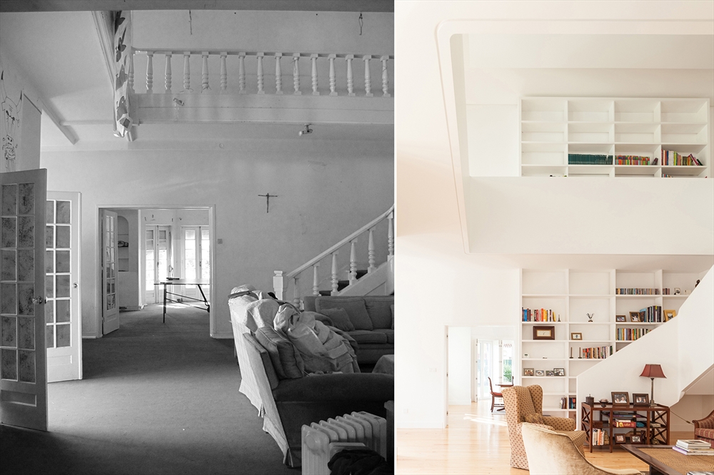 HOUSE IN ESTORIL / TARGA ATELIER / BEFORE AND AFTER
READ ALSO: GOLDEN RATION ARCHITECTURAL FIRM HEADQUARTERS / GOLDEN RATIO, MICHAEL BAKAS, KOSTAS BAKAS, ALEX BAKAS