Kyiv-based practice “Balbek bureau” was called to create an authentic Chinese place. The design concept of the restaurant, was inspired by “the legend of Mao” and by the rural landscapes of Yunnan in China.
Architects composed a unique interior by combining environmental friendly solutions and custom-made furnitures made of recycled materials.
The owner of the restaurant is well acquainted with the culture and gastronomy of China. According to his plan, MAO was to become an authentic Chinese place: with Chinese chefs, equipment and packaging shipped directly from China, as seen in local cafes.
Our team’s task was to create an authentic design project that would match the spirit of MAO. The interior needed to be simple and casual.
Among the areas we worked on were an open kitchen and a take-away area where you can buy Asian goods and place orders to go. In addition, the customers were presented with truly unique seating formats.
CONCEPT
The restaurant’s mascot is Mao, a young man from Yunnan province in southern China. Yunnan is a region famous for its diverse nature: mountains, jungles, rice and tea plantations. According to legend, the Mao family moved from there to Kharkiv and came up with the idea to introduce locals to Chinese cuisine. The family built the restaurant themselves, using modest funds but with the fondest memories of their native China.
We fell in love with the legend of Mao and brought it with us into the design concept. There are many hints of unfinished DYI renovation in the interior: open plasterboard, unframed mirrors, wooden boards stacked in the fashion of construction hypermarkets. The bamboo mezzanine also refers to construction aesthetics: bamboo scaffolding is often used in China to construct buildings, and even skyscrapers.
Many Asian cafes are inspired by Chinatown decor: neon signs, red lights and other attributes customary to these neighborhoods. Our team, on the other hand, tried to distance itself from the image of the city and sought inspiration in the rural landscapes of Yunnan.
We decided to let nature in: planted live bamboo, placed pots of plants along the picturesque windows and zoned the space with a winding emerald green bench. These attributes upheld the concept of environmentally friendly solutions, such as recycled plastic furniture and scrap canvas awnings.
DESIGN
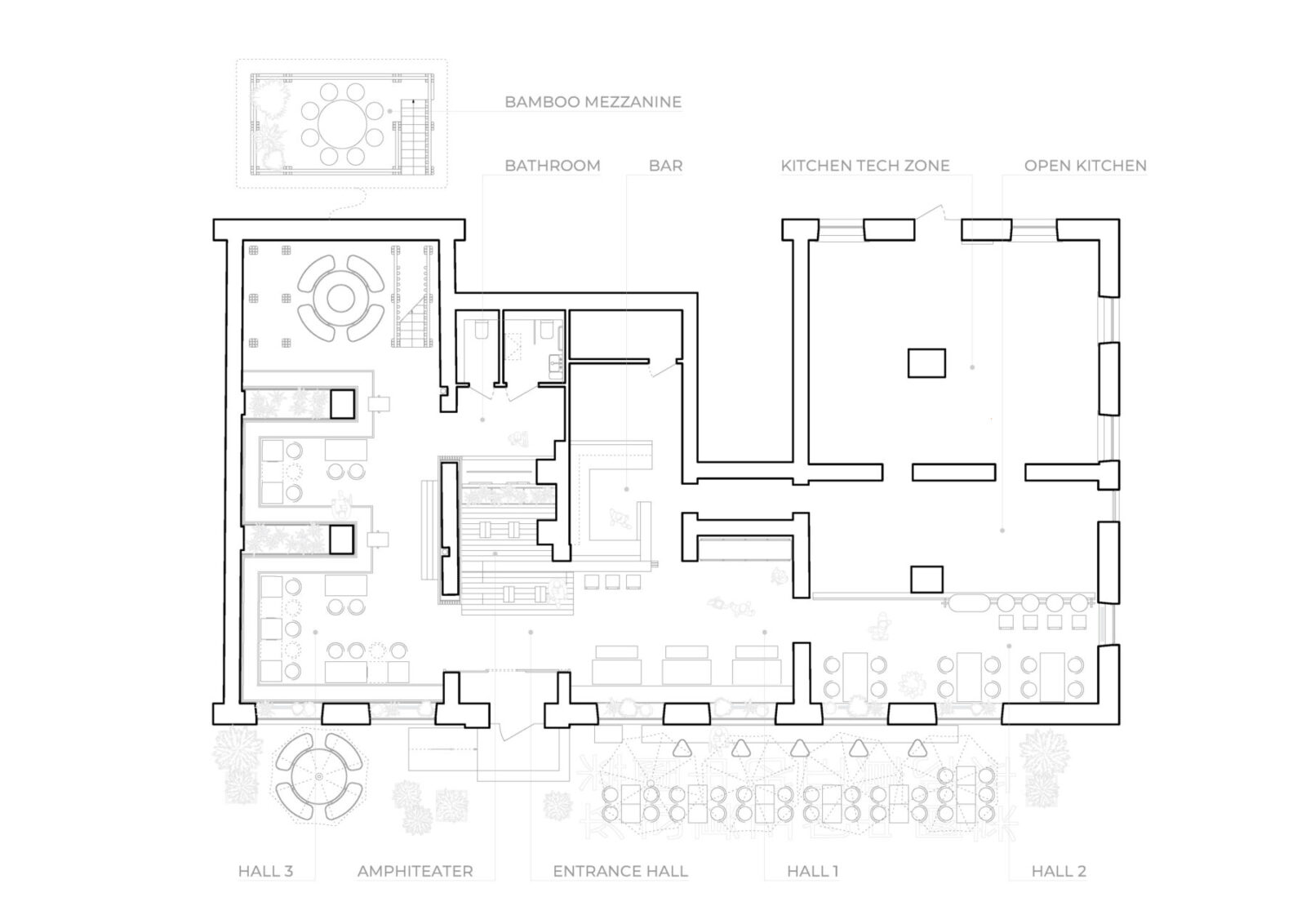
Entrance Hall
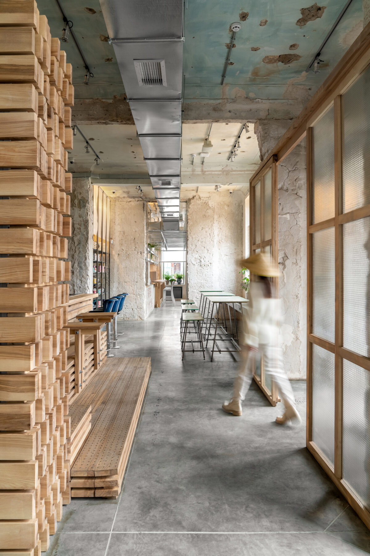
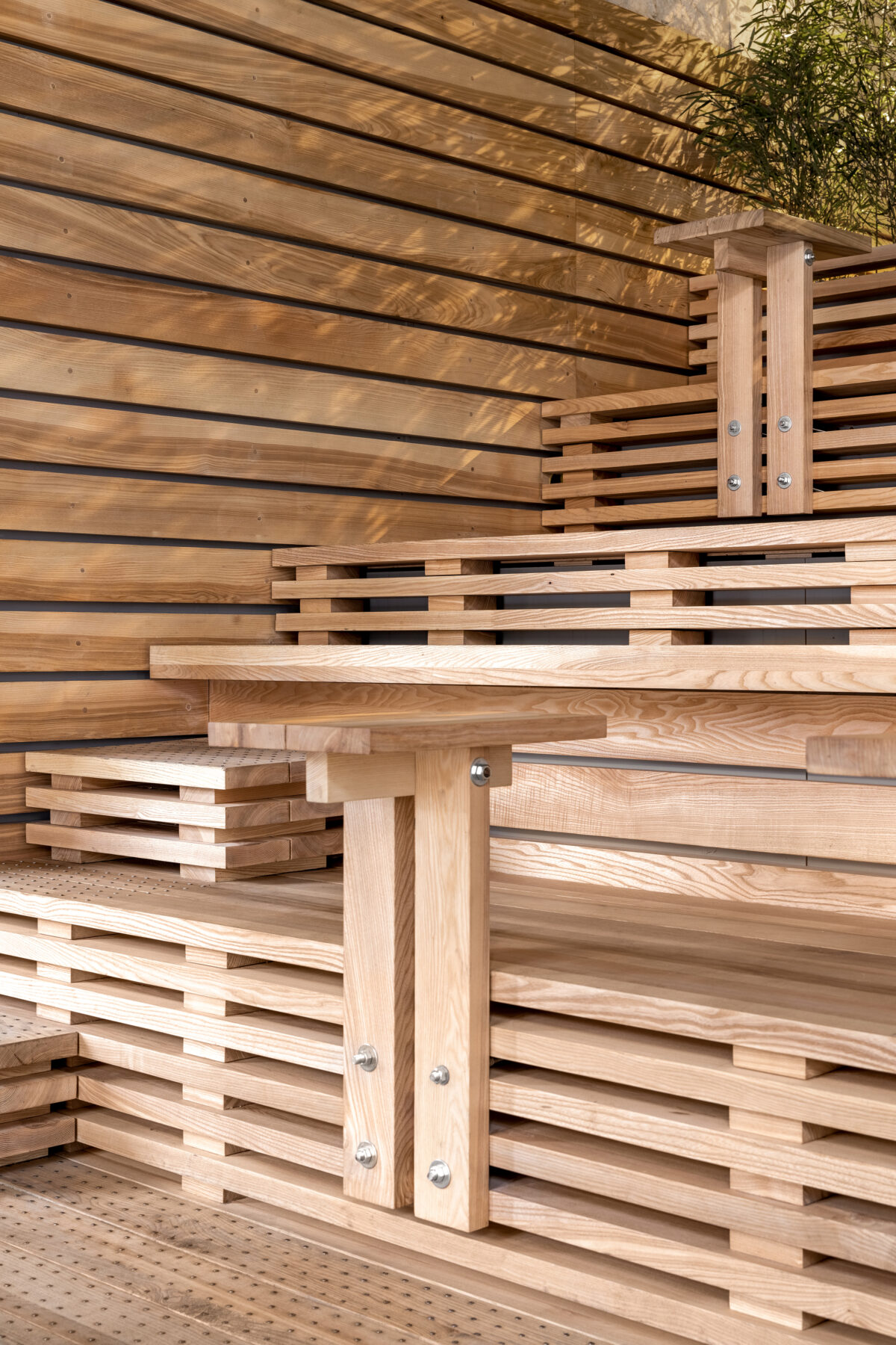
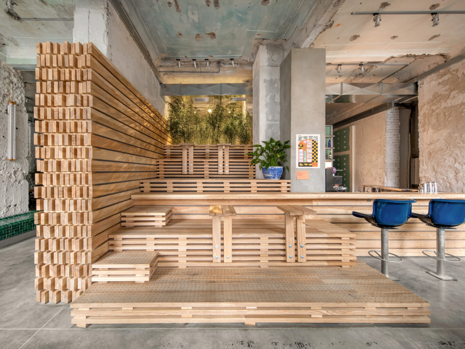
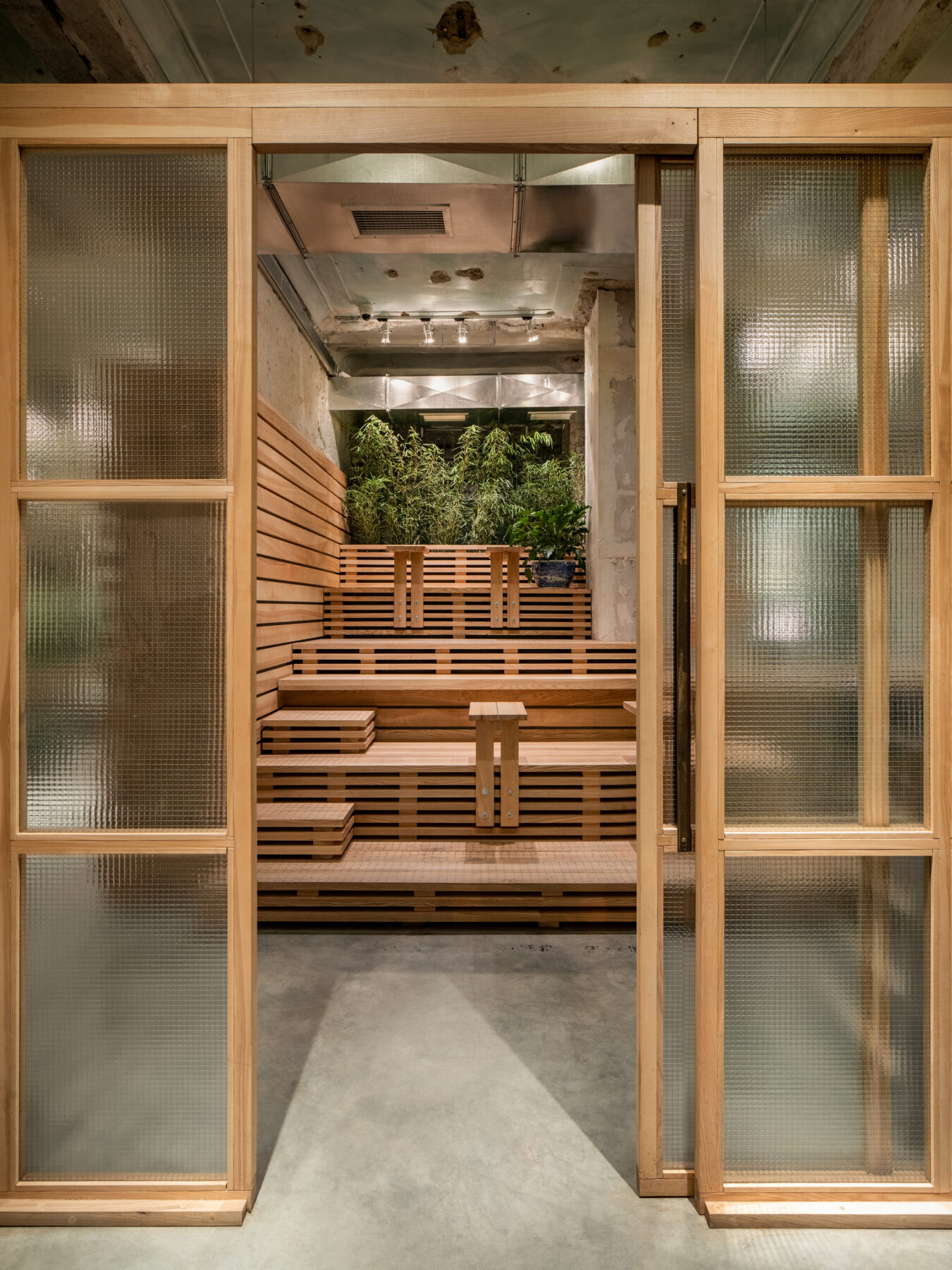
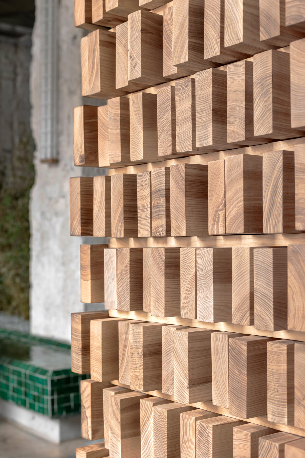
We designed an amphitheater made of wooden planks directly in front of the entrance. This serves as an alternative to the more standard that is usually located by doorways, which is often uncomfortable. In this area, guests can wait for their takeaway order or have a quick coffee. In the warmer months, when the front door is kept open, this atypical seating serves as a focal point for passers-by.
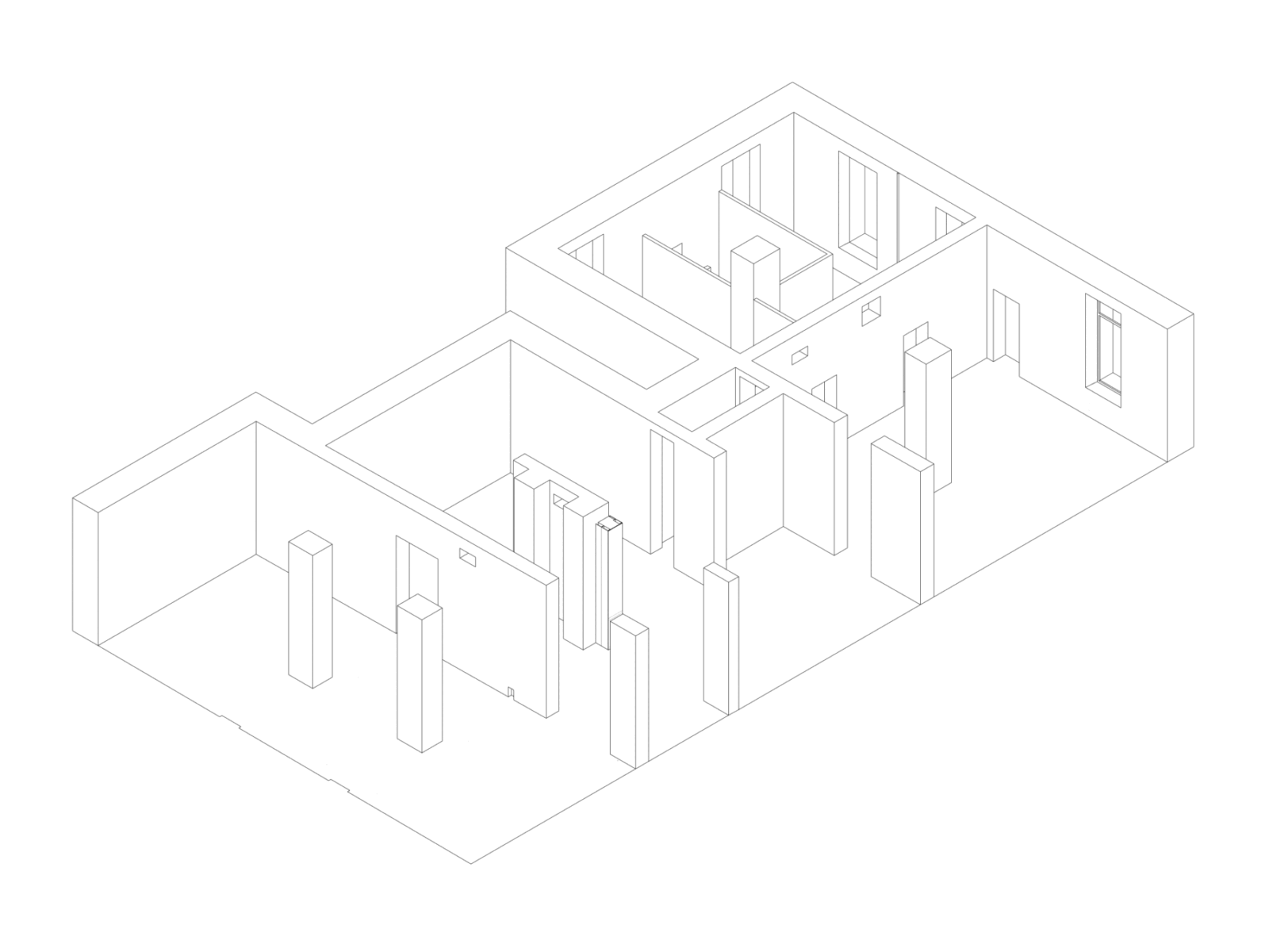
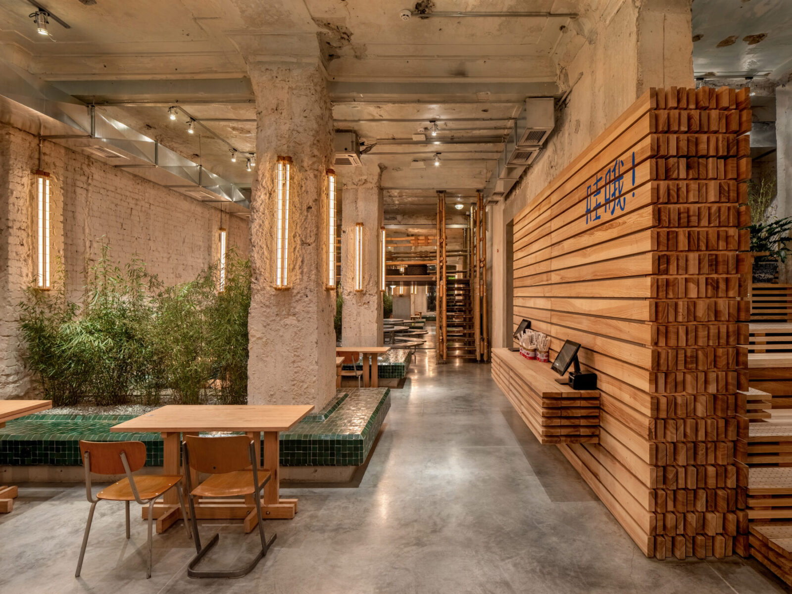
The amphitheater is part of a large architectural volume that zones the space of the restaurant. This volume starts from the wooden countertop of the bar, flows into a multi-level staircase, and then smoothly transitions to the wall panels and door. These panels then lead to the bathroom area, where the volume ends with the custom-made sink.
Hall 1
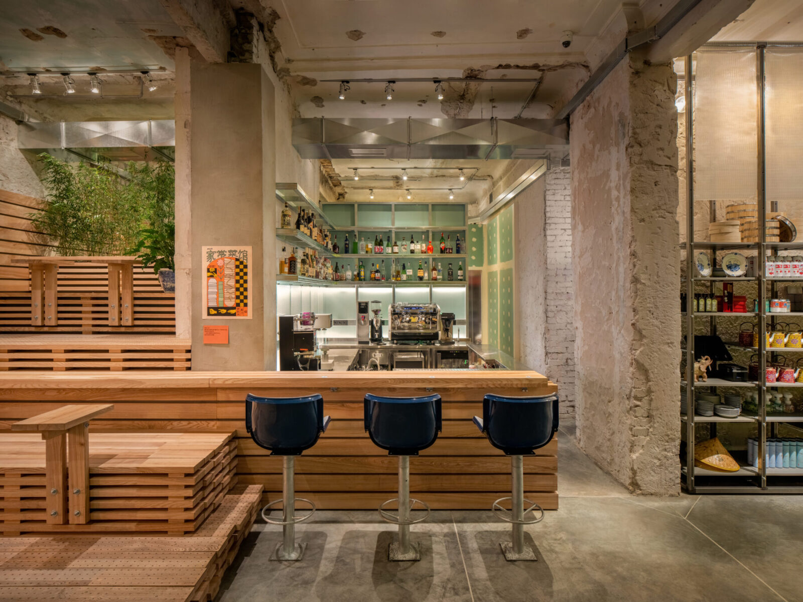
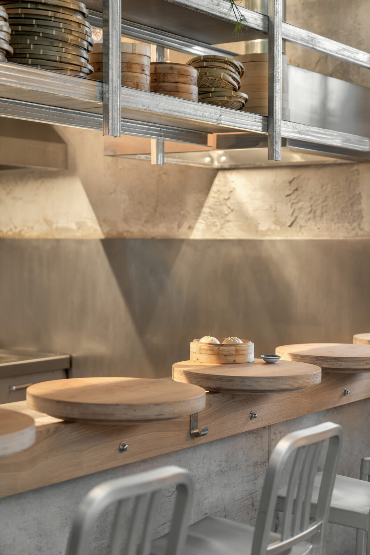
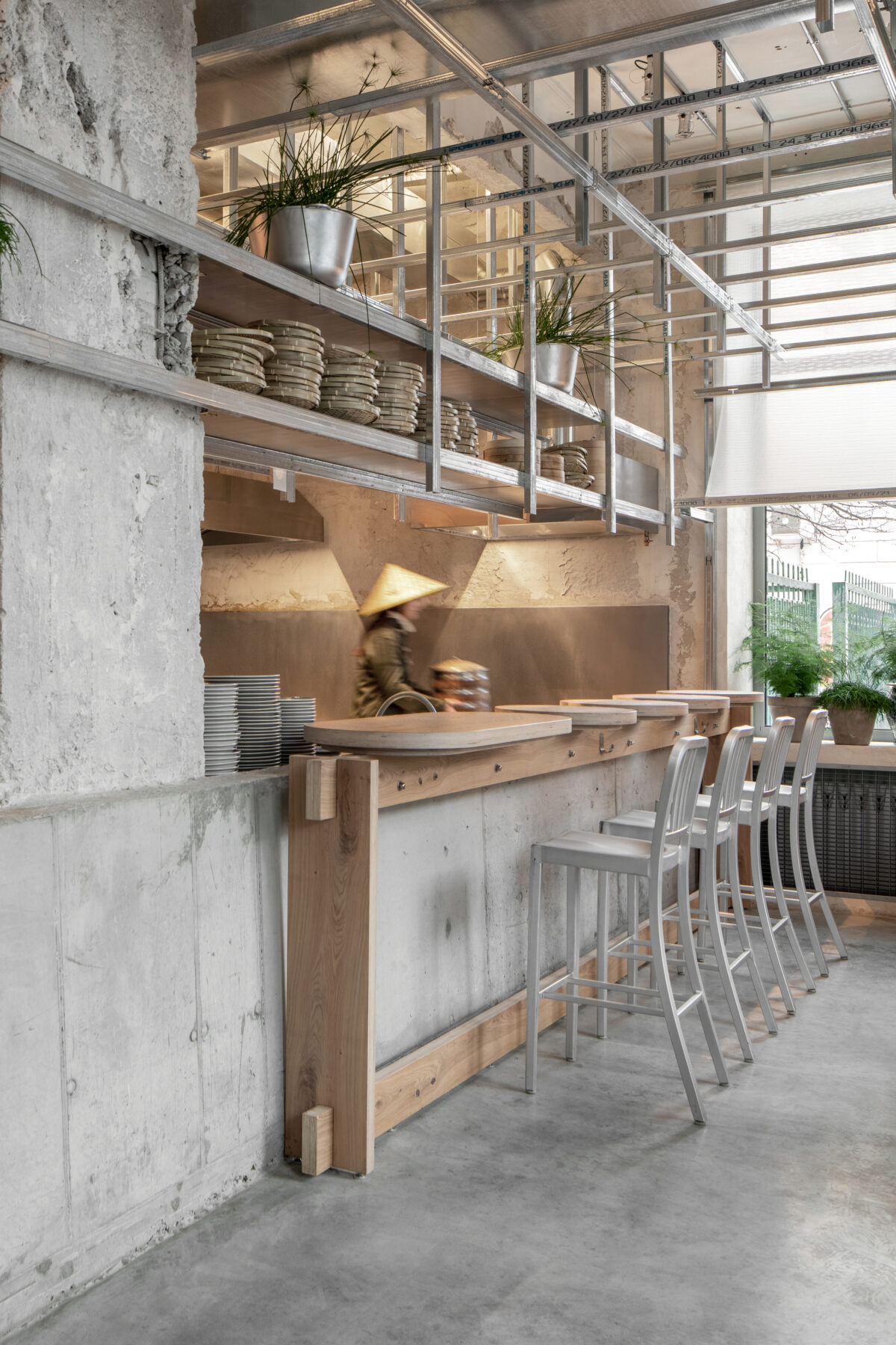
To the right of MAO’s entrance begins the first hall, the center of which is a contact bar with seating designed for three people. Its wooden countertop is a continuation of the amphitheater. Chairs near the bar are upcycled stadium seats sourced at a flea market, to which we welded brand new legs.
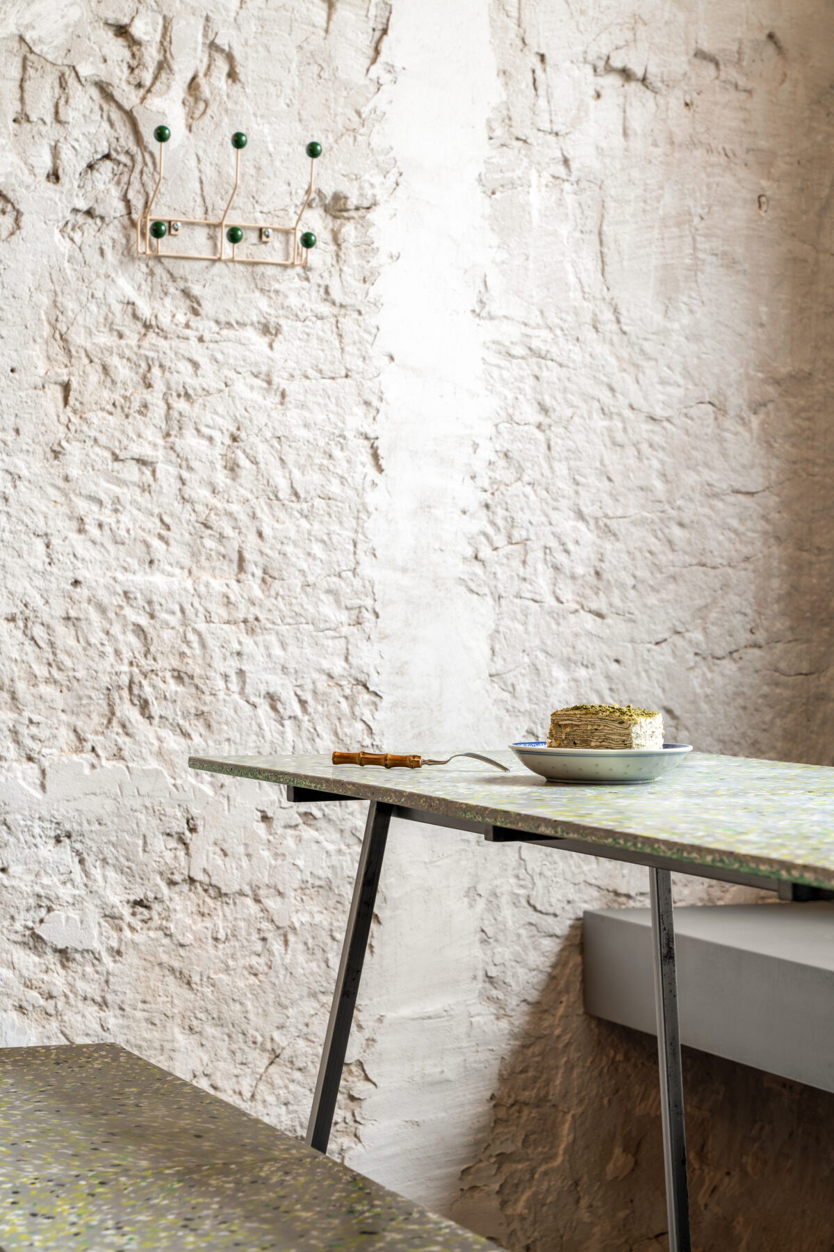
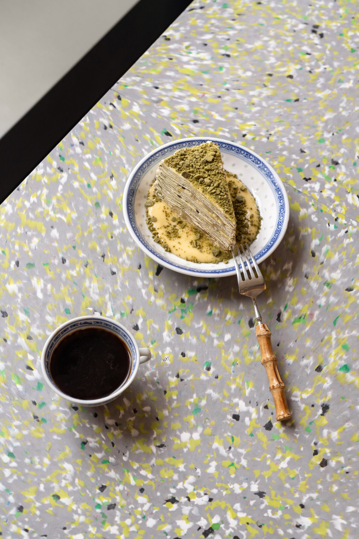
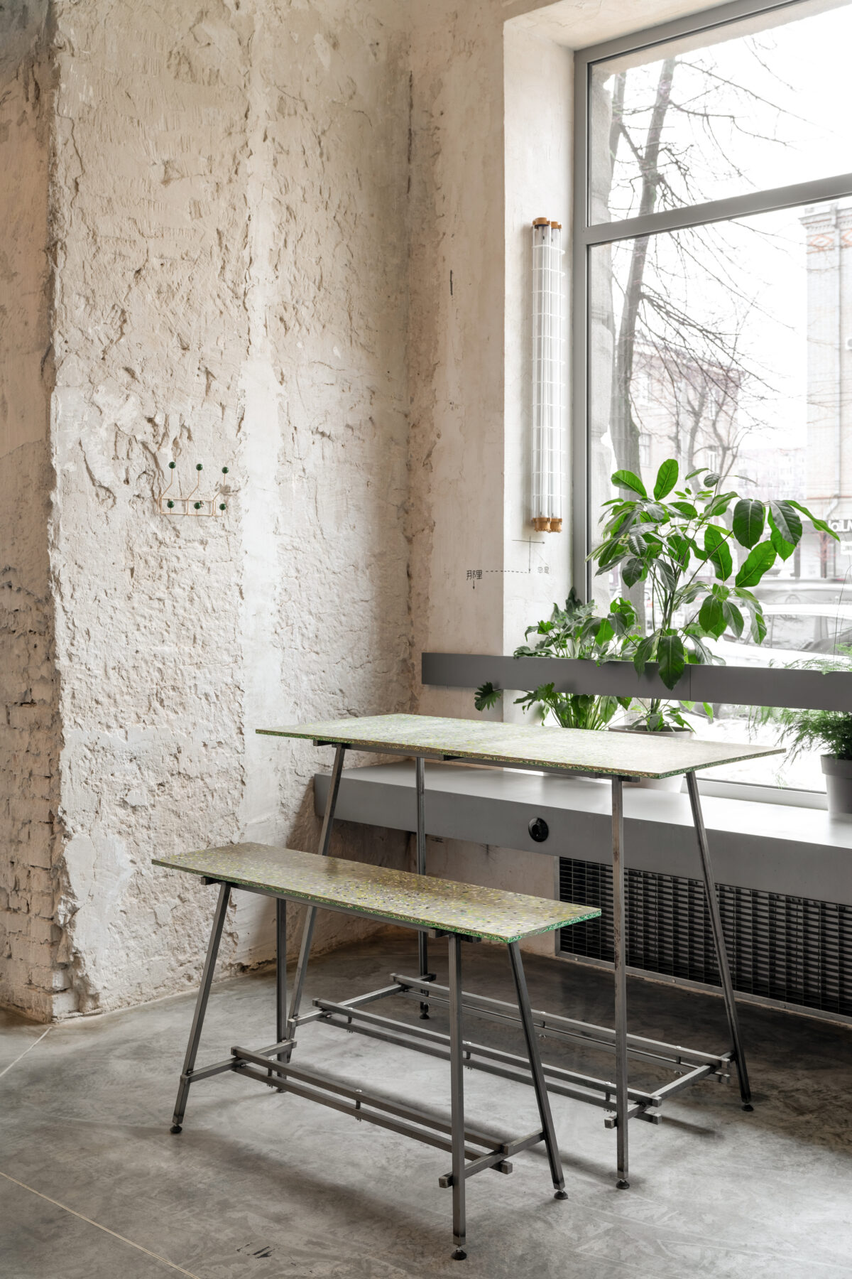
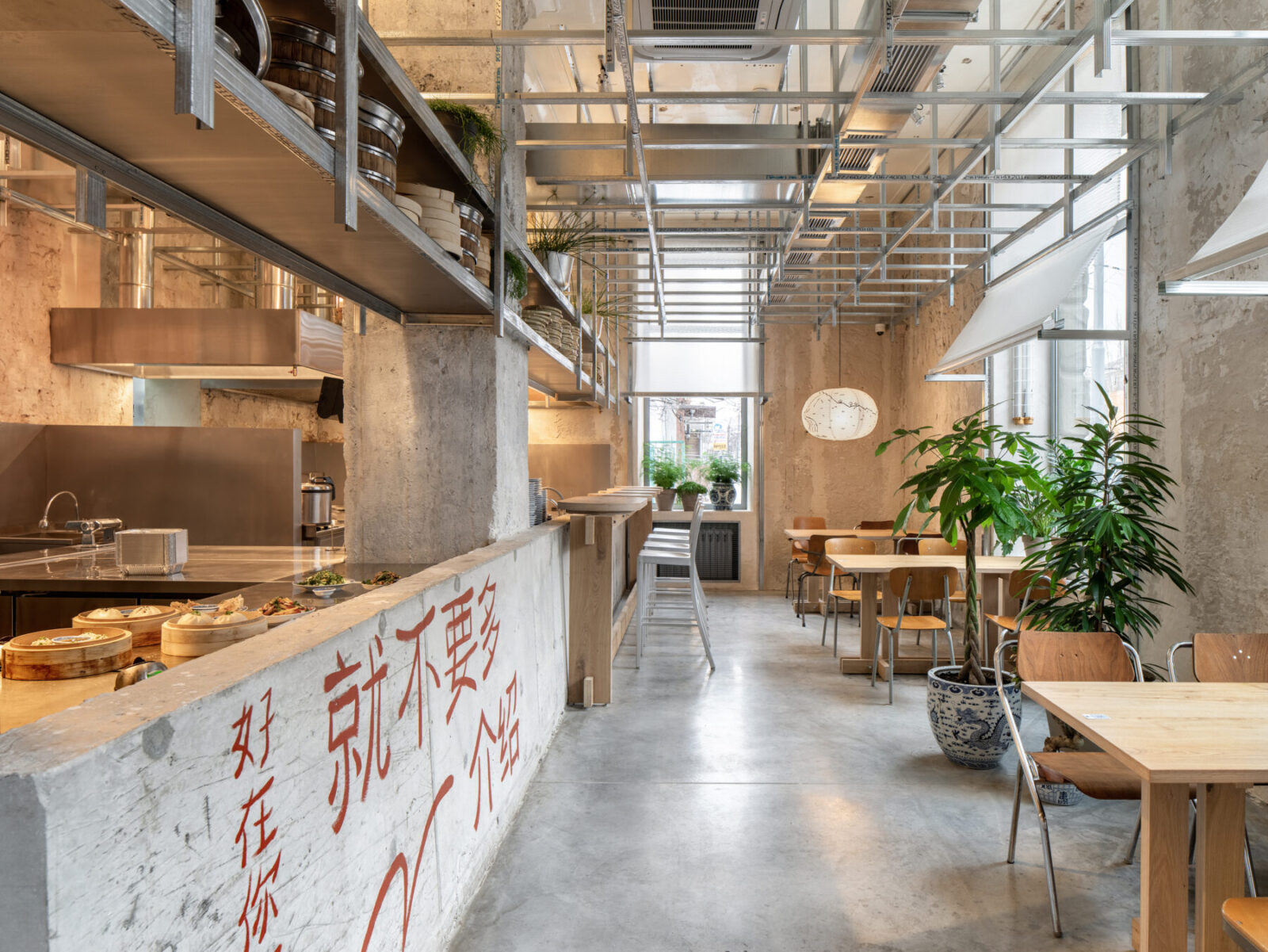
Bar shelves and partitions were constructed of plasterboard and aluminum profiles. To protect the drywall from splashes, along the perimeter of the work area we provided an apron of reinforced glass. Seating by the windows consists of custom-made tables and benches. Countertops and seats are made of recycled plastic bottle caps.
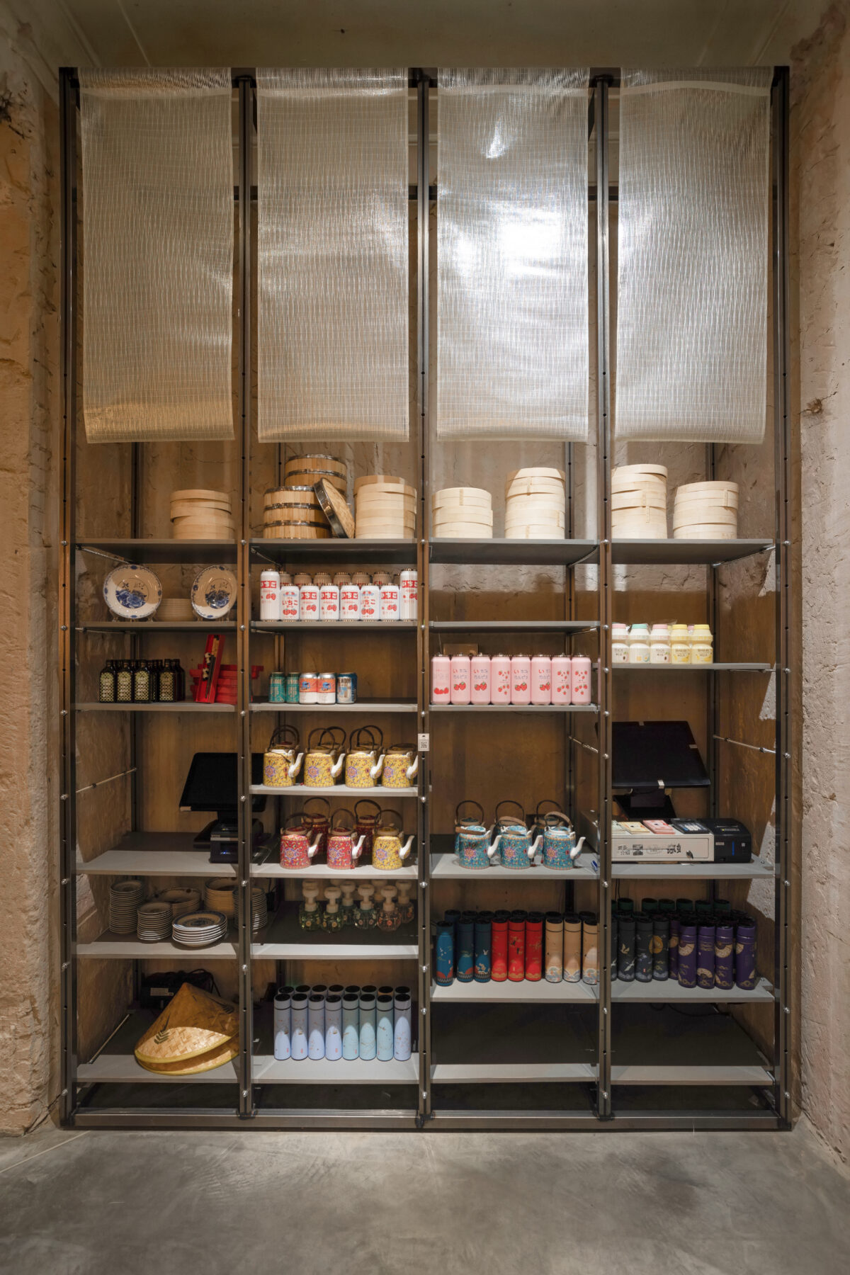
A retail area for Chinese souvenirs has been set up next to the bar area. A rack with colorful foods and goods can be seen even from the street.
Hall 2
The client wanted to locate an open kitchen in place of the amphitheater, but we persuaded him not to divide the work area into two separate blocks and base the open kitchen next to the technological area. Eventually, the second hall became the most popular among the diners: people book seats near the theatrical kitchen and watch the cooking process with fascination.
Hall 3
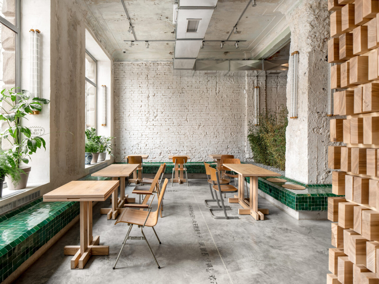
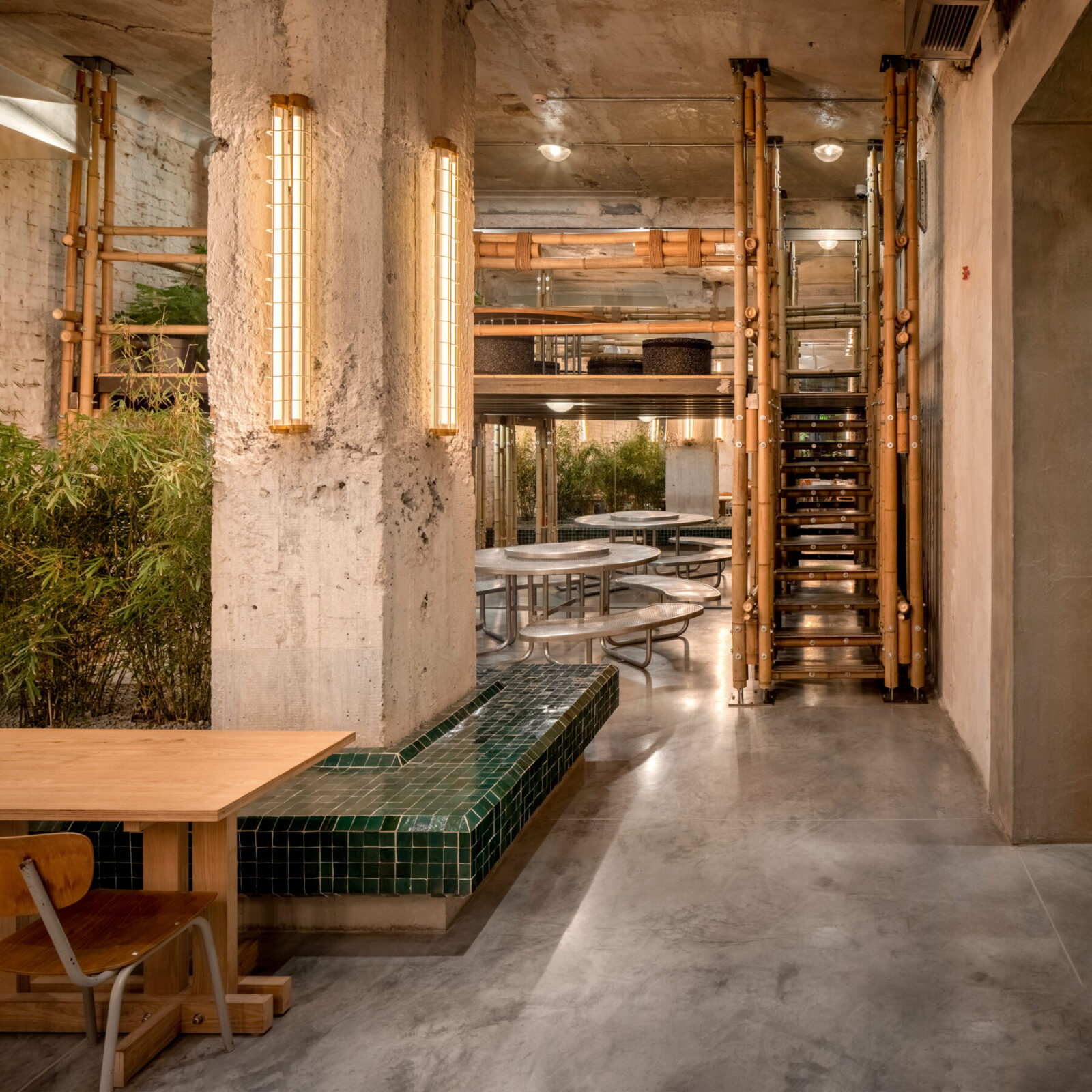
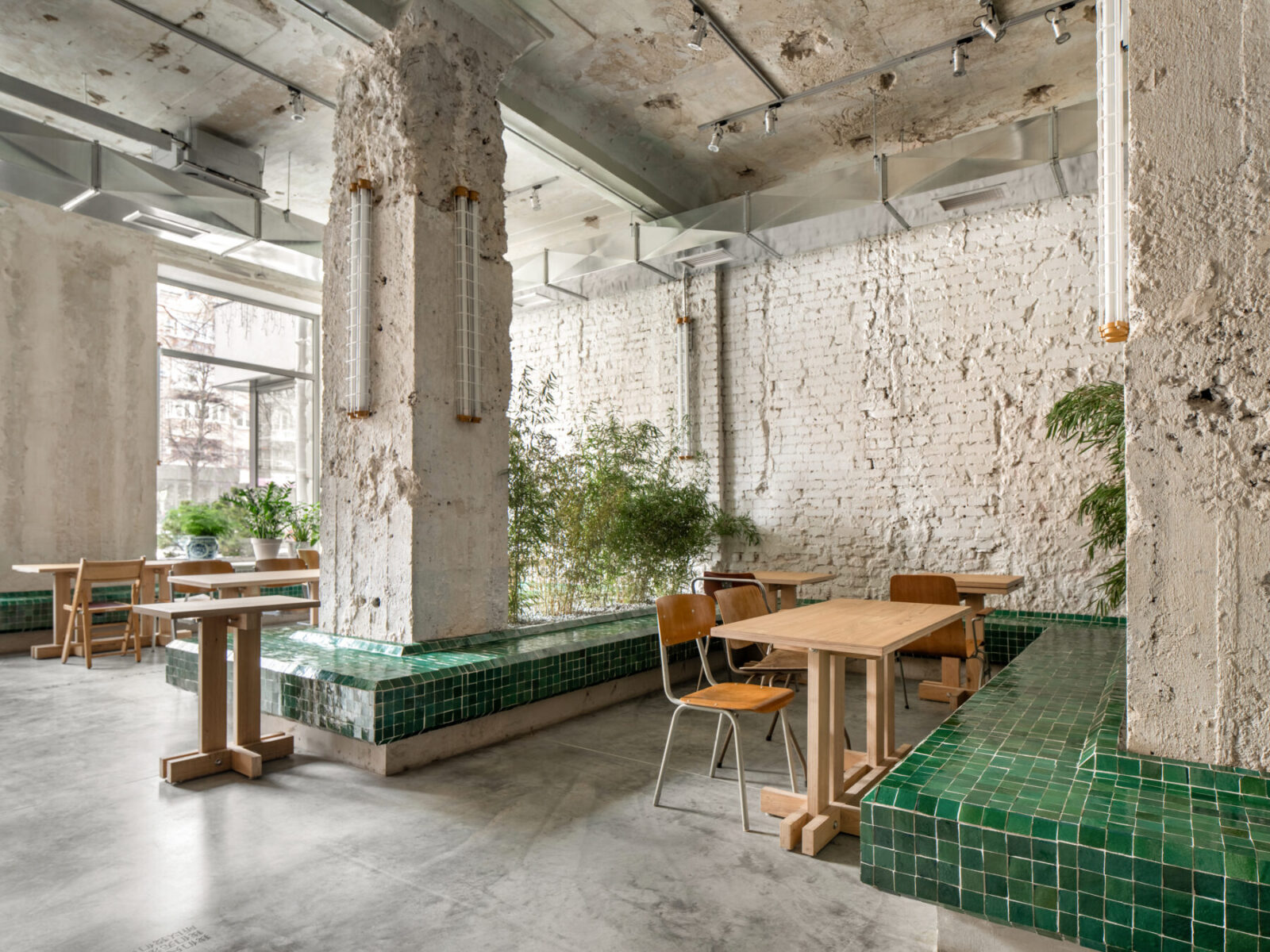
To the left of the amphitheater begins the third, largest hall. A focal point of this area is a 30-meter emerald green bench that snakes across the room and wraps around each of its columns. Custom tables seating two and four guests were set up along the bench. They are fixed to the floor but can be grouped thanks to their unfolding countertops. For example, three tables, two of which are equipped with such countertops, are easily combined into one large table. Vintage chairs were placed at the tables, which were sourced at flea markets for the entire restaurant.
Green areas with live bamboo were placed between the columns. The greenery added a sense of comfort to this area and at the same time improved the acoustics of the room. Since the interior is full of smooth and dense materials, there was a lot of noise and echo before the plants were set in place.
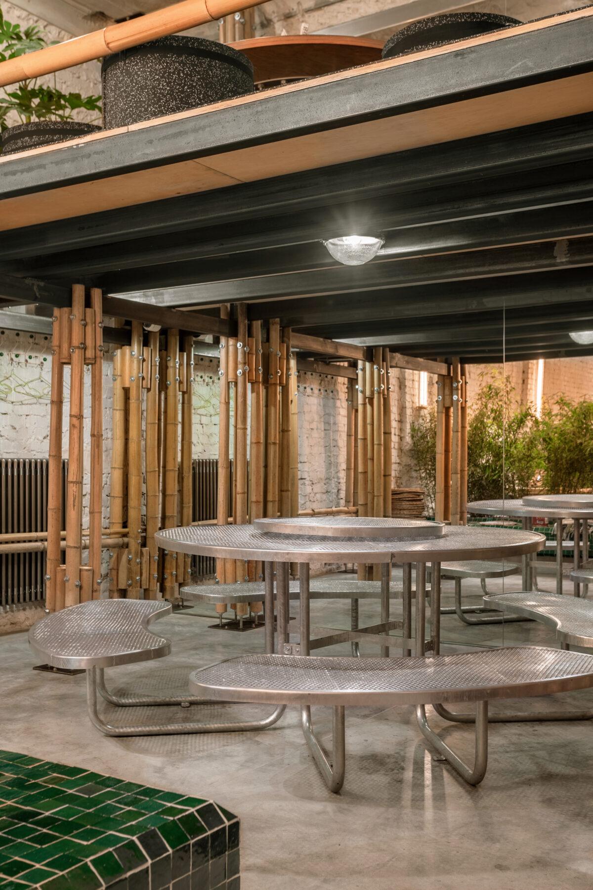
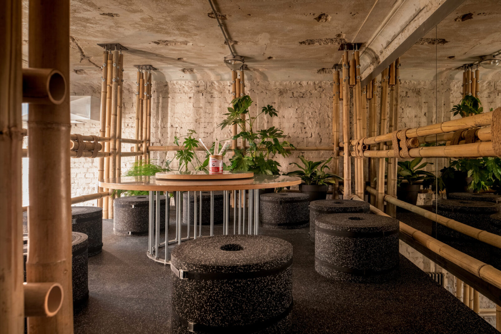
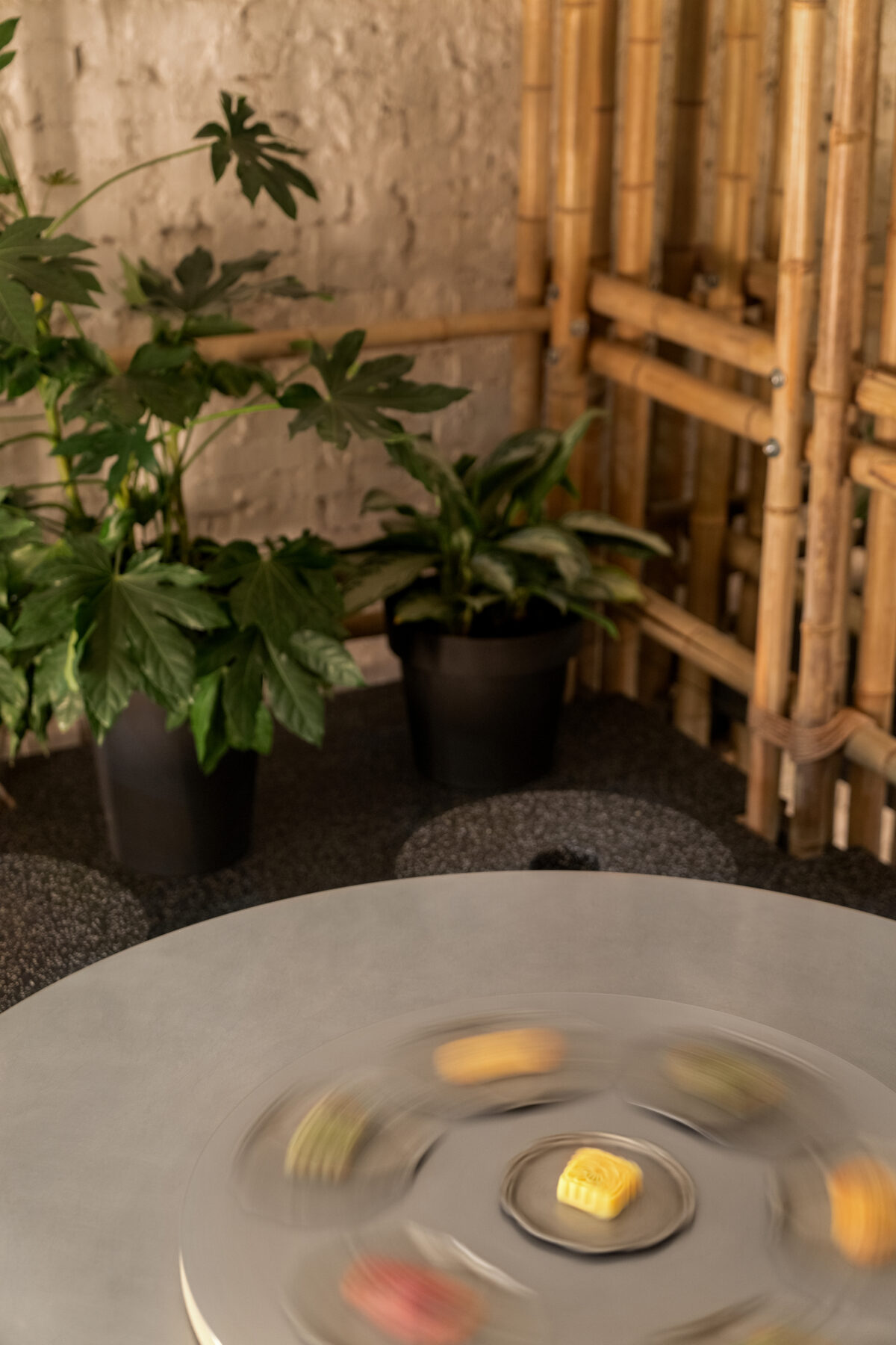
A dominant feature of the space is a bamboo mezzanine in the far part of the hall. Under the mezzanine stands a round table seating from 8 to 12 diners, made of perforated metal, modeled on classic outdoor picnic tables. A Lazy Susan, traditional in Chinese restaurants, was mounted onto the picnic table.
On top of the mezzanine stands another round table of the same diameter, also equipped with a Lazy Susan. As the second level is shorter in height, lower seating with custom-made poufs made of rolled foam fixed with an industrial tie belt was placed by the table.
Bathroom
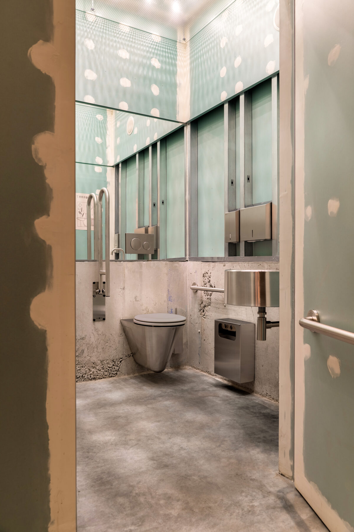
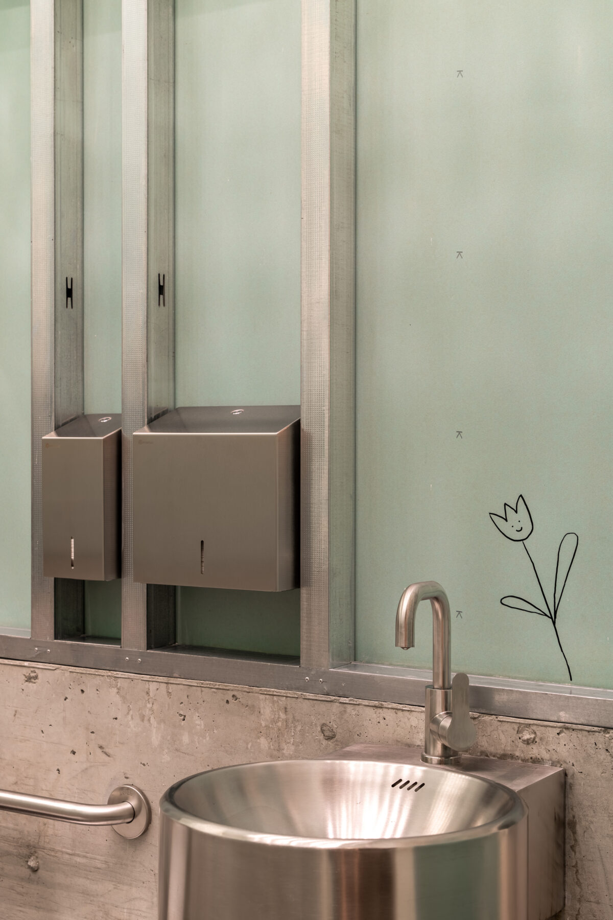
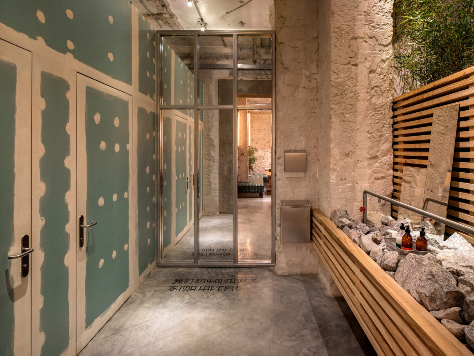
To the right of the second hall is a bathroom unit. It continues with the theme of unfinished construction, but, unlike the real bathrooms seen at construction sites, has an extremely aesthetic appearance. In order not to steal extra space, any new structures, including the toilet cabins, were designed lower in height (total ceiling height – 4 m; the height of new partitions – 3 m). The green plasterboard used to clad the bathroom walls was intentionally left unpainted both on the outside and inside. But since the bare drywall sections wear out easily, they were milled and varnished.
Inside the cabins, drywall is supported by a small cast concrete structure. On the walls, one can spot ironic drawings, inscriptions in Chinese and other Easter eggs designed by illustrator Myroslava Shevchenko. The inspiration for this decor stemmed from the notes that construction workers often leave on the walls. Both booths (an accessible one and a smaller one) have unique design features. The latter is equipped with illuminated reinforced glass, through which the fittings and piping of the toilet can be seen, in the former has a huge selfie mirror.
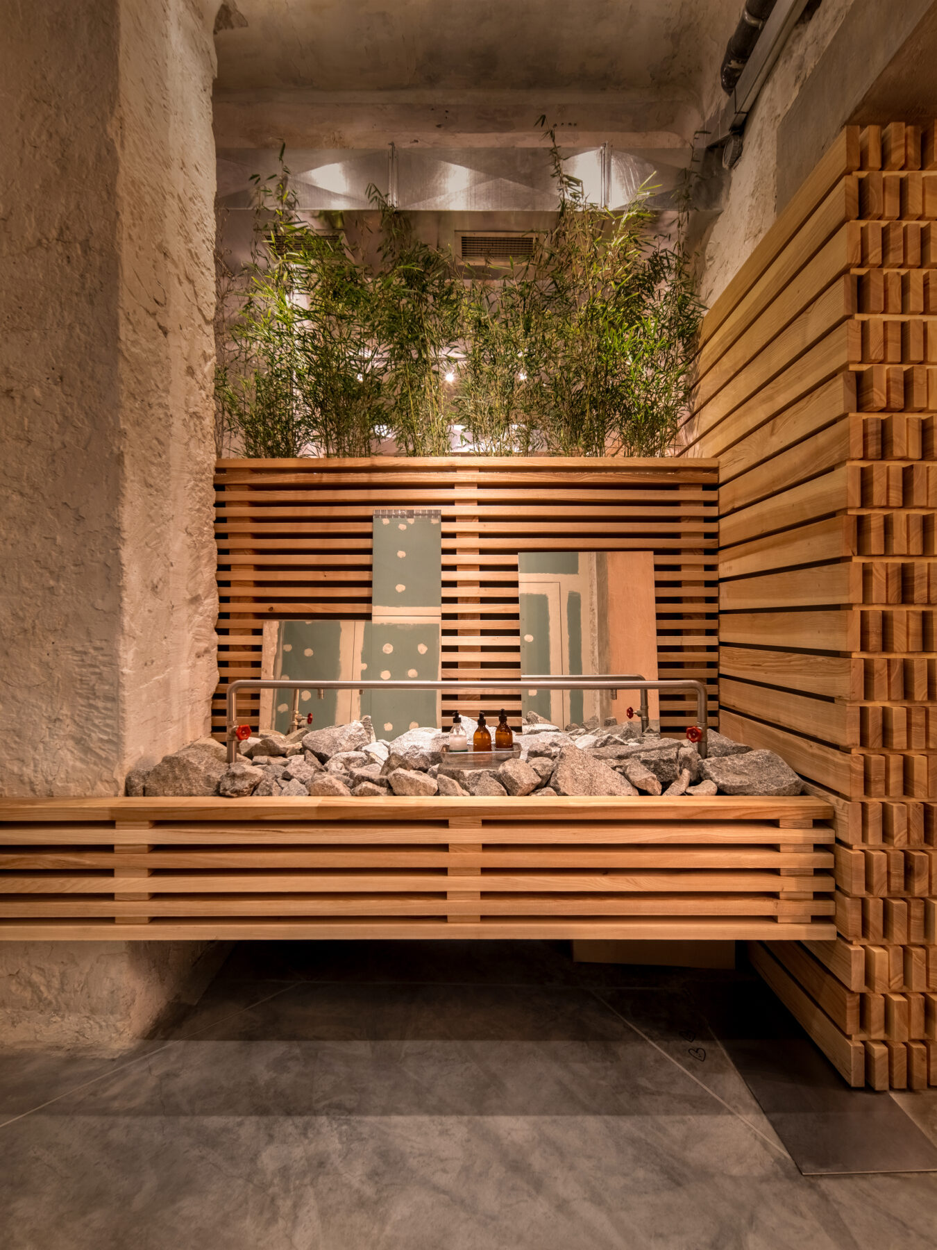
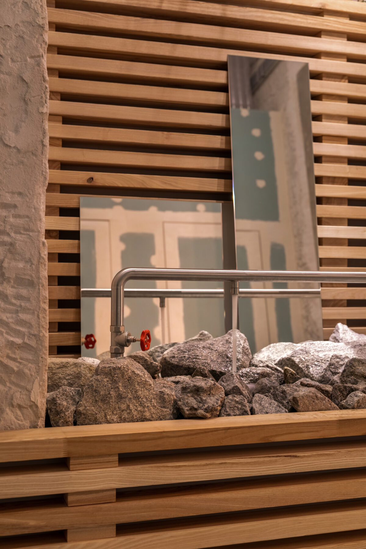
The client wanted to integrate natural stones into the interior. We realized this idea via our bathroom washbasin. When people wash their hands, the water splashes on the granite boulders. The faucet with two separate taps was designed using standard water fittings. The design looks quite simplistic, as if assembled in a garage, but, in fact, the implementation of this idea was quite challenging. Scraps of mirrors in various shapes and proportions were placed above the washbasin as if the Mao family had run out of money to buy a big one. A large mirror to the right of the cabins, framed with plasterboard profiles, conceals the technical zones of the restaurant.
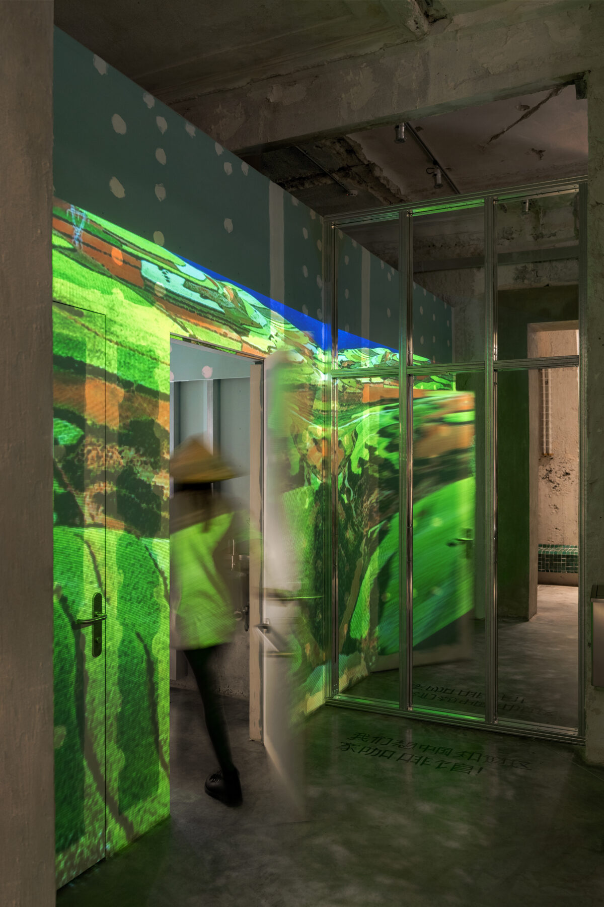
Since diners often take selfies in the mirror by the toilets, we decided to turn this place into a photo area. And to make enduring the toilet queue less tedious, this area was made as entertaining as possible. We have installed a projector on the ceiling, which projects various photos and videos onto the walls of the toilets: from landscapes of the Chinese province to modern cyberpunk graphics. The guest can walk into this projection and snap a photo in the mirror with these ‘special effects.’
CUSTOM-MADE ELEMENTS
Amphitheater
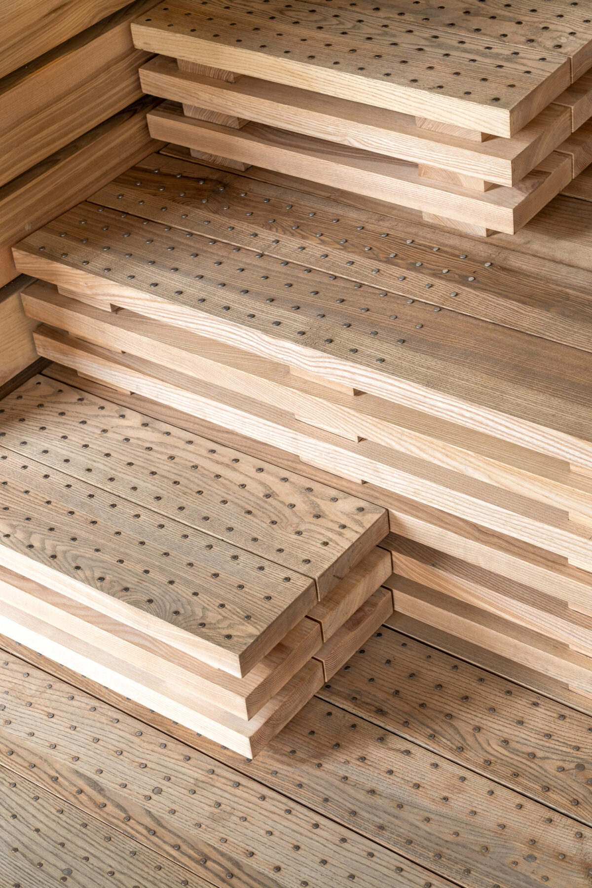
For the comfort of diners, the amphitheater was designed with wide gaps between the seats and aisles. Hundreds of nails were hammered into the steps, which helped make them less slippery and visually differentiate them from the seating areas.
Tiled bench
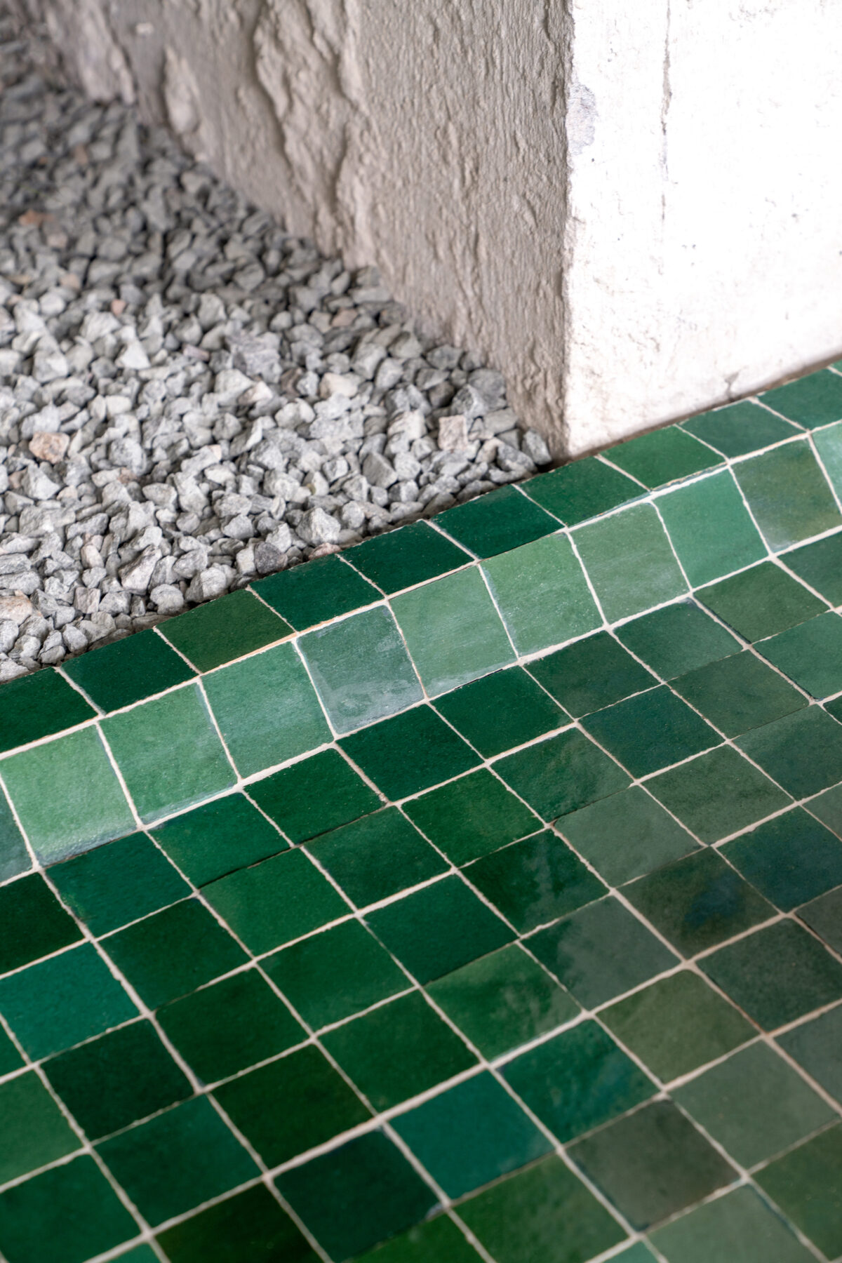
The bench that snakes around the columns in the second hall was code-named ‘dragon.’ Handmade emerald green tiles resembling reptile scales were ordered from Morocco. The tiles resemble mosaic often seen in fountains; this is another ‘street’ element that has found its place in MAO’s interior.
Bamboo mezzanine
The idea of the mezzanine arose from the client’s proposal to provide some seating on a second level. Originally, we planned to construct this using ordinary scaffolding, but in the end, to uphold the Chinese aesthetics, we settled on using bamboo. Finding non-decorative bamboo that can be used as construction material in Ukraine turned out to be a real quest. Chinese-grown bamboo turned out to be too thin, so they chose Georgian bamboo instead, which was thicker and stronger. Because bamboo springs and creates an effect of a trampoline, the mezzanine floor is reinforced with metal tubes. The rest of the elements – uprights, railings, handrails and stairs – are made of bamboo.
Countertops and seats made of recycled plastic
To integrate recycled plastic into the interior, we turned to a No Waste Ukraine’s recycling workshop for help. That’s how the idea of creating countertops and seats from recycled HDPE bottle caps came about.33,600 recycled caps were used to create the slabs from which the elements were then made. Initially, the countertops were planned to be white, gray and black, but in the process, the idea arose to spruce them up with bright accents. The choice fell on bright green – the color of Yunnan’s rice fields, which was imitated using milk bottle caps.
Canvas awnings
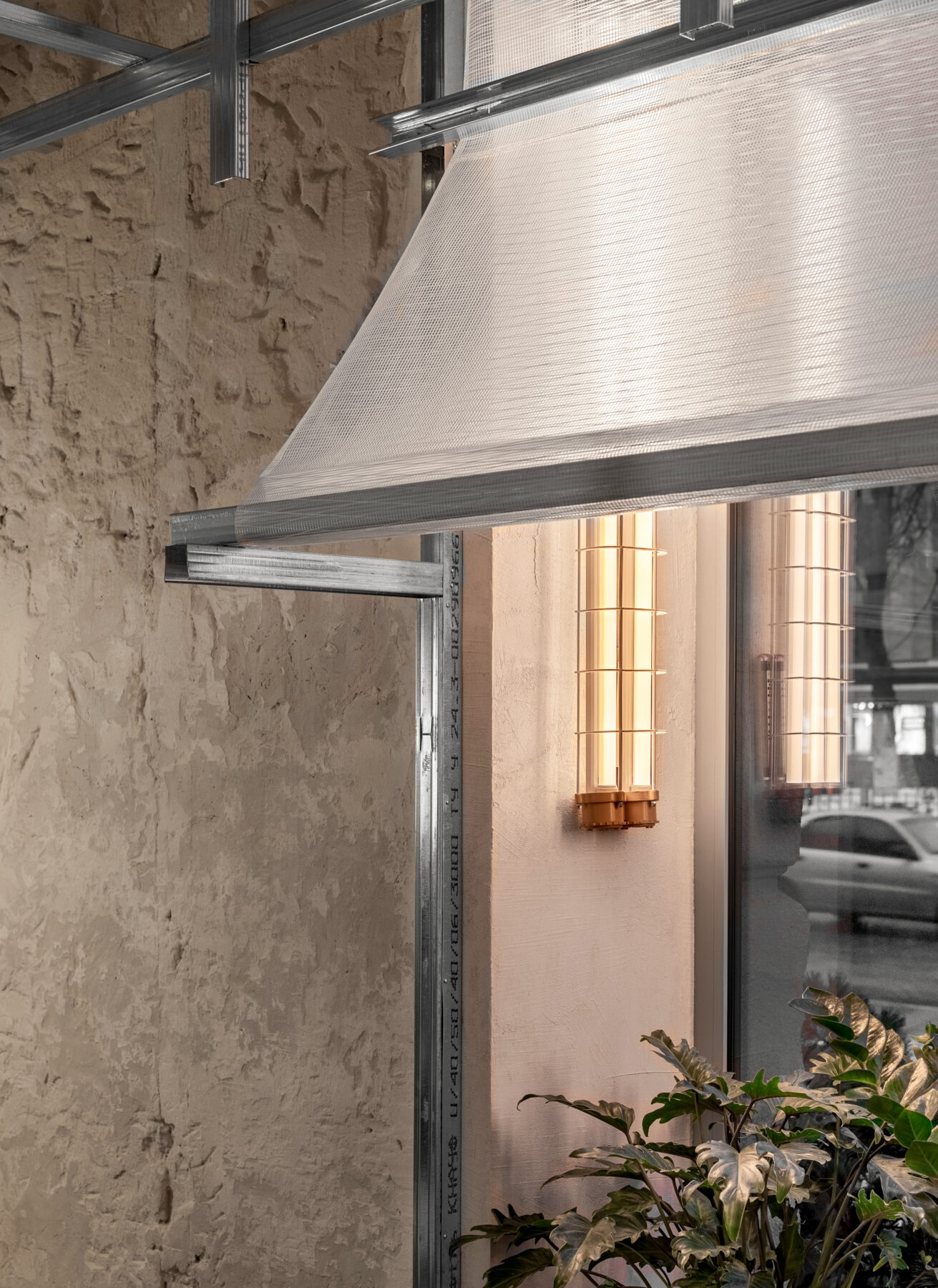
So that the awnings installed above the windows would not block the sunlight, we planned to create them using matte or translucent tarpaulin. However, this idea was replaced by an even better one: we turned to a manufacturer of sails and asked to give us any unneeded remnants of white sailcloth. With that, textile waste, which could end up in landfills, received a second life in the form of brand new awnings.
Wall lamps
20 identical wall lamps were shipped in from China. During transportation, most of the glass on the lamps broke, so we had to improvise on the spot. The lamps’ armatures were left exposed with no glass casings and were supplemented with new bulbs with warm amber light.
MAO is a project that was designed in incredible creative synergy with the client. He helped us immerse ourselves into Chinese gastronomy and offered up a lot of cool ideas.
With this project, we managed to realize our most adventurous ideas. For example, creating a bamboo mezzanine, the implementation of which at first seemed unrealistic. Thanks to these unique solutions, MAO differs from other Chinese restaurants and makes the gastronomic experience truly special.
WARTIME PERIOD
MAO opened its doors on December 21, 2021, but two months into the Russian invasion, it was forced to temporarily close.
During only the first 100 days of the full-scale war in Kharkiv, almost 3,500 buildings were damaged. Compared to other districts, the part of the city where MAO is located is relatively intact, but the restaurant’s building was damaged. A blast shattered three windows; also hitting a transformer, which caused problems with the power supply.
The team members who remained in Kharkiv switched to volunteering. Since the end of March, the MAO kitchen has been preparing 500 servings of food daily for citizens left without electricity and gas, and another 100 portions for the Ukrainian army. Some of the products are purchased by the owners at their own expense, and some of the resources were provided by partners such as World Central Kitchen.
To turn MAO into a volunteer headquarters, the owners had to reorganize the space a bit. In order to fit all the products needed for humanitarian aid, the chairs and tables in the halls were placed into storage.
As Kharkiv remains under enemy fire and Chinese chefs cannot return to the city, the future of the establishment is currently unknown. However, the owners, along with us, hope to re-open MAO’s doors for the people of Kharkiv soon.
Credits & Details
Design: balbek bureau
Architects: Slava Balbek, Nata Kurylenko, Daria Ovechenko, Roma Horoshylov
Project Manager: Anna Viktorova
Project area: 358 sq. m
Project year: 2022
Location: Kharkiv, Ukraine
Photo credits: Andrey Bezuglov, Maryan Beresh
ABOUT
MAO is a restaurant specializing in Chinese cuisine in the center of Kharkiv, with simple and authentic dishes from a Chinese head chef.
The restaurant is located on the ground floor of a ‘Stalinka’ style building, in a lively location near a central metro station. The MAO spans 358 square meters. Indoor seating is designed for 80 guests, while outside seats 40.
READ ALSO: "Πιστεύω πως η αρχιτεκτονική είναι αποτέλεσμα μίας πορείας και μπορεί να εξελίσσεται παραμένοντας απρόβλεπτη, με ένα ακριβές όραμα, αλλά ταυτόχρονα με μια στρατηγική αοριστίας στο επίπεδο της πραγματοποίησης." | Συνέντευξη με τον Αλέξανδρο Φωτάκη, Αποδέκτη του Βραβείου Αρχιτεκτονικής ΕΙΑ 2022
