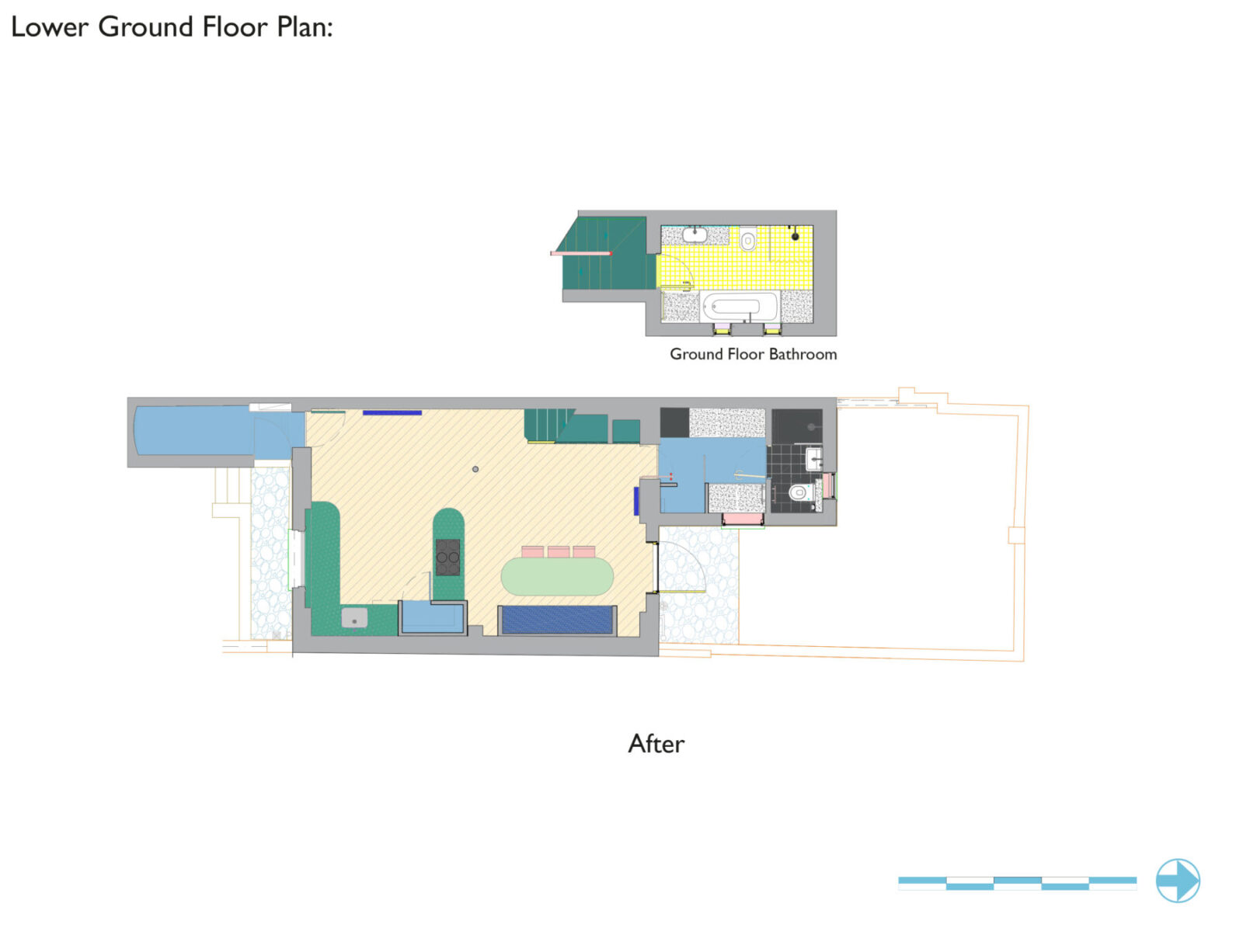
London-based Office S&M redesigned Mo-tel House, the lower ground floor of a Victorian townhouse in Islington, London, for a young family of four incorporating colour, mirrors and lighting to striking effect, materials with a previous existence and a story to tell as well as custom-made furniture pieces each designed to be as much a small piece of architecture as an item of furniture or a building in a city while serving more than one function.
-text by the authors
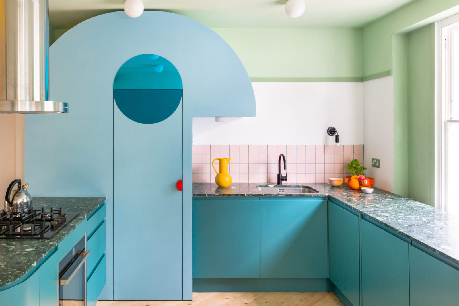
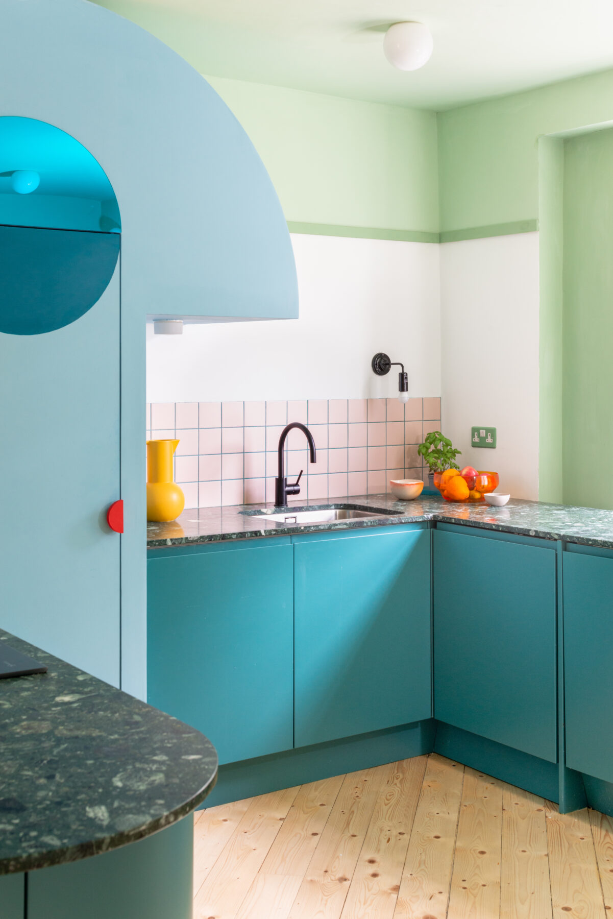
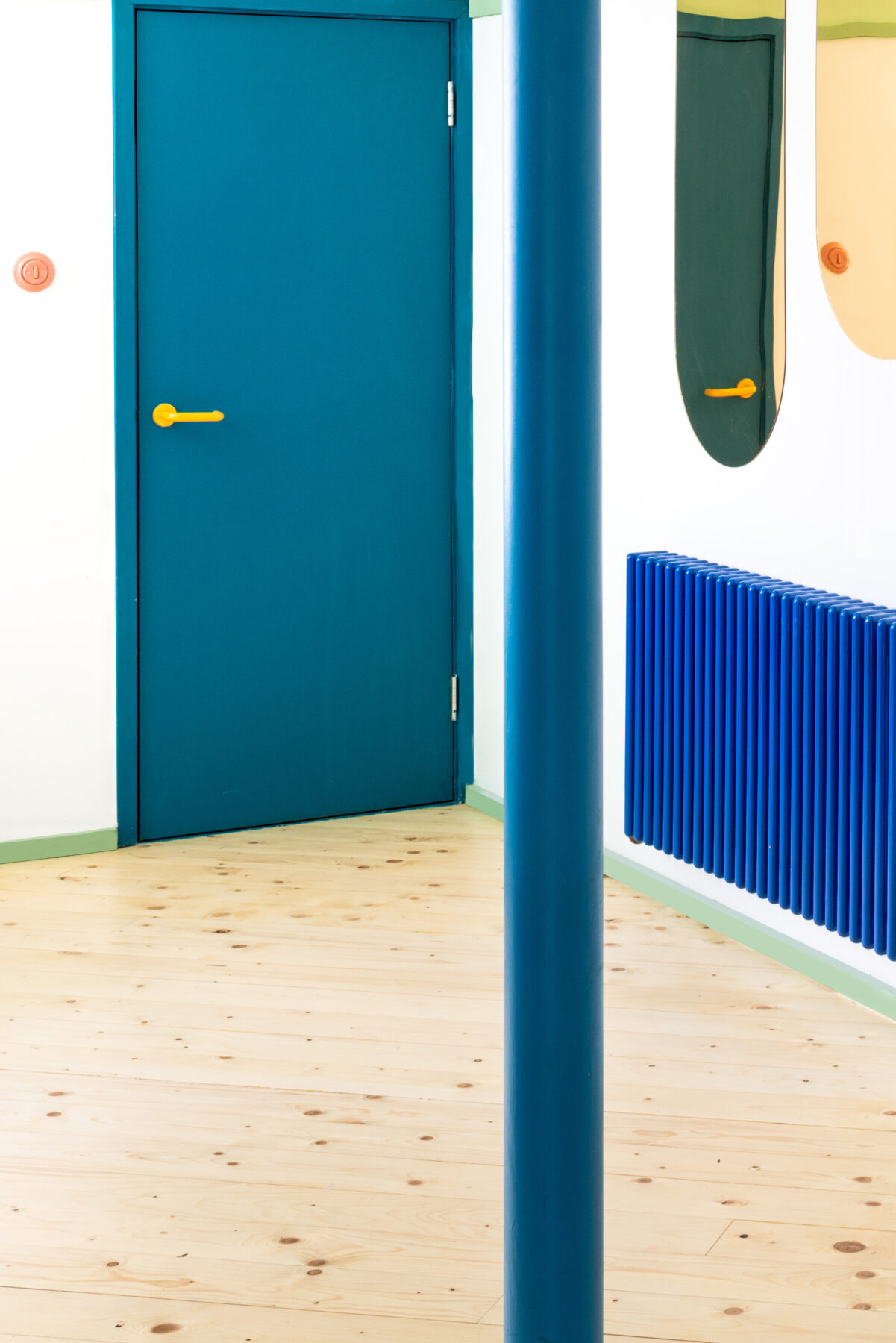
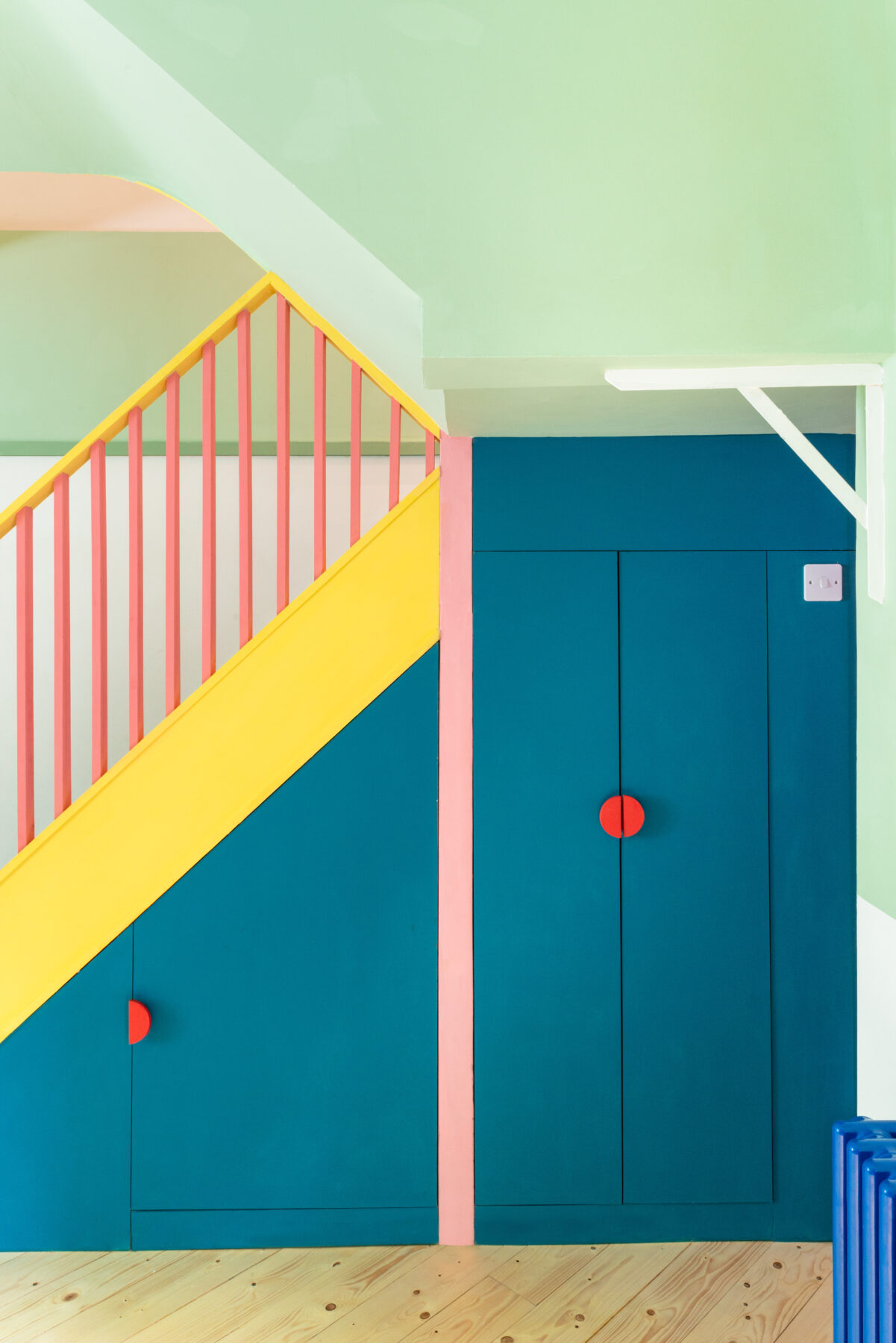
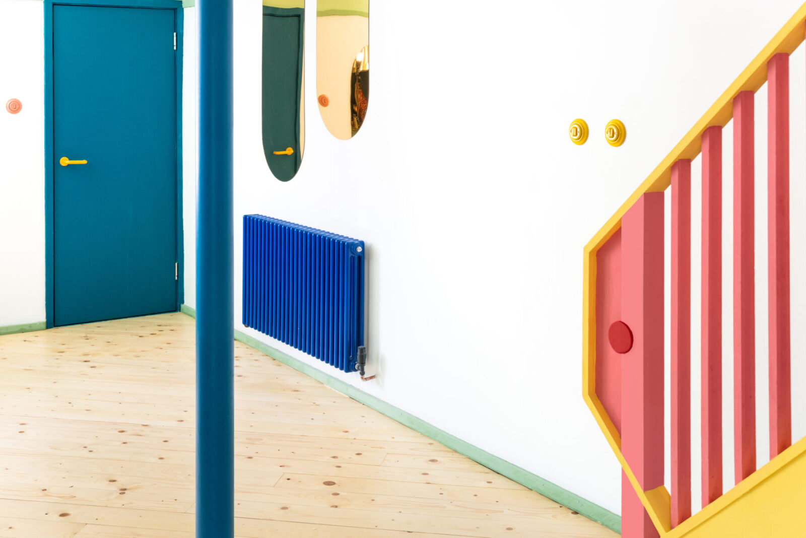
Mo-tel House is a remodelling of the lower ground floor of a Victorian townhouse in Islington, London, for a young family of four. The name Mo-tel House signifies the clients’ aspiration for their home: a joyful, bright and colourful escape from grey London. Alongside a brief to transform the previously damp, dark, and cramped area and bring it back into use, Office S&M was invited to create a space full of surprises and delight for each member of the family to enjoy.
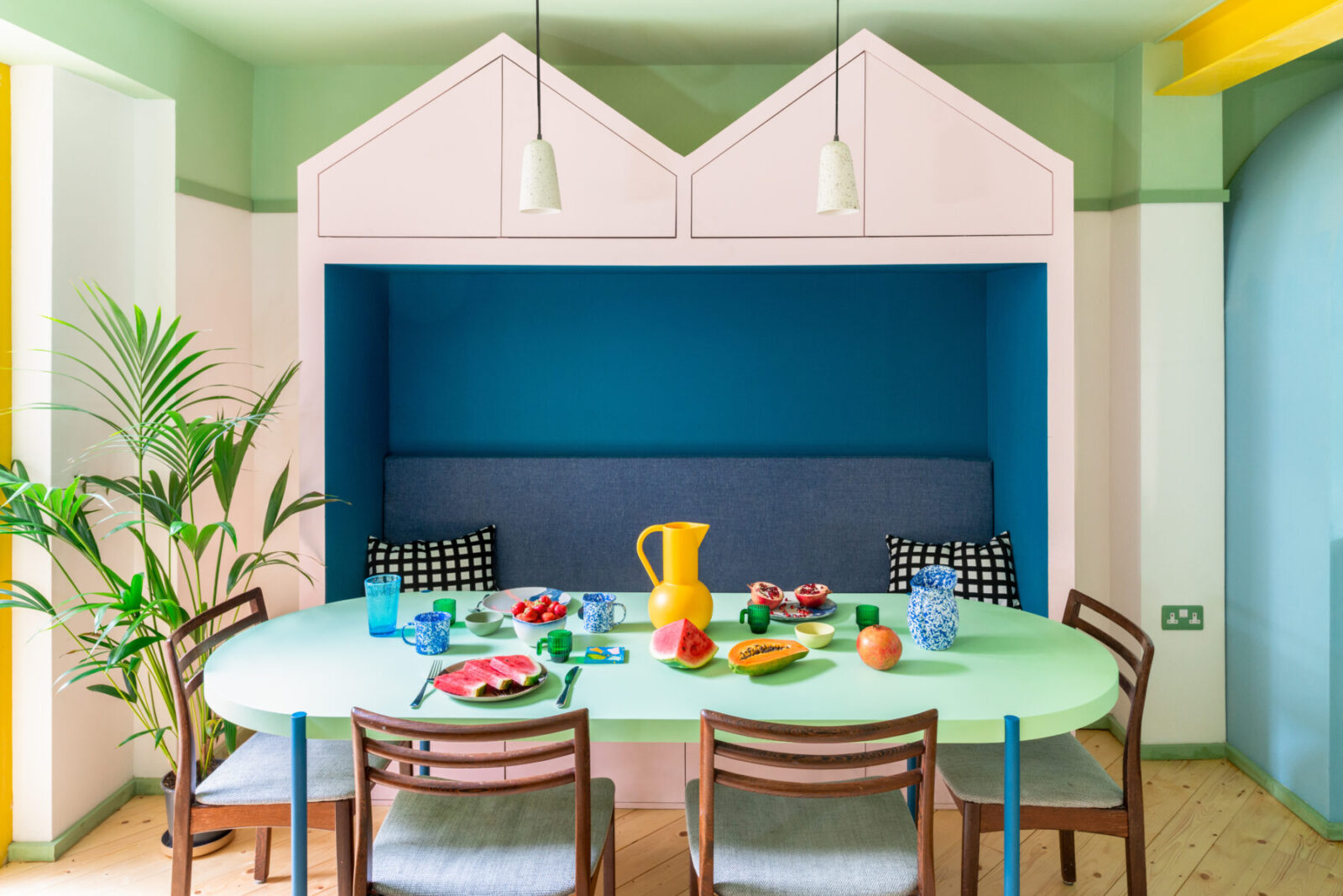
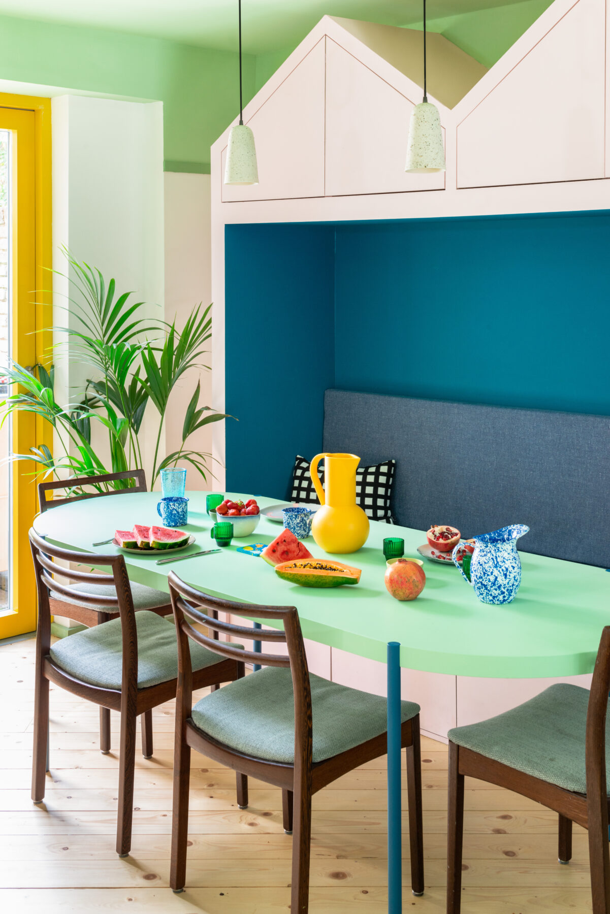
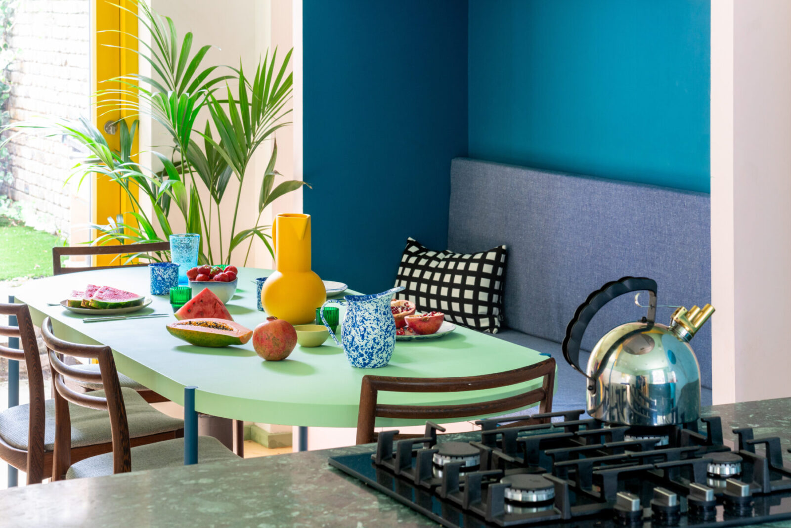
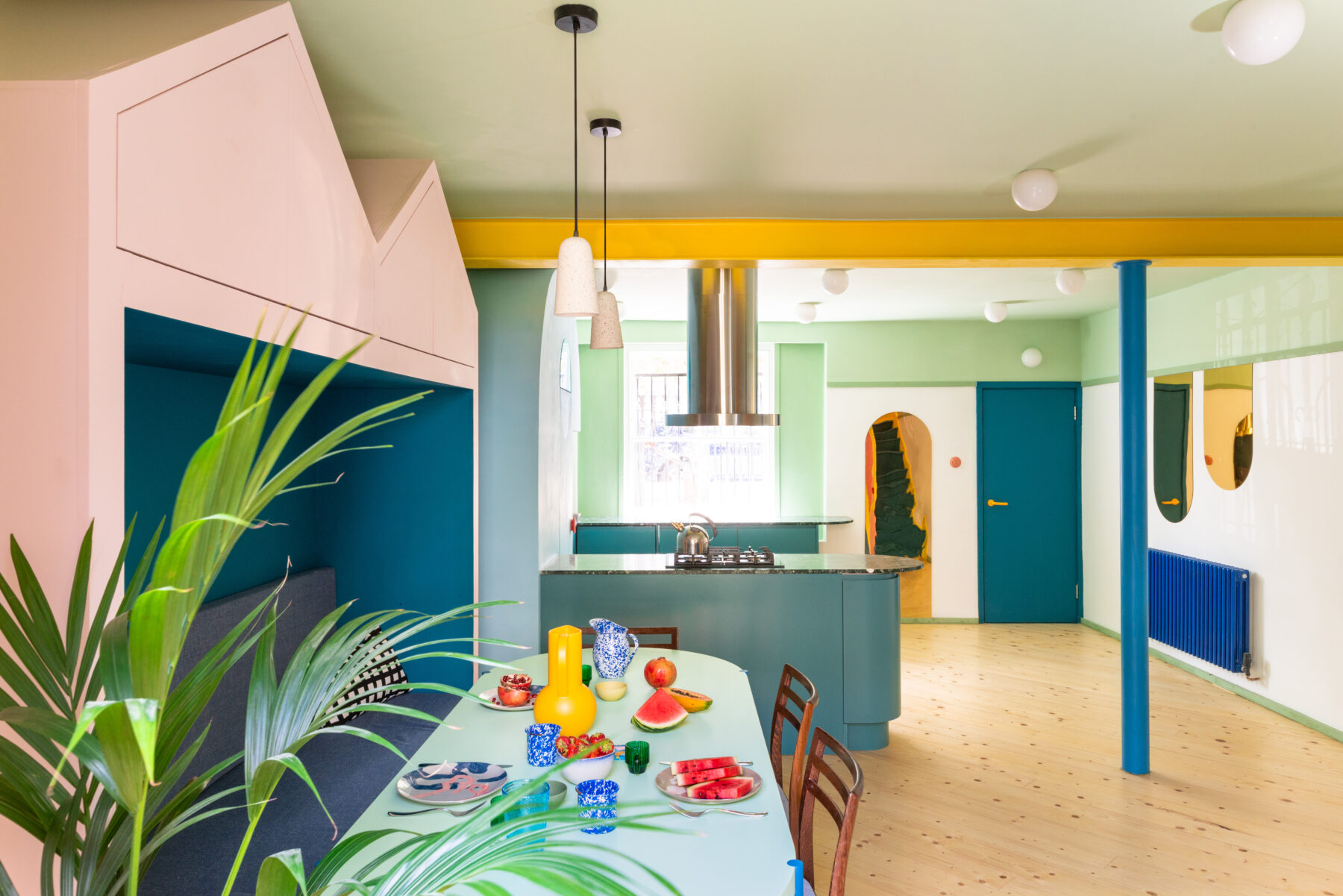
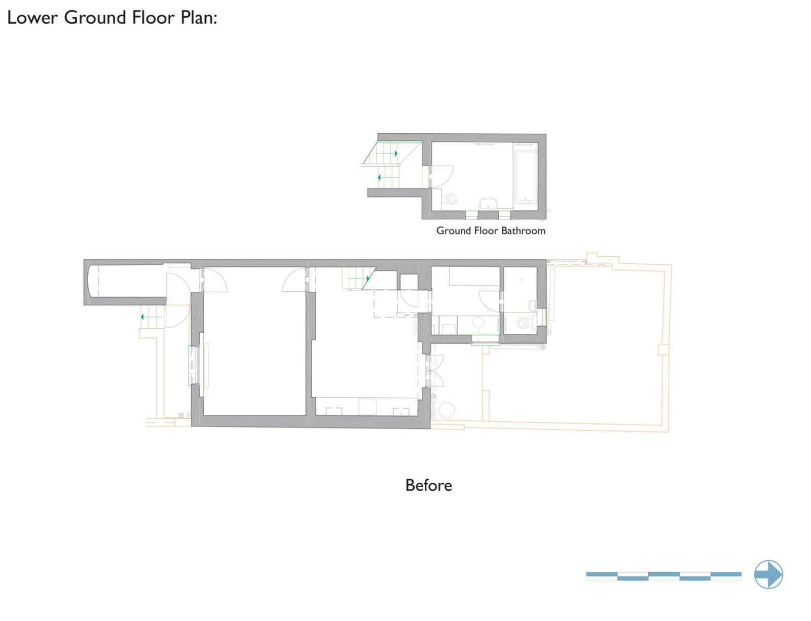
The reimagined lower ground floor now features an open plan, dual aspect kitchen and dining space achieved by removing internal walls, and a further two bathrooms and utility space.
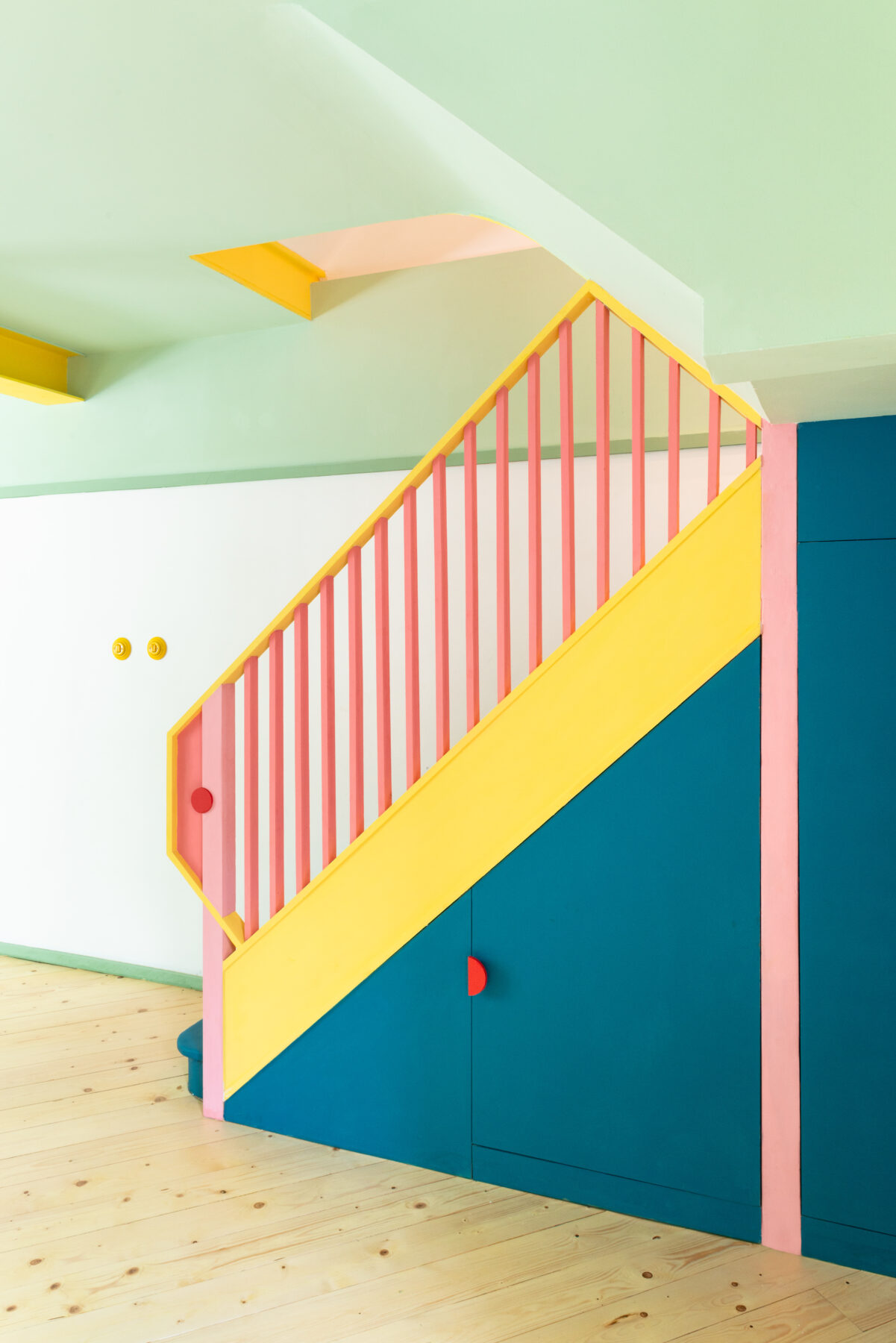
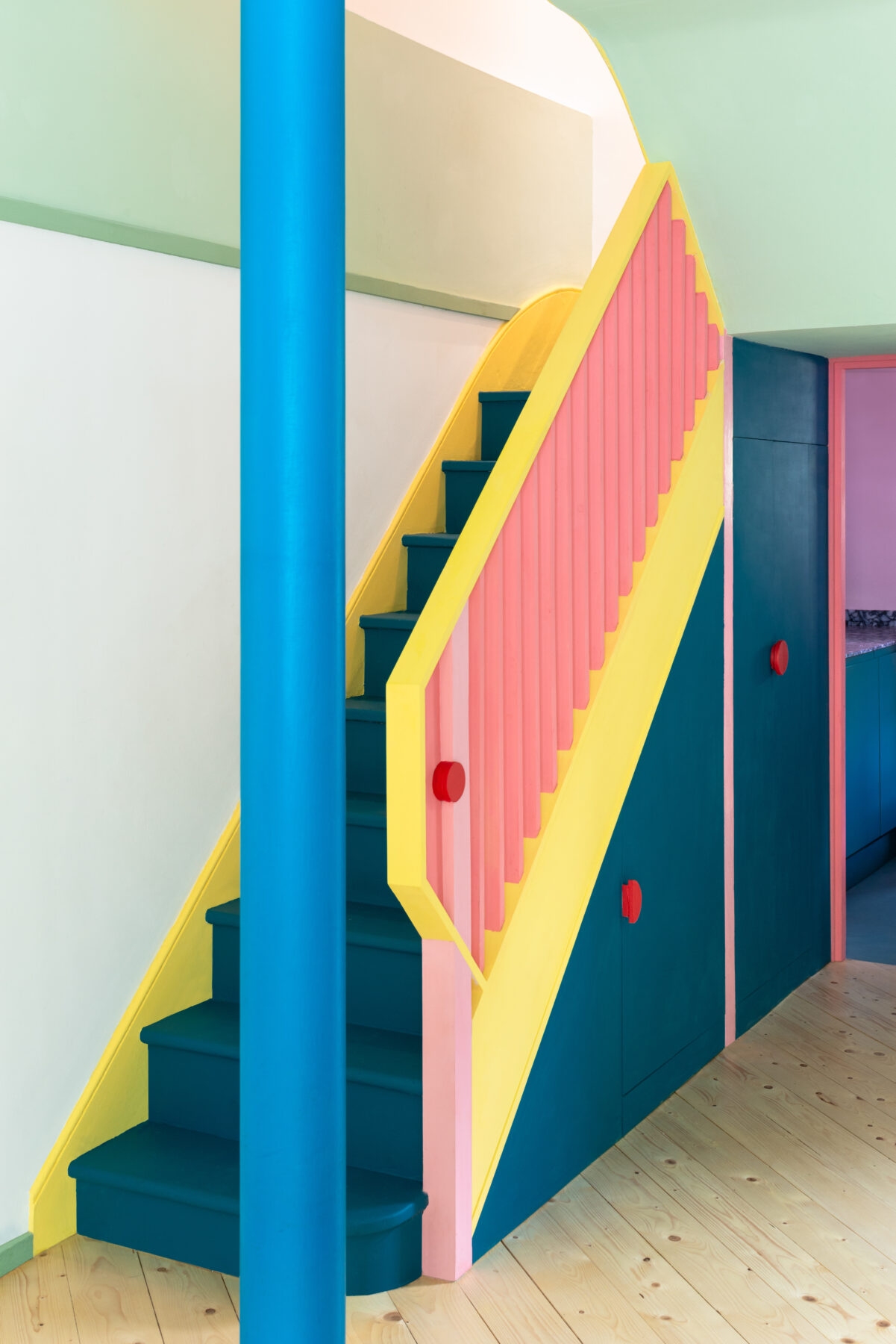

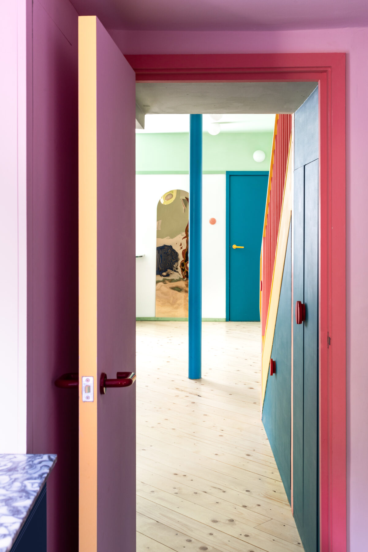
More unusually, the architects have designed all the furniture and deployed colour, mirrors and lighting to dramatic effect.
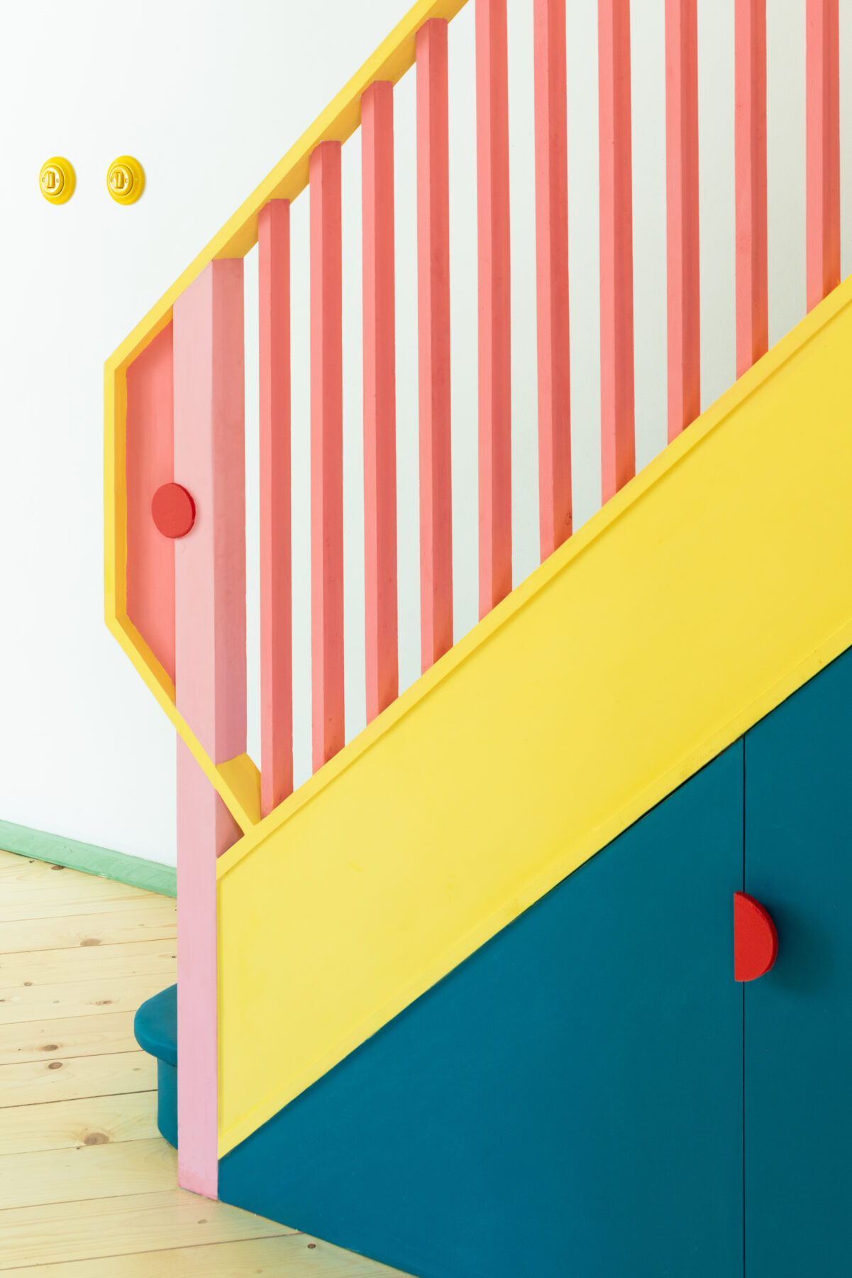
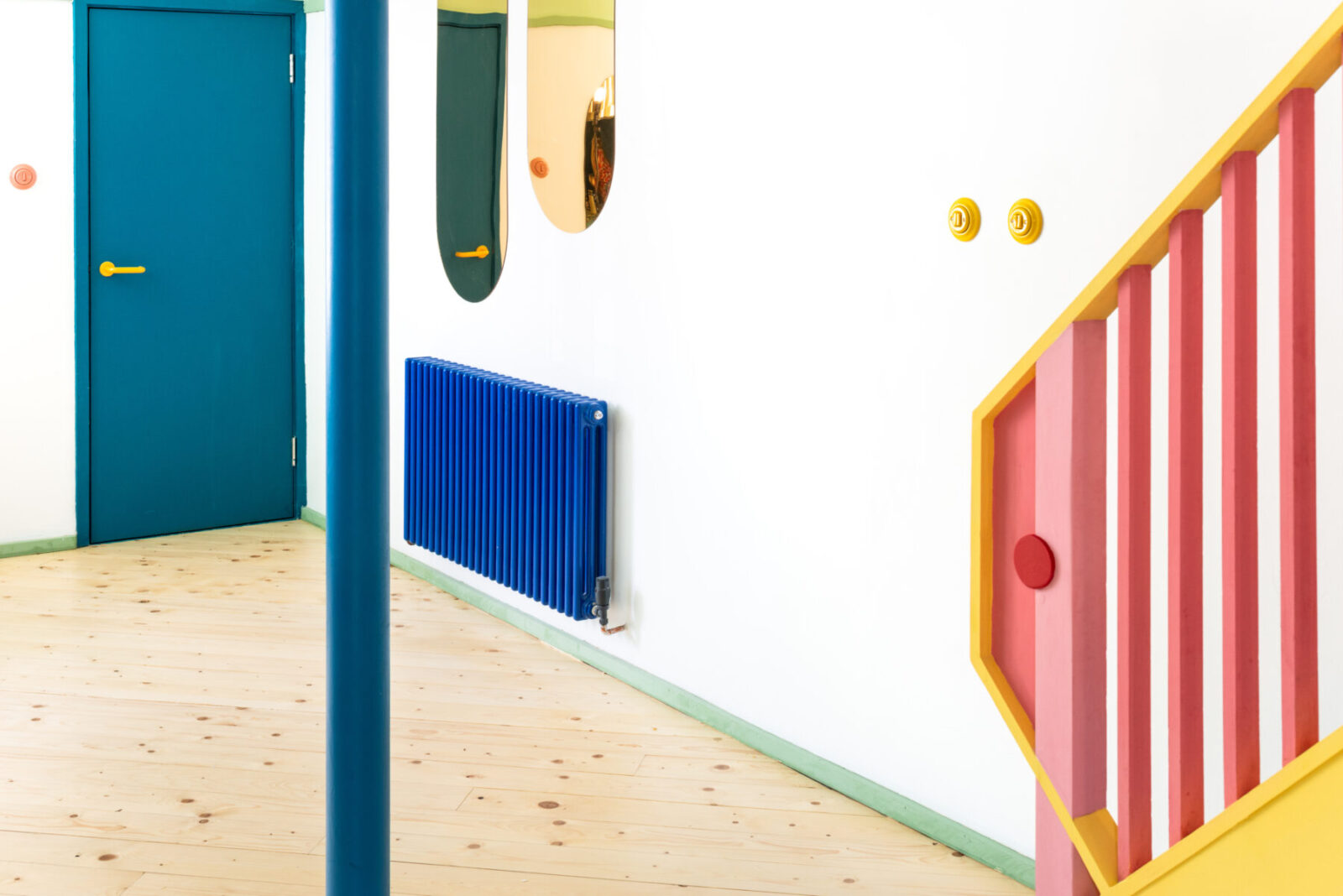
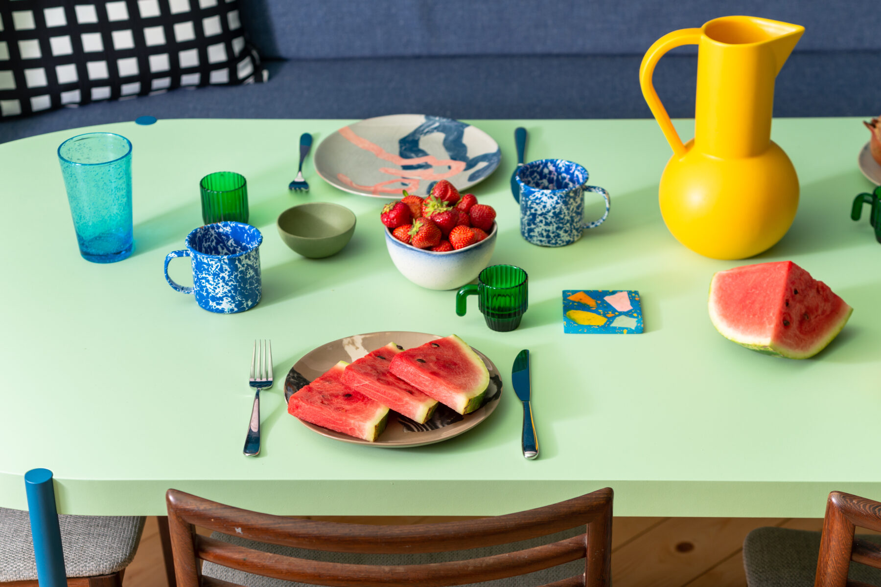
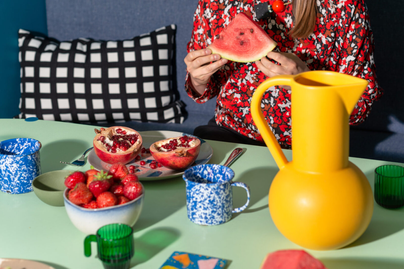
The cooking and dining area incorporates plinths to climb, soft surfaces to nestle in, tiny spaces to crawl into. Tropical colours and tinted mirrors are used throughout to reflect and frame views, distorting scale and suggesting worlds beyond. The client, Tamsin Chislett, is co-founder of Onloan, an online service based on lending fashion rather than consuming it.
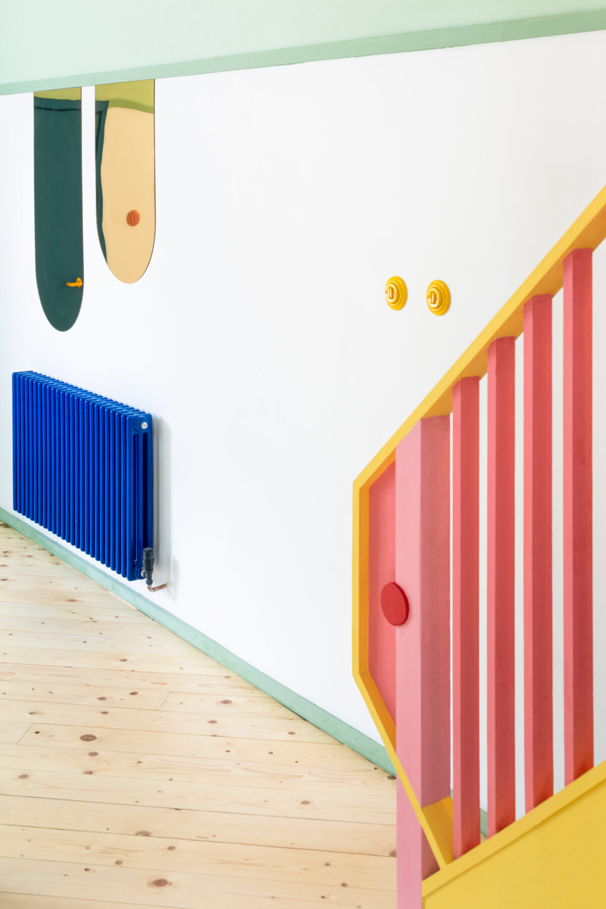
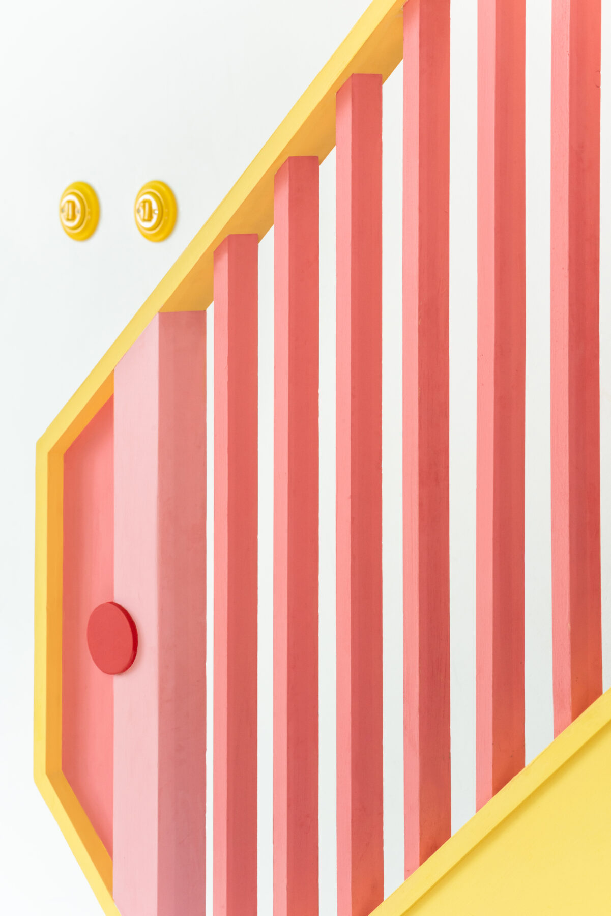
These ideas of borrowing and reuse were carried through in the project, with every material being borrowed, reused and reframed for a new purpose.
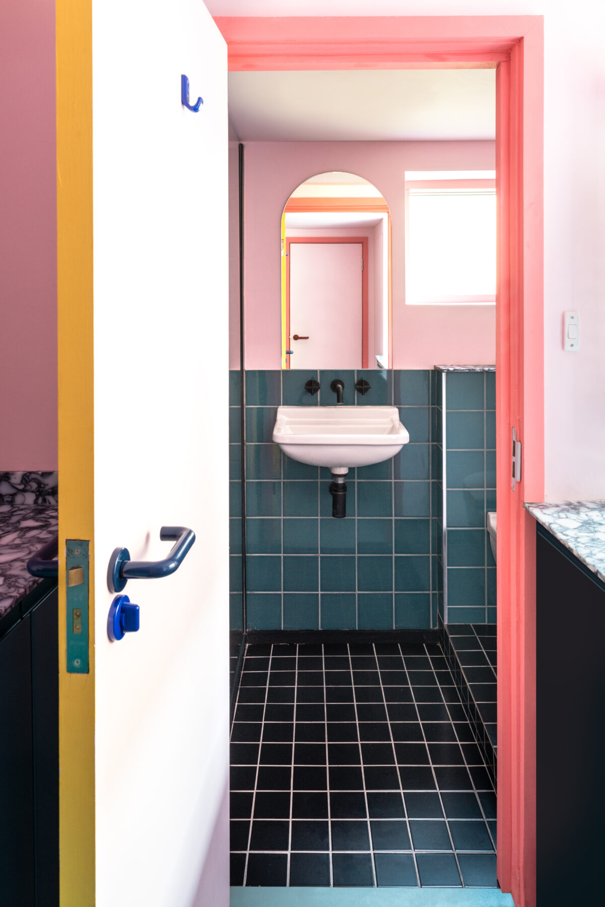
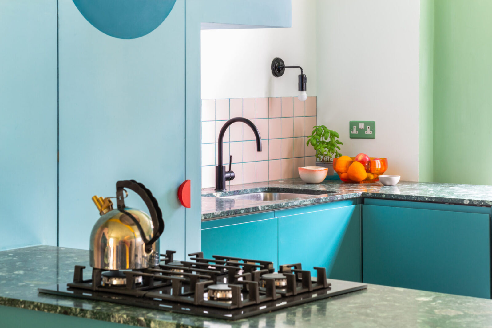
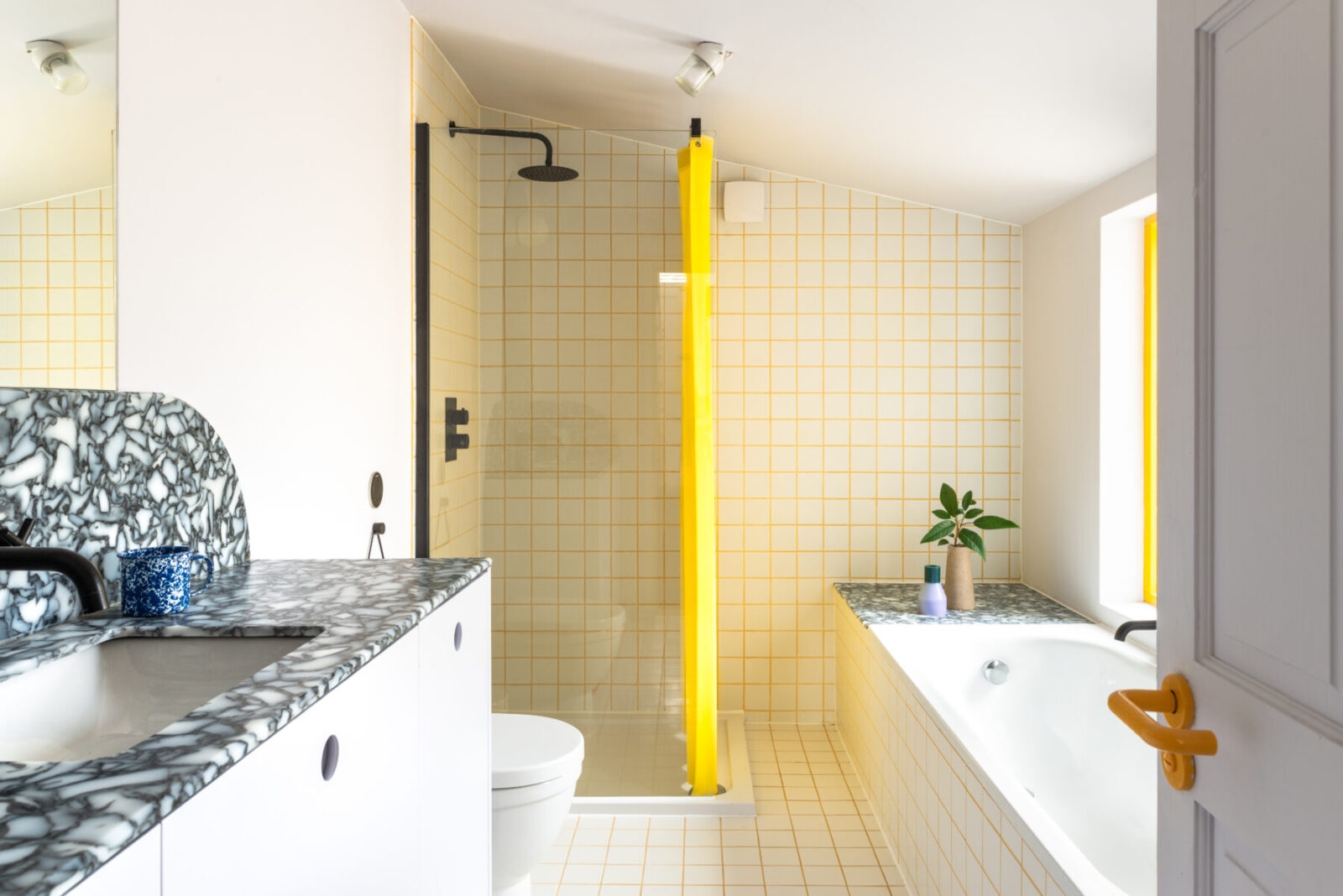
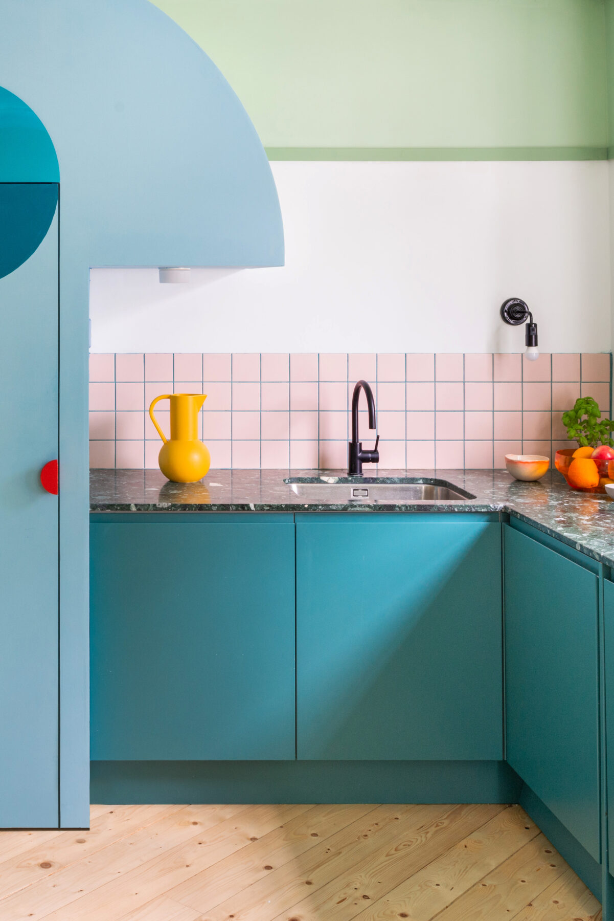
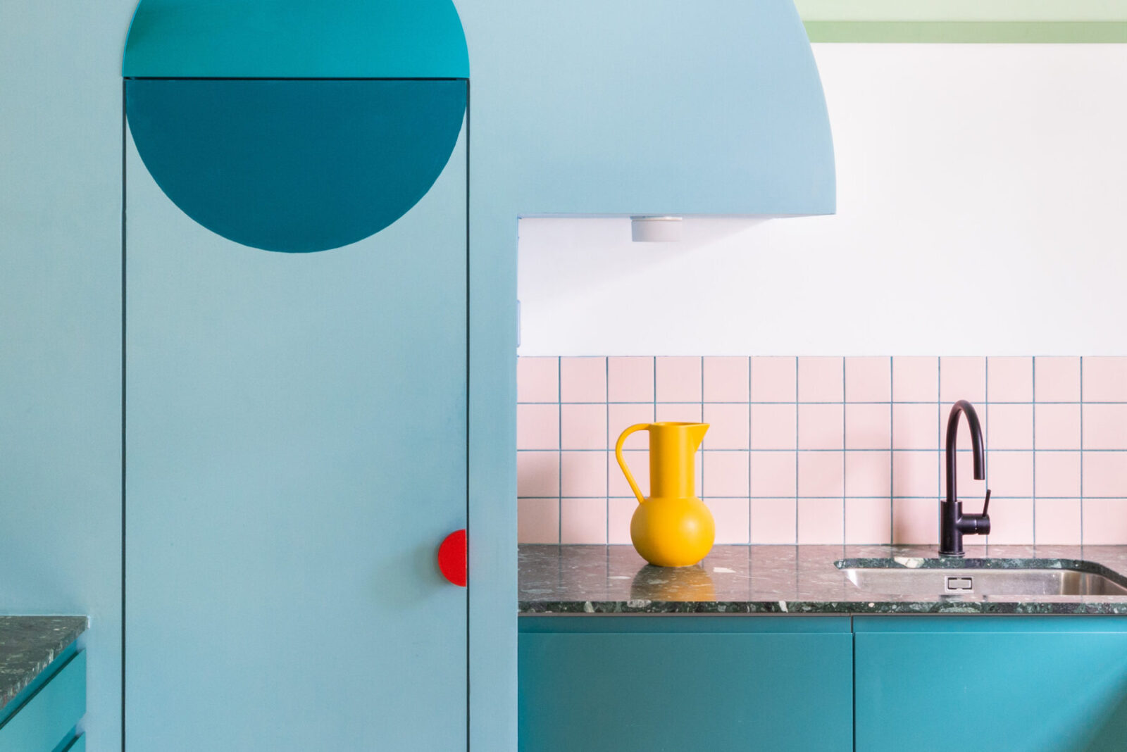
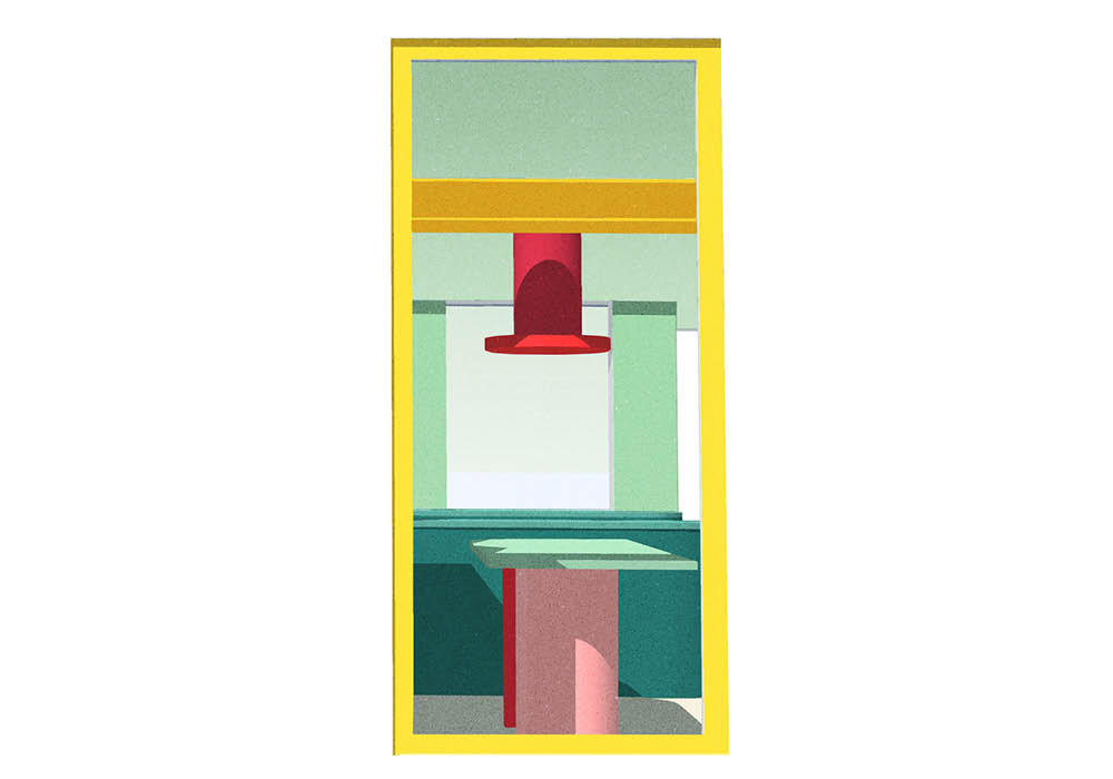
Office S&M chose materials with a previous existence and a story to tell: surfaces made from melted, discarded milk bottles and chopping boards, to form shiny, luxurious marbled worktops in the WC, bathroom and utility room; green terrazzo for the kitchen is made from marble chips and offcuts; and light pendants from recycled brick grog.
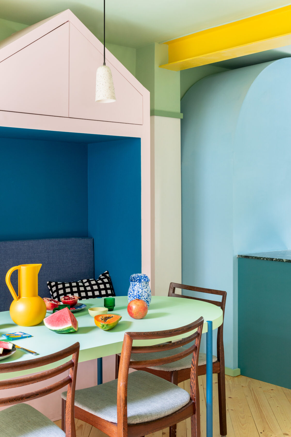
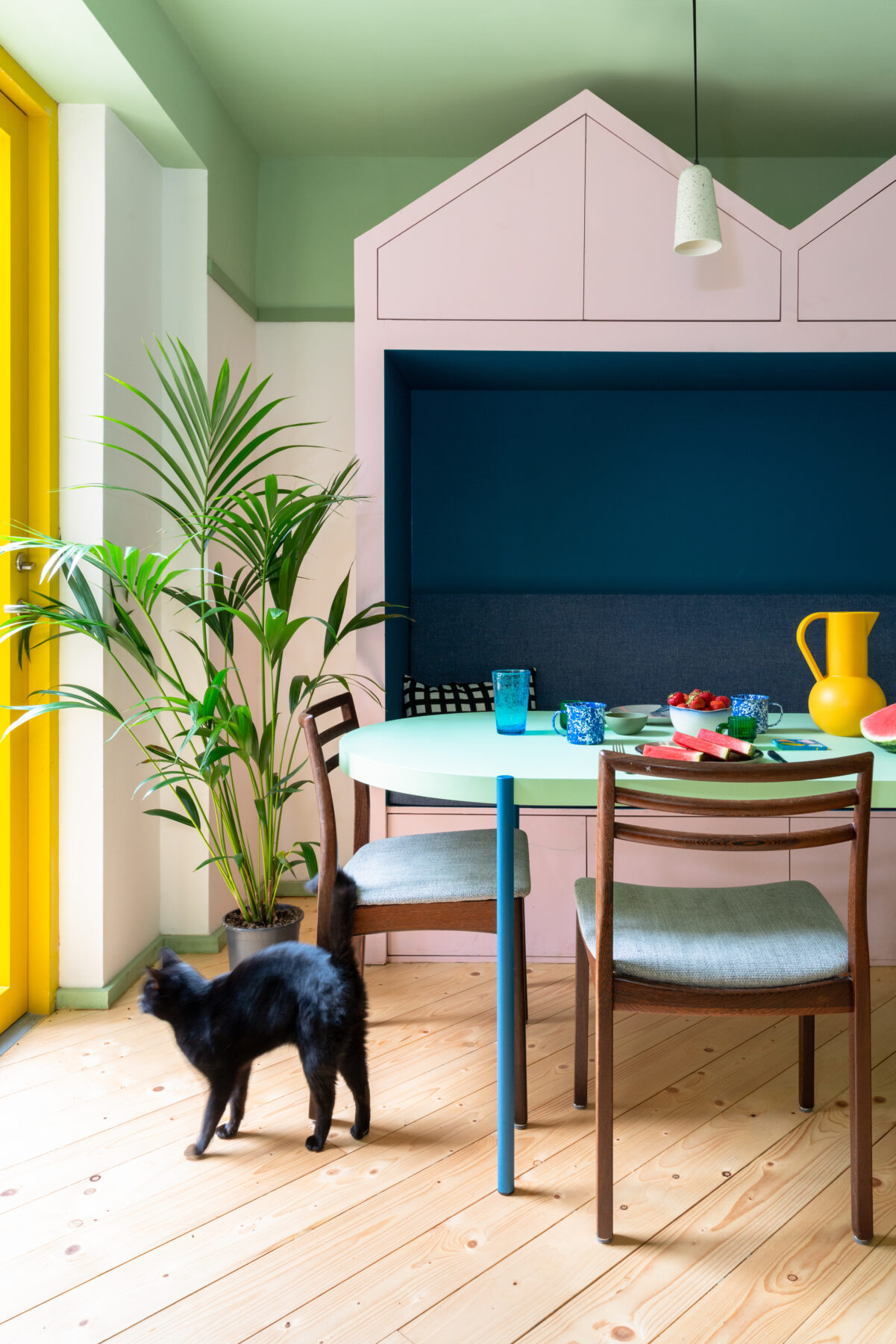
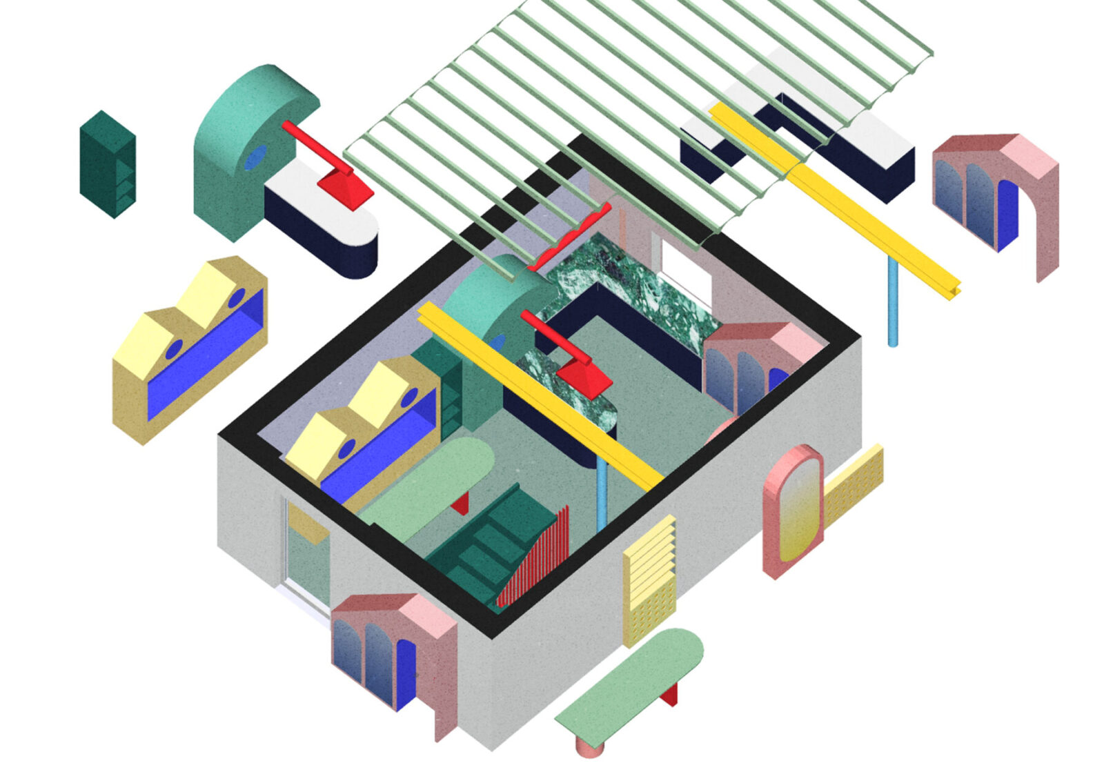
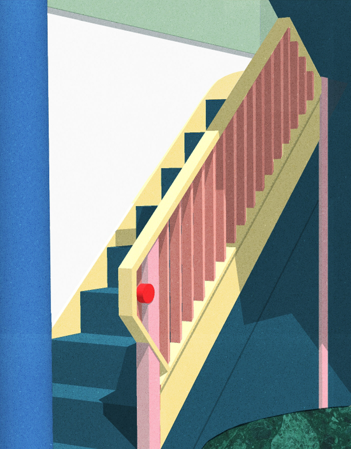
The architects designed each piece of furniture to serve more than one function. A pink and blue bench with crested canopy acts as dining seating, cosy reading nook, storage, regal throne, and cabinet to display curiosities collected during the family’s travels. This allows each family member to find new uses for the furniture, and through this reinterpretation and multiplicity of uses, longevity is secured and waste is reduced.
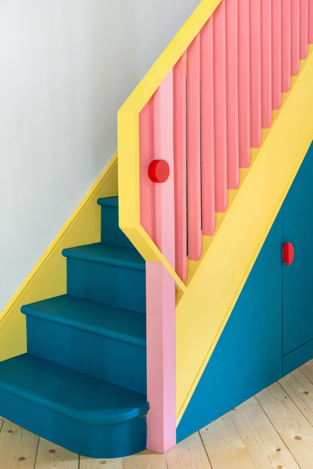
The suite of robust furniture pieces, each designed to be as much a small piece of architecture as an item of furniture or a building in a city, creates a series of interconnected but distinct spaces. By playfully dividing the plan, the furniture and colours both separate and connect, framing views across the room and creating an architectural dialogue between its inhabitants and the characters.
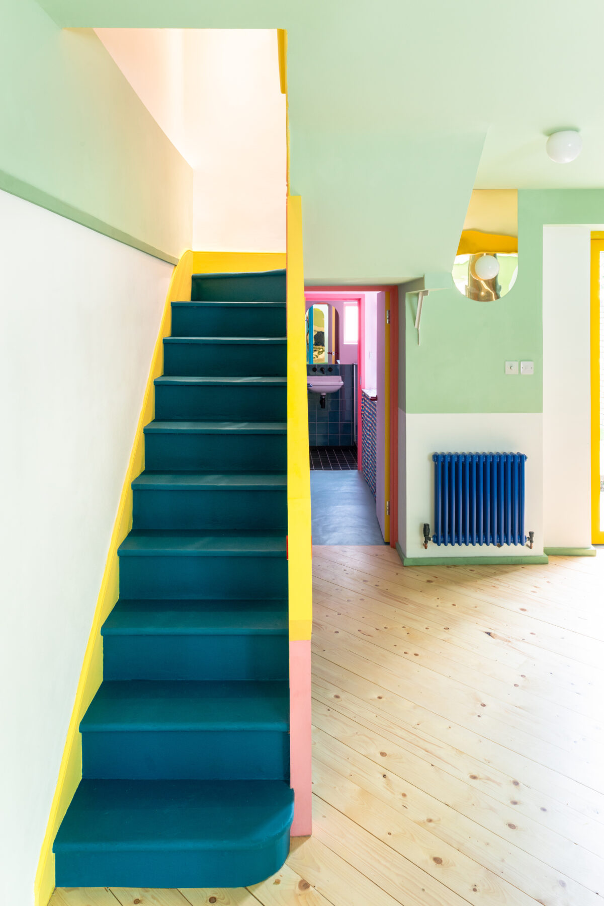
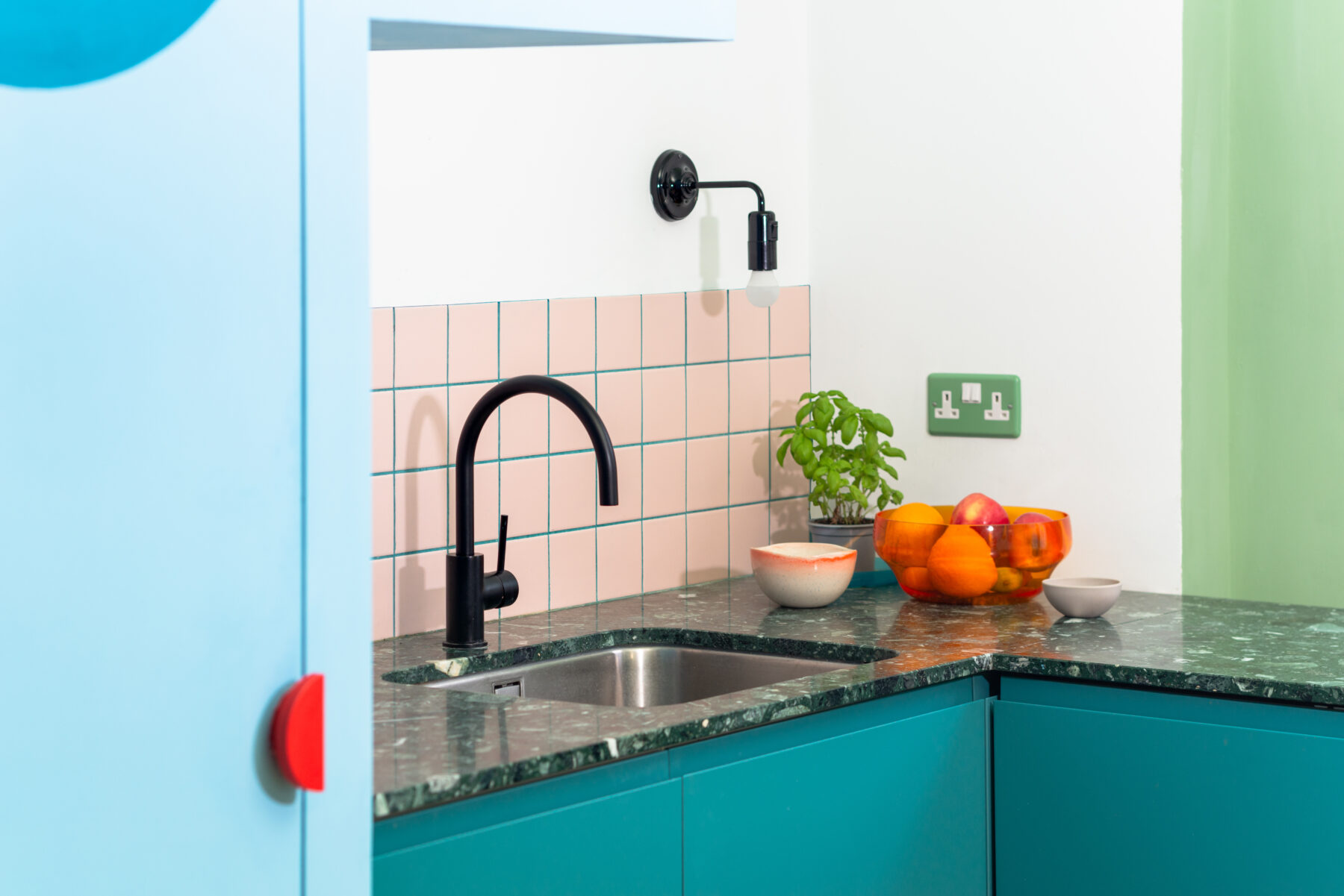
Peaks and arches create notional thresholds and a sense of enclosure to each of the spaces, as well as referencing the surrounding buildings and city.
Countering the reduced sunlight to the lower ground floor, Office S&M designed the lighting to come from multiple directions to mimic the sun, so that different areas could be lit in varying ways, with the house owners in control of light levels and even able to remotely adjust light colours and tones to respond to the changing seasons and mood. Mirrors have also been used strategically to reflect light throughout the space and create elements of surprise.
Catrina Stewart, Founding Partner, Office S&M, said: “Tamsin and Max gave us a fantastic brief and we’ve delivered an amazing home that reflects the family’s personality and professional ethos with our love of colour and imaginative design. Mo-tel challenged us to see reuse as a design tool for bold new ideas, and we found value and opportunities in materials that would otherwise have been overlooked.”
Tamsin Chislett, client, said: “We asked for ‘not boring’, and boy did Office S&M deliver. Our kids adore the space, from their secret storage spaces to the fun use of mirrors. Personally, the colours bring me joy on a daily basis (not least during lockdown!). And as a family, we feel our desire for a creative, playful home was really listened to – Office S&M made magic happen on our limited budget.”
Office S&M
Established by Catrina Stewart and Hugh McEwen, Office S&M is an award-winning architecture practice working with a 50/50 split of public and private clients on individual homes, new-build housing, workspace retrofit and public realm projects.



The practice engages clients and users in a collaborative process, experimenting with colours and materials to deliver joyful and unexpected spaces and places; elevating the everyday with exuberance. Office S&M responds to the context of each project – house, street or neighbourhood – acknowledging the existing, while deploying colour and narrative inventively to create drama.

Built projects include: Valetta House (2017), which won the NLA Don’t Move, Improve! 2018 ‘Best use of materials’ award; Salmen House (2017); Janus House (2018); and Finsbury Park High Street shops (2017), all in London. Current projects include: Mill Corner House, a new- build house in East Sussex; the Green Room in Newham; Nag’s Head Market, Holloway; and Chipstead Way, Croydon.
Achievements to date include: winning Building Design’s Young Architect of the Year Award (2020); inclusion in The Architects’ Journal’s 40 under 40 – a showcase of architecture’s brightest up-and-coming talent (2020); and recognition as a Rising Star by RIBA Journal (2019). Office S&M will feature in The Architecture Foundation’s New Architects 4, to be published in 2021.
Facts & Credits
Project title Mo-tel House
Typology Renovation, Residential
Location Queen Margaret’s Grove, Islington, London, UK
Site area Tamsin Chislett and Max Lines
Gross internal area 55m2
Completion July 2020
Architect Office S&M
Engineer Foster Structures
Contractor & Furniture Build McEllingott Building Ltd
Kitchen surfaces In Opera
Recycled plastic surfaces Smile Plastics
Photography © French + Tye
READ ALSO: Apartment IO in Bratislava, Slovakia | Alan Prekop
