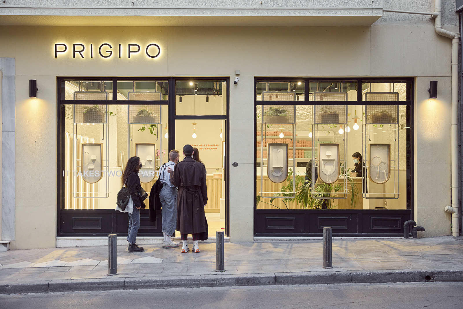
A retail store of the brand Prigipo jewels, is designed by LOOPO Architects, in the centre of Athens. Matching with the brand’s aesthetic, they created a space with minimal character and neutral pallet combined with contemporary elements. The place’s renovation is divided in the general space design and materiality and in the detailed design of the equipment for jewellery display and service.
-text by the architects
 Equipment design
A key feature of the composition is the element of the bar counters, which function as service points for the customers. The remaining store surface is left for wandering where through viewing different types of showcases the customers come in contact with the jewellery.
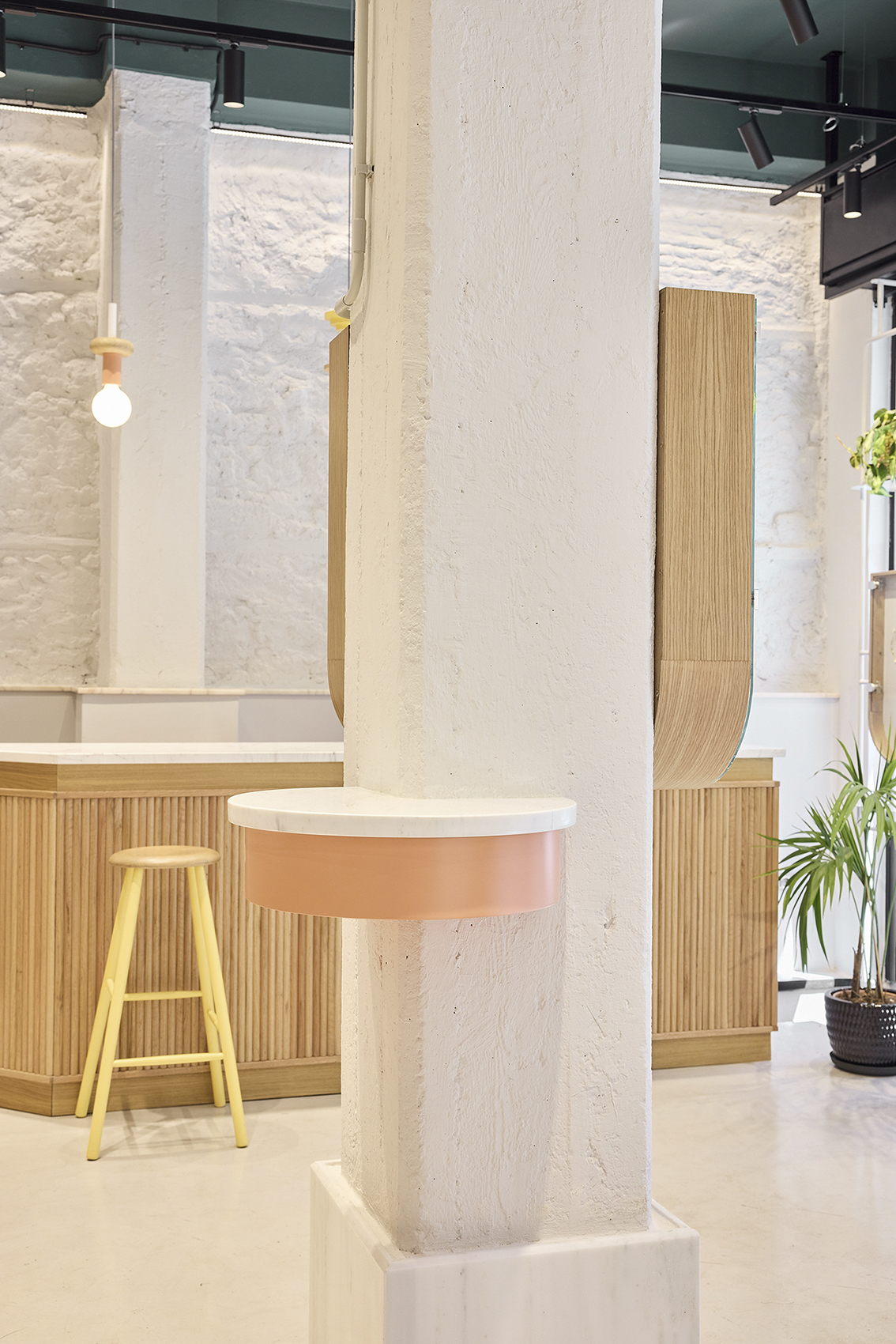
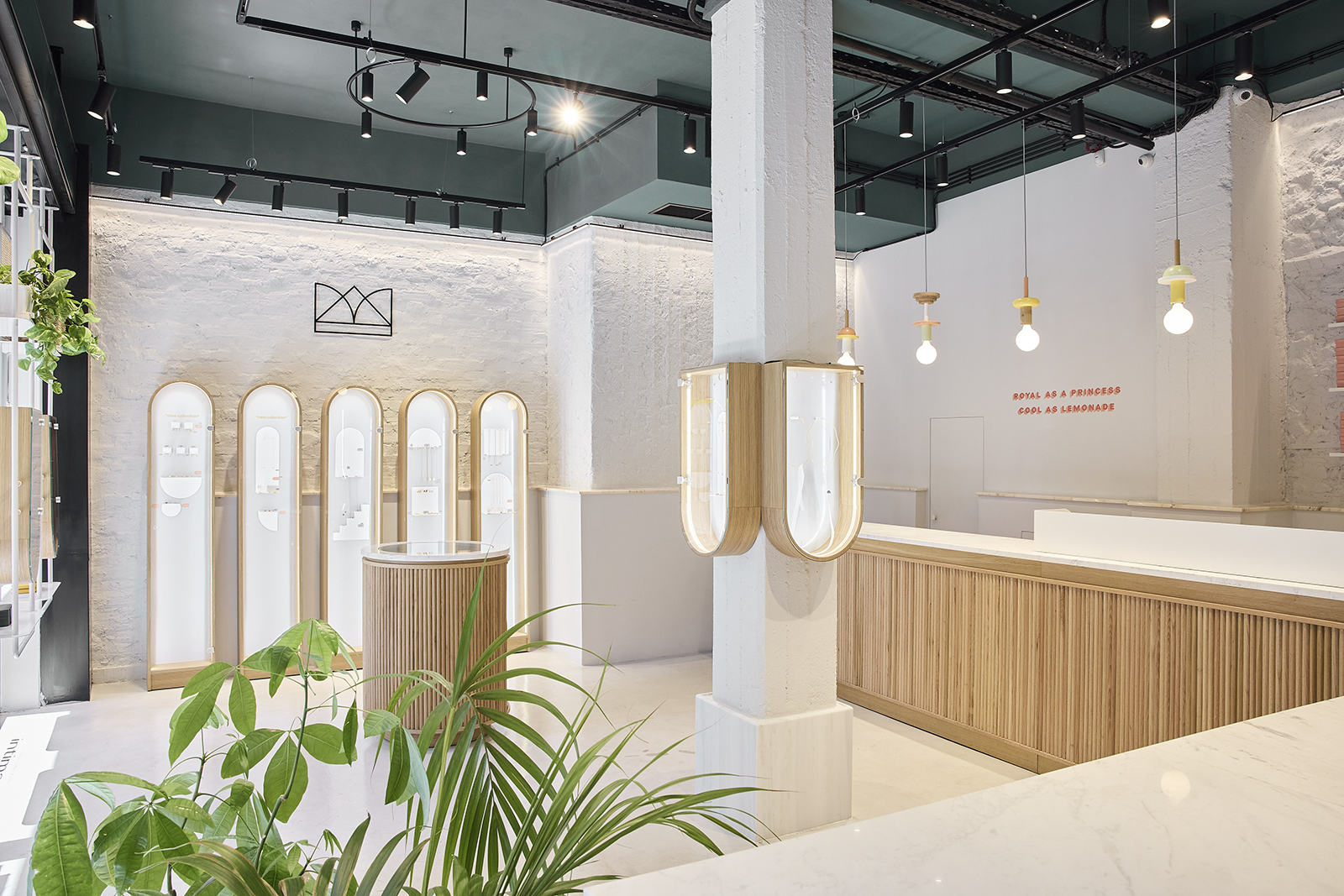
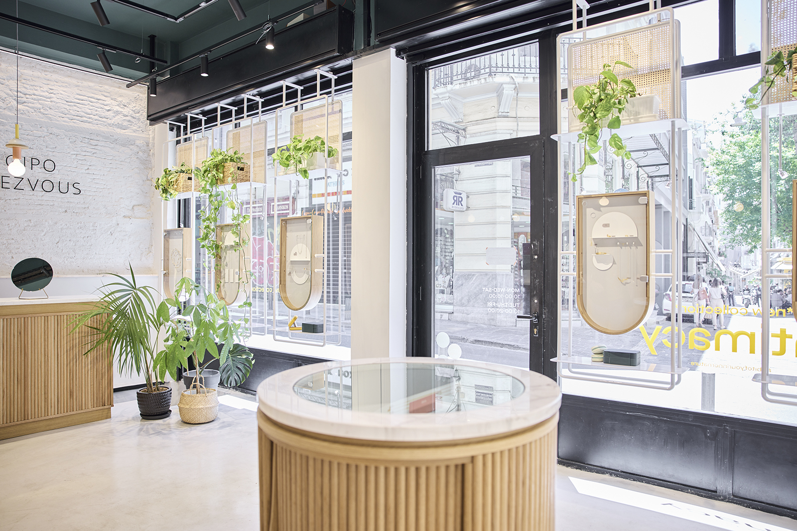
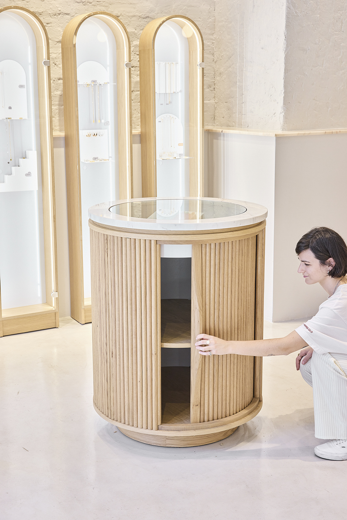
Special attention was paid to the design of the equipment for jewellery display and service. The equipment is consisted of the two bar counters, the metal showcases on the storefront and on both sides of the central column, the showcases with the curved finish on the left side of the entrance, the cylindrical free-standing showcase designed for horizontally setting out the jewels and a small horizontal showcase “biting” the central column.
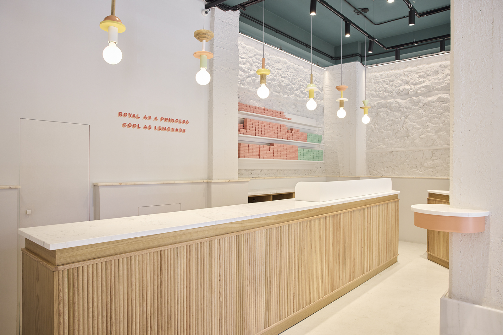
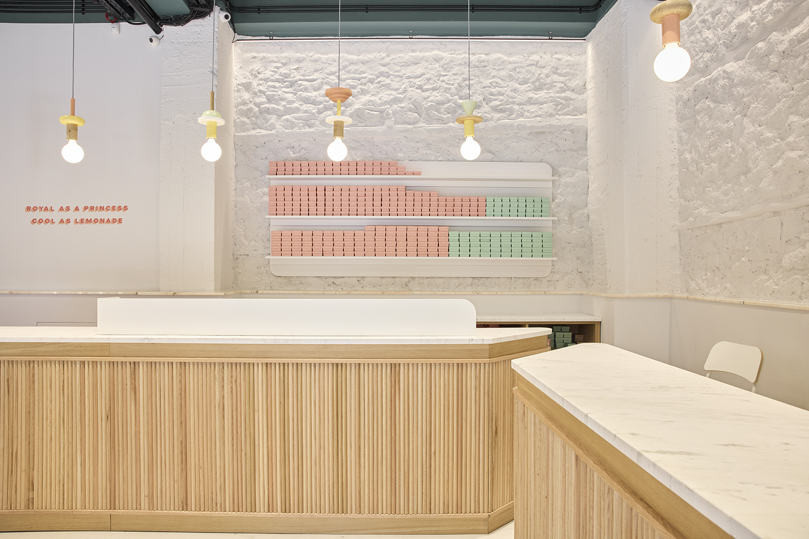
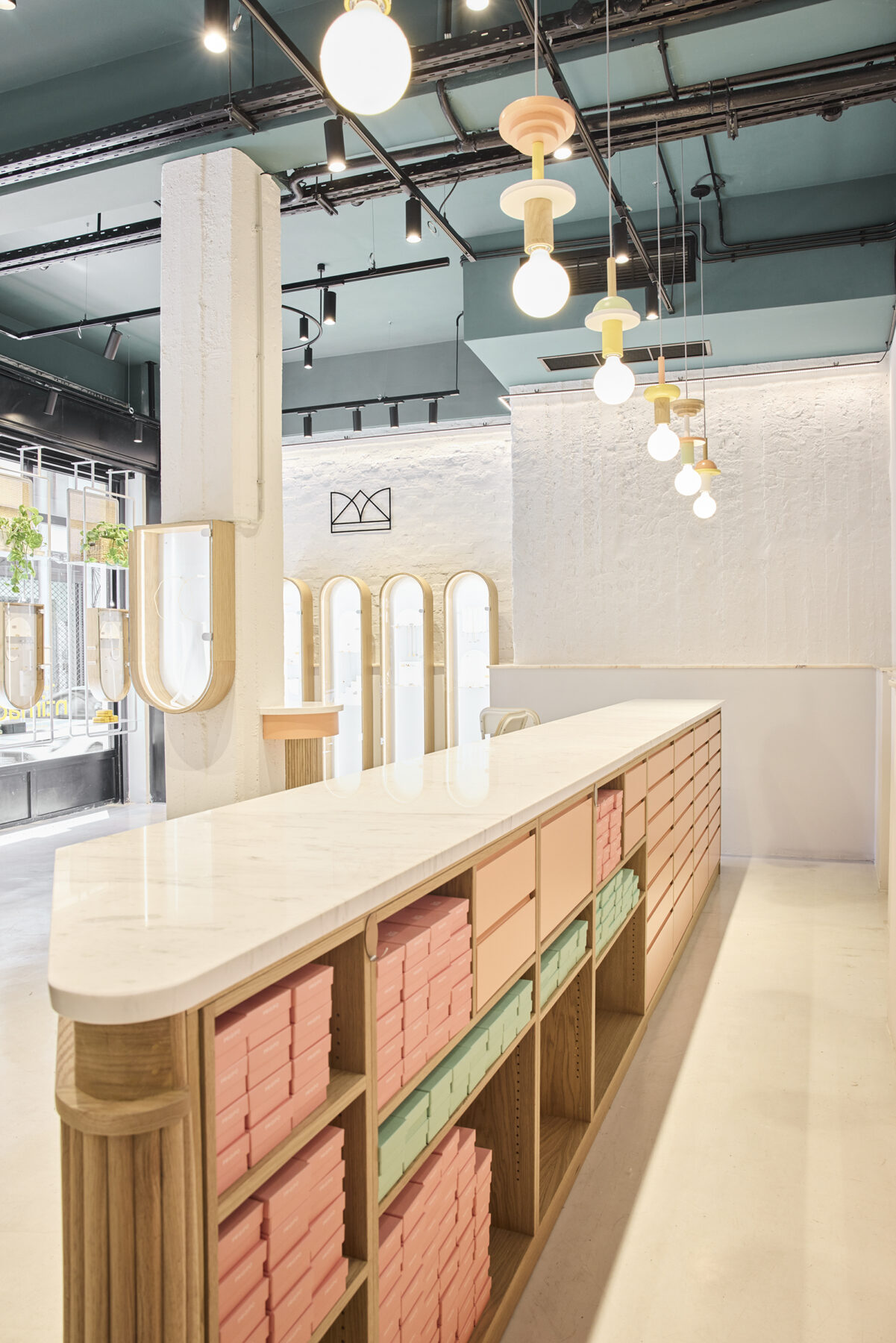
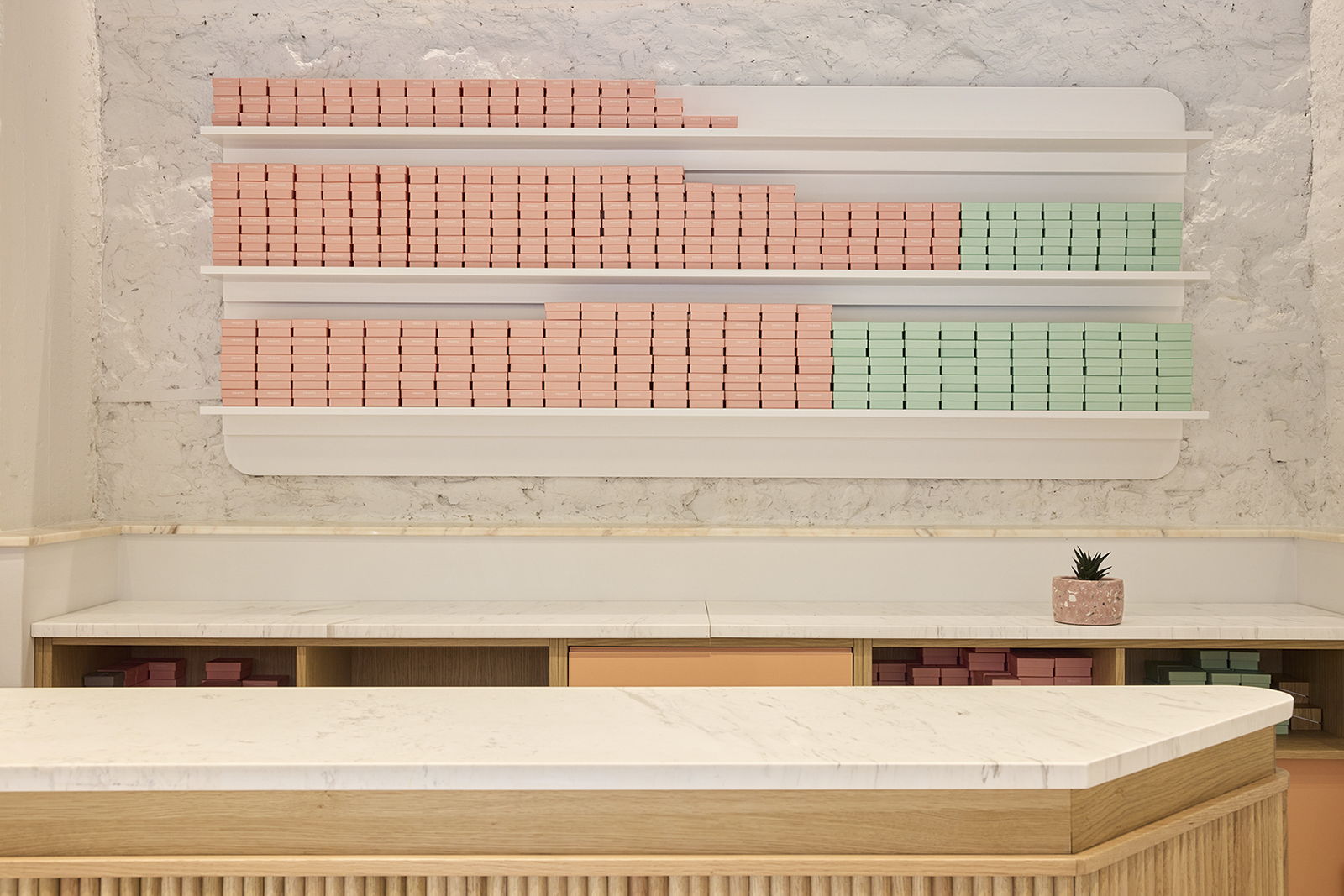
The two service counters are placed in an L-shaped layout. The largest element concerns the shop and the cash register. The registers and the packaging operation are located in the more secure spot of the counter, while the smaller counter functions as a more exclusive service point.
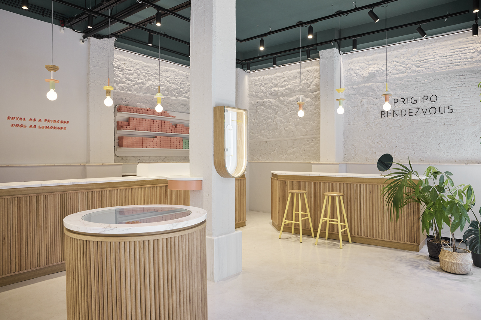
The vertical surfaces of the two counters consist of a number of semicircular wooden parts that form a pattern of linear elements and enrich the surface with depth. The horizontal surfaces of the counters are made of white marble with grey seams.
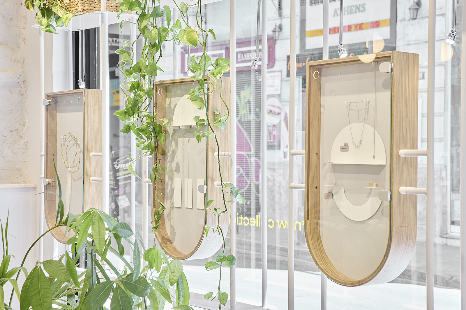
The metal showcases consist of a frame of round cross-section and light grey horizontal metallic bases. The shelf at the highest level is used for pots with plants and from that level up wicker serves as filling material for the metal structure. At the lower part of the showcase a vertical two-sided exhibition surface was designed.
The showcases with the curved finish offer vertical viewing of the products. The background is a metal sheet painted light grey, their facade is transparent throughout its height, while their sides are of solid wood in the same colour shades as the other structures.
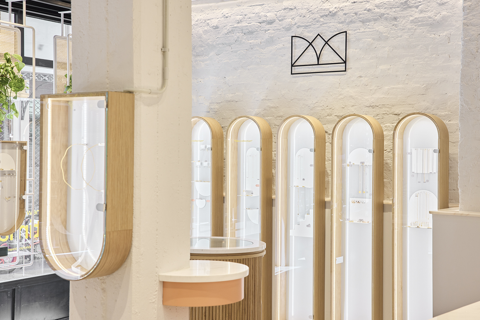
The cylindrical showcase is free-standing. It offers a horizontal display surface and its base has a sliding part for storage use and is in direct correlation in terms of materiality with the two bar counters.
Space design
The approach of the design followed the concept of creating a background on the floor, ceiling and walls, aesthetically suitable to host the structures of the equipment, and also capable to solve a series of functional and structural issues.
On the floor was implemented forged cement and the ceiling was painted with a dark green colour. The walls were divided into three horizontal zones with different characteristics concerning their materiality and their texture.
The lower part is a smooth surface of drywall and is separated from the middle zone with a pink marble surface which serves as a shelf. The middle part shows the textures of the masonry after removing the initial smearing; stones, bricks and wooden beams, reveal the means of construction of the building’s era.
The upper zone utilises the initial smearing, it is painted with a dark green colour and belongs to the same aesthetic and functional entity as the ceiling.

On the store’s facade preponderate the vertical showcases of the interior which are visually permeable to allow the visual contact of passers-by with the interior of the store.
Credits & Details
Architects: Loopo Studio
Typology: Retail store
Location: Athens, Greece
Construction: Christos Anastopoulos
Equipment construction: Giorgos Varkarotos
Equipment construction: Stavros Protopapas
Photographer: Kostis Sohoritis
READ ALSO: Sustainability meets design: DIY ecological house in Linz by bloggers Andrea Hörndler & Hannes Wizany