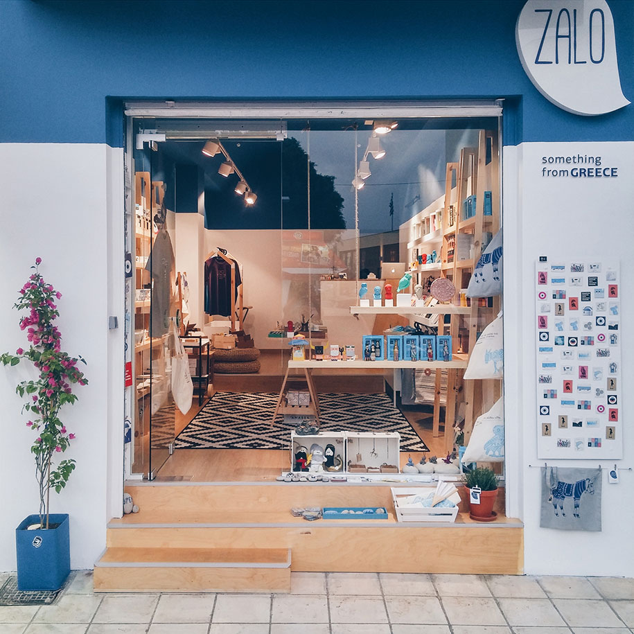
Zalo is located in one of the most interesting spots of Iraklion city, at the square that “hugs” the archaeological museum of Heraklion, which is one of the most important museums worldwide, and whereat the truth of the Minoan civilization is being kept, among others.
The owners of the souvenir shop are two young people, with love to the civilization and history, with a globular apprehension of an object’s value and an exceptional point of view for the importance of aestheticism.
The word “Zalo” in Cretan dialect means “step”.
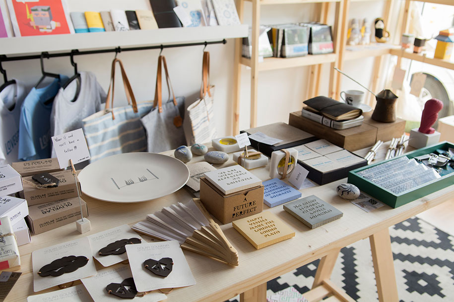
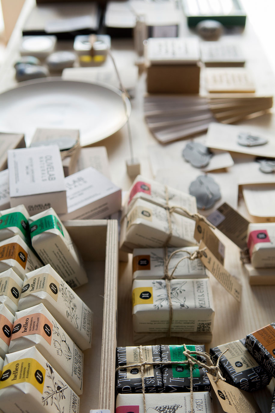
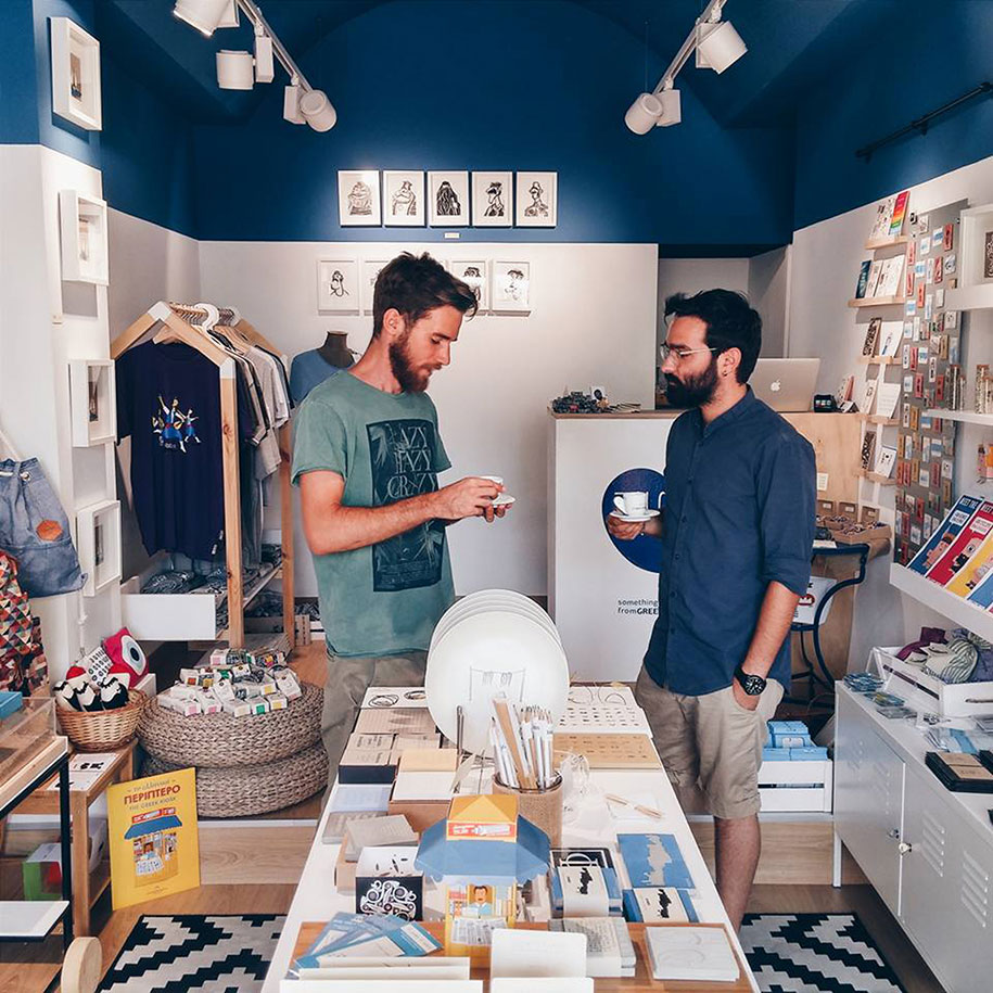
The team with great pleasure and love chooses artwork from Greek designers, while develops its own range of products and does a step forward to the designation of the Greek historical wealth in a modern performance, enriching the choices of both locals and visitors at the souvenirs’ market. Both the size of Zalo (25cm2), and the variety & diversity of the objects it shelters, drove to the creation of a space with simplicity to be its main characteristic.
A characteristic phrase that refers the memory of “Zalos” and accompanies its corporate identity is “something from Greece”. Our goal was that so the space as also the visual identity would follow this idea through the principles that consists the memory, i.e. the experience. In this way, the visitor feels more the deeper strands of the Greek culture in the space and less they can read them automatically by sight.
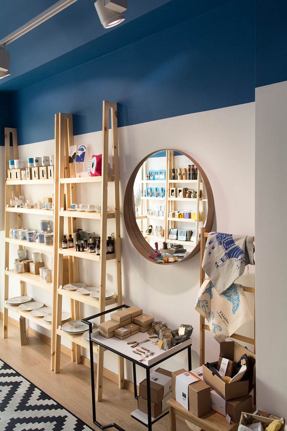
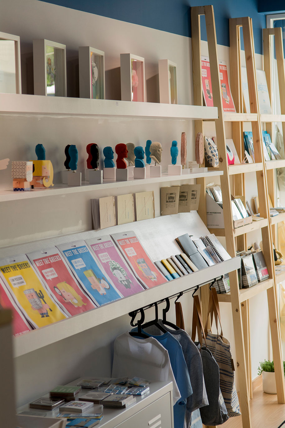
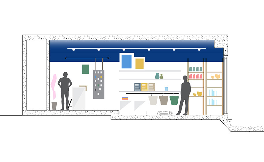
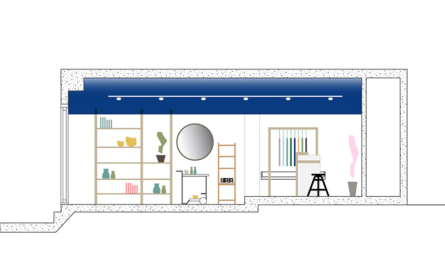
The clear blue sky is one of the most distinguishing characteristics to which someone refers to when he starts to describe Greece. But there is something that has attracted less attention, and is that the Greek blue sky is so impressive because of the natural horizon with which it unites. Like this, the paint of the arched ceiling in deep blue color gets to the walls in analogy 1:4, so as it creates the sense of the sky which imposes through its expansion, something that is printed to the horizon that appears to the sides. The color to the rest of the surfaces is white in order to function as a blank canvas in front of which every product separately, but also all the products together, are being featured.
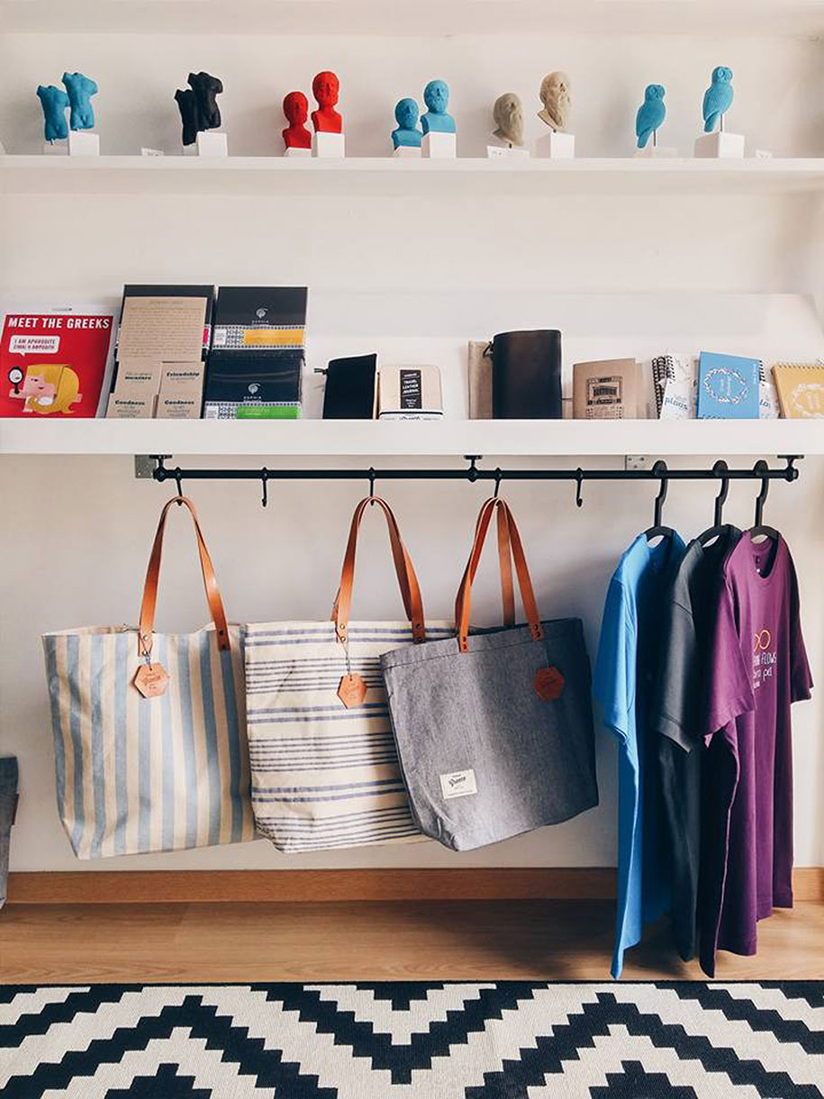
The constructions’ design is based on our choice & will that the space would be intimate, pleasant and comfortable for the visitors during their touring, but also functional referring to the exposition and the sighting of the products. From form’s perspective, the balance derived from different structures that connect in an undivided total, and not from uniform constructions in sequence.
The main characteristic of the sub – members is “climax”, meaning the culmination applied to all the sizes, width, height and depth, which in addition to its aesthetic value allows all products to be lighted properly.
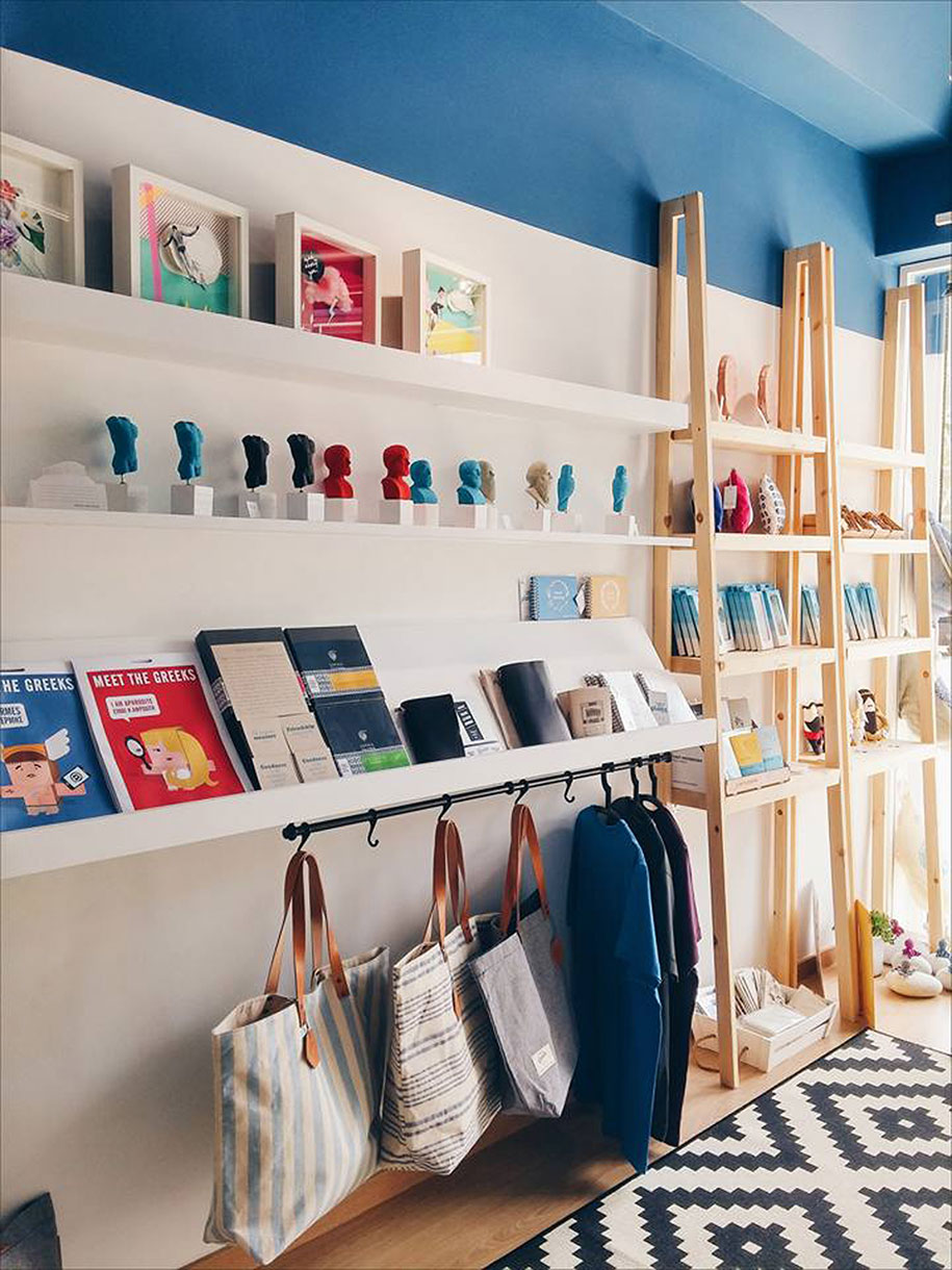
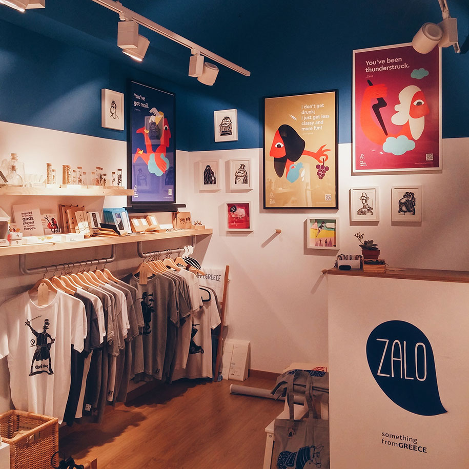
Wood was used almost exclusively for the realization of the constructions either by remaining in its natural aspect or by painting in white. A similar design philosophy governs the visual identity. With the connection of two fonts, one “handwritten” which expresses naturalism and intimacy, and one “sans serif” for the conservation of simplicity, we created the base of the logo. The shape that consists the title is the outline of the image of a sea shell that connects with the sea and the memory of its sound, but also the Greek summer in general. The colors of the identity are in sequence with the space, in a deep blue and white.
READ ALSO: Arquitectura-G Inculcate a Breeze into a Mint-Green Apartment in Barcelona