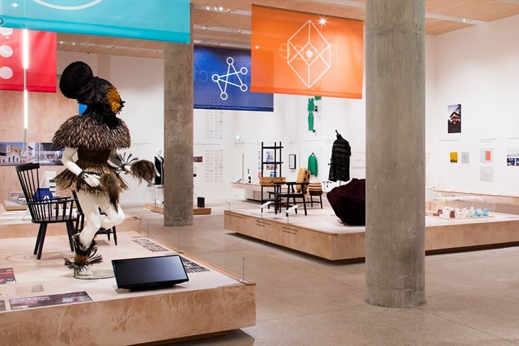
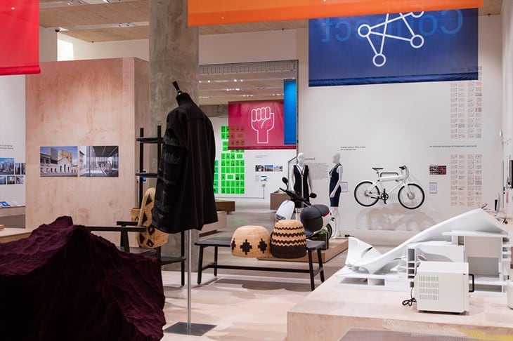
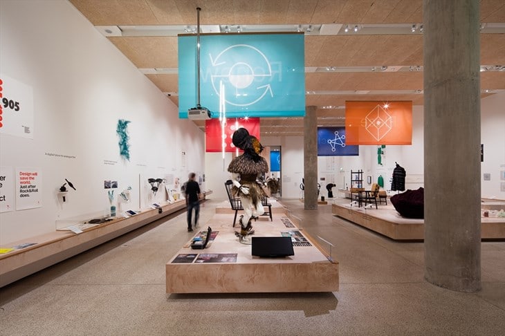
The Beazley Designs of the Year exhibition and awards are a relevant and provocative cross-section of contemporary design from six categories: architecture, digital, fashion, graphics, product and transport.
With work from established practices and newly qualified designers, the selection is diverse, thought provoking and forward thinking.
The process for the awards, now in its ninth year, started with the vigilance of international design practitioners, curators and critics, who, throughout the year, were alert to new developments in both their area of expertise and their region of the world. Their nominations, received by the Design Museum were reduced to a shortlist of 70 projects, and will be presented in an exhibition at the Design Museum until the 19th of February.
Each project selected for Beazley Designs of the Year is:
Design that promotes or delivers change, from using new materials or processes to enabling new ways of living.
Design that captures the spirit of the year from designs, such as the London 2012 Olympic Torch to a garment that embodies a current trend.
Design that enables access, from a website offering an excellent user experience to design that will improve lives.
Work that has extended design practice, from examples of best practice to projects that seem to `stand out` or signal the future for design.
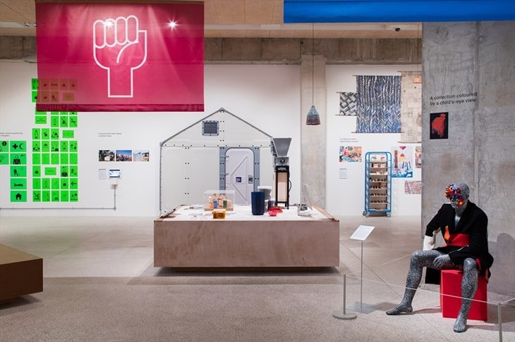
This year`s winners were decided upon by an independent jury and the winnings projects are presented here in category order.
Beazley Design of the Year & Architecture Winner – Beazley Design Awards 2016
Better Shelter
Designed by Johan Karlsson, Dennis Kanter, Christian Gustafsson, John van Leer and Tim de Haas, in partnership with IKEA Foundation and UNHCR.

Great design responds to needs, and there is no doubt that the refugee crisis is one of the biggest of our era. The design of “Better Shelter” sets a ground breaking example for putting values ahead of value and benefit above profit. “Better Shelter” is a social enterprise bringing design industry innovation to emergency and temporary shelter. The project has developed safer, more dignified homes for those who have been displaced due conflict and natural disasters.
Featuring a lockable front door and a solar powered wall, the shelter utilises flat-pack technology used in furniture design and has repurposed it to create a shelter that can be easily assembled and transported. Flat-packed in a two-box kit along with all the required tools, the shelter is easily assembled in about four hours. The photovoltaic panel provides enough energy to power the supplied light or to charge a mobile phone.
While it will not solve the crisis, it goes a long way to accelerate innovation, challenge unacceptable norms and communicate respect. Harnessing their vast experience for detail and production alongside their access to people`s attention across the globe, IKEA has shown that design is not only about improving conditions, but also about taking responsibility — and, as such, it is about making a safer world. 30,000 “Better Shelters” are already in use around the world and the judges chose “Better Shelter” as a clear demonstration of scalable design that has the ability to make a worldwide impact.
Digital Design Winner – Beazley Design Awards 2016
OpenSurgery
Designed by Frank Kolkman with the Design Interactions department of the Royal College of Art, London and the Kyoto Institute for
Technology.
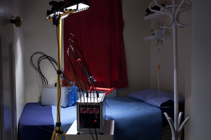
“OpenSurgery”, created as a graduation project at the Royal College of Art, claimed the Beazley Digital Design of the Year. Selected for demonstrating `a tipping point’ in our relationship with technology, the project was created in response to uninsured Americans posting videos on YouTube and performing minor operations and medical hacks on themselves and others. The Robotic Surgeon proposes an alternative do-it-yourself robot.
By combining 3D printing with laser cutting technology hacked with surgical equipment bought online, the machine theoretically could be replicated at a fraction of the cost of professional surgical care. Frank Kolkman`s project “OpenSurgery” is at once a design project, a subtle act of piracy, and an unorthodox piece of investigative journalism. While trying to develop a surgical robot that could be made affordable and accessible to communities living outside regulated healthcare systems, he ran head on into an enormous intellectual copyright wall.
In doing so, he exposed how corporations are hoarding potentially life-saving technologies and preventing them from reaching the public. The project is absolutely timely, socially responsible and critical of the monopolisation of knowledge by corporations to the detriment of society.
Fashion Winner – Beazley Design Awards 2016
Children vs. Fashion
Designed by Yolanda Dominguez
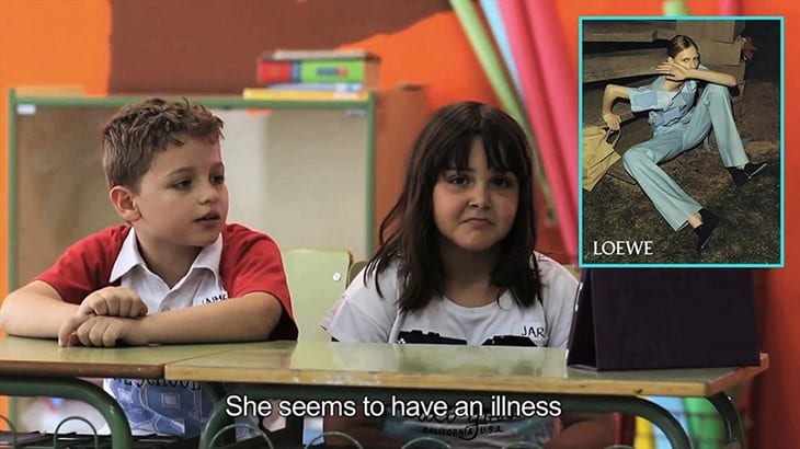
In the video “Kids vs Fashion” Yolanda Dominguez has made an incredibly astute and powerful comment on an industry with the kind of wit that makes it seem effortless. She asked a group of eight-year-olds from CEIP La Rioja School in Madrid to describe what they see in the latest fashion campaigns. Offering the uninhibited viewpoint of a child, the project exposes the negative impact of a selection of advertisements and how the focus is removed from the clothes that they are intended to promote. Using her humour and knowing naivety as a mask, Dominguez raises some heavy-hitting questions about the fashion industry without us even realising making us question a standard we`ve become all too familiar with.
Graphic Design Winner – Beazley Design Awards 2016
★ (pronounced Blackstar)
Designed by Jonathan Barnbrook at Barnbrook for David Bowie/Sony Entertainment Inc.
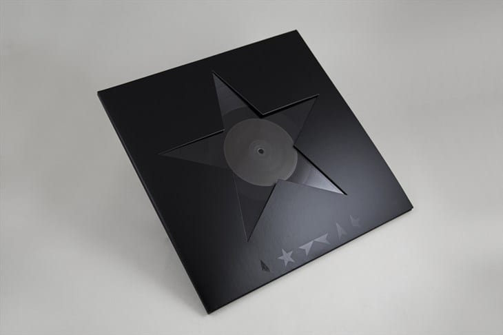
The iconic album cover of David Bowie`s Blackstar album received the Beazley Graphic Design of the Year. The Unicode Blackstar symbol created a simplistic identity that let the music take centre stage but also created a design that’s easy-to-recognise and share. Designed using open source elements, the artwork for the album became open-sourced itself following Bowie`s death enabling fans to engage and interact with the symbols.
As Barnbrook says, `The symbol, rather than writing “Blackstar”, has as a sort of finality, a darkness, a simplicity, which is a representation of the music.` It is remarkable and restrained, stripped back yet an almighty work of compelling graphic art. It is a clear counterpoint to the visual clutter that litters our daily view. It was created with deep trust and mutual respect: iconic design, worthy of an icon.
Product Design Winner – Beazley Design Awards 2016
Space Cup
Designed by Mark Weislogel and Andrew Wollman with John Graf and Donald Pettit, NASA Johnson Space Center, for Ryan Jenson at IRPI LLC

A coffee cup used by astronauts was awarded the Beazley Product Design of the Year. The “Space Cup” was designed and developed using scientific results of experiments conducted aboard the International Space Station. The cup is designed to exploit passive capillary forces to replace the role of gravity to create an earth-like drinking experience in the low-gravity environment of space. Sealed drink bags are normally sipped through a straw to avoid spilling in space.
The “Space Cup” however uses surface tension, fluid wetting properties, and a unique shape to drive the liquid toward the astronaut’s mouth whilst drinking from an open cup. The tiny cup brilliantly reflects the confluence of science, technology and design, responding to an extremely specific problem. It brings together the magic of something as enormous as space travel with the delight of something as basic and necessary as our daily caffeine. Design continues to shape and improve quotidian experience, even as daily life becomes extra-terrestrial.
Transport Design Winner – Beazley Design Awards 2016
Lumos – A Next Generation Bicycle Helmet
Designed by Eu wen Ding and Jeff Haoran Chen

“Lumos”, the world`s first smart bicycle helmet with integrated light signals, completed the category winners by being named the Beazley Transport Design of the Year. With a built-in accelerometer Lumos detects when you`re slowing down and automatically displays a brake light and turn signals. In August 2015, “Lumos Helmet” blew past its funding goal of $125,000 USD to raise over $800,000, making it the highest funded bicycle helmet campaign in crowdfunding history. The hope is that the helmet, by enabling cyclists to signal and communicate with other road users, will encourage and enable cyclist and motorist to coexist and cooperate, in turn leading to safer roads for everyone.
READ ALSO: Open Call for Projects / February 2017