The Holy See notches up another first this year, as it makes its inaugural appearance at the International Architecture Exhibition in Venice La Biennale di Venezia. The Vatican pavilion takes the form of eleven chapels built on the densely wooded area of the lagoon island of San Giorgio Maggiore. Following on from two highly successful appearances at the Venice Art Biennale, the Holy See will be present for the first time at the prestigious Architecture Exhibition, which opens on May 26th.
Beginning with a reconstruction of a ‘Woodland Chapel’ by one of Sweden’s early 20th century architects, Erik Gunnar Asplund, the display includes ten other ‘temples of worship’ designed by top artists from Europe, Asia, Latin America, the U.S and Australia.
It’s the Vatican’s second major foray into the world of the Venice Biennale after it staged pavillions for the 2013 and 2015 art biennales.
The Vatican, which spent 400,000 euros for the project, solicited designs from 10 architects as well as contributions from construction firms to defray the costs.
Situated on the Island of San Giorgio Maggiore, the Holy See Pavilion lead visitors on a journey through ten chapels designed by ten architects.
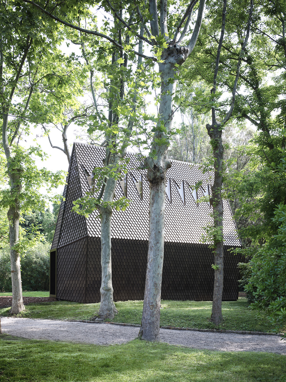
The beginning of the journey will be marked by the Asplund Chapel, designed by MAP Studio and built by ALPI, drawing inspiration from the “Woodland Chapel” built in 1920 by Gunnar Asplund at the Woodland Cemetery in Stockholm.
In dialogue with different cultures
At a press conference, the head of the Pontifical Council for Culture, Cardinal Gianfranco Ravasi said each architect, whether religious or not, brings his or her own experience into “dialogue with the plurality of cultures” to highlight the catholicity of the universal Church.
The ten chapels contain two key liturgical elements: a pulpit or lectern, to represent the proclamation of the Word and an altar to denote the celebration of the Eucharistic Supper.
Sacred space in the natural world
Just as Asplund’s ‘Woodland Chapel’ symbolised the constant quest of humanity for the sacred within the natural world, so this ‘Decalogue’ of chapels forms a pilgrimage for those in search of beauty and of nature in harmony with the created world.
The theme of this year’s Biennale is ‘FreeSpace’, denoting the generosity of spirit and sense of humanity at the heart of the artist’s activities.
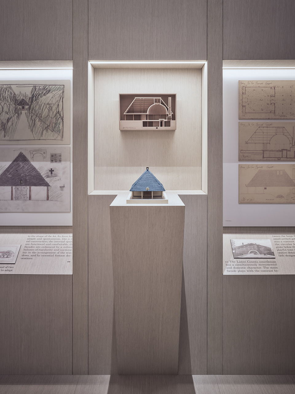
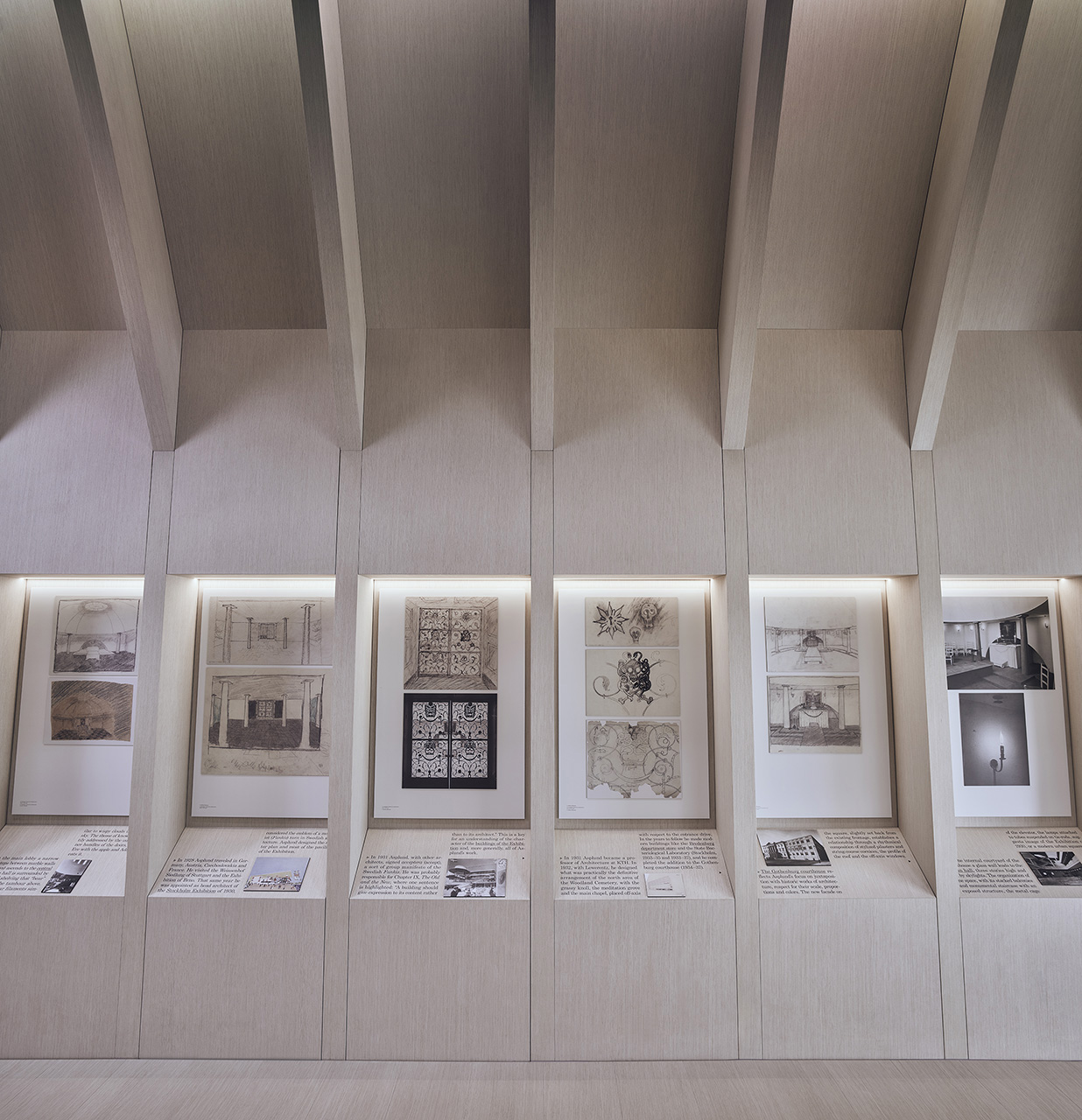
The basic idea of “Vatican Chapels” is outlined inside the building that hosts an exhibition of drawings by Gunnar Asplund for the “Woodland Chapel,” accompanied by documents and models that fully illustrate the theme of the project and its construction.
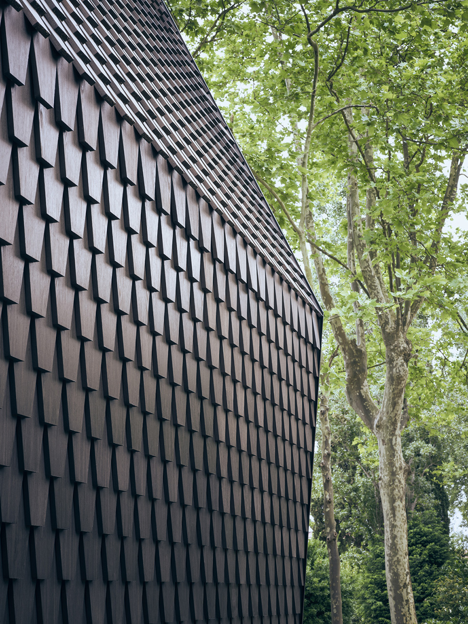
The original chapel is also narrated by the architecture of the Pavilion itself, inspired by the vocabulary of traditional Scandinavian constructions in wood, such as the Stavkirken, reinterpreted in a contemporary way.
Asplund Pavilion – MAP Studio
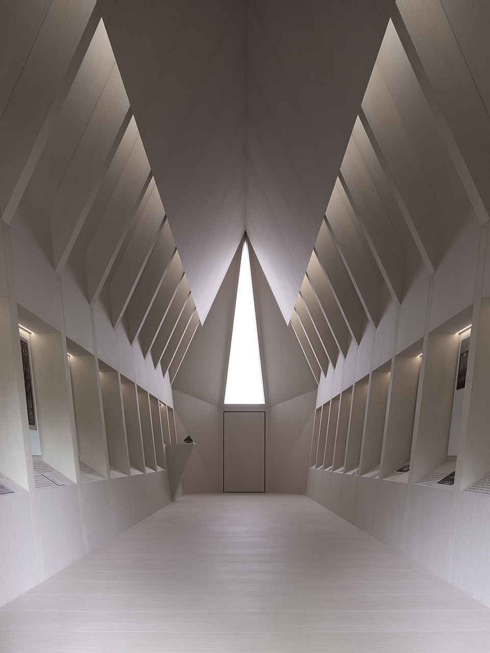
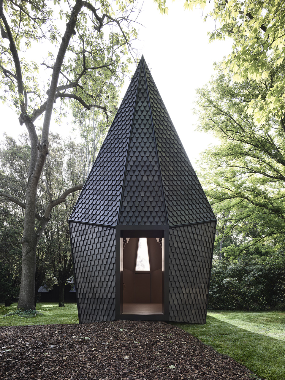
Matteo Sirinati, Chiara Dalla Valle, Alberto Zago (model)
Luigi Cocco
Federico Cedrone, Alessandra Chemollo
A PRECISE FORM OF ANONYMOUS ORIGIN – Andrew Berman
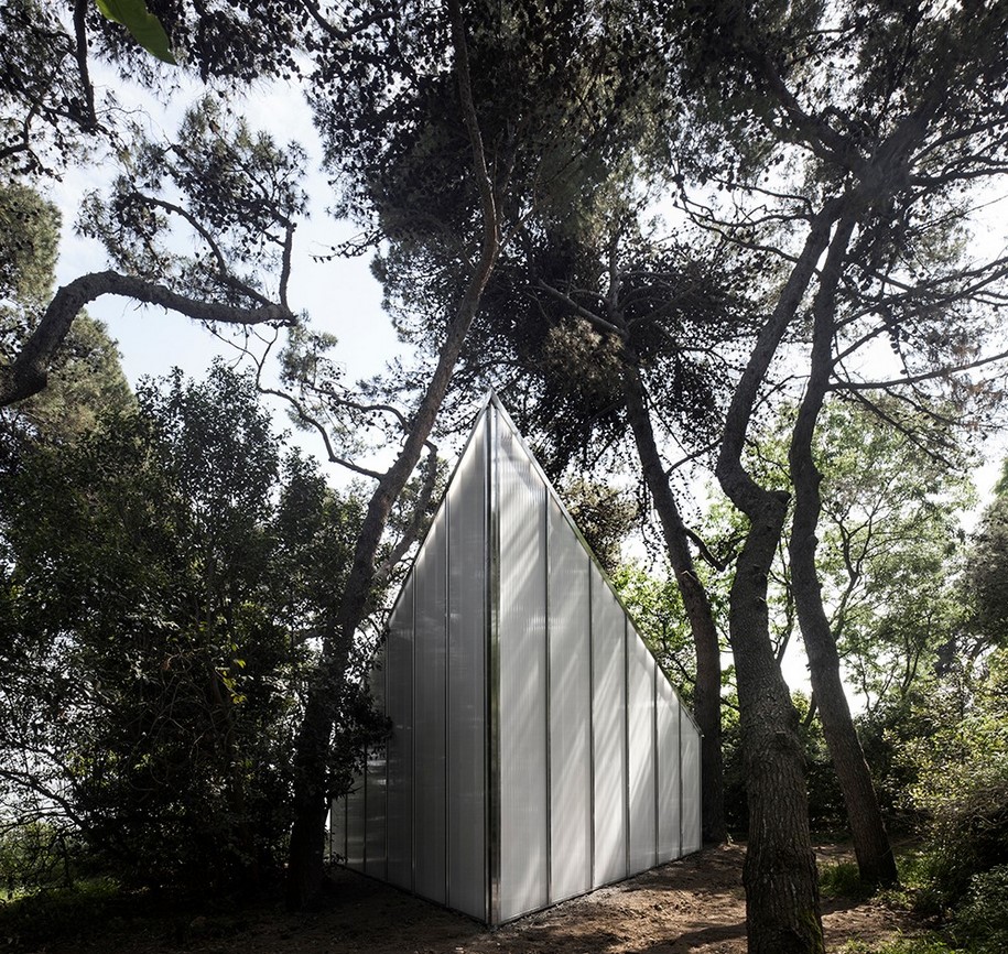
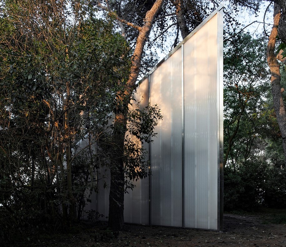
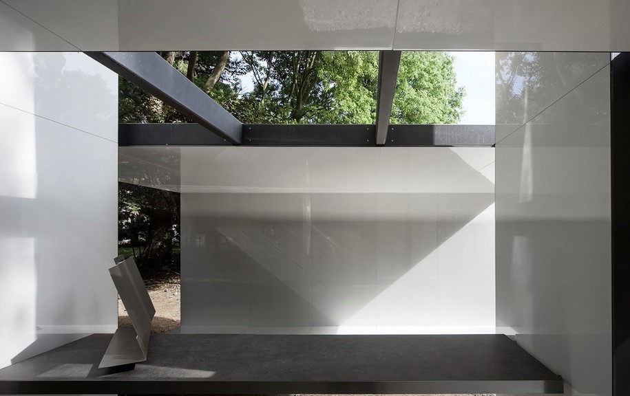
The building for San Giorgio is a simple structure. Its kin are sheds, buildings assembled of readily available materials for simple shelter or use. It is framed of wood studs and rafters, painted white. All exterior surfaces are clad in translucent polycarbonate sheets. The interior is lined in black painted plywood.
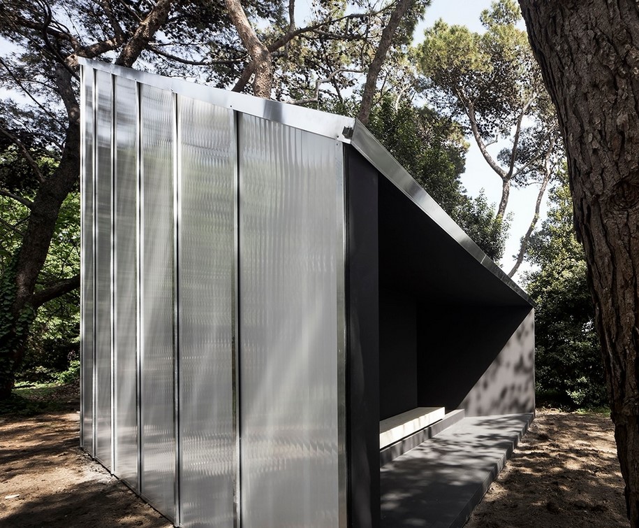
The plywood lining is folded down from the apex of the volume, allowing daylight to enter into the interior.
The structure is a precise form of anonymous origin; an indeterminate presence in the landscape.
The porch is a place for all to gather; a place from which to look out and survey one’s surroundings.
The bench within proposes a place to sit.
It is a space for looking inward, under light amidst darkness.
Architect Andrew Berman
Collaborators Alexander McLean (project manager), Dan Misri, Graham Brindle
with Moretti / Fabrizio Ferranti, Francesco Zanetti (in charge of the project), Terna
A BENCH AND A CROSS – Carla Juaçaba
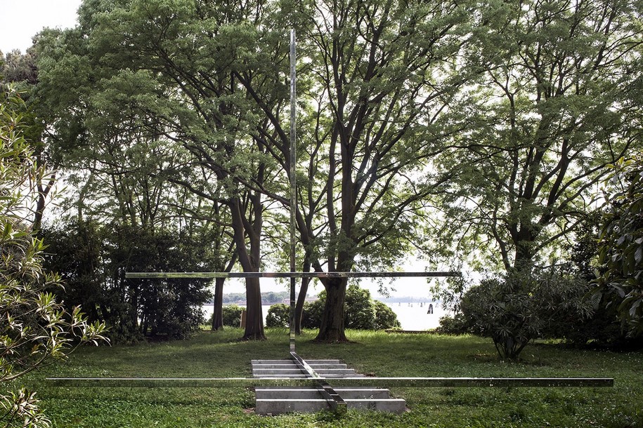
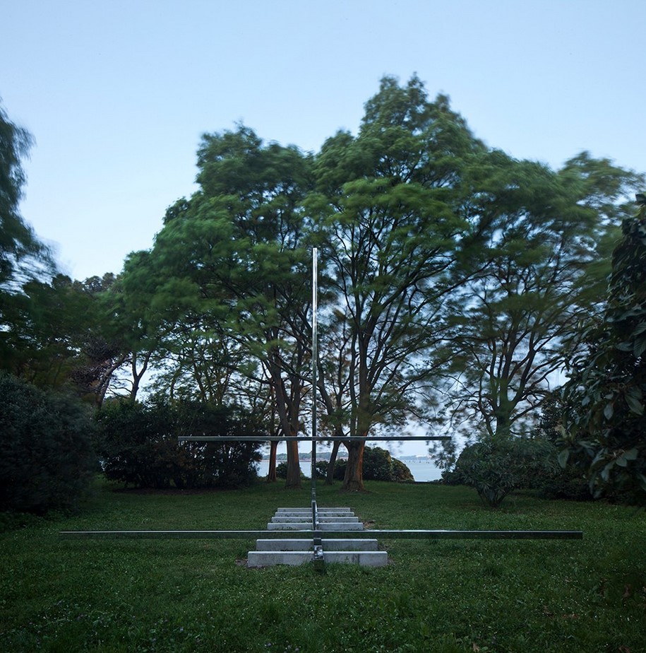
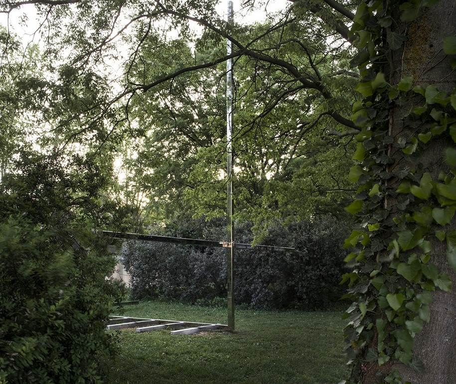
Four steel beams, 8 meters long (12×12 cm thick), compose the ensemble: one is a bench, the other one is a cross. It is built on seven pieces of concrete (12x12x200cm), which give metric to the ensemble.
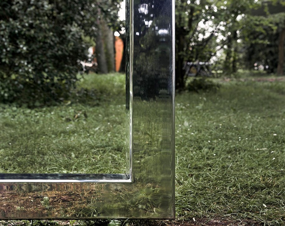
Steel beams are made of highly polished stainless steel to reflect the surroundings: the chapel may disappear at a certain moment.
And so the shadow of the ensemble may become more evident than the object itself.
The presence of history surrounds, the use of a bench and a cross is ages.
Architect Carla Juaçaba
Collaborators Clovis Cunha, Geraldo Filizola (structure), Luigi Cocco (structure)
with Secco Sistemi / Antonio Poletto (in charge of the project)
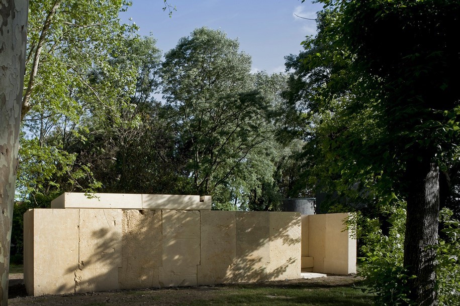
NO, IT IS NOT… – Eduardo Souto de Moura
-text by Souto de Moura
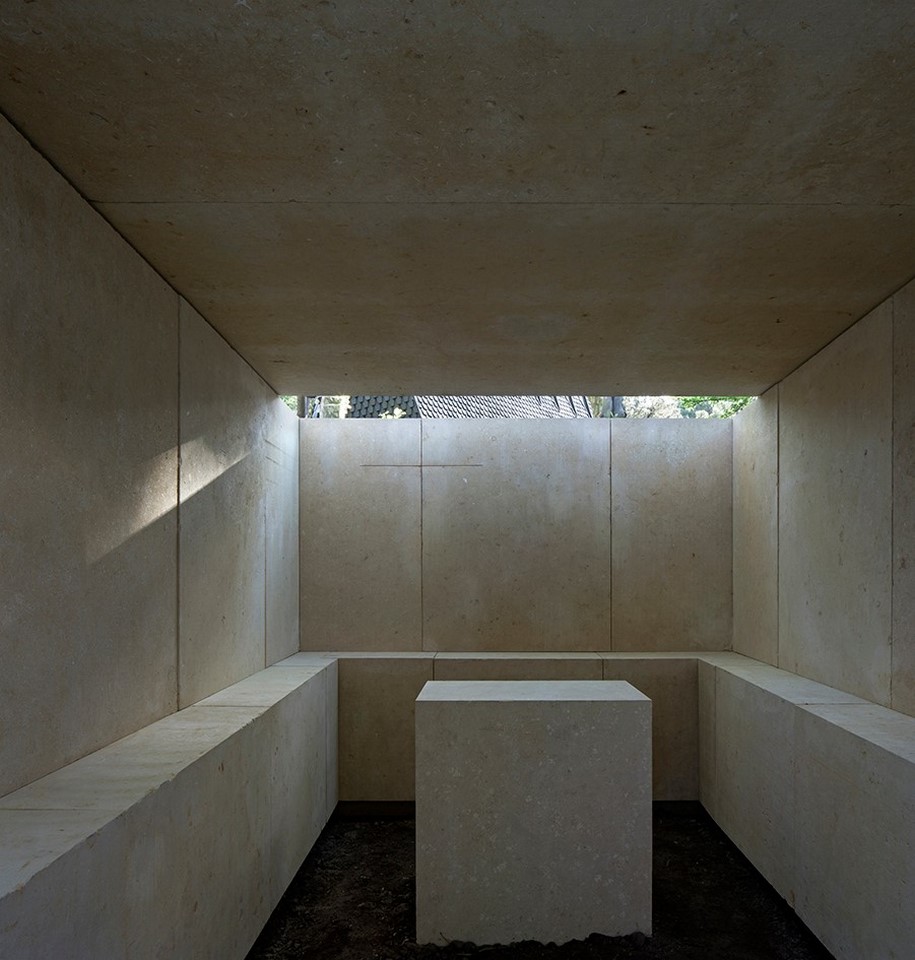
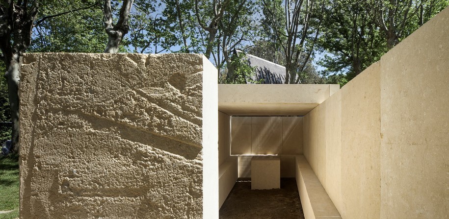
…no, it is not a chapel, not a sanctuary and in any case not a tomb.
It is simply a place enclosed by four stone walls, while another stone at the center might be the altar. The entrance is screened by a tree we want to conserve.
The walls, inside, have a ledge on which we can sit and wait… waiting with our feet on the ground, head in hands.
“Things themselves know when they ought to happen.”
– David Mourão-Ferreira
Architect Eduardo Souto de Moura with Francesco Magnani
Collaborators Simão Sandim (models), Luigi Cocco (structure)
with Laboratorio Morseletto, Deborah Morseletto (in charge of the project)
NOT A PROJECT; A REFLEXION – Francesco Cellini
-text by Francesco Cellini
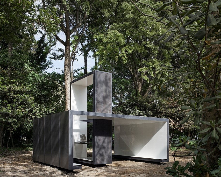
This is not a project for a chapel: it is a reflection on this theme developed by a respectful architect who is not a believer.
An architect guided by the intuition that any chapel is already inherently the physical embodiment of an idea, or a symbol, rather than a building truly intended as a space of ritual. Leaving aside examples it would be most correct to refer to as small churches, nevertheless capable of hosting a religious function (Asplund’s
chapel, for example), or noble or cemeterial examples with the primary function of social representation, we are left with the others, the majority: isolated in cities or in the countryside; the most fascinating, beloved and problematic. Too small to host a mass, except outside and to commemorate
a particular anniversary, even when they contain an altar and in some cases an indispensable ambone (or lectern), they are all characterized by a dedication and, in almost all cases, a corresponding icon. This is what they speak of to those who happen upon them, invited to pause and consider the life of a saint, a miracle, an event (or, in the Orthodox world, a site, made special by nature or history).
At the same time, without actually being a church, they represent, condense or allude to one: in some cases a true, almost naïve miniature and yet often extraordinarily effective. This was the theme I attempted to work with.
The design is missing something essential, the first item mentioned: a dedication; I felt it would be unfitting to invent one.
The second possibility remains: representing a church (Catholic), or better yet, as mentioned, alluding to it. So the objective was not to define a space that invites generic meditation, directed who knows where.
Instead, it invites a precise consideration, almost exclusively architectural and necessarily abstract, of the meaning of sacred spaces, of their proportions, relations and functions: what is the relationship between the hall and the presbytery? What is the role of natural light? Etcetera. To achieve this, I considered it necessary to abstain from an exuberance of form, and to work with elementary and pared down spaces and materials that are also practically abstract. A few explanatory and largely technical notes.
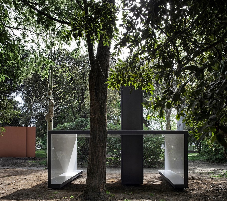
The first is that the idea of gathering suggested by the configuration of the garden, a space of small clearings surrounded by large trees, sanctioned the act of stripping the building of part of its envelope, entrusting its meaning as an interior space to the environment in which it sits.
The second is that the chapel does not touch the ground or, to be more precise, touches it only in a few points. Perhaps, if one were to respect tradition, a chapel should have weight, a great deal of weight, and sit heavily on the ground: this is yet another sign of respect for a site that, given the fleeting duration of this construction, was best left untouched.
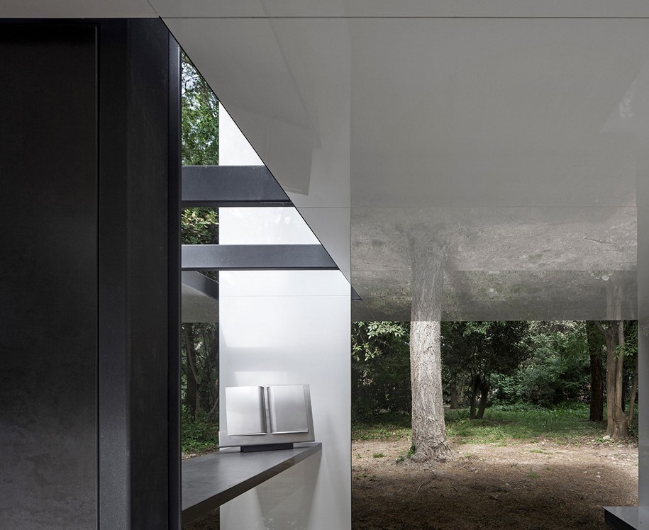
The final note has to do with the presence of two figurative elements (not yet fully defined at this stage of the design): an altar (a simple horizontal surface) and a book. Two distinctive, and highly simplified images; necessary, however, to identify a space too small to truly be considered a presbytery.
Architect Francesco Cellini
Collaborator Roberto Lorenzotti (structure)
with Panariagroup, Marco Levoni, Marco Grisendi, Andrea Zironi (in charge of the project)
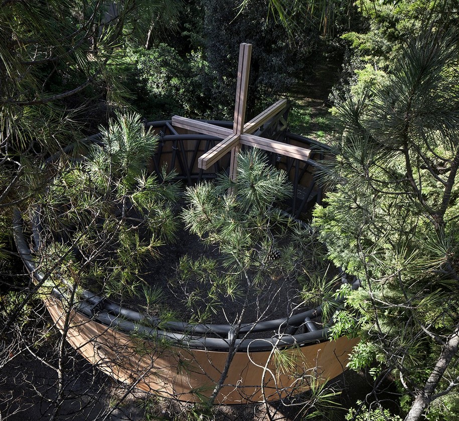
A NOMADIC CHAPEL – Javier Corvalán
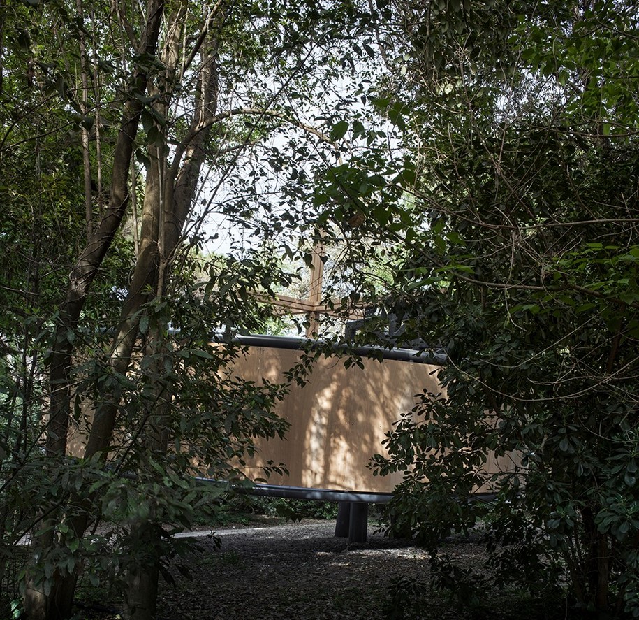
-text by Javier Corvalán
Can we think about architecture as a ball of wool? A sphere formed by a historical thread that easily unwinds in an orderly way?
Or as a more complex and interwoven reality, like a tangle that makes every project the development of a strategy to identify the thread of thoughts and intuitions. Gunnar Asplund, in the forest, “unwound” a Nordic house together with the Pantheon, and we have tried to identify the thread of our project starting with Asplund. We have liberated the circle, a cross-section of a cylinder, placing it in balance on a point of support, a tripod, actually a Venetian “bricola.” The cylinder does not touch the ground; if the earth shakes the chapel moves, if the wind blows the chapel moves. It rises toward the west and opens like a door; it descends toward the east like an apse, following the sun.
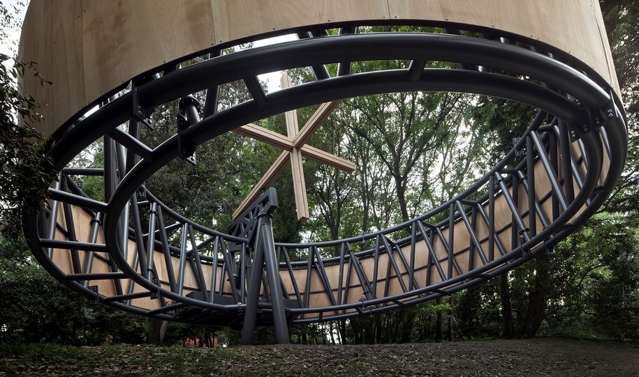
All the tensions combine in an embrace that is transformed into a three-dimensional cross, between the circular space and its roof which is wooded. In the forest one builds with wood. If the time comes the chapel can leave the lagoon, to reach other lands and find a new support, a rock, a cross, under another sky. But the circular space that contains it will not change.
The construction has been designed to have low environmental impact. Originally the foundation of the sole support point was composed of three wooden poles with a circular cross- section of 30 centimeters, placed like a tripod bolted to the ground, similar to a bricola.
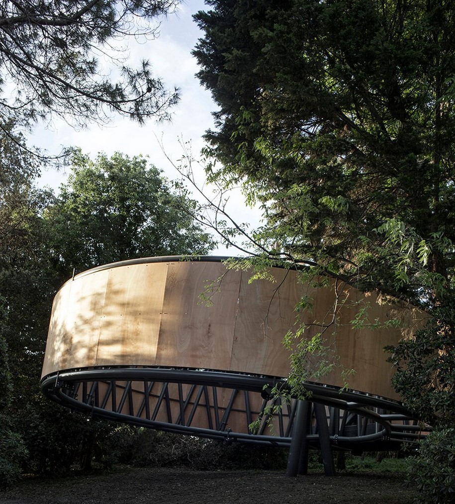
The tripod provided the support for the single steel arm which had to receive the weight of the cylindrical volume of the chapelforming the cross designed in the virtual plane of the roof. The main volume of the chapel was circular and was composed of two cylindrical sections, one larger, external, visible as the facade, and one that was internal, both tethered at a single point of contact corresponding to the spot where they were crossed by the east-west axis. This diameter would have been 11.2 meters, while the perimeter would have measured 36 meters. The cylinders would have been 3 meters high, with a wooden structure, connected by metal tubes held together by steel cables.
The circular volume should have been supported by a large L-shaped steel arm resting on the wooden tripod. This arm would have been completed by a “basket” that would be loaded with pieces of stone weighing 20 tons to act as a counter-weight. During the construction phase, due to the limitations posed by the consistency of the terrain, the effects of the wind, the safety regulations and the constraints related to the guidelines regulating public access to the exhibition space, it became necessary to abandon the use of wood for the tripod and the insertion of the support designed to allow the cylindrical volume to move under the pressure of the wind. For these reasons, while still complying with the static concept of the project, it was decided to make the entire structure in steel, inserting a connection between the tripod and the cylindrical volume.
Architect Javier Corvalán
Collaborators Magdalena Oddone, Joaquin Corvalán, Agostina Vacca Arreseygor, Maria Gloria Gutierrez, Sergio Ruggeri, Juan Bidart, Julieta Ardiles; Andrea Pedrazzini, Roberto Guidotti (structure)
with Simeon / Gianpaolo Stel (in charge of the project), Marco Molinaro (design manager)
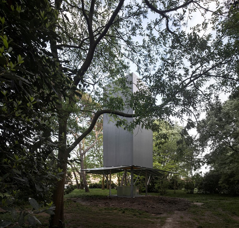
A DYNAMIC ENTITY CAPABLE OF SURVIVING THOUSANDS OF KILOMETERS AWAY – Sean Godsell
-text by Sean Godsell
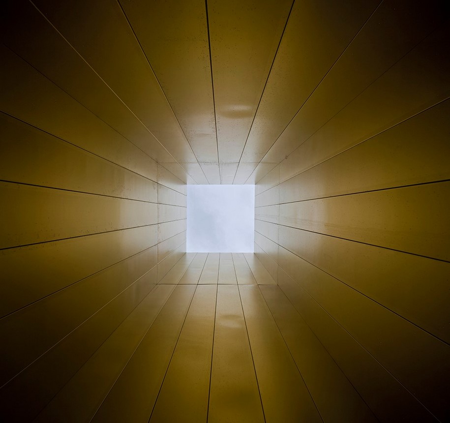
Architecture exists at that moment where we identify the metaphysical in the artistic and logical arrangement of structure and materials.
This recognition occurs when these elements are assembled in such a way that we see beyond their physicality and into our own spirituality. In other words, architecture is inevitably trapped within each of us, occasionally released by architects with the ability to interpret through built form our physical and psychological aspirations.
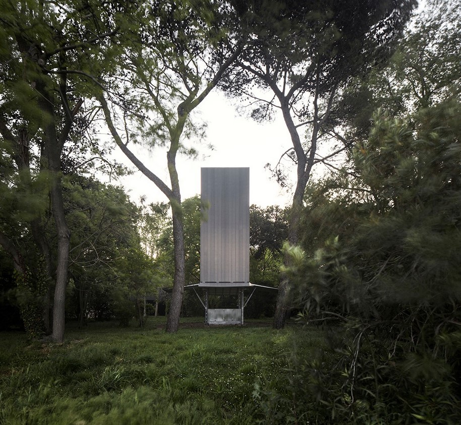
Ad maiorem Dei Gloriam. I was educated by the Jesuits whose apostolic ministry was an integral part of my childhood. Jesuit missionaries brought not only the word of God, but also education, research and culture wherever they ventured and their existence instilled in me a sense of the church as a resilient, dynamic entity capable of surviving thousands of kilometers away from Rome. My design extends that idea to make a relocatable chapel that can be transported, erected, re-packed and transported and re-erected wherever the need exists.
Architect Sean Godsell
Collaborators Hayley Franklin, Luigi Cocco (structure)
with Maeg / Antonio Zanioli, Massimo Zuccolotto (in charge of the project), Zintek /Gianni Schiavon (in charge of the project)
CROSSES MORPHED INTO A TENSEGRITY STRUCTURE – Norman Foster
-text by Norman Foster
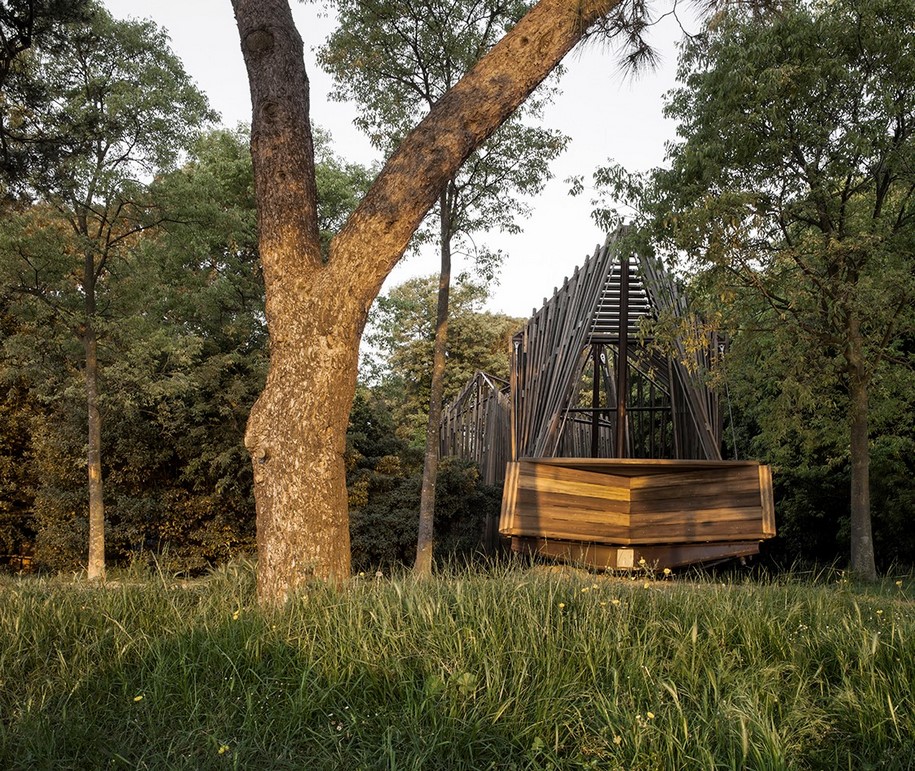
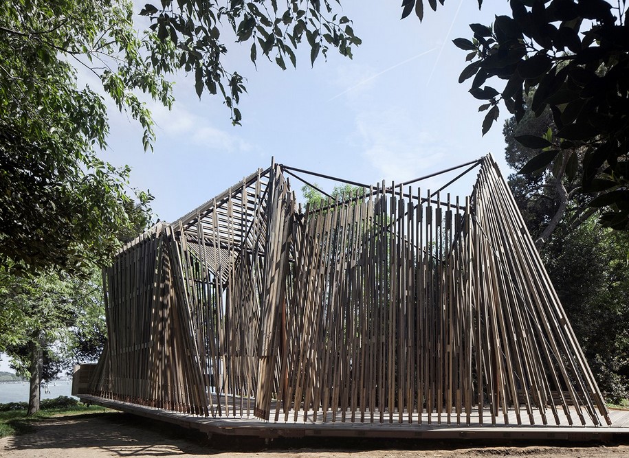
The Holy See Pavilion invited a number of architects to design site-specific temporary chapels to celebrate the 2018 Venice Biennale. Our project started with the selection of the site. On a visit to San Giorgio Island, close to Palladio’s magnificent church and the Teatro Verde, we found a green space with two mature trees beautifully framing the view of the lagoon. It was like a small oasis in the big garden, perfect for contemplation.
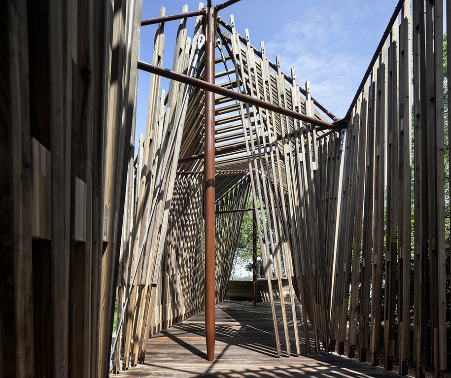
The design concept started with three symbolic crosses and a timber deck set in the landscape, that would receive a lent-like membrane. Over time the crosses morphed into a tensegrity structure of cables and masts whilst the membrane evolved into a wooden latticework attached to the structure.
The aim is to create a small sanctuary space diffused with dappled shade and removed from the normality of passers-by, focused instead on the water and sky beyond. The introduction of a direction change from the point of entry delays that experience and makes it a surprise to be discovered.
Architect Norman Foster
Collaborators Nigel Dancey, Taba Rasti, Pablo Urango, Roger Ridsdill Smith, Jeng Neo, Adam Davis, Fernando Torres, Beatriz Cases, Matthew Thomas, Emilio Ortiz Zaforas, Simone Avellini, Maria Soriano, Oscar Ruiz, Irene Del Val de la Sen, Helene Huang
with Tecno / Renato Dell’Orto (in charge of the project), Maeg / Antonio Zanioli, Massimo Zuccolotto (in charge of the project)
CROSS CHAPEL – Terunobu Fujimori
-text by Terunobu Fujimori
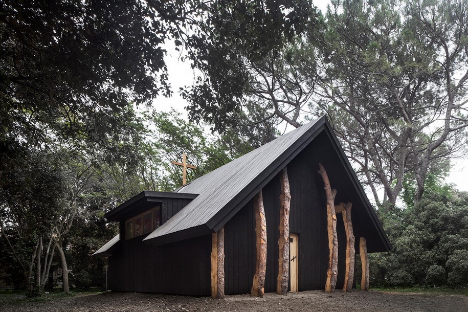
Perhaps it is only in Japan, but it seems that when the people think about the image of Christianity, the cross comes first of all to mind. When Christianity came to Japan in the middle of the 16th century, a cross was placed as the sole Christian symbol on the roof of the Nanban Dera, built in the capital Kyoto with traditional techniques. At the start of the 17th century Christianity was strictly prohibited and severely repressed, and Christian people were crucified.
After that, for two centuries and several decades, a test was made to discover hidden Christians; people were forced to step on bronze reliefs of a cross, a cross drawn on paper, or a statue of Saint Mary, and those who refused were executed.
The association between Christianity and the cross is unchanged in contemporary Japan, and even a small building surrounded with houses in the city
can be identified as a church due to the fact that a cross stands atop its roof [1]. The cross is unique as a symbol in the religious history of the world. Buddhism, Islam and Confucianism do not use scenes of death as symbols of the most important tenets of their faith. Buddha, Muhammad and Confucius were surrounded by disciples and died peaceful deaths.
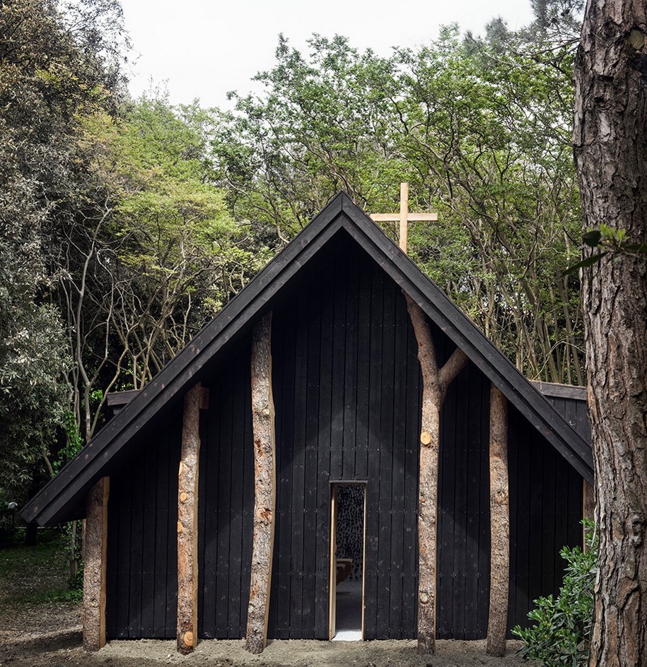
Designing a chapel for the first time, I decided to make the cross my theme. But thinking back on the many works of Christian religious architecture I have seen, no truly impressive crosses seemed to stand out. The overall architecture, the stained glass windows, remained in memory much more vividly than the crosses.
Nevertheless, I did find four crosses in my memories that had made a strong impression.
1) The tall stone cross standing in the wind and snow on the grounds of the monastery at
Clonmacnoise, built in Ireland in the middle of the 6th century [2].
2) The large cross that greets visitors on the hill of the Woodland Cemetery (designed by Asplund)
made in Stockholm in 1940 [3].
3) At the front of the Church of the Three Crosses or Vuoksenniska Church (designed by Aalto) built
in Finland
in 1959, the crosses stand facing both sides [4].
4) The cross of the OtaniemiChapel (designed by Kaija
& Heikki Siren) made in Helsinki in 1957 [5].
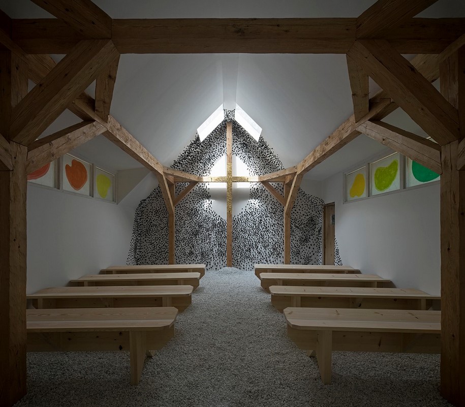
The cross stands by the glass window outside the chapel. Usually the cross of a church is combined with the image of Christ on the wall, but the above four cases are impressive in two respects: they stand apart from the wall, independently, and the Christ image has disappeared.
With these four impressions in mind, how could I make a new chapel with the theme of the cross?
While the four cases I remembered all stand apart from the body of the building, instead it might be possible to incorporate
the cross as an indispensable part of the structure. Fortunately Japanese wooden buildings have developed as the result of a frame structure of pillars and beams, so it is easy to incorporate the cross in the vertical and horizontal framework. The roof and the wall can be wrapped like a panel around
that framework. So the constructive approach was decided; but the question of how I should design the cross itself remained.
When I visited the hill of Golgotha in Jerusalem, I saw an impressive sight. A worshipper dipped his handkerchief in red scented oil on the flat rock where the body of Christ is said to have been placed. He then pressed it to his forehead. I was not surprised by the act itself, because the smoke of incense has the same role in Japanese Buddhism; but I was struck by the fact that the rock, almost buried in the ground, seemed to have been placed there like a shadow of the cross on which Christ was crucified. The sensation was very real. So I thought “yes, let’s raise the cross directly from the ground, and stop making the altar into a trapezoid. Let flowers, candles and the bible be placed directly on the ground. In this way, you will be able to get a little closer to the scene of 2000 years ago on the hill of Golgotha.”
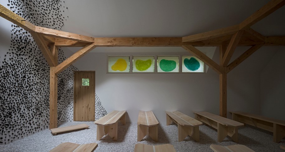
However, to show that the cross is none other than the one on which Christ was crucified, the flowers, candles and bible on the ground are not enough. To represent the ascension of Christ, portions of gold leaf have been placed on the cross, making it shine in the light that descends from above. Finally, I would like to describe the finishing of the outer and inner walls. The outer wall is in black, and suggests a place of quiet prayer. The inner wall is coated with plaster with embedded pieces of charcoal pieces, but around the cross it remain pure white, emphasizing the gilded part. Visitors walk through a narrow passage to approach the “stable-like” building, and “enter by the narrow gate” to experience the sensation of the ascension of the Son of God when they see the cross.
Architect Terunobu Fujimori
with LignoAlp, Damiani-Holz&Co / Erich Gruber (in charge of the project), Barth Interni / Antonio Geminiani (in charge of the project)
A CHAPEL AS A ROADSIDE SHRINE – Smiljan Radic
-text by Smiljan Radic
According to the popular saying in Chile, a roadside shrine is a trap for the soul…
But we know that these shrines are tribalized chapels where grieving people place flowers and candlesfor the tragically deceased.
These shrines are normally found abandoned at the side of highways adorned with the shapes and colors of a circus, or with the austerity of the plain walls of a temple.
On the other hand, if we look at historical examples, a chapel, any chapel, always hopes to be bigger than it is. It always pretends to be a church or a
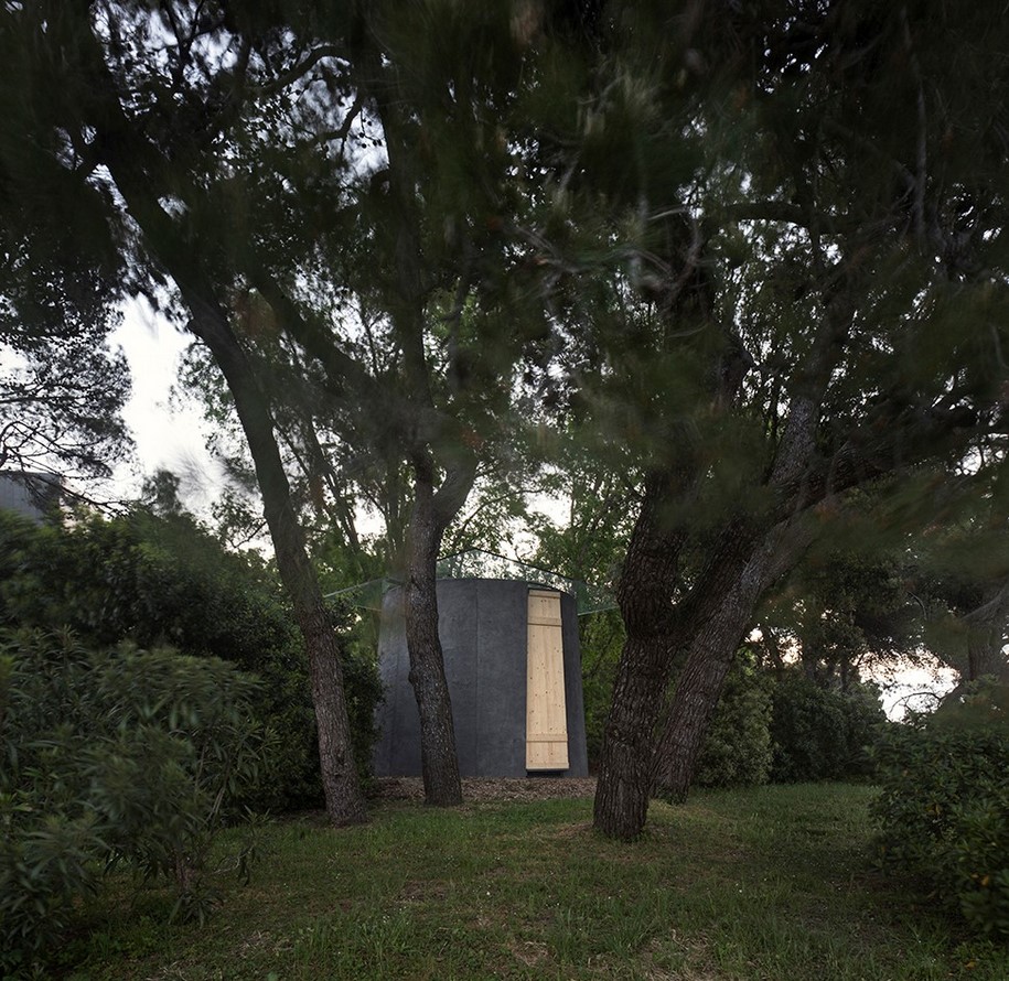
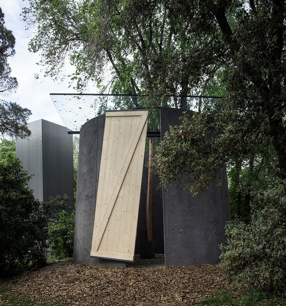
temple, hiding its smaller size, using large forms. Its scale is a trick.
Perhaps due to this desire for greatness, the elements of architecture seen in them are miniaturized… windows, doors, columns are shrunk down,
just big enough for a person to fit through, and their walls are large opaque sheets, avoiding the perforations that would betray this exquisite domestic size… All this confuses us and we are left doubting the human scale.
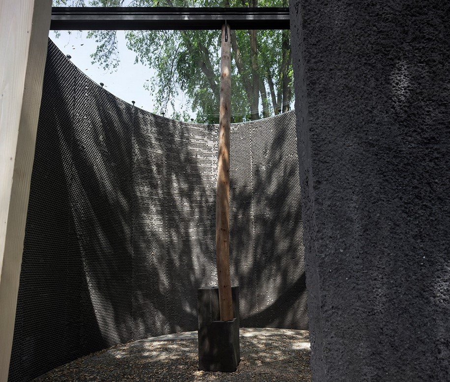
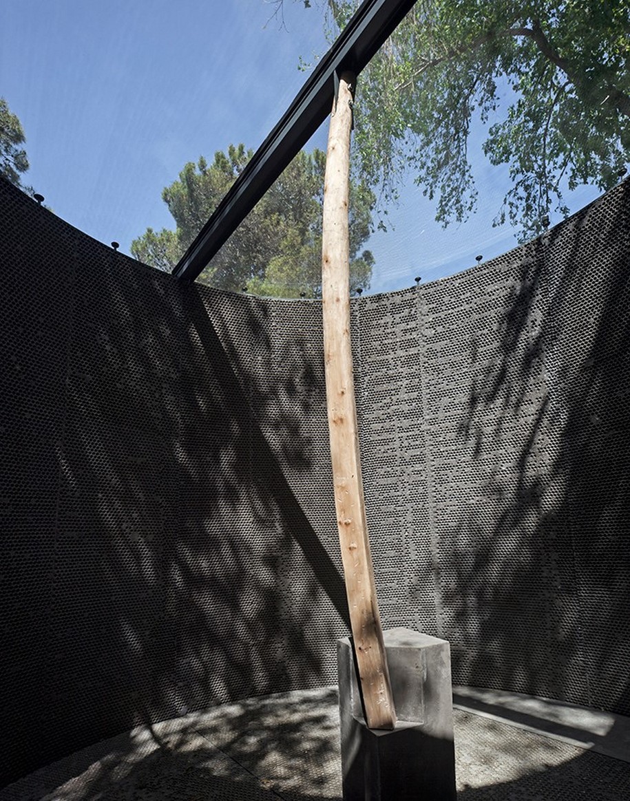
In this way, in a chapel and also in a roadside shrine, the monumental and the domestic live in harmony. This seems to be the basis of the issue in my small conical chapel, with its thin walls and open roof.
Architect Smiljan Radic
with Moretti / Mauro Belleri, Fabrizio Ferranti (in charge of the project), Saint-Gobain Italia / Davide Kohen (in charge of the project)
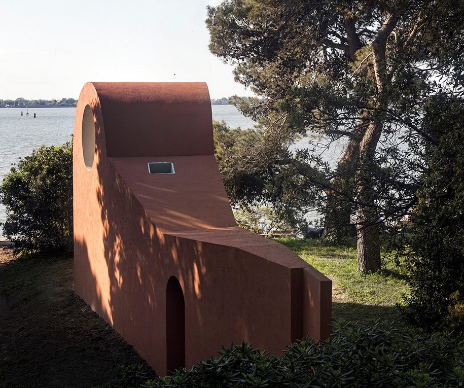
THE MORNING CHAPEL – Ricardo Flores & Eva Prats
– text by Ricardo Flores & Eva Prats
AN ISLAND
To be on an island and then inside a garden, allows a state of being where one’s mind can drift to a peaceful place of reflection. The garden in San Giorgio has a fan structure of walks, starting from Palladio’s Cloister towards the lagoon. The Morning Chapel is along one of these long paths, and sits right before this walking line meets the water.
THE FOREST
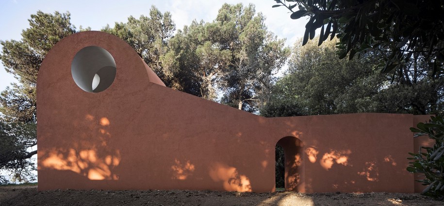
The chapel is presented as a wall parallel to the path. This wall has a door, offering the option to step aside from the common route and move into the forest, abandoning the known destiny offered by these lineal paths in favour of the unknown, at risk of disorientation. The chapel becomes a door to the forest, to the grander entity to which it belongs: a natural dome made out of the adjacency of tree branches. The fragmentary condition of the chapel is thus complemented by the pine forest, and borrows its natural qualities from the trees in it: the smell, the fresh air, the noises and the light. Both elements, built and vegetal, form a natural clearance that embraces the visitor and creates a place to stay. It is a change of rhythm, a change of breath.
EARLY MORNING
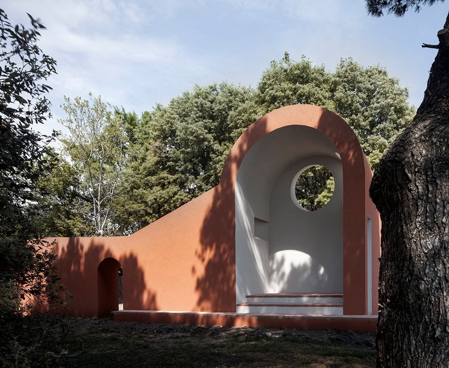
The chosen site is at the eastern part of the island, where the morning starts and the chapel can catch the first sun of the day. This chapel is an early morning place, where the first sunlight becomes visible through a ray of light that trespasses a circular hole in its wall. The Morning Chapel, catching the sunlight on its walls, and the island forest, a continuous canopy in darkness, together establish a quiet place, an invitation to sit alone or in a group.
COMPACTNESS
The chapel is thought of as an excavation in a wall, a chamber in its thickness opened to one side, containing levels and light, a place to sit protected from the sun and the rain. It is a compact construction with a continuous surface, to avoid expressing its building details, favouring instead
its solid, primitive aspect. This antique condition of its form and finishing makes it something in between a forgotten fragment from a previous
construction and an open chapel from the beginning. It moves between memories of the ruins at Villa Adriana to the open chapels of Latin-America.
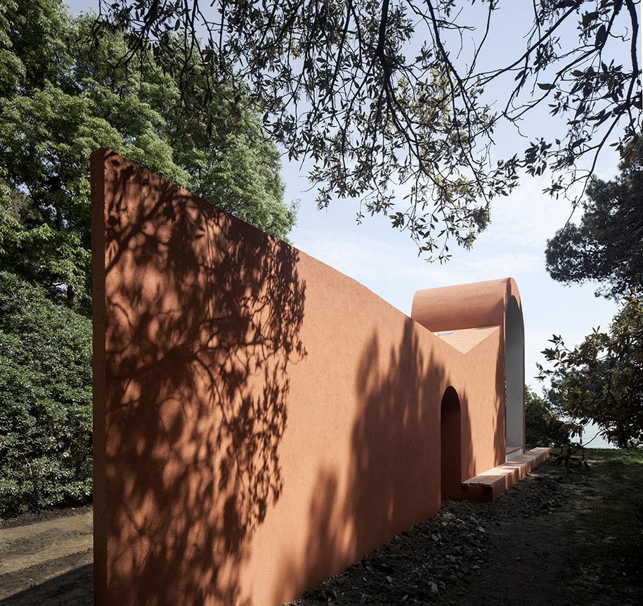
MEETING
Once there, one is confronted with the same end that the lineal walk was leading to. The difference is that the Morning Chapel builds another perspective and a meeting place. Its open condition welcomes all kinds of visitors this side of Venice, not imposing a precise meeting position but allowing a variation of encounters. Sitting in this place there is a double focus of attention: one towards the edge of the island and the lagoon; the other at the casual nature of people meeting around, all having arrived there due to magnetism of the Venice Biennale, sharing a common curiosity, a
coincidence to be celebrated.
Architects Ricardo Flores, Eva Prats
Collaborators Nina Andreatta, Inès Martinell, Jorge Casajús
with Saint-Gobain Italia / Davide Kohen (in charge of the project)
The Holy See Pavilion is curated by Professor Francesco Dal Co. The Venice Biennale will run through to November 25th.
READ ALSO: Inagawa Cemetery chapel and visitor centre by David Chipperfield Architects
