According to the Competition: the “Urban Sign” is a structure, which will act as an information point for permanent, periodic or temporary activities and events. The structure will be placed in outdoor areas, such as a square or a pedestrian precinct and should be clearly visible from a distance. The overall external dimensions will be included in a plan that will not exceed 6.0 m² and a total height of 4.0 m². In addition, the “Urban Sign” should be an easily assembled structure that can be positioned effortlessly and without foundations so it can be disassembled and removed without leaving permanent traces. The supporting structure has to be entirely made of wood. Furthermore, the static efficiency and the balance of the structure is ensured by its design and does not require additional intervention except for its stability, such as to prevent overturning in cases of increased wind factors.
We interpreted the “Urban Sign” as a distinguishable point in the urban public space which would not favor a specific route or direction but would constitute a staging point. In other words, “Urban Sign” is a landmark, where people can interact with each other and obtain information.
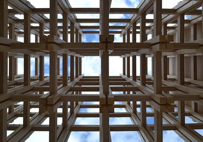
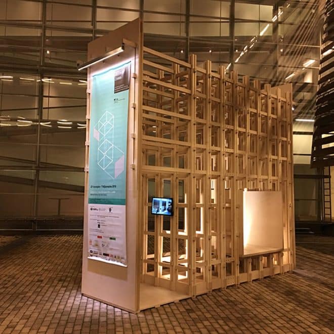
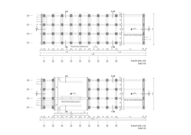
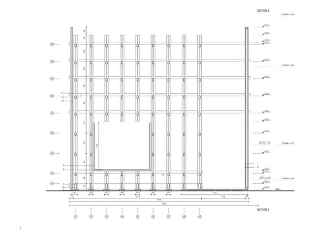
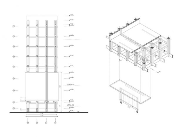
The proposal expresses our intention to design a structure which doesn`t enforce itself in the public space but maintains the existing visual relations. At the same time, we wanted to deploy the structural potential of wood. So, we came up with the idea to form a three-dimensional grid of wood whose complexity and details can meet the static needs of the structure (compressive, buckling, capsizing by wind). Moreover, the grid helps the synthesis of a structure that provides various ways to transmit information. The form of the 3D-grid allows us to stop the norm and form empty spaces in order to create both a staging area and a path through the construction. What is more, on the space grid it is possible to attach additional surfaces with cases for leaflets, extra screens etc.
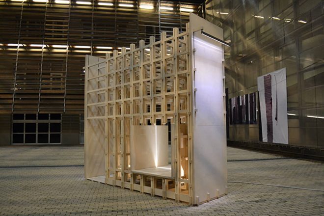
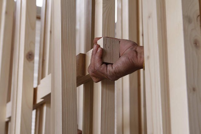
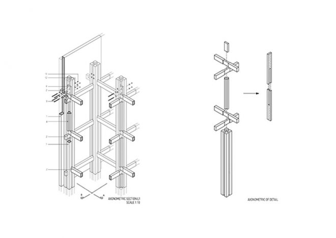
In response to the need of an easily assembled construction, the connections of the junctions do not require metal fasteners such as screws, bolts etc. A fully septate and rigid body is succeeded only due to the design of the wooden elements. Meanwhile, the detail solution manages to highlight the wood as a construction material, which had been our primary intention. To address the wind load, the longer side of the structure remains permeable reducing wind resistance. Solid surfaces are placed on the lateral side, where there is no danger of tipping.
The peculiarity of the structural system is not only functional but aesthetic, as the tissue creates interesting variations of light and shadow. By creating solid and empty spaces, special visual images are produced, which makes the construction distinct from a distance, capable of attracting people around it. The detail of each node of the 3D-grid consists of 4 square columns which have a cross-shaped space between them. This space is filled with the beams and the inner cross-shaped columns. The beams are placed in both directions (x,y) and their shapes indicate their exact placement point in the node. After the placement of one pair of beams (one in x axis and one in y axis), an inner cross-shaped column is placed above them and then another pair of beams are placed over it. The cross-shaped column is defining the z axis distance between the 2 pairs of beams (the ones that are placed under it and the ones that are placed above it).
The notches of beams are holding the node elements strongly and tightly bound to each other and at the same time they prevent the bending of the structure. The force of compression is received by the inner cross-shaped columns and the beams, but the whole node with the four perimetric square columns contributes to make the inner elements way more strong. In this way, Urban Sign can independently overcome any kind of static force without the need of additional supporting fasteners (like screws), except of the base and the top of the structure. Additionally, the whole structure can be separated into two parts so it can be easily transferred. To bond these two parts, bolts and nuts are used. Because of the limited use of other materials except wood (like metal or plastic), a very clear architectural solution is succeeded. As people move through the mass of the Urban Sign, we hope they will always rediscover, with a hint of surprise, the preciousness of things.
In January 2016, our proposal was constructed and presented in the atrium of Benaki Museum during the exhibition of the competition.
Facts & Credits:
Competition: Greek national competition for architecture students “Urban Sign”
Organization: Hellenic Institute of Architecture, Greek Union for Timber, collaboration with the municipality of Athens
Team: Aimilia-Ira Desypri, Aristeidis Misiaris and Filippos Tsoulogiannis-Nikolaou
READ ALSO: A Fresh Coffeehouse in a Kiosk: Taste Habitat by KaanDesignOffice